Affiliate links on Android Authority may earn us a commission. Learn more.
We asked, you told us: Most of you hate the new POCO logo and mascot
February 22, 2021

POCO recently declared its independence from Xiaomi, although the expectation is that the two companies will still share technology and components. Nevertheless, it’s clear that POCO is here to stay.
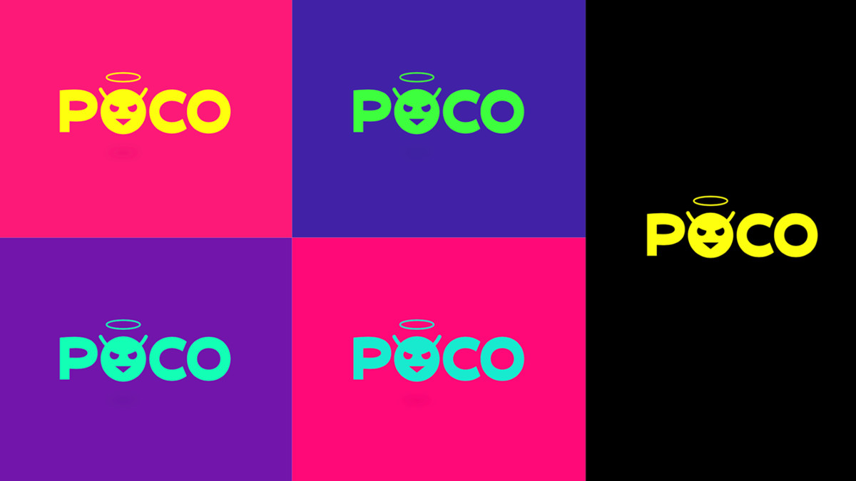
The newly independent company announced a new logo and mascot last week, ostensibly as part of ongoing efforts to distance itself from Xiaomi. This new mascot is essentially a tweaked angry emoji, featuring a halo and wearing a snarl of sorts, and the mascot also forms part of POCO’s new logo (seen above).
So with all this in mind, we thought it would be a good idea to ask Android Authority readers what they thought of the new branding. Here’s how you answered.
What do you think of POCO’s new logo/mascot?
Results
We posted the poll to our website on Thursday February 18, with polls also being posted to our Twitter and YouTube pages. Almost 3,500 votes were tallied on the website, while almost 2,600 votes were counted on Twitter, and roughly 16,000 votes were cast on YouTube. And the results were very consistent across all three platforms.
In each of the polls, over 70% of respondents said they hated the new POCO logo and mascot. Comments on the website and social media suggest that the logo looks rushed or as if a child came up with it. Other comments also note that the logo looks like a bikini or the logo for an adult website.
Nevertheless, just over a quarter of respondents across the board said they liked the new logo and mascot. There were no comments supporting the logo on the website or Twitter, but several respondents on YouTube expressed support for it.
Comments
- Anthorama: Looks like a bikini to me
- Leo: Looks like a sexshop logo.
- Wongwatt: Looks like POCO employed a primary schooler to design their logo – anything based on an emoji is automatically trash.
- Uhlai Suhrai: I seriously hope they will reconsider. I refuse to have to look at this on my welcome screen. I don’t expect Apple level design but just…… no.
- jasontallica245: Wish@POCOGlobal should stick with the same logo instead of adopting this.
- MrMathewJr: The CEO’s kid took over the design project
That’s it for this poll results article, thanks for voting and leaving comments! What do you think of the POCO logo and mascot? Let us know by leaving a comment.