Affiliate links on Android Authority may earn us a commission. Learn more.
Hey Android phone makers, can you leave the power button alone already?
Published onNovember 13, 2021

Smartphones might be hurtling towards a port-less, button-less future, but if there’s one button that remains a constant (for now), it is the humble power button. But what purpose it serves seems to be in a constant state of flux. Being the last bastion of hardware controls also means that the power button often has the task of serving double duty as a shortcut for multiple tasks.
This single button has been repurposed so often it rarely does the one function it was intended for.
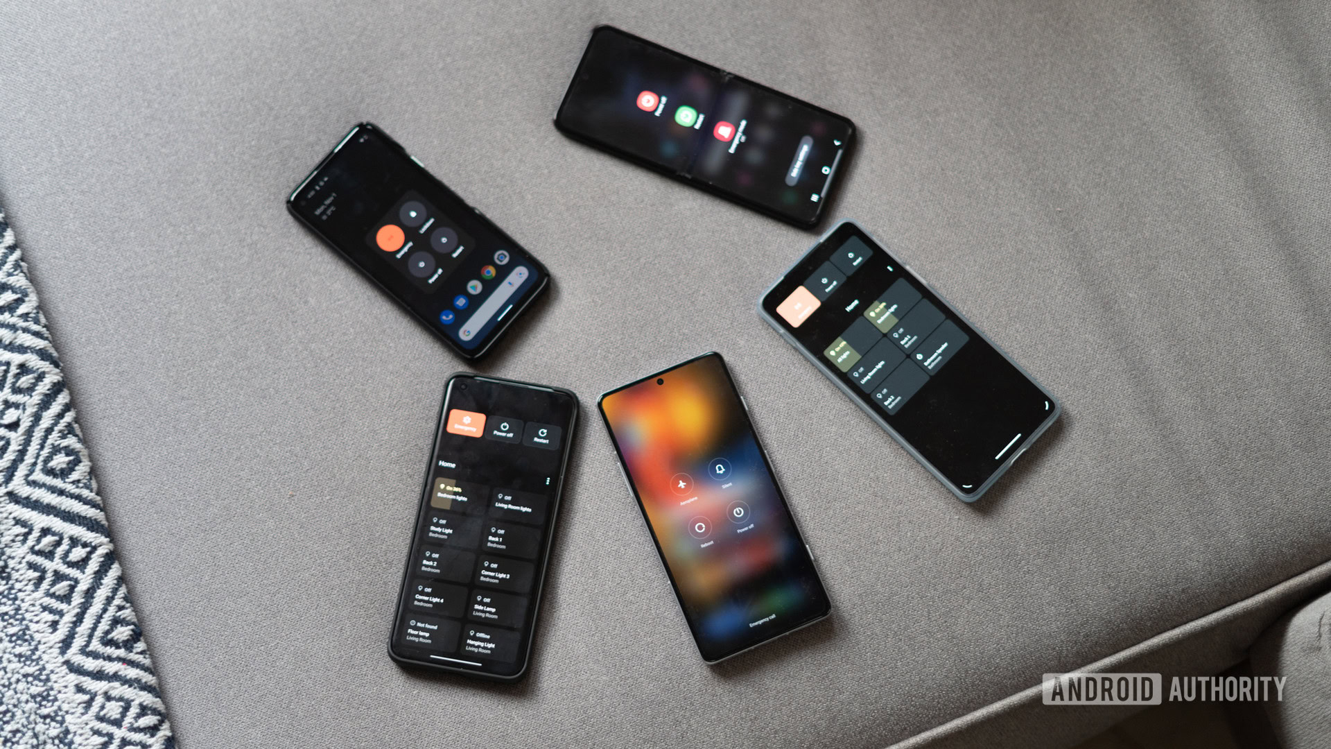
Samsung’s default implementation has you scrambling for Bixby, while on a Google Pixel, you could control your smart home. Except, now you can’t (more on that later). A OnePlus or a Motorola might follow Google’s lead, but then you have phones by POCO that drop all pretense and let the power button be what it is — a single-purpose power button. You know things have come to a head when in some cases, the power button doesn’t even serve as a — shock and horror — power button! Look, nobody can seem to come to a consensus on how to exactly use it, but someone needs to put an end to this madness.

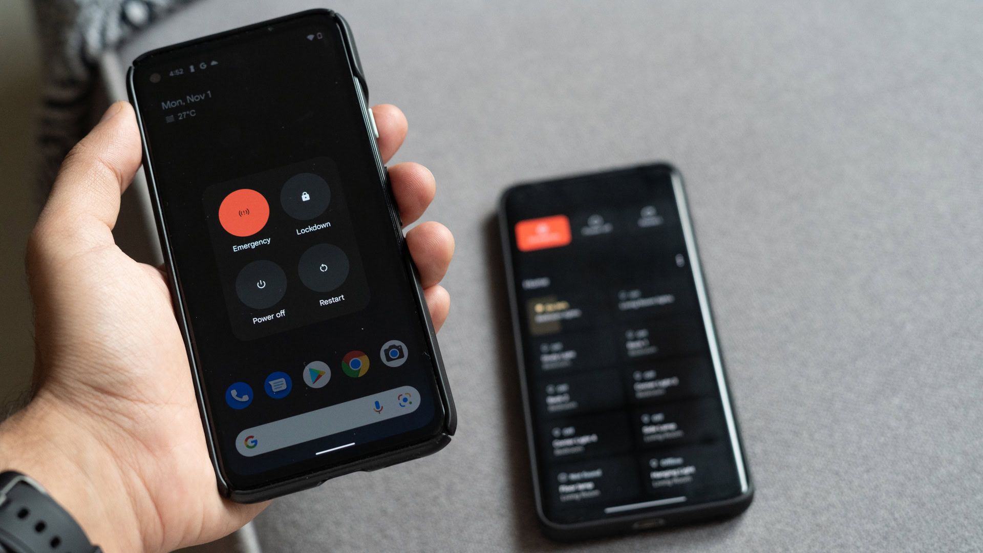
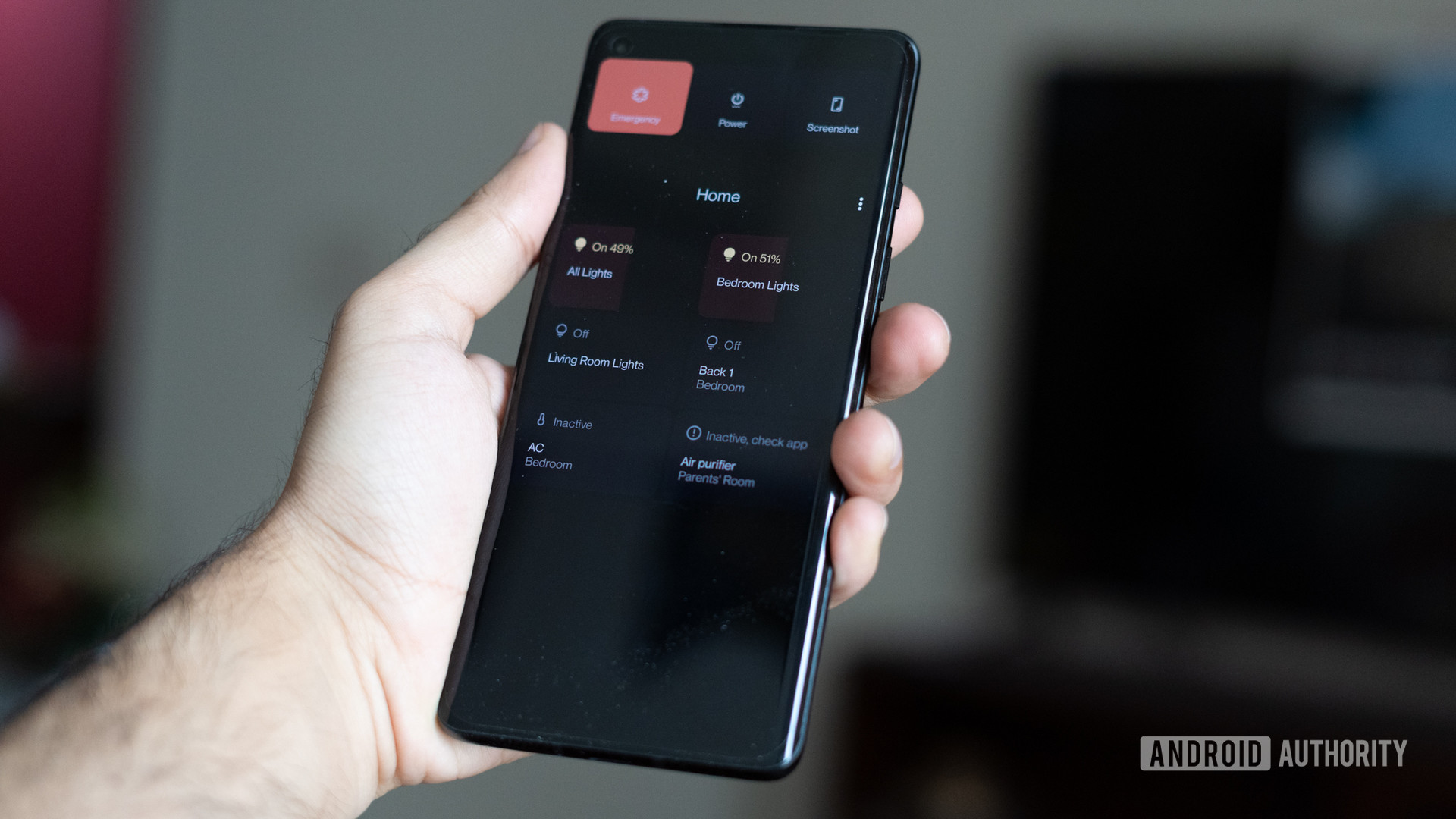
Straight up, one of my favorite additions to Android 11 was the ability to bring up smart home controls when long-pressing the power button. I’m a self-professed smart-home tinkerer and while voice assistants like Google Assistant are great, the ability to quickly adjust lights or turn on my air conditioner from the power button is hard to beat. Or well, it was. Earlier this month, Google released Android 12 and completely nixed the ability to add device controls into the power button. So, we go back to the notification shade and a quick access tile.
Read more: Android 12 — everything you need to know
That one single move breaks a key workflow that I’ve been using for the past year. But the problem stretches beyond the Android 12 redesign and is symptomatic of a broader issue for Google’s approach to basic Android features. One of lacking consistency and the need to enforce some standardization.

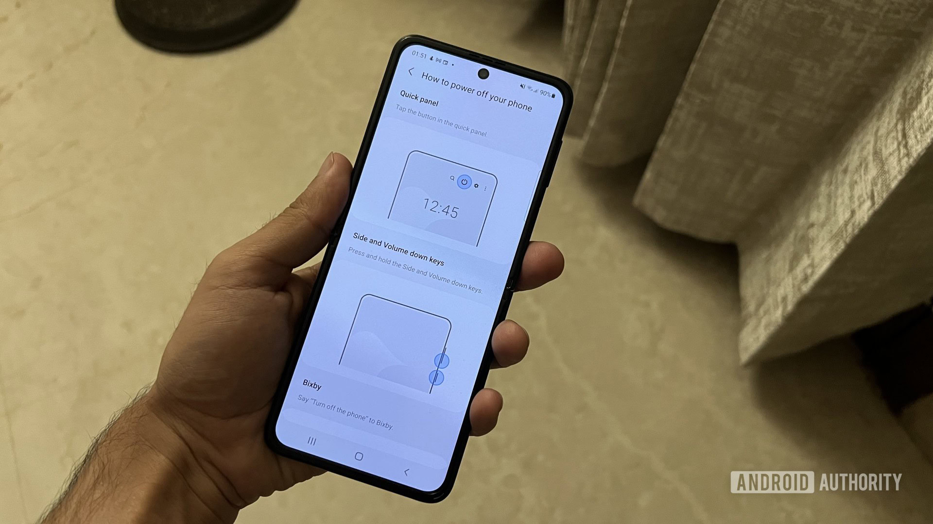
When using the Samsung Galaxy Z Flip 3 for a second opinion review, even I had to do a Google search on how to restart the device simply because the power button doesn’t do what a power button should. Yes, I know you can change the behavior, but as a reviewer, my job revolves around using the stock configuration because that’s what the manufacturer wants the average user to experience. A first-time Samsung user shouldn’t have to go scrambling for help because the power button brings up a halfway useful search engine instead of the power controls they’d expect.
Add to the power button if you need to, but don't take away basic featues
Now to be fair to the South Korean company, it has long been pushing for a Bixby shortcut in the power button. In fact, it never adopted smart home device controls activated by the power key to begin with. That, however, further leans into my concerns with how every brand is treating a basic usability feature like their own personal fiefdom.
Okay, I get it. Perhaps, Google has the data it needs to know that users don’t really care for smart home controls as a shortcut. In that case, perhaps we let the button be exactly what it is — a power button.

Take away the extra features if you have to, or add them if you need to, but don’t take away the base function of what the button is supposed to be. With the two biggest names in the Android space playing fast and loose with the most basic of accessibility features, the onus lies on Google to set guidelines that ensure smartphone vendors follow through as well.
We’ve already seen too many variations on core features likes notification dropdowns, but we’re far and away from the wild west days of early Android customization. Am I nitpicking? Probably. But, it’s the little things that make a difference, and having a consistent design for how a key feature like the power button works is the least you can expect from your smartphone.