Affiliate links on Android Authority may earn us a commission. Learn more.
realme 2 Pro review: A step in the right direction
Published onSeptember 28, 2018
Realme 2 Pro
What we like
What we don't like
Realme 2 Pro
The realme 2 Pro comes hot on the heels of the realme 2, which itself came just a few months after the realme 1. However, the realme 2 was a bit of strange iteration. It added a fingerprint scanner and a dual lens camera — both missing from the first — but actually shrunk the resolution and downgraded the SoC. This was likely because realme recently broke away from Amazon and OPPO to form its own separate entity and wanted to make a name for itself.
Rather than a true next-gen upgrade, the realme 2 was more a “rethink” of the realme 1 with different priorities.
Is this realme 2 Pro the genuine upgrade the realme 2 might have been? Let’s find out in this realme 2 Pro review.
Hardware and design
This device is a massive upgrade in a whole bunch of different ways. It has a Snapdragon 660 AIE SoC, which is a huge step up from the Snapdragon 450 we saw last time. It comes with up to 8GB of RAM, and 128GB of storage. It has a 3,500mAh battery, 16MP dual rear camera with an f/1.7 aperture, and 16MP around the front as well (f/2.0). It’s running Android 8.1 with ColorOS 5.2 on top.
That 3,500mAh battery is the only downgrade from the base model realme 2, which packed a whopping 4,230mAh cell.
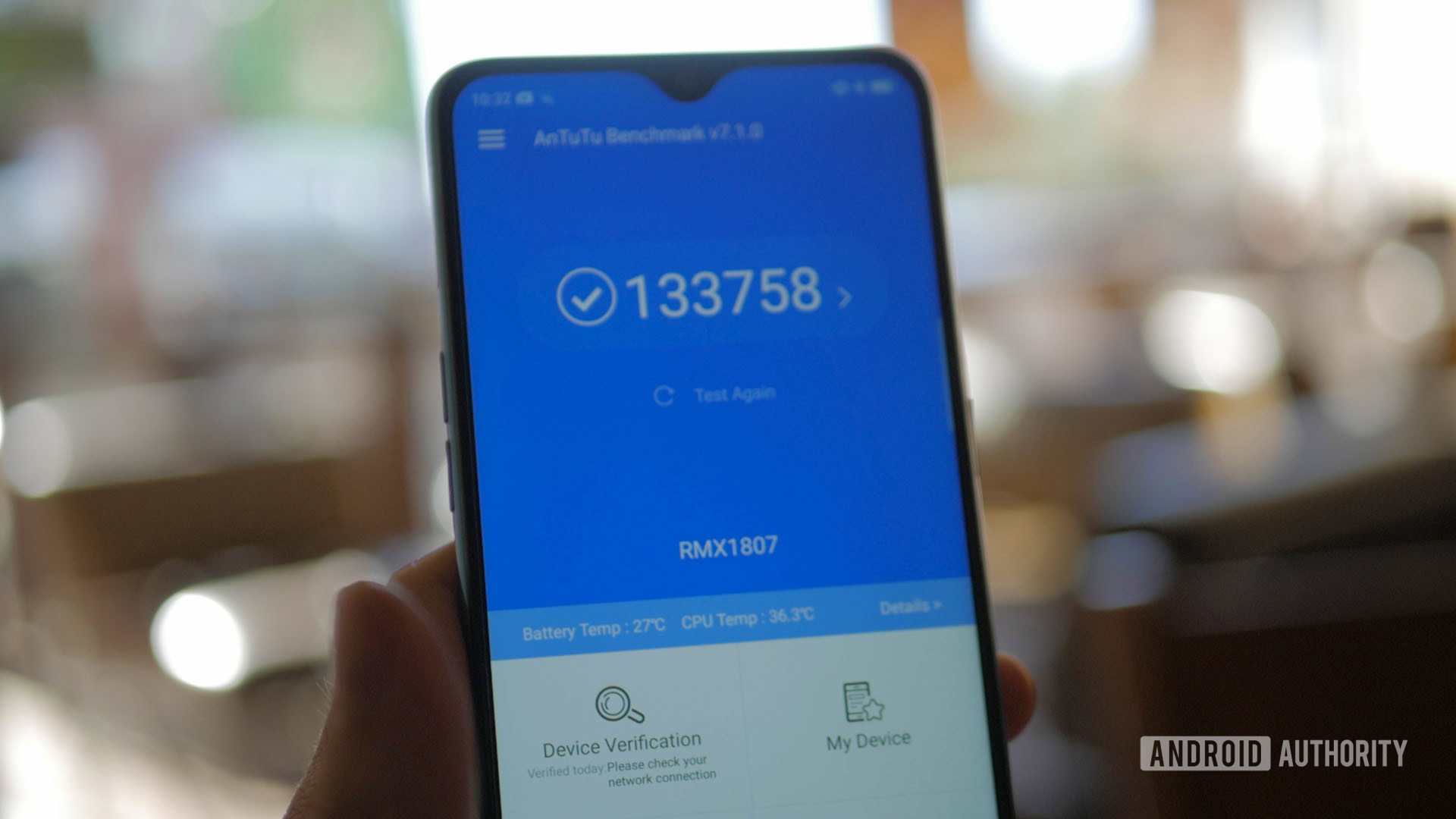
This thing doesn’t have crazy performance by any stretch, but it’s certainly a big step up and more than enough for most games on the Play Store.
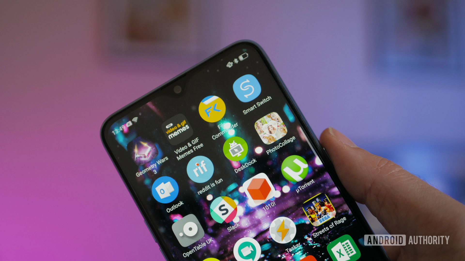
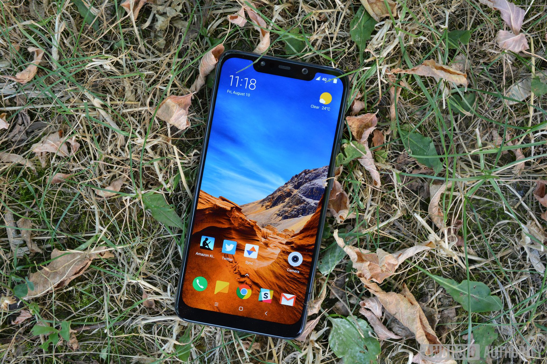
The screen is a 6.3-inch TFT LCD 1080 x 2340 display. It has a notch, but it’s a tiny “dewdrop” notch which is actually pretty nice and gives the phone an outstanding screen-to-body ratio of 90.8 percent. The design is actually one of the bigger selling points at this price range.
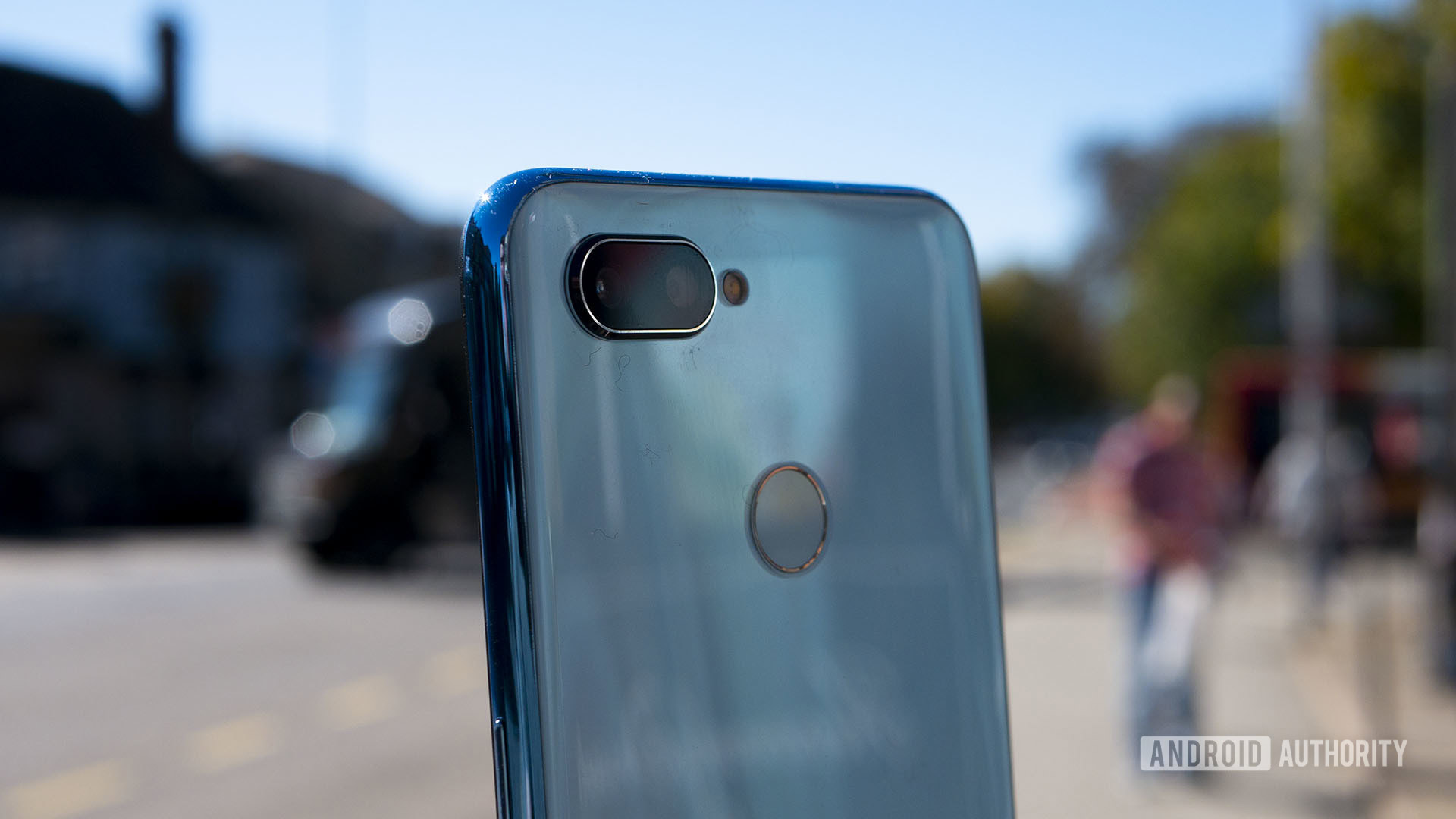
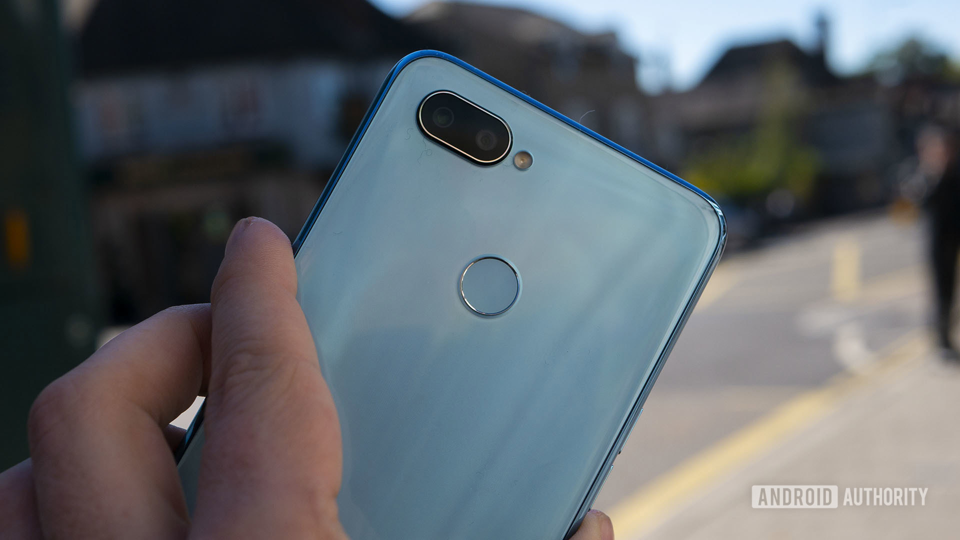
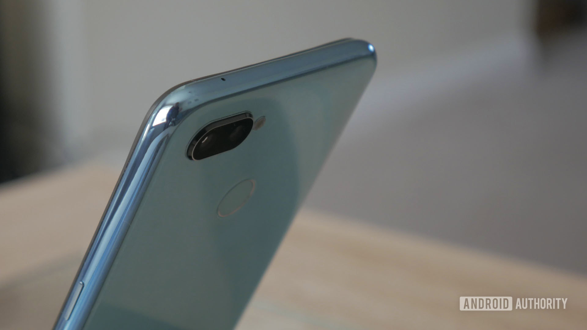
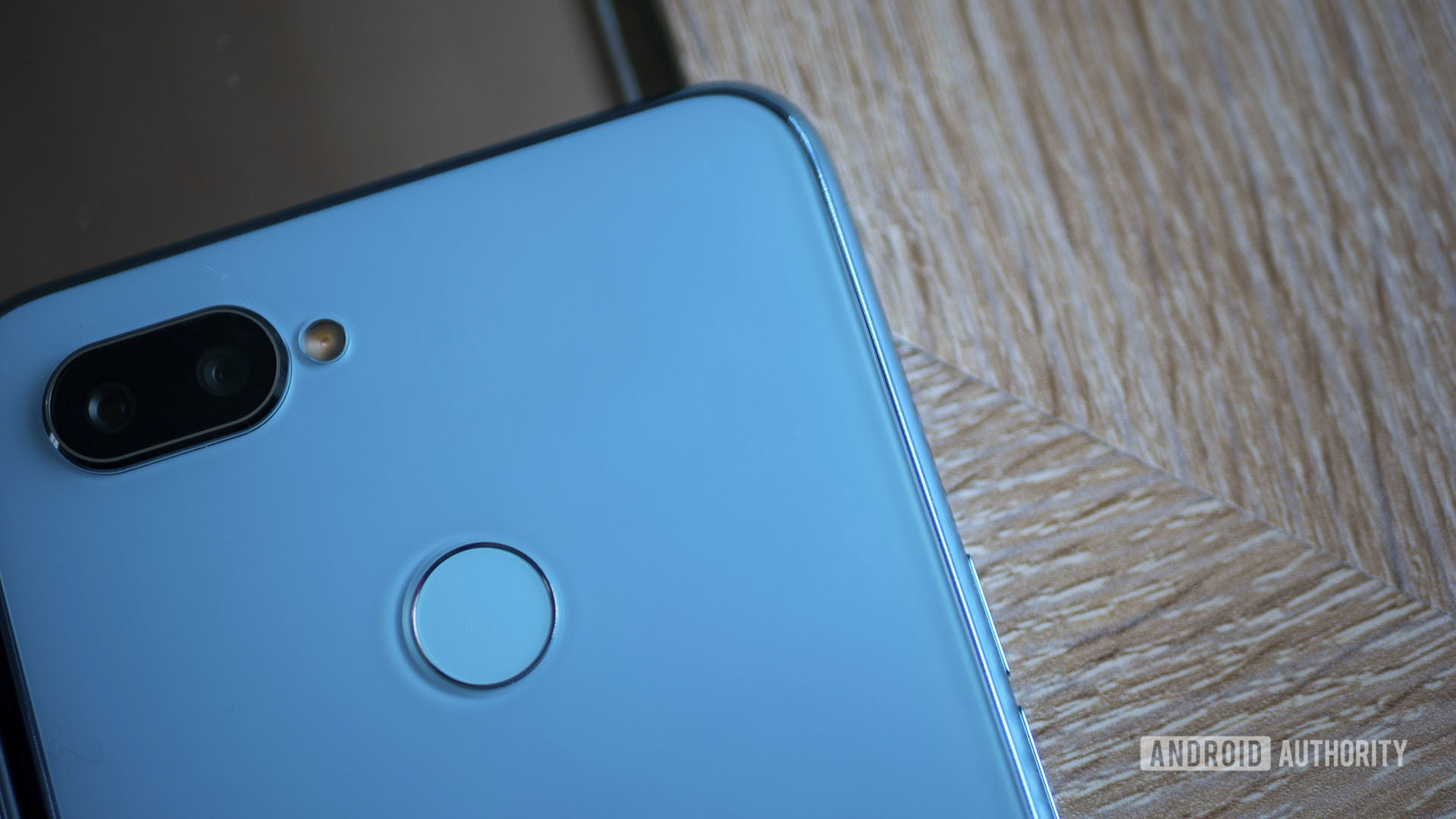
It’s even a big step up in the looks department. Gone is the plastic diamond-patterned back, replaced with what realme calls a “Dewdrop back cover.” I have no idea what this means, but it’s polycarbonate, it looks nice, and appears to have a second transparent layer. There’s no IP rating or wireless charging, but that’s normal for the price. The three colors available are ice lake, blue ocean, and black sea. Mine is the ice lake edition.
The bizarre decision to go with a microUSB is poor future-proofing.
There’s also a fingerprint sensor again, combined with blazing-fast facial recognition, and a headphone jack. Camera-based face unlock is really quick thanks to some AI smarts. It all seems like a real upgrade, except for the bizarre choice of a microUSB port for charging.
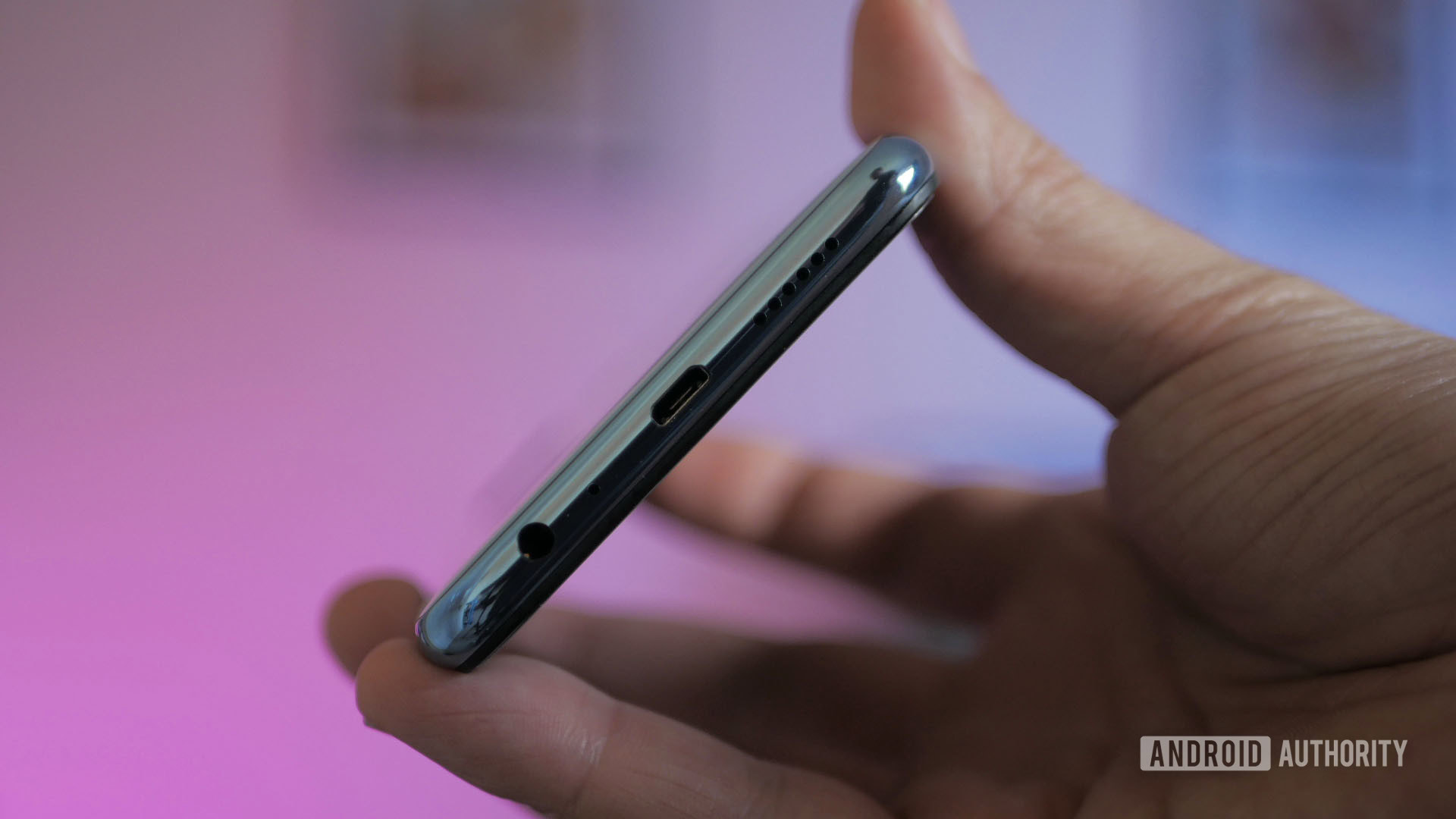
This is not a big deal by any stretch. You can certainly live with marginally slower transfer speeds and occasionally needing to make sure your plug is the right way around (USB Type-C: it’s reversible!). However, it is becoming increasingly difficult to find compatible chargers and devices for that old format. Since most of us keep our smartphones for a good few years, that will only get worse. This is poor future-proofing. Other manufacturers have shown you can include a USB-Type C at a budget price, so I’m not sure why it’s absent here. It’s a blight.
A blight I tell you!
There’s also no NFC, which means no Google Pay support.
There’s also no NFC, which is fairly common at this price point.
Daily use and camera
The realme 2 Pro is quick and reliable, its battery performance is good, and ColorOS is annoying. It’s not a huge deal, but it’s probably the ugliest skin in town these days, with annoyances like the fact that notifications that can’t be dismissed (why??). I’m also not a fan of how the lock screen works — you need to make an additional swipe after you’ve registered a fingerprint or a face, which often results in me staring blankly at the screen for a few minutes before realizing I can get in. These are not deal breakers, though. ColorOS also has a couple of additional features thrown in.
The general experience of using this phone is absolutely fine and what you would expect for that fairly decent spec-sheet. I’ve been using it for a few days and haven’t run into any problems.
The camera is slightly better than I expected. I was ready to hate it, but it actually performed quite well. Photos have good saturation and contrast, and the low-light performance was surprisingly impressive. I tried tripping it up a few times and it consistently bested me. This of course is thanks to that f/1.7 aperture, which is also what allows for some good natural depth effects.

The bokeh “portrait mode” also makes an appearance on both sides, and does hit-and-miss job, which is normal at this price point. There are also a bunch of beauty mode effects for those interested, including the option to beautify multiple people in a single shot. It’s great if you have a lot of ugly friends.

The biggest drawbacks in the camera department are the relatively low detail when you zoom in on distant objects, and the all-over-the-place exposure. This significantly neuters the benefit of the 16MP selfie camera, which would have otherwise been ideal for vlogging and such.
Exposure is all over the place.
The camera app is also somewhat irritating, in particular needing to enter a “video mode” to record video, rather than simply hitting a record button. Apparently there’s some AI scene-detection going on, but I didn’t notice it much myself other than the phone occasionally pointing out the lighting was good.

This obviously isn’t going to be the camera phone of choice if you spend a lot of time on social media, but it’s also not horrible. It will be a good companion when chronicling meals out with friends and all the funny things your dog does.
You can see some more full-res camera samples here.
Price, value, and competition
How compelling an offer this is will depend on the price. That comes in at 13,990 rupees (~$193) for the base model and 17,990 rupees (~$248) for the higher specs.
If you’re going for the more expensive model, you could get a POCOphone F1 for just $50 more, which has a significantly better SoC and a larger battery. The lower priced phone is competing with phones like the Xiaomi Mi A2, which comes with fairly similar specs.
I was kind of hoping this might be to the budget market what the Pocophone F1 is to the mid-range — it’s not. However, it’s a solidly built device with attractive looks and strong performance. It’s good value and it’s yet another example of how these days you can get a very appealing smartphone without spending a small fortune.

It’s certainly a big step in the right direction for realme. (That’s a callback to my review of the realme 2 for those that missed it. It was very clever. In other news: I’m really tired.)
I give this phone a “well done, realme.”
Related
- OPPO Find X review: Finding space
- OPPO F9 review: Not your average notch
- OPPO confirms plans to enter UK market, but will it launch the Find X there?
- Independent research suggests OPPO and HUAWEI cheating benchmarks by huge margins