Affiliate links on Android Authority may earn us a commission. Learn more.
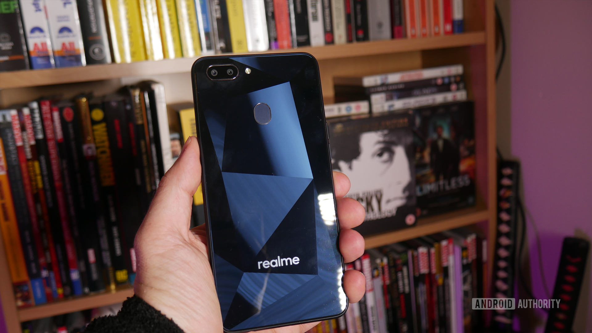
realme 2 review: One step forward, one step back
Published onSeptember 6, 2018
Realme 2
What we like
What we don't like
Realme 2
It’s only been about three months since the realme 1, and yet here we are with the realme 2 — an iterative update to an incredibly affordable device, bringing some additional features without inflating the price much. However, for every step forward, the phone takes another step back. This device removes as many feature as it adds!
realme has now broken away to become its own brand. For its debut it kept the price the exact same as the previous model, thus necessitating more compromises for a phone already all about compromise. Let’s take a look at the $130 handset in this realme 2 review and see what exactly is going on here.
realme 2 design and media
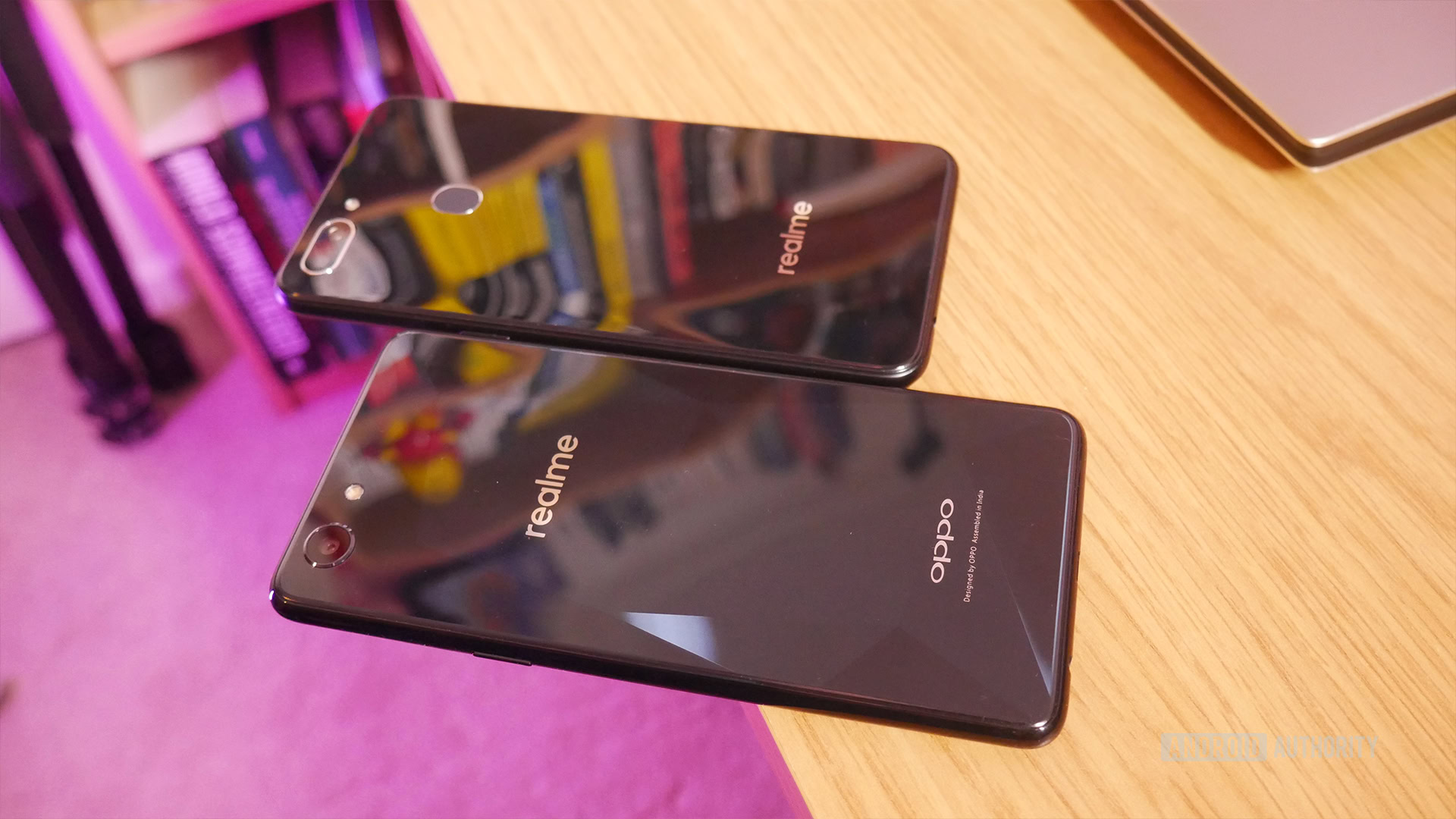
The phone’s design shows most of its positive progress, as well as a some suspect decisions.
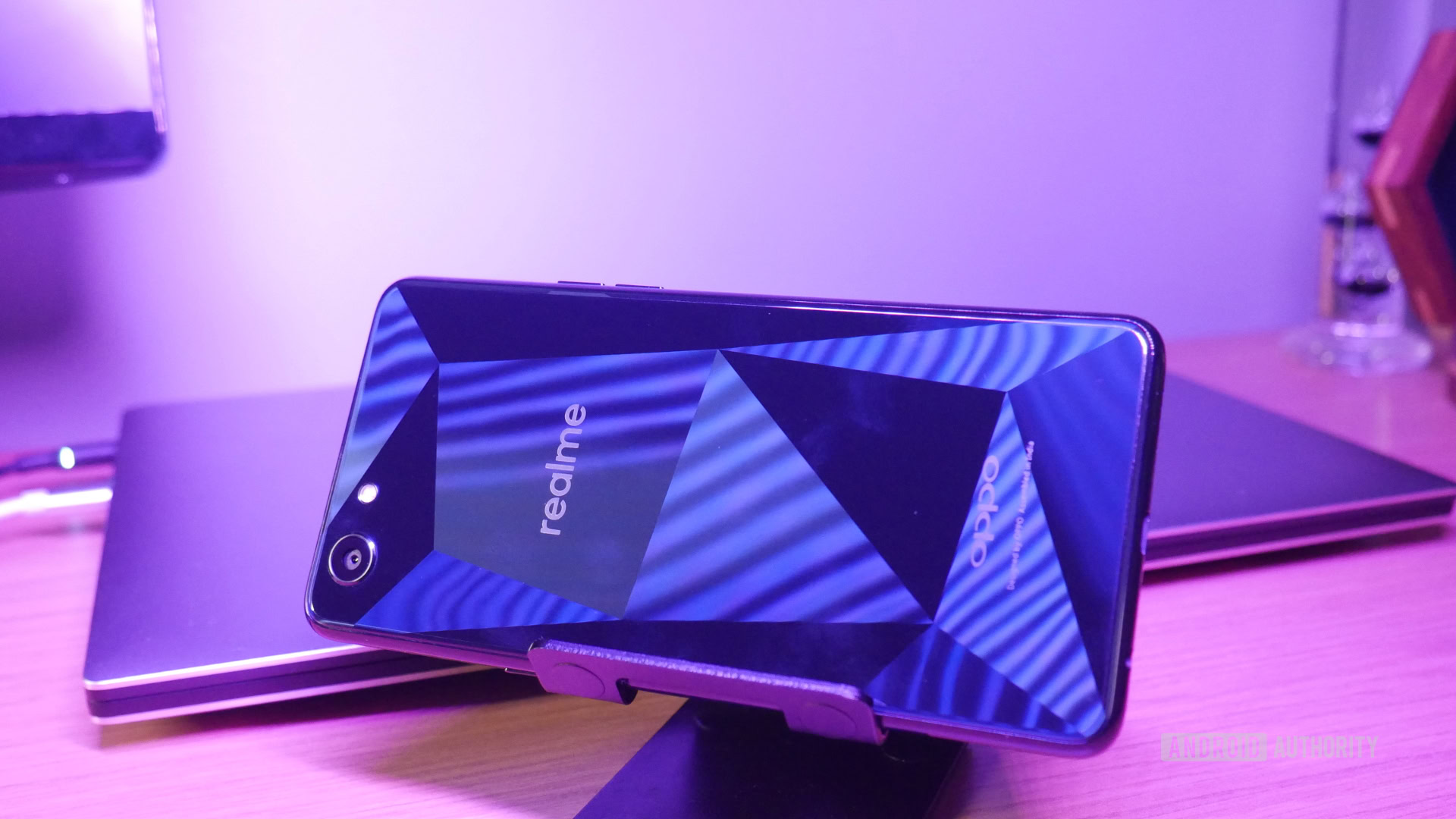
The very plasticky build and the interesting polygonal effect adorning the rear of the phone have remained the same. I said in my realme 1 review this looked much better in photos than in person, and this time around the effect seems even subtler. Every now and then it catches the light and brings out the pattern, but most of the time it looks like a glossy black finish. It’s certainly not a killer design feature, but on an otherwise nondescript, cheap phone, it’s still a welcome inclusion.

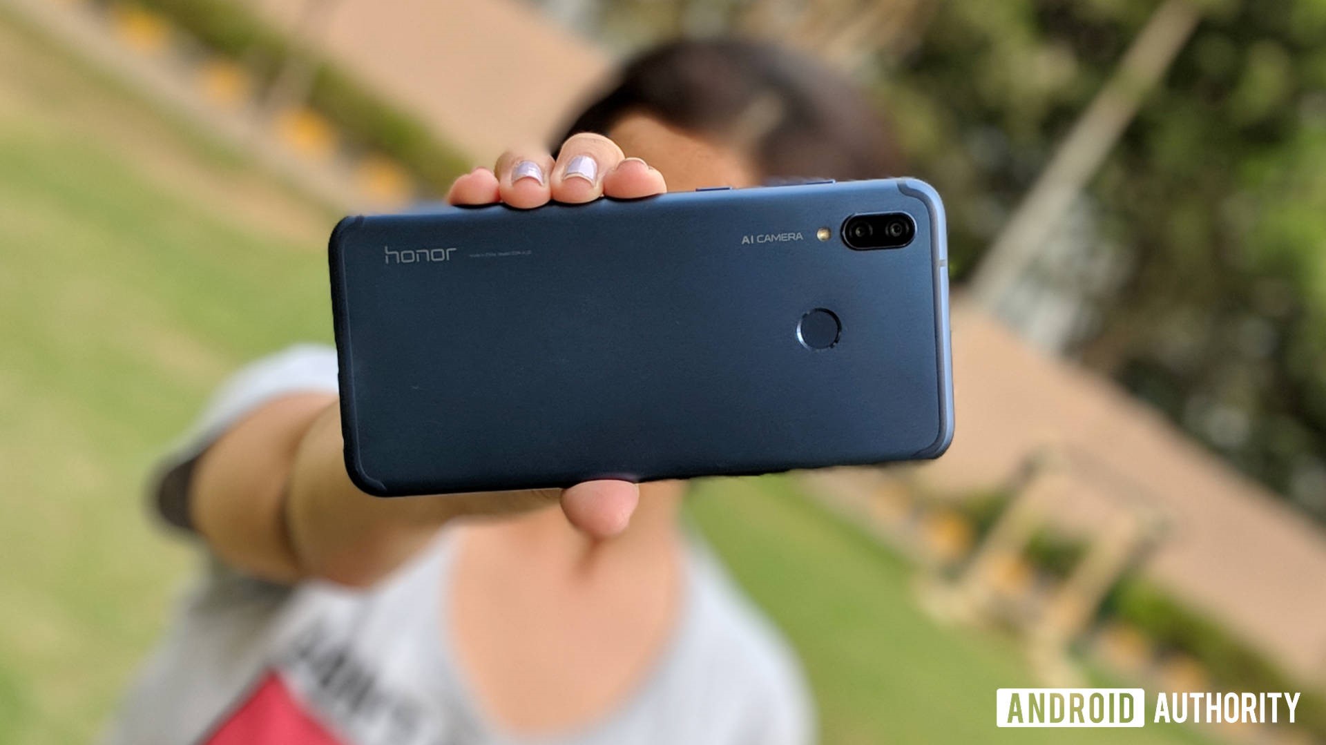
The branding around the back is now a little less ostentatious (a big win), and there’s a dual-lens camera and a finger print sensor (more on them in a bit).
Another interesting design choice this around is the inclusion of a notch. Many of you just clenched reading that, but I actually quite like it (interestingly, this feature seemed to have been cut last minute from the first realme based on early renders).
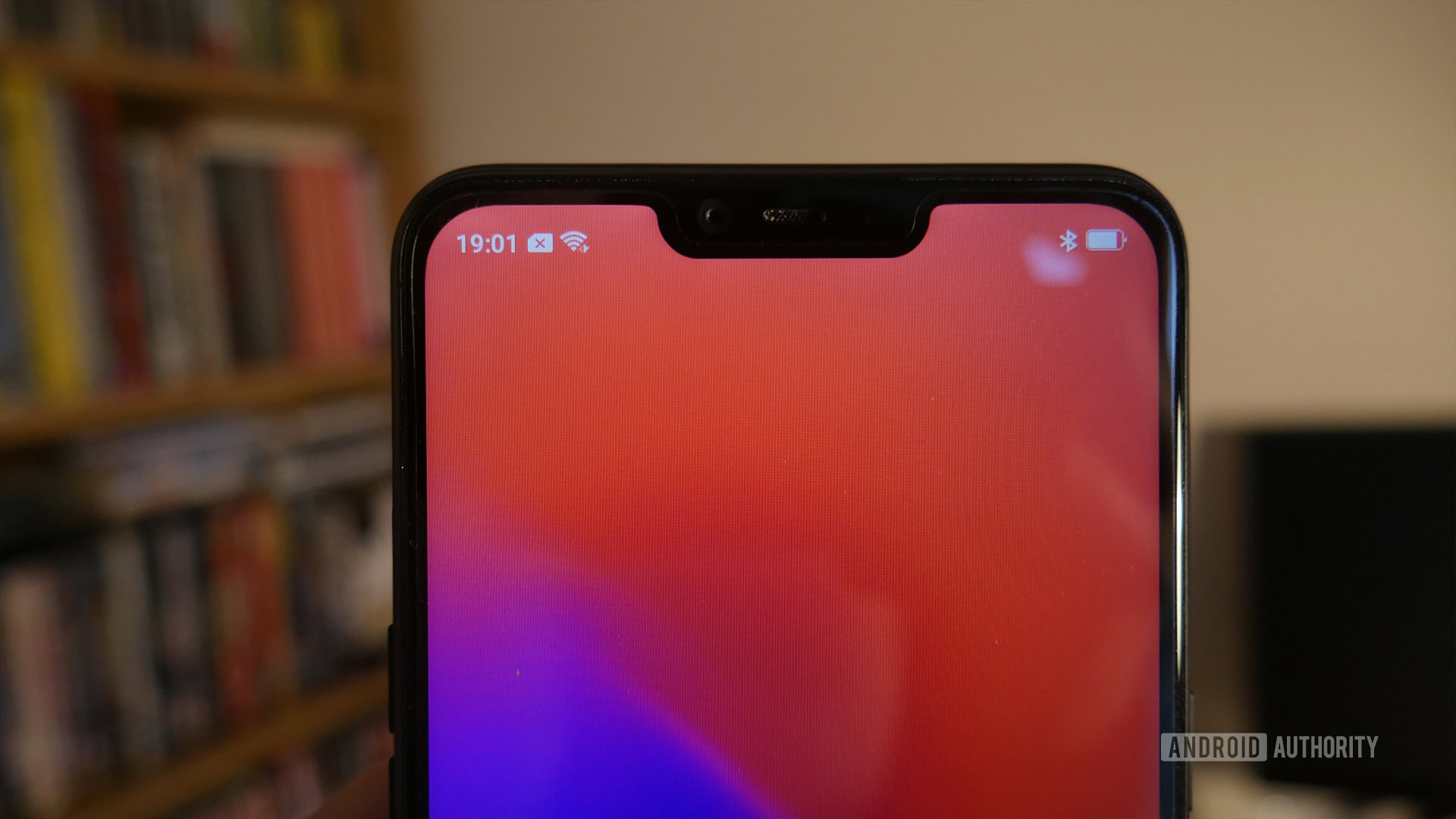
It’s not that I like notches — I’m not really a huge fan — but a notch can make a phone look a little more 2018. Cheap phones don’t often get to have modern design aspects, so having a notch here just makes the phone look and feel a little less like a compromise. It’s interesting to see a notch on a phone this affordable, basically.
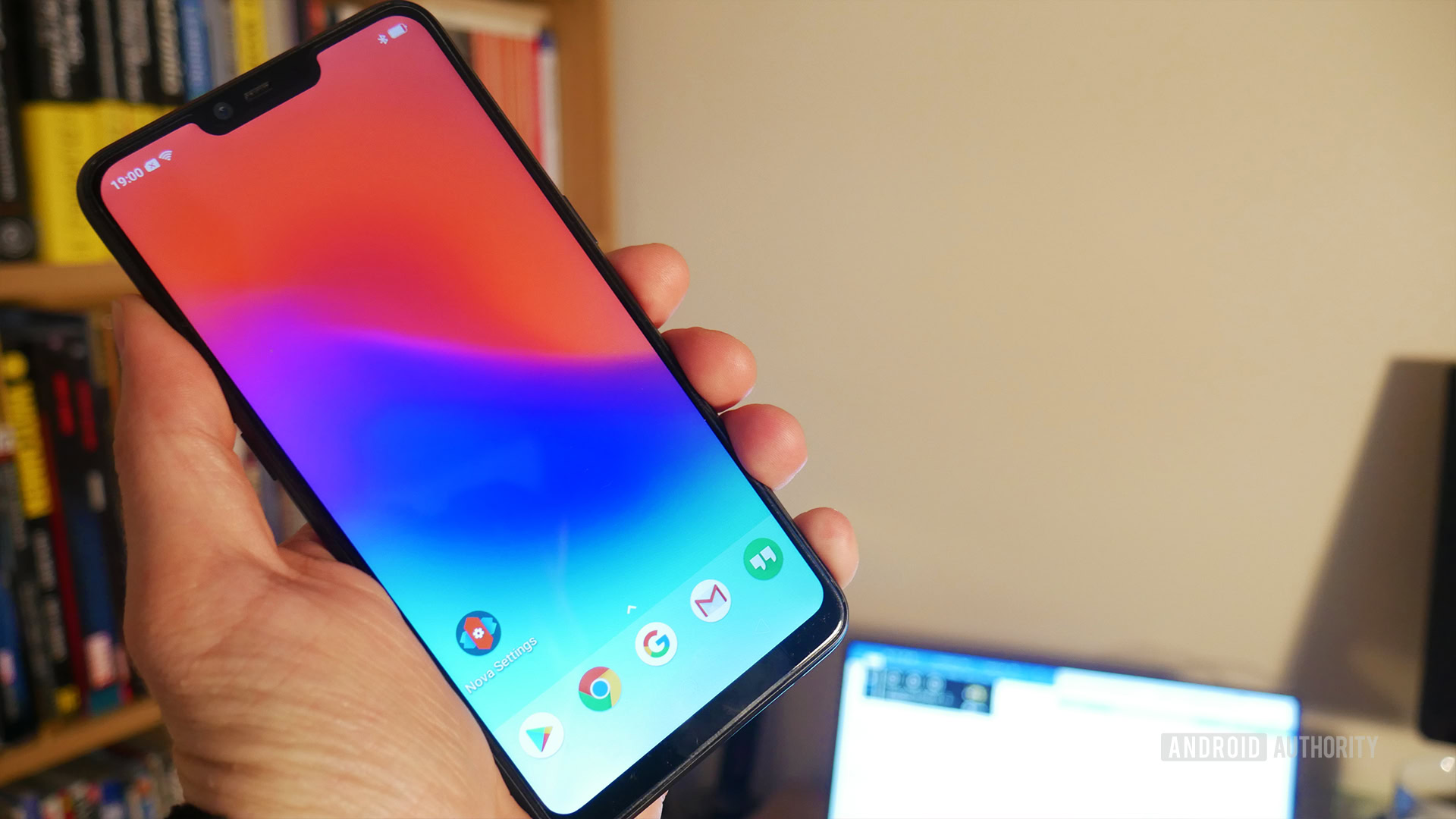
However, there is another very big compromise here in the form of a lower-res screen. The realme 2 comes with a 720 x 1,520 screen. This isn’t hugely noticeable until you put it next to a device with a sharper screen (especially a punchy AMOLED). That’s when you really notice the difference and even the whites look murkier than last time around. If you lean in close, you can even see individual pixels.
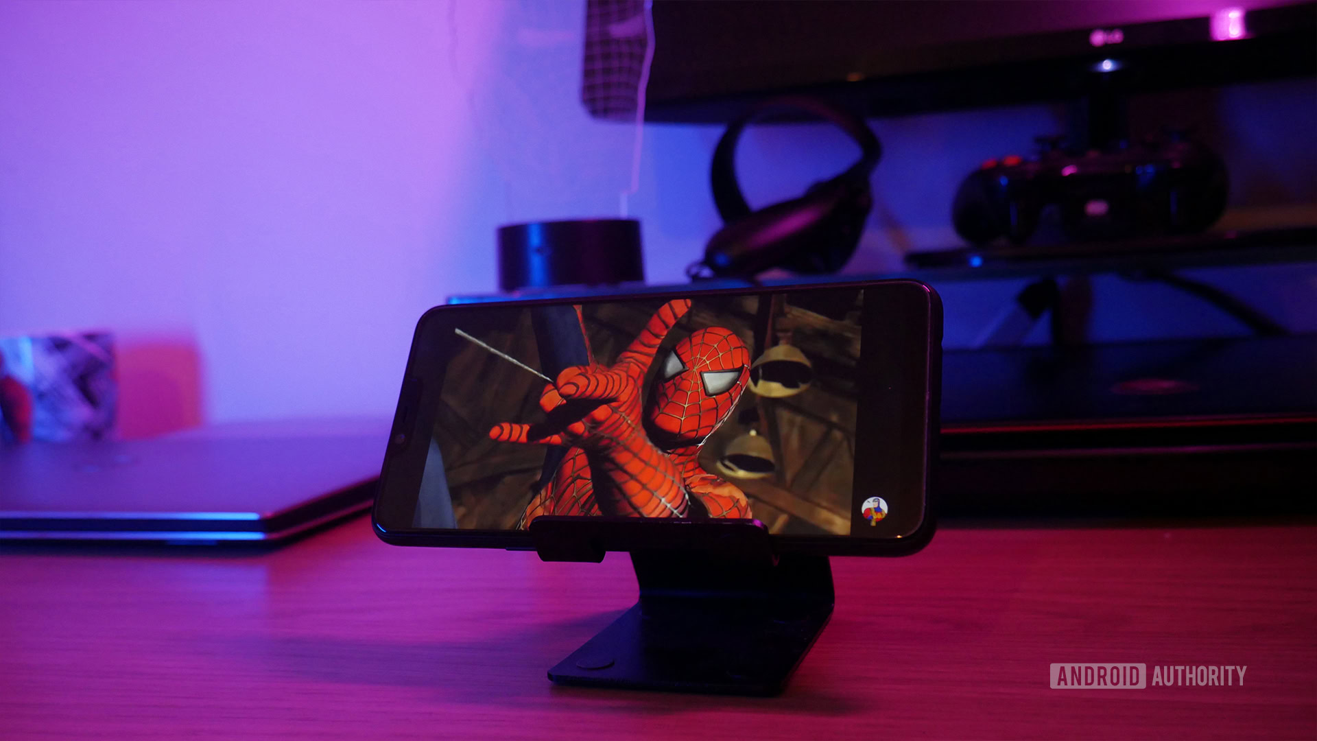
Obviously, this isn’t really a media consumption device. It can consume media (nom nom) but the lack of sharpness combined with a very sub-par single speaker mean it’s not particularly good at it. This really doesn’t sound good when you crank it up. You certainly won’t want to listen to much Spotify without using the headphone jack (which is thankfully present and correct).
The rest of the time it’s fine — the Nintendo Switch is 720p after all and most people don’t have a problem with it. It just doesn’t make a ton of sense to increase the size of the screen to 6.2 inches and hit a 80.85 percent screen-to-body ratio with the notch, only to then make the screen actually less sharp.
The phone’s design is still very clearly cutting corners to save money. The plastic build is really noticeable, and the seam running around the side is even worse. The buttons are both oddly placed and mushy. Separate volume buttons always give me the heebie-jeebies.
I wouldn’t expect a water-resistant, unibody, glass, and metal construction at this price. For what you’re paying, this is about as good as it gets. I’m just letting you know what to expect.
realme 2 performance and software
The design got a bit of an upgrade, but the internals have actually taken a small step backwards.
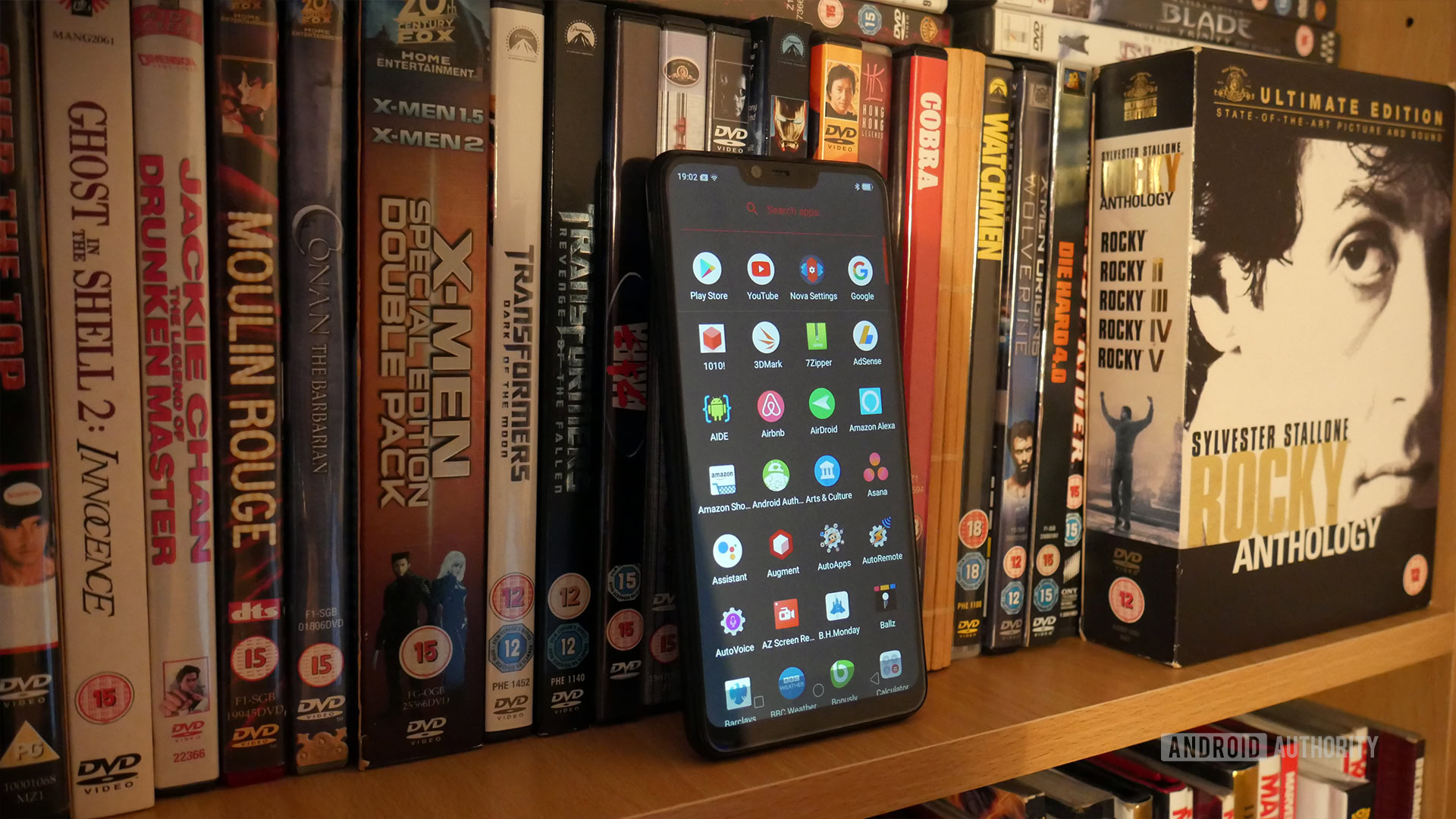
We’ve gone from a MediaTek to a Snapdragon, which you would normally expect to be a good thing. Unfortunately, it’s the rather underpowered Snapdragon 450.
The original realme 1 was not exactly a speed demon, but for day-to-day use you could generally get by. It would even be fine for a bit of light gaming. This time around expect things to chug a little. You’ll see the odd stutter as you navigate with the browser. Apps take a long time to open. 3D games will experience skipped frames and occasional slow-down. You can still play something like Asphalt 8, but you’re going to experience a fair few stutters on low settings. The Adreno 506 does okay with 2D games though, but don’t get this for gaming!
AnTuTu benchmark scores weren’t good. The realme 2 only defeated 20 percent of users, compared with the 38 percent managed by the realme 1.
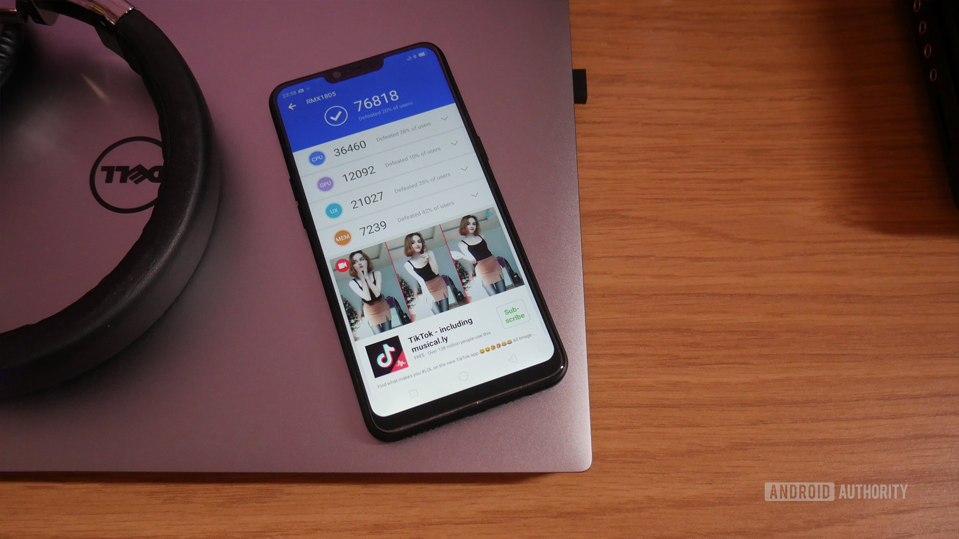
I found performance significantly better than the HONOR 7S sporting the MediaTek MT6739 processor. That phone was just… urgh.
This is a manageable phone, it’s just not great. That’s a big shame considering the realme 1 was actually better than I anticipated. This device wreaks of missed opportunities.
What’s unfortunately not helping matters either is the software, which is everyone’s favorite Color OS. I’m sure it’s actually someone’s favorite somewhere, but it sure isn’t mine. There are worse offenders out there in the bloat department, but it felt like I was constantly fighting against this UI. Being unable to dismiss notifications before they’re ready to leave of their own accord is simply obnoxious, and finding out how to change the default launcher took longer than it should (thankfully it’s doable though). Why are so many dialogue boxes lime green on white? Who possibly thinks that’s a good color scheme?!
Why are so many dialogue boxes lime green on white? Who possibly thinks that's a good color scheme??
Other budget devices out there, like ones from Nokia, sport Android One and other vanilla experiences — which is certainly something to consider when weighing up the value of this phone.
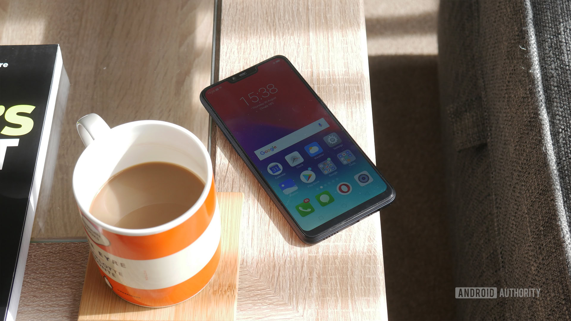
I’m testing the 3GB/32GB model, but you can also get 4GB/32GB and 4GB/64GB. None of these configurations are anything to write home about, but they’re all perfectly serviceable and RAM management hasn’t been a bottleneck for me.
Perhaps the most impressive aspect of this phone from a hardware perspective is the battery. At 4,230mAh, that is a significant upgrade over the realme 1’s 3,410mAh, and also a whopping great battery by any standards. Combined with the low-res screen, the battery has fantastic staying power and will easily see you through a day of even heavy use. Honestly, this is among the best longevity you will get from any phone. It’s a compelling backup for travel and the like when you factor in the cost as well.
realme 2 camera and features
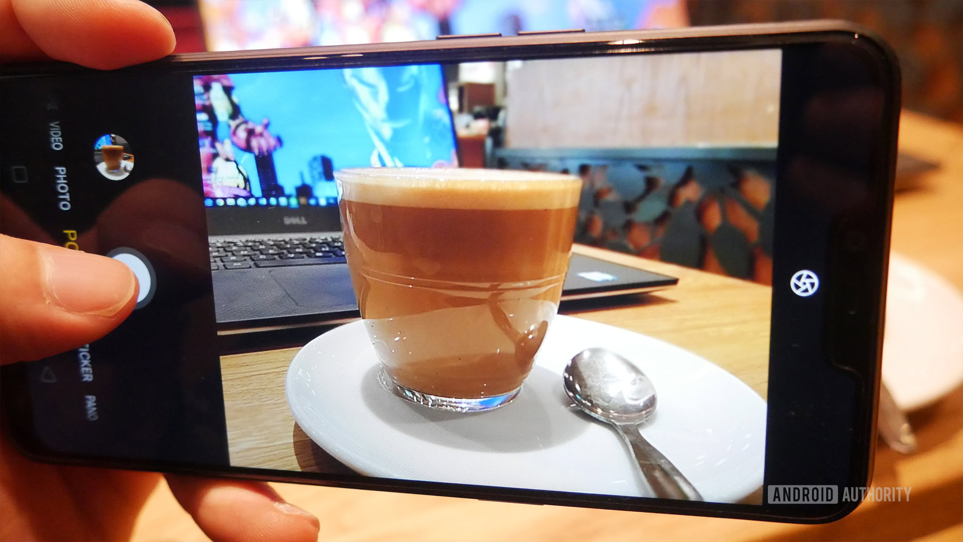
While the realme 2 takes some surprising steps backwards in some departments, the camera is actually a bit nicer. The dual lens camera combines a 13MP f2.2 lens with a 2MP secondary depth sensor for bokeh. Around the front is an 8MP selfie lens, which is also capable of portrait effects, despite losing the NPU found in the Helio P60 from the realme 1.
The only change here is the secondary lens, which presumably should only come into play with depth effect shots. However, it felt like the shots I managed with this camera were slightly superior. Perhaps the second lens lets in a bit more light? Maybe it allows for better post processing. Perhaps it’s a software update. Whatever the case, photos appeared a little more contrasty to me. The original camera was never that bad given the price anyway.
If you want to see these pics in all their glory, you can check them out here.
Obviously, this is no Pixel or Galaxy. Occasionally I found images to looked a little blurry due to the lack of stabilization. Colors are washed out. It falls apart in even slightly lower light (with lots of noise), and background detail gets lost in a lot of pictures too. However, it still performs perhaps better than you might expect overall. There are even a couple of fun options like AR and time-lapse in the app.
Other features here all work well too. The fingerprint sensor is really fast, and the face unlocking is really good — better than even some much more expensive implementations. The fingerprint sensor is actually worth mentioning because the realme 1 lacked the feature. With face unlock not quite secure enough for things like PayPal, this was actually a serious omission.
We’re still charging via MicroUSB too, which is starting to feel really old hat.
realme 2 review: Closing comments
I’m in a weird position. I still think realme is offering a great value phone here. It’s definitely leaps and bounds better than the HONOR 7S (*shudder*). I’m less sure whether this is better than the realme 1. While the secondary lens is nice, the only tangible advantage you get from that is bokeh — something the realme 1 already did. The bigger screen is cool too, but it’s lower resolution and notch mean it isn’t really an unqualified win.
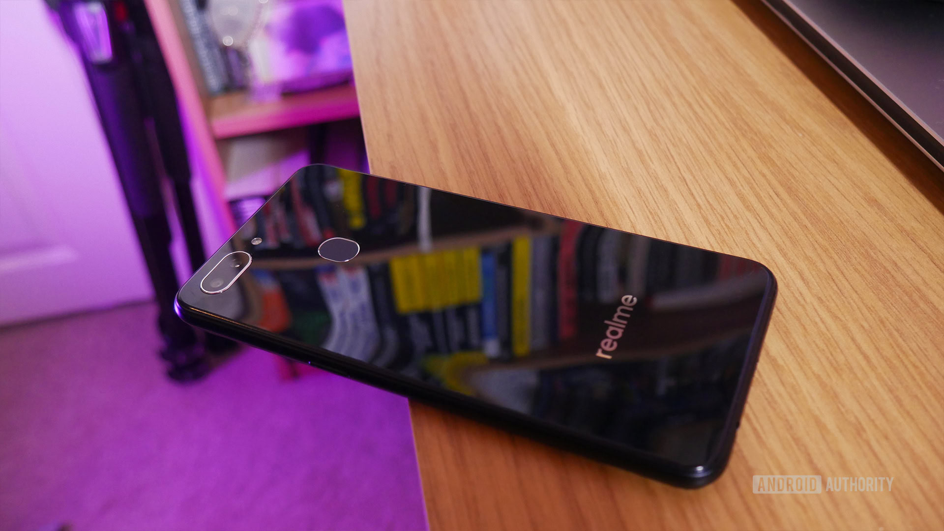
Really the fingerprint sensor and the battery life improvements are the two really wholly positive improvements here, though the realme 1 had no problems in the battery department anyway. It feels like two steps forward and at least two steps back, especially considering the same cheap design and use of MicroUSB. It’s so weird this self-proclaimed “successor” would force you to make so compromises to get those new features.
If it had just kept the exact same internals and screen as last time, this would have been a really compelling device for the price range. As it is, it’s bit of a curiosity.
Those of us with less spending power at least deserve upgrades to still actually upgrade our phones
I get it’s a cheap phone, but those of us with less spending power still want upgrades that actually upgrade our phones, right?
If you have $100-$150 to spend, then a realme phone is a good choice. Which one you pick is a tougher question, and really depends on what you value.
That’s it for our realme 2 review. Let us know your thoughts!