Affiliate links on Android Authority may earn us a commission. Learn more.
Samsung allegedly copied iPhone app icons too, Apple says and it may be right

The U.S. Apple vs Samsung trial continues today with new testimonies and evidence submitted by each party to make it case. We’re going to share with you an interesting slideshow, as posted by CNET, that shows us a variety of images in which we can compare various app icons as found on the iPhone and/or iPad and on Samsung Android devices.
Apple says that Samsung has allegedly copied app icons design including the app icon for the Phone app, Music app, Contacts app, Phpto app, Notes app and Settings app.
And it will surely be interesting to see how Samusng will explain to the jury why its icons are so similar to Apple’s app icons. From where I’m looking I will say that they are awfully similar, and makes you wonder what Samsung designers must have had in mind when coming up with these app icons in the first place.
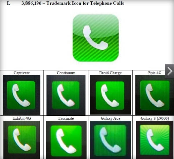
Let’s take the Phone app: it has to be green, because we’re used to having green drawings on phones representing the button we have to push when initiating a call. We’ve associated green with making phone calls form before smartphones were launched. But does the phone image on that green background has to be tilted in the exact same position? What if the background was white and the phone was green in Samsung’s designs?
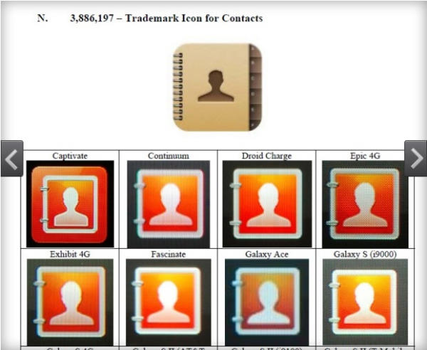
The Contacts app is a bit different, although it does remind one of the iPhone Contacts app icon. Here, Samsung was able to use a different color, although the general idea is pretty much the same, we have a profile of a person posted over what seems to be an agenda or a notebook
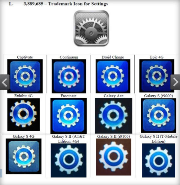
Samsung almost got it right when it comes to the Settings app too. We’re looking at a blue app icon, which is nothing like the gray app found on the iPhone. Too bad though that there’s the same wheel on both icon sets.
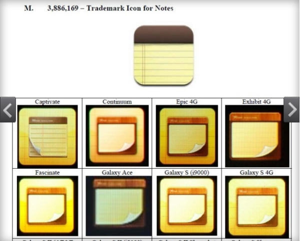
Moving on to the Notes app, we have Samsung using almost the same color option as Apple does in its iPhone Notes app. While it’s clear why the phone icon has to be green, why does the notes app have to be yellow on Samsung devices too? Can’t it be white, or any other color?
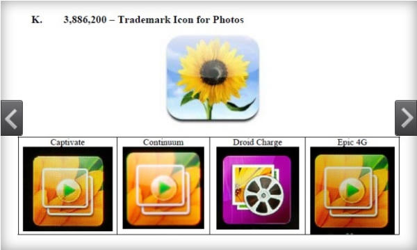
I left the most disturbing icons for last, as Samsung will really have to explain why its Photo app on some devices has to contain elements of a flower, which is what is found on the iPhone’ Photo app. Are people only taking pictures of flowers?
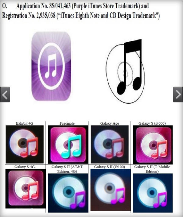
The weirdest choice Samsung made for an icon is represented by the Music app icon that looks too much like the kind of icon Apple has been using for a few years for its iTunes music service. The same kind of concept was then brought to iOS devices, and Samsung seems to have been really interested not only to use a variation of purple, or thereabouts colors, for its various Music app icons, but so many of them show a CD design and a note on top of it, which is too similar to Apple’s Music app found on iOS devices.
So while it’ll certainly be a lot more easier for Samusng to argue that touchscreen-based smartphones and tablets have to be rather square with rounded corners, it’ll be a lot more difficult to explain why UI elements from various Galaxy handsets look so much like elements from the iPhone. And there are plenty of Samsung devices that use the icons above including:
Captivate; Continuum; Droid Charge; Epic 4G; Exhibit 4G; Fascinate; Galaxy Ace; Galaxy S (i9000); Galaxy S 4G; Galaxy S II (AT&T Edition, 4G); Galaxy S II (T-Mobile Edition); Galaxy S II Epic 4G Touch; Galaxy S II Skyrocket (4G LTE); Galaxy S Showcase; Gem; Gravity Smart; Indulge; Infuse 4G; Mesmerize; and Vibrant.
Of course, this is not the first time we see these icons, they were there all along, although they make quite an impression when merged together like that. And they may not be found to be infringing on Apple tech – a jury will still have to tell us if that’s the case – they surely paint a pretty clear picture, that Samsung was, in fact, inspired in its smartphone design, by Apple elements. Maybe too much so when it comes to some of the apps described above.
We’ll be back with more news from the trial, but in the mean time, tell us how you’d defend Samsung when presented with such compelling evidence?