Affiliate links on Android Authority may earn us a commission. Learn more.
Has Samsung perfected design with the Galaxy Note 7?
Published onAugust 3, 2016

To say that Samsung smartphones have evolved in design over the past few years would be to state the obvious, but from the plastic backing to a glass-and-metal design, this is exactly what Samsung has done. The distinction between the Galaxy Note 4 and the Galaxy S6 was stark even though only six months passed between their respective releases, yet the handsets since have mostly followed the same general design.
Related Note 7 content:
- Galaxy Note 7 S View Standing Cover and Battery Pack hands on
- Samsung Galaxy Note 7 availability: what we know so far (Updated)
- Samsung Galaxy Note 7 vs Galaxy S7 Edge First Look
- Galaxy Note 7 vs Galaxy Note 5 first look: the difference a year makes
- Galaxy Note 7 color comparison: gold, silver, black & blue
- This is the Samsung Galaxy Note 7
With Samsung seemingly set on this design, many expected the Galaxy Note 7 to simply be a larger Galaxy S7 Edge with the addition of an S-Pen, but after a brief hands-on at yesterday’s satellite event in London, the design of the Note 7 has struck me in a very different way to the Galaxy S7 Edge.
Isn’t the Galaxy Note 7 just a larger Galaxy S7 Edge?
Yes… and no; while the Galaxy Note 7 does adopt a lot of the design characteristics of the S7 Edge, Samsung has made a couple of crucial tweaks. And, although pictures don’t do it justice, the Galaxy Note 7 feels a lot different and nicer than the Galaxy S7 Edge in the hand.

There’s no denying that the Galaxy S7 Edge is probably one of the most well-received Samsung smartphone designs in history and it seemed like the company had finally found a balance between style and function. From the Galaxy S6, S6 Edge and the Galaxy Note 5 to the Galaxy S7, S7 Edge and Note 7, there’s definitely a steady progression in Samsung’s design language.
Of course, the Note 7 still features glass on both sides along with a metal frame around the edges and the various keys and ports are all in identical positions to the Galaxy S7 Edge. Samsung hasn’t made any drastic changes here, and why should they; after all, if it isn’t broken, don’t fix it. Instead, the company has made a couple of subtle yet crucial hardware changes.
What makes the Note 7 different?
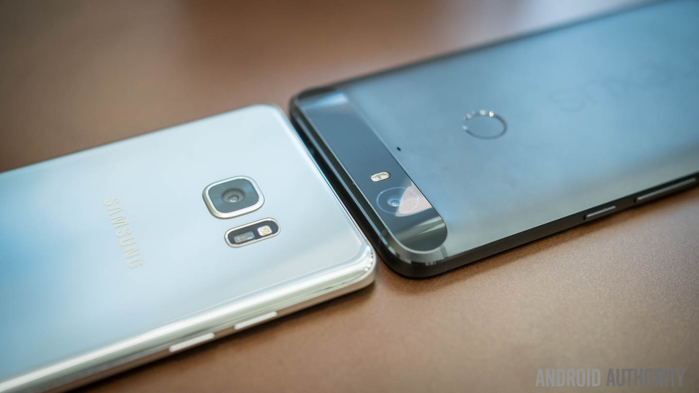
There’s just one word to describe it: symmetry. Top-to-bottom, side-to-side and now front-to-back, the Galaxy Note 7 is symmetrical whichever way you look at it.
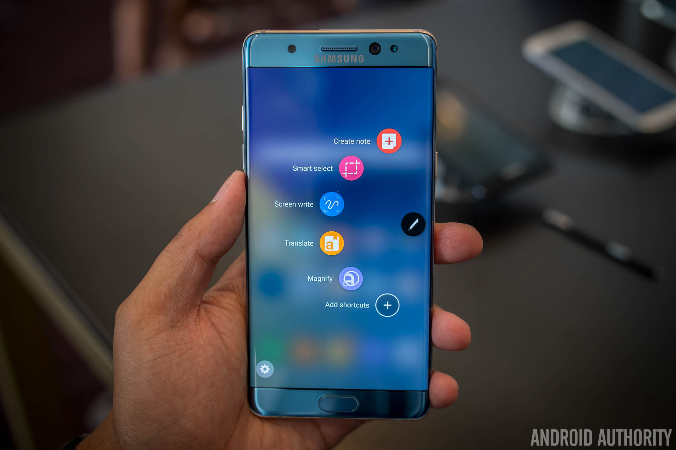
One of the biggest issues people have found with the Galaxy S7 Edge – which was also mentioned during the Note 7 announcement in London – is the curved edges and the accidental presses as a result of the design. With the Note 7, the edges are a narrower curve (with the same curves on the rear), the corners have been tightened and the metal and glass have been sculpted so they almost flow seamlessly together.

The Galaxy Note 7 doesn’t feel like a large-screen smartphone and is actually easier to use in one hand than the Galaxy S7 Edge, despite having a screen that is 0.2-inches larger. Thanks to the tighter curves on the front and back and the metal frame, Samsung has managed to make a curved edge smartphone that is actually useful and not a case of style-over-function like with the Galaxy S7 Edge. If you’re one of those who’s had accidental presses on the curved edges of the S7 Edge, the Galaxy Note 7 pretty much fixes all of these.
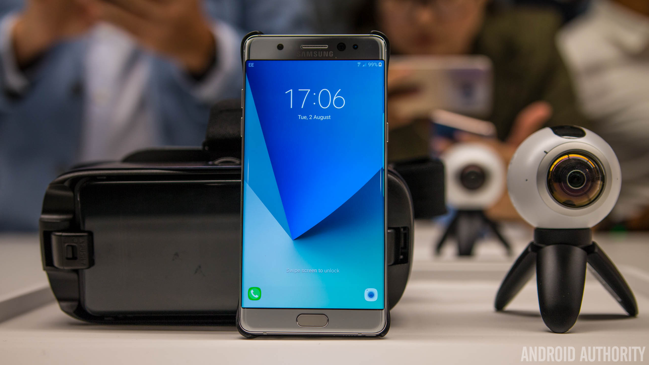
Another change is in the Galaxy Note 7 colors as Samsung has brought over a few of the Galaxy S7 Edge colors – Black, Silver and gold – while adding a stylish new coral Blue color. The Black and Blue are especially nice in person but across the entire range, Samsung has now anodised the frame so it matches the color of the phone. The Black Onyx Galaxy Note 7 gets a black frame, the Gold and Silver get different metal accents and the Coral Blue gets a stylish coral-like color. Personally, as nice as the Black Onyx color is, the Blue Coral is beautiful and probably the color I’ll end up buying.
Is it really perfect though?
Design-wise, it’s difficult to see what Samsung can do to improve the design further, at least from an initial hands-on. Although slightly wider, thicker and taller than the S7 Edge, the Note 7 actually feels more comfortable to use than its predecessor and the extra 12 grams of weight adds some much needed girth to the phone. Simply put, Samsung has only made a couple of changes to the Galaxy Note 7 design but these were changes in the right areas, after listening to customer feedback.
[related_videos title=”You might like:” align=”left” type=”custom” videos=”706763,707136,706889,706761,707119,706890″]Specs-wise, there’s not a lot different between the two devices as the camera, processor, RAM, water-resistance, screen technology and resolution of the Galaxy S7 Edge make their way to the Galaxy Note 7. The latter however also adds an updated S-Pen, double the base storage and a USB-C port to somewhat differentiate it from Samsung’s previous flagship. Otherwise, Samsung’s latest Note is pretty much built on the Galaxy S7 platform and offers mostly the same experience.
From an initial hands-on, the most striking thing about the Galaxy Note 7 is the subtle tweaks to the design and the differences they make to the in-hand experience. The S7 Edge may have felt like a king at first but thanks to this latest addition, it takes a step back to being a mere prince. It’s still absolutely stunning but the visual effects, coupled with extra weight and a tighter more refined design mean the Galaxy Note 7 is the current king when it comes to smartphone design.
Related Note 7 content:
- Galaxy Note 7 S View Standing Cover and Battery Pack hands on
- Samsung Galaxy Note 7 availability: what we know so far (Updated)
- Samsung Galaxy Note 7 vs Galaxy S7 Edge First Look
- Galaxy Note 7 vs Galaxy Note 5 first look: the difference a year makes
- Galaxy Note 7 color comparison: gold, silver, black & blue
- This is the Samsung Galaxy Note 7
What do you think of the little changes that Samsung has made to the Galaxy Note 7? Are they enough, and if not, what else would you change about it? Let us know your views in the comments!