Affiliate links on Android Authority may earn us a commission. Learn more.
Samsung design: the good, the bad, and the ugly
Published onMay 9, 2014
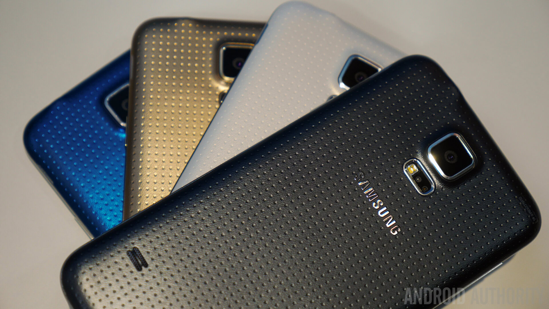
It’s not easy to claim the top spot in the worldwide smartphone market. You can’t do it without offering consumers something compelling and that starts with great design. According to Strategy Analytics, Samsung shipped 89 million units in the first three months of this year, for a commanding 31.2% share of the global smartphone market. The share is slightly down on last year, but the market is still growing. According to Canaccord Genuity, 41% of all the smartphone market profits for that same period went to Samsung.
Despite performing well in the market, Samsung has not been winning any design plaudits recently. In fact, the head of mobile design, Dong-hoon Chang had his offer to resign accepted last week. According to Reuters this was down to the reception that the Galaxy S5 received. Min-hyouk Lee, a VP nicknamed “Midas,” will take over, and he too has been a key player in the Galaxy series design, so it remains to be seen whether he will institute major changes.
Let’s take a look back at Samsung’s smartphone designs over the last few years, and see where it got things right and where they went wrong.
The Good
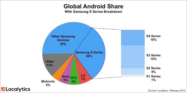
The continued success of the world’s biggest smartphone manufacturer is based on a lot of factors, but the strength of the Galaxy S brand is clearly central and it accounts for the lion’s share of profits. Localytics estimates that 30% of all Android smartphones sold in the world are part of the Galaxy S series. The current leader is the Samsung Galaxy S3 on 15% and there’s a good reason for that.
It’s easy to argue that the Galaxy S3 marks the high point for Samsung’s smartphone design. The company was heavily criticized and sued for copying the look of the iPhone in its original Galaxy S model and it retained a very similar rectangular look in the Galaxy S2. With the Galaxy S3, Samsung went in a new direction, a curved body with round corners, a much slimmer home button with angled sides, and a range of colors. It was genuinely distinctive and it didn’t hurt that it contained truly cutting edge hardware.
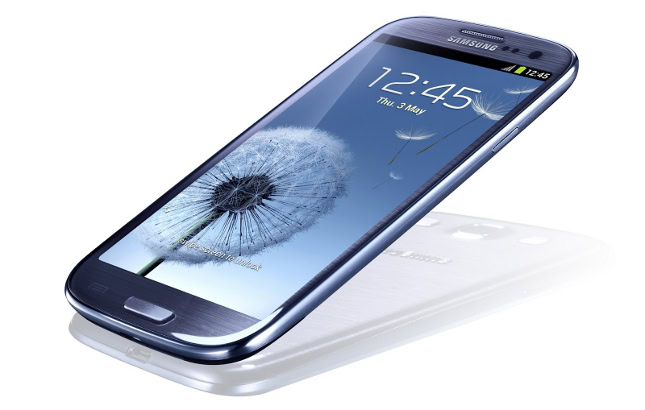
“Designed for humans, inspired by nature” was the tagline and the curves in the design seemed to follow through to the rippling water effects and natural touches in the interface. There was still a little criticism of the removable polycarbonate back, but consumers seemed to appreciate the lighter weight and the comfortable feel. If you stand the Galaxy S series in a line, you can clearly see how the S3 stands out, and the S4 and S5 actually look like steps backward.
The Bad
Before we dive into the barrel of bad Samsung designs and come up clutching the winner, it’s worth mentioning that any OEM trying to innovate with new designs is going to have a few misses. It sometimes feels like Samsung churns out more models than the rest of the market put together in its mission to explore every possible form factor. Consider the Samsung Continuum, the Samsung Sidekick, and even the Samsung Galaxy Round.
The same impatience that drove it to rush out the Galaxy Gear can be seen in a number of its devices over the years. There’s a determination to be first, and a lack of refinement as a result. A lot of Samsung’s bad phones look like inbred children of the Galaxy S series, but you can’t criticize devices like the Samsung Galaxy Fame too harshly because they are deliberately cheap.
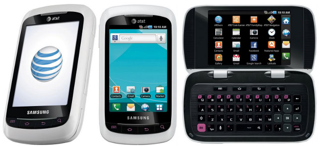
If we’re really scraping the bottom of the barrel then the bad title has to go to the Samsung DoubleTime with its white plastic body and giant hinges. It was a fat device with two displays, both awful 3.2-inchers with a 480×320 pixel resolution. One of them was on the outside, but the phone opened up to reveal the other (which was permanently stuck in landscape), rendering the first obsolete, a classic throwback to the feature phone glory days. So what was the point of the hinge? To reveal a keyboard highlighted in pink.
The Ugly
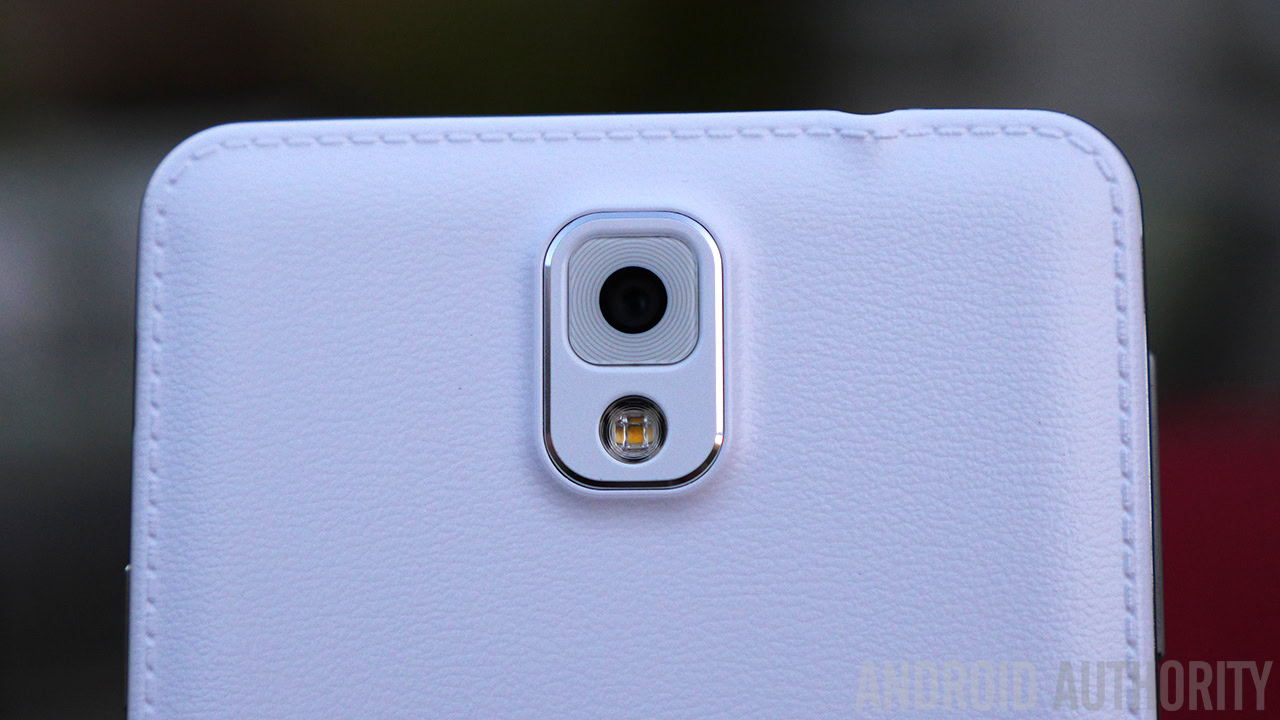
It’s not a massive surprise to see some bad designs pop up in the lower echelons of Samsung’s lineup and cheap can often be ugly too, but when tacky, cringe worthy designs start creeping into your flagship range, there’s obviously a design problem. The signs that Samsung was taking a wrong turn were there to see in the Note 3. A faux-leather effect complete with fake stitching does not add class to a polycarbonate backing. Samsung may have made the best of a bad idea, but it was a bad idea.
Who knew that things would be pushed further with the Galaxy S5? There’s no arguing that it’s a powerful and impressive smartphone, but how the design team could look at that pockmarked back panel and not be slightly concerned is beyond us. The Band-Aid comparison might be going a bit far, but it’s not just the texture, the white version looks really cheap and the blue and gold are downright gaudy.
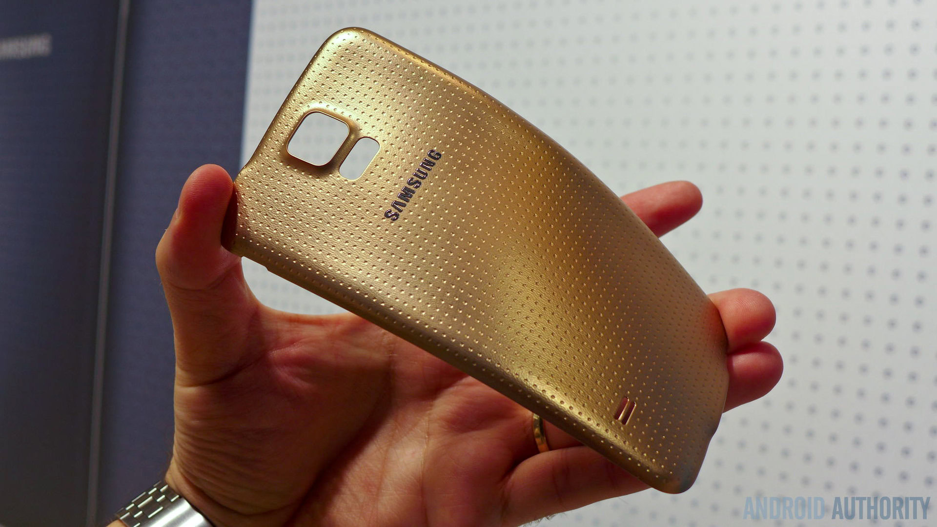
It may not be strictly-speaking, the ugliest phone that Samsung has released, the DoubleTime has a shot at that title too, as does the Galaxy S4 Zoom, but they have mitigating reasons for their bad looks. Stick the Galaxy S5 in a line-up with the best that Sony, HTC, LG, and Apple have to offer and ask them to turn around. It definitely stands out as the ugliest of the bunch.
That’s like, just your opinion, man
There’s no way everyone will agree about this post. Some people felt that the S3 was ugly when it first came out and it went on to be the company’s most successful smartphone ever. Beauty is in the eye of the beholder and so is ugly. You might also argue that it’s what’s on the inside that counts, and there are plenty of great cases to hide your phone in.
What would be your picks for Samsung’s good, bad, and ugly? Do you think the Galaxy S series needs an aesthetic overhaul?