Affiliate links on Android Authority may earn us a commission. Learn more.
Ongoing Samsung Galaxy Fold review: Day 1 -- Initial impressions
Published onSeptember 24, 2019
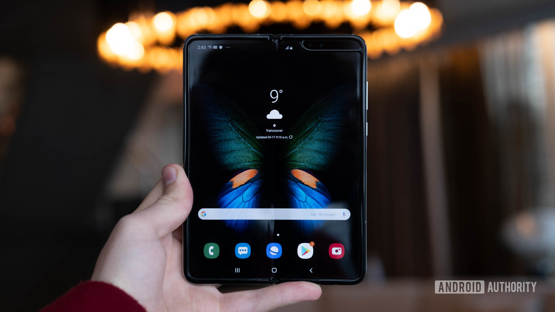
The Samsung Galaxy S and Note series may be the company’s bread and butter, but the Galaxy Fold is the main course and dessert all rolled into one. It highlights the industry’s latest technology while exploring a new mobile computing paradigm. The folding screen allows the Galaxy Fold to transform from pocketable phone to readable tablet. In so doing, it seeks to usher in a new age.
Does the phone stride boldly into the future, or stumble along the path? Find out in Android Authority’s ongoing Samsung Galaxy Fold review.
Samsung Galaxy Fold review: The big picture
It takes a strong vision, a lot of hard work, and plenty of resources to launch a new form factor. Smartphones have been a thing for most people for well more than 10 years now, and tablets have almost reached their first decade. Each has its advantages. Phones are smaller and more portable, while the added real estate of a tablet allows for a richer visual experience.
Foldables hope to bridge this divide and offer the best of both worlds.
Samsung and HUAWEI have been racing since last year to get a true folding device to market. When I say “true folding device” I mean a phone with a screen that bends, folding upon itself one way or the other in a way that’s meaningful enough to change the overall shape.
Where Huawei’s Mate X screen is entirely on the outside, the Samsung Galaxy Fold’s main display is hidden within. You open it like a book to use the larger screen.
Each has pros and cons, and we look forward to diving into both to see just how they impact the day-to-day experience.
What’s in the box
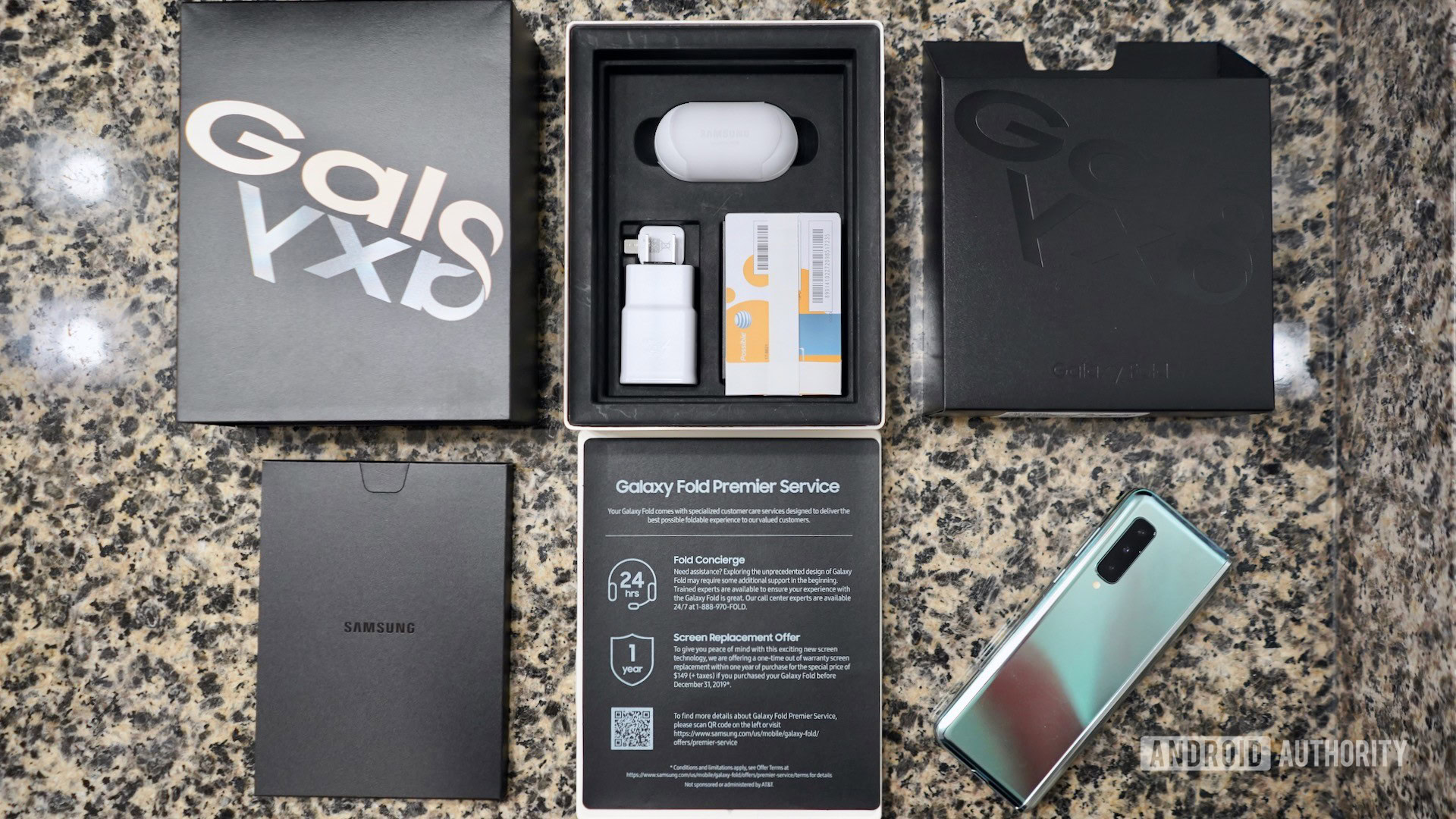
Opening the Galaxy Fold retail box is sort of like unfolding a puzzle. A black outer sheath slides upward, revealing a white box that’s tucked into a second sheath that slides down. Once the sheathes are removed you have the main container, which itself is split into two halves.
Lift the lid and you’ll see the Galaxy Fold tucked into the cardboard. Samsung installed a sticker on the screen that warns against stressing the display and committing other acts of abuse.
Below the phone are two more info sheets. The top one explains the basics of the Galaxy Fold Premium Service, while the second reiterates the care needed to keep the phone safe. Galaxy Buds Bluetooth headphones, a high-capacity charger, and a USB-A to USB-C cable are provided, as is a basic case to protect the phone from scratches and minor drops.
You’ll also encounter a SIM tool and lots of paperwork.
First impressions
The Galaxy Fold is a significant piece of hardware that grabs the attention of nearly everyone who sees it. I used it for a day around Manhattan, Newark, and even San Diego. I noticed a lot of eyes locked onto the Fold.
There’s a reason Samsung ships the phone unfolded. You’re encouraged to turn it on and see the screen before anything else — an experience that’s sure to get your pulse racing. The square(ish)-shaped display fires up brilliantly and holds your gaze. It’s only after your eyes have feasted on the bendy AMOLED that you begin to notice other aspects of the hardware.
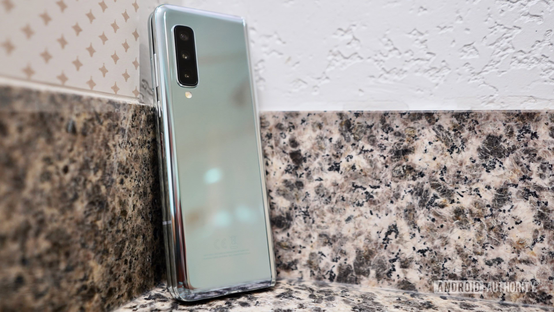
The glass back of the silver variant we have is similar to the Aura Galaxy Note 10 in terms of the gradient and reflectivity. It’s quite something. Thanks in part to the outer display, the front is basically black. A metal, book-like spine protects the hinge on one side when the Fold is folded.
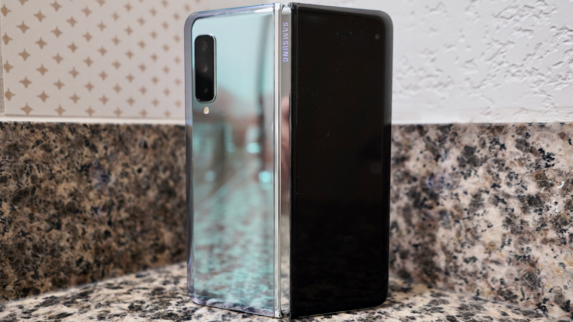
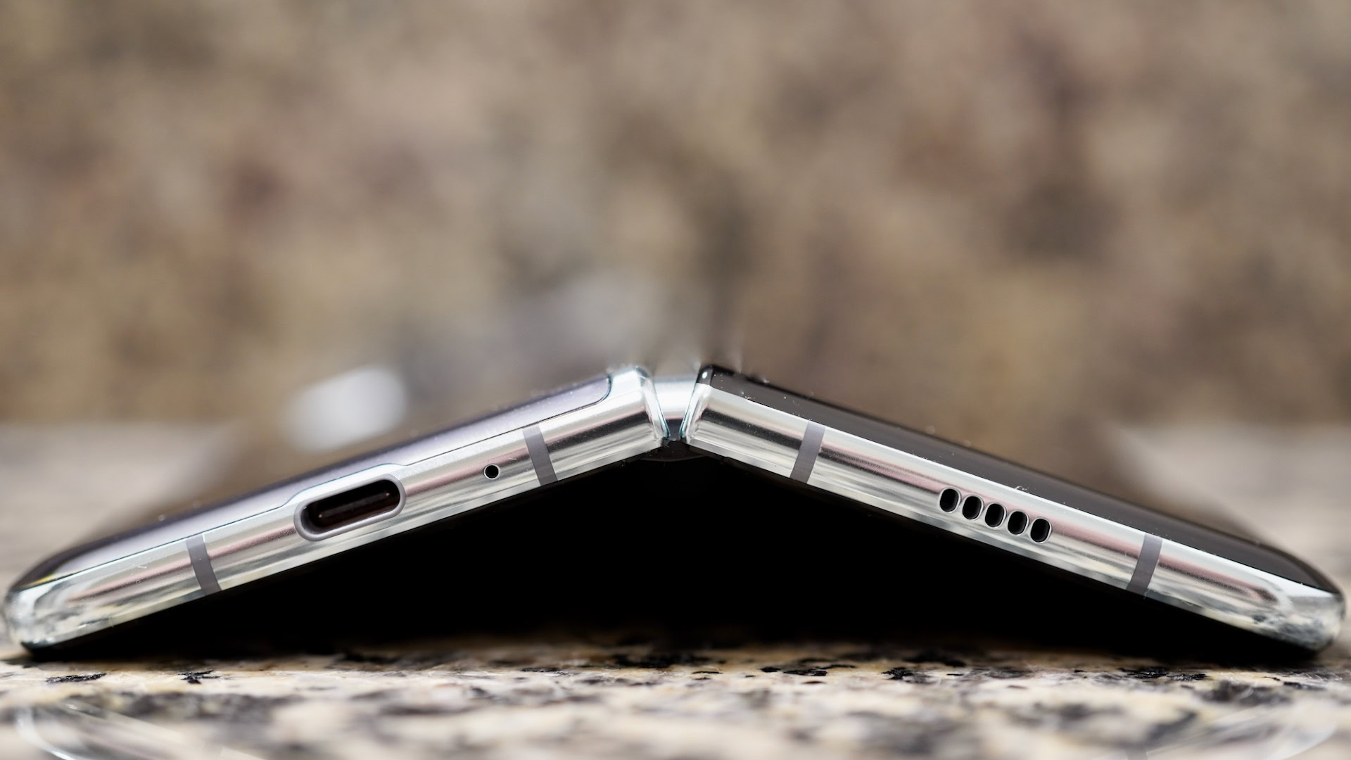
Anyone who’s ever used a recent Galaxy S or Galaxy Note phone will feel at home with the design of the edges. The silver-colored metal is curved and comfortable. The power/Bixby button, volume toggle, and thumbprint reader are positioned on the right edge — both when the phone is open and closed. You’ll find the SIM card tray located on the left edge and the USB-C port tucked into the bottom edge, but no headphone jack even though this is a huge piece of hardware. (Courage.)
The hinge is clearly over-engineered to withstand thousands upon thousands of open-and-close actions.
I’d call the phone heavy. How can it not be? It measures 160.9 by 62.8 by 15.7mm closed, or 160.9 by 117.9 by 6.9mm open, and weighs in at 276g. That’s 100g more than most other phones. It’s made of a combination of materials, including metal, glass, and plastic. Samsung packed a lot in there, and nothing about the phone comes across as cheap.
Speaking of which, Samsung went through a number of steps to reinforce the device after the first units failed in spectacular fashion. Compared to what I remember about the first generation of the Fold, this version feels more significant, stronger, legitimate. I wouldn’t give the strength of the hinge a second thought. It’s clearly over-engineered to withstand thousands upon thousands of open-and-close actions.
None of this means the Fold is rugged, not at all. It’s not IP rated, and Samsung basically warns against ever dropping it. Believe it or not, Samsung is offering a one-time screen replacement for $149 during the first year of ownership in order to put owners at ease. After that, uh, it’s going to cost a lot more.
That screen. THAT SCREEN
I like. Big. Screens and I will not lie. Those other fellas can’t deny. The huge glass caught your eye. And made you iPhone owners wanna cry.
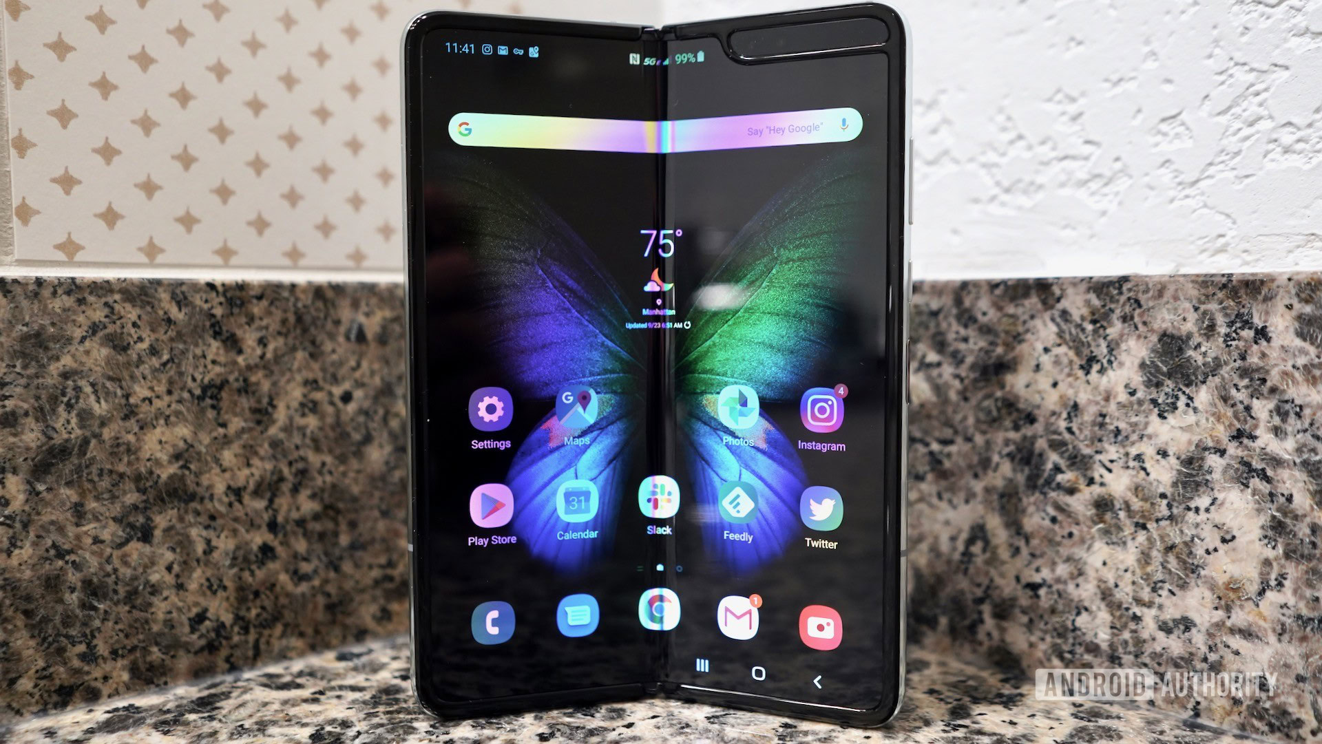
Yeah, it’s impressive. It stretches 7.3 inches across the diagonal, with 2,153 vertical pixels and 1,536 horizontal pixels. The pixel density is 362ppi, which isn’t anywhere close to the highest in the market, but it’s still good. The display has a unique aspect ratio or 4.2:3. The Dynamic AMOLED is incredibly bright, clear, and punchy. As is always the case, Samsung pushes the colors a bit. Even so, the dynamic range is excellent, blacks are grim-reaper dark, and photos, videos, and more look fantastic on it.
A seam is visible in the center of the screen when the display itself is off. Your thumb will feel it as it glides over the surface. However, the seam completely vanishes visually most of the time. Only on a few screens — that were a single solid color — revealed it. Over the course of the first day I didn’t notice the seam get any larger, rougher, or more obvious as I opened and closed the Fold.
Then there’s the notch in the upper right corner. I don’t mind it. It contains the user-facing cameras and sensors. Samsung used the screen space to the left of the notch to contain the status bar for notifications, signal, battery, etc. I stopped noticing the notch fairly quickly.
I like. Big. Screens and I will not lie. Those other fellas can’t deny. The huge glass caught your eye. And made you iPhone owners wanna cry.
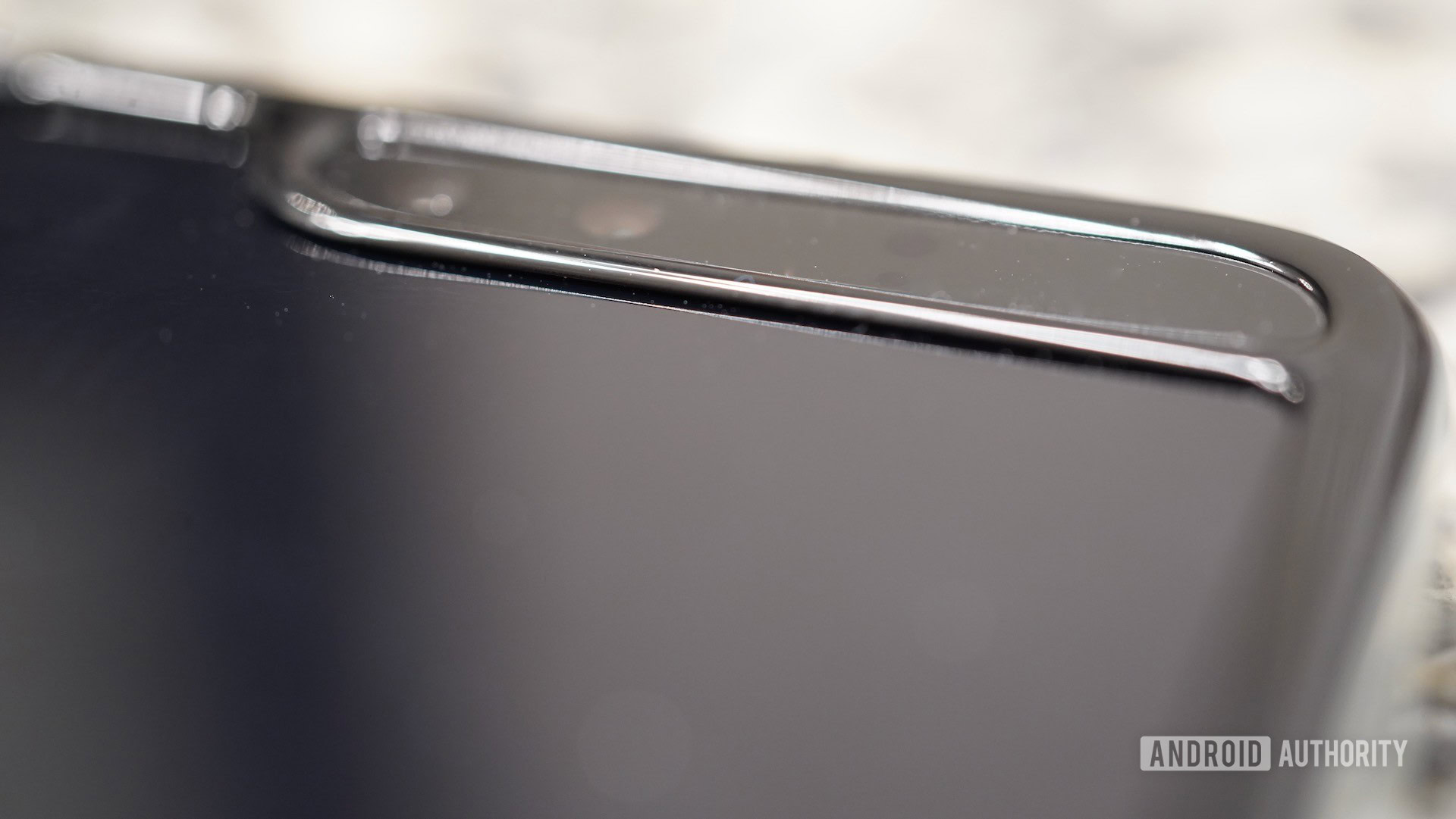
A raised ridge circles the entire display. Samsung says this is one of the changes it made, as the ridge is a bit thicker than on the original. There is a small cap piece (top and bottom) that protections the exposed portion of the screen at the seam where it bends. This is where the top layer of the display appeared to be a screen protector to some initial users. The screen comes across as more tucked in and safeguarded. I didn’t see anything that looked like it could be pulled apart. This is good news.
The sheer size and brilliance of the screen simply draws your eyes in. It’s the screen that caused so many passersby to give it a second look. Most people haven’t seen this form factor and it will take time for it to become something people experience on a daily basis.
I’m not the biggest fan of the exterior display. At 4.6 inches with a 21:9 aspect ratio, it’s tall and skinny and looks awkward. The resolution is respectable at 1,680 by 720 for a density of 399ppi. It’s usable, though I’m certain Samsung designed it in such a way to encourage people to just opened the darned thing and use the main screen.
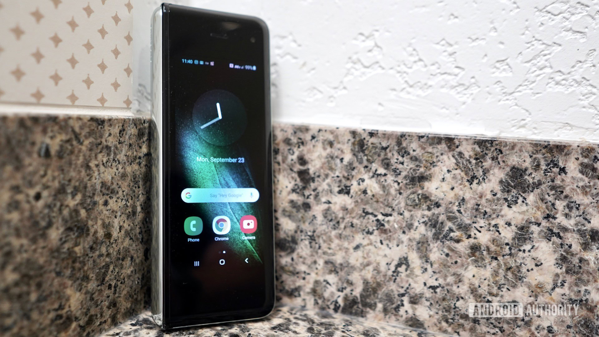
The cover display offers a full smartphone experience, complete with always-on display, app dock, search bar, and so on. You can easily respond to incoming messages or emails, use the camera, make calls, control music, open apps, and do all the normal things you expect with a modern device.
The end result of app continuity is nearly magic.
Everything you can do on the outer screen you can do on the inner screen thanks to app continuity. Samsung and Google worked together to create the APIs developers need so their apps transition seamlessly not only from one screen to the other, but from one shape or window to another as people multitask with the Galaxy Fold. Google baked these APIs into the core of Android 10, which means developers now have easy access to these tools in order to customize their apps. The end result is nearly magic.
Over the course of the day, I started tasks on the outer screen, flipped the Fold open and continued them happily on the larger screen. It flows well and never came across as slow or forced.
Learning curve
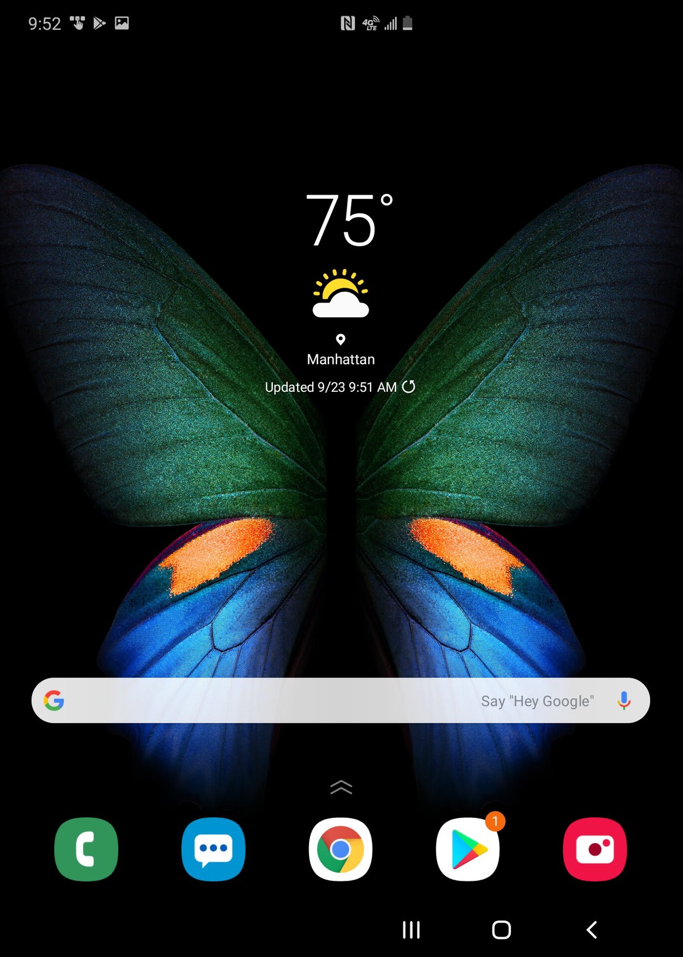
The Samsung Galaxy Fold takes some getting used to. It’s a touch ungainly when closed due to the chunky thickness. You can definitely feel it in your pocket as you walk around. The weight and blockiness both contribute here. It looks a bit gangly when closed, as it’s so narrow and long.
I wasn’t able to develop a real rhythm with it in the first day. When should I use it open? When should I use it closed? Which apps work best on the outer or inner screens? Should I multitask in several windows, or hop between full-screen apps?
If there’s one app that was harder to figure out than others, it was the camera. The results of the first wave of photos I took didn’t exactly turn out as I assumed they would.
This kind of knowledge will come with time as people fold the Fold into their daily routines.
Samsung Galaxy Fold review: Coming on Day 2
I’ll spend my second day evaluating basics such as camera performance, productivity, and more. Be sure to come back tomorrow for more impressions of the phone in our ongoing Samsung Galaxy Fold review.