Affiliate links on Android Authority may earn us a commission. Learn more.
Ongoing Samsung Galaxy Fold review: Day 2 - Getting familiar with the Fold
September 25, 2019
As we continue to use the Samsung Galaxy Fold, we find new and interesting aspects of the phone to talk about. If you haven’t already, please be sure to check out our Day 1 look at the device, which covered our first impressions of the form factor, hardware, and display.
In this installment, we’ll veer away from the hardware a bit to look at the software experience of the phone, which, let’s face it, is just as important as the hardware.
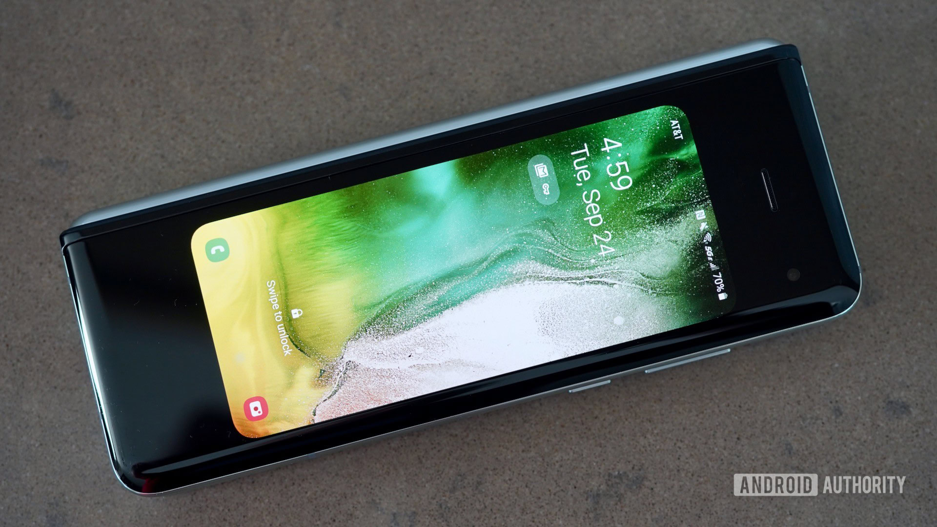
Samsung Galaxy Fold review: Cover display

The outer screen, or Cover Display as termed by Samsung, is the screen that you see and interact with when the Fold is folded shut. As we noted in Part One, it’s a 4.9-inch AMOLED display with a 21:9 aspect ratio. The resolution is respectable at 1,680 by 720 for a density of 399ppi. The display itself is mostly fine, though I wish it were a bit brighter. I had some trouble reading it under a bright sun.
In short, it acts like any normal smartphone screen does. When the phone is sleeping the always-on display shows the time, date, and notification icons. You can select the clock style, what notification content is visible, and so on.
I like that it supports multiple home screen panels, including Bixby Home, as well as widgets and app shortcuts. The Cover Display allows you to access the app drawer, main settings, notifications, Quick Settings, and even quick app switching via the multitasking tool. You can go through an entire day and only use / interact with the Fold via the Cover Display.
Apps, however, do look squished. Samsung worked with developers to cater their apps to the 21:9 aspect ratio. The company also adjusted certain aspects of the Android 9-based OneUI to make it work, such as limiting when users can place just three app shortcuts across the screen and similar. Typing on the narrow version of the on-screen keyboard was a challenge. My fat fingers made lot of mistakes.
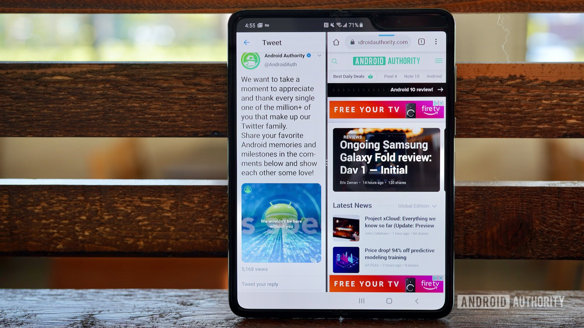
What’s totally odd here is that App Continuity is off by default.
The vast majority of apps I opened on the Cover Display transitioned seamlessly to the inner main screen. (This is thanks to App Continuity.) What’s totally odd here, however, is that App Continuity is off by default. You have to dive into the settings to turn it on. Why leave the phone’s most important power inactive, Samsung? Head-scratcher, to be sure.
Bottom line, the outer display is a perfectly legit smartphone unto itself. It’s perfect for interacting with the Fold on the go. For example, I found it ideal when I landed in San Diego and needed to triage my inbox as I walked out of the airport. This is exactly the scenario for which the Samsung Galaxy Fold was designed.
Inner screen
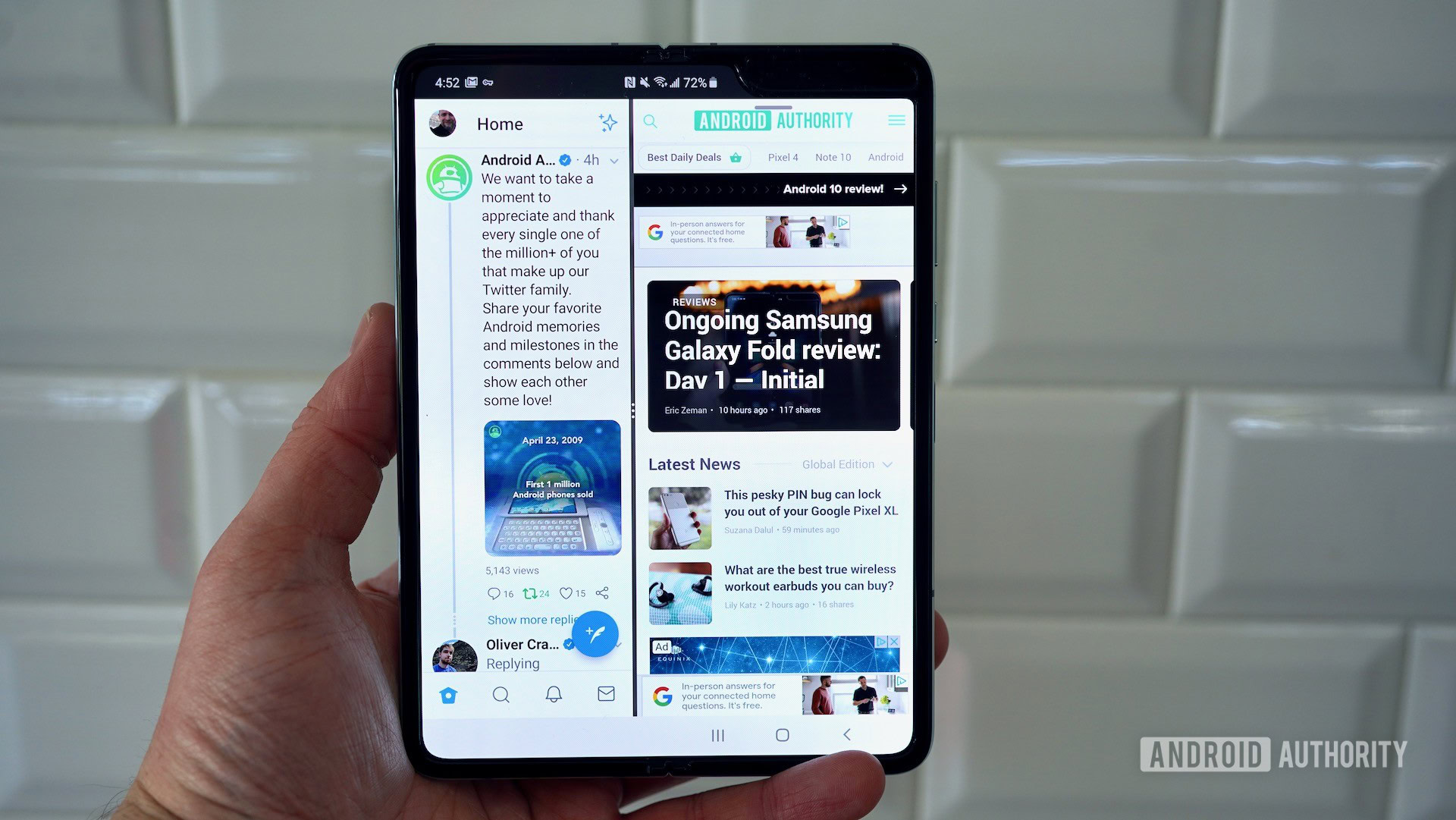
As functional as the Cover Display is, that’s not the reason you’re going to buy the Samsung Galaxy Fold.
The phone’s main screen stretches 7.3 inches across the diagonal, with 2,153 vertical pixels and 1,536 horizontal pixels. The pixel density is 362ppi, which isn’t anywhere close to the highest in the market, but it’s still good. The display has a unique aspect ratio of 4.2:3.
Samsung calls this screen Dynamic AMOLED Infinity Flex and has assigned a lot of fancy descriptors to it. It says the display is made from “tissue-thin bonded layers with innovative polymer, a new foldable adhesive, to a first-of-its-kind virtual dual-axis hinge.”
What’s the point of this screen? Real estate, of course.
In other words, it bends and is delicate. How delicate? Well, Samsung offers a range of warnings on what not to do to the pricey screen. For example, no S Pen or other styli, no fingernails, either. Don’t put a screen protector on it, and don’t pick at the edges. Woe unto thee who shalt break these rules.
What’s the point of this screen? Real estate, of course. Samsung claims the Galaxy Fold offers a 1.4x increase in size over browser window when compared to the Galaxy Note 10 Plus. It also boosts the width of 16:9 videos by 1.3x, and, when in portrait mode, videos are 2.2x larger than on the Note 10+. One cannot complain about more screen.
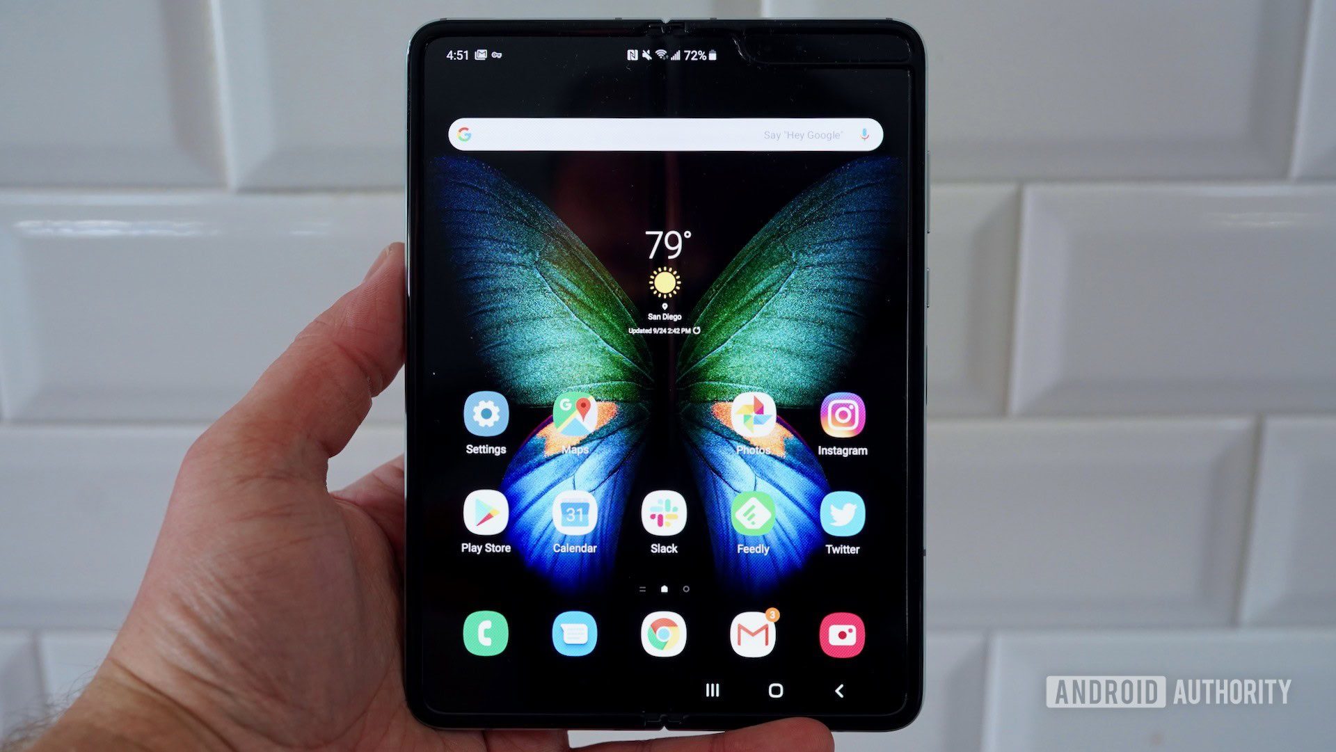
The larger display affords users to spend a lot more time with the Galaxy Fold, or at least to spend more time with their favorite apps. After several days’ use, I began to feel the Fold a familiar contraption. Sorting between messaging, calendaring, and other tasks felt natural enough that I didn’t need to think extra about them.
Multitasking is fairly easy to put into place on the Fold. There’s a handy tray that slides out from the right edge so you can drag apps out onto the larger screen. I dig that the phone supports up to three apps on the display at once. I was able to run Twitter, Gmail, and Slack with no problem. Let me tell you how helpful that can be.
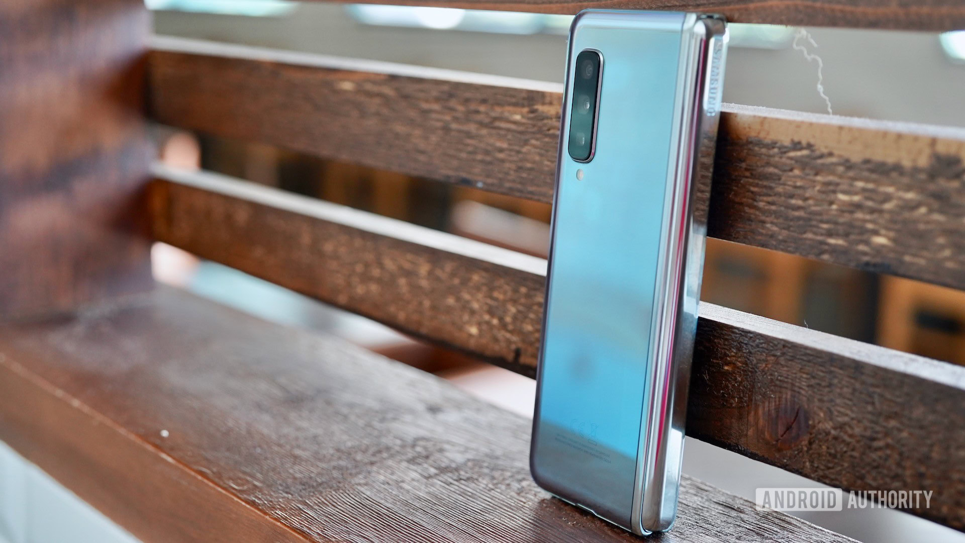
Otherwise, it’s a basic Android experience — just more of it. Some apps really shine on the larger display, such as Gmail, Twitter, and Instagram. Everything on the Android 9-based OneUI functions as it does on Samsung’s Note and S series devices.
I believe the basic usability concept of the convertible phone/tablet could use some rudimentary work, but the basics are in place.
Most phones out there have a learning curve to some degree. There’s no doubt in my mind that the Galaxy Fold from Samsung has a steeper learning curve than most other phones.
That doesn’t mean that the phone is hard to use, though it does mean that not everyone is going to have an easy time taming it. For example, the camera doesn’t always follow through when transitioning between shooting styles. Moreover, the basics of the camera app could use a lot more work thanks to the awkward and inconsistent naming scheme.
Audio
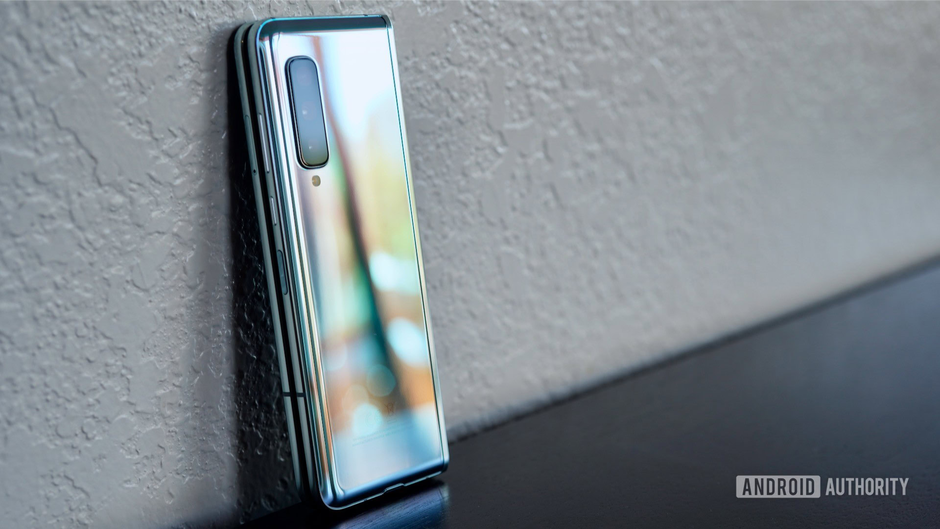
Every phone has to pay the reaper as far as audio quality is concerned. The Galaxy Fold is better than most. Not only does it have more speakers, it also pumps out more volume.
Stereo speakers are affixed along the top and bottom edges of the phone. This arrangement doesn’t necessarily portend better sound. Music pushed through the Samsung Galaxy Fold’s “stereo” speakers will provide a richer experience. There is no headphone jack on the Galaxy Fold, which means analog folk are left to their own.
It also includes the same Dolby Atmos suite that’s available to the Note 10 series, which means you have plenty of opportunity to tweak the sound to you liking.
All said, however, the sound is surprisingly good. Not only is it loud, it is clear and free of distortion. That’s exactly what I want to hear when I’m in the mood for some Megadeth.
Samsung Galaxy Fold review: Day 3 arrives soon
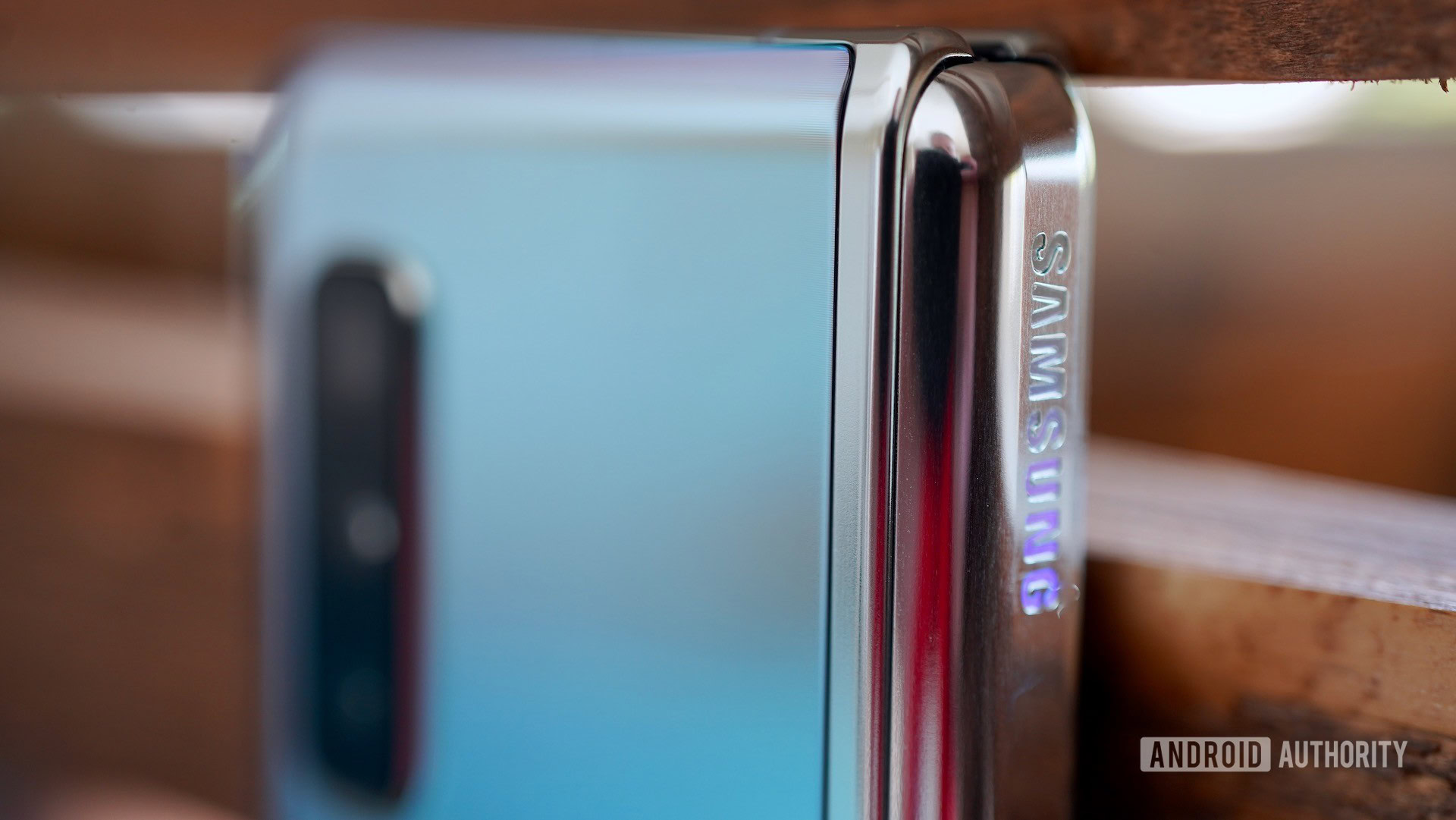
Now that we’ve examined the basics of the Samsung Galaxy Fold, we’re going to dive deep, deep into the hardware as we assess the camera, battery, and processor performance of this premium phone.