Affiliate links on Android Authority may earn us a commission. Learn more.
Samsung Galaxy Note Edge first impressions!
Published onOctober 26, 2014
Editor’s Note: This first impressions comes from a Japanese edition of the Galaxy Note Edge. It’s likely that many of the issues and specifics mentioned below are unique to the Japanese variant of the Galaxy Note Edge, and will be likely rectified before it reaches European and Western markets. We always desire to deliver relevant, and accurate information, and our full review and coverage of the Galaxy Note Edge with video will come late next week.
Samsung turned more than a few heads last month when it unveiled its futuristic phablet alongside the more traditional Note 4. While the latter of the two has been released in many territories around the world already, the Edge couldn’t be more elusive, and now it’s exclusive (for the moment) to Japan! Read on to find out our first impressions.
In a move that can only be described as mind-boggling, Samsung has released the Edge here in the land of the rising Sun on October 23rd, despite forgoing the country on the Note 4 entirely. Barring the questions of logistics (the alleged one million production run limit by the end of the year comes to mind), the curved phablet is available on two carriers no here, KDDI Au and NTT Docomo, with the former offering a CDMA variant and the latter and larger carrier offering the more global-friendly WCDMA build.
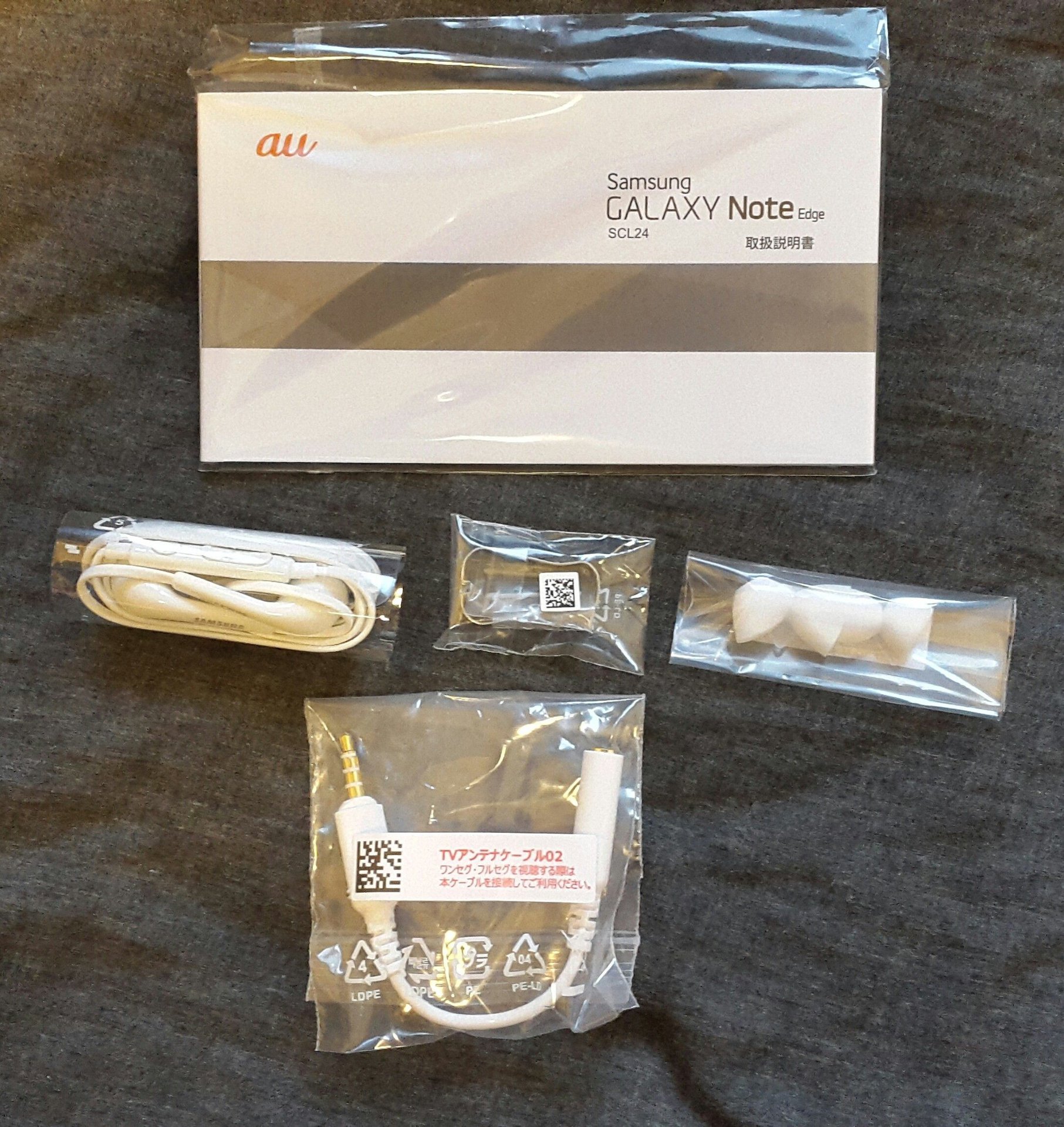
It’s also worth mentioning that only the Docomo variant can be unlocked for international use. Let that be a warning to any potential importers. Also note that only the black model has released, with the white variant hitting stores in mid-November.
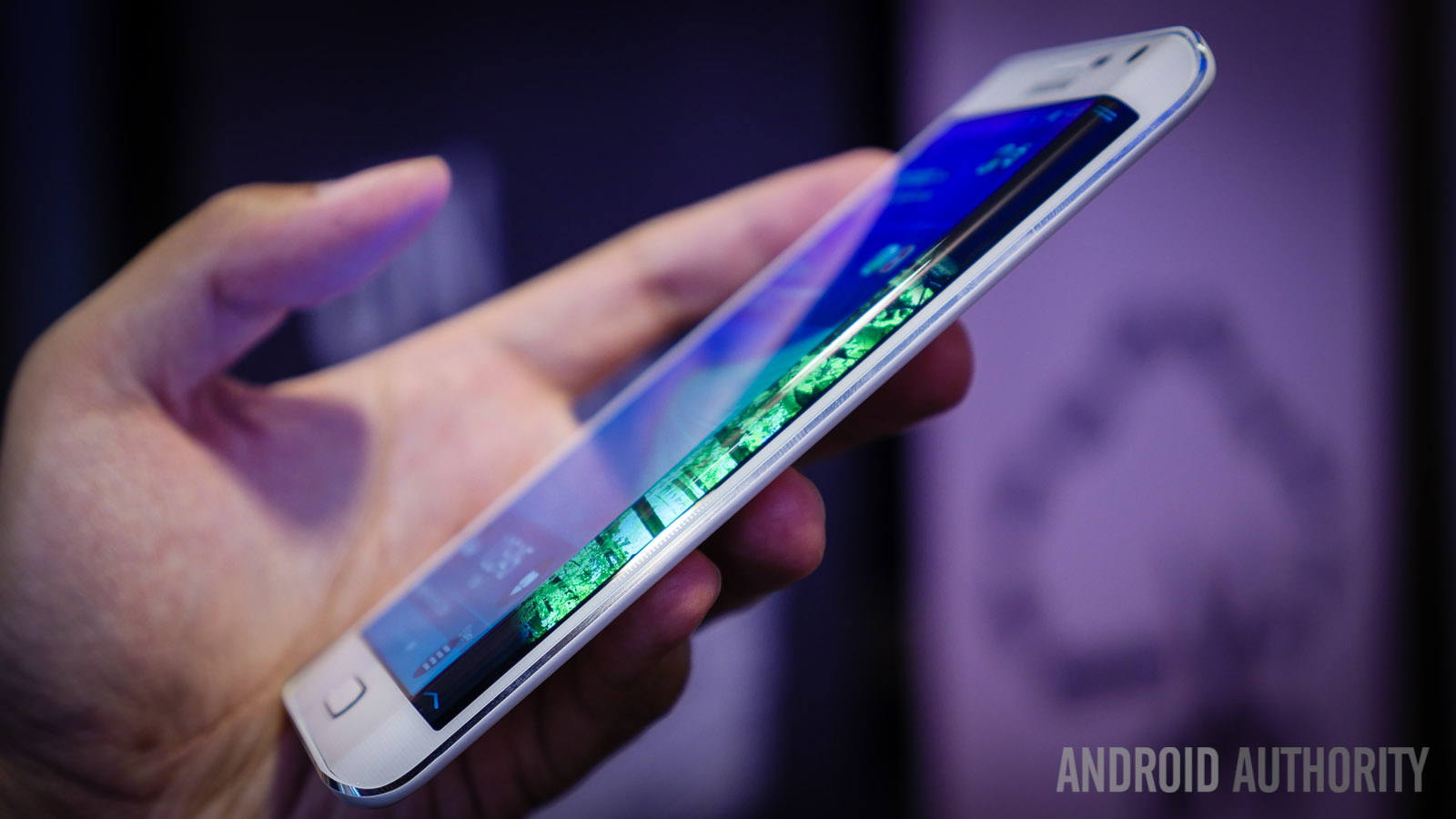
The Galaxy Note Edge is, quite frankly, the most ambitious phone Samsung has made to date. Whereas last year’s Galaxy Round had a novel approach with its curved screen, it was essentially a Note 3 minus the stylus and accompanying software. Sure, it had a great SAMOLED HD screen, sure it had 3GB of RAM, and it even had a trivial novelty gimmick with its rolling motion to look at the time without touching the power button. The Edge, on the other hand, feels more like a genuinely unique device. The curved side of the screen allows a great deal of functionality and customization, while at the same time providing a unique user experience unlike anything seen before.
The curved side display is used for quick access to applications and notifications, but via customization options, can be altered and expanded with mini games, tools, customized messages, train information, and potentially countless numbers of features once developers start programming for it. In the few days since the release here, two new (free) options have popped up in the GALAXY Apps store: a pair of panels from competing train schedule companies, joining the previously released Running Apps RAM manager and a hamburger type game.
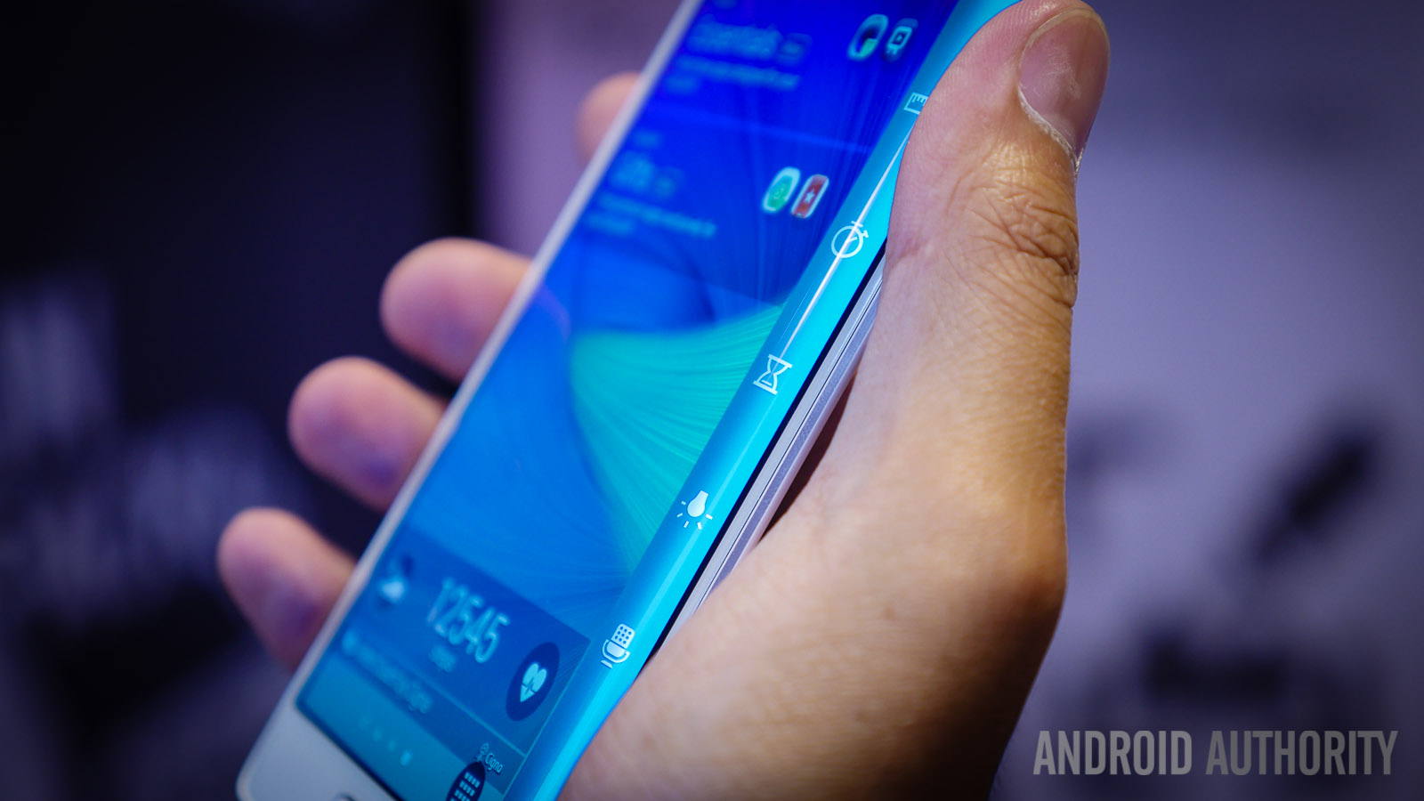
The Edge panel is, in and of itself, marvellous and at time slightly irritating. It can be customized in many different ways via the Settings menu. The basic bar allows you to choose from the various applications installed on the phone and essentially replaces the home launcher row. Users can add more icons than fit on the screen at one time: to access them one simply needs to scroll down. At the top of the Edge panel is a little tab that, when dropped down, allows the user to access quick tools such as a ruler, stopwatch, timer, flashlight, and voice recorder.
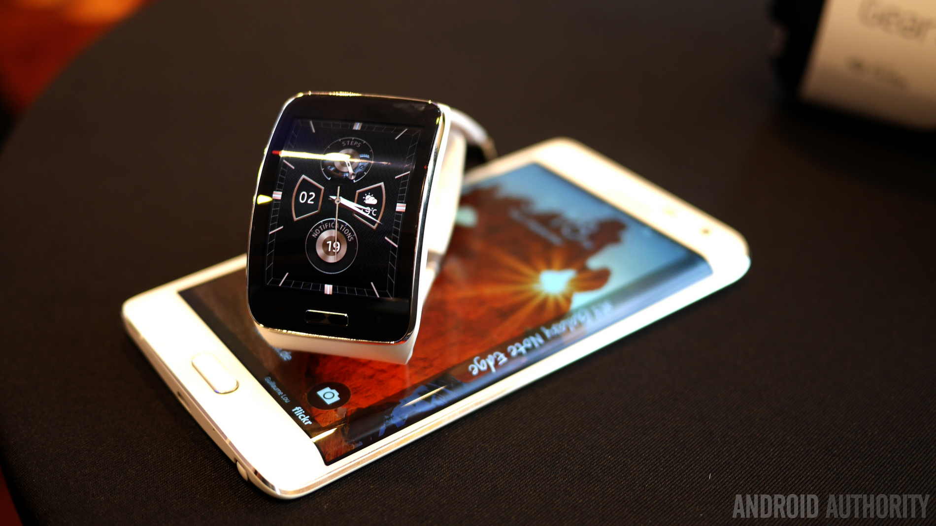
Swiping to the left or right on the panel cycles through the active ones. After a few seconds of inactivity, the tray will disappear, and only the far right edge will be black with the text “Galaxy Note Edge” written in a styled font. This text can be changed or deleted entirely by the user. Upon touching the Edge Display region, the most recent active tray will reappear. Further customization is possible with a stock ticker-esque interface (only compatible with select apps), a night time clock mode that will keep the Edge Display active for a set number of user-defined hours with a clock and calendar, and several different color options, one setting exclusively for use with Samsung’s Flip Wallet.
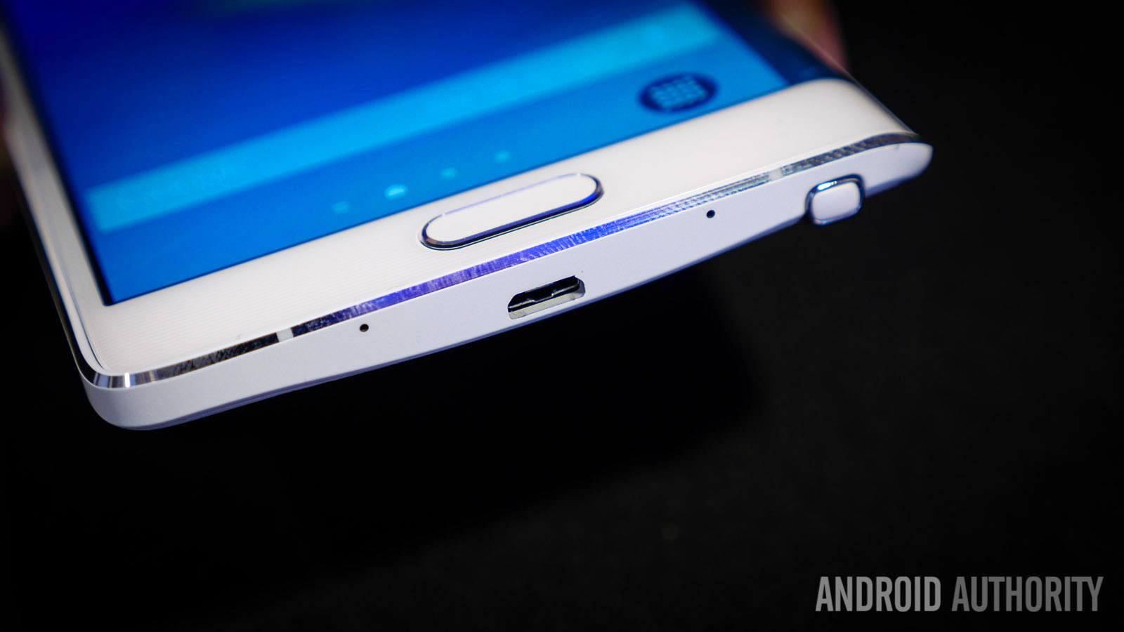
In terms of design, the Edge differs slightly with its metal frame. The Note 4 is basically an enlarged Galaxy Alpha, both featuring a metal frame with flared accents on the four corners and a sculpted metal volume button. The Note 4 also features a colored stripe that goes between the metal band giving it a sandwiched effect. The Edge forgoes all of this entirely, with only a single, silver band near the screen and the remainder the colored stripe.
Said band is also completely devoid of the accents seen on the aforementioned models, as they are on the volume rocker. As many have noticed, the power button has been re-positioned to the top of the unit as it’s traditional place on the right side is impossible with the flattened body curve. Ironically the more plain look the Edge has actually makes it look better than the Note 4. It’s far more simple and solid looking, with the side display, almost as if to say “I’m deceptively simple yet beyond your wildest dreams”.
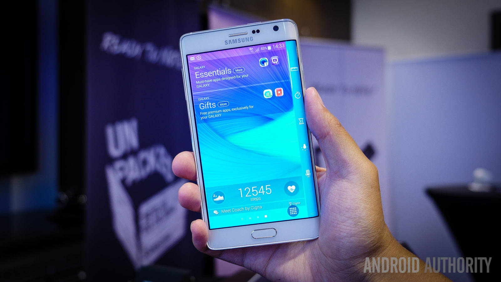
Software and feature-wise, aside from the Edge display this is the exact same phone as the Note 4: It’s running Samsung’s TouchWiz UI running over Android 4.4.4, features a 16 megapixel OIS-equipped rear camera and 3.7 megapixel front camera, Dual Band WiFi a/b/g/n/ac, the S-Pen and it’s accompanying software and tricks, etc. The screen is absolutely wonderful with its 1600 X 2560 QHD display (524ppi) and includes the same re-calibrated color modes Samsung has been using for the past few top tier devices released this year but still produce absolutely incredibly brilliant images.
Borrowing a page from the Korean version of the S5 “Prime”, the Japanese Edge comes with the Festival Effect setting, a cute little feature that-when activated-displays various animations and backgrounds on certain days of the year. As to if this novelty will reach the overseas versions remains to be seen.
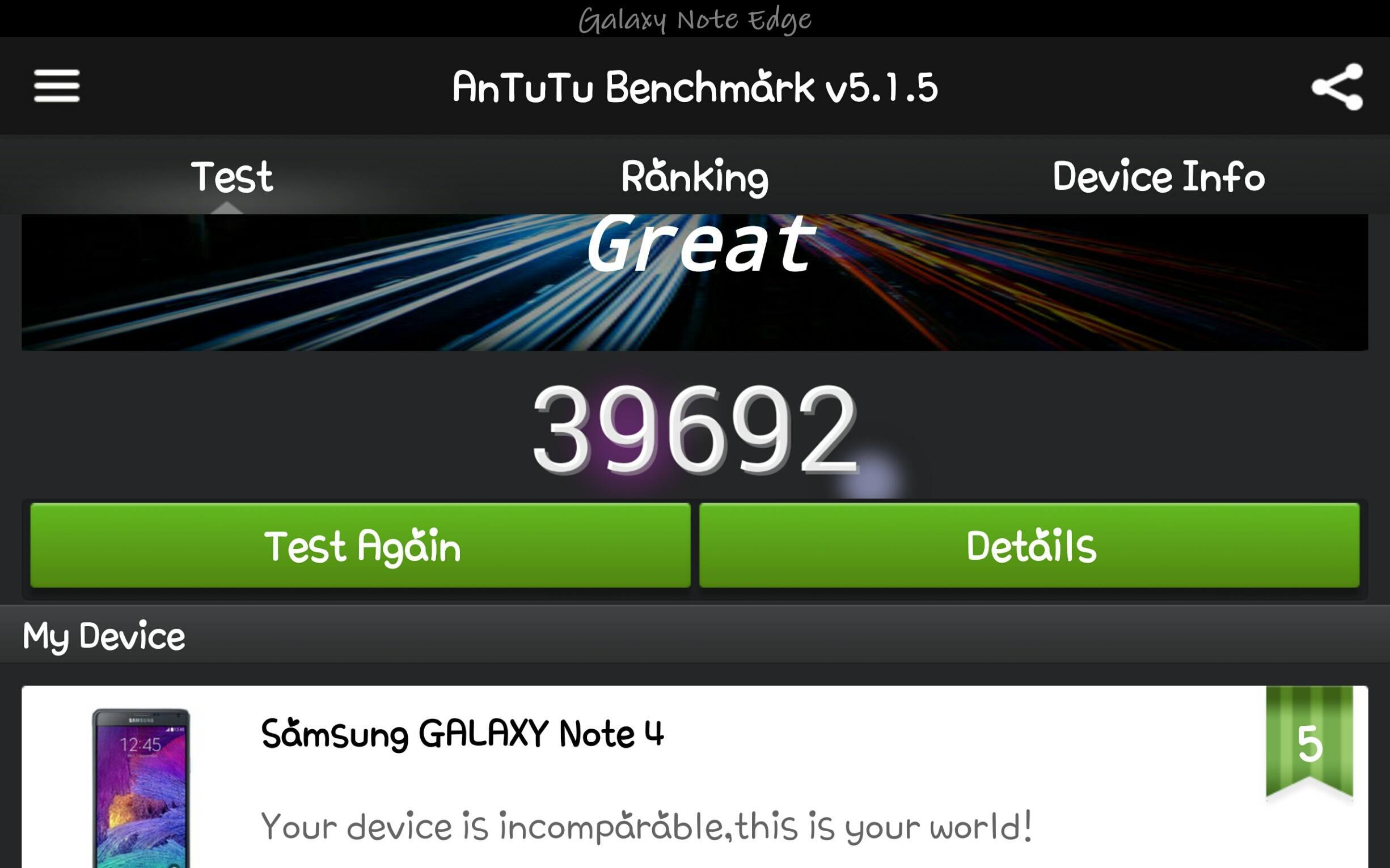
The Japanese variants feature the Snapdragon 805 processor which in theory should blow everything out of the water, yet, as far as benchmarks go, it’s not possible to get proper results. Antutu is currently detecting the phone as the Galaxy Note 4, and with benchmark results that can’t even match last year’s Note 3. Quadrant yielded results on par with the Exynos Galaxy Alpha. Rest assured that the full review will have a complete breakdown of specs and scores, with the latter hopefully fixed by then.
Battery life has been slightly better than average. As of 9:30pm the phone was down to 24%, and that’s solely based on sending emails and light Web browsing throughout the day. It remains to be seen what kind of performance and results will result in more aggressive testing, such as video or gaming. This could be a result of the Edge’s 3000mAh battery, down from the 3220mAh power cell the Note 4 comes with.
In using the Edge so far, three points have struck out as possible annoyances.
While inactive (i.e. in applications) the Edge screen will deactivate and appear black. When a notification appears, it will overlap whatever you’re doing, and thus obscure the far right portion of the screen. This is particularly annoying when you are trying to type something or access a menu or button hidden underneath as doing so will immediately launch the source of the notification. You must wait for the notification to re-position itself to the Notification Shade (located via the standard pull-down menu as per usual) before normal use can resume. This is equally problematic if the Edge area is touched, which will activate the panel.
There are some performance issues (lag) that was simply not present in the Note 4. This may be due to software that has yet to be properly optimized, or it may be a result of the Edge display. Suffice to say, however, that in running Hangouts and Line simultaneously, switching between the two was met with significant periods of inactivity, such that Swiftkey didn’t even load for a good 4 seconds. It’s possible that 3GB of RAM is simply not enough to combat all the software bloat and TouchWiz layers, or it’s likely that Samsung’s software is new, and that apps themselves haven’t been updated to take into consideration the additional screen real estate.
There doesn’t seem to be a “hands off” way to activate the Edge panel. Whereas the Galaxy Round allowed users to roll it on a flat surface to glance at notifications, there is no way to turn on the Edge Display without activating the power button or Home Button. This is one instance when LG’s Knock On feature would work wonders; if the screen could be turned on by double tapping it.
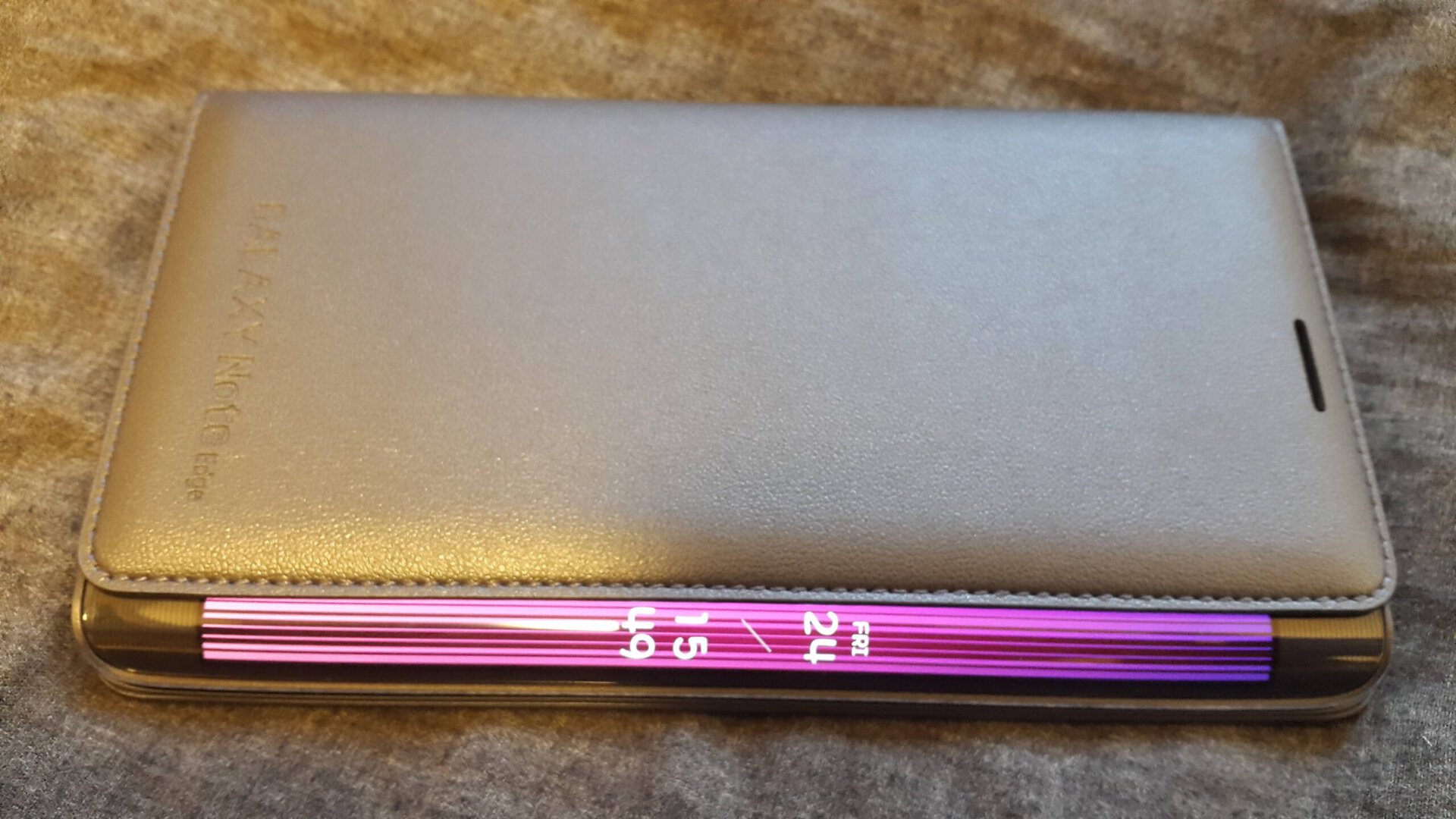
On a final note, it’s also worth mentioning that Samsung’s Flip Cover works very well with this device. It’s made of the same thick material that the Galaxy S5 cover had, and protects the camera from touching whatever surface the Edge is laid down on. Furthermore its asymmetrical design allows the Edge Screen to remain visible. In Japan it retails for roughly $60US, but amazingly in light of a promotion Samsung was offering, was give away free to those who pre-ordered.
All in all, the Galaxy Note Edge feels like a healthy breath of fresh air in a market that has been centered around spec upgrades over form and functionality. Make sure to check back next week for more impressions, unboxing and comparison videos and more when the review unit arrives!