Affiliate links on Android Authority may earn us a commission. Learn more.
Samsung Galaxy S11 Plus camera: Is it the weirdest looking multi-lens camera?
Published onDecember 4, 2019
2019 saw basically every important smartphone maker produce devices with more than one rear camera. Even single-shooter holdouts like Google joined the multi-camera party with the dual-lens Pixel 4, though most OEMs were a little more ambitious than the search giant and opted for two, three, or sometimes even more additional sensors.
There’s just one problem that plagues this multi-camera utopia: making all those extra camera holes not look really ugly. Some manufacturers have managed to integrate extra sensors with style and pizzazz. Others… have not.
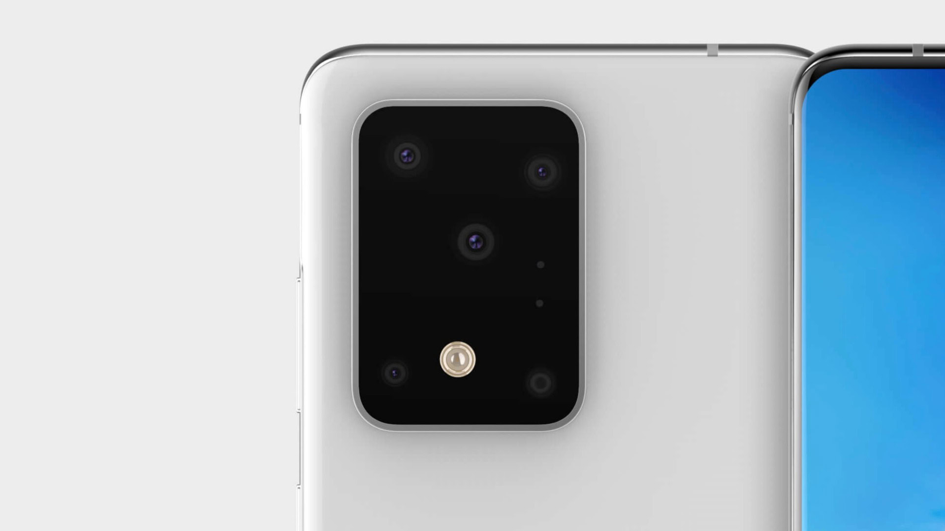
With a raft of early Samsung Galaxy S11 Plus renders once again making smartphone fans question Samsung’s sanity what the criteria is for a good-looking multi-lens camera module, I thought it’d be fun to take a look at the most famous/infamous attempts in recent memory. I’ve also tried to lump them into categories, because there are definitely some clear design trends out there and far too many phones to include them all.
Read more: Samsung Galaxy S11 series: The 8 things we want to see
Editor’s note: This has all purely been done for a bit of fun. You might have a burning passion for circles or a vehement hatred of squares. Beauty is in the eye of the beholder… unless you like the S11 Plus camera renders, then you seriously need to rethink your life choices.
Squares and squircles
Google Pixel 4
- The one that looks like a Pokémon
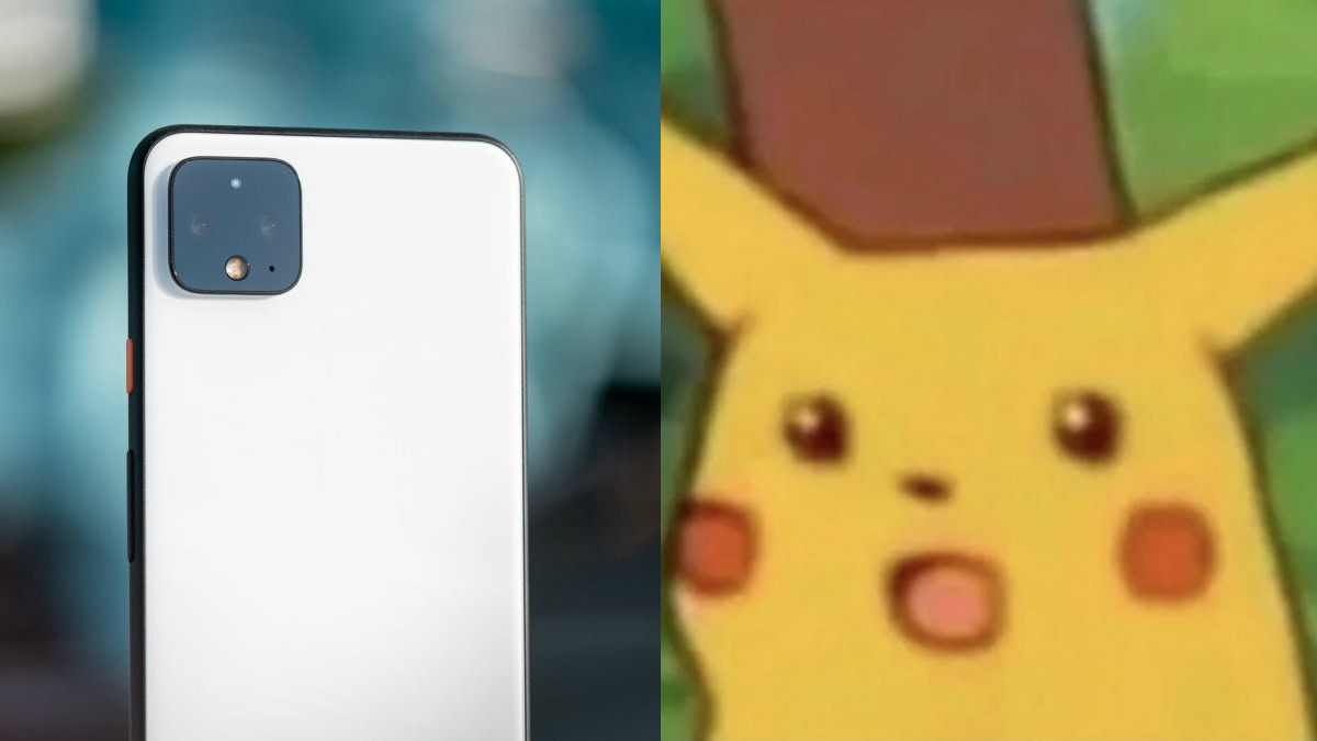
Sorry, you’ll never be able to unsee this one now. When any part of your $799+ phone looks like a popular meme you’re in trouble.
Honestly, I don’t hate the Pixel 4 camera module’s cutesy, yet sparse design. Is it a poor use of space? Absolutely, but then I see how happy/surprised/terrified it is of me and I can’t help but cut it some slack.
Next time though Google, please use some of that wasted real estate for an ultra wide-angle camera.
iPhone 11 Pro
- The one that looks like a stove top
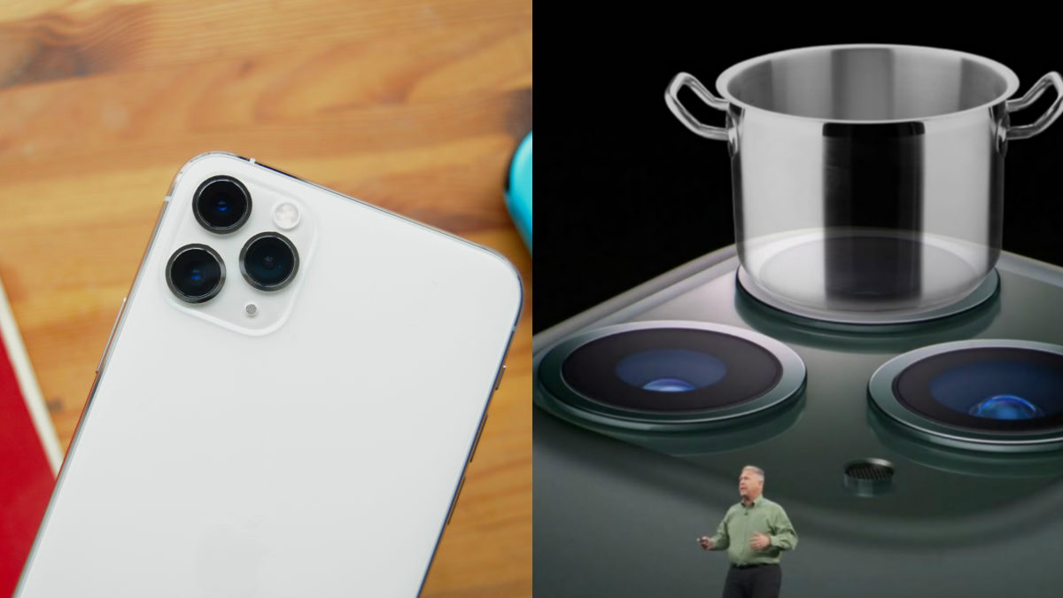
The iPhone 11 Pro, and to a slightly lesser extent the dual-lens iPhone 11, has the opposite issue of the Pixel 4 — the lenses take up way too much space on the “squircular” bump.
When the iPhone 11 Pro officially debuted, the internet argued over whether it looked more like a stove, a fidget spinner, or one of those circular-bladed electric shavers.
Team Stove won out eventually, cementing the iPhone 11 Pro as a camera phone with some killer video chops that looks like it could cook actual chops.
Samsung Galaxy S11 Plus
- The one that defies all sense of taste and decency
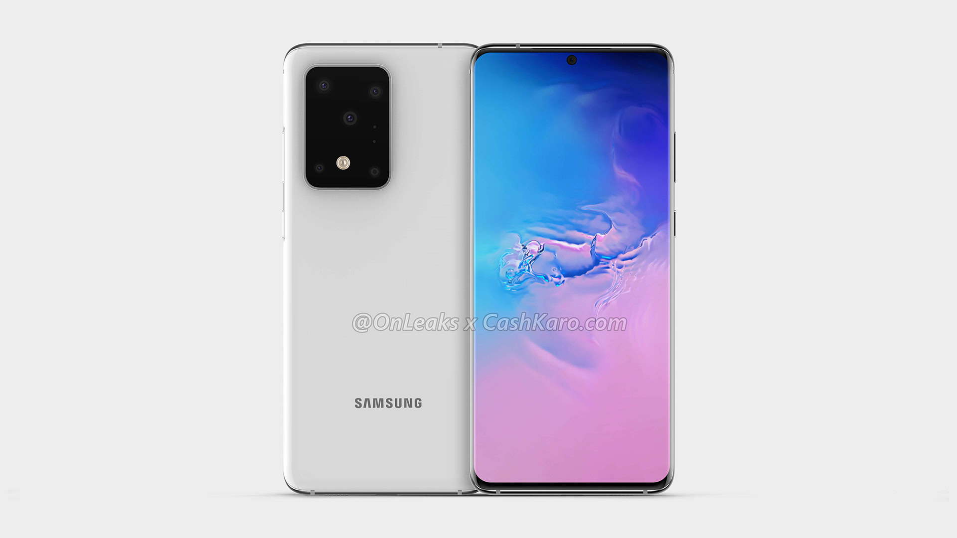
Okay, this is based on CAD renders, so try and hold back your anger/stomach. But if this is what we’re going to see in the flesh come early 2019 then fans of basic symmetry might want to look elsewhere.
If the iPhone 11 Pro is the stove, this is the kitchen sink. There isn’t a single element of the camera setup that aligns with another. I hate it.
I guess when you’re bored it could double up as a makeshift connect the dots puzzle.
Just so, so many phones with traffic light-like modules
- The boring ones

It can be vertical or horizontal, aligned to the left, center, or right, whatever the minor variation, if you’ve even glanced at a smartphone in 2019 you’ve no doubt seen this functional, but dull design already.
Some OEMs have tried to make their camera strips look sexy with color accents. Others add a bit of text boasting about the ever-increasing number of megapixels which will inevitably be pixel binned anyway.
Nevertheless, the traffic light look is about as vanilla as it gets for phone cameras.
Circles and pseudo circles
OnePlus 7T, vivo Nex 3, Nokia 7.2, and others
- The ones that look a bit like coin-op binoculars
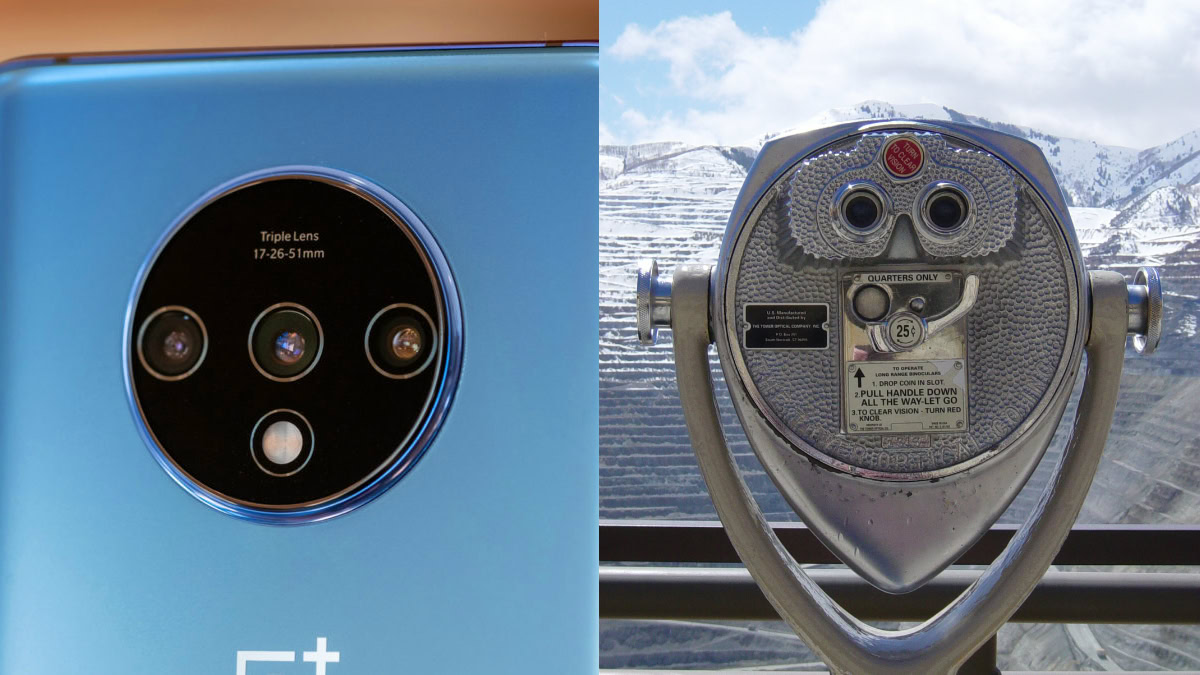
I’ve seen a lot of hatred for the OnePlus 7T’s circular camera module, but I really like it. It’s quirky, immediately recognizable, and gives the 7T a hint personality beyond “the 7 Pro/7T Pro but cheaper.”
On the negative side, though, it’s unnecessarily huge. OnePlus has also performed the cardinal sin of adding tiny text no one will ever read unless they’re close enough to lick the phone. Yes, I can see it’s a “Triple Lens” camera, OnePlus — the three lenses are a dead giveaway.
The vivo Nex 3’s circular module opts for a similar approach to OnePlus but tones the overall size down. Unfortunately, it falls further into sinfulness with a bunch of pointless text on the bezel and plonking the flash outside of the circle like it’s trying to escape. Then there’s the Nokia 7.2 with its three cameras and flash arranged neatly inside a circular bump, but sullied by a ZEISS branding in the middle.
Stop. Putting. Text. On. Camera. Modules.
HUAWEI Mate 30 Pro
- The one that wants to look so badly like a DSLR
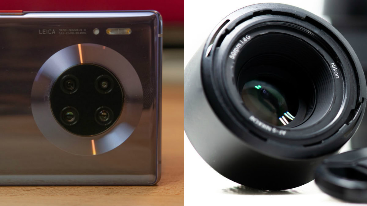
The HUAWEI Mate 30 Pro is the best phone no one outside of China should buy.
That’s a shame because the Mate 30 Pro has one of the more unique multi-lens camera modules thanks to its glossy “halo” ring border. There’s also a pleasing amount of symmetry between the four lenses with all the superfluous Leica branding and other sensors sat adjacent to the halo.
It’s a little ostentatious and far larger than it actually needs to be, but it’s eye-catching enough that it’ll distract from all those AWOL Google apps for a bit.
Redmi K30 series
- The one that looks like an ancient arcade machine coin slot
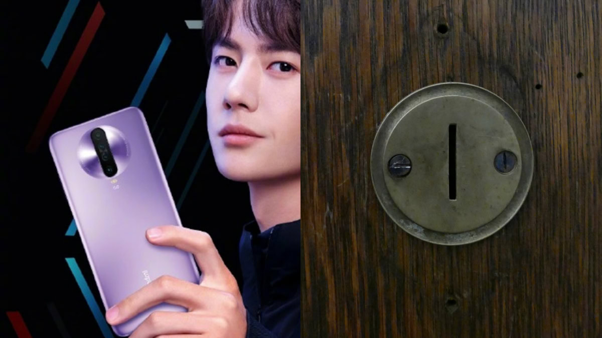
What do you get if you cross the Mate 30 Pro’s halo with a vertical, quad-lens traffic light camera? You get this hideousness.
The Redmi K20 series was already a love-it-or-hate-it affair with its garish aesthetics, but this is beyond the pale of good taste. Within minutes of the first official renders hitting the internet the K30 was being compared to a piggy bank and old school arcade machines (remember those?).
The phone will apparently be an affordable, 5G-enabled powerhouse, but the Xiaomi sub-brand was clearly preoccupied with whether or not it could make a disgusting circle-strip-hybrid that it’d didn’t stop to think if it should.
Flips, nightmare fuel, and the future
ASUS Zenfone 6, Samsung Galaxy A80
- The mechanical ones that will impress your pals, but will almost definitely break in like a year or two
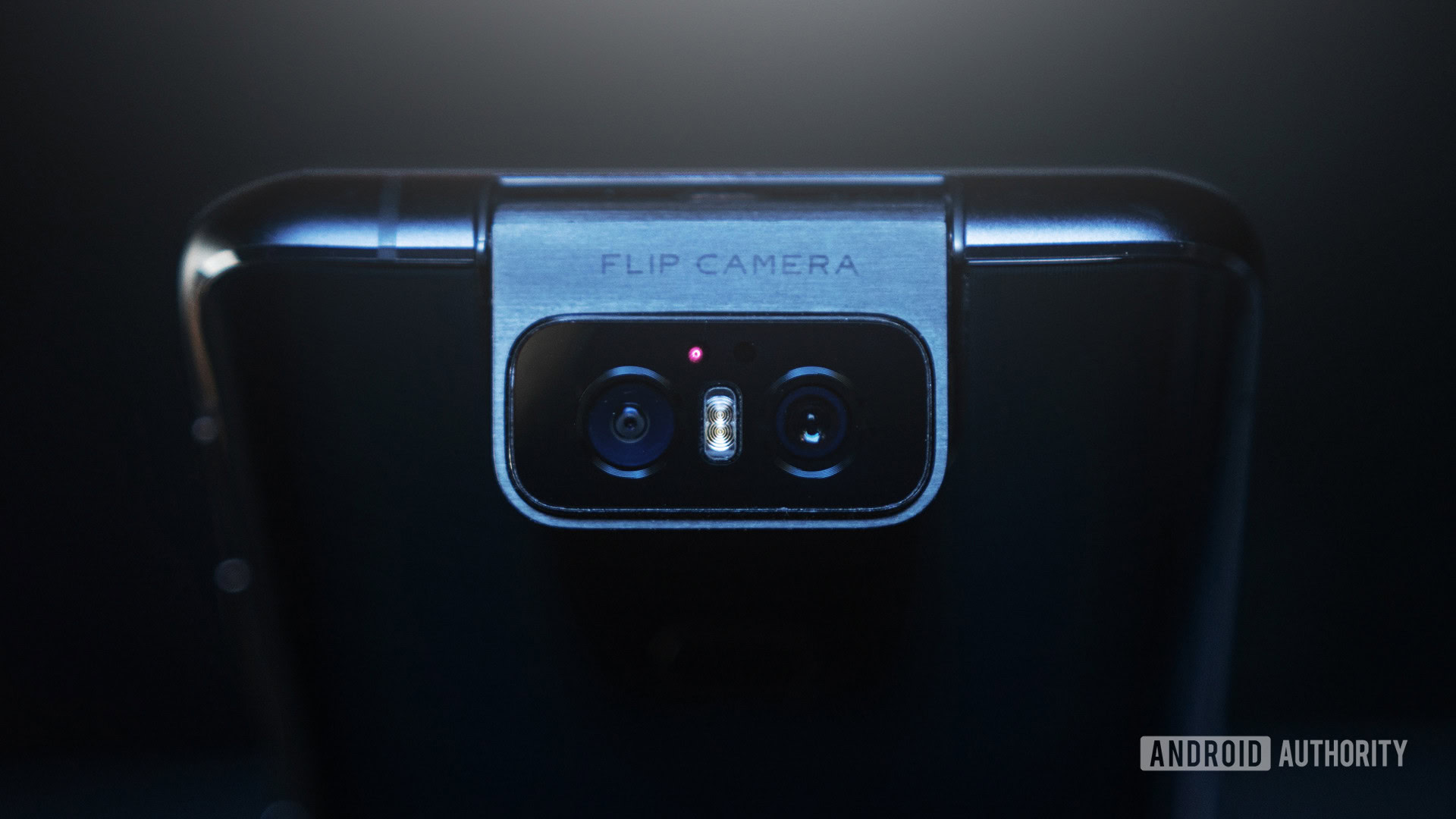
Moving parts on a phone are wildly impractical, but undeniably very cool.
ASUS Zenfone 6’s flip-flopping camera has two boggle eyed lenses with a flash sandwiched in the middle and it looks eerily like an owl’s face. There’s also a bit of text that reminds you its a flip camera. Sigh.
Meanwhile, the Samsung Galaxy A80 tricks you into thinking its a regular horizontal camera — albeit with more quintessential Samsung symmetry issues — before raising and flipping over to become a selfie shooter.
There’s so much untapped potential for weird camera designs that spin and rotate, but for now you can think ASUS and Samsung for trying something a little different.
Nokia 9 PureView
- The one that’s a phone and an eldritch Lovecraftian horror show
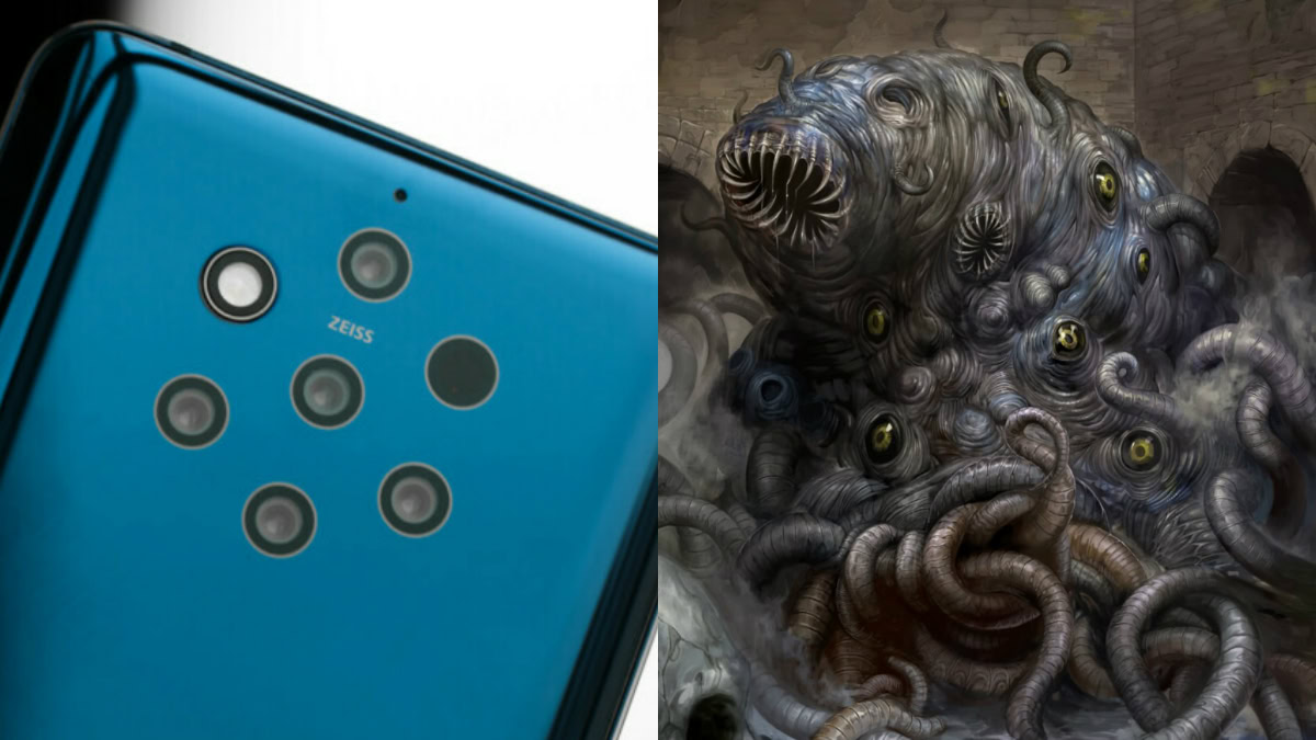
Do not Google trypophobia.
Whatever Light and Sony are working on
- The one that will definitely have way too many lenses
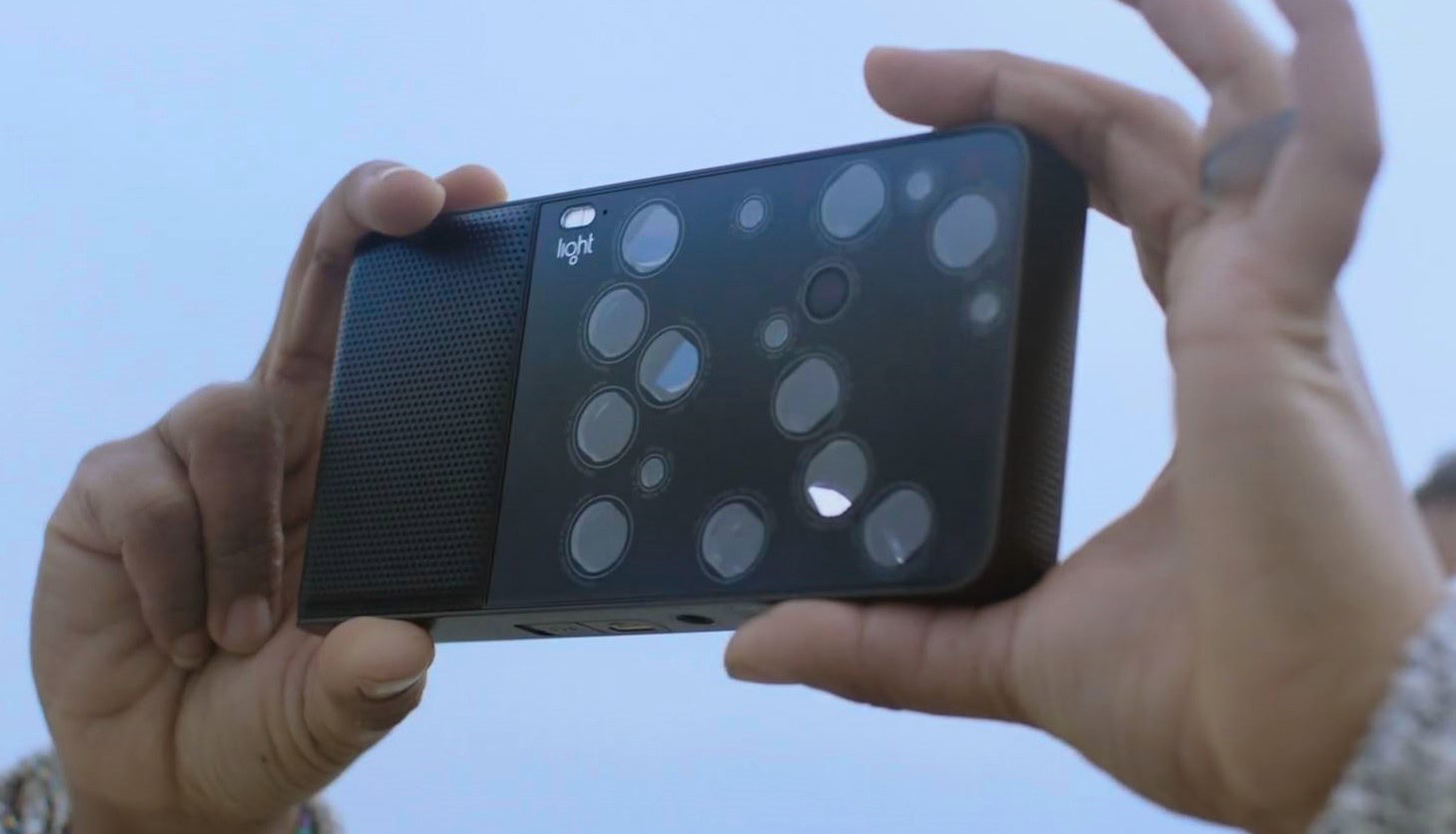
As unsettling as the Nokia 9 PureView is, we may be longing for the days of penta-lens camera phones if companies like Light have their way.
The firm behind the L16 camera is reportedly working on phone camera prototypes with Sony that could very well stretch beyond five lenses. Let’s just hope the end result isn’t as underwhelming or as truly disturbing as the hexadeca-lens L16 camera (above).
Which phones do you think nailed the multi-lens look? Are there any awful examples we missed? Let us know in the comments.