Affiliate links on Android Authority may earn us a commission. Learn more.
Comparison video shows Galaxy S4 running Lollipop
With the imminent launch of Android 5.0 Lollipop, we’re seeing quite a few devices running early builds of Google‘s revamped OS. Next up is the Samsung Galaxy S4, and we get a pretty good look at it, thanks to the folks at Sammobile.
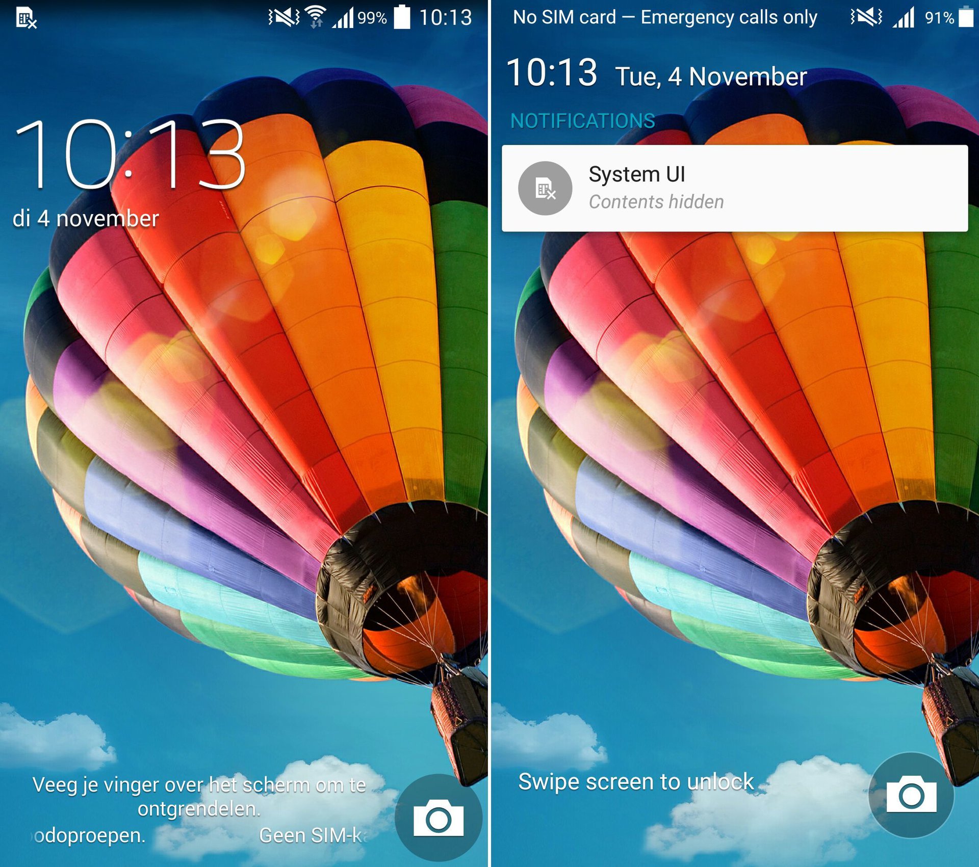
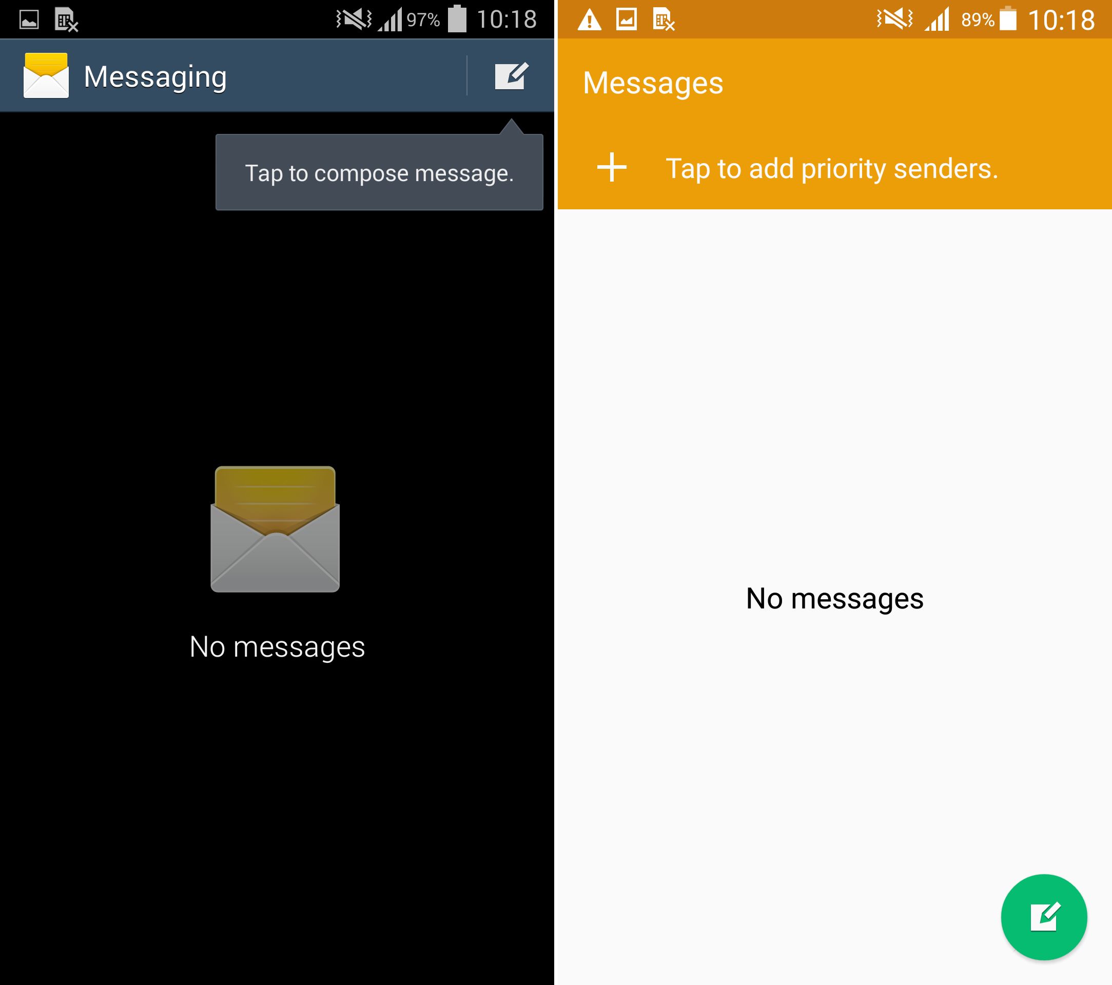
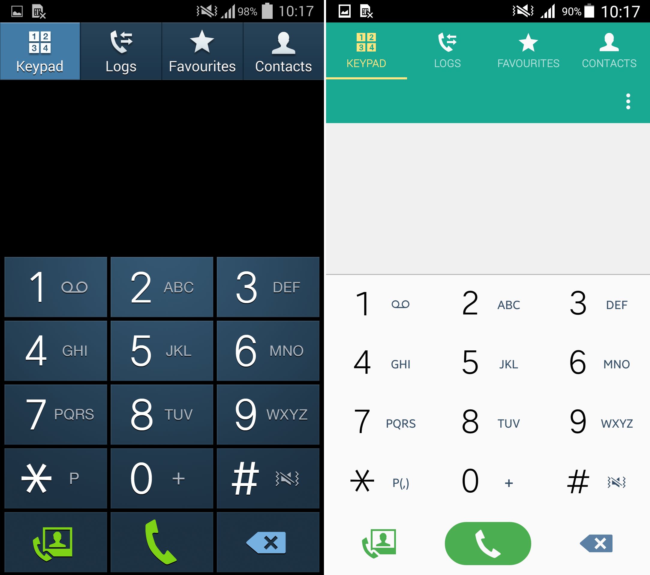
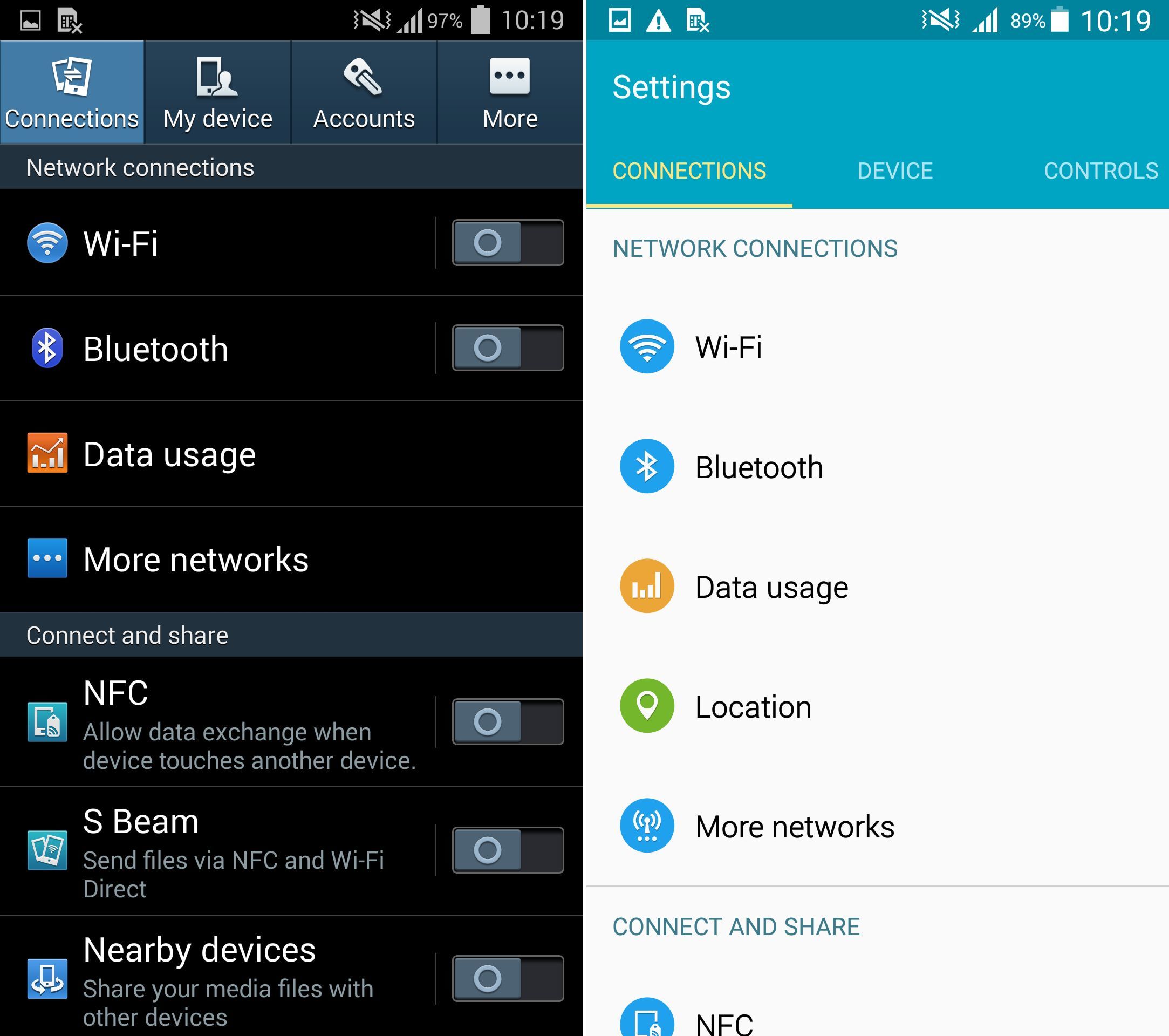
In the comparison video and attached photos, the Lollipop-toting S4 is compared to the S4 with KitKat. Almost every aspect of the UI has been looked at and compared, so let’s take a look to see what is exactly changing with the update.

Right off the bat, you can already see UI differences on the lock screen. The KitKat S4 shows only the clock widget, while the Lollipop S4 shows Google’s new card-like, actionable notifications on the lock screen. Moving to the home screens, virtually nothing has changed. The UI’s look very similar, except for when you try to add a widget or change the wallpaper. In Android 4.4 KitKat, all you need to do is long-press on the home screen, and click whether you’d like to change your wallpaper, or add a widget. Samsung has ditched it’s old way of doing this, and has now adopted the way that was introduced in KitKat.
Moving on to apps, we can see a revamped messaging application. With the Lollipop-style compose button and the color-coded status bar up top, we’d say this is a nice improvement over the old app.

Take a look at the new dialer. The icons look a bit more flat, and the colors are more subdued.

Next up is the new Settings menu. We’re now looking at lighter, more fluid-looking UI. Samsung brought a white background with light-blue accents to the Settings menu, and for us, it looks a lot better than before.

Lastly, we have Quick Toggles. Samsung hasn’t really done much to fix their extremely crowded Quick Toggles pane, but they have changed the look of it to coincide with the Galaxy S5. The background is now the familiar light-blue, with subdued dark-blue accents. Samsung’s take at Quick Settings have been one of the pain points of Touchwiz for awhile now, so it’s nice to see them updating their older handsets to look more modern.

There are a few more UI comparisons in the full article, which you can find below. How do you feel about the new Lollipop update? Are you excited to get the update for your Galaxy S4? Let us know how you like it!