Affiliate links on Android Authority may earn us a commission. Learn more.
This is what Nougat looks like on the Galaxy S7/Edge (Update: more screenshots and details)
November 10, 2016

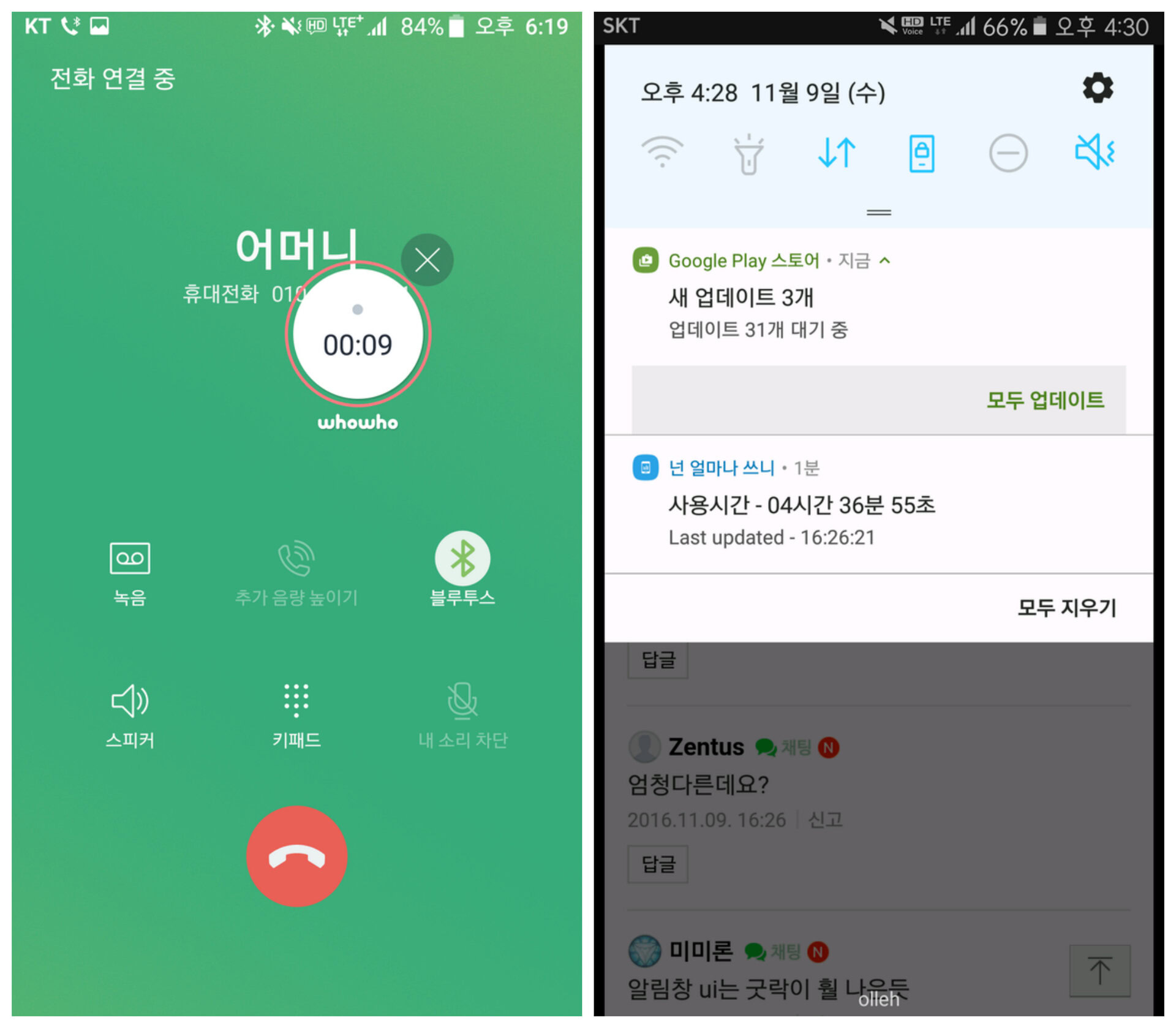
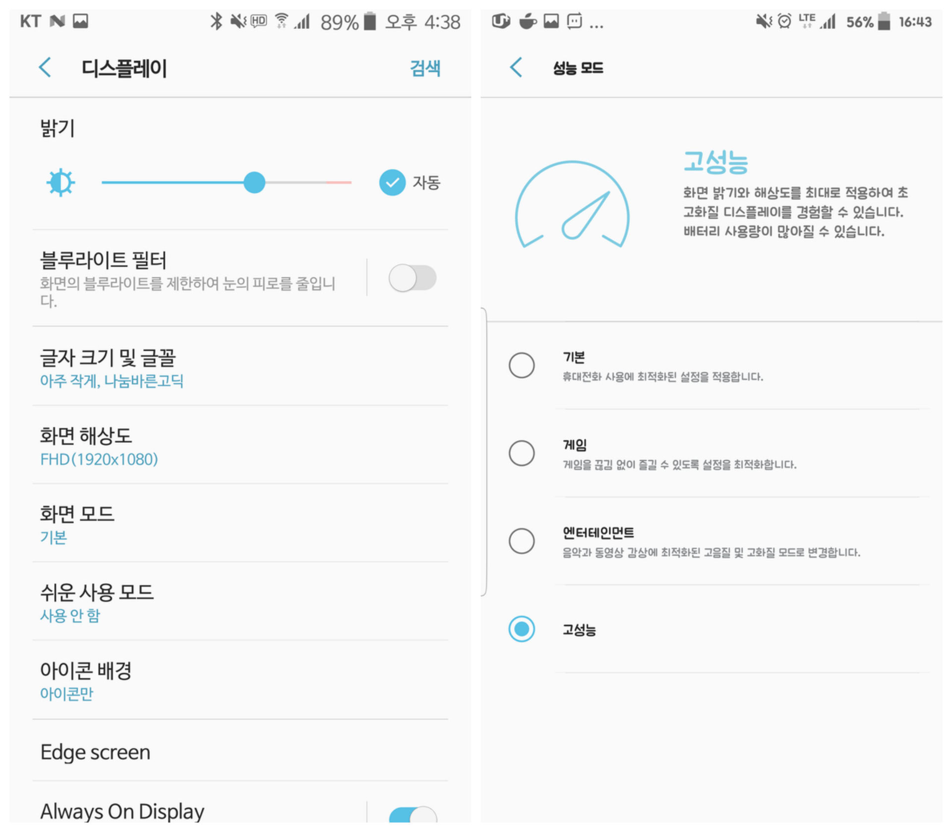
Update, November 10: The folks over at Sam Mobile got their hands of the Nougat firmware for the Galaxy S7 (version G930FXXU1ZPK1) and published an extensive gallery of screenshots. The UI includes elements we’ve first seen on the Note 7’s Graxe UX, coupled with some new elements and features. These include new animations, a new font (Samsung One), a blue light filter for nighttime reading, the ability to switch between performance modes, and a Device Maintenance tool that will allow users to optimize their devices. Check out a selection of the screenshots below or visit the full gallery over at Sam Mobile.
Original post, November 9: Following the introduction of an Android 7.0 beta program for Galaxy S7 and Galaxy S7 Edge users in the UK and South Korea, we knew Samsung was close to rolling out an early version of Android Nougat. Now, we know what it looks like.
Sam Mobile obtained screenshots of the new UX, which appear to come from a Korean device, and uploaded some videos showing it in motion. Samsung’s UI once again features the typical white and blue Grace color palette but appears to have seen some changes in its icons and menus.
Check out the media below.


In other news, the Wi-Fi alliance has also just certified the Galaxy S7 and S7 Edge’s Android 7.0 firmware. Though this doesn’t mean that Nougat is now ready to be deployed, it’s a crucial step in the quality assurance process and confirms that the UI is in its final stages.
The new Grace software is still in production, so the images above may not reflect the final design. Still, what on your thoughts on how the new interface looks so far? Let us know in the comments.
Thank you for being part of our community. Read our Comment Policy before posting.