Affiliate links on Android Authority may earn us a commission. Learn more.
Observations on switching to the Galaxy S7 Edge from a non-Galaxy user
Published onMarch 16, 2016
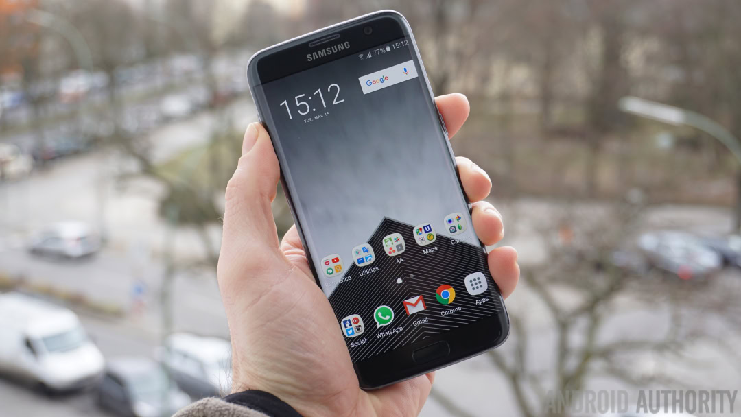
Like my colleague Andrew Grush, who recently confessed that Samsung’s TouchWiz UI on the Galaxy S7 Edge isn’t so bad after all, I too consider myself a stock Android fan. I’ve also had consecutive Nexuses since the Nexus 4 and always return to stock Android after any time spent dabbling in other UIs. In the interests of science though, I’ve recently made the switch from a Nexus 6P to the Galaxy S7 Edge: here are my observations.
I can almost live with TouchWiz
I’ve spent years grumbling about TouchWiz, about how bloated and laggy and clumsy it was. But with the version found on the Galaxy S6 I had to admit that it was finally getting better. With the Galaxy S7 Edge I have to admit that I think I can actually live with it.
I still prefer the snappiness and cleanliness of stock Android, but TouchWiz isn’t anything close to the ugly lumbering beast it was a few years ago. It bugs me that I can’t completely remove the quick settings from the top of the Settings menu and app drawer organization is idiotic, but it’s at least bearable.
But it’s still laggy
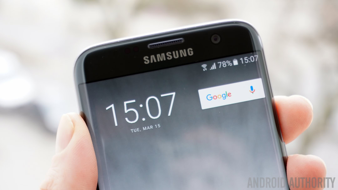
On first glance the Galaxy S7 Edge is very fast. When benchmarking it, the Galaxy S7 Edge tops 130K on AnTuTu, and the experience itself is generally very smooth. And yet I still find the Galaxy S7 Edge lagging and taking far longer to launch apps or menus that it should.
With this much raw unadulterated power under the hood, it should have been impossible for Samsung to slow this beast down at all. And yet, Samsung somehow managed to do just that.
With this much raw unadulterated power under the hood, it should have been impossible for Samsung to slow this beast down at all.
Why does Samsung put nav buttons on the wrong side?
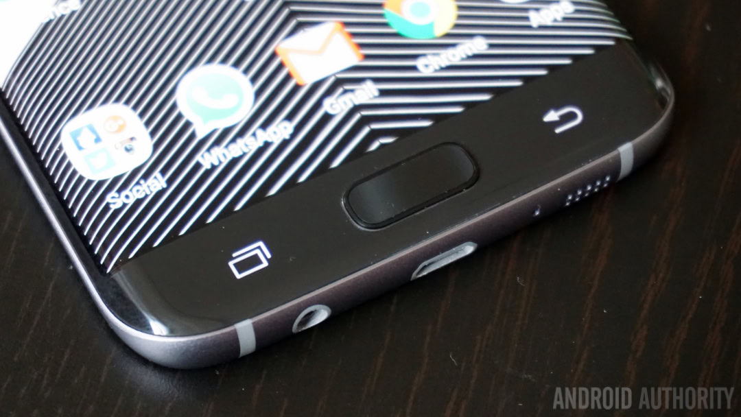
I know Samsung is practically synonymous with Android for many people, but Google is even more so, wouldn’t you say? So if Google dictates that the navigation buttons go back, home, recents – in that order – then why does Samsung insist on doing it in the reverse order?
Practically every other OEM does it the way Google does it, so why can’t Samsung? It’s a needlessly annoying discrepancy between Samsung and everyone else that brings absolutely no benefit.
Physical buttons need to die, now
Speaking of Samsung buttons, I am once again reconfirmed in my belief that a physical home button is ridiculous and should go the way of microUSB ports. While I can appreciate the presence of a front-facing finger scanner, OnePlus managed a pretty decent solution for that on the OnePlus 2.
Switching from capacitive buttons – which are an awful experience in my opinion – to a physical home button simply to navigate the UI is not only weird and inconsistent, a clicky home button also feels really cheap compared to on-screen buttons.
[related_videos title=”GALAXY S7 EDGE VIDEOS” align=”center” type=”custom” videos=”679646,676937,676067,675817″]
All phones need a quick launch camera shortcut
Coming from the Nexus 6P, which has a quick launch camera shortcut via a double press of the power button, changing to a double press of the home button on the Galaxy S7 Edge to launch the camera wasn’t such a big deal. But whichever way you do it, all smartphones should have this feature. By law.
If it can’t be baked in as a core feature of Android, then Google should really try to force all OEMs to add it on, because once you get used to it, it feels like a basic human right, like free Wi-Fi. Speaking of the camera: why is there still a camera shortcut on the lock screen when I have a quick launch camera shortcut from any screen?
There is no excuse for that fingerprint magnet back
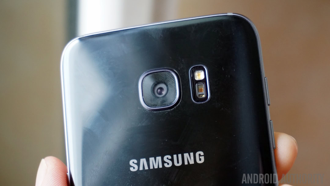
I don’t care what you say, there is absolutely no way anyone could ever convince me that the back glass of the Galaxy S7 Edge is OK. It is quite possibly the worst fingerprint magnet I’ve ever come across (with the exception of the Galaxy S6).
Samsung may have “improved” it since the last iteration by a tiny bit, it is still unbelievably bad and quite frankly, kind of disgusting. If Samsung heard the fans complaining about the removal of microSD in the S7, they surely heard every single person that ever mentioned the Galaxy S6 is a huge fingerprint magnet.
There is no way anyone could ever convince me that the fingerprint magnet glass of the Galaxy S7 Edge is OK
Touchscreen response is pretty bad
The first thing I noticed when switching to the Galaxy S7 Edge is how bad the touch responsiveness seems to be (although I might just be unlucky). It’s not so much the screen, although it does kind of “grab” at your finger as you swipe on it compared to the Nexus 6P, but rather the touch response itself.
Quite often, when swiping away notifications the S7 Edge registers it as a press and launches the app instead. Likewise, when tapping UI elements it occasionally doesn’t register any press at all and I have to give it a serious press to get a response. Feel free to tease my ability to use a phone if you like, but something here is not right.
But that display is beeyootifull
Touch response is one thing, but dynamic range and color reproduction are another. The Galaxy S7 Edge’s screen is as amazing as it is immersive. I’ve never been a particularly huge fan of over-saturated AMOLED displays, but the Galaxy S7 Edge (on low brightness) tickles my fancy like no LCD display ever has.
Needles to say, when viewing videos or photos the pumped up saturated colors seep into your eye and stroke your brain into loving them, whether they are realistic or not. It’s ocular porn to be sure, but boy does it do its job well.
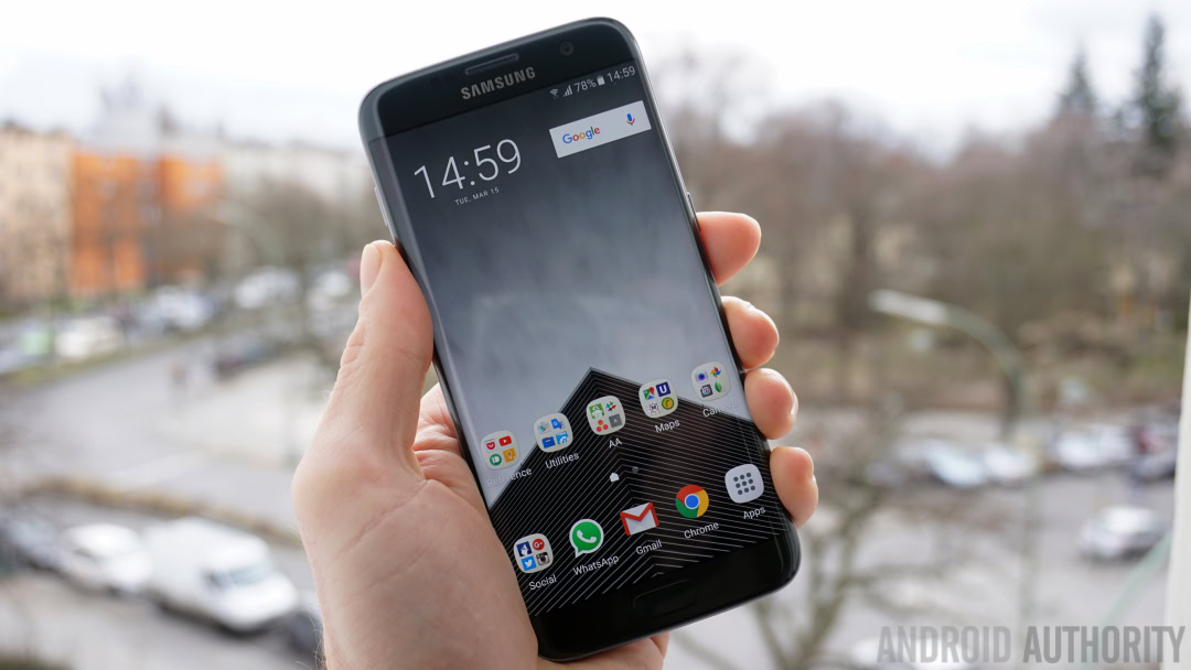
Why on earth can’t I move the app drawer icon?
This is one of those questions I cannot come up with any logical explanation for. On all Android devices the app drawer shortcut is located in the center of the bottom row of app icons (called the dock). But not on the Galaxy S7 Edge.
What’s even worse than its illogical placement is the fact you can’t move it. On practically all other Android phones you can move all icons including the app drawer shortcut. Not so on the Galaxy S7 Edge. For reasons unknown it is permanently stuck on the right hand side of the dock. And that’s just dumb.
The folder situation is a joke
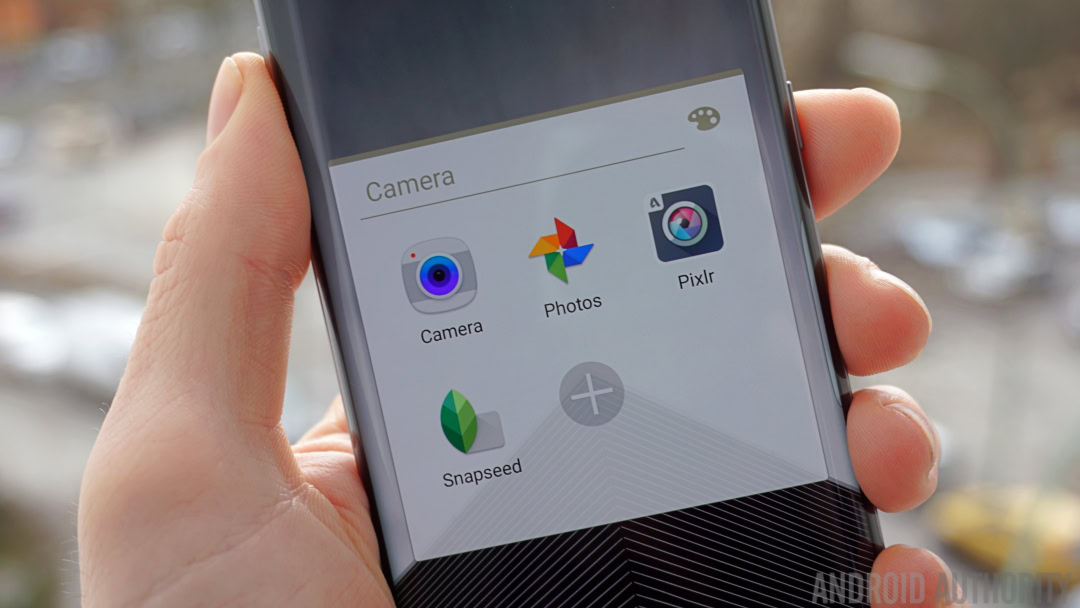
I’m used to folders on stock Android, where opening a folder with, say, four apps inside opens up a window just a little bit larger than those four app icons. Makes sense, yes? On the Galaxy S7 Edge though, opening a four-app folder takes up half the damn screen.
There’s acres of wasted space, a giant + button for people that don’t realize you can just drag icons onto a folder to add them and the irritating fact that instead of a four-tile grid, you get a row with three icons, then one left over with that non-removable + icon and a blank space.
I would have made it even thicker
While I was overjoyed to find that Samsung had bumped the battery capacity in the Galaxy S7 Edge by almost 40% compared to its predecessor I can honestly say that Samsung could have easily pushed it to 4,000 mAh (or more) and gotten away with it.
While the Galaxy S7 Edge is a little thicker than the Galaxy S6 Edge it doesn’t feel like it thanks to that lovely curved edge on the back side. And the whole thing is still so remarkably light than an even thicker phone with an even bigger battery wouldn’t have negatively affected the Galaxy S7 Edge one iota.
Not great speaker placement
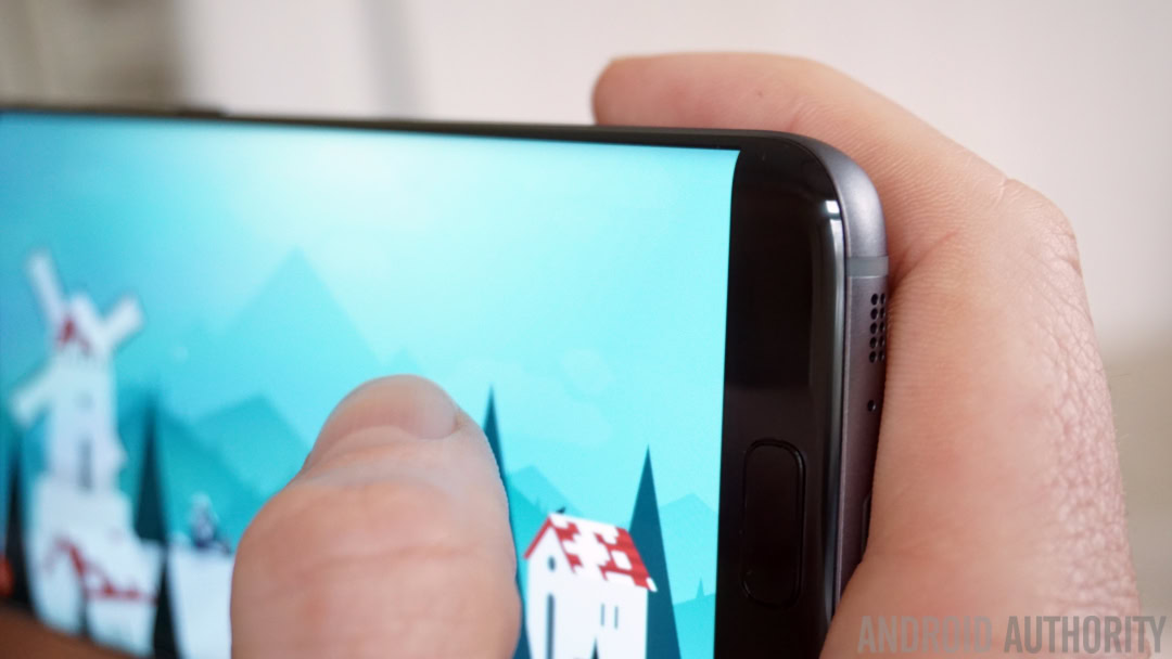
The bottom-mounted speaker placement on the Galaxy S7 and Galaxy S7 Edge is pretty bad. Assuming you rotate your phone into landscape orientation by moving the top of the phone to the left, as I do, then you’re going to find yourself frequently blocking the speaker grill with your index finger.
While it would have been even worse on the other side of the charging port, there’s not much else Samsung could do about this other than move the speaker to the front (yes, please) or to the back again (no thank you).
You're going to find yourself frequently blocking the speaker grill with your index finger.
It’s unnecessarily difficult to access battery stats
This may be nitpicking from a stock Android fanboy, but I can’t understand why Samsung doesn’t provide a quick way to access battery stats on the Galaxy S7 Edge. On stock Android you simply swipe down on the home screen and tap the battery icon to instantly jump to the battery section of the settings menu or, in Android N, to bring up a mini battery stats menu.
On the Galaxy S7 Edge, however, I have to swipe down, tap the settings icon, scroll all the way down to near the bottom of the list, tap the battery section and then Battery Usage to see my usage graph. What takes two actions in stock Android takes five in TouchWiz. I’d advise adding Battery to your settings menu quick settings.
Thank heavens the Edge screen has third party support
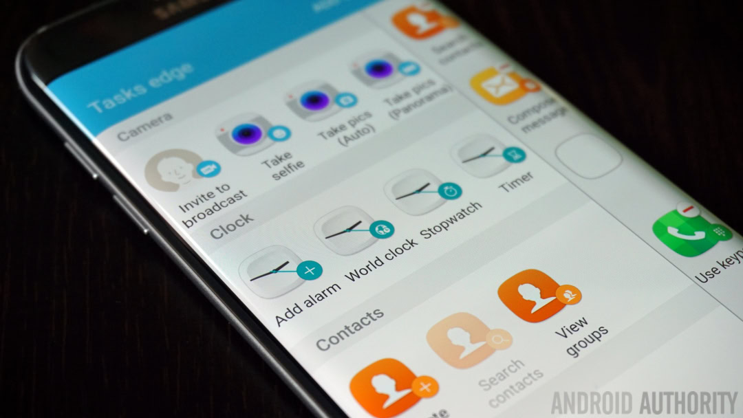
The Galaxy S7 Edge screen features are better than those found on the Galaxy S6 Edge, but they desperately need some help. Fortunately, third-party developers are now able to create edge features of their own, which will absolutely save the day, because even though things are better on the S7, the Edge still kinda sucks.
The main problem is being limited to Samsung apps for Tasks Edge and the pre-loaded tasks Samsung thinks are most useful. Let me assure you Samsung, a shortcut to the timer or “view groups” in Contacts is not what people want on this panel. At least Apps Edge lets you ditch all the Samsung apps and replace them with the ones you actually use, but third-party Edge features can’t come soon enough for me.
[related_videos title=”RELATED VIDEOS:” align=”center” type=”custom” videos=”679964,675002,676415,675814″]
Wrap up
Now, of course there’s plenty of other things I could mention too, like the addition of microSD support (and the possibility for making it adoptable storage in the Galaxy S7 Edge), performance, size, app double-ups, cameras, Always On Display vs Ambient Display and so on, but I really wanted to just focus on the things that struck me the most about the transition.
The Galaxy S7 Edge is easily the best phone Samsung has ever put in my hand. I wrote previously about how the Samsung Galaxy S7 Edge may have made me a Samsung convert and while I may stop just short of saying the conversion is complete, I am happy to say that Samsung has never done a better job of winning me over.
How do you think the Galaxy S7 Edge compares to the Nexus 6P? What are your thoughts on stock Android vs TouchWiz?