Affiliate links on Android Authority may earn us a commission. Learn more.
Samsung Galaxy S7/S7 Edge Feature Focus - Touchwiz
Published onMarch 18, 2016

Samsung‘s TouchWiz has long been met with mixed reception, with some users feeling its added features make it a welcome addition, and others feeling that the UI is too bloated, sluggish, and messy when compared to stock. Of course, there are also a number of folks that are judging TouchWiz based on earlier experiences with it, but just as Android has evolved over the years, so has TouchWiz.
The new version of Samsung’s software skin has changed a lot, especially compared to TouchWiz from years past. Even coming from something as recent as the Samsung Galaxy Note 5, you are going to notice some alterations. So, what is TouchWiz like in the Samsung Galaxy S7 and S7 Edge? Is it good? What has changed, and what is the same?
In this post we will tell you all about the new software, so let’s dig right into the details.
Aesthetics
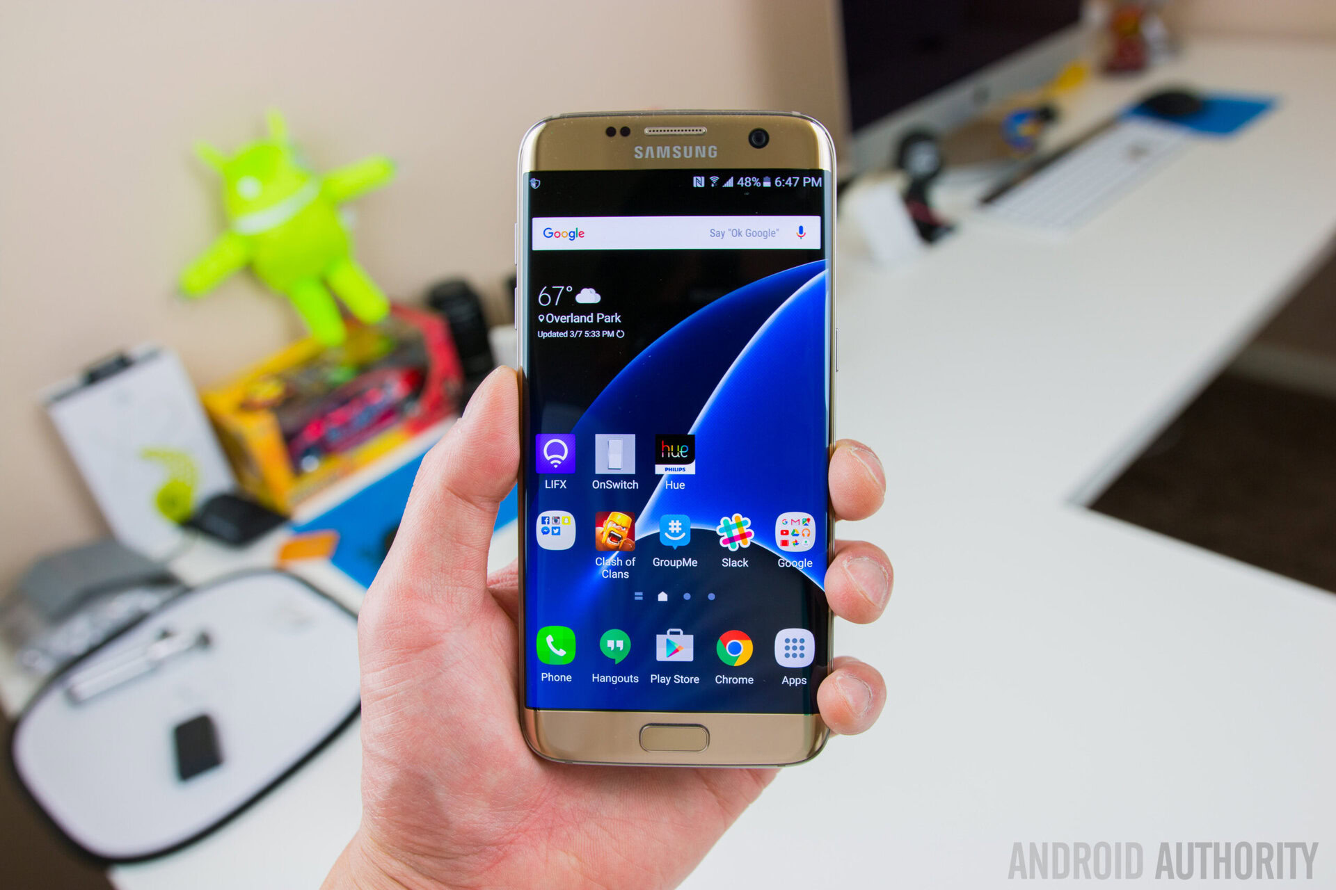
This is definitely the easiest place to start, as it includes some of the differences you will first notice when using a Samsung Galaxy S7. This also happens to be an important point of interest for many of us who feel that TouchWiz wasn’t exactly the most attractive looking UI in its earlier iterations. You are probably itching to know if things have improved or not. The verdict? TouchWiz definitely still needs a bit of work, but this is likely the most eye-pleasing interface Samsung has ever come up with.
The first difference you will notice is that the notification area colors have been changed to white on a subtle blue background. I personally think this looks a lot cleaner than the previous dark blue/green hues Samsung has stuck with for so long. And if you are not 100% satisfied with the changes, the Theme Store is still available, with plenty of options for every kind of user.
This was introduced with the Samsung Galaxy S6, but it is still a nice addition and since its introduction the number of themes available have greatly expanded. There’s all sorts of colors and options, and for those who prefer a more ‘stock’ look, it’s more than possible to make that happen with themes. Its also worth noting that changes to the settings and notifications will stay in place even if you are using a 3rd party launcher for the homescreen, which is important for those who want to change up the looks but prefer using something like Google Now Launcher or Nova.
There’s also been some subtle changes to the animations. One example is the way shortcuts expand as you pull down the notification area. In addition, recent apps now expand from the middle, as opposed to being pulled out of the bottom. Changes like these don’t make a huge difference to the user experience, but they do help the UI feel significantly more polished.
Better organized settings
Many of Samsung’s features have also been put in a single location in the settings, under ‘Advanced Features’, making them much easier to find. Here you will see older capabilities like pop-up view, smart capture, palm swipe to capture, camera quick launch, and one-handed operation. You’ll also find some new additions like Game Tools, which we’ll talk about a bit further down in this post.
Home screens now much easier to organize
I must say one of the new features I like the most is the ability to move multiple apps to a new home screen, simultaneously. All you have to do is drag them to the top of the screen. This will allow you to move 5 applications at once. It’s one example of how the Korean manufacturer is looking into ways to make its UI much more useful and friendly.

Always-on display
We have seen other manufacturers introduce similar features, and now it’s time for Samsung to have its turn at keeping your screen helpful even when it is off. Right now it can show you the clock, calendar or a couple of random, pre-defined images. You can also take a look at notifications, but so far this only works with Samsung apps and it’s nothing more than an icon with no further details than that.
Being honest, Always-on Display in its current form is fairly limited and doesn’t really come close to something like Motorola‘s Moto Display, but it is still handy for quickly glancing your calendar, the time, and so forth. And because it’s not much of a battery hog, the sacrifices for using it are rather insignificant.
Game Launcher
Other features I really enjoyed are Game Launcher and Game Tools. If you are a big mobile gamer, I think you will agree with me. What this does is aggregate any game you download into a single folder. But this is not only an organizational tool. It can help you optimize your gaming experiences to your liking. For example, it’s possible to extend battery life by reducing the resolution and frame rate.
Also, isn’t it annoying to get notifications when you are playing games? Game Tools really comes in handy during these situations. This feature puts a floating bubble on top of your gameplay. When expanded, it displays multiple options; among them is the ability to mute notifications and alerts. One can also minimize the window, record video, lock capacitive keys, take a screenshot and more.

Any bad sides?
I know I have been saying plenty of good things about the new TouchWiz, but it’s not all perfect, and the software definitely has its quirks.
The default icons are very bright and cartoonish. However, that certainly isn’t my biggest gripe. I am quite disappointed with the app drawer. It let’s you organize apps alphabetically, but it only does it with apps currently installed. Download a new application and you will have to re-organize your apps.
Same goes for with uninstalling apps. Get rid of a few and you will be left with a gaping hole in your app drawer. It certainly would have been nice to have an option to keep the app drawer always alphabetically organized, regardless of what you do.
What about the Edge?
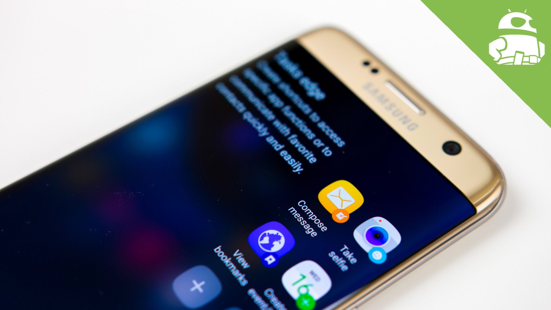
Those of you rocking the Samsung Galaxy S7 Edge obviously have some extra features that take advantage of the curved screen. You will find many of last year’s elements here, including the People Edge and the Apps Edge, but now you get two columns to fit more information in the interface.
It is also now possible to create shortcuts to commonly used tasks and quickly view information (stocks, weather, sports, etc.). I also love that you can organize these panels in any order you want.
Last year, we felt that the Edge features were mostly a gimmick, but this year Samsung has begun to expand the feature set to the point where it could be truly useful. That said, you initially have to force yourself to make use of these additions and train yourself to keep using the, or else you could easily end up forgetting they are there. Once you do get used to them, they can truly become a useful part of your mobile routine, however.

Wrapping up
Overall, I think Samsung has really made a lot of great improvements with the new TouchWiz for the Galaxy S7 and Galaxy S7 Edge. I will tell you this much: it’s no longer something I feel compelled to cover up with a 3rd-party launcher, like I did in previous years. TouchWiz is not perfect, and there are still some issues Samsung needs to look into, but I think the company is finally on the right track.
Hit the comments and let us know if you agree or disagree! We always love listening to what you have to say.