Affiliate links on Android Authority may earn us a commission. Learn more.
(Update: Video added) This is Samsung's Good Lock UI for Android
Published onMay 19, 2016
Update May 19: Video Added!
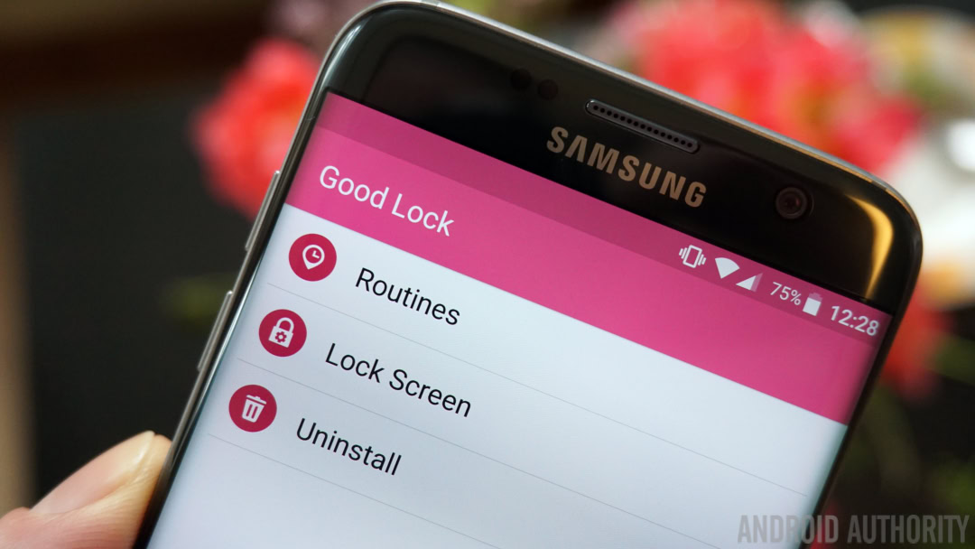
Original Post Mar 30: Samsung has launched a new “advanced” lock screen UI in the Galaxy Apps store called Good Lock. It’s kind of a mix between a lock screen app and theme, but it leaves large parts of the familiar Galaxy S7 and Galaxy S7 Edge UI intact (Note: Good Lock is now available for all Note 5 and S6 variants as well). Your recent apps list, lock screen and notifications shade will be radically different while your home screen and settings menu will remain the same. But I think there’s more to Good Lock than meets the eye.
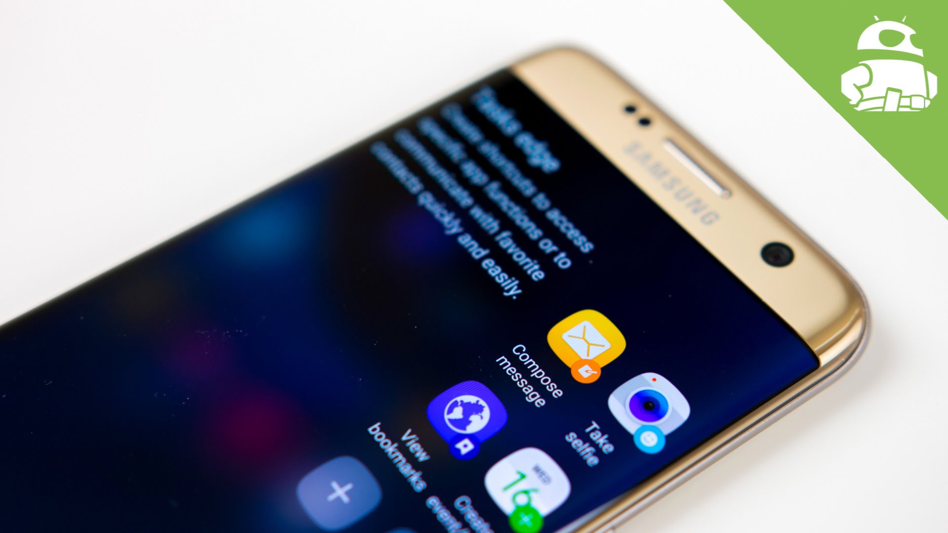
Another major feature of Good Lock is Routines, which are basically customizable profiles for app shortcut, widget and color schemes for different times of day or different locations. There’s a customizable mini app launcher on the lock screen, a new-look recent apps list, a notifications shade that looks a lot like stock Android, stock-looking status bar icons, lock screen widgets and a new notifications section called Keep.
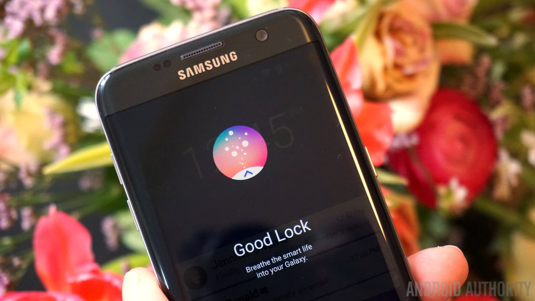
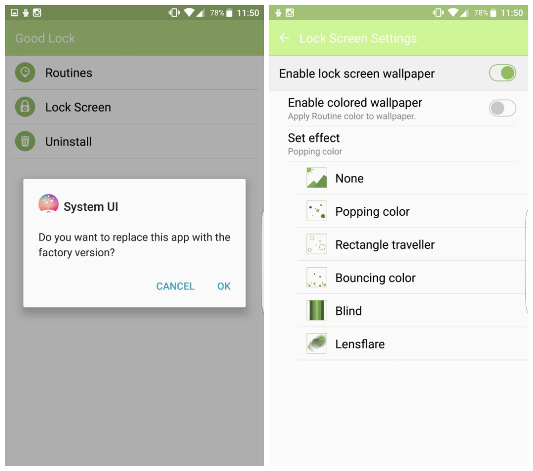
The “app” installs as an update to the System UI so it’s simple to add and to remove again if it’s not for you. It is currently only available in the US Galaxy Apps store, but you can grab the APK at the bottom of the article if you live elsewhere and want to check it out. To uninstall it, just go to the Good Lock settings. But first, let’s take a closer look at the major features of Good Lock.
Lock screen
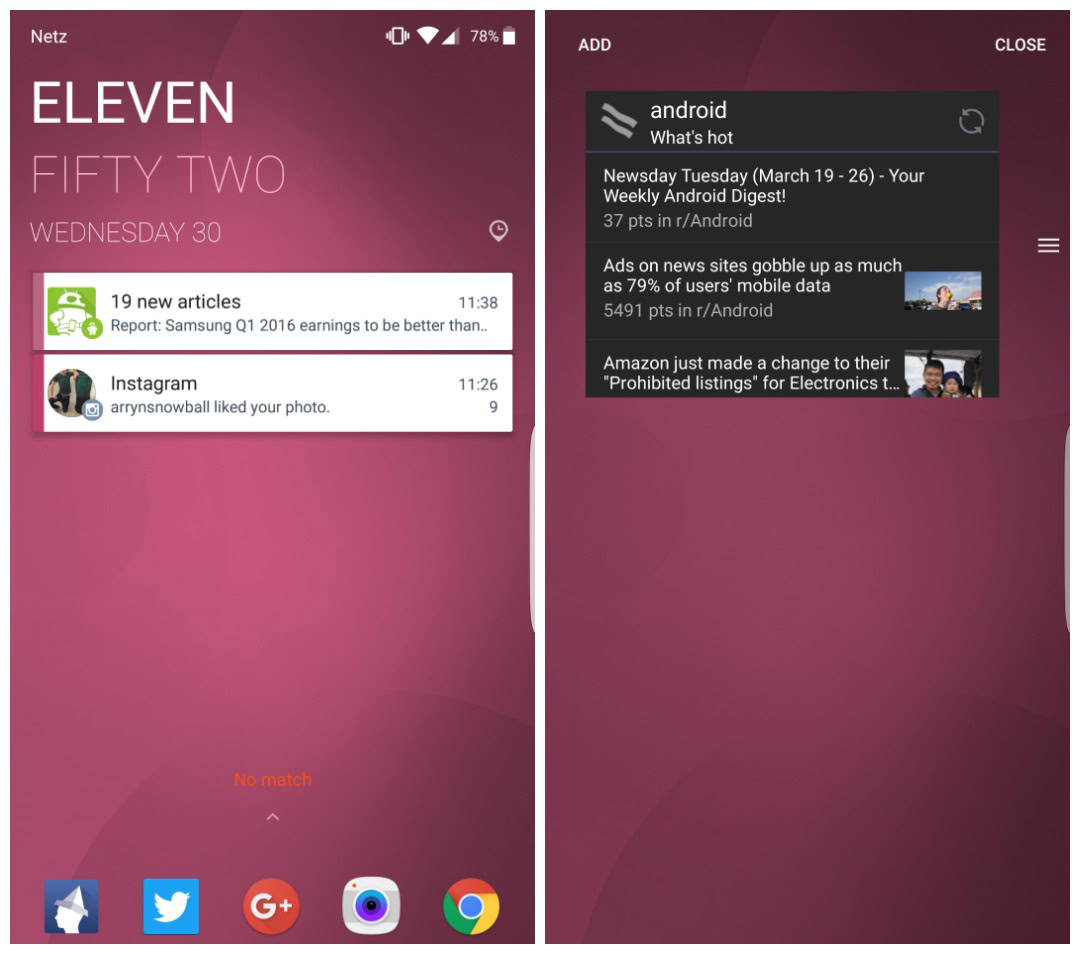
In some ways your lock screen won’t look any different with Good Lock: you’ll still have a clock and the date, expandable notifications and app shortcuts at the bottom. But Good Lock adds a lot more functionality to your lock screen than the standard System UI allows and you can create multiple lock screen configurations via Routines, which we’ll get on to in a moment.
On the lock screen, you can choose the particular style of clock and date, add multiple widgets (accessible by swiping down on the clock itself), notifications can be bundled into folders and you can bring up the full Quick Settings list with a swipe down from the top of the screen. Adaptive color palettes for the wallpaper can also be enabled, based on your Routines.
App tray
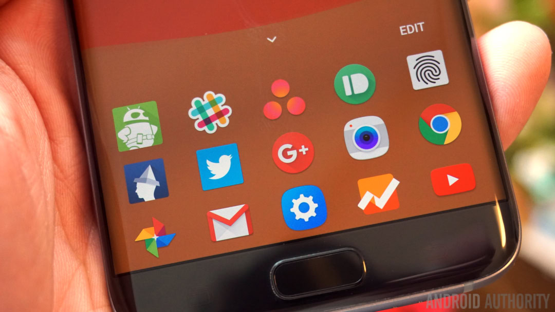
You can also create an app tray for all your favorite apps. Rather than the usual two lock screen app shortcuts, Good Lock allows you to add up to 20. You can add and subtract from the list at any time, right from the lock screen, and a swipe up expands the dock from one row to the full list. You can also select the grid size for the app icons in the lock screen tray, which shrinks the icons to fit.
Strangely though, when you’re looking at the single row of icons in the lock screen dock, tapping them won’t launch them. Tapping icons in the expanded tray does, but from the minimal view you have to swipe an icon up (you’ll see a little gooey bubble animation as you do it) and then the app will launch. You’ll still have to enter a PIN, pattern or fingerprint to access the app.
Notification handling
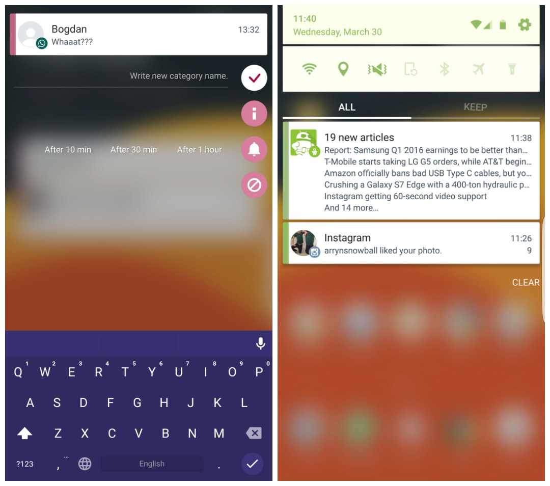
Notifications will not only be bundled in the usual Android way, but also into Good Lock folders. When a notification comes in, you can long press it to open up a notification management screen. You can create a category for the notification (which will then see it grouped into that notification folder), “snooze” the notification, see app info and block all notifications from that app.
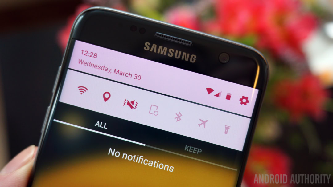
Swiping down on notifications not only expands the contents of the folder or the notification, it also brings up the full notifications shade. You’ll now see the short list of Quick Settings toggles at the top and the addition of tabs to your notifications list: All and Keep. All is the full list you’ve just been looking at, but Keep is a little different.
Keep
Like the “snooze” or reminder function for individual notifications, Keep lets you get back to a notification later by setting it off to the side. It’s where you can put notifications you don’t want gone entirely but that you don’t want taking up space on your lock screen. It’s all about making you more productive without actually having to unlock your phone.
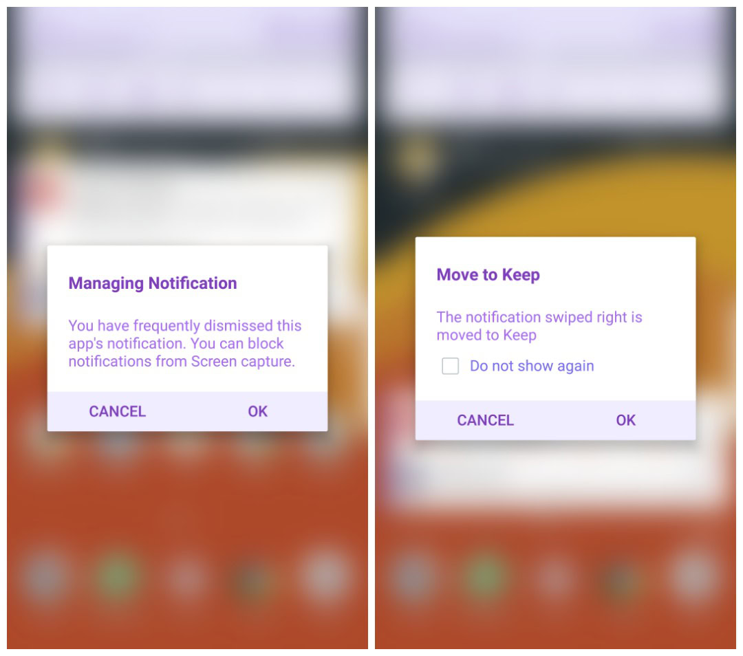
From the lock screen, swiping a notification left or right will dismiss it in the usual way, but when you’re in the tabbed notifications shade view, swiping right will move a notification to Keep instead. A left swipe will dismiss it as per normal. If you regularly dismiss notifications from a particular app, Good Lock will offer to block them for you.
Is Keep any good?
Keep might seem like a waste of time to some, but it does let you filter and deal with your notifications without having to actually unlock your phone. And that is pretty much what Good Lock is all about – giving you more functionality from a locked down phone. Keep is basically a VIP notifications area for when you do unlock it.
If your notifications come in thick and fast throughout the day, you can quickly dismiss most and save others to Keep to deal with when you have time. To remind you of your awaiting Keep items, once you’ve added a notification to the Keep tab but not looked at it, the title of the tab will jiggle slightly so you know you’ve got important notifications to get back to.
Recent apps
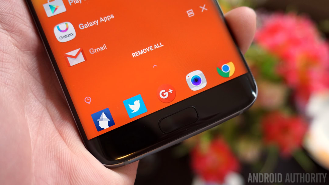
The recent apps list also gets a major makeover with Good Lock. You’ll no longer see card-based snapshots of the apps you used most recently. Instead, you’ll see a simple list with the app icon and name on the left and a split-screen and X icon on the right. If you swipe down the top of the list will be populated with more apps along with a nifty animation.
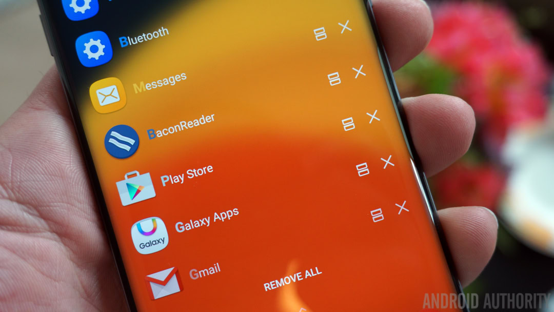
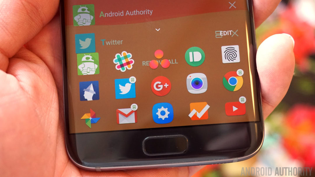
You’ll also see the app tray at the bottom of the recent apps list, just as it appears on the lock screen. One difference you will note is the addition of multi-window buttons on some apps. The difference here is that when you tap the multi-window button in the recent apps list it will bring up split screen mode. But in the app tray long-pressing the button will bring up a mini floating app window instead.
If you just tap the multi-window button in the app tray it simply launches the app as usual. Likewise, long-pressing the button in the recent apps list doesn’t launch a pop-up window. However, you can still get a pop-up window from a full-screen app by dragging down from an upper edge of the screen and access split-screen mode by long-pressing the recent apps button. It’s strangely inconsistent but you do get used to it.
Quick Settings
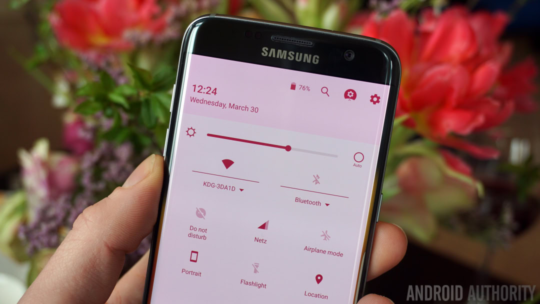
This is perhaps the most peculiar part of Good Lock – the Quick Settings area is almost indistinguishable from stock Android. You’ve got the same toggle layout from Marshmallow with the addition of a brightness slider. There’s also a battery icon at the top that thankfully provides a rapid shortcut to the battery settings and little drop-down arrows under Wi-Fi and Bluetooth that bring up mini menus without leaving the Quick Settings area.
Even the minimal list of Quick Settings toggles at the top of the notifications shade is stock Android-looking, although it more closely resembles the Android N preview than Marshmallow. Unlike other Samsung UI’s though, it is a static list you cannot swipe through for more options. The status bar completes the borrowings from stock Android, replacing Samsung’s status bar icons with those from stock Android.
Routines
Routines are the other major part of Good Lock. There’s a default Routine you need to set up to start with but you can add more later and turn individual Routines on and off with a toggle in the settings menu.
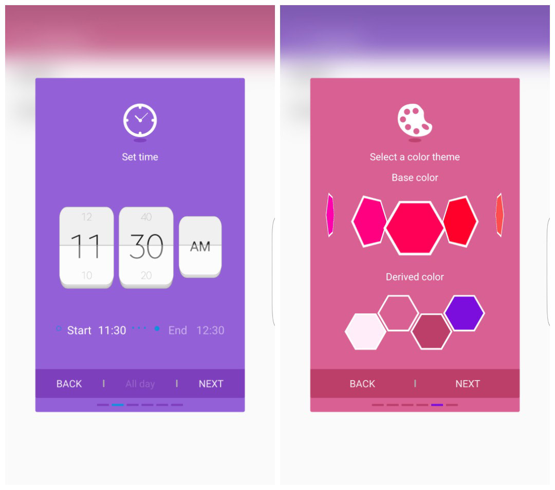
Routines can be tied to locations or time, but the settings currently only allow you to set times of day, not days of the week. So if you wanted to set up a Routine for the Weekend, you’d have to manually turn it on in the settings when the weekend lands and turn it off again on Monday.
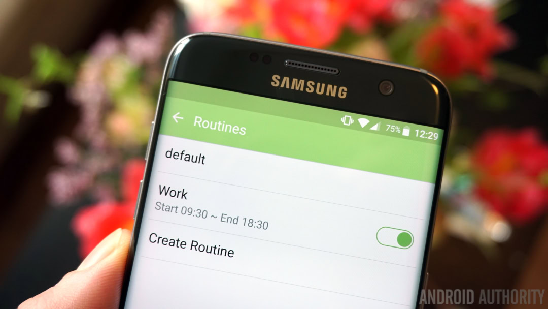
Setting up a Routine is simple enough: give it a name, set a location for it, set a start and end time, choose a clock and date widget for your lock screen, decide whether you want Wi-Fi, Bluetooth, sound and screen rotation enabled, choose a color scheme and finally, set the layout of your lock screen, including choosing widgets and curating that particular Routine’s custom app tray.
Routines work well, but the idea is not terribly different to other adaptive profile and location-aware apps already out there. Custom launchers have had features like this for a while too. Nevertheless, Routines are done well and they kick in at the right times, complete with new color scheme and app tray.
Is Good Lock any good?
One of the strangest things about Good Lock is that in some places it is very well done and polished, while in others it is inconsistent and feels a little unfinished. To give you some examples:
- There’s a nice animation when you swipe down on the recent app list
- In the notifications shade both the settings icons and search icon spin when you long-press them (but there’s no System UI Tuner I could find)
- When Routines are toggled there’s a colorful transition through the colors of the rainbow in the app bar and status bar
- The Keep tab jiggles in the notification shade to remind you you’ve added something to it
- There’s quick access to battery stats from the Quick Settings
These are the nice parts of Good Lock, the parts where it feels like a finished product. But for every one of these there’s another part that seems oddly unfinished or inconsistent:
- Scrollable widgets don’t work on the lock screen
- Inconsistency with the multi-window button in recent apps and the app tray
- Swiping right on the lock screen dismisses a notification, but in the notifications shade (or expanded view of the lock screen) it moves it to Keep
- There’s one fewer Quick Settings toggles in the lock screen version compared to the unlocked version
- Only one of the Quick Settings toggles can be hidden
Furthermore, not all changes made in the main settings menu are reflected in Good Lock while others are. For example, if you go to your main lock screen settings you can change your lock screen app shortcuts. However, you won’t see those apps because the Good Lock app shortcuts override them via the Good Lock settings. However, if you block a notification from Good Lock it will also be blocked in the main notifications settings. This is unnecessarily confusing.
Wrap up
Considering these kinds of imperfections, inconsistencies and duplications, it’s difficult to say whether Good Lock is a random unfinished UI experiment that for whatever reason found new life as a Galaxy App, or that Good Lock is actually a prototype Samsung UI in testing. It doesn’t appear in Galaxy Labs yet, but it might in future.
Either way it is a fun, refreshing and interesting twist on Samsung’s interface; one that takes a little getting used to, to be sure, but one that definitely has potential. It offers an alternate vision of what TouchWiz – or whatever comes after TouchWiz – could be. Some will find it unnecessarily confusing while others will greatly appreciate Good Lock’s mission of making a locked phone as functional as it has ever been.
One other possible interpretation, one that is as exciting as it is unlikely, is that Samsung is toying with ways of taking more of the tedious work out of major Android firmware updates and putting them in easily updatable apps instead, kind of like what HTCdoes with Zoe and Sense.
Of course, Samsung has way too many baked-in software additions to simply add a System UI update over stock Android, but the “thinner” the work on Samsung’s firmware the quicker that important Android updates can be rolled out, with smaller visual stuff and extra features coming via updates to Good Lock instead. While it may never pan out this way, it’s definitely something to think about.
What do you think of Good Lock? An intriguing possible future for Galaxy devices or a big old mess?