Affiliate links on Android Authority may earn us a commission. Learn more.
Samsung Galaxy S8 nav bar update adds new 'full screen' button

Samsung has been rolling out Galaxy S8 and S8 Plus updates recently with Bixby improvements and fixes for SD card related issues. The South Korean manufacturer has also just started to roll out the June security patches in Europe and India, and with these comes an update to the navigation bar settings that might not please everyone.
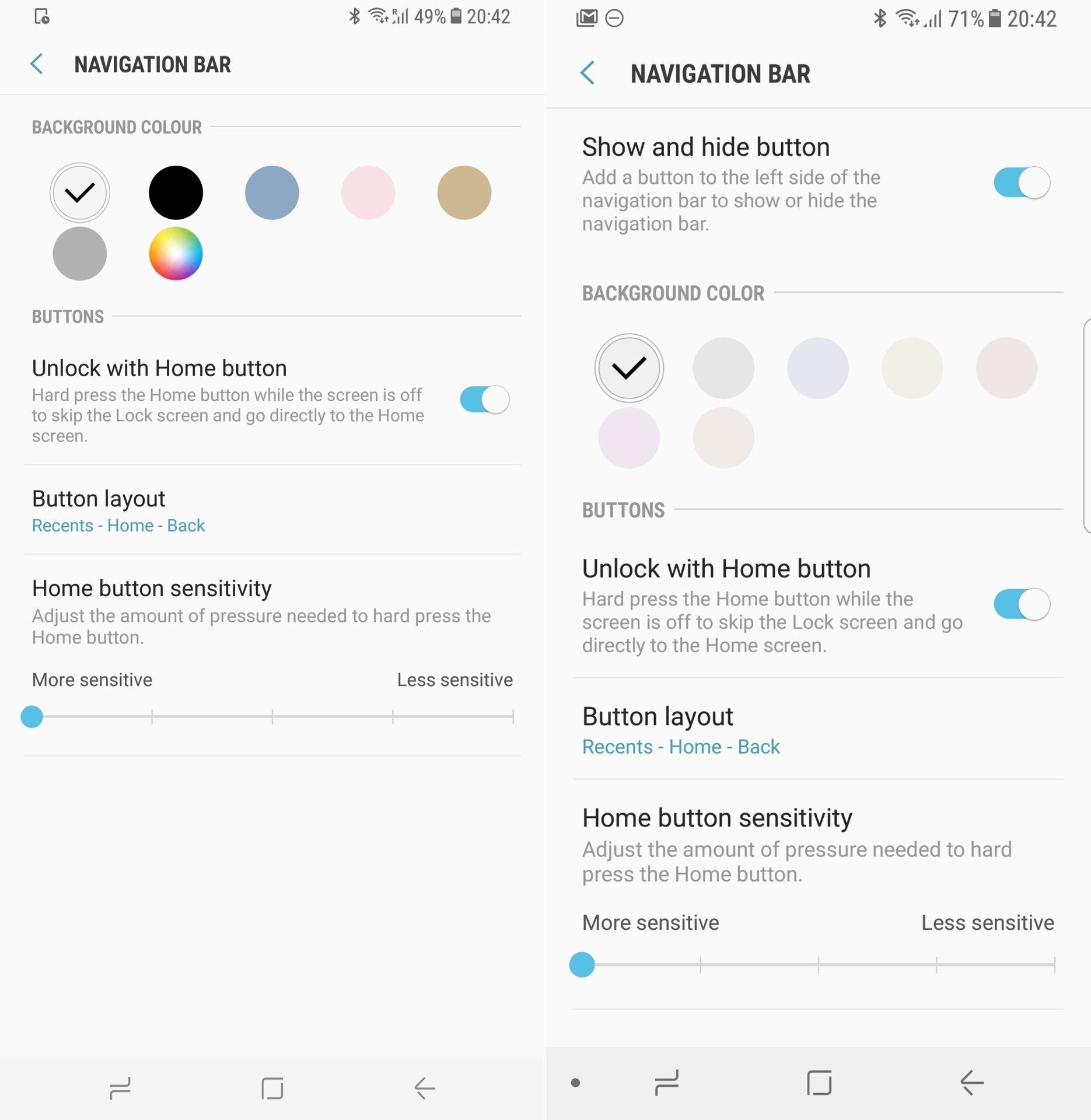
According to SamMobile, the update removes the RGB scale for the navigation bar color, and replaces it with light color shades only. This not only restricts the breadth of color options available, but also means you can no longer select a pure black navigation bar (though there are reports that you can work around this by using a black theme).
The black navigation bar background is the default on most Android handsets, so it’s often the go-to choice for those who don’t want the nav bar to stand out. It’s not clear why Samsung has changed the options for this, but it’s possibly connected to burn-in fears.

OLED screens don’t use powered pixels to create the black color on a display; instead, black pixels are simply pixels that are switched off. This means that activated pixels — that is, the non-black pixels on a display — degrade at a faster rate.
In extreme cases, this can lead to certain parts of the screen becoming lighter than the rest of the display — what we typically refer to as burn-in. Samsung’s new change may be intended to avoid this issue on its phones, something we’ve already seen with the constantly-shifting home button. (You can read more about the Galaxy S8 and screen burn-in here.)
Weight is also given to this notion by another part of the update: Samsung now provides users with an option to hide the nav bar completely. This is thanks to a new setting in the nav bar menu, and it means you no longer have to use this workaround to achieve the same thing.
This update should be rolling out in the US within the coming weeks; what are your thoughts on the changes? Let us know in the comments.