Affiliate links on Android Authority may earn us a commission. Learn more.
Why the Galaxy S8 finger scanner location is ...
February 7, 2017

We’ve just had another look at the design of Samsung’s upcoming Galaxy S8 flagship and it echoes previous leaks regarding the placement of the fingerprint scanner. The leaked design suggests that Samsung will be removing its home button completely and moving the fingerprint scanner to the back of the phone. In addition, Samsung will place this on the right hand side of the camera module, moving the flash over to the left side.
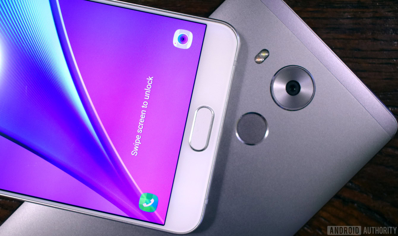
Moving the fingerprint scanner to the back is no bad thing in and of itself, even though it may throw a few consumers who are used to Samsung’s front-mounted scanner design. I personally find the rear placement adopted by LG, HUAWEI, ZTE, and others to be eminently practical and highly ergonomic, but your mileage may vary.
But Samsung seemingly has something a little different in mind with it’s top left position, and it’s hard to imagine it working out quite as well as other existing designs which typically locate the scanner below the camera.
Just plain impractical
The most glaring issue is that the scanner is so close to the camera module. The design on the back will surely see a lot of us blindly reaching for the unusual module position, smudging the camera lens and flash module as we go. Keeping our phone lenses clean is probably not something we do often enough anyway and this will just make things worse, sacrificing our picture quality to a layer of finger grease.
Given that the Galaxy S8 and particularly the S8 Plus aren’t going to be small phones, placing the scanner so high up on the back also may be a problem for some with smaller hands, who usually don’t have any reason to position their fingers so high up a handset.
The nice thing about Samsung’s old home button was that it was always within reach, as it was never much further away than the on-screen keyboard. Scanners on the back are usually ok if they’re placed in the lower two thirds of the body, but right at the top on the back might be a bit awkward for some.
Furthermore, the rectangular module also looks to be a bit smaller than Samsung’s old home button and the circular rear scanners used by other manufacturers. Anyone who regularly uses their phone’s fingerprint scanner will attest to how finickety these modules can be to partial prints.
Unless Samsung’s fingerprint technology has improved in leaps and bounds, some users my find themselves having to learn how to carefully position their finger or just spend longer setting up the scanner to work with partial prints than they have previously. Either way, it’s not exactly intuitive.
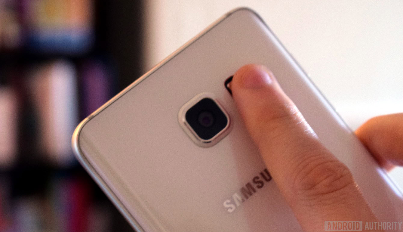
All of that being said, let’s try a little experiment. If you have a large smartphone at hand, pick it up with your right hand and see where your index finger naturally rests. I was a bit surprised to find that mine actually sits somewhere just below the proposed scanner placement when testing this out with the Note 5, meaning that it’s a simple quick movement to reach for where the scanner would be. It’s actually probably even easier to reach for than the center placement on the G5 and others, so perhaps I’m wrong about all this?
OK, now swap over to holding your phone in the left hand and you’ll see the glaring flaw in Samsung’s design. Suddenly a fingerprint scanner on the right side of the camera module is horrible to try and reach for. You’ll drag your finger across the flash and camera module and contort it into a very uncomfortable position.
This Galaxy S8 design looks to be really unfriendly to anyone who predominantly holds their phone in their left hand, which includes myself. This design has its merits, but on the whole just seems a little too cumbersome compared with current implementations. Whether you’re a leftie or simply hold your phone in your left hand to swipe type with your right, the placement is all wrong.
Maybe better than it seems?
It’s hard to see a major upside with the Galaxy S8’s new fingerprint scanner location, but perhaps it has been positioned there as a compromise rather than Samsung’s ideal position?
We obviously haven’t had a look at the phone’s internals yet, but we do know that removing the home button is allowing Samsung to shrink down the bezels and increase the-display to-body ratio of the Galaxy S8. This new rumored 18.5:9 aspect ratio also has to come at the expense of some of the company’s long running design traditions, as does the new single piece glass body. The fingerprint scanner seems like a logical piece to move elsewhere.
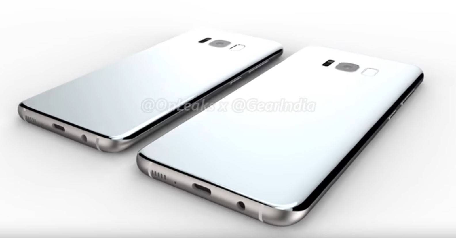
On top of that, there are plenty of electronic parts and circuit board space taken up by fingerprint scanning modules, and placing this at the bottom of the phone where the USB port and 3.5mm jack also reside would have certainly increased the handset’s length. Perhaps, moving this part is what’s allowed Samsung to keep the 3.5mm audio jack while still shrinking down the handset’s bezels.
This doesn’t exactly explain the placement right by the camera module, but it’s quite possible that Samsung has found that this allows for the most efficient mainboard layout. In addition, we’re all aware of the battery issue that plagued the Galaxy Note 7. Samsung may have chosen to position the fingerprint module higher up the phone in order to maximise the amount of space available to store the battery so as not to repeat the pressure problems that led to those infamous defects.
Samsung’s reasoning is unknown at this point, but there are plenty of plausible explanation as to why the fingerprint scanner may be positioned as it is. It may turn out that this was an important decision in order to build the sort of handset that the company wanted. Or it could just be to avoid looking like all the other rear-mounted scanners out there.
Wrap up
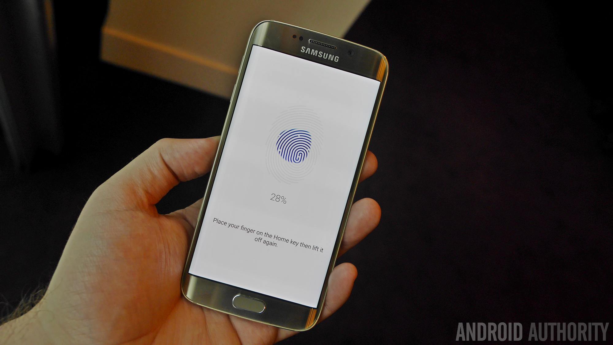
For some, the Galaxy S8 fingerprint scanner placement is going to be a bit of a disappointment and perhaps even an inconvenience. For others, it may turn out to be a highly ergonomical design that’s preferable to the old home button and even the rear placement found on other phones.
From a purely hardware standpoint, it’s also a little disappointing not to see Samsung making use of cutting edge technologies, such as under display implementations that could have removed the need for a dedicated fingerprint touch module entirely by embedding hardware in the display. Especially if reducing bezels is the primary design goal here. Regardless, we’ll have to wait to go hands on with the flagship before drawing any final conclusions. Not forgetting that the fingerprint scanner might just end up playing second fiddle to more convenient iris scanning capabilities anyway.
Where do you stand on what we know about the Samsung Galaxy S8 design? Are you a fan or a skeptic?