Affiliate links on Android Authority may earn us a commission. Learn more.
Sorry, Samsung, I still don't want to use Good Lock
In 2023, Samsung completely changed its Galaxy Z Flip series when it expanded the cover screen and turned it into the Flex Window. It made notifications easier to interact with, widgets more useful, and even brought fully-fledged app support to the front of the Galaxy Z Flip 5 — well, at least for a small handful of apps. For everything else, you had to install Good Lock and jump through a series of hoops to create a second app drawer.
I complained about the strange setup at the time but figured it was a one-year hiccup that Samsung would fix once it had more time to fine-tune its Flex Window experience. Boy, was I wrong, so here we go again. Sorry, Samsung, I still don’t want to use Good Lock on the Galaxy Z Flip 6 — at least not for this.
Steep, steep learning curve

Honestly, my problem with apps on Samsung’s Flex Window isn’t one of optimization. It’s one of access. I don’t mind that Samsung hasn’t gone and made a bunch of apps work perfectly on its oddly shaped cover screen, as it only has control over its first-party options — none of which I use. However, splitting its app drawer into two pieces and hiding them in two separate places makes for a learning curve that’s just a bit too steep.
On one hand, you have apps that Samsung officially supports on the Flex Window — so few that you could probably count them on one hand. The toggle to access those is hidden in the Labs section of the Settings app, which is completely separate from the Flex Window settings. When I got there, I was greeted with an app drawer that held Messages, YouTube, and Google Maps, and that’s it. Not exactly a well-stocked drawer.
Why have one app drawer on the Flex Window when you can have two?
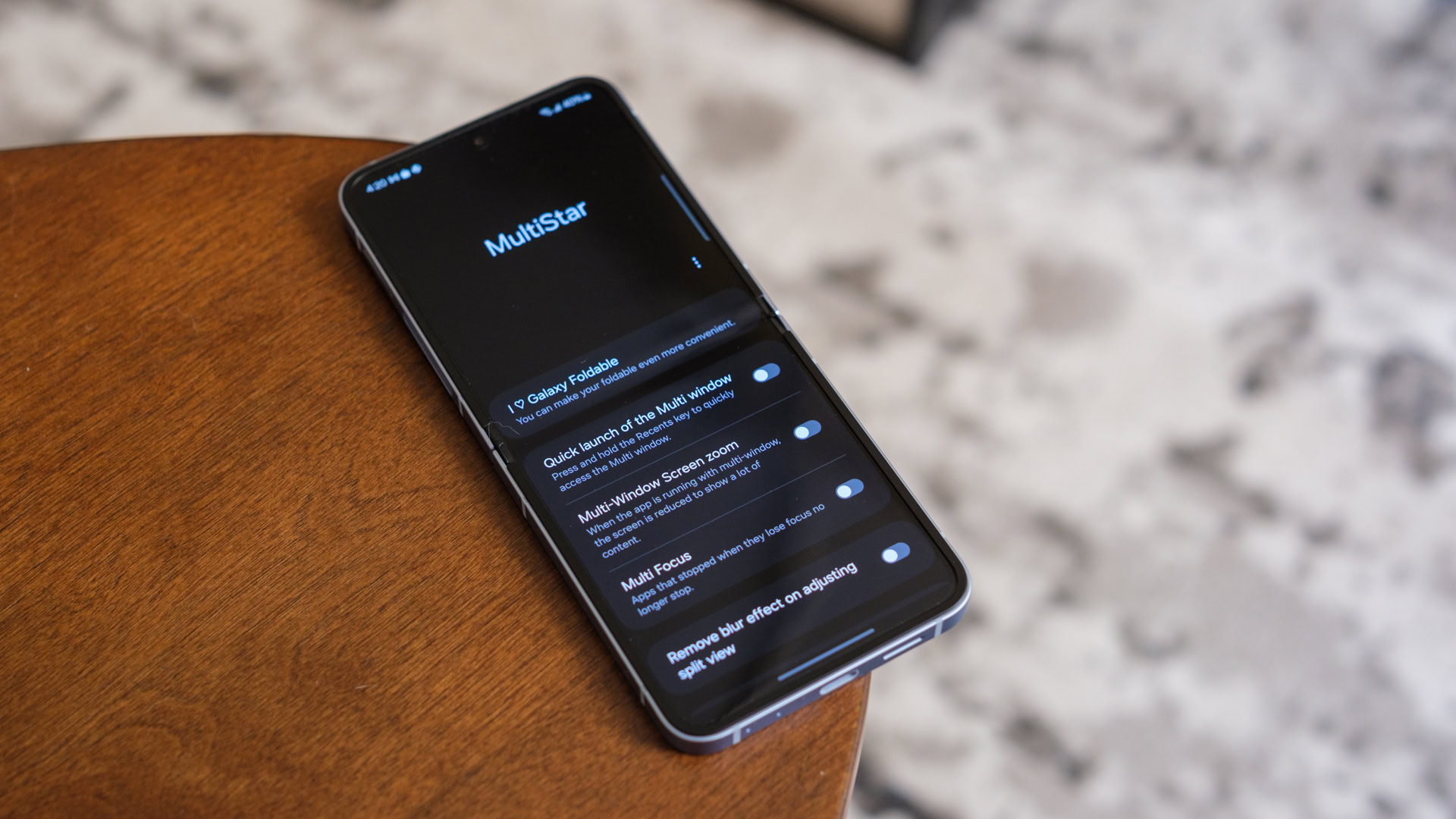
For everything else, you still need Good Lock — or at least one small part of it. I remembered that much from my time with the Galaxy Z Flip 5, but I couldn’t remember which one of the many Good Lock components actually opened up access to the app drawer (it’s called MultiStar, by the way). Nothing within Good Lock jumps out and screams, “Add me to your Galaxy Z Flip; I have apps!” Instead, I had to go back and reference my guide on accessing any app on the Flex Window — I literally wrote the guide and couldn’t remember how to do it.
If Samsung streamlined the process and let us know in the Labs menu that its app support isn’t perfect and that quirky layouts sometimes occur, that would be fine. I don’t think anyone minds that apps designed for tall, thin displays don’t work quite right on short, wide ones, but I’ve never met anyone who wished they had two app drawers instead of one.
Good Lock has its place, just not here

Don’t get me wrong; there are plenty of other reasons to use Good Lock on a Samsung Galaxy device. The app is split into two tabs, Make Up and Life Up, which let you customize the look and accessibility of your phone, respectively. They combine for around 20 different wrinkles that probably make the Galaxy S24 series, Galaxy Z Fold 6, and even some budget Samsung phones better — it’s just an odd place for Samsung to hide something important to its Galaxy Z Flip 6.
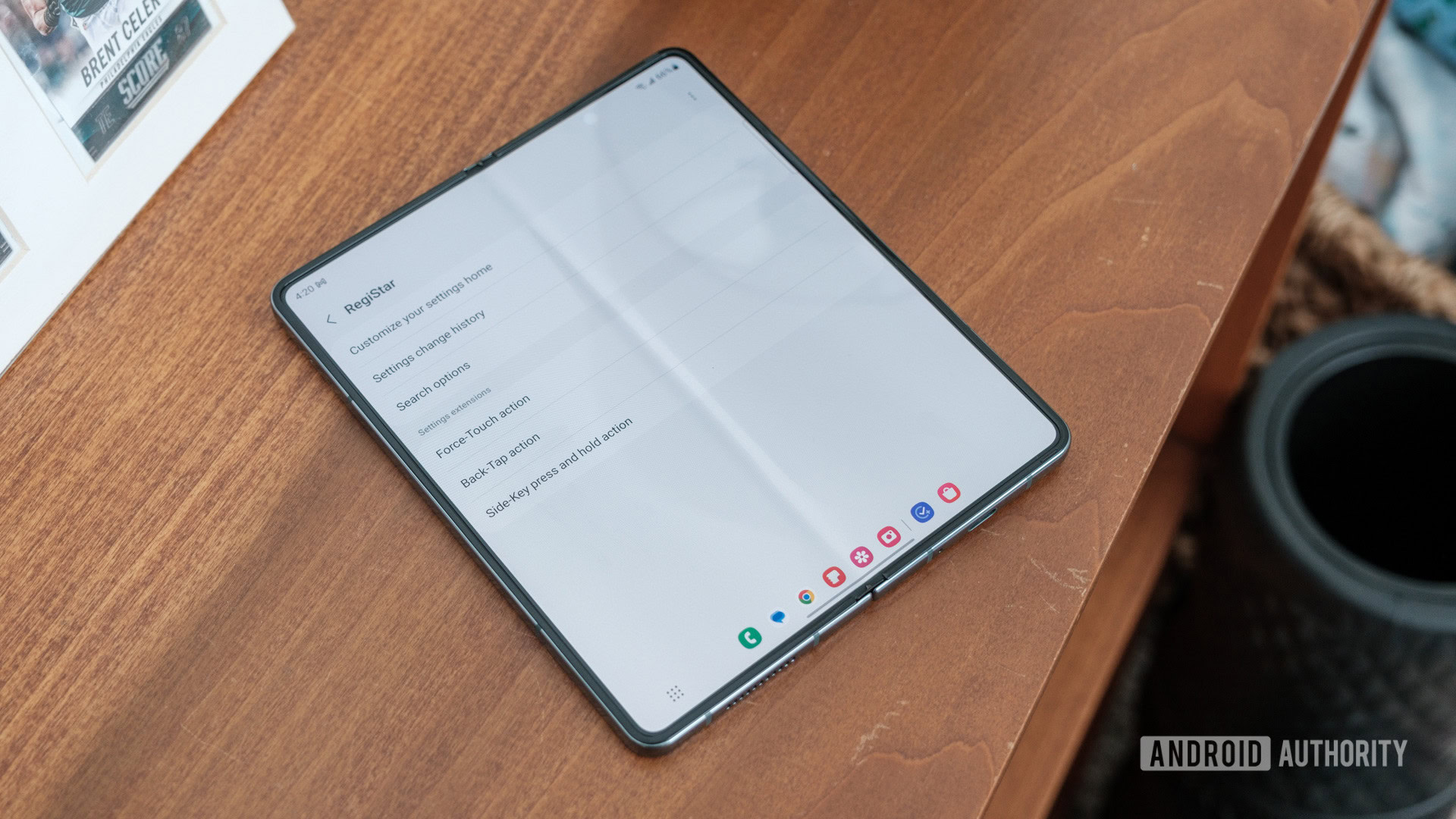
In fact, I’ve used both Theme Park and LockStar from the Make Up section to make my recent Samsung devices feel a little bit less generic. Good Lock even has an option called Edge Lighting Plus, which lets you make notifications more interesting — even if Samsung has essentially given up on curved displays. This isn’t even touching on the fact that the Life Up section adds options for more complicated routines, richer control over your phone’s sound, or the ability to make your phone easier to use with one hand.
Good Lock is great, but it's too out of the way for something so core to the Flip experience.
Sure, you could argue that any of these Good Lock features I’ve mentioned deserves to be part of Samsung’s standard settings menu. I probably would agree — like I said, I use some of them myself. I’m just saying that, to me, access to apps on the Flex Window shouldn’t involve a trip to the Galaxy Store (or, long overdue, the Play Store).
Please, Samsung, follow Motorola’s lead

And, I know, if Samsung’s quirky setup were the only game in town, I wouldn’t have as much room to complain. Good Lock would still be an extra hoop to jump through, but what other option would I have? The problem is, it’s not the only option — there’s another flip phone on the market that handles its cover screen exactly as I think Samsung should, and it’s called the Motorola Razr Plus.
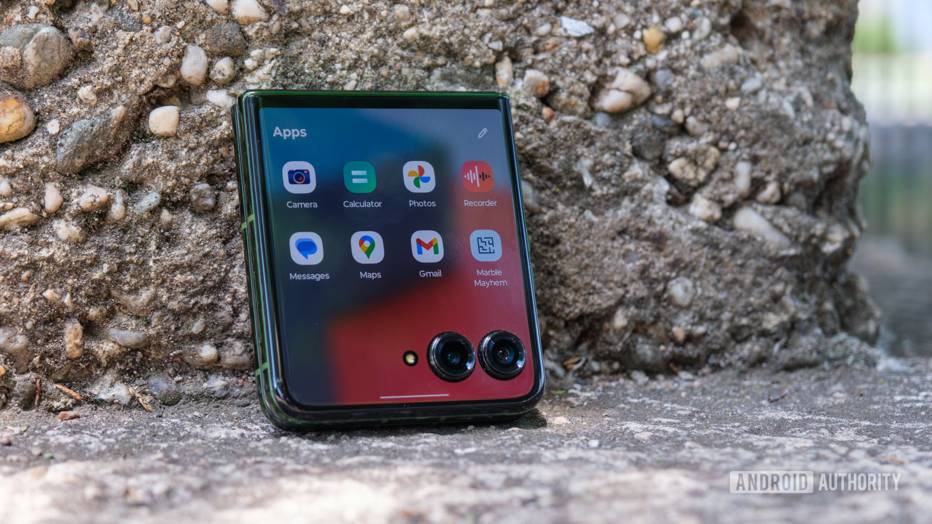
Motorola puts all its cover screen settings in one easy-to-access place, putting your panels, preferred music player, and even creator-specific tools on one screen. Right in the middle of that extensive menu of settings is an important button labeled App Settings. It does exactly what you think it should — give you access to which apps you want to see on your cover screen app drawer and which ones you’d rather save for the internal display. There’s no experimental features menu to dig through, nor is there an extra app to download, just a quick set of toggles for every app already on your phone.
Motorola got it right, and it's time for Samsung to copy.
If Samsung wants to make its Flex Window easier and, by extension, more enjoyable to use, it should follow Motorola’s lead. The Razr Plus’ cover screen is just as quirky — apps have to find their way around a pair of camera cutouts rather than fit within an oddly shaped panel — yet Motorola is willing to give them free rein of the space. The Batwing brand even programmed a toggle to force apps above the cameras should you need to access the buttons they’d normally block. It’s not a perfect solution, yet it easily beats Samsung’s inflexibility.
Unfortunately, I get the sinking feeling that Samsung will stick to its guns, at least for a bit longer. It’s already been slow to make significant changes to its foldable phones over the years because most people still haven’t used one, so I’d be surprised to see it take the initiative to fix something that isn’t technically broken — or until Apple finally jumps into the space. Until it does, though, I’ll reach for the Motorola Razr Plus at any chance.

Excellent build quality
Class-leading update commitment

Expanded cover displays
Smooth, ad-free software