Affiliate links on Android Authority may earn us a commission. Learn more.
The Samsung Galaxy Z Fold 4 is great, but it's Android 12L I really love
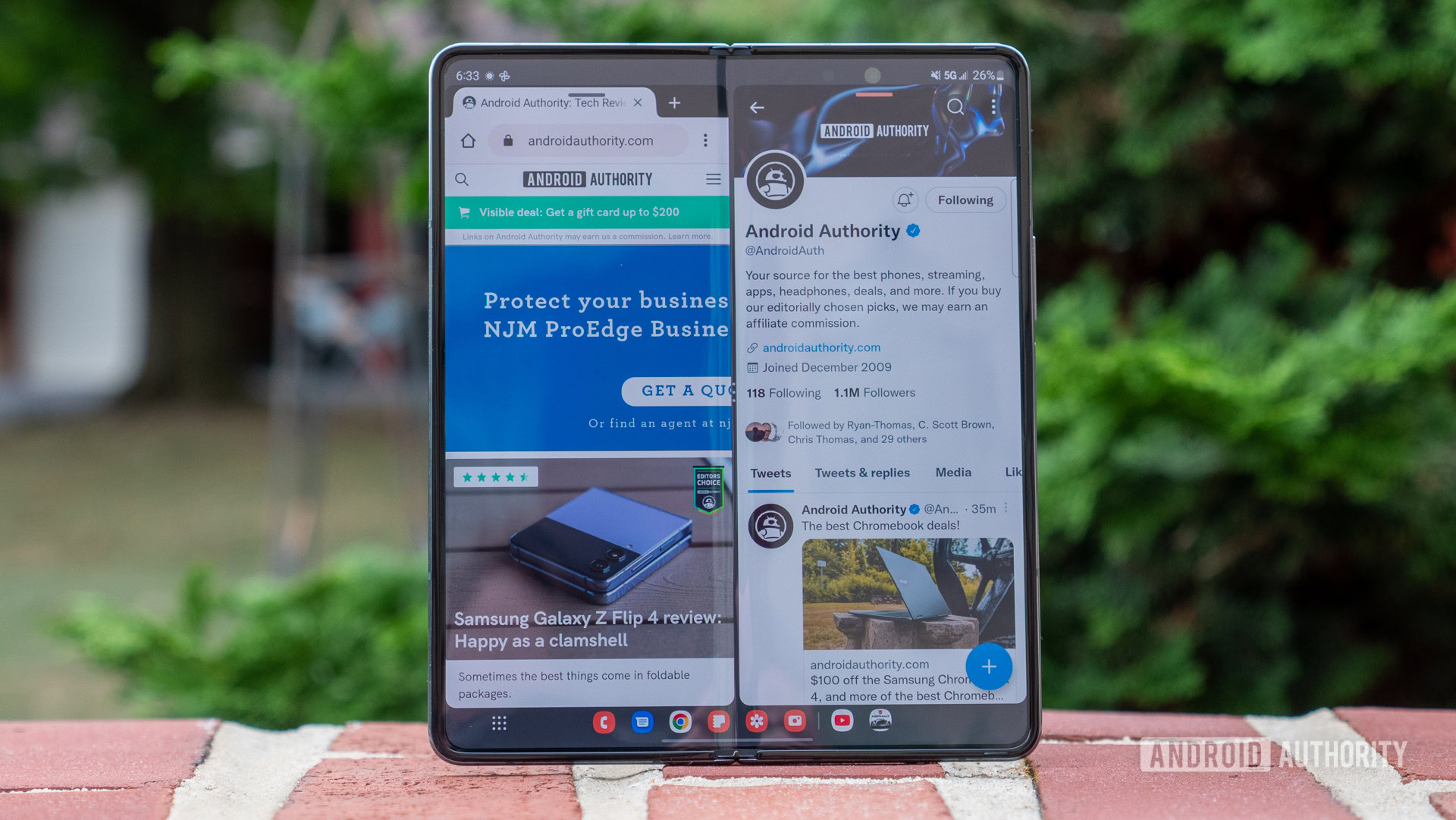
The Samsung Galaxy Z Fold 4 isn’t really a phone. It’s not a tablet, either. It has a big tablet-like display and phone-grade cameras, but it doesn’t fully commit to either side. As such, it needed a software experience that walks the line between phones and tablets without falling one way or the other. That’s where Android 12L comes in. It’s the shot in the arm that Samsung’s book-style foldable needed, and it sets a new bar for curated software.
See also: Samsung Galaxy Z Fold 4 review
Treasure the taskbar
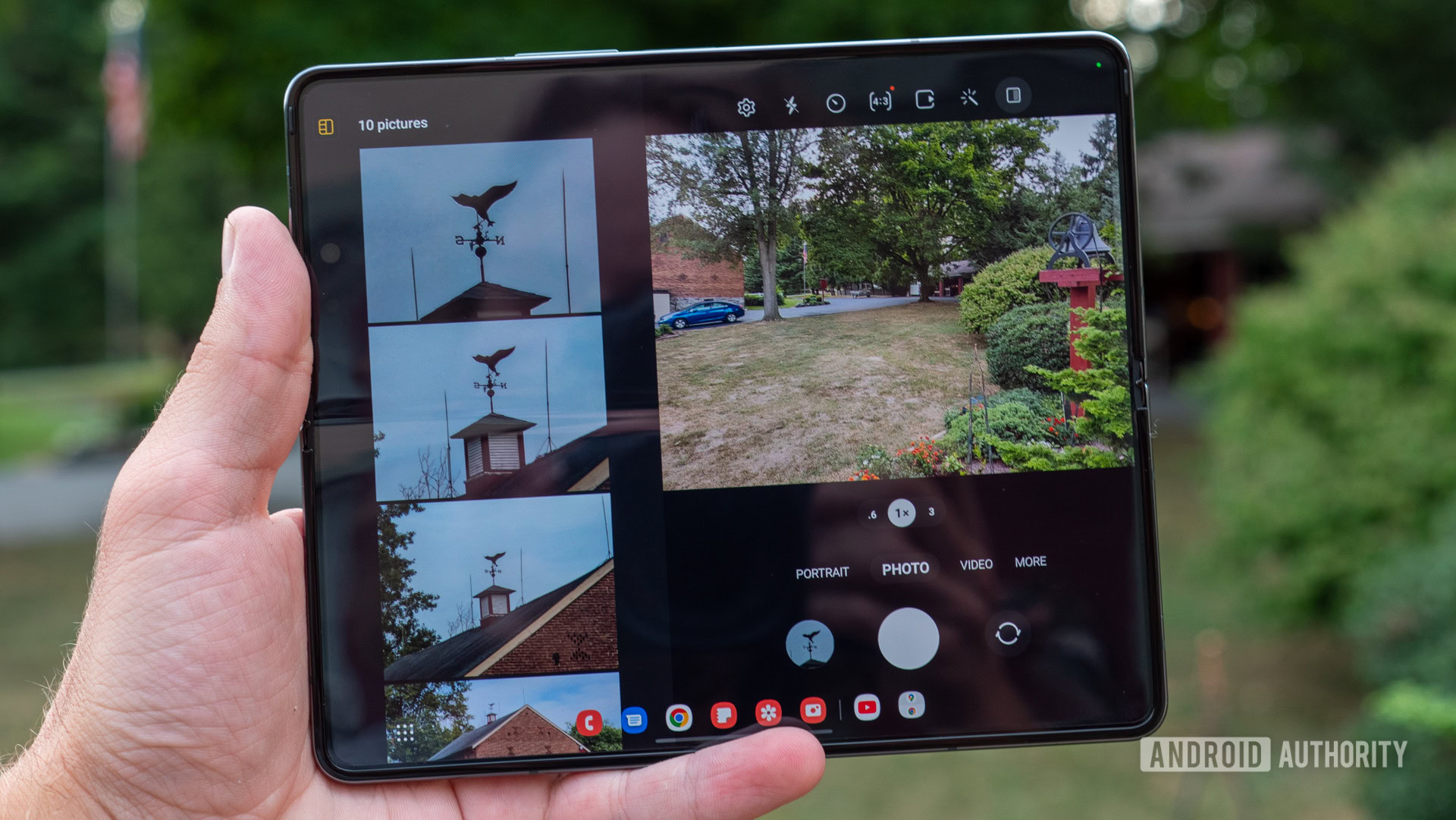
Android 12L on the Galaxy Z Fold 4 lives and dies by the taskbar on the bottom edge. Alright, maybe it’s not that dramatic, but it goes a long way in making the 7.6-inch display more manageable. It fills a role similar to the taskbar found on a Mac or PC, saving you from thumb yoga rather than giving your mouse pointer a break.
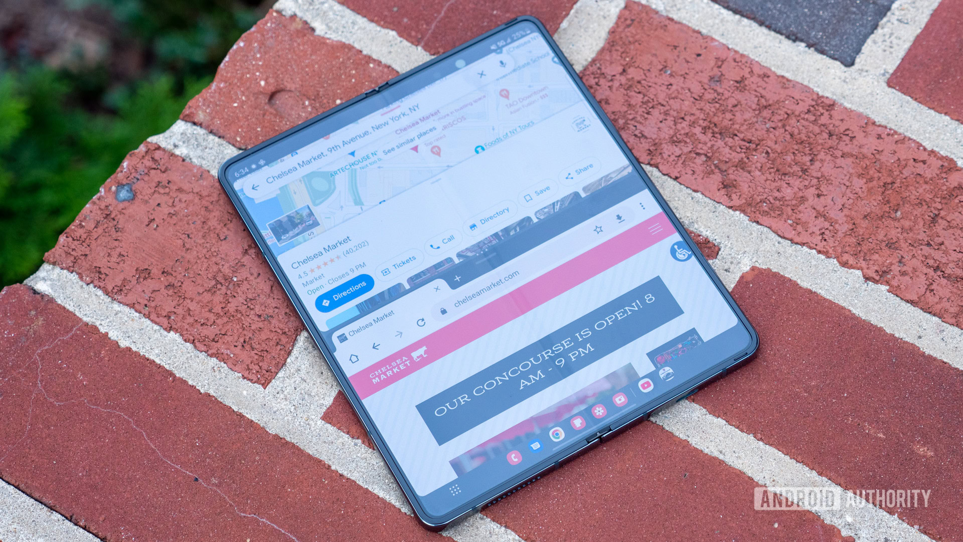
Not only is the taskbar easy to reach, but it practically begs you to multitask. It stacks a few must-have apps for everyday use next to some of your personal favorites, making it easy to jump from one focus to the next. Once you get into the weeds of multitasking, you’ll also start to see some of your go-to combinations pop up to the far right of the taskbar. One of mine is a combination of Chrome and Google Maps — a perfect mix for navigating to a restaurant and reading a menu simultaneously.
The Android 12L taskbar puts more at your fingertips and offers a break from painful thumb yoga.
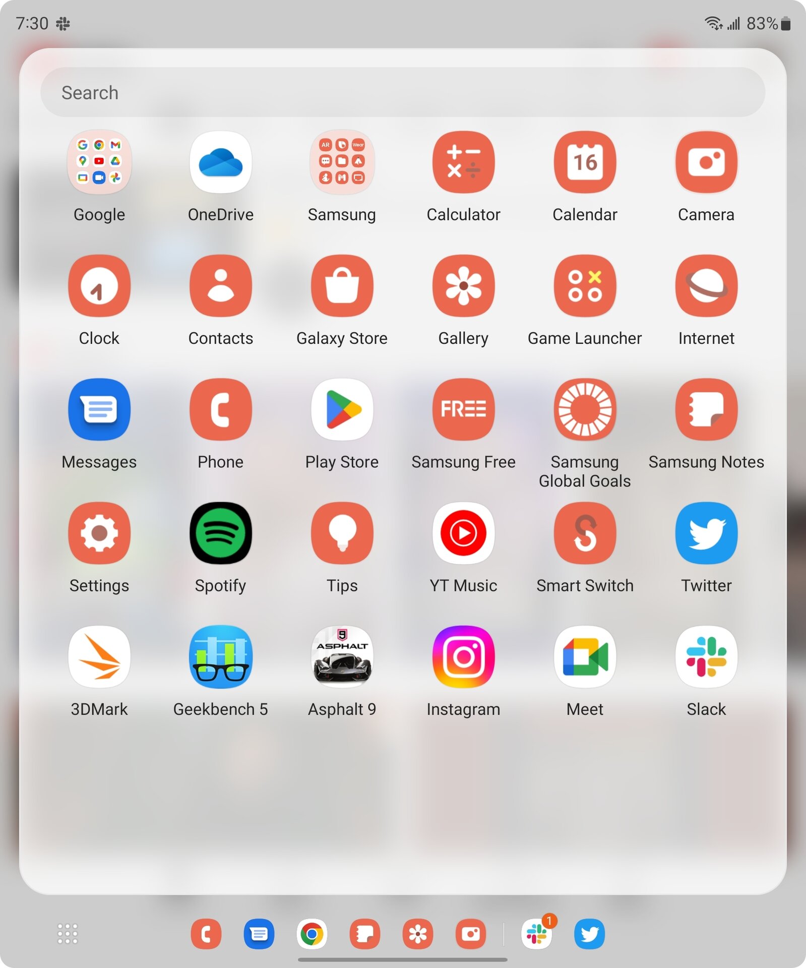
If you can’t find just what you need, the rest of your apps are a tap of your left thumb away. It took me a minute to realize that the icon with nine dots was a shortcut to the app drawer, but now I hardly use anything else. The in-app app drawer is slightly condensed from the full-screen version and doesn’t require a trip back to the home screen to get there. And yes, it’s just as easy to open a second app and multitask from there.
Perhaps the most ingenious part about the Android 12L taskbar is knowing when to hold ’em and when to fold ’em (pun intended). It disappears when you have the main display closed and any time you dip into a full-screen video or a game like Asphalt 9. Even when you can’t see it, the taskbar is just a swipe up away — just don’t start from the very bottom of the display, or you’ll bounce back to your home screen.
Learn more: Here are the best foldable phones you can get right now
Layouts, layouts, layouts
Running two apps at once is nothing new — at least on Android. However, it’s rarely as intuitive as it is on the Galaxy Z Fold 4. Splitting the massive display into two or three clean blocks is miles ahead of dividing Samsung’s next-largest display, the Galaxy S22 Ultra, in half.
When multitasking in Android 12L, you also have full control over whether your apps are split vertically or horizontally. I prefer to have the windows on top of each other, as it’s easier to scroll both simultaneously, but the choice is entirely yours.
Two apps, three apps, vertical, horizontal, the layouts have (almost) no limits.
Samsung’s first-party apps also benefit from a healthy dose of layout love. The camera app, for example, looks almost comical when given the entire display for its viewfinder. However, it offers optional tweaks like Gallery Mode and Cover Screen Preview to optimize for the folding form factor. Gallery Mode opens a panel on the left half of the inner display to show off the last few photos and videos you captured, while the Cover Screen Preview does exactly what it says on the outer display.
The native dialer app also gets in on the fun, taking on a sort of phonebook layout. Its Contacts tab displays your entire list of contacts to the left of the crease and opens in-depth information to the right side each time you tap on a name. The Recents tab follows a similar structure, though the Keypad is just a giant keypad. YouTube is one of the few third-party apps to support a completely customized layout, but it’s still a work in progress, as I’ll explain below.
Not every Samsung app follows the highly customizable Android 12L trend, and a few skip multi-window support altogether. Samsung Wallet, for example, is all or nothing when it comes to accessing your screen. That’s probably fine if you’re just using the app to make a mobile payment, but it’s not as convenient if you want to keep an eye on your finances while online shopping.
Read more: With Android 12L, Google should be leading by example
A few creases left to smooth
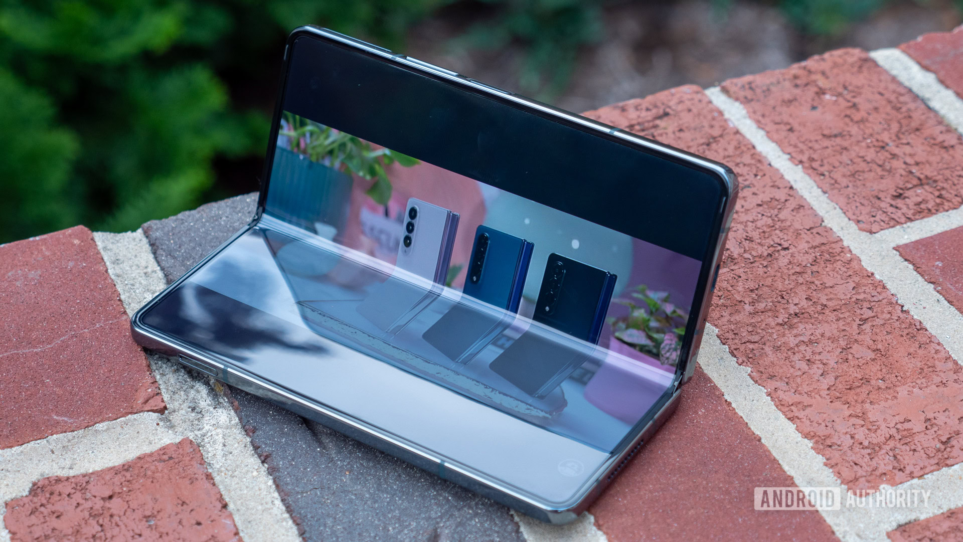
Android 12L was never going to be perfect right out of the gate. As the software solution for tablets, Chromebooks, and foldables, it already had a mountain to climb. The three types of devices vary wildly in size, shape, and use, so optimizing an app for a tablet isn’t the same as optimizing it for the Galaxy Z Fold 4.
For example, opening a video on YouTube can take on any number of layouts. It works fine with the Galaxy Z Fold 4 fully open, whether in landscape or portrait, full screen or not. However, the minute you try to watch a full-screen video with the display partly folded, you get the horror above. Instead of shrinking the video and pushing it above or below the fold, it stays smack in the middle, where you can only see half of what you’re watching. Never mind the thick black bars — though they’re more due to the square aspect ratio than Android 12L.
Google might be the mastermind behind Android 12L, but its YouTube optimization is a head-scratcher at times.
Another problem is that some apps skip optimizing for Android 12L altogether. Instagram is a great punching bag for large-screen devices simply because it refuses to play the game. It doesn’t exist for the iPad or the Galaxy Tab, and its approach for the Galaxy Z Fold 4 is something to the tune of “here’s the normal smartphone app, deal with it.” Instagram doesn’t even bother to fill the screen on Samsung’s premium foldable, it shows up as a window that you can slide to the left or right for easy scrolling. Again, it’s no fault of Android 12L, but layout issues become usability headaches, especially when developers won’t try to adapt.
Despite the quirky layouts, Android 12L is the Galaxy Z Fold 4’s biggest step in the right direction. Thankfully, Google promised to keep developing the software as long as Samsung keeps pushing foldables, so there’s still hope that some of the flaws get ironed out. After all, the software keeps me coming back to a phone that every fiber of my being wants to believe is too big. My fibers aren’t wrong. It’s a behemoth, but a behemoth that proves its worth on my busiest days.
Thank you for being part of our community. Read our Comment Policy before posting.