Affiliate links on Android Authority may earn us a commission. Learn more.
Opinion: Why Samsung’s on-screen keys on the Galaxy S8 aren’t perfect
Published onMay 16, 2017

Samsung’s switch to a taller display on the Galaxy S8 means the company had to move away from its recognized arrangement of capacitive keys flanking a horizontally-oval home button. For most users, this is a wish come true, but did Samsung get it right on the first attempt? Is there anything more to the keys than being just that, navigation keys? Let’s take a look!

The best thing about the on-screen buttons is that Samsung has finally moved away from the trademark physical home button and capacitive keys that we’ve come to expect. Samsung’s implementation was never the greatest, mainly as it opposed Google’s implementation and generated confusion among Android users.
The move away from physical keys has also bought us closer than ever to the phone we’ve all been waiting for: all display, all the time. Of course, the Galaxy S8 isn’t that, but with minimal bezels on both, the bottom and the top of the display, Samsung has bid adieu to its bezels and joined the rest of the Android landscape with on-screen keys.

As with other manufacturers, Samsung has adopted on-screen keys with added customization, but with a twist you may not have been expecting. Other Android manufacturers have taken to offering additional keys that you can add to the navigation bar for additional functionality. For example, HUAWEI allows you to drop down the notification menu while LG adds this as well as a quick shortcut to its QCapture+ note taking application.
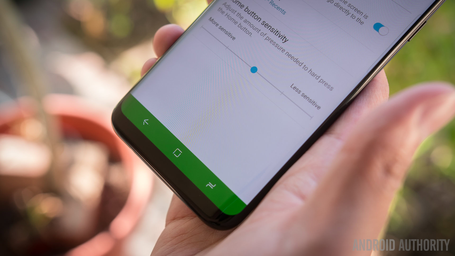
Samsung meanwhile offers customization but it’s limited to swapping the keys around to match the traditional Android layout. What can you customize, we hear you ask? The background color of the navigation bar which can look cool, but, and this is a big “but,” it only works in Samsung’s own apps. When switching from the messaging app to Hangouts, the bar switched from our custom red to the default black.

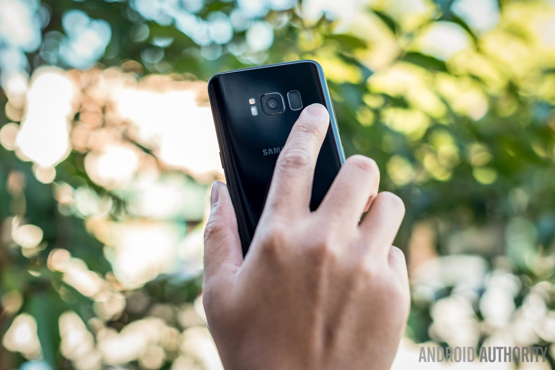
Herein lies the biggest issue for me with the on-screen keys: given the tall-nature of the display, stretching and swiping down to access the notifications would be an awful lot easier if you could just tap a button on the navigation bar to access notifications. Of course, this is Samsung’s first attempt at on-screen keys but it’s not that hard, right? Yes, you can swipe down on the fingerprint sensor, but given its awkward location on the rear, it’s not as simple as it could have been.
Read: How to switch software buttons on the Samsung Galaxy S8
On top of this, the jarring difference between the colored and default notification bar when you switch between apps essentially renders this customization useless. For now, the on-screen keys are just that: on-screen buttons. Sure, we have smaller bezels now but with a couple of simple tweaks – hopefully via a future update – Samsung will have on-screen keys that serve more purpose. And this will be great for all users, especially if you find the display too tall.
Would you change the color of your navigation bar and do you use any of the additional keys offered by other OEMs? Let us know in the comments!