Affiliate links on Android Authority may earn us a commission. Learn more.
Samsung killing the physical home button is a big deal
Published onMarch 30, 2017
Since the original Galaxy S, the physical home button has been a staple of Samsung’s flagship Android smartphones, a key part of the company’s mobile design language, and a tactile feature prefered by many. The arrival of the Galaxy S5 saw the home button take on a new role as the hub for the company’s fingerprint scanner, making the feature a key part of Samsung’s Knox security platform as well.
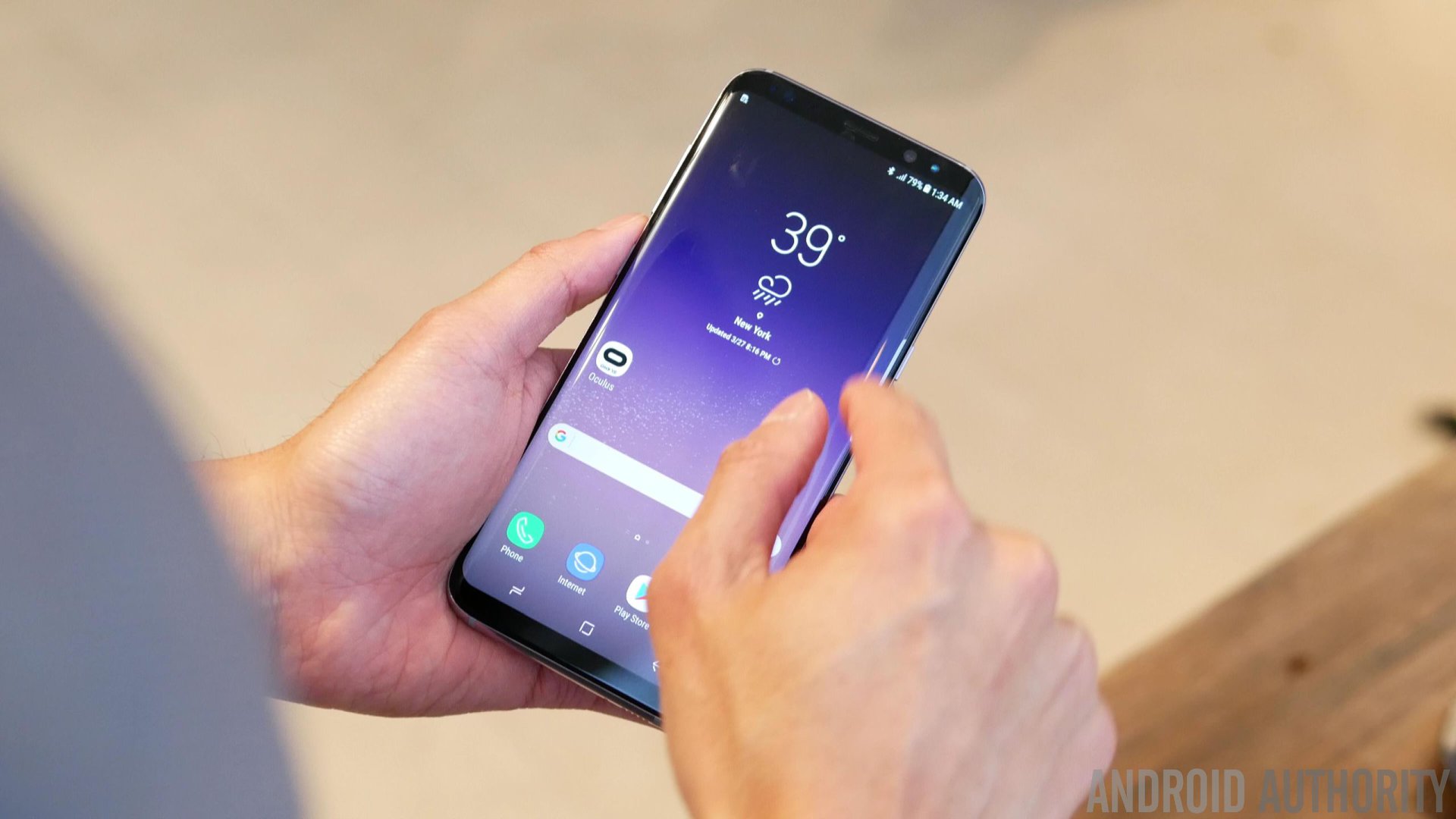
But the Galaxy S8 does away with one of Samsung Mobile’s most recognisable calling cards, instead leaving the bezel-less design of the handset to market the brand all by itself. It’s a bold move, and one that is likely to win over as many fans as it frustrates the old faithful. Either way, there’s little denying that the Galaxy S8’s design stands out from your typical smartphone, and I don’t think that Samsung’s flagship tier is going to suffer a major crisis of identity without the home button.
Pros and cons of the old way
The old home button afforded Samsung a number of advantages, some of which are already causing a few grumbles among those deciding whether or not to pick up the Galaxy S8.
For starters, the new fingerprint scanner’s placement is now rather unconventional. The old design, housed inside the home button, lent itself nicely to a quick thumb press, without having to rearrange our hands from the familiar typing position.
Removing the home button means that Samsung has had to find a new place for its fingerprint scanner. In some ways, it’s a shame that Samsung didn’t find a way to implement an under-the-screen solution that would have kept the old convenience.
Instead of placing the scanner in the middle on the back, as other manufacturers have done, Samsung has moved the module to the side of the camera. A decision with comes with a few pros and cons of its own, as I’ve discussed before. Samsung itself seems to realize the location is less than ideal, adding a reminder to the S8’s camera app to periodically clean the camera lens.

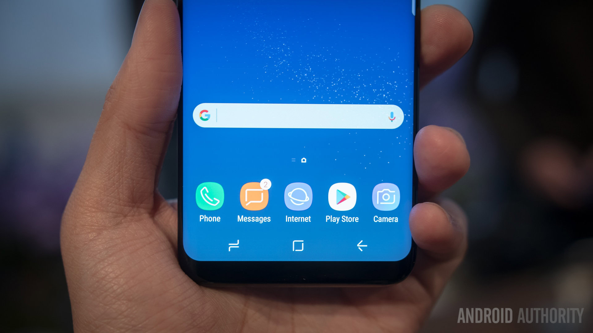
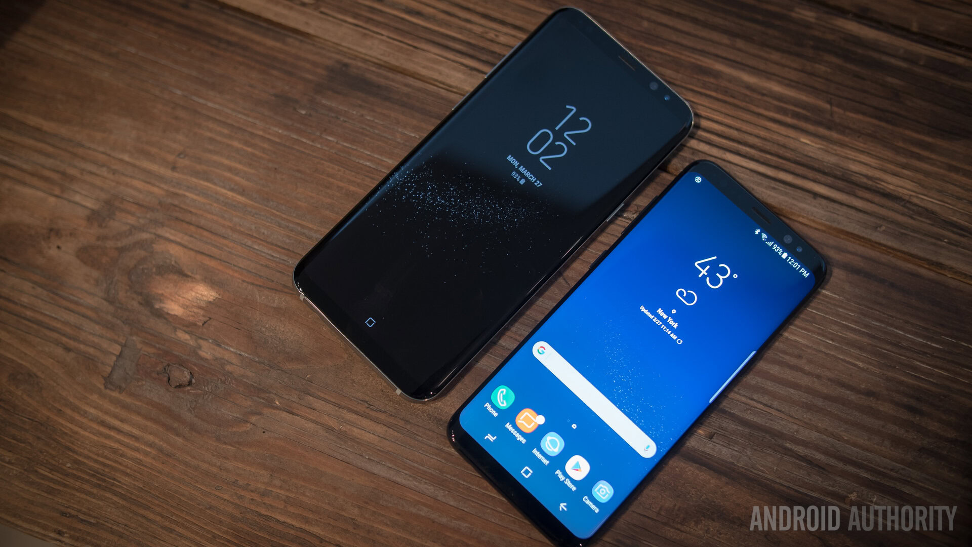
The old physical keys also previously allowed Samsung to maximise the screen space of its handsets, rather than losing a section of its UI to navigations buttons. Yes, the S8 has a tiny bottom bezel, but it’s not that much smaller than that on the S7 and both are pretty similar in size when you include the on-screen button strip Samsung had to add on the S8.
If screen real estate is super important to you, then this has been a long running competitive difference when compared with some of Samsung’s competitors, such as LG, Sony, and even Google’s acclaimed Pixel.
However, this isn’t such of an issue now that the Galaxy S8 has moved over to a ultra widescreen 18.5:9 aspect ratio. The extra-tall feel of the S8 and S8 Plus still leaves plenty of room for running an app, or even two in dual window mode, without feeling like the navigation buttons are taking up precious space. Still, this marks a notable shift for Samsung, not just in terms of the physical handsets design but in the look and feel of its Touchwiz UI.
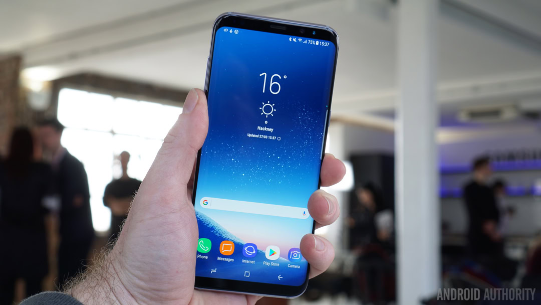
You’ve probably noticed that the company hasn’t opted for Google’s typical Nougat navigation icons with the Galaxy S8, and has instead chosen its own back, home, and running apps icons. Samsung wants to appear like it made this move on its own terms as a conscious decision (not because the under-glass finger scanner wasn’t ready in time), and is owning the change by incorporating the new on-screen navigation buttons with its own design language.
Between the new fingerprint scanner placement, on-screen navigation, and bezel-less design, the removal of the home button has changed quite a lot about the Galaxy S range.
Of course, the home button has always come at the expense of a larger bezel at the bottom of the handset. This hasn’t usually been massively larger than some of its competitors that don’t feature a home button, but every millimeter seems precious these days. Consumer desires for thinner phones and larger screens has encouraged Samsung towards a bezel-less design where there’s little room for extra buttons. At least not on the front of the handset. On-screen buttons may not be for everyone, but they certainly let the screen occupy more space.
During the launch of the Galaxy S8, Samsung talked about how the share of 5.5-inch handsets has grown from 8 to 18 percent of the market between 2014 and 2016. The company clearly sees the removal of the home button as an important step in meeting this demand, without creating handsets that are overly large. Impressively, the regular 5.8-inch Galaxy S8 (148.9 x 68.1 x 8 mm) fits into a smaller form factor than the Galaxy Note 7 (153.5 x 73.9 x 7.9 mm), which offered a smaller 5.7-inch display size.
Will others follow suit?
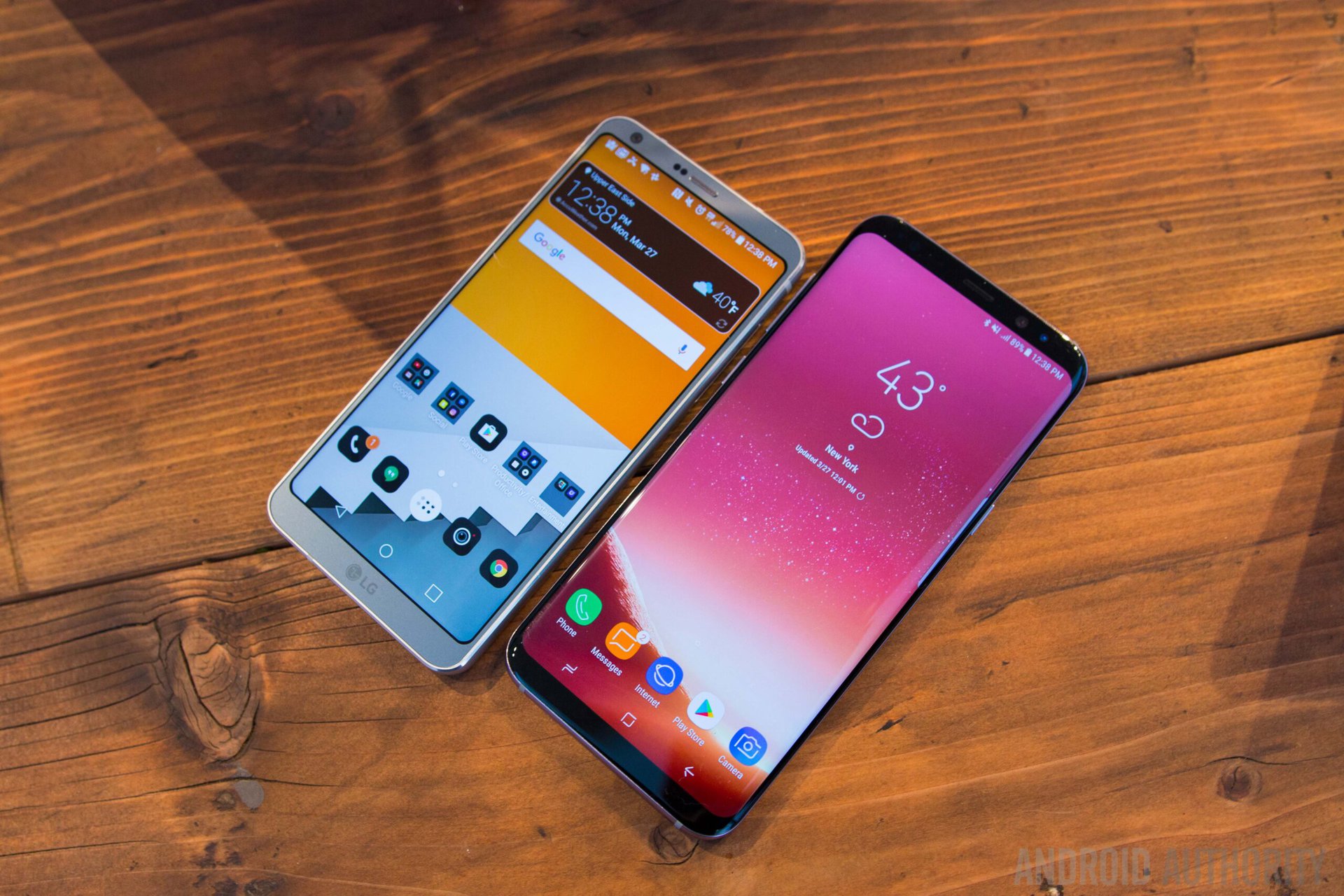
With a positive reception for the design of Xiaomi’s Mi Mix, the LG G6, and now the Galaxy S8, bezel-less smartphones seem likely to become more common in the future, and this probably means that other manufacturers may soon begin dropping their home buttons to follow the trend, just as they implemented them in following Samsung’s lead.
Other manufacturers may soon begin dropping their home buttons to follow the trend.
We’ve certainly seen smaller – and even some larger – manufacturers emulate Samsung’s look in the past, to give customers that feel that they’re still buying a premium product.
It feels likely that some OEMs may take inspiration from the market leader’s new design, even if they can’t outright copy or afford to implement Samsung’s curved AMOLED display technology.
On the plus side, a little more variation in the market would be a good thing. I’ve previously complained that Note-inspired designs like HTC’s U Ultra are far too common these days. But by the same token, we don’t want to see every manufacturer begin emulating Samsung’s new look. Choice and variety are some of the Android ecosystems most appealing traits, after all.
Wrap up
At first glance, the removal of the home button might not seem like such a big step for Samsung, but the reality is that it has had a number of implications for the company’s flagship design, both aesthetically and in terms of the hardware and the software feature that it can offer to consumers. Then there’s the knock-on effects for the company’s brand awareness, as departing from a familiar design and abandoning its front-facing branding is a bold new step. But that’s another topic altogether.
Where do you stand on Samsung’s new design? Will you miss the home button and front facing fingerprint scanner, or is the change in direction worth the new look and extra screen size?