Affiliate links on Android Authority may earn us a commission. Learn more.
Android 11 on Galaxy phones: Hands-on with all the new One UI 3.0 features
Published onApril 1, 2021
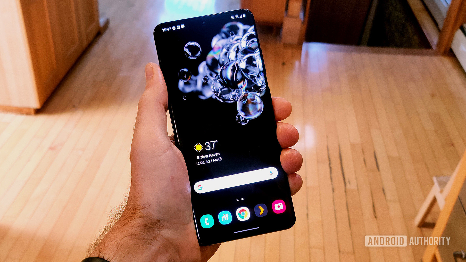
After a months-long beta testing period, Samsung finally started rolling out One UI 3.0 to select Galaxy phones in late 2020. Based on Android 11, the latest version of Samsung’s Android skin introduces some new features and design tweaks.
Unfortunately, if you are on One UI 2.5 and hoping for a wildly different experience with this upgrade, you’re going to be disappointed. Admittedly, there are some very cool new things going on here. Overall, however, the look and feel of the operating system remains quite similar.
If you are still waiting on One UI 3.0 and want to know what to expect, we’ve rounded up all the most notable changes here. Have the update already? You can use this to make sure you are taking advantage of all the newest features.
We will not be covering all the new Android 11 features here. While most of those are included with the Samsung software upgrade, they are not exclusive to One UI so there’s no point in rehashing them. Click here to see all the most important aspects of Android 11.
Samsung One UI 3.0: Notifications revamp
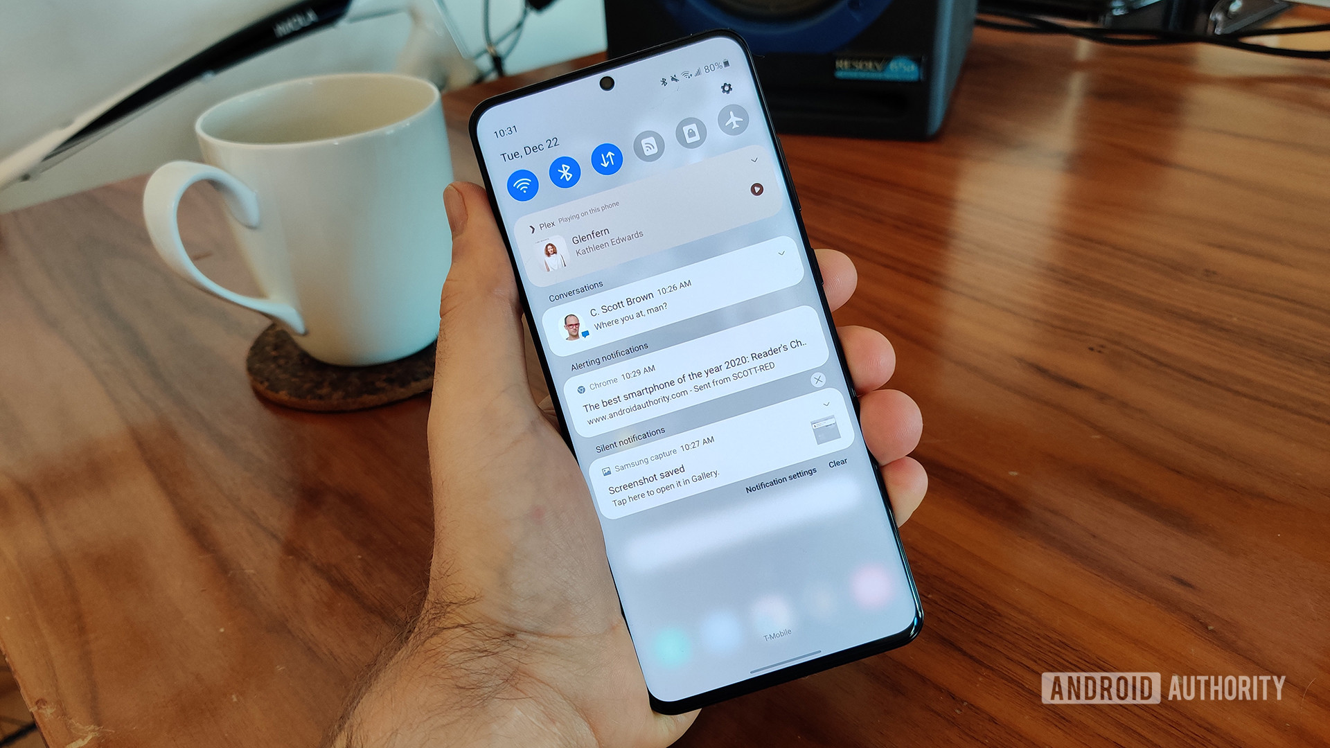
One of the biggest areas Google focused on with Android 11 was notifications. Since the notification shade is integral to staying in touch with friends and family, Google put a heavy emphasis on making it more organized and streamlined.
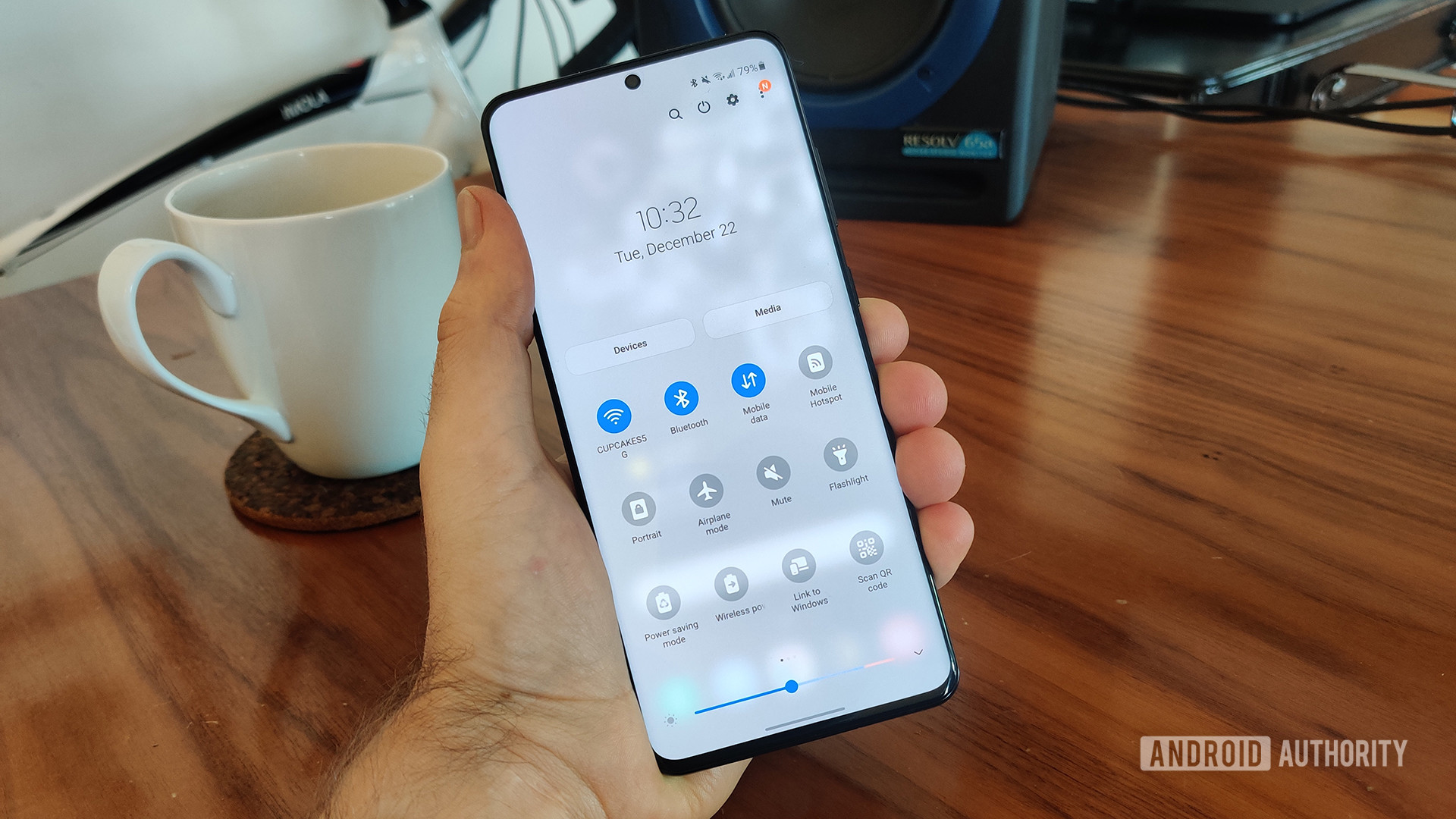
Taking Google’s cue, Samsung also focused a lot on the notification shade in One UI 3.0. The company updated the whole look of the shade, adding a new light gray color (when not using dark mode) and a new fade-in animation. It’s all very smooth and classy.
Samsung also removed some things to make the shade less cluttered. For example, the power button is gone from the upper right corner. It’s refreshing to see Samsung take a “less is more” approach here.
Ultimately, though, the most notable changes are the ones instituted by Android 11. The music player moves out of the notification area and into the Quick Tiles section, and each notification is organized under different headings depending on their importance. As usual, you can long-press any notifications to alter how the OS should treat them.
New alerts and bubble support

Speaking of notifications, Samsung tweaked the way alerts pop up on your screen while you’re actively using the phone. When a notification would come in with Android 10, you would get a large alert in the top quarter of the display. This would have shortcuts to app features (reply, delete, ignore, etc.) and/or canned responses if applicable.
Now, the alert is much smaller and simpler. In the photo above, you can see a Slack notification that barely takes up any screen real estate. When you tap the notification, it opens up the conversation within the app itself. This is a little less useful but less obtrusive. You’ll need to decide for yourself if this is an upgrade or a downgrade.
If you ignore the alert, it will head to the notification shade. That’s where you’ll find the usual shortcuts and other interactions, should you not want to head straight to the app itself. If you don’t like this change, you can bring the bigger notifications back by heading to Settings > Notifications.
Additionally, since this is Android 11, your Samsung phone will now support chat bubbles. They look similar to how Facebook Messenger does it. You can choose which conversations within which apps will see a bubble alert. Conversely, you can turn them off altogether by heading to Settings > Notifications > Advanced Settings > Floating Notifications.
Fast access to widgets
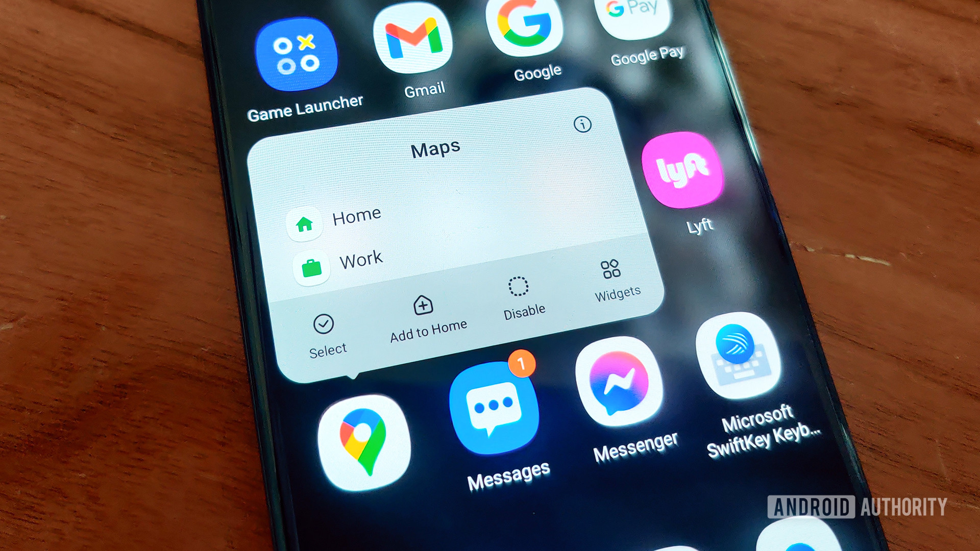
Android has had widgets for a long time, but using widgets hasn’t changed much over the past decade. Samsung finally gave widgets a little love with One UI 3.0.
Now, you can long-press an application (either within the app drawer, dock, or home screen) and see an option to view that app’s related widgets. If you tap the Widgets button here, a menu pop-up appears that allows you to scroll through the applicable widgets. You can find the one you like and instantly add it to the home screen. Not bad!
This doesn’t work for widgets on the lock screen or always-on display. Nevertheless, Samsung still brought some notable tweaks there, as you’ll see in the next section.
Always-on display and lock screen tweaks
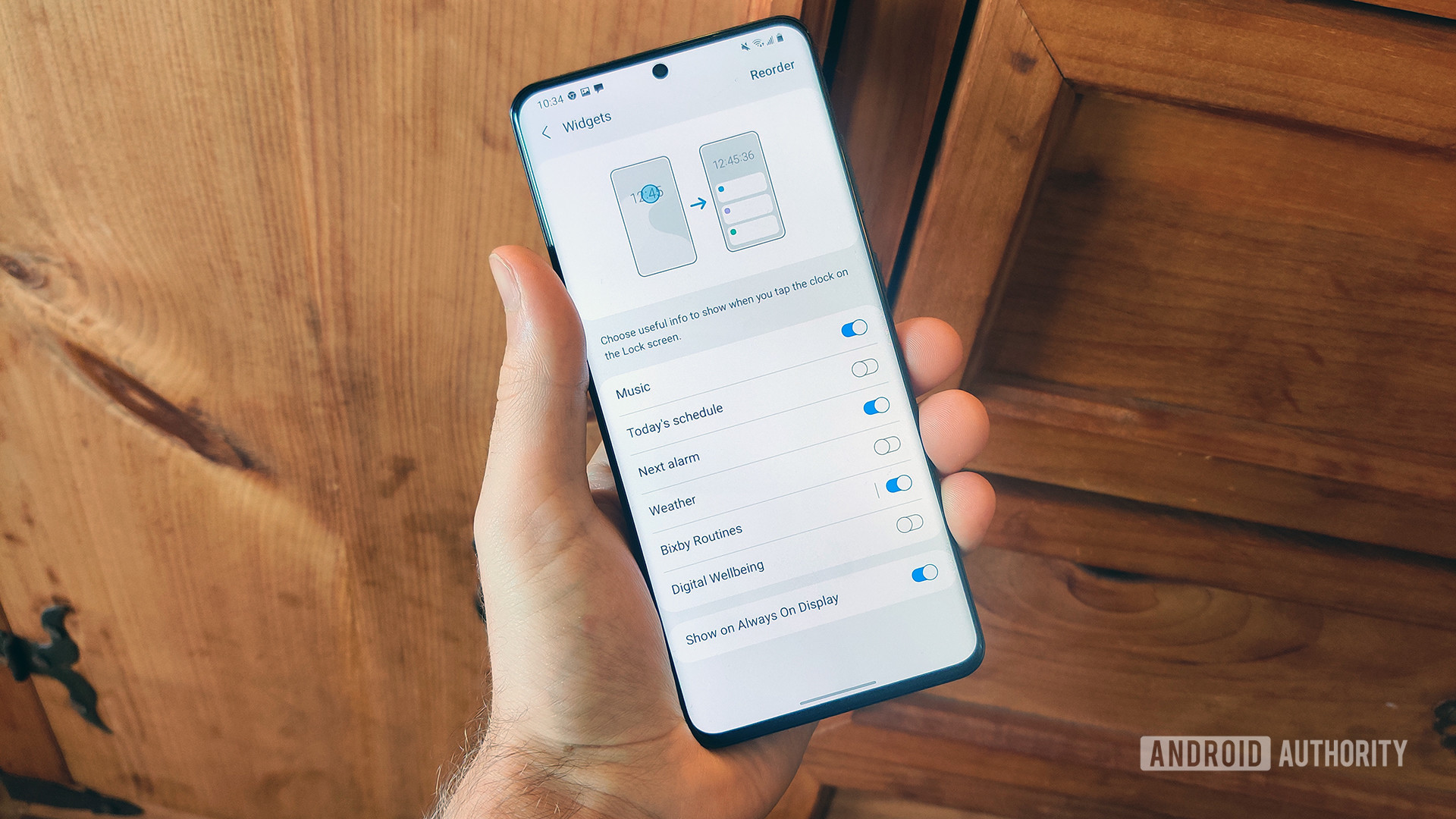
Samsung has nailed the always-on display for years. There’s a lot of customization on offer, including colors, designs, and even animated GIFs. You can also adjust which alerts appear on your AOD.
With One UI 3.0, Samsung claims that all AOD widgets have been “improved,” according to the official changelog. However, it is unclear what those improvements are and we couldn’t see any obvious changes. It could just be that they are more power-efficient.
Sammy also improved lock screen widgets and those changes are much more obvious. For example, there’s a new Digital Wellbeing widget that will allow you to keep tabs on your phone usage without needing to, you know, unlock your phone. Nice move, Samsung.
Finally, Samsung also updated the dynamic lock screen option. This feature automatically changes the look of your lock screen wallpapers based on certain categories (art, animals, places, etc.). There are now more categories from which to choose, and you can pick multiple categories instead of locking yourself to just one.
One UI 3.0 debuts Samsung Free
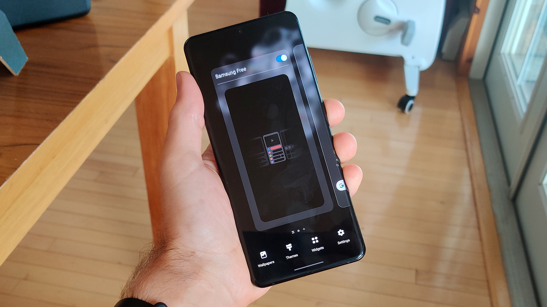
This might seem like the umpteenth time Samsung’s done this, but here it goes: the home screen panel that lives to the left of the main panel is different in One UI 3.0. It’s not Bixby Home or Google Discover or Samsung Daily or any of the other systems put in place there previously. Now, it’s called Samsung Free.
As before, Samsung Free is an aggregator that brings you news and other types of information in an easily scrollable feed. It’s similar to Samsung Daily and Bixby Home, but appears to mostly focus on just news and a few app suggestions from the Galaxy Store. Hopefully, this will make it less cluttered than previous iterations.
If you’re like us, you’ll be happy to know that it’s easy to turn off Samsung Free. Just long-press on any blank space on your home screen, swipe to the left, and turn off the Samsung Free toggle.
Huge volume controls
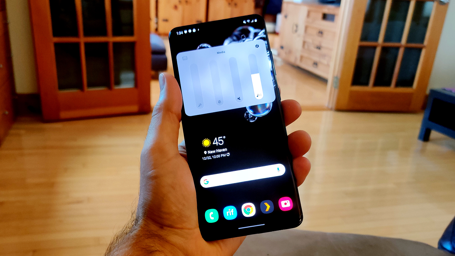
Samsung revamped the look of the volume control slider in One UI 3.0. It’s very curvy now with all information living within the slider, such as which device you are currently controlling.
On top of this, if you hit the three-dot expansion icon at the top of the slider, the full volume panel looks a lot different than it used to. Now it takes up a huge portion of the display. From there, you can alter the various volumes of your phone (notifications, media, etc.). You can also quickly toggle Google’s Live Caption on or off from within this panel.
Related: The best equalizer apps for Android to make your phone sound its best
Finally, there’s a settings button on the larger panel that opens up the dedicated Volume section within the system settings. There’s only one extra item here, which toggles automatic media volume controls on or off.
Strangely, some things are missing
As we mentioned earlier, Samsung’s One UI 3.0 is based on Android 11. One would expect all aspects of Android 11 to be here, but some things are missing.
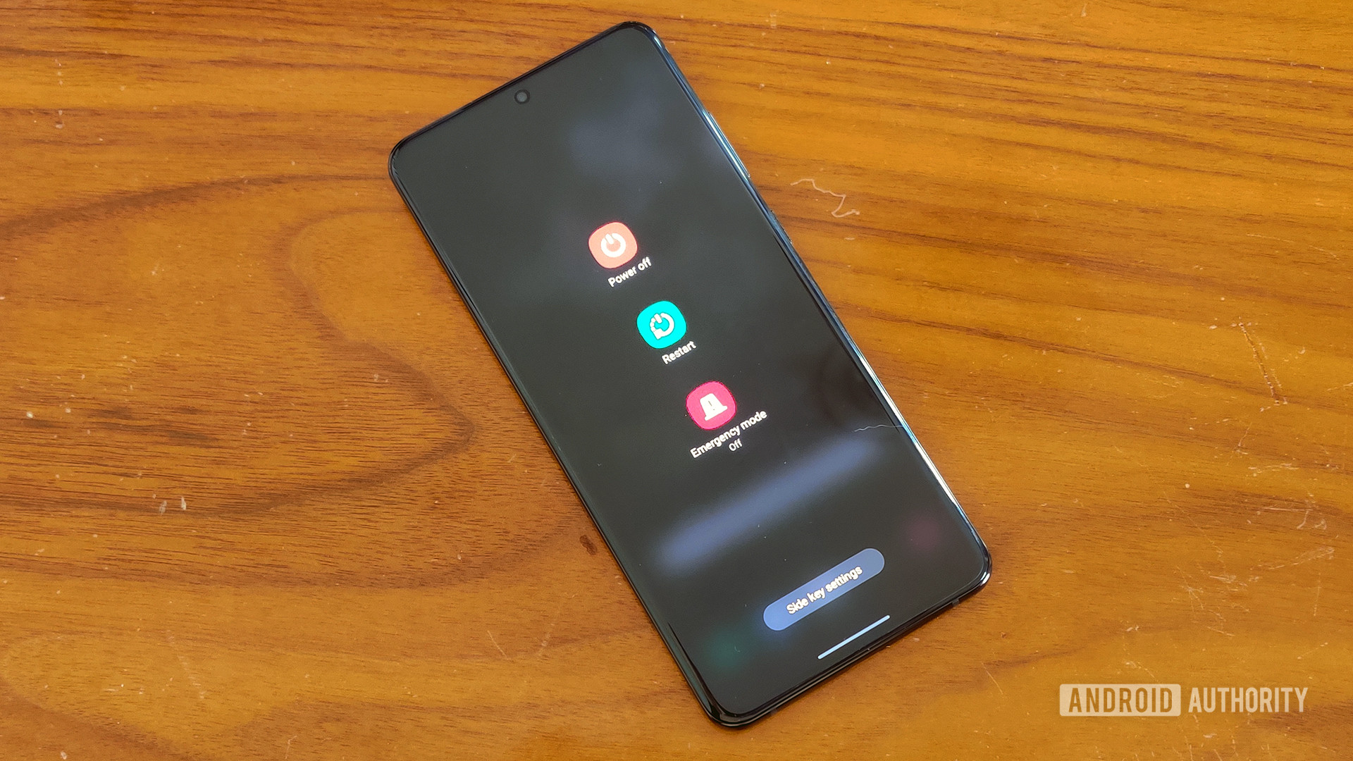
The biggest omission is the lack of smart controls within the power menu. In Android 11 proper, if you hold down the power button (or “side key” as Samsung insists on calling it), you get a whole new, full-screen interface. You can quickly select your credit card for contactless payments, turn your smart lights on or off, etc. There are also the expected power buttons that allow you to power down or restart your phone.
Samsung didn’t add any of these updates. The power menu in One UI 2.5 carries over without any changes. When you hold down the side key, you will see a power button, a restart button, and an emergency mode button. That’s it.
Other omissions make more sense. For example, the native Android 11 screen recorder gets replaced by Samsung Capture, which is a superior (if not native) experience. You also use Samsung’s dark theme controls over the native ones first introduced with Android 10.
One UI 3.0: Miscellaneous stuff
That’s it for the biggest changes within the latest One UI update. There are a few other little tweaks we noticed, though:
- Home screen folders got a slight redesign. Now, instead of a 4 x 4 grid, it’s a 4 x 3 grid. We’re not sure why Samsung would do this as it’s far less efficient, but oh well.
- You can now turn the screen off with a double-tap anywhere on a blank section of the home screen. This is an old-school feature that’s been around on other systems for years, but Samsung is just now joining the party.
- When you first set up your Samsung smartphone, there will be more accessibility options available, which is definitely a great and important move.
- Keyboard settings are now under General Management within system settings, which Samsung says will make things easier to find.
- The Samsung Internet app has been updated with a new design, more settings tweaks, and the ability to have 99 tabs. Seriously.
- Wireless Dex is now a part of One UI 3.0. Even though this feature landed on 2020 Galaxy flagships with One UI 2.5, its inclusion within the 3.0 upgrade ensures that other Samsung phones will get the feature.
That’s it for One UI 3.0 updates! Which one is your favorite?