Affiliate links on Android Authority may earn us a commission. Learn more.
Samsung One UI 4: Hands-on with all the new features for Android 12
Published onSeptember 25, 2021

After months of waiting, Samsung has finally released its Android 12 beta in the form of One UI 4 beta. This latest version of Samsung’s Android skin doesn’t see a whole lot of changes vs last year’s One UI 3. Still, the beta can be installed on select Galaxy devices via the Samsung Members app.
Unsurprisingly, in line with Android 12, One UI 4 focuses on customization for its significant changes. There are some more extensive updates to privacy and device care, but for the most part, these alterations are minor across the board.
We’ve compiled all the most notable changes in One UI 4 so you know what to expect when the stable version arrives. Remember that we will not be covering all the new Android 12 features, as those are not specific to One UI. For more on what to expect from Android 12 specifically, check the link below.
Read more: Android 12 features
Samsung One UI 4 beta: Home screen customization
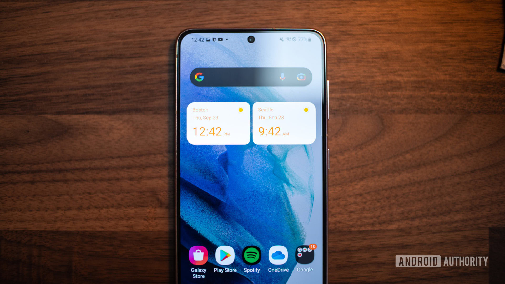
The most visible change to One UI 4 is this year’s customization options for both the home and lock screen. Starting with the home screen, widgets are updated with a new and refreshing look that aligns with Android 12’s Material You redesign. Widgets are flatter with a rounder appearance, and certain widgets, such as the dual clock, will now change from light to dark mode depending on the time of day. Unlike Material You, these widgets will not adapt their color to the background, but who knows, that might be a change we see in the future.
Speaking of dark mode, Samsung made a subtle change here for a slightly more seamless experience. Icons, wallpapers, and certain text fields are now slightly dimmed when in dark mode. Personally, I’m not a huge fan of this change. As a result, I kept turning up the brightness when in dark mode. I understand why Samsung made this change to make the experience a little easier on the eyes, but I still prefer the old method of a dark mode on One UI 3.
Lock screen tweaks
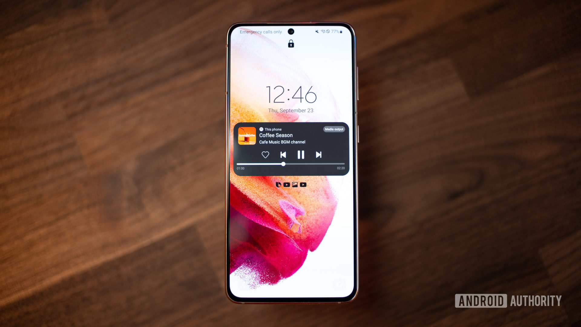
On the lock screen, you can now set the voice recorder as an option for quick access. Also, media controls now see options to change the media output. This change isn’t just in the lock screen but carries over to the notification shade as well. One UI gets some minor updates to the always-on display; more specifically, users can now set it to only come on for notifications. Additionally, there are a handful of smaller updates to the customization options for the AOD that include some new animated stickers, as well as new themes on the Galaxy Store.
Notifications
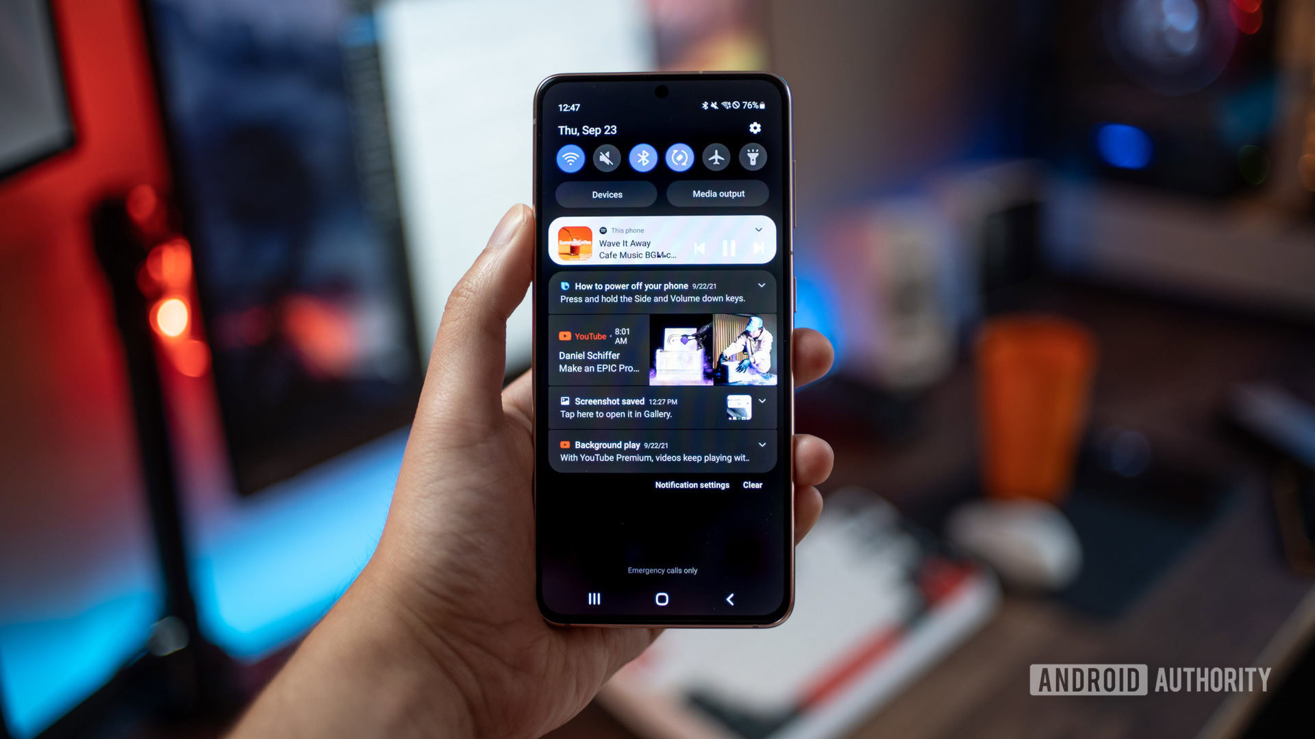
Last year, Samsung placed a big focus on One UI 3’s notifications; however, this year, there are not many alterations. Notifications are slightly condensed, and the background in both light and dark mode is less transparent. The Quick Settings tiles look almost identical to One UI 3 but are slightly more condensed. The brightness slider is now larger for easier access while holding devices one-handed. Other than that, there are no major changes to the way notifications are handled, and they still remain true to Samsung’s design language instead of Android 12’s Material You.
Check out: The best Samsung phones
Keyboard and Sharing Menu
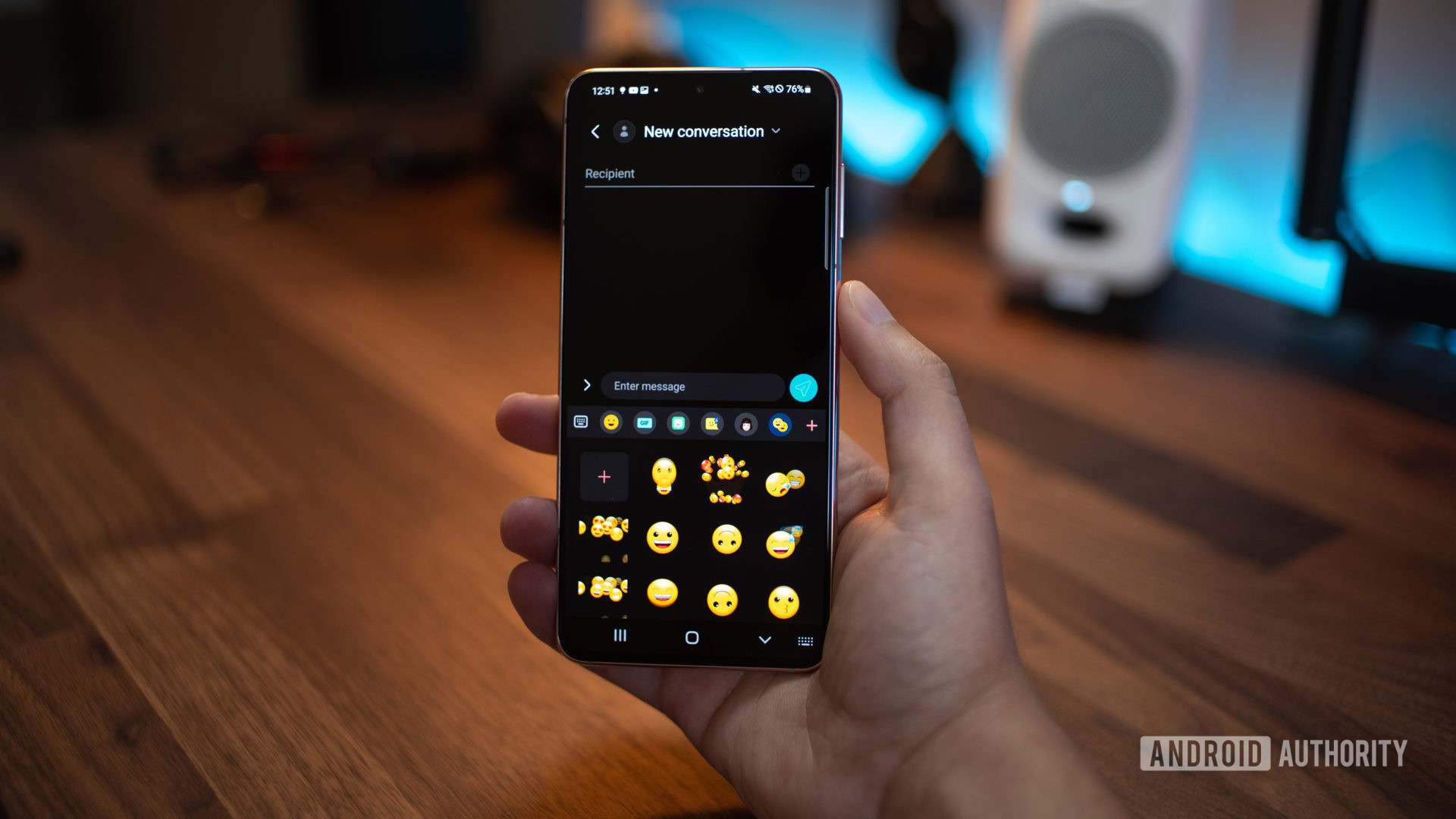
Samsung added a few additional features to the keyboard, mainly some additional stickers and animated emojis, which can now be quickly accessed via one tap on the keyboard. There’s now also support for more third-party integration; specifically, Grammarly can now be integrated to help with spelling errors. Again Samsung is really pushing the animated emojis, which I’ll admit are cool, but I would have liked to see more development in other areas of the OS.
The sharing menu finally gets an update that allows users to customize the order in which sharing options appear in the menu. This is incredibly helpful and a great way to clean up that panel. I’m happy to see that this is finally an addition to One UI.
Privacy changes
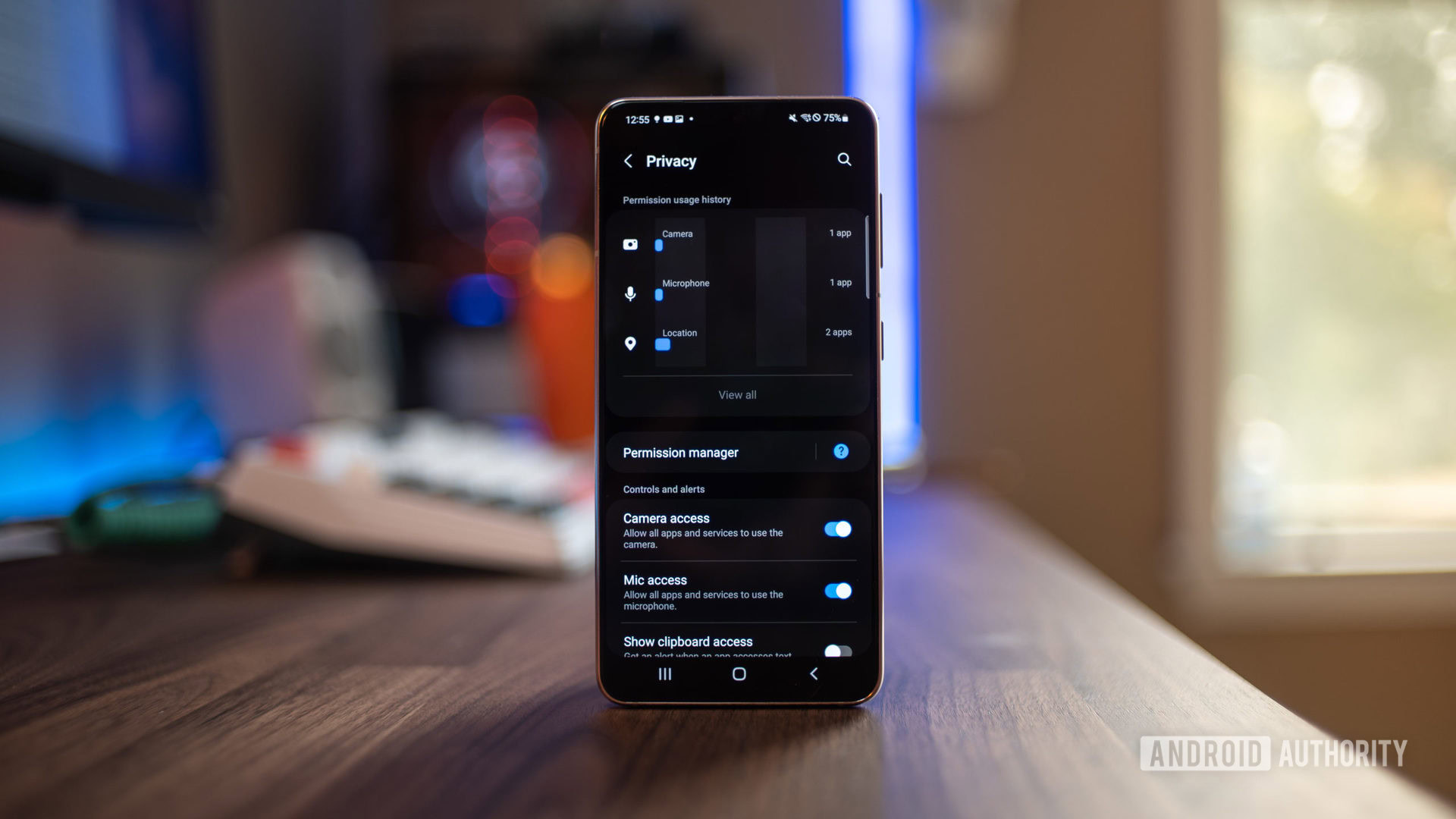
In line with Android 12’s focus on privacy, One UI 4 now gets an improved privacy dashboard complete with the ability to see at a glance which apps are using what permissions over the past seven days.
Samsung One UI 4: Hot or not?
There is an option to show clipboard access, mic, and camera access across all apps, instead of an app-by-app basis. Also, camera and mic indicators will now appear in the status bar when a specific app has accessed one or either of them. Clicking on them will reveal more information about when and which app used them.
Lastly, there is an additional setting for Android 12’s new “Private Compute Core,” which lets you clear data your device has learned and turn off smart replies and paste suggestions from the keyboard.
Camera
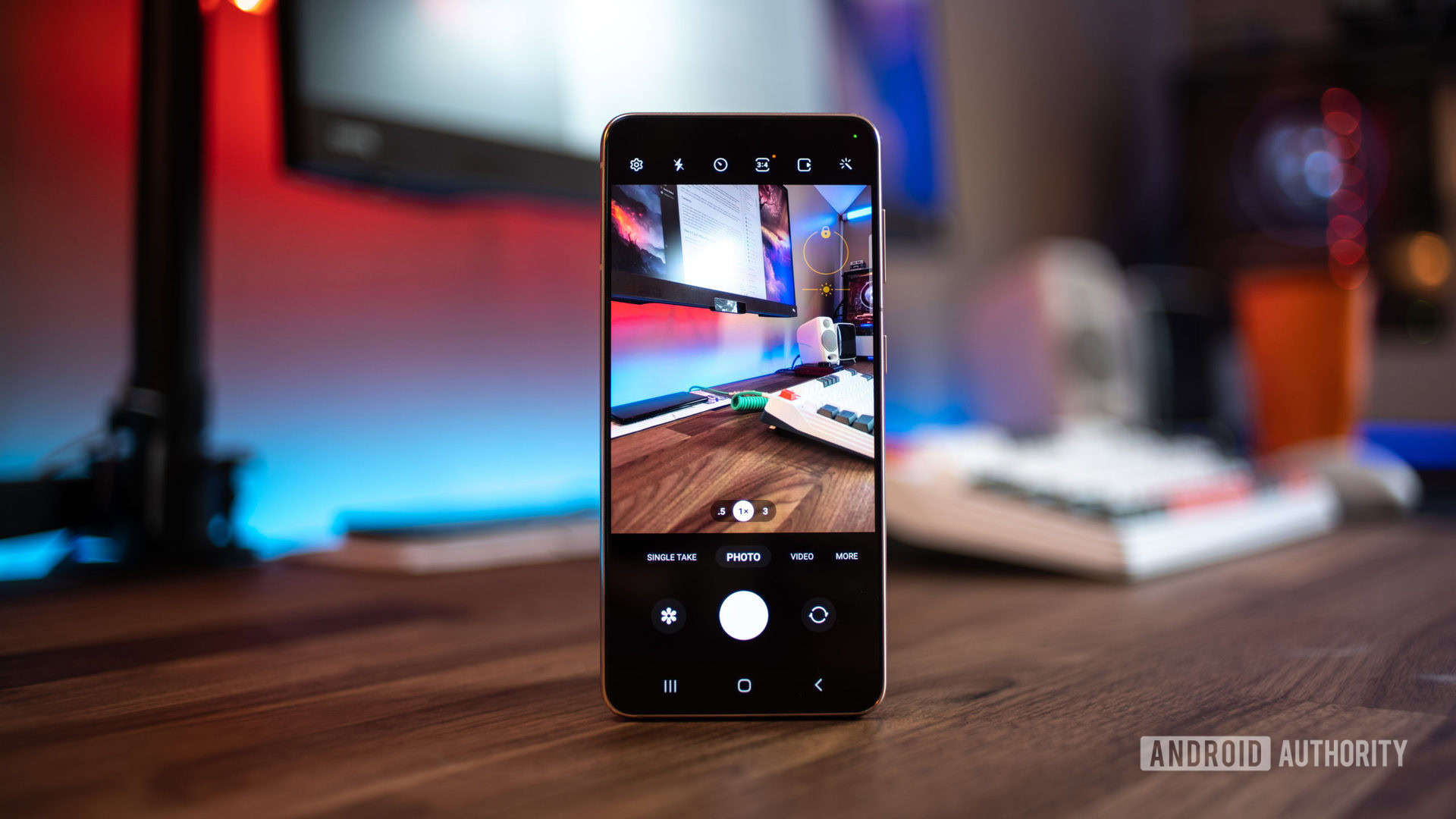
Samsung made some minor changes to the camera app, but overall it’s visually cleaner. Instead of the tree icons indicating zoom options, Samsung switched these to actual numbers, a change that will make figuring out what lens you are using straightforward. The option to hold down the shutter to start video recording is still present, but you can now hold and swipe up to lock on the recording button. Also, the scene optimizer icon no longer appears in every lighting scene but presents itself in low light or landscape scenarios. Lastly, the pro camera mode settings have been slightly rearranged to give a cleaner representation, and the gridlines are on by default.
One UI 4.0 features: Miscellaneous stuff
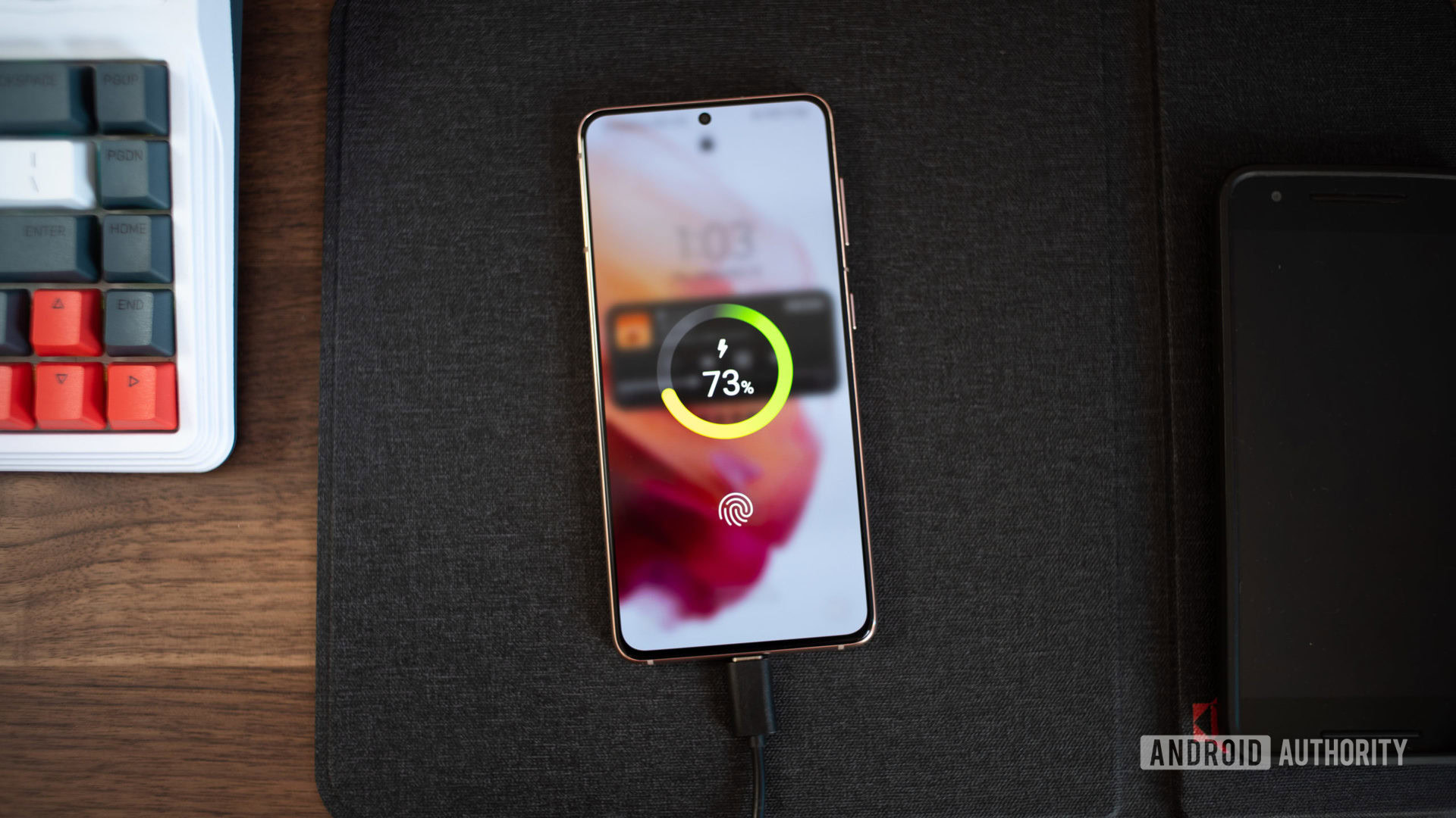
Again this update is relatively small compared to Android 12’s update overall. There are a few other additional updates that we noticed:
- One UI 4 gets new charging animations. They look clean and give a modern feel compared to One UI 3’s animations.
- Picture and Picture and multitasking windows sport rounded corners instead of square ones.
- Device care features a new “Protect battery” option that allows users to limit the maximum charge to 85% in an attempt to conserve long-term battery life.
- AR emoji can be set as contact photos.
- Samsung Good Lock now supports third-party icon packs that can be downloaded via the Google Play store.
- You can now add emojis to your photos or videos through Samsung’s built-in photo editor. Additionally, there is now an “Object Eraser” option in the Labs section, which will allow you to remove objects or people in images using something similar to Adobe Photoshop’s content-aware fill.
What do you make of Samsung One UI 4 so far? Let us know in the comments.