Affiliate links on Android Authority may earn us a commission. Learn more.
You told us: Samsung One UI 4.0 has a lot of fans, but a lot of critics too
Published onSeptember 29, 2021

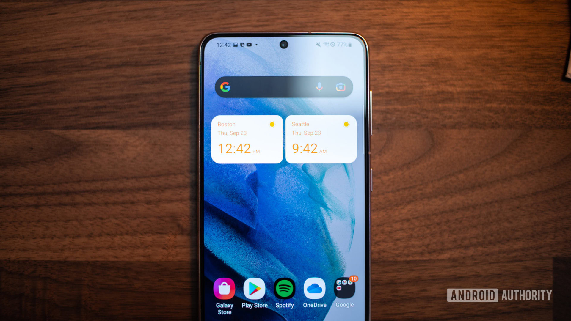
Samsung launched the One UI 4.0 beta in recent days, giving Galaxy owners a taste of what’s to come with the stable update later this year. The beta, which is available for Galaxy S21 series owners right now, brings some Android 12 features as well as quite a few Samsung-specific tweaks.
Is the One UI 4.0 beta a step in the right direction for the Korean brand or a dud? We asked you for your thoughts on Samsung’s beta software and here’s how you answered that question.
Samsung One UI 4.0 beta: Hot or not?
Results
We posted the poll inside our One UI 4.0 beta hands-on over the weekend, and it quickly accrued votes. In fact, over 7,600 votes have been tallied as of writing. And the winner? Well, roughly 60% of respondents thought the new Samsung software was hot stuff.
The beta received praise from a few readers for keeping things visually consistent compared to One UI 3.0 and One UI 3.1. So perhaps this could be why the majority of voters like what they see.
Meanwhile, just under 40% of polled readers said they were turned off by the One UI 4.0 beta. It seems like these respondents took issue with the overall visual style as well as problems related to new and existing features.
Comments
- I may be in the minority but am happy Samsung didn’t pastel the $hit out of Android 12 like Google did. If I wanted a Leapfrog computer I would have bought one. While Samsungs approach is more suitable and maybe underwhelming to some, they have made changes and kept them consistent. More importantly it’s not so different it would alienate those less tech savvy after the upgrade. People will be split on this and that’s fine. I’m happy that they’ve kept it familiar while others will feel it’s too familiar and not different enough.
- George: What Google did with the so called “Material You” is an absolute mess. I hope One UI will remain the same, and Samsung won’t take that approach.
- Neil: This being the Beta build will there be additional major changes for future builds ? Because I’m a bit underwhelmed with what I’ve read here.
- DBS: It’s the same garbage that made me refuse the Android 11 / OneUi 3.x update. And it doesn’t seem to fix it OR give us the tools back to fix it.
- Patrick Mac: I’m okay with how OneUI 3.1 looks so the lack of a UI refresh isn’t a big deal but there are some features that could have been added to further make the user experience better and give more control.
- G.G.: I have 0 complaints on how fluid my software is running on s21 ultra, but to me the ui and the task menu should see an overhaul, make it unique, make it like no other
That’s it for our latest poll results article, thanks for voting and leaving a comment. Have you tried the One UI 4.0 beta yet? Give us your thoughts below if you have.