Affiliate links on Android Authority may earn us a commission. Learn more.
One UI 5.1 gets inspiration from Apple's iOS 16, but is it doing it better?
Published onFebruary 20, 2023
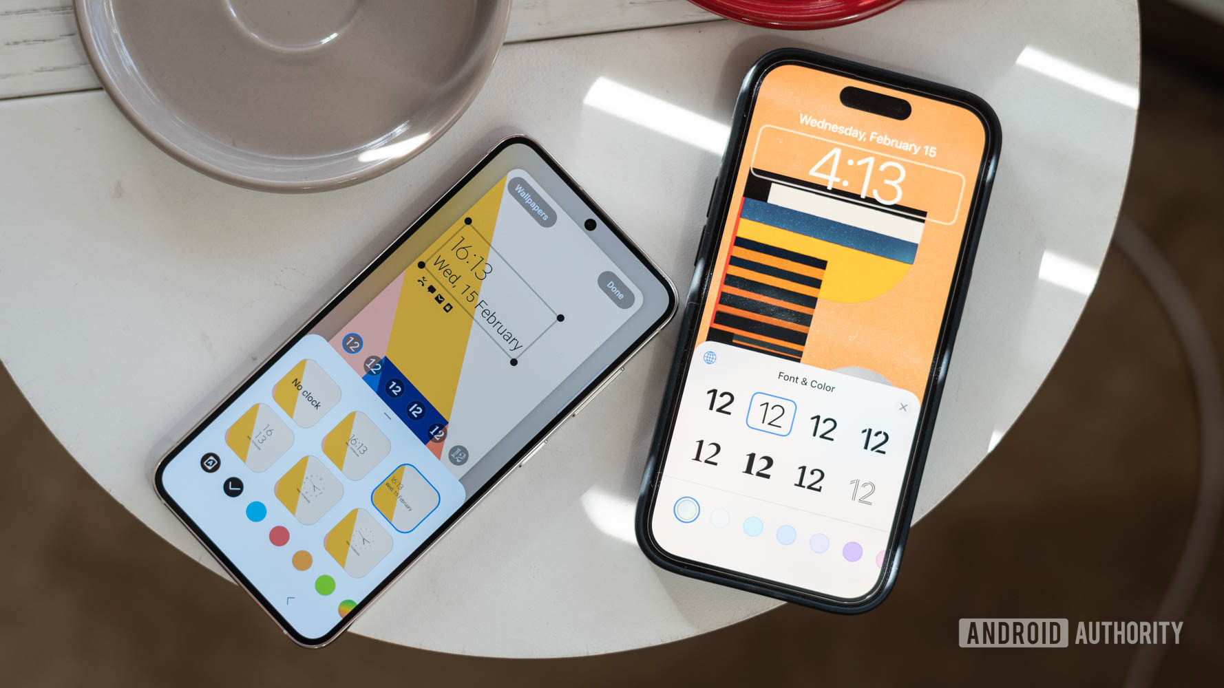
The game of cribbing features from competitors has been a long-standing tradition in the smartphone space. From customization to quality-of-life enhancements, the Apple vs Samsung fight rages on as both iOS and One UI have riffed off each other to bring the best of additions to users.
While iOS has long been an extremely restrictive option compared to Android, things have been on the up and up for a few years with iOS edging out Android in several aspects. Apple took an about-turn on customization with widgets on iOS 14 and has since introduced even more personalization with iOS 16.
Meanwhile, Android OEMs have always taken up the mantle of customization — some more than others. With One UI 5, Samsung debuted an extensive array of options to make the lock screen and home screen experience even more attuned to personal tastes. This, in addition to nice-to-have conveniences like the ability to pull out subjects from a photo or transcribe text from an image.
I’ve been using an iPhone 14 Pro since it launched last year and am intimately familiar with the operating system’s nitty-gritty details. Meanwhile, I just got my hands on the latest and greatest from Samsung — the Galaxy S23 Ultra. So the obvious thing to do was to see how close One UI 5.1 on the Samsung Galaxy S23 Ultra gets to iOS 16 on the iPhone 14 Pro. Let’s take a closer look.
Do you think copying features is the right approach for Samsung's One UI?
A better lock screen experience
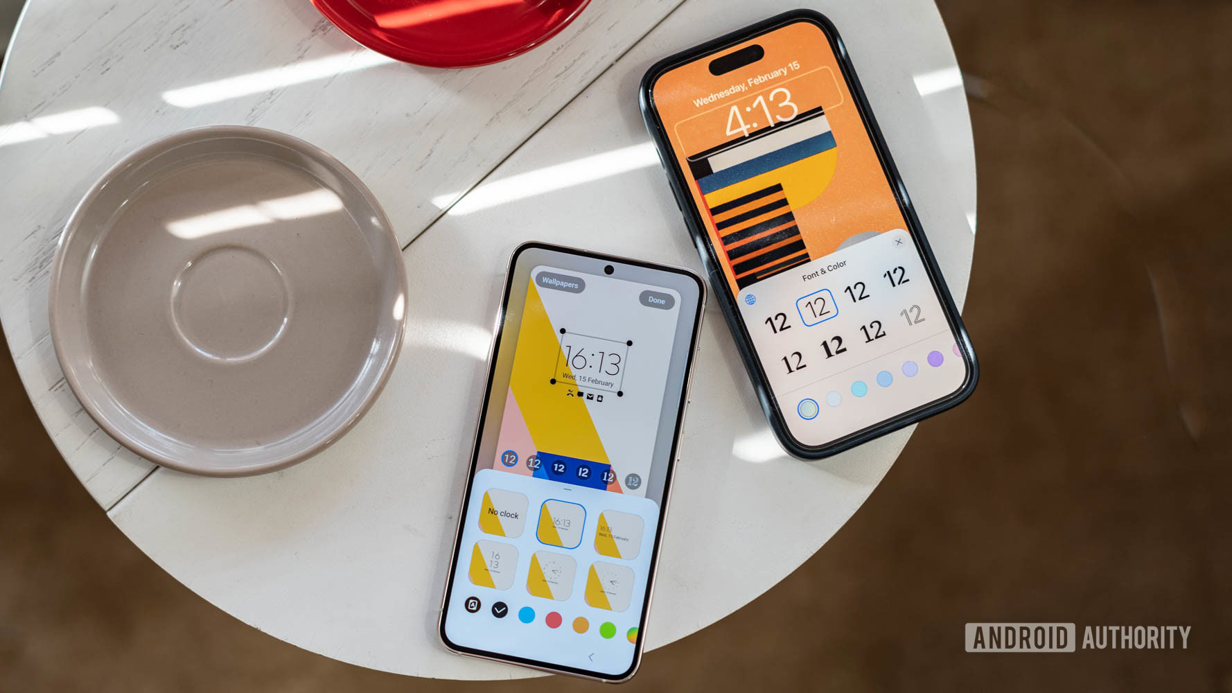
Like everyone else, my daily experience with my phone kicks off from the lock screen. That’s also where Samsung has brought in some of the most prominent additions with One UI 5.1. Just like iOS 16 on the iPhone, it is now possible to completely reimagine the kind of clock you want on the always-on display. Between analog and digital versions, fonts, and even the colors of the text, there are ample opportunities here to truly create your own lock screen experience.
Samsung goes a step beyond Apple in the variety of clock faces and fonts to choose from.
If you want to lean into further customization, there’s always been the Good Lock module from Samsung that lets you add more graphic widgets with animated characters and pixel elements. With One UI 5 and 5.1, Samsung has folded more of these customizations into the core customization experience. Of course, Good Lock on One UI 5.1 will let you go further by allowing granular adjustment of each element of the widget, including, but not limited to, the color of individual indices or sweeping arms of analog clock widgets. It’s a clear step above Apple’s more restrictive approach — a relatively limited set of eight fonts and a swathe of color options.
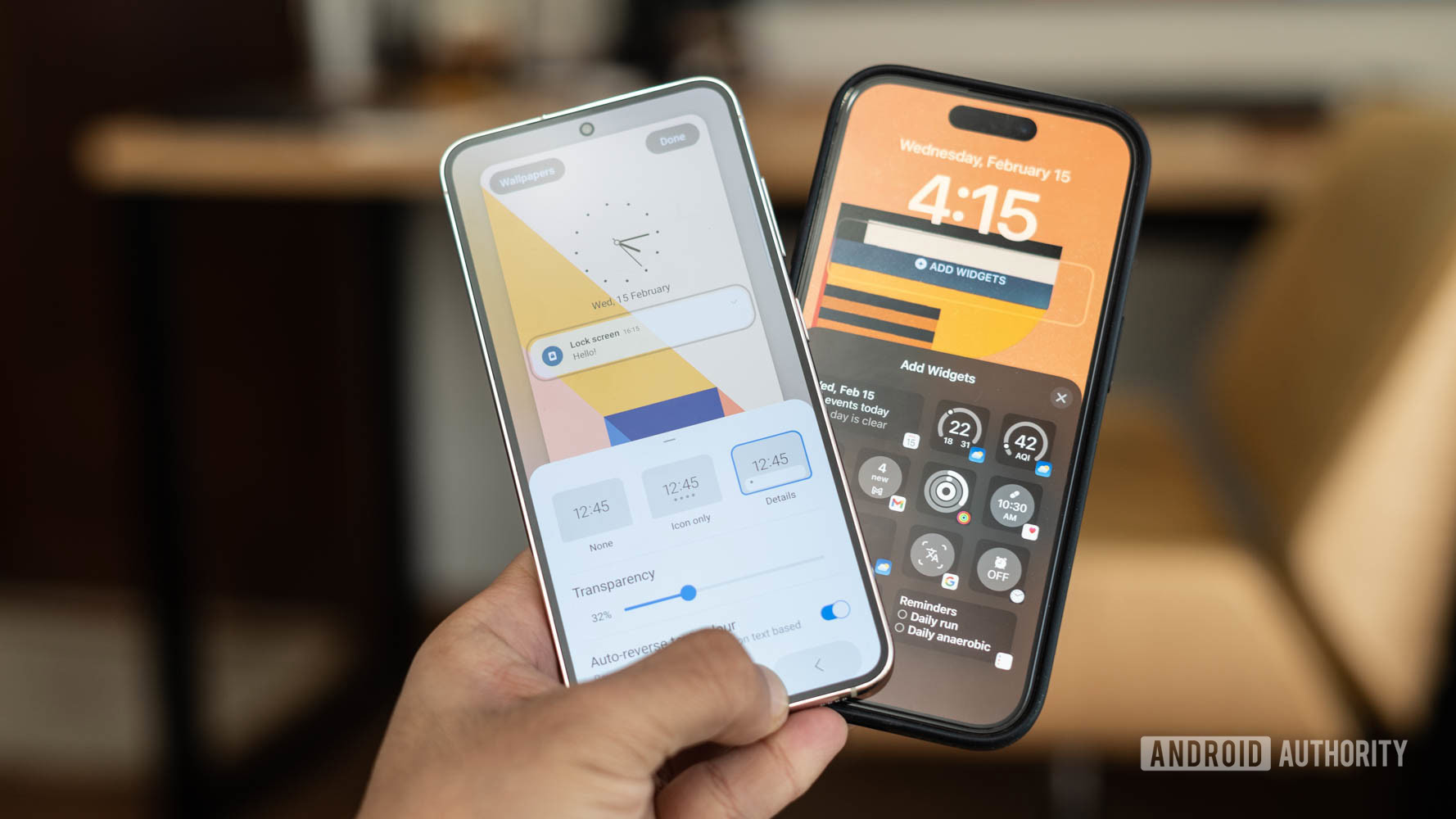
Those customization possibilities further extend into the notifications panel, but that’s also where things get interesting. While Samsung lets you swap between a minimal notifications hub and a full-blown panel, the iPhone presents no such option.
In the case of One UI, you can choose between no icons, a minimal hub, or a full-blown notifications widget that shows icons for every existing notification. You can then tap on the hub to pop open the full list of notifications and interact with them. The extended widget hub, however, can get pretty messy as it overflows over existing text elements if you’ve got a lot of notifications like me. I found the sweet spot to be in the minimal hub that shows a small number of icons indicating incoming notifications.
Unlike iOS, Samsung One UI lets you customize the appearance of lockscreen notifications, but the implementation isn't perfect.
On iOS, notifications continue to be a bit of a hit or miss in terms of presentation. While the lock screen remains pretty clean with the cascaded list of notifications placed at the bottom of the phone, pulling them up and interacting with them hasn’t changed much. Despite attempts at reducing clutter, iOS has a long way to catch up with Android’s quicker and cleaner way of dealing with notification overdose.
Unlike iOS, One UI on Samsung phones will also let you swap out the shortcut buttons placed at the bottom of the screen, which is a nice touch. The big win for Apple, however, is in how the iPhone allows you to place widgets on the lock screen.
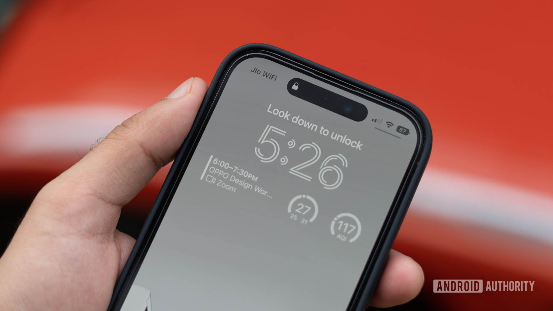
Now, widgets on the lock screen aren’t new, nor have they always been the most useful addition. The feature has been a part of Android for years, but the implementation has always been lacking. Apple’s forced emphasis on aesthetics and strict guidelines ensures that the end product is a lot more polished than anything we’ve seen so far. Be it the visually pleasing widgets on the home screen or the Apple Watch-like complications embued variants on the lock screen, it’s a marked visual upgrade over widgets on Android. I’ve added essentials like a habit tracker, fitness metrics, and a Reddit widget to the lock screen and find great utility in the at-a-glance visibility. It’s brilliant.
One UI's pre-selected list of lock screen widgets are a far cry from the vast number of elegantly designed widgets on iOS.
On the other hand, Samsung hides a predefined set of system-level widgets behind a second tap of the clock widget. These are limited to a music player, weather widget, clock, and routines. Samsung’s surprisingly rigid system is in stark contrast to Apple’s rare, liberal approach to lock screen personalization.
Home screen widgets get an upgrade
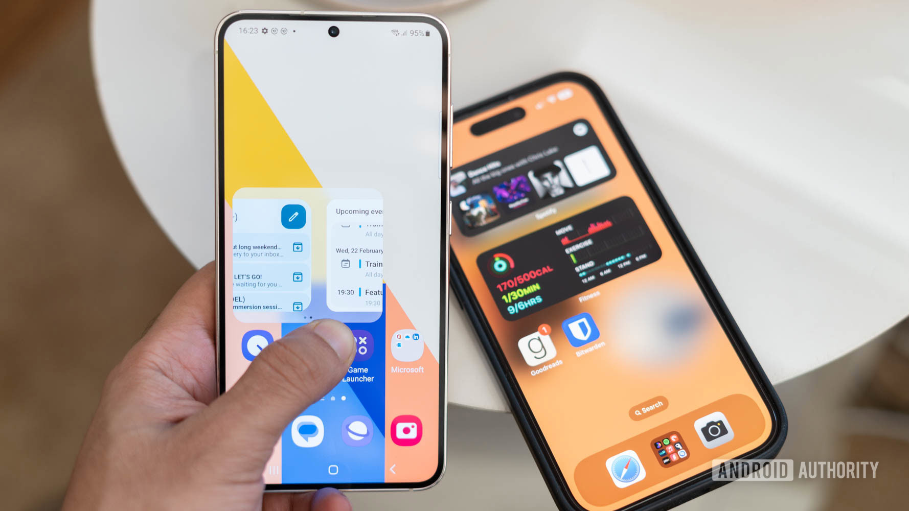
Swiping into the home screen opens up a starkly different yet similar world of customization. For example, Samsung recently added the ability to create stacked widgets in One UI 5. These widget stacks can incorporate a range of widget options that can be pulled out contextually based on how you use your phone.
One UI's stacked widgets aren't as smart as iOS 16's widget stack.
Unlike the vertical-scrolling iPhone stacked widget, Samsung has opted for horizontal scrolling, but that’s just a matter of personal preference. I use it to tuck away widgets for package trackers and health metrics I’d like to have on hand but don’t need to see all the time. Like the iPhone, I’d have liked to see additional smarts here to pull out specific widgets based on notifications or activities. Sure, Samsung’s smart stack can do just that, but that’s an entirely separate widget.
Another feature that caught my eye was the spruced-up wallpaper support. If you prefer bright and graphically intense wallpapers, Samsung’s video wallpaper addition would be of interest to you. The software makes it a cinch to use any video as a lock screen or home screen wallpaper. The effect can be a bit garish and isn’t for me, but the option is there for those who like it. The iPhone offers no such option.
More One UI and iOS bits and bobs
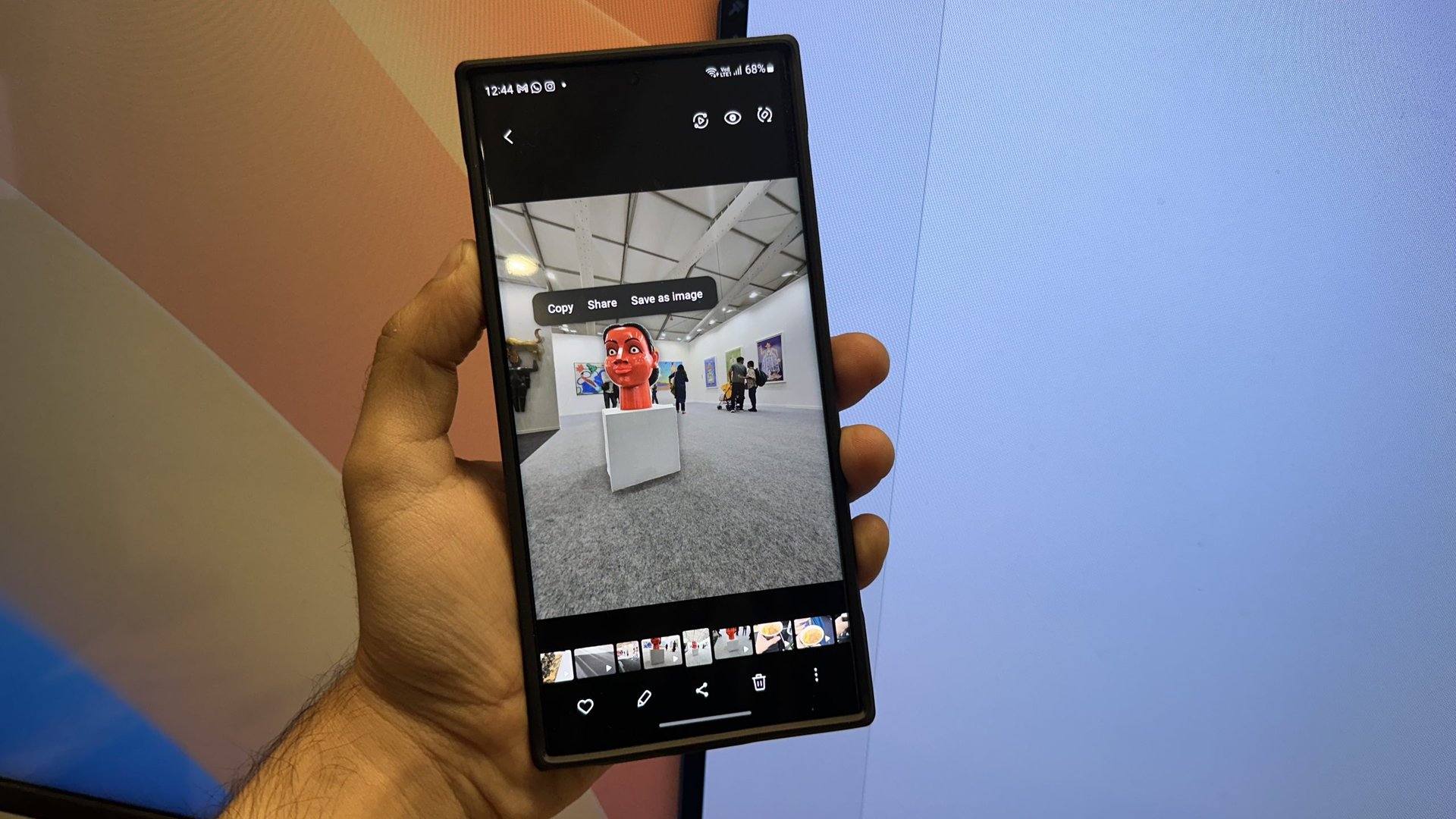
Samsung’s iOS-inspired features extend to more aspects of the user experience. For example, the ability to pull out elements from a photograph is straight-up riping off Apple’s iOS 16 feature. Samsung’s implementation gets the job done but tends to miss out on boundaries on occasion. Moreover, it tends to apply a halo around the subject which might not be quite what you want. On the flip side, One UI 5 does let you save the object as an image with a single tap instead of using the overflow menu on iOS 16 — a small time-saver for those who use the feature a lot. Other than the direct option to save the extracted element, iOS generally fares better here.
Samsung's method of pulling out subjects from an image is good but not perfect.
Another feature that got consolidated with One UI 5 is routines or Bixby routines as it was previously called. While Samsung has had the feature for several years now, the rejigged arrangement makes it easier to access and set up. Like Focus Modes on iOS, modes in One UI 5.1 let you activate quiet times or whitelists and blacklists for apps depending on work hours when you are driving or working out, and more. Routines, Samsung’s take on Siri Shortcuts, however, are much easier to implement. A series of straightforward if-then logic statements can have you set up scenarios like activating Google Maps when driving or disabling silent mode when out and about.
Apple’s Shortcuts app continues to be a lot more powerful and will let you set up more in-depth programmatic logic. One of my favorite use cases has been to set up a shortcut that will let me send a WhatsApp message without saving a phone number as a contact. Overall, while there are similarities to be found here, the scope of the feature is very different. Samsung’s routines feature is a light built-in substitute for the much more powerful — and equally complicated — prosumer-focussed Tasker. Apple’s Shortcuts, on the other hand, might be a bit too complicated for the average user but have a lot of potential for users who want to get their hands dirty. Personally, I prefer Apple’s approach of giving more power to the user here, especially since iOS’s walled garden won’t let me install an alternative app.
One UI 5.1 vs iOS 16: Which one does it better?
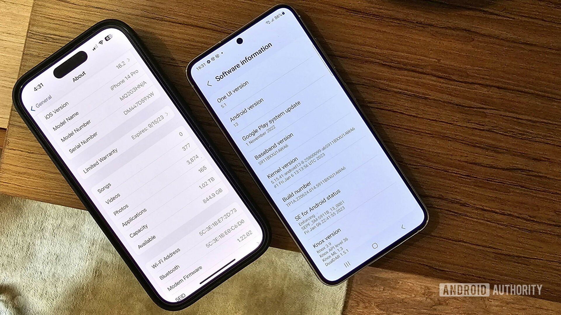
Now that I’ve spent a week testing out One UI 5.1 on the Galaxy S23 Ultra, it is clear to me that both manufacturers are heading in a similar direction even though their approaches might be slightly different. If you’d asked me a few years ago, I’d never have guessed that Apple would have a fairly robust system of customization in place on the iPhone, but here we are.
One UI clearly takes a lot of inspiration from iOS, but usually does it just as good, if not better.
Still, outside of a few instances, Samsung’s One UI takes existing Android features plus inspiration from Apple and elevates everything with more capabilities and/or ease of use. It’s a great position to be in for fans of either operating system, and you’re not really missing out on much by picking one over the other.