Affiliate links on Android Authority may earn us a commission. Learn more.
Here's the one thing I hate about Samsung's One UI
June 1, 2024

One UI has really grown on me after almost four years of using Samsung Galaxy phones. It’s a great skin overall, but there’s one thing about it that I truly hate, and that’s bloatware — and it seems to be getting worse each year.
Samsung One UI’s bloatware problem
All smartphones come with pre-installed apps, including iPhones and Pixels. However, it seems like Samsung is taking it to the extreme.
For starters, there’s a plethora of Samsung apps on board, some of which duplicate the functionality of Google’s pre-installed software. They take up precious storage space on the device, consume processing power and RAM, eat into the battery life, and slow down performance, especially on budget Galaxy phones. They consume data too, because the phone automatically downloads them during setup.
But the bloatware problem isn’t limited to just mid-range phones. Spending top dollar on a flagship Samsung phone doesn’t get you immunity either. The Samsung Galaxy S24 Ultra comes with more than 50 pre-installed apps and services!
You can uninstall some of them like TV, Global Goals, Smart Tutor, Shop, and others. But unfortunately, you can’t get rid of Google duplicate apps including Phone, Messages, My Files, and Gallery. I find it distasteful that an expensive Samsung phone comes pre-installed with apps that I’ll never use and also can’t delete.
It’s not just Samsung apps
While I don’t like the idea of my phone having a bunch of Samsung apps on board, I can at least understand the logic behind this decision. It’s just Samsung’s way of trying to get people to use them. If you start using Samsung apps and like them, you’ll likely stick with the brand for a long time since you won’t get most of these apps on other devices. And to be fair, some of the apps are actually good. Samsung Notes, for example, has more functionality than Google Keep could ever imagine.
However, the real frustration comes with third-party software. These include Google apps like Google TV, Meet, and YouTube Music. Then there are Microsoft apps as well like Microsoft 365, LinkedIn, OneNote, and OneDrive. The Galaxy S24 also comes with Spotify, Netflix, and Facebook. While I get that some of these are popular, I personally don’t use most of them. And the ones I do I can always just download myself if I want to. Thankfully, unlike a lot of Samsung apps, at least you can uninstall them.
However, that’s just another task one has to do when setting up a new Galaxy phone. I feel like the experience of a new phone should be about downloading apps you like and organizing the home screens, not sorting through 50 apps and deleting the ones you don’t want to use — if you can delete them at all.
A backward evolution for One UI

Samsung’s software evolved from TouchWiz to Samsung Experience and, finally, to One UI. The colorful TouchWiz existed before Samsung launched the first Galaxy S smartphone and had its issues including a cluttered design.
Samsung then overhauled the UI, taking a more minimal approach. Samsung Experience was launched, which came just in time for the Galaxy S8’s debut. Although the software was more streamlined than TouchWiz, it still had issues.
The tech giant returned to the drawing board in December 2018 to develop One UI. Its polished interface gave it a breath of fresh air compared to its predecessors. The UI was both simpler and easier to use.
There's more bloatware on newer Galaxy devices than on older ones running One UI.
Since its debut, One UI has continued to evolve, with Samsung making regular changes and adding improved functionality. However, the evolution is taking a backward turn because there’s more bloatware on newer Galaxy devices than on older ones running One UI.
For example, while the Galaxy S20 — launched with One UI 3.0 based on Android 11 — came with several Samsung, Google, and Microsoft apps, it didn’t have nearly as many on board as the latest Galaxy S24. There was no Samsung TV, Global Goals, or Shop on board. There was no Google TV, Meet, YouTube Music, LinkedIn, or OneNote on board, either. And while the S20 came with Netflix and an uninstallable Facebook app, it didn’t have Spotify. The S21 was even better, ditching Netflix, OneDrive, and many others.
The S24 series having more bloatware than the S20 seems like a huge backward evolution to me. Considering that most people uninstall or disable these apps, it’d be nice to see Samsung tone it down a little and make the whole experience more manageable. Forcing apps on users, especially the ones from other companies, doesn’t help in creating a great first impression with Samsung devices. Less is more in my opinion, especially when it comes to software.
I still love One UI, though

I don’t want to make it sound like One UI is all doom and gloom. In fact, I’m actually very fond of it overall. Samsung’s software skin has dominated one-handed use. Navigation across all the apps on the phone is seamless, thanks to the entire page dropping down to thumb level when scrolled. The software skin is also packed with tons of nifty features I use regularly.
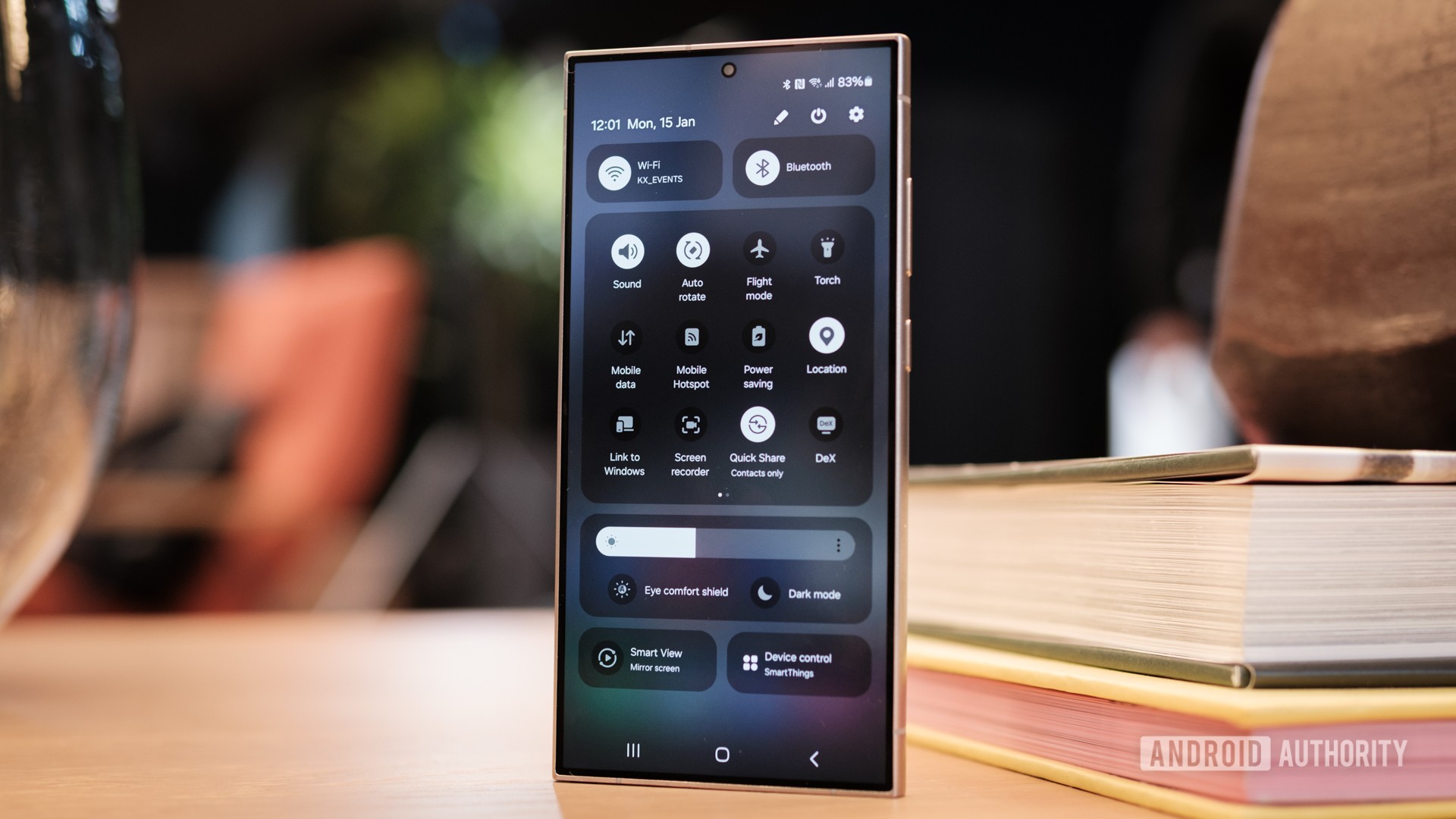
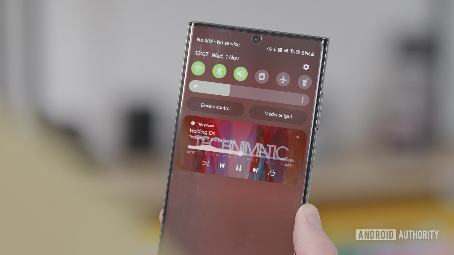
With the latest version of Samsung’s skin — One UI 6, based on Android 14 — the tech giant is keeping things simple by not changing the UI for the sake of it. While there aren’t significant overhauls, it brings several quality-of-life improvements, like minor visual tweaks to the Quick Settings panel, notification shade, and audio player. It also lets you set different lock screens for each mode, alongside several other features detailed in our One UI 6 review.
Do you think there's too much bloatware on One UI devices?
The most exciting part of One UI is the updates. Samsung took the update throne from Google when it announced three years of major OS updates and four years of security updates. It later upped that to four major OS and five security updates, leaving Google in the dust.
Google rose from the ashes, promising seven years of updates with the launch of the Pixel 8. However, Samsung quickly matched the tech giant stride for stride by offering an equal support length for its devices. It’s also worth noting that its update speeds are unrivaled, second only to Google.
These are the things that attract me to Samsung’s phones and its software, which I’ll continue to use and enjoy. But I’d enjoy it a lot more with less bloatware on board, or at least the ability to delete all the apps that come pre-installed. And honestly, I don’t think I’m the only one who feels this way.
Let me know if you agree or disagree with my take in the comments. I’d love to hear your thoughts.
Thank you for being part of our community. Read our Comment Policy before posting.