Affiliate links on Android Authority may earn us a commission. Learn more.
Hands-on with Samsung One UI and Android Pie on the Galaxy S9
Published onNovember 16, 2018
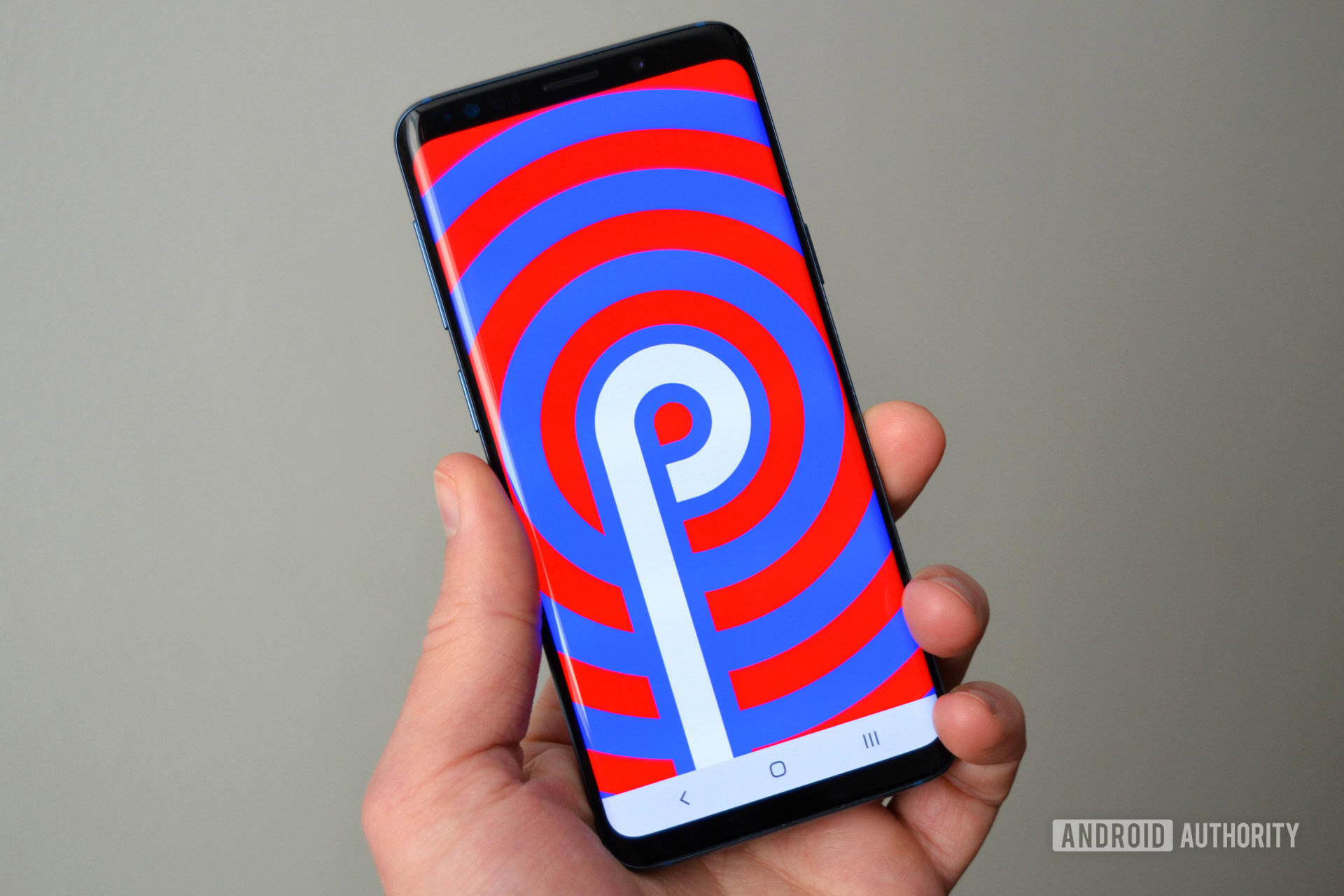
Samsung recently announced an all-new user interface for its phones. It’s called One UI, and it aims to simplify Samsung’s notoriously feature-packed software while also making everything more visually appealing.
If you own a Galaxy S8, S8 Plus, Note 8 or Note 9, you can try out the beta version of One UI right now — and I’d suggest you do so. One UI is a fantastic improvement over Samsung’s previous software, and makes everything much easier to use. If you own the Galaxy S9 or S9 Plus, the stable version of the One UI is currently rolling out around the world.
What’s new in One UI?
There are a ton of new features and visual improvements in One UI. The full list can be found here, but I’ll walk you through the most important ones.
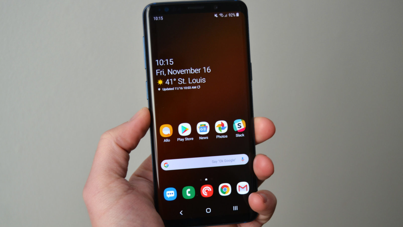

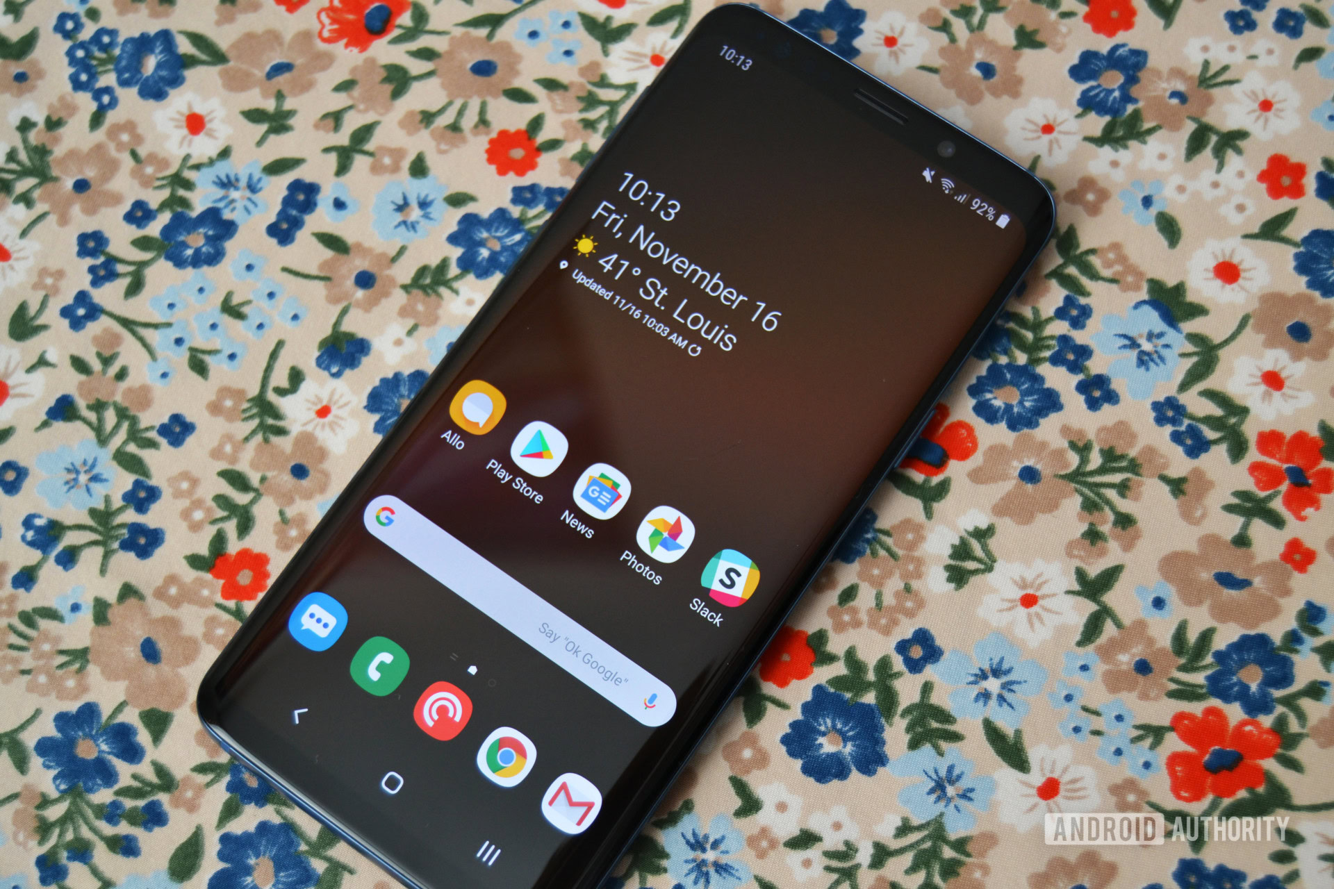
The whole user interface has received a really clean visual makeover. Since this build of One UI is based on Android 9 Pie, you can expect to see even more white settings menus with bright blue accents. Samsung’s system app icons are all new too, as are the buttons in the quick settings panel. About the only thing on the home screen that Samsung didn’t touch is the app drawer, which confusingly still requires you to swipe horizontally instead of vertically.
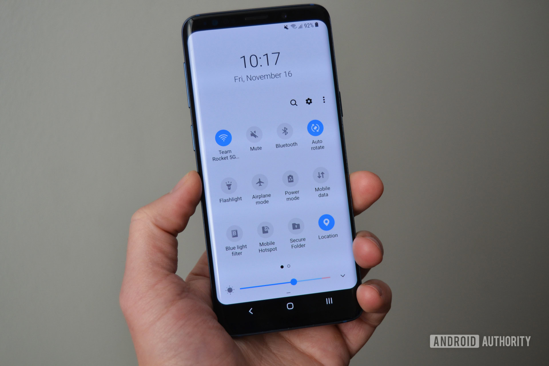
Samsung is trying to reimagine how software is designed in relation to how big our phones are. Instead of including touch targets at the top of an app, Samsung is now reserving that space for visual-only elements. The bottom half of each app is for interactive elements. Take the quick settings panel for example: Once you swipe down twice to reveal all the quick settings, the top half of the screen shows the time and date while the bottom portion shows your quick settings. This not only makes it easier to reach things with one hand, it also makes each app look much cleaner.
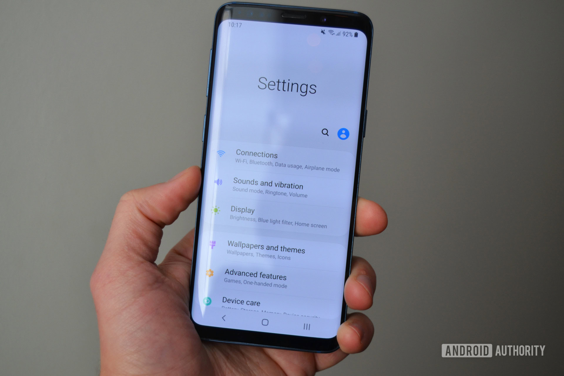
We’ve complained (okay, I’ve complained) about Samsung’s confusing settings menu layout in previous builds, but the company is making that better too. You’ll find some of the toggles have been moved to different areas in the settings menu that make more sense. Also, related settings are now grouped together into subheadings. For instance, the apps and notifications sections are now bundled together, while lock screen and biometrics/security are grouped together.
Most of you are going to love this next feature. Samsung added a system-wide dark mode to One UI, and it’s just as awesome as it sounds. Turning on night mode gives every system app — messages, quick settings, regular settings, and even Bixby — a dark theme. It’s true-black too (not that mostly grey tone Google uses on its Pixel phones), so you’ll be able to save some precious battery life thanks to the S9’s AMOLED screen. Samsung claims you can set it to automatically turn on/off with the sunrise/sunset, but I think that option is missing from the settings menu in this build.
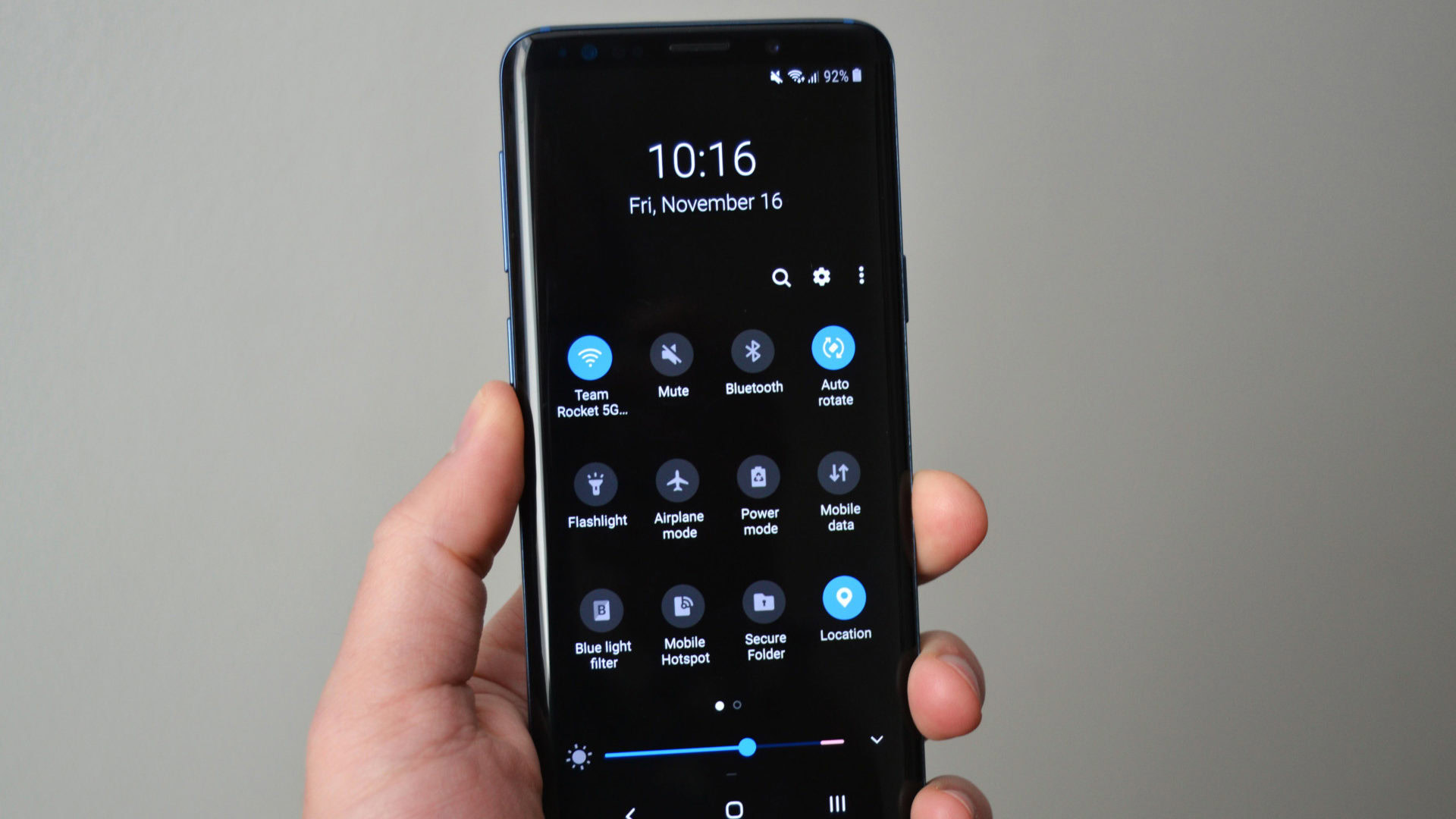
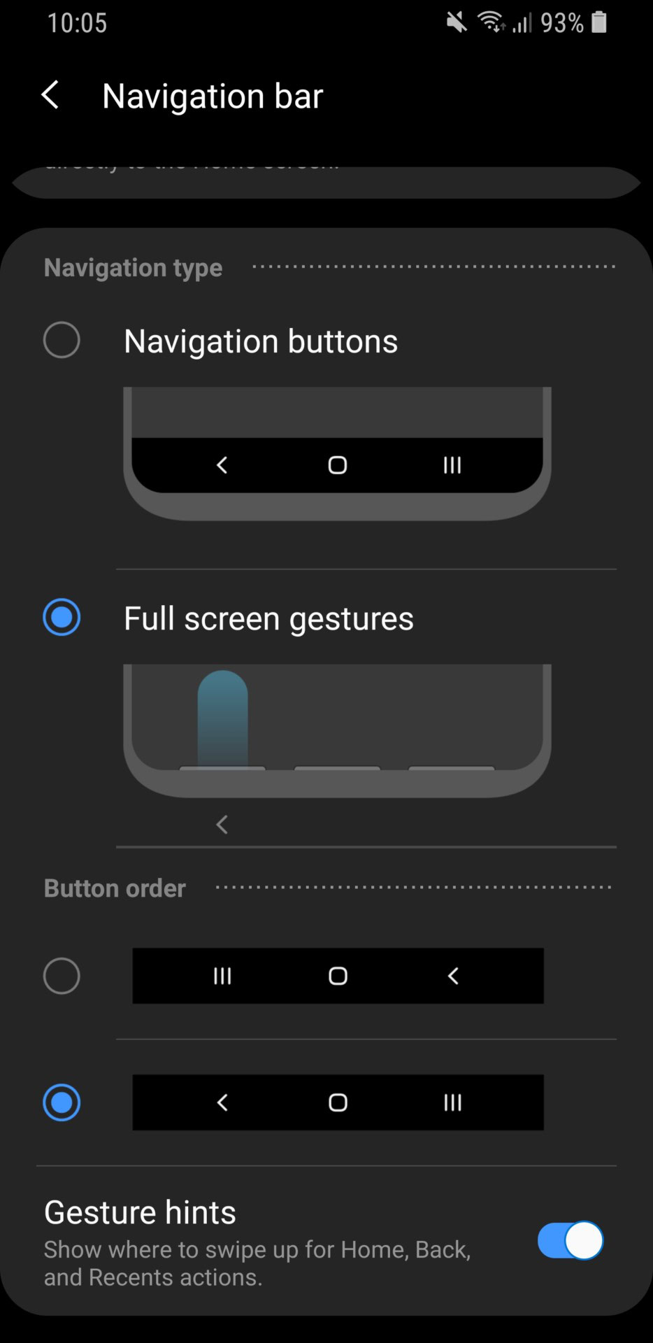
Samsung has changed the look of its navigation buttons too. The home button is more rounded, and the app switcher has been changed to three vertical lines.
If you don’t want to use traditional navigation buttons, Samsung also included a gesture navigation option in this build. These are Samsung’s own gestures, not the gestures many of us our used to on the Pixel. Basically, the new gestures remove the navigation buttons and replace each one with a swipe up from the bottom of the screen. If you need to go back, swipe up from the left side (under where the back button would normally show up). The same goes for the home button and recent apps.
I think the idea behind it is good — the attempt at simplicity shouldn’t be understated — but I don’t think it works well in practice. Maybe I just haven’t given myself time to get used it.
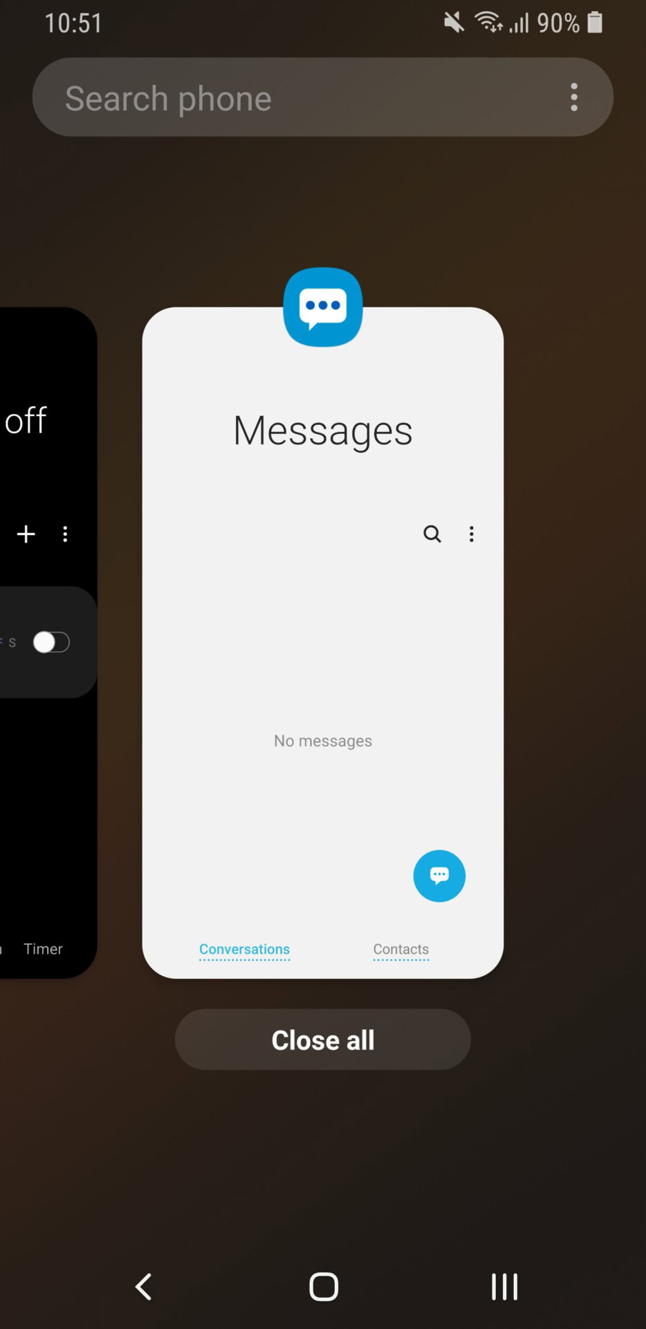
Finally, the recent apps menu has been overhauled. It now scrolls horizontally like most other Android Pie builds, and it’s quite fast. You also get a search bar at the top if you want to quickly type out the app you’re looking for.
A few other tidbits to mention about One UI:
- The always-on display now has a “tap to show” option if you don’t want it running at all times.
- New clock styles have been added to the always-on display.
- Always-on display now also features charging information.
- There’s a new scene optimizer in the camera app that’s supposed to automatically recognize things like food, landscapes, and people.
- The stock Samsung keyboard now has a floating keyboard option. It will also change color depending on the color of the surrounding app.
- Bixby Home also received a visual overhaul, but it’s still the same, finicky Bixby we’ve all grown to ignore.
- HEIF images are now supported.
Remember, this is a beta
For as much of an upgrade as this is, you’re still signing up for a beta. That means apps might not work, random force closes might happen, and you’ll probably experience a good amount of jank in certain parts of the OS.
I haven’t had any major problems or app crashes, but I have noticed a few things. As mentioned, Samsung says you can set night mode to a specific time or based on the sunrise/sunset, but that option is missing for me. My Galaxy S9 also likes to disable night mode at random times, even though I have it set to stay on at all times.
It’s a small thing, but I’ve also noticed some spacing issues in the app drawer.
How to install One UI on the Galaxy S9 and S9 Plus
You can find all the instructions on how to join the One UI beta program right here. I do want to clarify a few things, though:
- U.S. users need to join the program via the Samsung+ app, while everyone else needs to join in the Samsung Members app.
- If you don’t see a prompt to download the One UI beta on the Samsung+ home screen, you may need to update your app. I saw the prompt after updating Samsung+ to the latest beta. You can download that here.
- I’ve heard some users have been having trouble receiving the OTA update after joining the One UI beta. If you’re struggling with that, pop in a SIM card and the download should be available.
I’m really impressed with One UI even though I was skeptical at first. The changes Samsung made to its apps, coupled with the new visual style, make this a fun Android skin to use. I didn’t think I’d ever say that about Samsung’s software, but here we are. Good job, Sammy.
Have you given One UI a shot? What do you think so far?