Affiliate links on Android Authority may earn us a commission. Learn more.
Samsung's One UI design is getting stale

When Google dropped Android 12 in 2021, it drastically overhauled the way the operating system looks and feels. Material You made Android 12 more adaptable to the user’s taste while also making the system more uniform. This change ended over three years of Android looking pretty much the same from generation to generation.
However, Samsung’s One UI Android skin didn’t reflect those changes. In fact, it hasn’t changed much at all in its four-year history.
This puts Samsung in a precarious situation. On the one hand, One UI is its own thing and Samsung leaving the design alone keeps things consistent across its huge lineup of devices. On the other hand, hardcore Samsung fans might be looking at the “new” Android and feeling left out of the fun.
Myself, I am firmly in the latter category. While Samsung’s One UI skin is powerful, customizable, feature-rich, and thorough, it’s also become boring. Firing up a new Samsung phone today feels just like firing up a Samsung phone from four years ago.
On the dawn of One UI 5’s big reveal, I think it’s time for Samsung to change things up a bit.
Samsung’s One UI hasn’t changed much
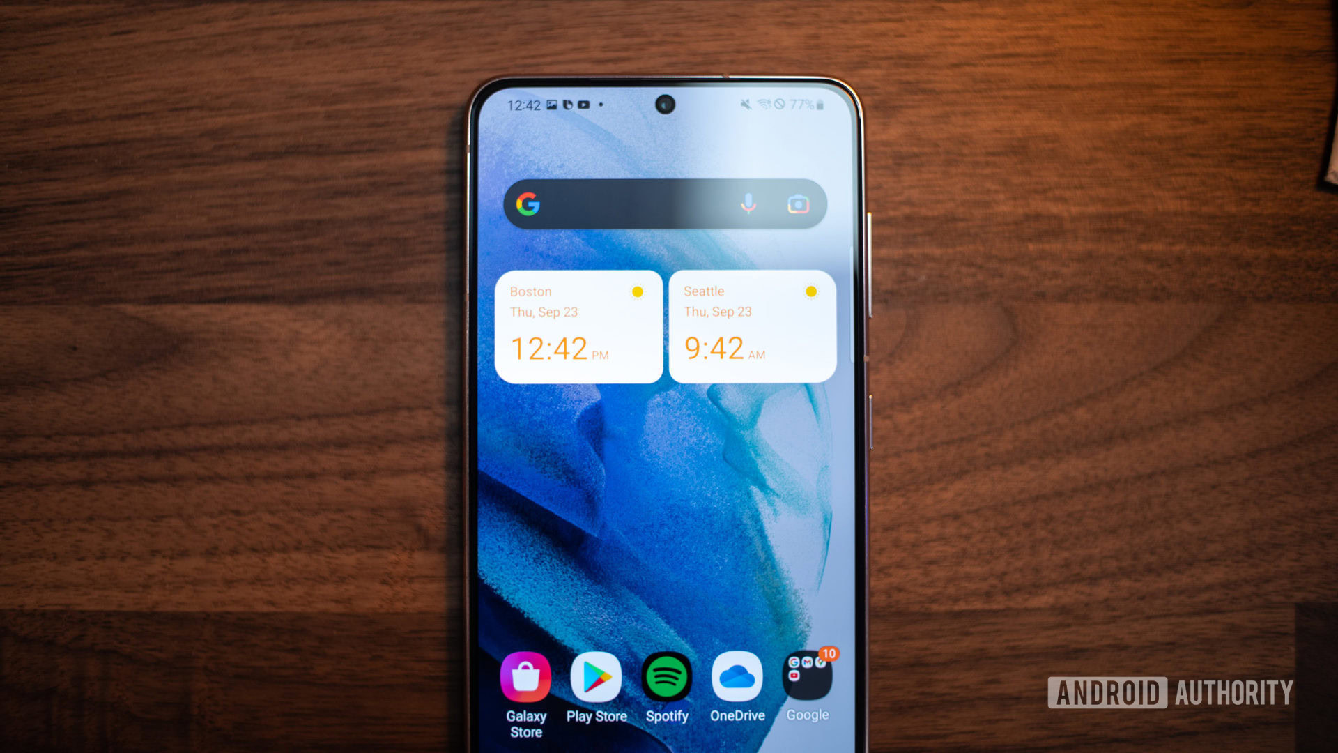
Above, you can see the four major iterations of One UI. This is how they appeared when you took the Galaxy S phone of that year out of the box. Outside of the wallpaper, it’s pretty much the same on each device.
It doesn’t end at the home screens either. The notification drop-down, Quick Tiles, app drawer, pages within Android settings, and pretty much every other aspect of the skin haven’t changed on any significant level since 2018.
Outside of the default wallpaper, a Samsung phone from 2019 looks just like a Samsung phone from 2022.
Instead, Samsung has made tiny changes here and there. For example, with One UI 4, Samsung offered some new widgets. These widgets fit with the Material You look of stock Android 12. However, the drastic overall changes to Android 12 did not appear.
Now, with Android 13 going official in August, we know from One UI 5.0 beta launches that it won’t look much different than previous generations either.
How long can Samsung keep this up? Maybe the company doesn’t want One UI to ever change?
Consistency might be key?

It’s not difficult to see why Samsung wouldn’t want to alter One UI that much. The company launches dozens of devices each year at price points varying from $100 to nearly $2,000. One UI powers them all, and keeping that experience consistent could be an integral part of its branding strategy. One UI has even made its way to Samsung’s laptops as a skin on top of Windows and Wear OS, so it’s not hard to see why it doesn’t want to rock the boat too much.
Samsung also now sets the bar when it comes to Android upgrades. For most of its devices, the company offers four Android upgrades and five years of security patches. This commitment is the best in the world of Android, outshining even Google itself. It’s possible that keeping One UI the same from year to year works into that strategy as well. In other words, it could be that changing One UI too much would cause Samsung to not be able to make this same commitment.
Finally, there’s also a simple question of a return on investment. Samsung might have done some marketing research and found that most people don’t seem to mind the idea that One UI hasn’t changed much. After all, iOS has looked pretty much the same for the better part of a decade, and people still love buying iPhones. If that were the case, it would make a lot of sense for Samsung to skip spending time and money on revamping the look of its Android skin since that alone is unlikely to sell more phones. You can help us see if this could be the case by answering the poll further up in this article.
Do you think One UI needs a major revamp?
I am losing excitement for One UI

Regardless of Samsung’s reasoning for keeping One UI from changing much, I think it could use a refresh. Stock Android now has a very distinct look and Samsung’s One UI doesn’t fit that look. In a way, it makes Samsung phones feel like they are from the past rather than part of the present.
Obviously, Samsung can’t just take the look of stock Android and “Samsung-ify” it. That would make Samsung phones look too much like Pixel phones, which would be a huge mistake as far as branding goes. But there are so many directions in which it could go. Maybe taking an approach that has a lot of straight lines to contrast the “curves everywhere” aesthetic of Pixel UI. Perhaps going a bit more simplistic along the lines of Windows 11 would be cool. Android is so flexible so the sky’s the limit for what Samsung could do here.
Whatever Samsung would do, I think it needs to do it. Frankly, One UI is just getting old. While this might not happen with One UI 5 straight out of the gate, I’m hoping for at least some signs that Samsung is willing to mix up its increasingly tired formula. Otherwise, it’s going to be terribly unexciting to pick up a Galaxy S23 and see the same layout I’ve seen since the Galaxy S10.