Affiliate links on Android Authority may earn us a commission. Learn more.
Shame! Shame! Samsung and OnePlus have ruined my favorite smartwatch feature
August 17, 2024

Before I get to it, I hope anyone perusing this article knows to read the title at the pace and tone of Septa Unella in Game of Thrones. Shame has been earned. Now that that’s out of the way, I am very disappointed in both OnePlus and Samsung for making the same regrettable design choice on their latest smartwatches. More importantly, both companies teased an improvement, only to let us down unapologetically. I thought a rotating digital crown was making its way to the masses with these watches, but ended up with misleading buttons.
Would you want a rotating digital crown on your smartwatch?
When a smartwatch leaks and renderings or photos make their way across the web, my interest is immediately kindled. Like most reviewers (and most children in early December), I love sneak peeks. Guessing internal specs, musing over compatibility, and over-analyzing design choices is half the fun of anticipating launch seasons. Unfortunately, sometimes, that means getting my hopes up based on misguided assumptions.
Leaked images led me to believe both the OnePlus Watch 2 and Galaxy Watch Ultra would feature a rotating digital crown.
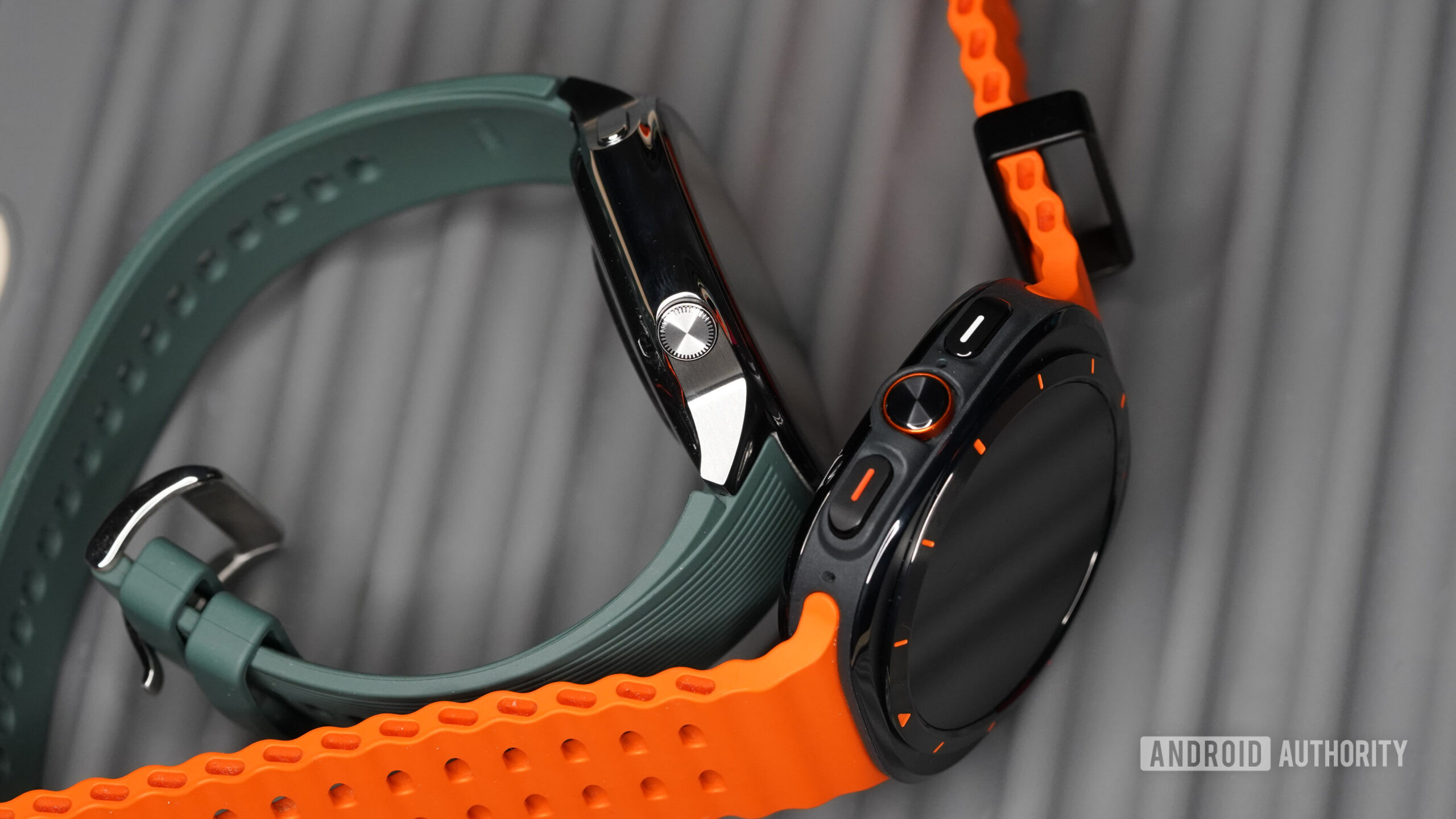
Just like the time I thought Santa was bringing me a bicycle, but the big box turned out to be my brother’s, sometimes a device lands and breaks your little heart. This has never been the case more than when both the OnePlus Watch 2 and 2R and the Samsung Galaxy Watch Ultra arrived with kneecapped digital crowns. I was fully prepared to spin my way through powerful Wear OS experiences, and instead, the crowns don’t function as anything but glorified buttons.

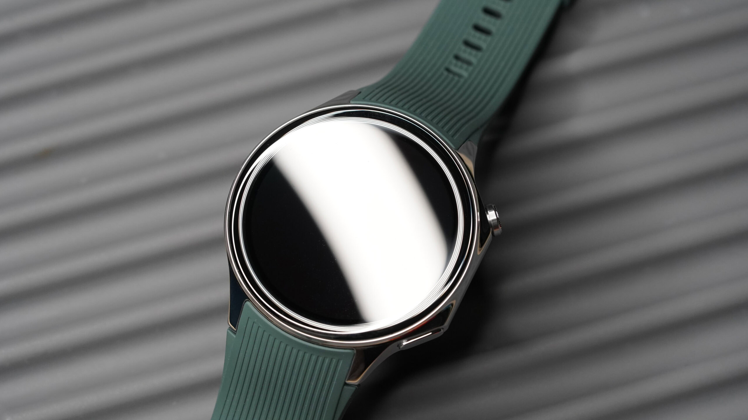
The OnePlus Watch 2 was the first offender. I saw images of the newly designed watch but then heard the news that the prominent digital crown would, in fact, spin, but not to any effect. Coming from the Apple Watch, I constantly tried to use the OnePlus watch crown anyway, only to remember that the functionality doesn’t exist. It’s a customizable button, yes, but the shape and spin is only for looks. Throughout my review period, it repeatedly blew my mind that a company would incorporate a rotating dial into the design of their watch case but not make it truly useful.
Unfortunately, neither company added functionality to the devices' digital crowns beyond use as basic buttons.
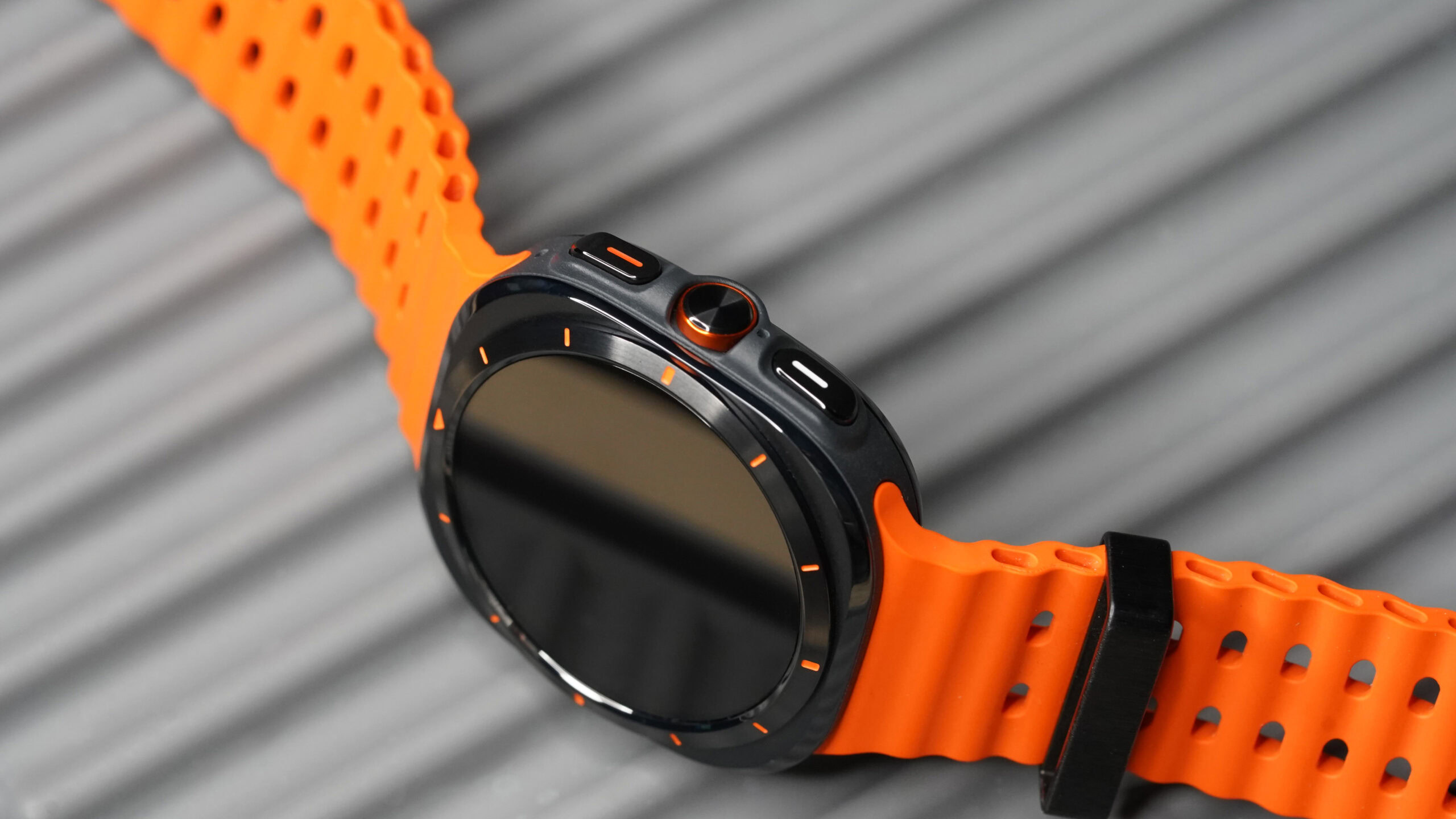
Then, the Samsung Galaxy Watch Ultra arrived in all its Apple-influenced glory, and I thought, yes, finally, my favorite navigation tool would make its way to Wear OS. I even celebrated the clever button guard, which I knew would help prevent accidental bumps and spins. Yet despite copying Apple’s bands, siren, and color scheme, Samsung drew the line at Apple’s rotating digital crown. I actually don’t even think the Samsung crown spins (other reviewers claim it does, but mine is stubbornly set in place).

When I consider that Samsung also opted not to include a rotating bezel on the Galaxy Watch Ultra, my distress grows. Tactile navigation is not only satisfying, it’s incredibly useful in a number of scenarios. Touchscreens can be very unreliable with sweaty hands or sunscreens. They’re also hard to use on the go. I often try to scroll through a menu mid-workout and end up on the wrong screen or at the bottom of a long list. A digital crown offers an additional way to interact with your device that is more consistently responsive while fitness tracking.
Apple's rotating digital crown remains the best example of the tool.
I’m not saying every smartwatch needs to add a rotating Digital Crown, but I simply do not understand the point of adding a crown but failing to put it to good use. If I purchase a wearable with four buttons and one doesn’t do anything, I’d be baffled. In my opinion, a rotating digital crown that can’t scroll isn’t much better.
Thank you for being part of our community. Read our Comment Policy before posting.