Affiliate links on Android Authority may earn us a commission. Learn more.
Samsung appears to be copying the wrong bits from Apple
Published onNovember 26, 2023
We’re slowly closing in on the launch of Samsung’s Galaxy S24 series, which will no doubt set the bar for the best flagship smartphones of 2024, and not just in the Android sphere. This year’s launch could be particularly interesting, with plenty of rumors suggesting big changes to come.
For starters, January’s rumored launch looks set to include both Exynos 2400 and Snapdragon 8 Gen 3 chipsets, reigniting the old geographical rivalry. A shift towards powerhouse AI features is said to be on the cards, as could a lock screen shortcut to Instagram that surely no one asked for. There’s already plenty to talk about and the phones are still months away.
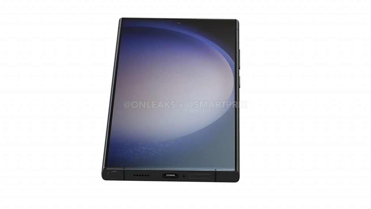
But perhaps the biggest leaked change is Samsung dropping its long-running curved display from the Ultra in favor of a flat(ter) panel. Leaked renders certainly look more Apple-esque than anything we’ve seen before, but I’m not sure this is the sort of change Samsung should be focusing on.
For one, I’m a convert to curved panels for larger phones. Yes, the regular Galaxy S24 will be lovely to use with a flat panel; it’s small enough to hold in one hand, regardless. But once you’re well above 6 inches, flat panels quickly become a hindrance, while subtle curves help keep a phone usable in one hand. Ergonomics are extremely important with a phone as large as the Galaxy S24 Ultra, and a flatter panel won’t help unless the phone is substantially thinner, which doesn’t appear to be the case.
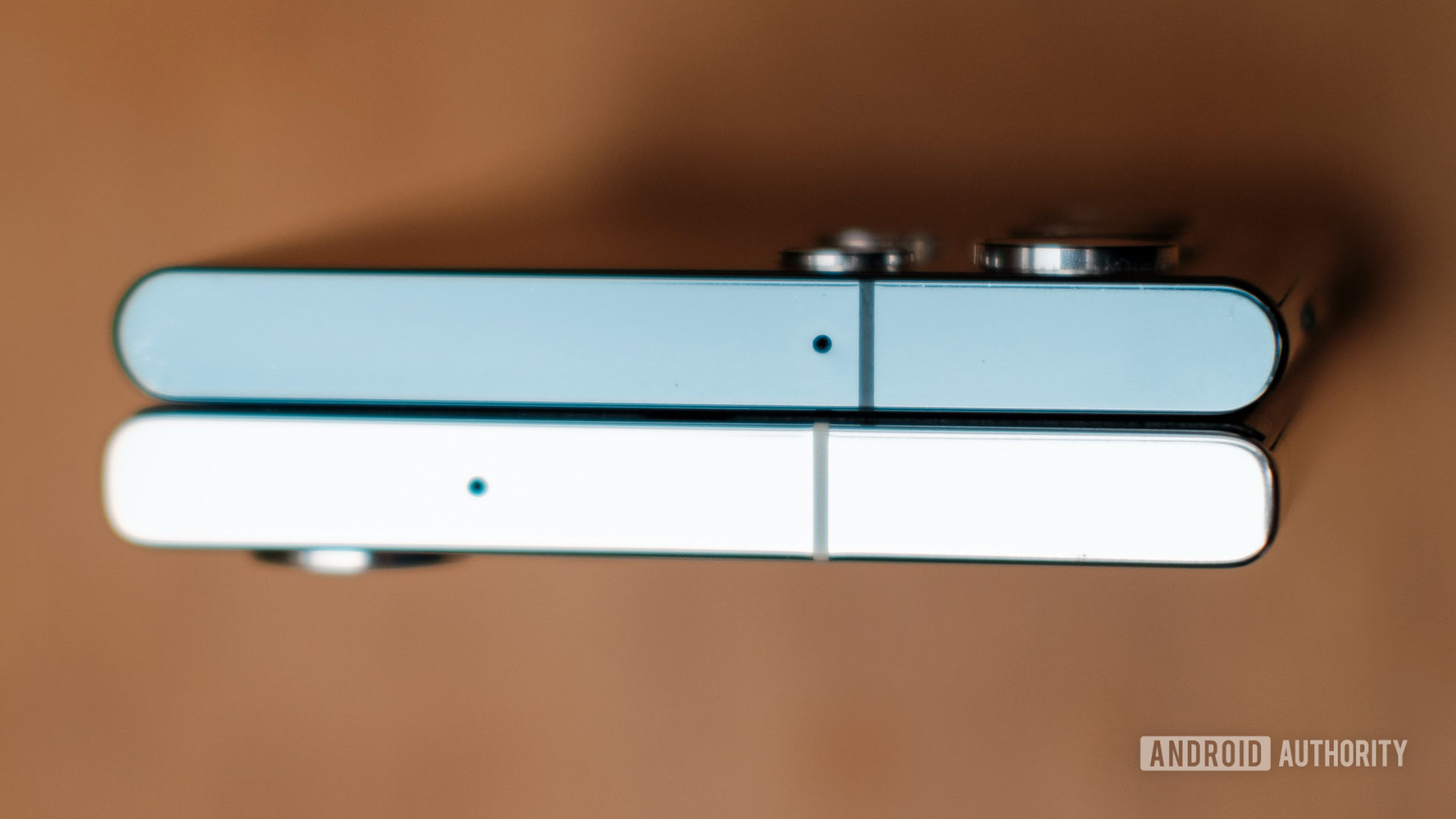
Samsung has been moving towards flatter Ultra edges for a couple of generations. As shown in the picture below, the S23 Ultra’s chassis is slightly flatter than the S22 Ultra’s. The display still has a curve, but the newer model is boxier overall. Having used both, I think this makes the S23 Ultra bulkier and more awkward to hold than its predecessor.

You only have to look at the almost universal disdain for the sheer awkwardness and bulk of Apple’s flat-edged 6.7-inch iPhone 15 Pro Max and its predecessors to be worried about the S24 Ultra. Even shaving off weight with a move to a titanium chassis hasn’t made the gargantuan iPhone any easier to interact with, another attribute Samsung appears to be emulating.
Of all the things Samsung could do to try and win over iPhone customers, copying Pro Max ergonomics is just not it. Thankfully, the leaked renders (which are only so reliable anyway) hint at a subtle chassis curve that should make the phone more comfortable to hold than the Pro Max. Even so, pushing the bezel up on top means less display where you want it most.
Of all the things Samsung could do to try and win over iPhone customers, copying Pro Max ergonomics is just not it.
US market share data makes pretty grim reading for most manufacturers, but Apple is holding up better than the rest. Perhaps that’s prompted a little more emulation from some rivals, but the design is just a small aspect of the modern smartphone identity. iMessage is arguably more key to Apple’s Western appeal, as recent RCS adoption and other news have highlighted, and Samsung can’t do much about that.
But it can double its efforts to catch Apple’s lead in the videography sphere. There’s room for improvement in both quality and features, ranging from stabilization to near-lossless recording options. Apple is also leaning heavier into gaming, and Samsung could advocate for bringing bigger and better titles to its phones and the Android ecosystem. Samsung looks poised to lean more heavily on AI in the coming generation, which might help the brand stand above Apple’s so-so offerings here. Ultimately, it’s unique, exciting, and genuinely useful features that potential customers care more about than whether a phone looks like a popular alternative. I wouldn’t fix what isn’t broken to chase that pipe dream.
Maybe I’m getting ahead of myself, and the Galaxy S24 Ultra design will turn out just fine. Perhaps it’ll be even better than before, somehow? I’m yet to be convinced, but here’s hoping.
