Affiliate links on Android Authority may earn us a commission. Learn more.
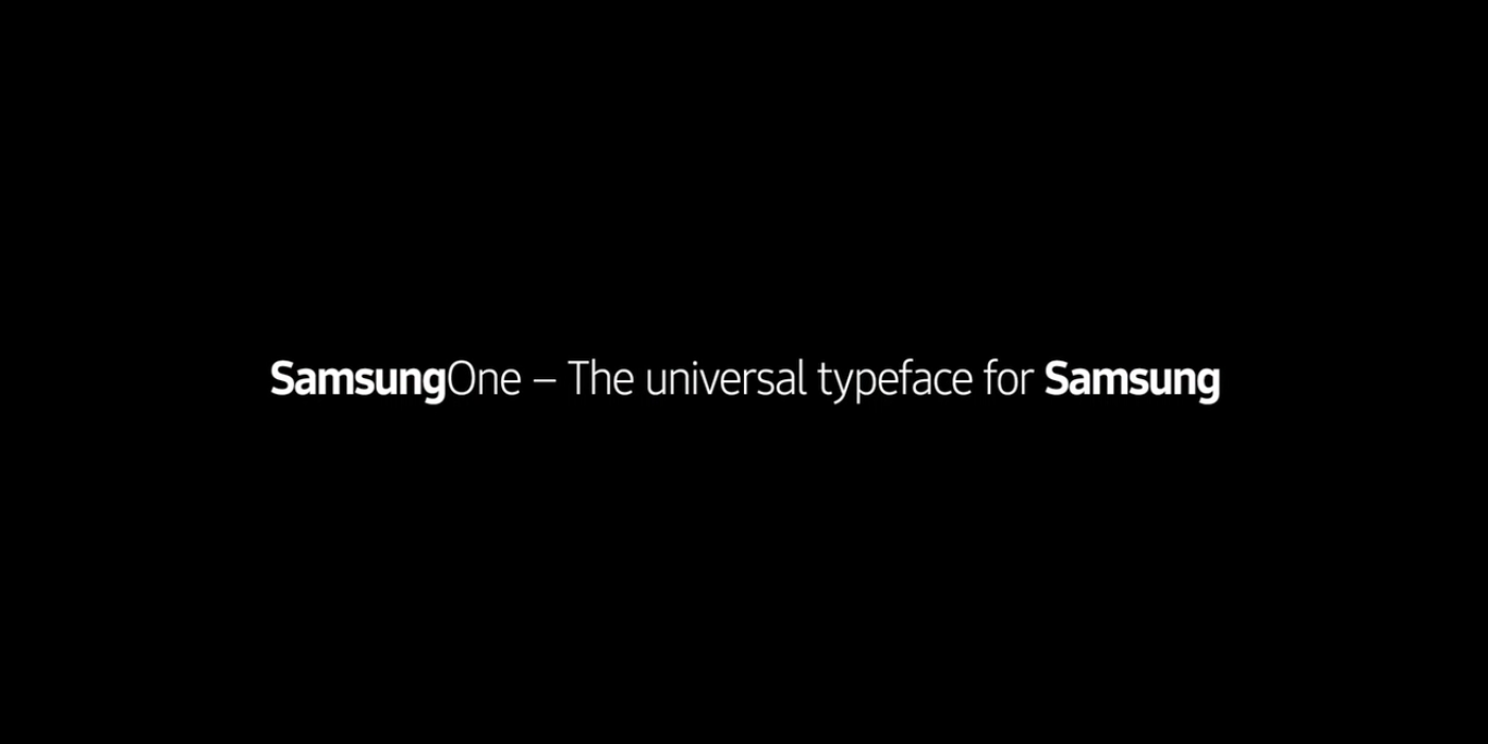
SamsungOne is the new font for all things Samsung
Published onJuly 22, 2016

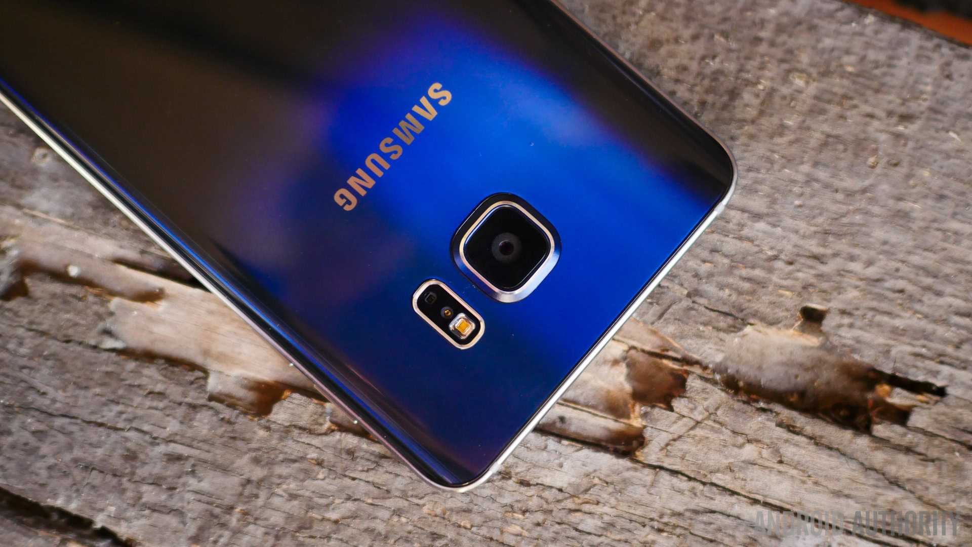
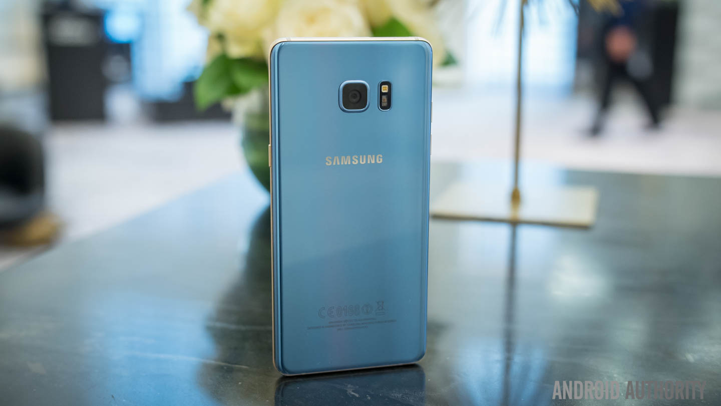
Samsung is a household name, and the Samsung name badge can be found on everything from smartphones and televisions all thee way up to refrigerators, washing machines and dishwashers. The products may be unique, but Samsung is set on ensuring that all their products – such as the Galaxy range of smartphones – belong to the same family. In the process of doing so, they have just announced the release of SamsungOne: the new universal typeface for all products Samsung.
[related_videos title=”Samsung in video:” align=”center” type=”custom” videos=”702787,702431,701387,698045,692759,679646″]
SamsungOne isn’t just a single font, it is a family of scripts that covers 26 writing systems, more than 400 languages and over 25,000 glyphs. This means that no matter where you are in the world and regardless of the language you speak, you and your products can be united thanks to the SamsungOne font.
To make sure the font worked for customers globally across all their products, the company teamed up with design firm Brody Associates and a number of specialists. As Samsung explains in its official statement, they came up with a design that is based on five core typographic principles:

- Humanist: SamsungOne mixes a simple, single-width stroke with more calligraphic details. A squared curve is combined with angled terminal ends to create a font which is very human, flowing and open.
- Distinctive: Dynamic angles that come from how an arc joins a line create a consistent design personality. Prominent dots, distinctive diacritics and the tail on l add legibility as well we provide some of the distinctive design DNA for SamsungOne.
- Universal: Like a global Family, SamsungOne is uniquely localized while speaking some of the same typeface DNA.
- Expert: A crafted hands-on approach to type design and detail where small adjustments to height plus descenders and ascenders ensure balanced forms. A balanced and proportional set of characters aids consistency.
- Legible/Scalable: Letterforms are specifically designed to work functionally at small sizes, and dynamically at large sizes. Characters are open and spacious aiding readability. Specific details are added to ensure legibility at text sizes.
The story behind the design can be found in the following video, where world renowned typographer and the designer of the font, Neville Brody, discusses the philosophy behind it:
The font looks neat, clean and is extremely legible. What do you make of it? Do you think they should use another phone and can you see this being on your refrigerator, smartphone or TV in the near future? Let us know in the comments section below.
