Affiliate links on Android Authority may earn us a commission. Learn more.
Unsubstantial Style: Samsung's Edge Panel is a forgettable feature (take Note!)
Published onApril 18, 2016
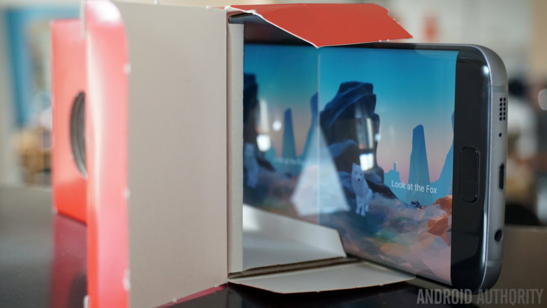
“Unique”, “pretty”, “cool”, “stylish”, “worth the extra cash”…Ask anyone who has seen one of Samsung’s Galaxy S Edge displays and chances are their initial reaction will be one of admiration and adoration. It makes sense: the Galaxy S6 Edge, Galaxy S6 Edge+, and the Galaxy S7 Edge are indeed stunning to look at. It also makes cents, literally an entire 10,000 of them given extra premium that Samsung charges for its curvy craftsmanship. Should the fact that an Edge Display is a major selling point of these products be considered negative? Not at all.
Let me be the first to say that, with the Galaxy S7 Edge, Samsung has put more effort into making the Edge Display useful. It lets you add shortcuts, tickers, widgets and more. Still, the problem I have with it is that while it’s not intuitive, it is always intrusive. Quite frankly, I don’t like having to slide out the tile from the side of the screen to make use of this functionality, and I absolutely can’t stand how rather than simply becoming an overlay on the screen, it overlaps everything.
Samsung just doesn't want to do more with the Edge Display, yet, paradoxically...it already has.
Why can’t I launch apps simply by touching an icon permanently situated on the side of the display? Why can’t the Edge portions have persistent visibility? It’s almost as if Samsung is sitting on a proverbial pot of gold here – a sub-screen that works independently from the main one – and yet refuses to realize such a revelation. The company just doesn’t want to do more with the Edge Display.
And yet, paradoxically, it already has.
Editor’s note: Keep in mind this is an opinion piece, representing the opinions of just one writer and not the publication as a whole. We fully understand that not all our audience will agree. If you have a differing opinion, be sure to voice it below in the comments!
The Galaxy Note Edge
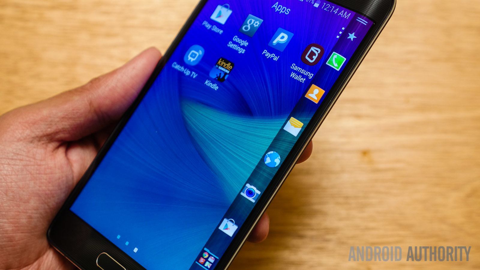
The very first commercial incarnation of the Edge Display allowed for every single grievance I just pointed out. Don’t believe me? Look at the Galaxy Note Edge. This product was absolutely brilliant. Why? Because not only did it look and feel like a true tech innovation, it was actually backed up by practical and productive purpose. The Edge Display was a separate, fully independent display fused together with the main one to literally create a two-in-one product.
Take a look at how useful the Galaxy Note Edge’s second screen was:
You could write personal messages, pin apps to the second screen, take photos with greater ease…even notifications were sent directly to the Edge as opposed to appearing on the notification shade. The Note Edge managed to impress people in part because of how much effort Samsung put into its implementation. It was, to be quite blunt, a rare example when a “pointless gimmick” turned out to be a relevant and useful supplementary addition to the product itself.
[related_videos title=”Galaxy Note Edge” align=”center” type=”custom” videos=”569017,564683,680806″]
Copied by the Competition
If you want additional evidence to demonstrate just how influential a second sub-display was, look no further than LG’s own V10 released last fall:
Ultimately LG’s implementation left a bit to be desired given that the sub-display sat atop the top of the main display. This made one-handed use and access to it quite cumbersome, but nonetheless the features were similar. Clearly LG found this useful enough to resurface this year in a mid-range device announced at MWC, the LG X Screen:
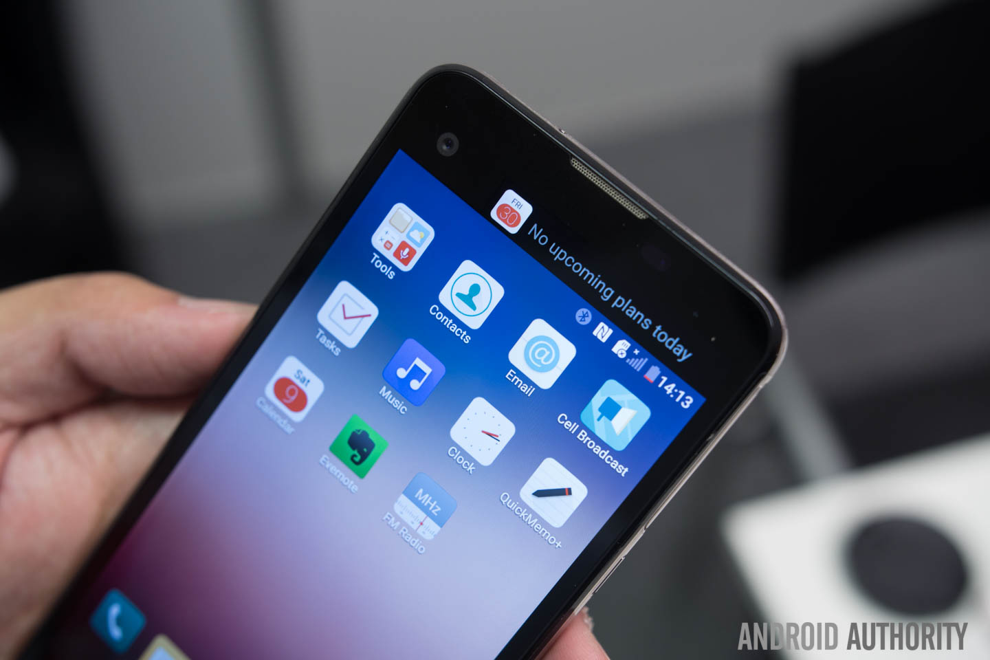
So here we have LG with two different products with flat LCDs, one of which isn’t even a high-end offering, that make intelligent use of a sub-display. Meanwhile, Samsung has released three Edge devices with curves on both sides, yet can’t bother to allow any of them to function independently.
Subjugating (the lack of) substance
While I have no problem with something being pretty just for the sake of being pretty, the problem I have with the current Edge Display is that Samsung is trying to legitimize its inclusion with the new focus on Edge Apps. Take a look at just how utterly intrusive they are:
Am I the only one who feels this is just plain silly? The voice recorder needs to occupy the whole screen? As does the contact list and app short cuts and weather? Seriously? There is absolutely no reason whatsoever these features couldn’t also be used on the standard Galaxy S7. The only “legitimization” for the Edge model restrictions is the more “seamless” process of sliding out the pop-up due to the curves.
Just look at some of the things you can add with the S7’s Edge Panel:
I dare say that as they exist now, all of these functions would work far better as literal mini-pop up windows, not unlike what Sony began to do years ago with its Xperia series, and even Samsung itself used to do back in the early days of the Galaxy Tab series.
The biggest irony is that you can actually set the Edge panel handle (pull-tab) transparency to 100% meaning it’s literally invisible. So you can forget it’s even there. This kind of masking for a “useful feature”?
For Example
Allow me to point out just how disconnected the overall picture is. One of the Edge Apps is a widget that shows current RAM Usage. A similar panel was available for the Galaxy Note Edge where it could be casually displayed at any and all times via the second display. With the Galaxy S7 Edge however, it needs to be “summoned” which means a conscious effort to gesture for it and a total interruption from whatever you’re currently doing.
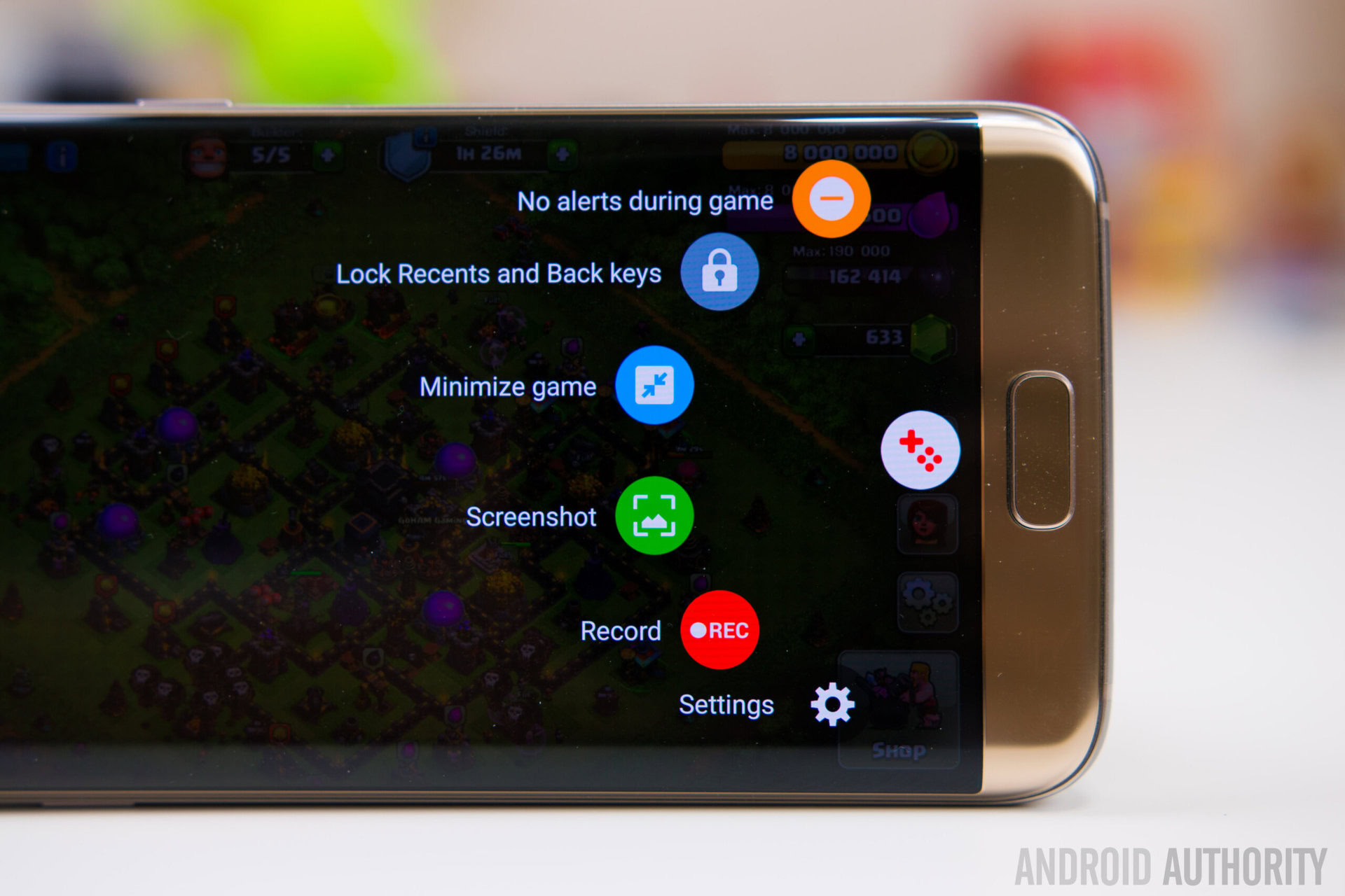
Another perfect example is the added functionality for game broadcasting Samsung has baked into the S7. Notice how it takes up the entire screen, yet would work flawlessly were these buttons mapped to a sub-screen Edge Display:
Seeking Logic
What is it people often say about wearables? That the litmus test for is “glanceable” information that requires no effort to see? Shouldn’t this also be applied to the Edge Display? For the life of me I just can’t understand why Samsung would so deliberately cripple the very feature it gave birth to, and the one that actually made people stop their initial skepticism and view the Edge Display as a logical extension of the user experience.
I’ve come up with two possible conclusions:
Possibility 1: The company has poorly correlated the overall “failure” of the Note Edge with the implementation of the Edge Display or because of its sharper curve. For reference, a report emerged last year that claimed Samsung sold just over 630,000 units of the Note Edge worldwide.
Of this argument I have a couple of points to raise:
- The Note Edge was the first product of its kind, and retailed for $100+ more than the Note 4. Perhaps Note customers simply didn’t want to spend extra.
- The Note series is decidedly not a mainstream device thus it can never attract the same number of customers as the standard Galaxy S flagships.
Possibility 2: Samsung “couldn’t” make a more pronounced Edge Display with this year’s model simply because it was cutting costs by using the same manufacturing direction as last year’s S6 Edge. Note that, while the S7 Edge is different in size from both the S6 Edge and the S6 Edge+, the actual curve itself has not changed. To this end the production is seemingly just a matter of cutting the display into different sized pieces. There is nothing to fuse together and having just one screen does cut costs.
Honestly speaking though, it’s difficult to speculate what exactly is going on here. It could be one of these two possibilities, a combination, or something different entirely. If the Galaxy Note Edge could run two separate panels with its “ancient” hardware, are we supposed to just pretend the Snapdragon 820 couldn’t do it that much easier?
Going forward
Let me be frank here. Last year, on two separate occasions, I lambasted Samsung’s Galaxy Edge products. The first with the Galaxy S6 Edge, and then again with the Galaxy S6 Edge+. Part of the argument – indeed almost all of it in the former piece’s case – boiled down to some of the very issues I’ve gone over in this piece. Another year, a brand new product, and yet still style over substance.
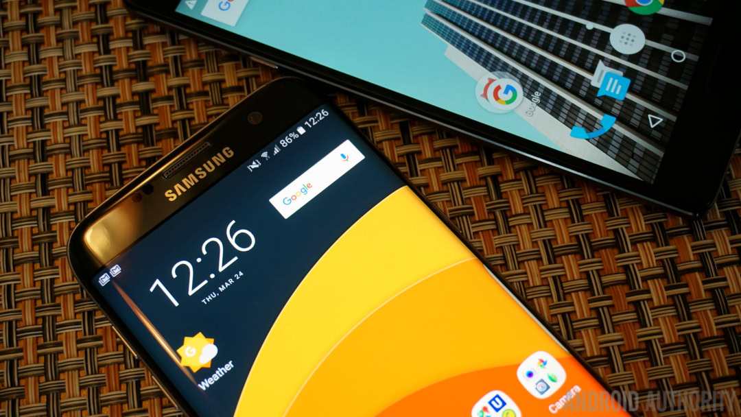
It is my sincere hope that Samsung can correct this perceived problem with the next product to make use of an Edge panel. If the OEM launches a Galaxy Note Edge 2 this year – it would seemingly make sense as there sure doesn’t seem to be a need for an S7 Edge “Plus” given the size of the standard model – perhaps will suffice. Alternatively, if next year’s S8 Edge will be the next device to use it, at the very least Samsung should redesign the frame such to allow a more pronounced curve.
If even that fails, at least let the user opt for a hybrid split screen feature wherein the Edge Apps can permanently affix themselves to whichever of the two slanted slides desired. This would, for all intents and purposes, have the same effect as the two panel construction the Note Edge offered.

As a final consideration, reports indicate Samsung is going to be providing curved AMOLED displays to rivals like vivo and Xiaomi. If these companies, or any other for that matter, actually go and one-up Samsung with superior implementation using the Korean OEM’s own displays, it will indeed by the ultimate joke.
Wrap Up
I will openly admit that depending on the individual, there is tangible added functionality of the Edge Screen in its current form; for users who want quick access to contacts and who enjoy its other communication features, it may be of great use. Ultimately it is my personal opinion that Samsung has deliberately shortchanged the potential of its most popular panel, your own mileage may differ significantly.
It is here that we would like to ask you, the reader, to offer your own take on the matter. There are two surveys: the first specifically for those who have used the Galaxy Note Edge, and the second for all customers. In addition, please feel free to leave your own thoughts in the comments section below.