Affiliate links on Android Authority may earn us a commission. Learn more.
All I want from Samsung's One UI 7.0 is a vertical app drawer list
Published onMay 5, 2024
I know third-party app launchers exist, but they are not the answer for me.
So yeah, I thought I’d start this article by addressing the obvious first: Yes, third-party launchers can fix many issues in Samsung’s approach to home screens and app launchers in One UI 6.1, but why should I need them to get the most basic feature of all?
Why should I install a third-party app and risk small hiccups or a less-than-optimal experience in my app switcher only to get a feature that should’ve been available by default?
Why do I need third-party software to fix Samsung's obstinate removal of a feature that's been in Android since Marshmallow?
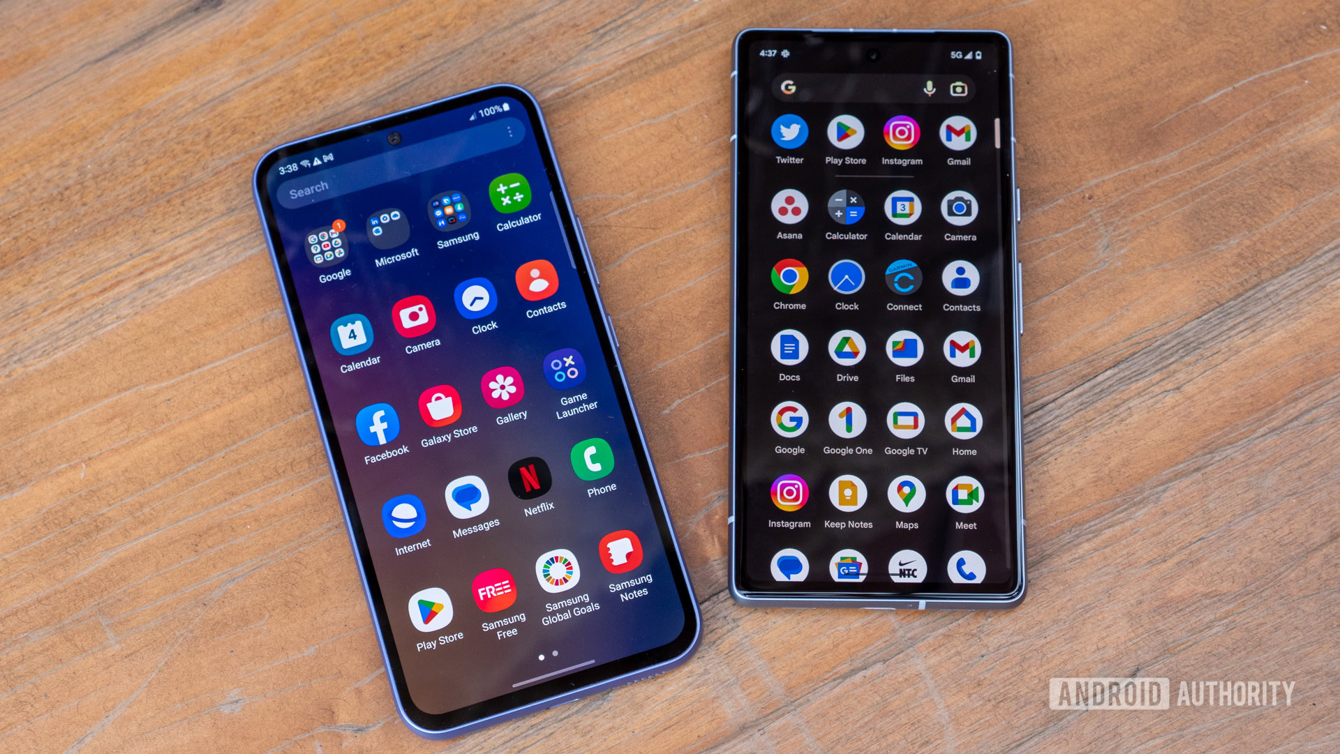
Why, of all the customization options available in One UI that let me tailor the design and experience to my liking in every minute detail, is there no option to make the app lists scroll vertically and continuously, instead of going inefficiently, page by page and horizontally?
Vertical or horizontal app drawer?

Why is Samsung skipping the vertical app drawer, which has been a staple of stock Android since the good ol’ Marshmallow days in 2015? If something is so intrinsically part of the Android experience, it should be available — even if only as an option — in any Android skin. This is not iOS, where I have to spend days scrolling through dozens of app screens, and heck, even iOS implemented a smarter app list than the horizontal drawer!
And why did Samsung think it was enough to add the vertical app drawer as an option in the Home Up Good Lock module? … Only for it to treat it like the absolute afterthought it was and forget to update it when One UI graduated to version 6.0 and then 6.1. Leaving the vertical app list out of the Home Up implementation for the latest Galaxy S24 series and any other Galaxy phone that has received One UI 6.0 and above for the last months is a clear sign of how much this feature matters to Samsung. (Read: not at all.)
And why should we wait for One UI 6.1.1 in the summer, as a Samsung Community moderator implied (via @theonecid), to get this neglected feature back?
Look, I know I’m complaining about a minor feature in the grand scheme of things. But if Samsung can build all the Galaxy AI novelties in the world, why can it not bring this simple toggle to One UI? Is it because it’s a less shiny feature?
A vertical app drawer should just be a core option in One UI 7.0 (if not the default setting), instead of being relegated to some obscure module only we geeks know about. It shouldn’t be at the mercy of Good Lock’s messy One UI compatibility track record, either. If gesture navigation can make it to One UI as a setting, so should the vertical app list.
People learned to scroll vertically through TikTok; I think they can figure out a vertical app list.
Sure, a vertical app list sounds less sexy than black-and-white photo colorization or generative image editing, but how many times do you scroll through your apps every day versus how many times do you use genAI to edit a photo? It’s not even a competition between the two for me. And every time I try to open an app on my Galaxy S24 Ultra, I curse a little under my breath because Samsung has taken a frictionless interaction, added friction to it, and decided that was good enough for the millions of people who use its phones every day.
It’s 2024, Samsung. People have learned to scroll vertically through TikTok and Instagram; I think they can learn to scroll vertically through their app lists, too.