Affiliate links on Android Authority may earn us a commission. Learn more.
Here are the silliest Android phone features of all time
Published onSeptember 18, 2024
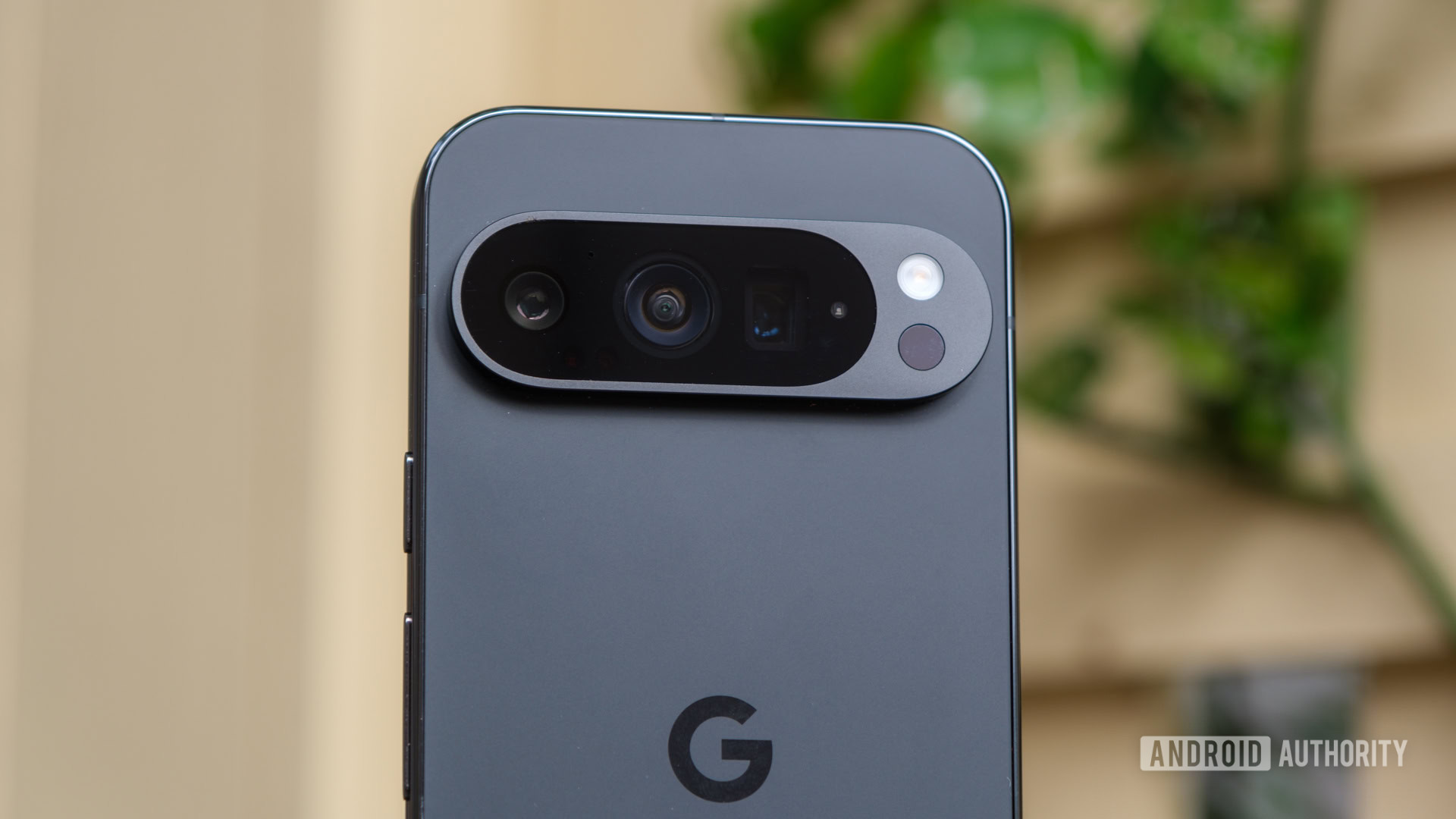
I love it when Android brands get creative. Sometimes, an idea out of left field will work out perfectly, like bringing back the flip phone with a foldable display or using a bio-resin for protection instead of standard plastic or glass. Other times, it’s not quite the same stroke of genius — but sometimes, that’s just as memorable. And yet, those missteps are just as significant because sometimes they lead to something much better. Here are a few of the silliest features to launch on an Android phone.
Oh, and if I’m honest, Apple’s Camera Control inspired this list. At first, I thought it would be little more than a button you could use to trigger the shutter, but we’ve since found out that it does quite a bit more. I was too far down the rabbit hole of silly Android features by the time we got all the details on the Camera Control, though, so here are the fruits of my labor anyway.
Friends modules on the LG G5
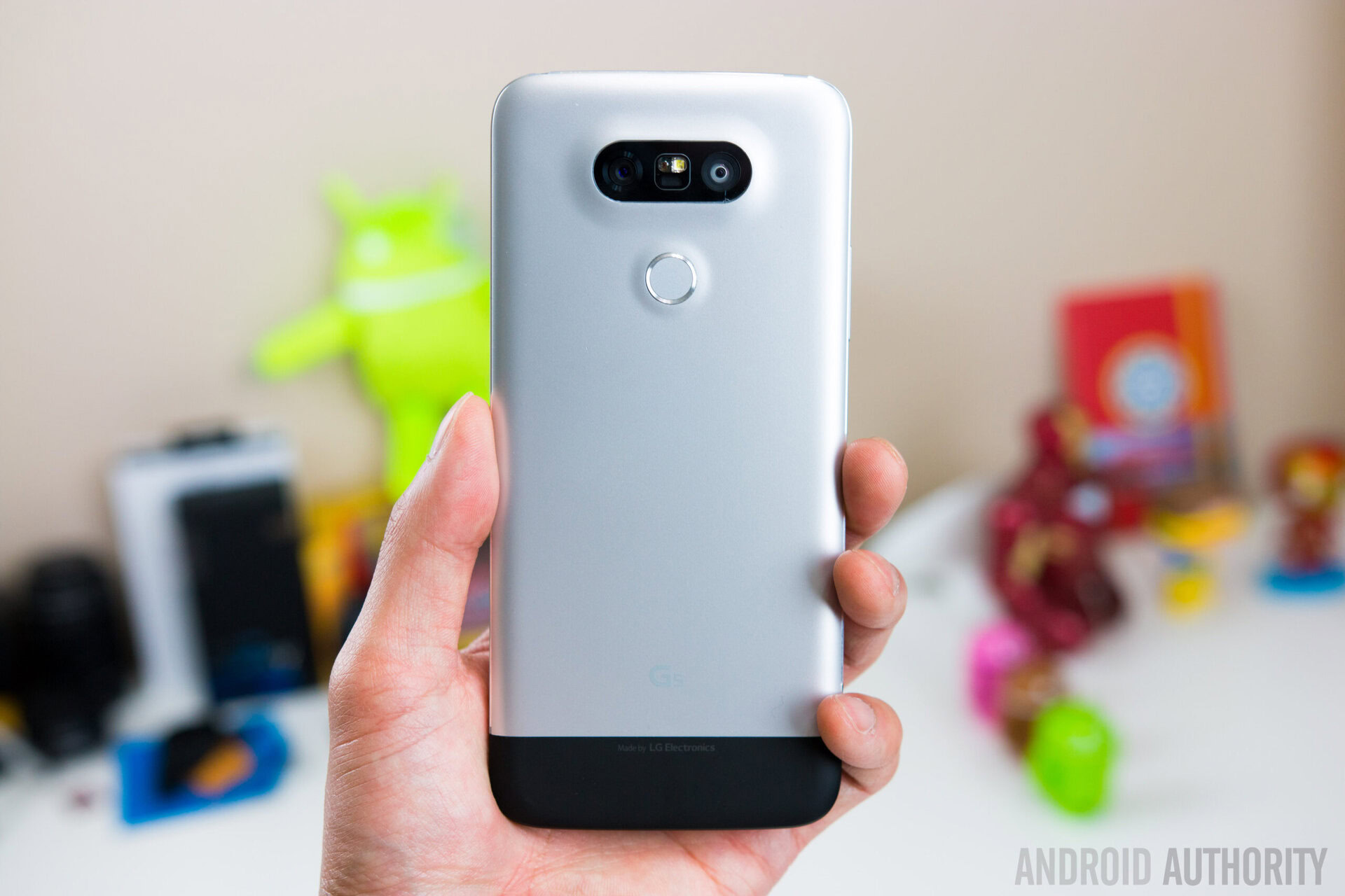
It’s funny — I could have had my choice of modular phone attachments to make this list, with both LG and Motorola giving it a shot. Heck, even CMF by Nothing jumped into the modular realm not too long ago. However, I have to call the accessories launched with the LG G5, dubbed Friends, sillier. My reasoning is that at least Motorola made its Moto Mods compatible with more than one device during their lifetime. You could attach things like an external JBL speaker, a projector, and even an external 5G antenna (to give you a sense of when the Moto Mods launched) to four generations of the Motorola Moto Z.
If I had a nickel for every modular Android phone that launched, I'd have a surprising number of nickels.
With the LG G5 Friends, however, it’s the opposite. They were designed to work with the LG G5 and only the G5, meaning you could spend a lot of money on accessories that had no futureproofing. Now, I don’t necessarily think the idea behind the Friends accessories is a bad one — it seems pretty cool to swap out the pieces of your phone to add a better camera grip, upgrade your phone’s DAC and amp with Bang & Olufsen tuning, or attach a VR headset long before they were cool. But, when they’re designed to fit the exact body of one specific phone, and then LG adopts a new design the very next year, you look pretty silly.
What ultimately happened to the LG Friends is that the company went from a clever, modular design with the G5 to a unibody construction for the G6, choosing water protection and wireless charging over swappable accessories after just one year. And yet, we’ve barely scraped the surface of silly ideas to come out of LG in the last few years.
Motion Sense and Soli on the Google Pixel 4
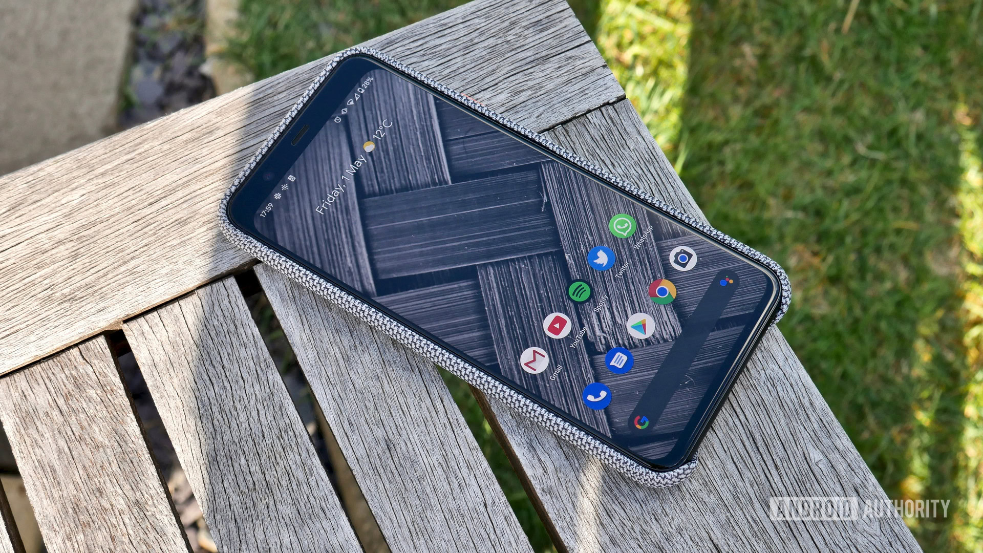
Google, like LG, is a big fan of its own creativity. Over the years, we’ve had several short-lived Pixel features, like the black-and-white panda Pixel 2 XL and the deepest notch your eyes have ever seen on the Pixel 3 XL. We also had a year when Google decided that short-range radar was the future of interacting with your phone, so it crammed a Soli sensor into the top bezel of the Pixel 4 series. It was the culmination of five years of work and was designed to let you skip songs, silence phone calls, and snooze your alarms with nothing more than a lazy wave.
The problem was that it never worked quite right. Sure, we had other complaints about the Pixel 4 series, like its terrible battery life, but the fact that Google’s Motion Sense gestures never really got off the ground makes the Soli sensor one of Android’s silliest. Google did its best to roll out updates that would fix its functionality, too, but they never really took hold, prompting the company to ditch its grand idea when the Pixel 5 rolled around.
That’s not to say that everything Google put in the Pixel 4’s chunky top bezel was bad, though, as it also housed IR-based face unlock, which is as close to an Android version of Apple’s Face ID as we’ve gotten over the years. It relied on a pair of infrared sensors to map the depth of your face, offering a much more secure way to unlock your phone than the camera-based facial recognition that Samsung and several others used at the time. Unfortunately, IR-based face unlock made way about the same time as the larger Soli interface, mainly to shrink that top bezel.
Hand ID on the LG G8 ThinQ
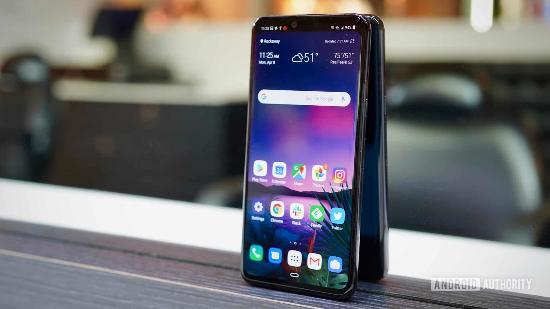
And now, from one palm-based feature to another — unsurprisingly, back to LG. That’s right, we’re talking about Hand ID, an infrared-based palm-mapping feature that arrived on LG’s last G-series flagship, the G8 ThinQ. Essentially, the G8 ThinQ would use a time-of-flight sensor and an IR camera to make a map of the unique veins in your hand, acting like a giant fingerprint that you could use to unlock your phone and trigger gestures.
Unfortunately, like the Pixel 4’s Soli sensor, LG’s Air Motion and Hand ID never caught on quite like they were supposed to. After all, you’re already holding your phone with one hand, so it’s often easier to use the other to tap or swipe on the display than to wave it around six or eight inches away like you’re casting a spell at Hogwarts. I remember a few hand-based gestures fondly, like the ability to flash your palm to trigger a three-second camera timer, but those didn’t require the advanced ToF sensor or IR camera.
Holographic display on the Red Hydrogen One
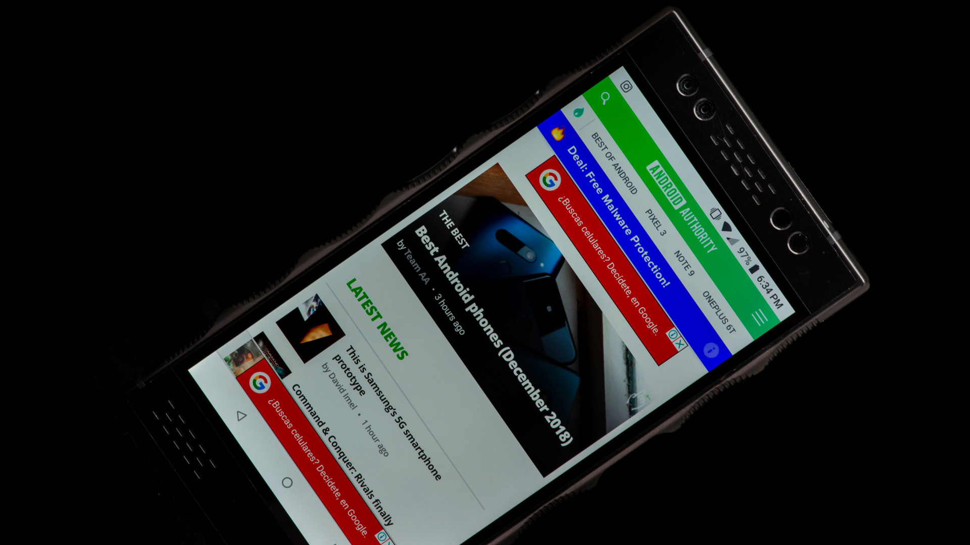
It turns out that Android brands like to get creative when it comes to their smartphone displays, too — for better or worse. Sometimes, things work brilliantly, like the return of foldable phones I mentioned above. Other times, it’s pretty much a disaster, like when Red put a holographic display into its debut Hydrogen One. I mean, it should come as no surprise that a high-end camera company wanted to incorporate a feature that could show off its camera capabilities, but it’s safe to say that it didn’t work quite right this time around.
Essentially, the team at Red worked with a company called Leia to put an additional plate behind the LCD in the Hydrogen One. This plate would allow it to direct the light coming out of each pixel to give your eyes the illusion of depth from a flat display. It was a clever approach, too, using four images rather than the standard two so that the final product would have more movement than a traditional 3D image.
Unfortunately, the Red Hydrogen One’s display is one of the silliest on an Android phone because it simply didn’t work as often as it should have. Interacting with the basics like your home screen, web browser, and most apps gave you a standard 2D experience, with 3D mode only kicking in for a few supported apps. Also, Red’s four-way effect made plenty of people dizzy when it launched, adding too much blur to the screen and making your eyes work a bit too hard to focus.
And then, we never got a Red Hydrogen Two.
Curved display on the Samsung Galaxy Round
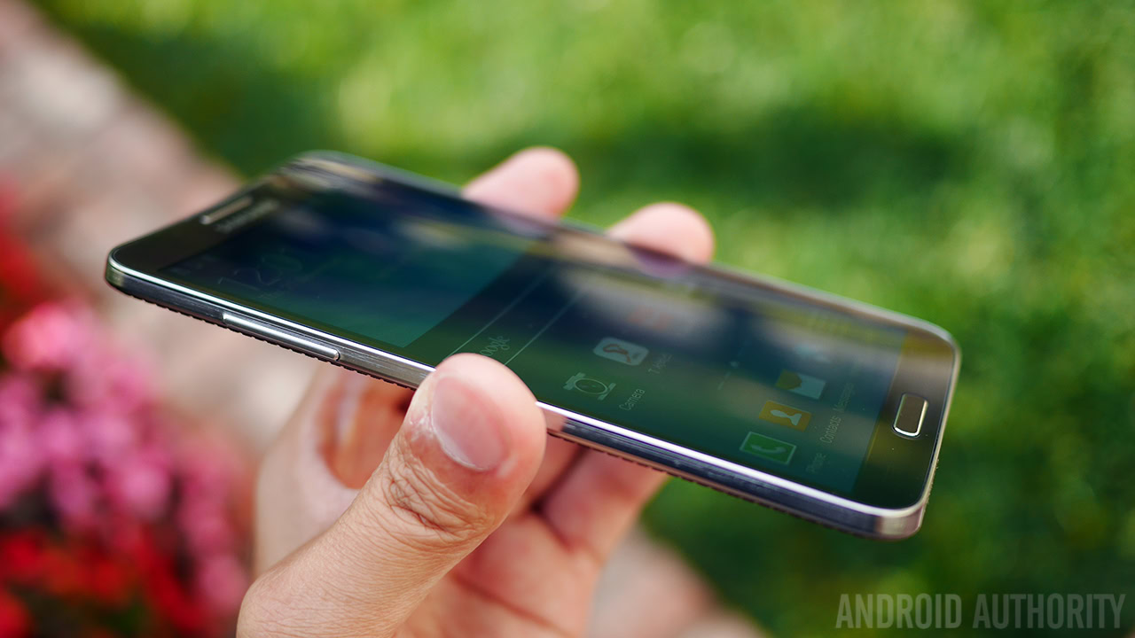
Although Samsung has mostly stayed away from gimmicks in recent years — to the point where we’re begging for some innovation — that wasn’t always the case. In fact, Samsung used to let its mind run wild with things like a full-blown zoom camera on the back of the Galaxy S4 Zoom, which could have also made this list. It also jumped on the curved phone trend long before it brought back foldable phones in the form of the Galaxy Z series when it created the Galaxy Round.
Launched over a decade ago, the Galaxy Round was Samsung’s answer to the LG G Flex, a phone that curved from top to bottom, almost like a banana. Samsung’s idea, however, was to bend the phone from left to right, acting more like the world’s shallowest taco shell. After all, this shape would fit more naturally into your hand and sit more comfortably in your pocket than LG’s approach. The bend was also designed to help reduce screen glare by redirecting the light rather than bouncing it right back into your eyes.
Samsung was early, maybe too early, to the gesture game with this one.
On top of that, Samsung developed a few gestures that it hoped would incentivize users to rock the Galaxy Round’s curved screen back and forth. The first one was an easy way to check on information on your lock screen, dubbed Quick Glance. It allowed you to push down either side of the display for a few seconds, after which point it would show your date, time, and messages before disappearing as you let go. It was a neat idea but could be replicated by simply pressing the home button instead. Samsung also added music controls to its native player on the Galaxy Round, allowing you to skip forward or backward by pressing the phone right or left.
Unfortunately, the Galaxy Round never really stuck around because its curved display was replaced by one of the most common — but still silliest — Android features of all time.
Waterfall displays, well, everywhere
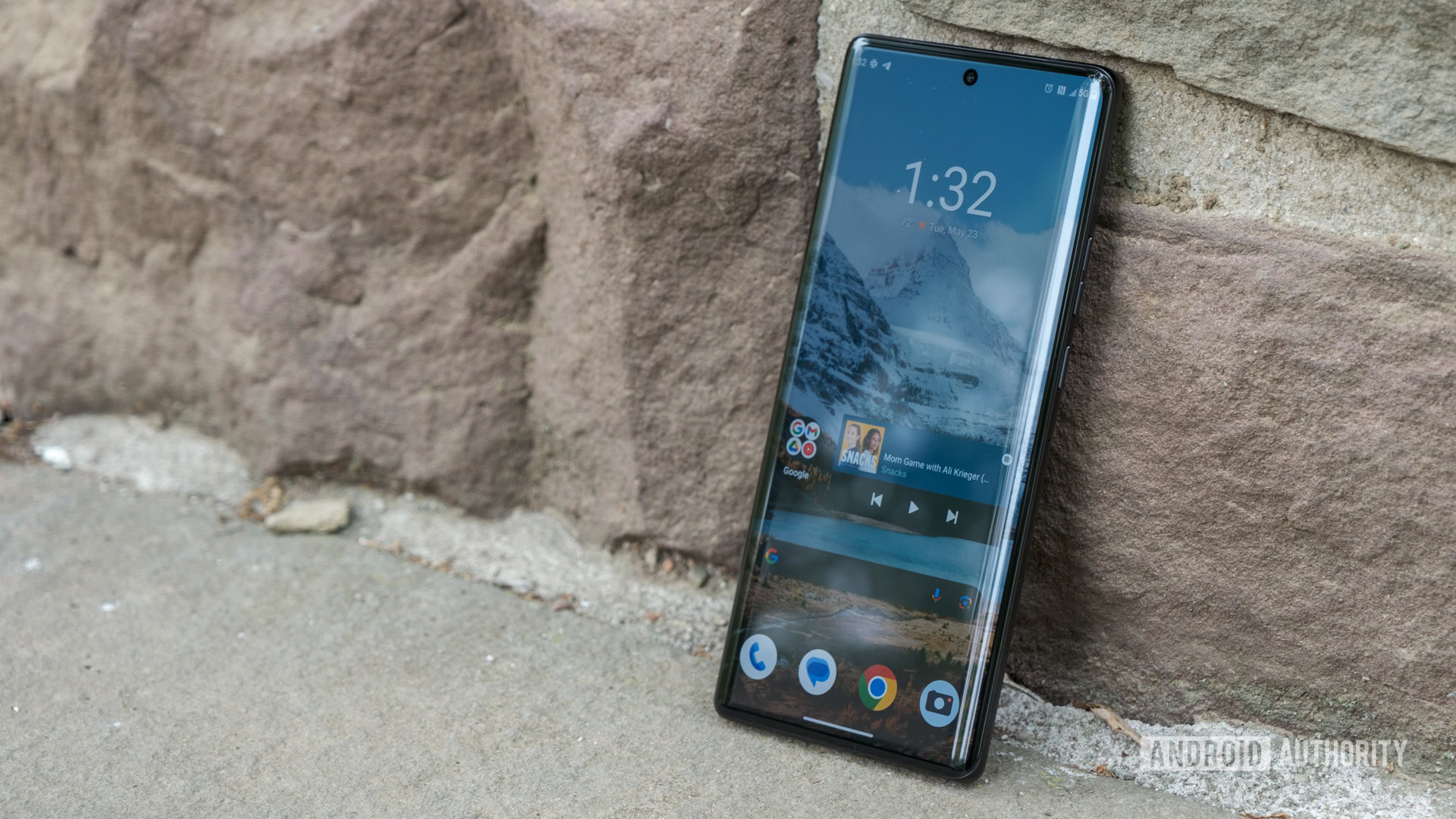
Yes, that’s right — waterfall displays might be one of the silliest features ever to take the Android world by storm. And yes, I know that at one point, they were designed around clever features like the Edge Panels on Samsung Galaxy devices, but for the most part, waterfall displays seemed more like a way to make a phone appear as thin as humanly possible. I can understand wanting to do so, as it made devices like the Motorola Edge Plus (2023) — which had a quad-curved display — look razor-thin, but it also makes some of the best Android phones almost impossible to hold comfortably, let alone protect with the case.
Sure, it was easy to wrap your hand around those slim sides, pinching the frame within the pads of your hand, but that was also the problem. Any pressure on the display itself would result in accidental presses galore. I can no longer count the number of times I accidentally stopped the playback of an Instagram Reel or made an unintended move in Warhammer 40,000 Tacticus because I wasn’t holding my phone just right — it simply happened all the time.
Thankfully, our national nightmare seems to be ending — at least on the Android phones I use most. Both Google and Samsung have shifted away from waterfall displays with their respective Pixel 8 and Galaxy S24 series, adopting flat replacements with thicker, more comfortable side rails that aren’t prone to accidental taps and presses. There are plenty of waterfall displays still out there, like the one on the OnePlus 12 or the namesake panel on the Motorola Edge Plus, but I’m much happier to see flat panels come back on more than just the iPhone.
Temperature Sensor on the Google Pixel 8 Pro and 9 Pro series
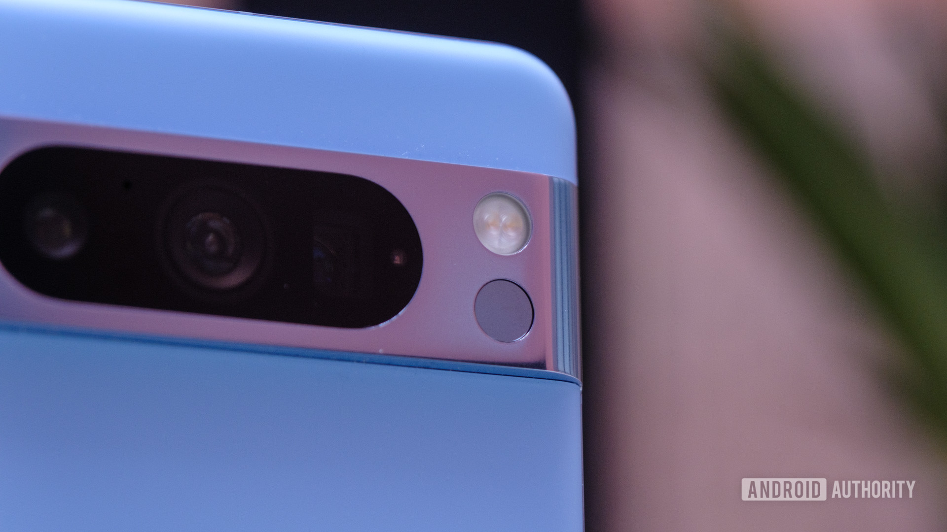
If not for Apple’s Camera Control, this would have almost certainly been the feature that inspired a look at other quirky Android features. Yes, it’s Google’s temperature sensor — a brand-new feature from the Pixel 8 Pro that just never made much sense. On one hand, it seemed like a response to the COVID-19 pandemic, a quick way to check the temperature of just about anything around you. On the other hand, though, it launched without the approval to check human temperatures, which is vital for a medical-adjacent sensor.
Unfortunately, when you remove human temperatures from the equation, the temperature sensor looks silly. It can tell you how warm your bath is or if you need to put your coffee in the microwave to warm it back up, but you can do both things simply by using your hand. I also don’t love holding my Pixel 8 Pro (or Pixel 9 Pro; yes, Google kept the sensor for another year) to a hot pan on my stove to tell me it’s ready to cook.
Thankfully, though, FDA approval to take human temperatures finally reached the temperature sensor about four months after the Pixel 8 Pro launched. It might make the sensor a bit more useful if you have kids to send back to school each morning, but for me, a dad to two cats who don’t go to school, I’ve yet to find a helpful scenario.
The LG Wing — everything about it
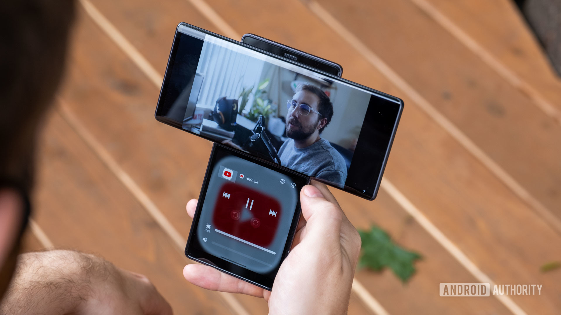
So far, all of my picks for the silliest Android features of all time have been just that — features. They’ve been smaller parts of otherwise normal-ish phones that made me and my colleagues scratch our heads just a bit. This time, though, we have to talk about the entire LG Wing. No single feature on the Wing is the silliest; it’s the whole phone. Ambitious? Yes. Impossible to convince mainstream users to buy? Also yes. When we reviewed the LG Wing, we said we were excited about its eventual sequel — a phone that never came.
What makes the Wing so silly, you ask? Well, look at it. LG decided to resurrect the swivel phone, but this time, it did so with a second, square display you could only access when you flipped the primary display sideways. Sure, it had its moments — separating the YouTube controls from the video you were watching was kind of handy, as seen above, but the quirky design also meant that the Wing needed a pop-up selfie camera, adding another moving part to a phone that was already centered around moving parts.
The LG Wing might not have been good, per se, but man, it was as creative as they come.
Under the hood, the Wing was a little underwhelming, too. It carried a Snapdragon 765G that would have been fine for the average user, but the Wing wasn’t meant for average users. It also only packed a 4,000mAh battery with 25W wired charging, which isn’t a lot when you have to power two displays most of the time. Mix in that the Wing’s cameras were bang-average for stills (but good for videos thanks to a gimbal mode), and it’s tough to see how anyone was ready to fork over $1,000 for this experiment.
And yet, I find myself wishing that more people did just that. I wanted more people to buy in on LG’s quirkiness because, by the end, it was the only brand leaning in and looking for ways to make its Android offerings unique. It certainly deserves its place as the most-represented brand on this list of silly Android features, and I still kind of miss looking forward to LG launching a new off-the-wall smartphone. Maybe one day, someone will pick up that mantle and become the quirky Android hero I’m waiting for.