Affiliate links on Android Authority may earn us a commission. Learn more.
Do bezels still have a place on our smartphones?
December 29, 2017
Editorializing on the state of mobile technology can be a slippery slope. Not every issue is cut and dried. It’s up to us to hash it out. Sometimes it’s a friendly twitter conversation. Other times it’s in a chat. But sometimes, we need to pull out the stops and figure things out in front of everyone. Joe Hindy and I did just that, but don’t take our word for it. We want your opinions as well, so check out our thoughts, and then leave your own in the comments, and let the debate continue.
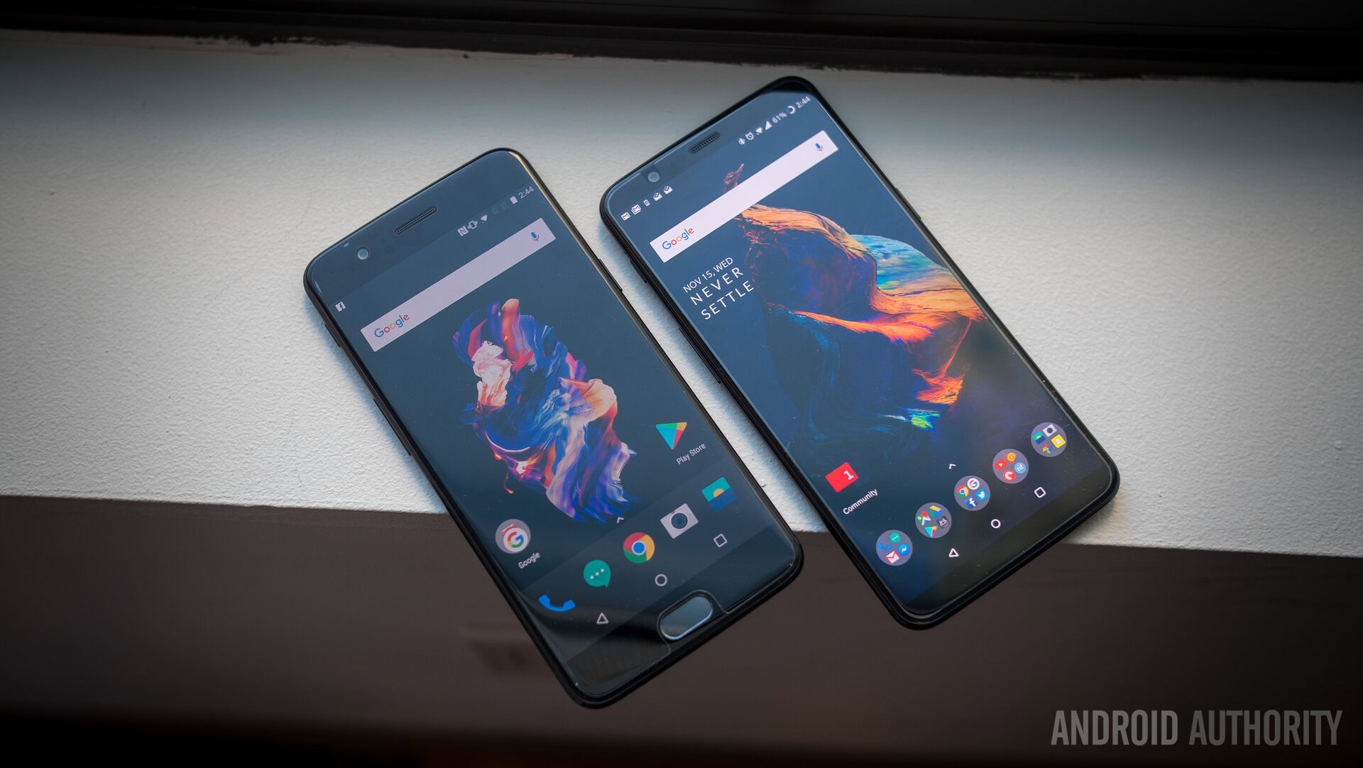
OnePlus made some headlines with the release of the OnePlus 5T. Basically the only difference between the two phones was that one had a 18:9 minimal bezel, and the other did not. Some say that the “T” stands for “tall”. But still, it ruffled some OnePlus 5 buyers who were looking to get in on the 18:9 train, but got left at the OnePlus 5 station. Too much metaphor? Anyway, the introduction of the OnePlus 5T got us thinking about these bezels and just whether or not we’re all trending in the right direction.
Don’t know what you’ve got
Sometimes, it's for looks, not for function.
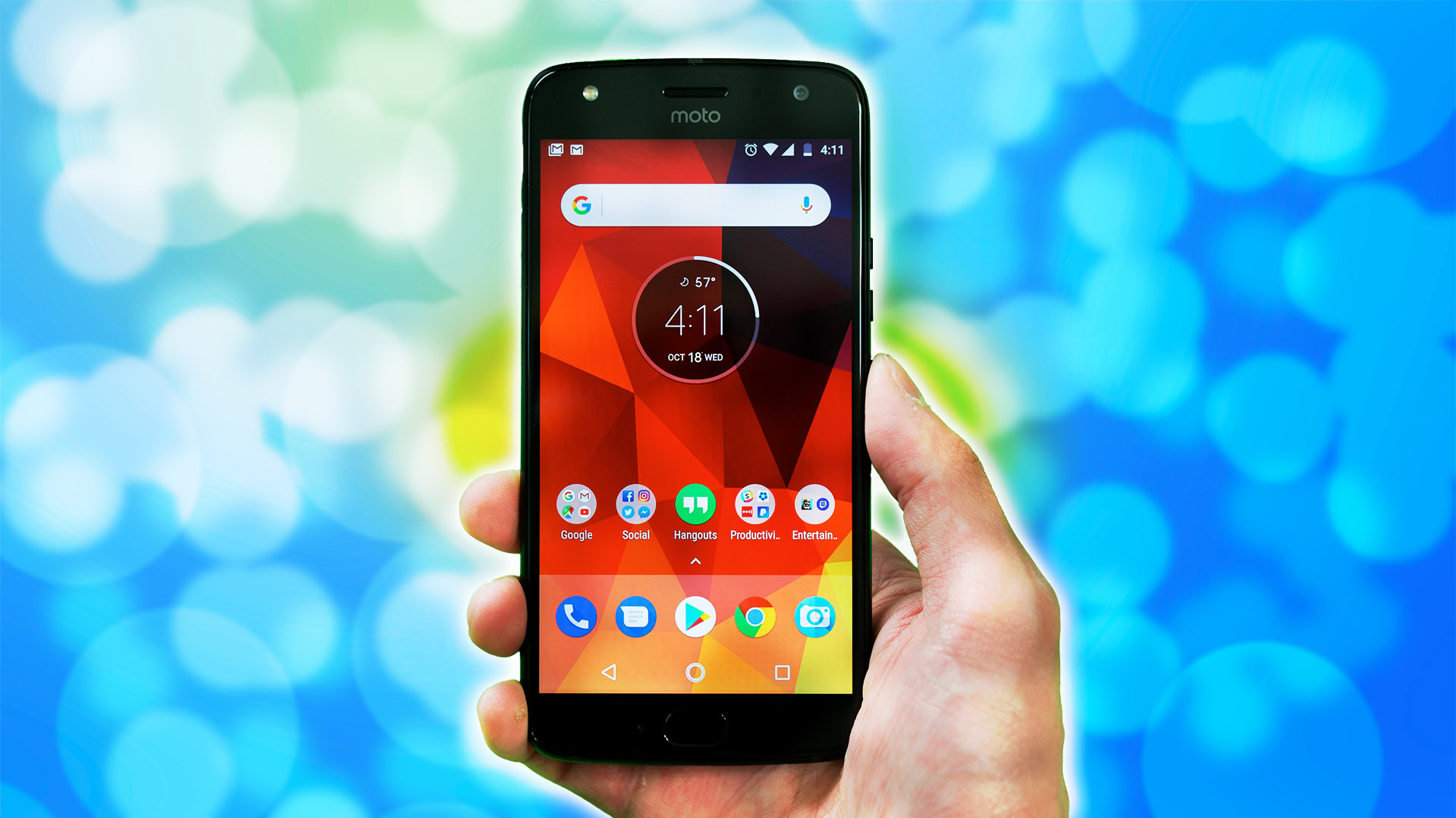
Joe Hindy: Display tech is weird. OEMs are in a race to simultaneously make displays as big as possible while also making the smallest possible phone. It’s led to a number of fun and interesting innovations. It’s one of the reasons OEMs removed the headphone jack. Bezels just seem like they’re the next thing to go. That may not be the best idea.
You won’t miss bezels until they’re gone. It’s true that many use cases don’t demand an absolute need for bezels. On the other side of that coin, coffee mugs don’t necessarily need handles either. Yet, we keep them around. Sometimes, it’s not for looks, it’s for function. TVs and computer monitors would be amazing without bezels, but we don’t actually pick those up and touch them all day long.
Brave new world
...we're treading into new, exciting territory.
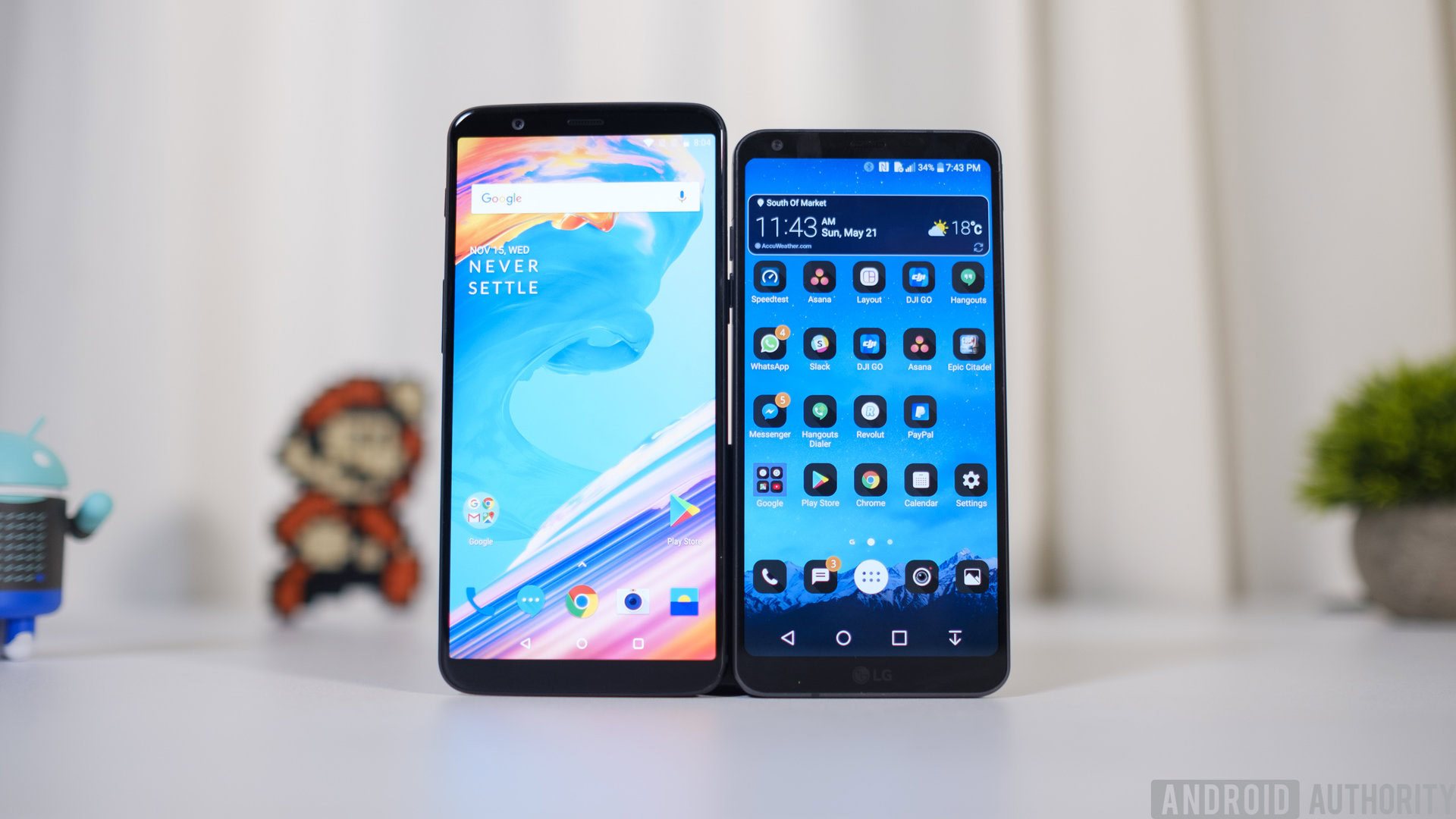
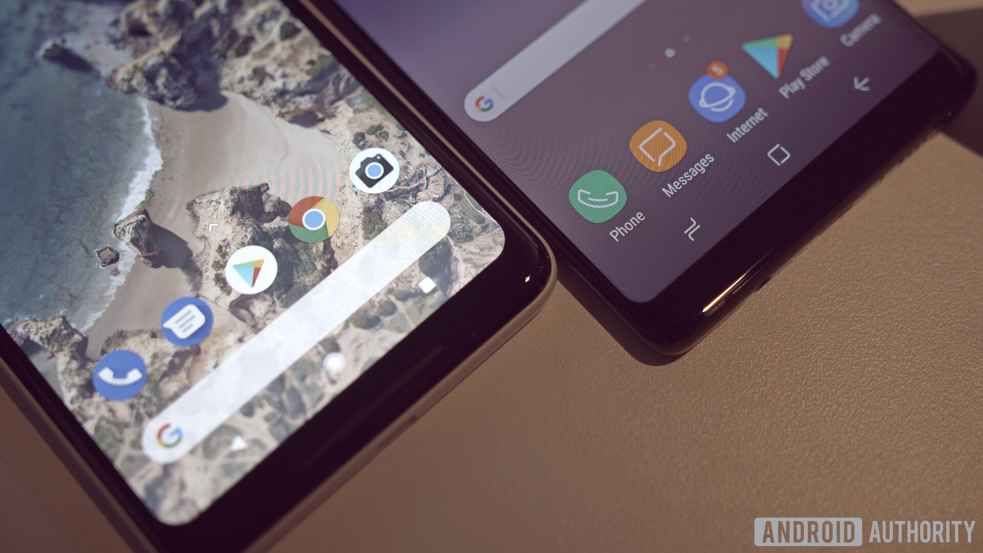
Adam Doud: It’s funny. I used to be on that side of the fence. Then I came across the LG G6. Its phone has a 5.7” screen, but when I set it on a table, it’s the exact same footprint at my HUAWEI HONOR 8 with a 5.2” screen. Bezels – especially bezels on either side of a phone (in portrait) have been shrinking for as long as we’ve had smartphones. They started small and got smaller. We’ve all had to learn how to hold phones on the sides.
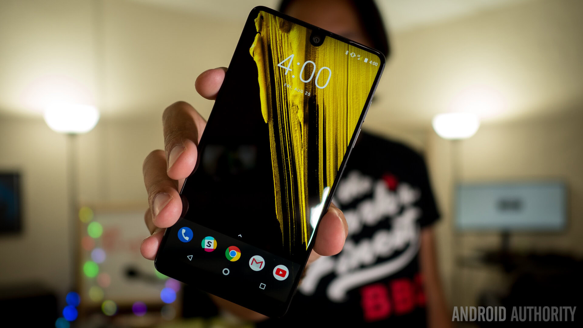
Now that the top and bottom bezels are getting almost as small, we’re treading into new and exciting territory. Whether you’re toting the iPhone X with the Unibrow, or the Essential phone with the cutout, or even the Mi Mix 2, you’re getting a ton of screen in essentially the same package as smaller phones of yesterday. It’s an exciting time to be living in the bezel-less world.
No place to rest
I see the Razer phone with its expansive top and bottom bezels (with speakers!) and see a company that understands its demographic.
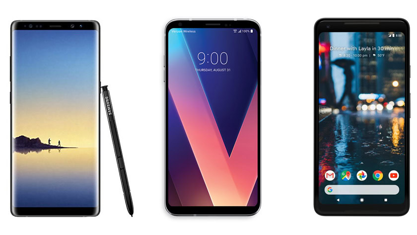
JH: Two months ago, I encountered my first (near) bezel-less phone with the Samsung Galaxy Note 8. I ooh’d and aww’d at it like most people. It’s a good looking phone. The top and bottom bezels are minimal and the phone literally has no bezels on the sides. If you’re going to experience something, you might as well go hard or go home.
Generally speaking, the experience isn’t terrible. I’m not going to sit here as a pro-bezel person and proclaim that everything about bezel-less designs are bad. That would be a lie. Still, there are enough use cases to justify the existence of a bezel. Perhaps not a sizable one, but a top and bottom bezel at the very least. I hit my phone icon (bottom left corner icon) when reaching for my YouTube app (right side of the phone screen) even with thin bezels. Having no bezels only makes that worse.
New territory
Consumers have dictated that they want smaller phones.
AD: Well, you know, in the professional world, we don’t play (heh) games. I admit I’m not much of a gamer, but I generally resort to the “pinky-phone holder” technique. It’s similar to how I take photos. Not being a gamer, I can’t really testify to where to rest thumbs. Mine hover over where the buttons are supposed to be. Don’t get me started about virtual buttons. That’s a whole new debate.
There have to be sensors, and Essential and Apple still need to figure out the best place to put those sensors. No doubt about it. We’re not at the end of the “where do we put the sensors” road. OEMs will almost certainly try something else, and it’ll be fun to see what those experiments look like. Like you, I won’t definitively say that bezels have no place in society, but there is one more point to consider.
Consumers have dictated that they want smaller phones, and we’ve seen them thinning down to ridiculous proportions. This resulted in the loss of the 3.5 mm headphone jack, reduced battery life, and in extreme cases, the phone itself bending. Now, we’re moving on to making phones smaller in a different dimension, height, and this one actually makes sense. By getting rid of unused space at the top and bottom of phones, we’re making phones more usable in one hand. Phones are supposed to be held that way, after all.
New problems
I believe that bezel-less is just change for the sake of change
JH: Leave it to these “visionaries” to try and figure out a solution to a problem they’re causing, right? Last I checked, a bezel is a perfect place to put your sensors, camera module, and even speakers if needed. It’s a weird case of fixing something that isn’t really broken. The notch on the Essential Phone isn’t nearly as egregious as the iPhone X, but it still looks weird and out of place. Especially when they could’ve added a few millimeters to the top of the phone and kept everything else wonderful. It’s a fun design, but there is something about ripping out random shapes from the top of the screen that just looks so unsatisfying. Maybe that’s just personal preference.
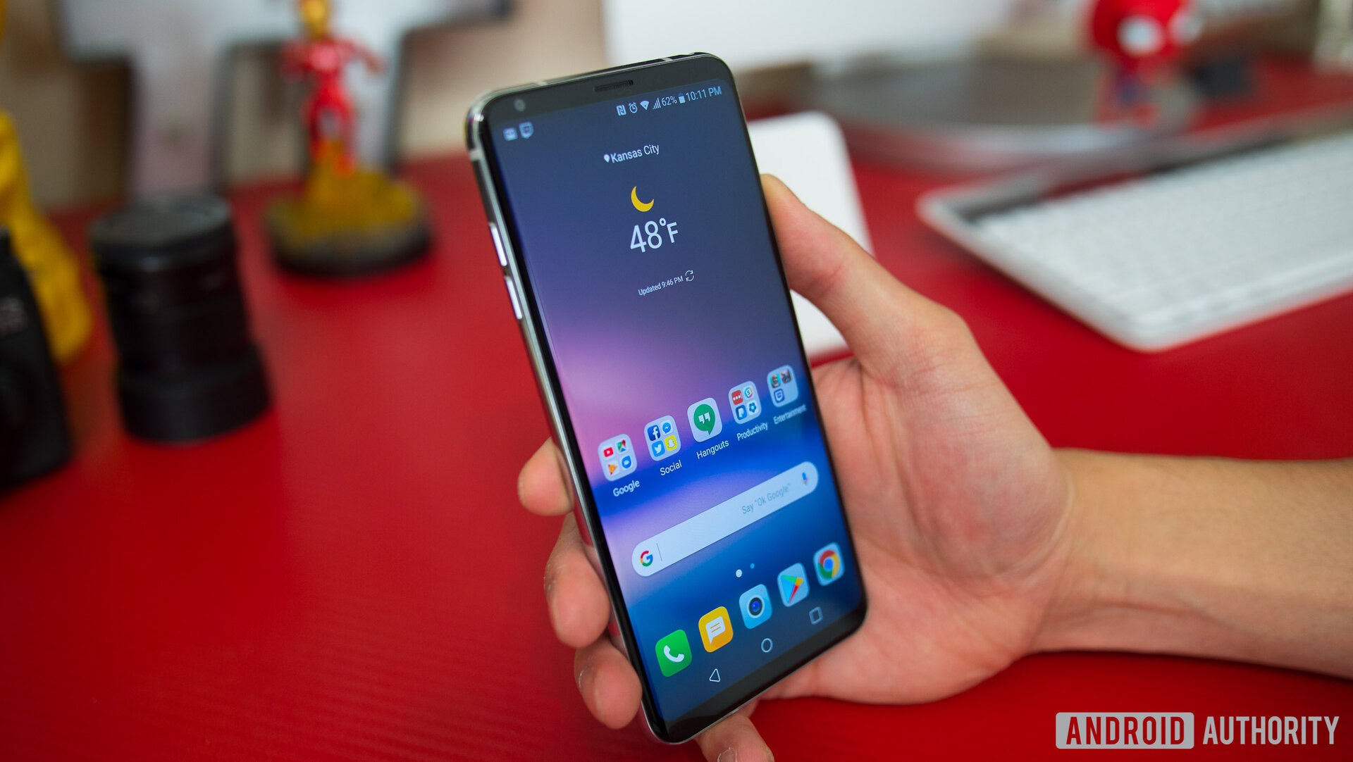
The hilarious irony is whatever space you earn back from removing the bezels, OEMs are now spending on an 18:9 aspect ratio. The Note 8, G6, and V30 would be shorter and easier to use in one hand if they’d stuck with the classic 16:9 ratio. This continues the trend of weird changes for particular reasons, which are cancelled out by other changes. The 3.5mm headphone jack was supposed to make the phone thinner and more waterproof, but the V30 is thinner than the Pixel 2 XL and it also has better a better IP68 rating versus the IP67 of the Pixel 2 XL. So, why remove the jack?
I would understand the trend more if other trends didn’t exist. A 16:9 display with a bezel-less design would, in fact, be easier to hold in one hand. However, 18:9 kind of cancels out all the hard work they’re doing minimizing the bezel experience. My Galaxy Note 8 would be exactly the same width if it had a 16:9 ratio, but it would be shorter. Bezel-less is just change for the sake of change. It’s something shiny to catch the wallets eyes of the consumer. Between sensor placement, stopping accidental presses, and gaming, the bezel still has a definitive, functional, and logical spot on the smartphone. OEMs should be careful about removing that.
Multi-tasking pro

...if we can eliminate that bezel and go fully edge to edge, new and exciting form factors will follow...
AD: You make some good points. But I think 18:9 gives a lot more screen value than 16:9, especially with multitasking being so prominent in Android 8.0. Having an equal top and bottom square for multiple apps is the better way to go. But that’s a debate for another time. In the meantime, you’re right, the 18:9 bezel-less design is eye candy. It is freakin’ gorgeous to hold and use. Samsung is killing it with Infinity Displays, and I for one am really enjoying the Mi MIX 2 (which doesn’t have a notch, by the way).
Consider also, that a truly bezel-less design will pave the way for devices like the ZTE Axon M, and other folding form factors (say that five times really fast). Candy bar slabs are boring, and we’ve reached a plateau of smartphone design. If we can eliminate that bezel and go fully edge to edge, new and exciting form factors will follow, and that will be awesome!
One of the great things about a good debate is that there are no right or wrong answers. This is the part where we leave it to you, the reader. Where do you stand on the bezel debate? Is there room for framing in your world? Is smaller better? We’ve made our impassioned pleas up above, and we’re eager to listen in on your thoughts down below in the comments.