Affiliate links on Android Authority may earn us a commission. Learn more.
Soft reset: Three ways Motorola can recapture its glory days
I’ll admit it — I’ve given Motorola a tough time over the last year or so. I’ve questioned everything from its software partnerships to its cameras, and the only thing glowing about any of my recent Moto G reviews has been in a radioactive, steer-clear sense. And yet, Motorola can’t help but hold a strangely special place in my heart with some of its budget phones. With that special place in mind, I can say it’s time for Motorola to do a bit of a reboot, starting with these three things.
Rethink the cameras… again

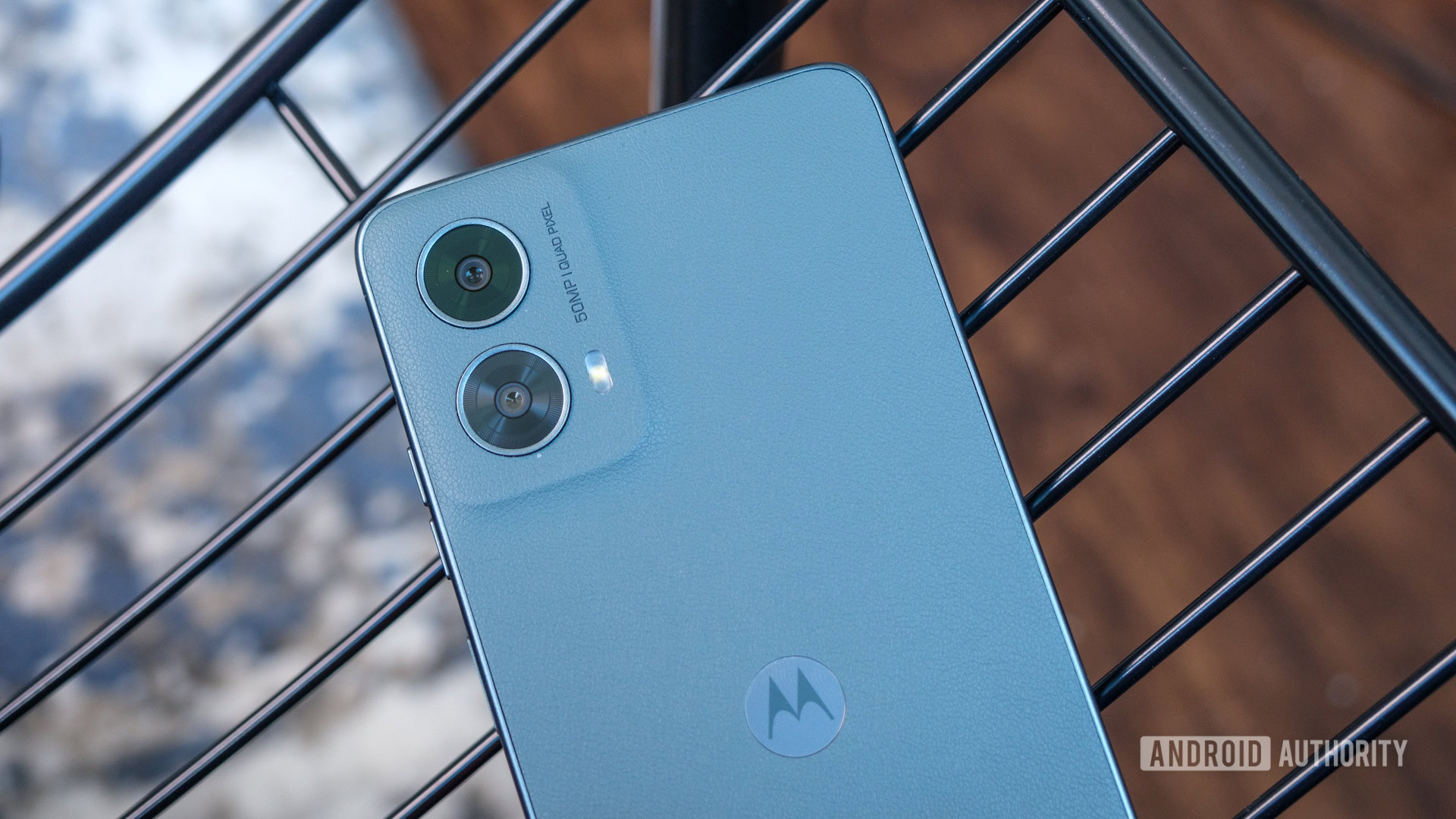
It’s not winter, but Motorola’s cameras are like snowflakes — no two are alike. I’m exaggerating just a bit, but only because most of the 2024 lineup has one thing in common — a 50MP primary sensor. Outside of that, the Motorola camera experience is a wild and unpredictable grab bag that doesn’t often scrape the best that budget camera phones have to offer.
I don’t think it’s fair to ask for a flagship-grade camera experience on a budget phone (after all, most of Motorola’s lineup is in the sub-$400 realm), but the Batwing brand needs to find some consistency. Take the Moto G series, for example — all four devices have the same primary camera, but their supporting casts feel like Motorola just reached for whatever was lying around. The lowly Moto G Play offers just one camera (seriously, in 2024), while the Moto G 5G adds a 2MP macro lens that could easily be replaced with extra software and an ultrawide camera. The Moto G Power makes that very swap with an 8MP sensor, only to be outdone by the Moto G Stylus with a sharper 13MP ultrawide.
We capture too many photos and videos to be stuck with cameras this inconsistent.
And, before you jump on my case, yes, I know there need to be differences between the phones to justify different price points, but with the frequency at which people capture photos and videos these days, I’m not sure this level of camera disparity needs to be one of them. Motorola could probably standardize its 50MP primary sensor and 8MP ultrawide across the entire Moto G series and rely on better displays, more premium materials, and faster charging to differentiate them instead — something it already kind of does.
At least Motorola seems willing to try something new regarding its flagship camera setups. Usually, when we see a pair of cameras, we expect a wide primary sensor and an ultrawide backup, but the new Razr Plus bucks the trend by pairing its wide camera with a telephoto — punching in rather than zooming out. I’m still not sure that it’s the perfect solution, as a phone like the Razr Plus seems better suited to a wider vlog-like camera angle, but it’s proof that Motorola is at least willing to try something different. Maybe the next step is to pair an ultrawide camera with a telephoto sensor and use software to combine the sensors for the equivalent of 1x zoom, like the current ultrawide approach to Macro Vision.
Then again, you might like the current state of Motorola’s cameras. After all, it’s finally bumped up the resolution across the board and seems to be catching up in post-processing, too.
Hello UX, goodbye ads

Where Motorola appears to be falling behind, however, is with its software. Sure, it’s rolled out a shiny new name, transforming My UX into Hello UX, but that was, frankly, the least of Motorola’s concerns.
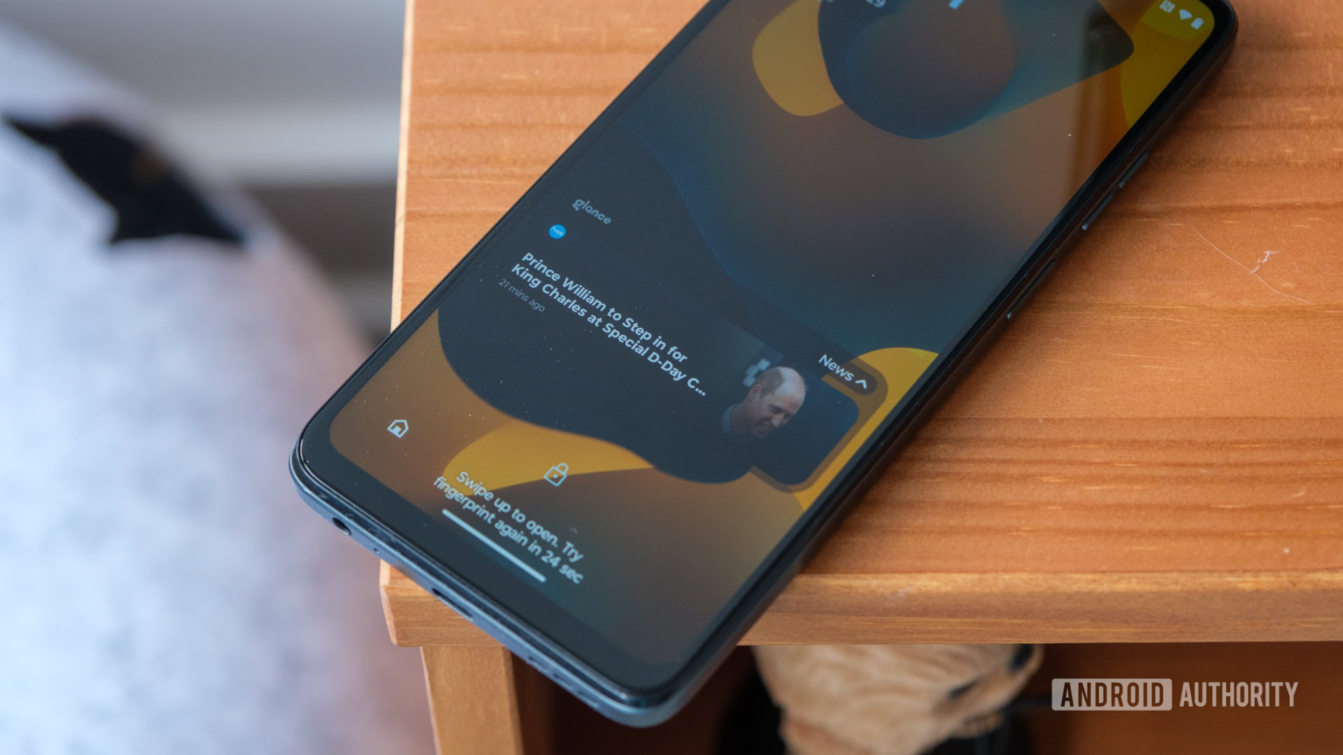
Instead, partnerships with Glance, 1Weather, and the much-maligned shopping, gaming, and entertainment hubs have turned Motorola’s once-clean software into a bloated, laggy punching bag when I’m having a bad day. I’ve already pointed out in a few reviews how you can liberate yourself from the barrage of ads and unwanted extras, but I can’t wrap my head around Motorola forcing people to opt out rather than opt in. Unless you’re tech-savvy and setting the phone up for yourself, there’s a good chance you’ll wind up with folders designed to weigh down your storage space and a weather forecast that buckles under its own weight.
Even worse, Motorola’s lock screen news articles courtesy of Glance keep getting pushier. While setting up my Edge (2024), I noticed that the usual Glance screen didn’t come up, instead turning on the news updates by default. Then, when I opted out through the settings menu, I immediately started getting push notifications to turn Glance back on. To paraphrase Mean Girls, stop trying to make Glance happen — it’s not going to happen.
On top of ditching these bloated partnerships, Motorola needs to give its phones the update support they deserve. The Moto G series is in line for all of one Android version and two years of security patches, and there’s no telling when these updates will come. Even the premium Razr and Razr Plus are only tapped to receive three years of Android updates and a fourth year of security support. That might have flown a few years ago, but it’s far too short now that both Google and Samsung offer seven years of updates. Even if Motorola does upgrade its support, don’t hold your breath for timeliness — the Razr Plus (2023) still hasn’t received Android 14 after nearly a year!
More vegan leather, more fun

Well, now that those less-than-fun suggestions are out of the way, let’s remind Motorola of all the fun it used to have. Remember Moto Mods? They didn’t last all that long, but man, there was a time when you could attach a JBL speaker or a Hasselblad camera to the back of your Moto Z smartphone. You could even add 5G back when it was only available on a street-by-street basis in a few select cities.
On top of Moto Mods, we used to have Moto Maker — a website where you could design and order your own Moto X. I was too young to fully enjoy Moto Maker during its heyday (read: my parents wouldn’t let me buy any of the dozens of Moto X designs I made), but it didn’t stop me from spending hours clicking through different color combinations. Moto Maker was the epitome of the Android motto, “Be together, not the same,” and it’s a little bit of that personality I’d like to see come back.
Moto Maker might not be practical in 2024, but the idea should live on.
I know it’s not practical to bring Moto Maker back in 2024, but it’s the idea that counts. Motorola opened the door to dozens of colors, materials, and textures, only for most brands to ditch them in favor of frosted or glossy glass or plastic. Actually, Motorola is still one of the more exciting brands when it comes to colors and materials, but I’d like to see it lean in even further. The Razr Plus comes in four bright shades, including the Pantone color of the year, and has a couple of different textures with both vegan leather and vegan suede on the back.
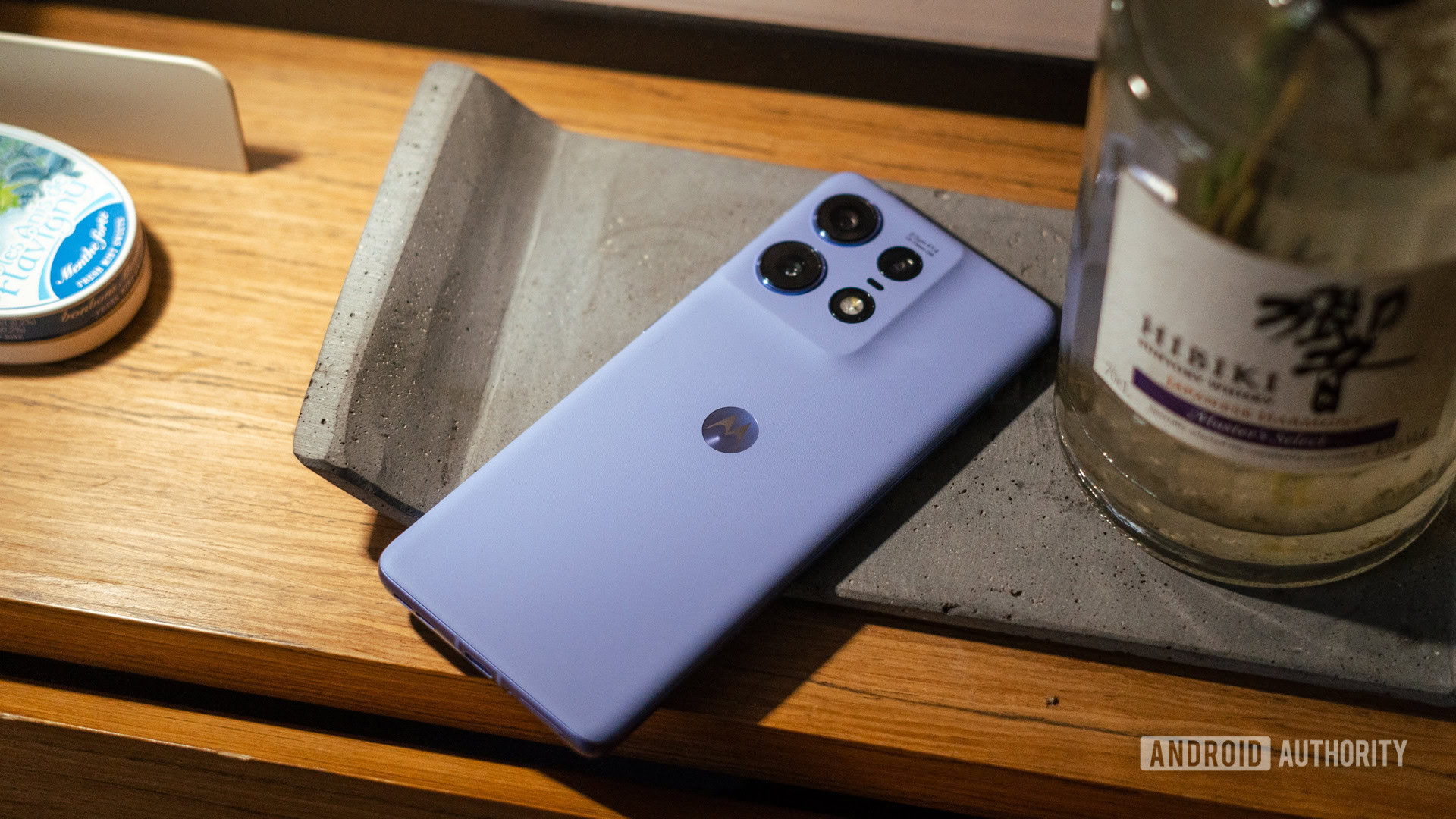
Shifting down a level or two, the Moto G series has finally started to have fun with its designs. Moto G 5G and Moto G Power 5G come with vegan leather in 2024, and they look almost good enough to be members of the Edge family. However, there’s one piece of Batwing-branded fun I’m begging to come to the United States — the Nordic Wood version of the Edge 50 Ultra. I’m sure it would be rebranded as the Edge Plus (2024) but think of the heads that a wooden smartphone would turn.
Make the Razr Plus a blueprint, not a standout

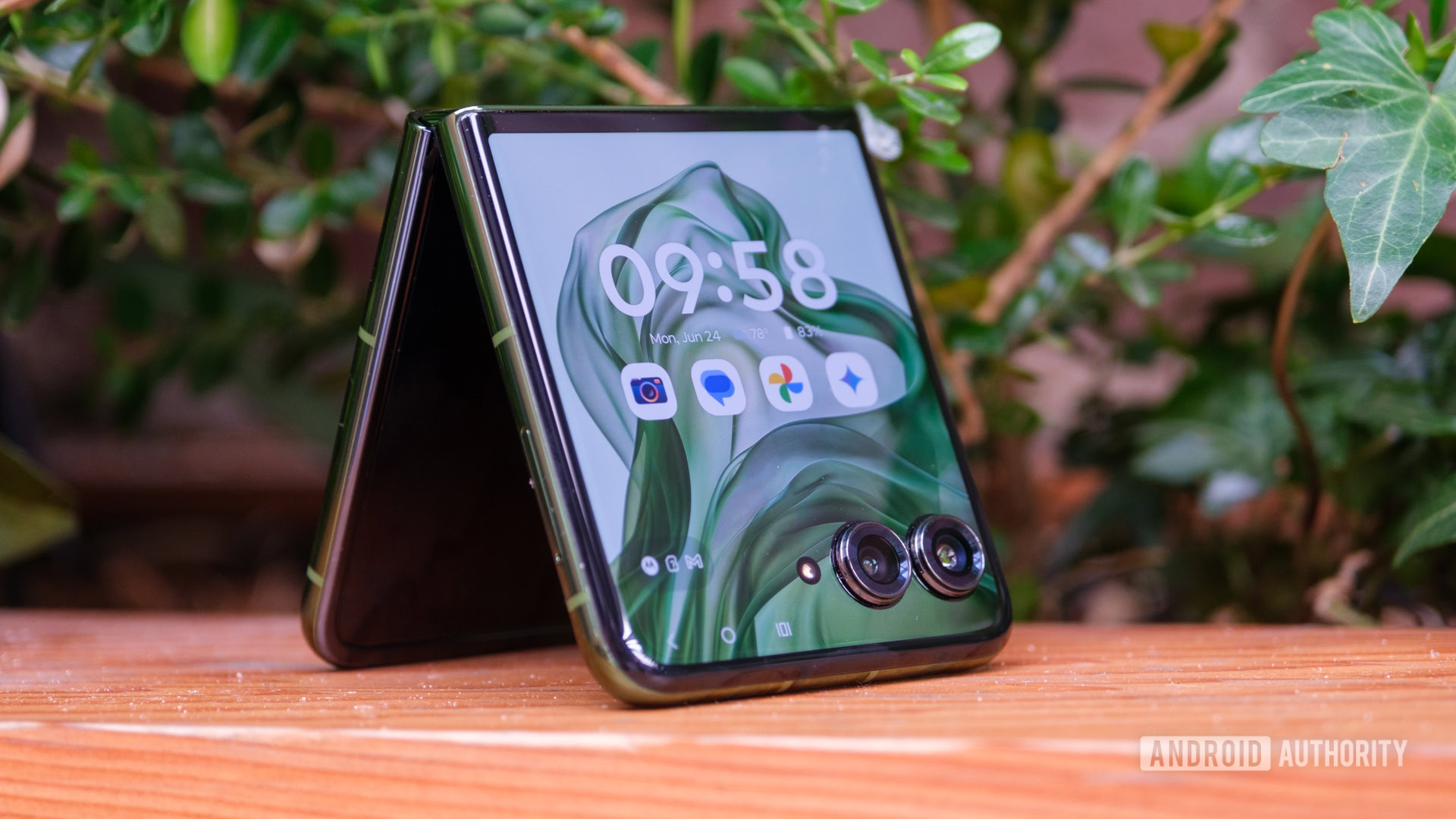
So, I’ve put the main pieces of Motorola’s 2024 offerings on blast, but one phone comes close to fixing them all at once — the Razr Plus (2024). No, it’s still not perfect, and this is by no means a review, but if Motorola wants to get back to why people loved it in the first place, its most premium Razr needs to be the rule rather than the exception.
For starters, the Razr Plus went for a camera setup all its own, adopting the 50MP wide and telephoto sensors that I mentioned before. It has an internal 32MP selfie camera, too, but that doesn’t matter much because almost everyone will use the larger, sharper external sensors instead. The Razr Plus comes with the smoothest version of Motorola’s Hello UX, a version that already carries a few of the earliest Moto AI features and — more importantly — comes without 1Weather or Glance anywhere to be found. Even the Razr Plus’ cover screen experience is easily the best on a flip phone, allowing you to open any app at any time and coming with a suite of time-wasting but addictive games.
We don't need more Razrs, but we need more phones to follow the Razr blueprint.
And, of course, the Razr Plus leads the way in terms of design, both for Motorola and for flip phones as a whole. It continues to stretch its cover screen larger and larger while pairing it with some of the brightest aluminum frames and most interesting textures of vegan leather that Motorola can find. I still think that the Nordic Wood of the Edge 50 Ultra is the most unique design choice of the year (or the last several years), but there’s no reason it couldn’t come to the Razr Plus in a few months.
At the end of the day, the important lesson is that Motorola still has greatness in it. There’s still a little bit of the creative spark that brought us Moto Mods and Moto Maker; the company just has to be willing to spread it beyond the confines of its most premium foldable phone. The sooner it does, the better its chances of climbing back to the top.