Affiliate links on Android Authority may earn us a commission. Learn more.
Sony Xperia SP review
Published onMay 21, 2013
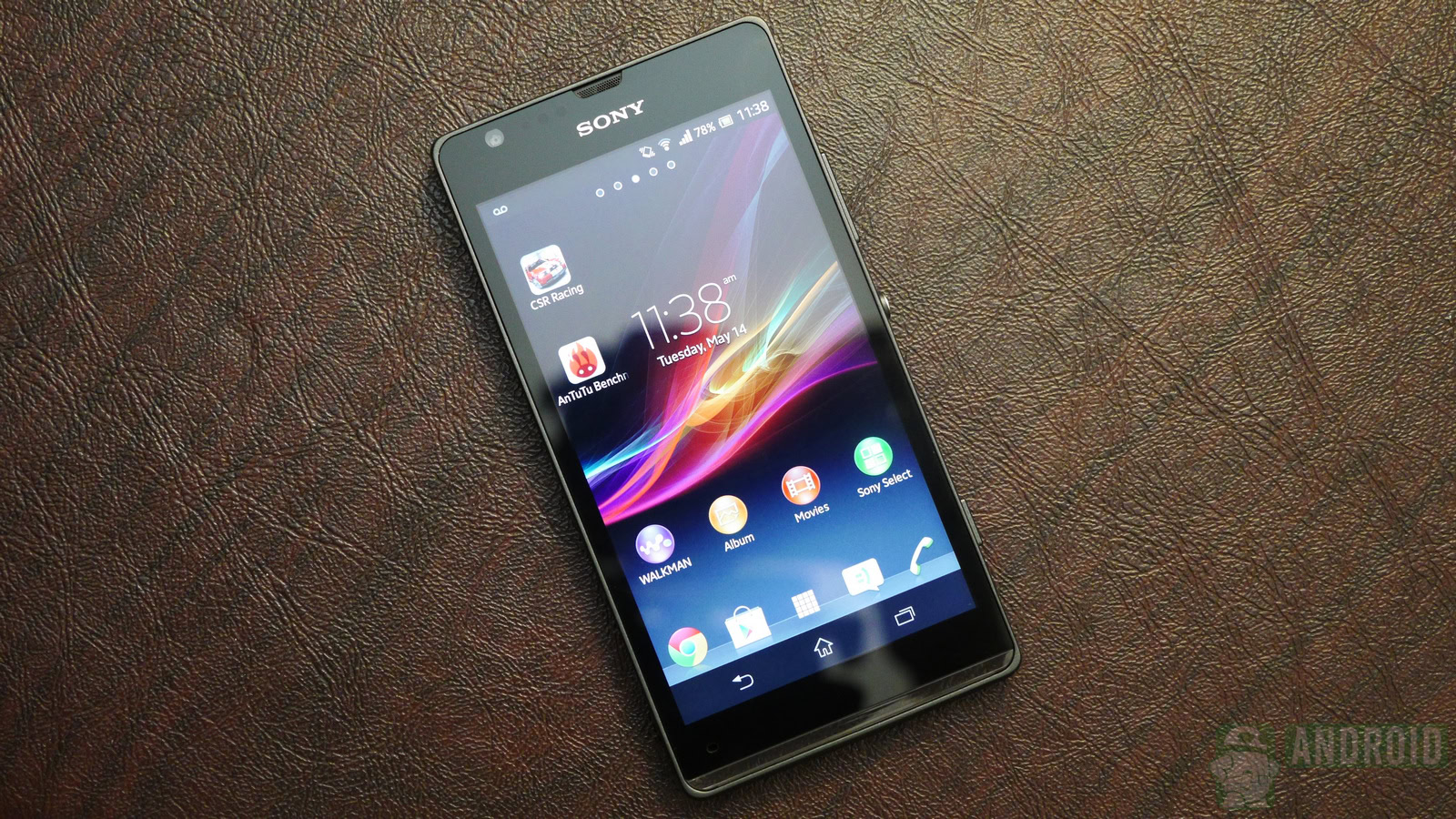
Sony is back in the game, that much is for sure. Not only has the storied Japanese company made its first profit in five years, but the Xperia Z and Xperia Tablet Z have been hailed as masterpieces of industrial design and praised for their user experience.
But Sony isn’t just focusing on the high-end market. Plenty of people look for attractively-priced devices with decent specs, and Sony isn’t ready to ignore such an important demographic.
Enter the Sony Xperia SP, a mid-ranger that looks great, at least on paper. But will customers agree? As usual, we take a look at the Sony Xperia SP’s design, specifications, features, and software. In a hurry? Jump straight to the video review.
Design: a consummate Xperia with a gleam of light
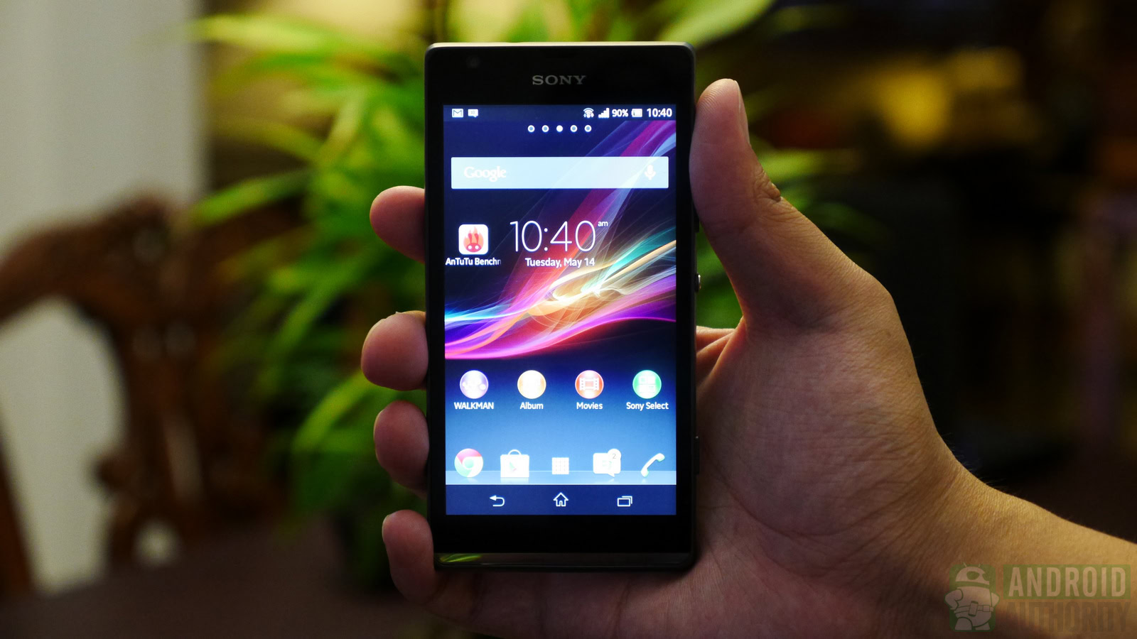
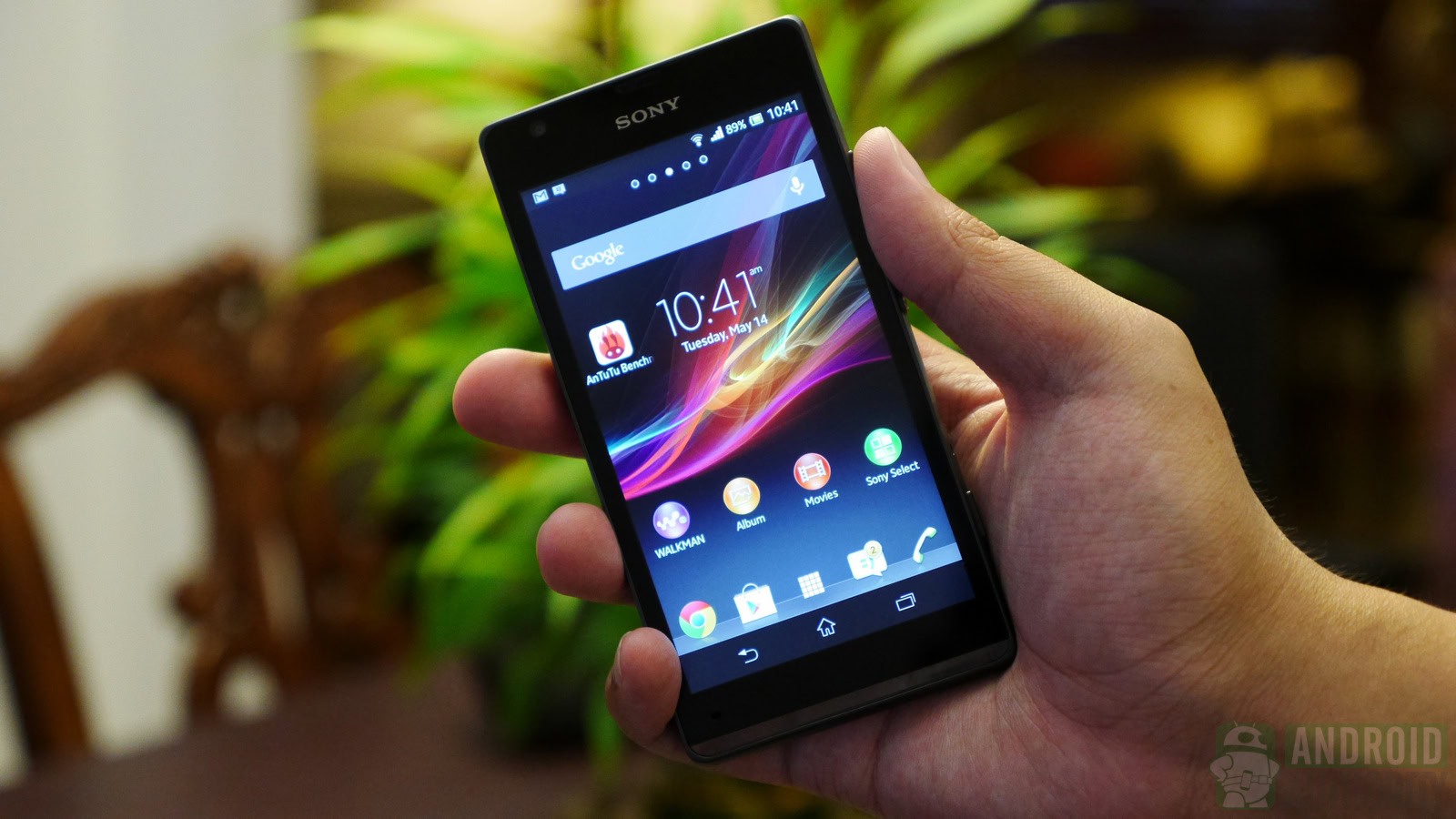
From the first glance it’s easy to tell that the SP is a true Xperia. The phone retains the rectangular corners and flat sides of its more expensive siblings, but has a few twists that make it stand out. On the front, Sony opted for its typically minimalist appearance – the front of the SP is the screen and nothing else.
On the side, the distinctive silver power button makes an appearance, along with a volume rocker and a dedicated camera shutter button.
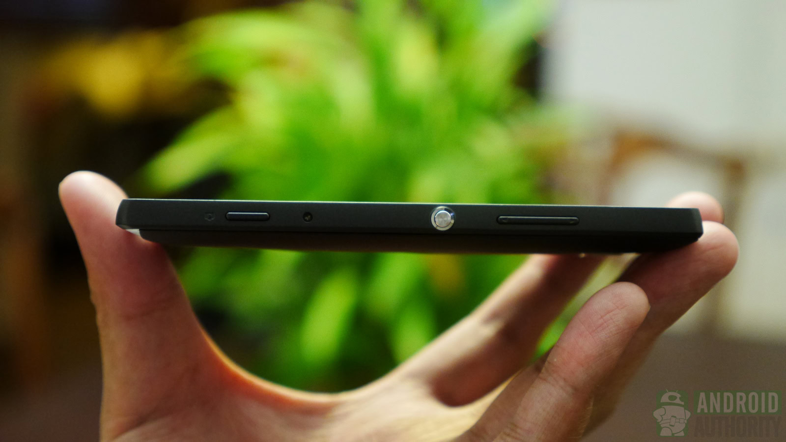
The Xperia SP has a solid, hefty feeling to it, conferred by the aluminum frame that runs along its edges. However, at 10 millimeters and 155 grams, it may be too thick and hefty for some users. On the back, you get the 8MP camera, surrounded by a plastic removable cover with a matter finish that helps with the grip.
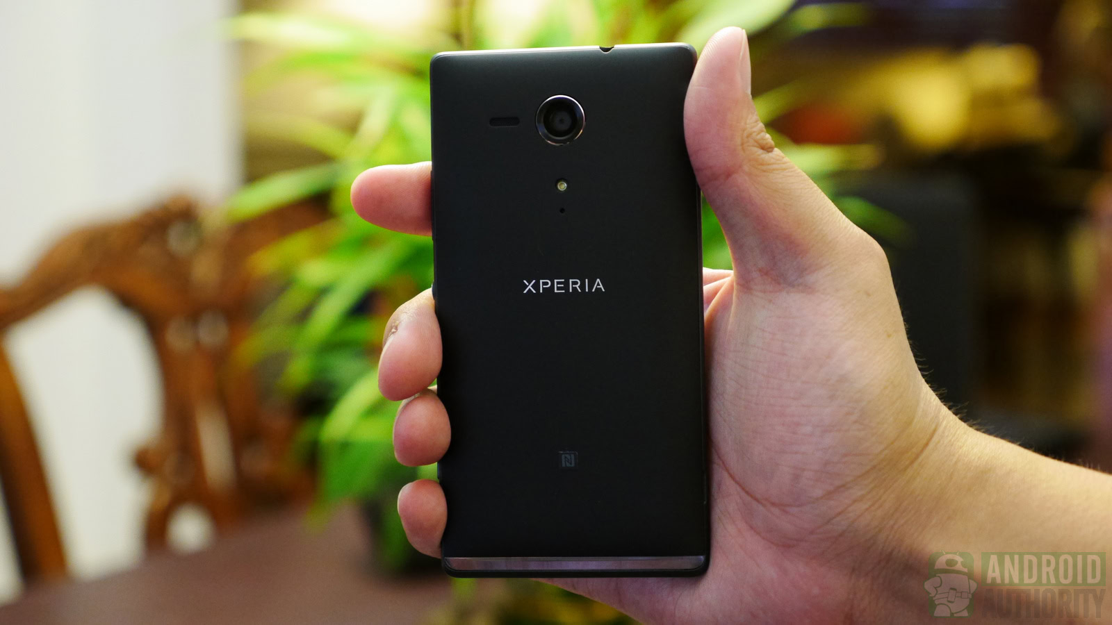
The XP’s most distinctive design feature is the transparent strip of plastic on its bottom, which diffuses the colored LED notifications or lights up in rhythm when music plays on the phone. It may not be much, but this little feature is enough to make the Xperia SP stand out from a sea of drab mid-rangers.
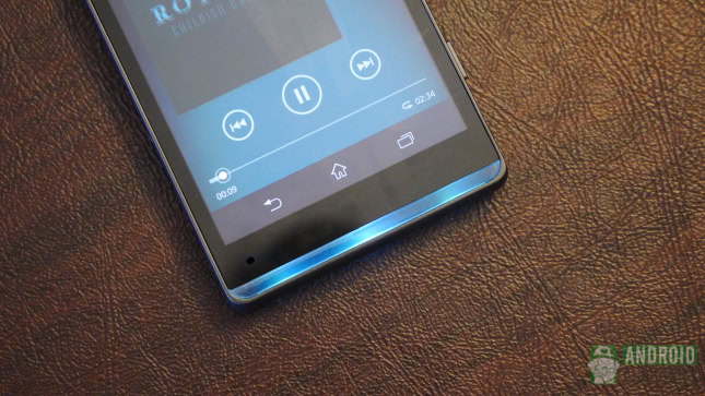
At the end of the day, the Xperia SP is a balanced, well designed Sony device, that we think most users will enjoy, as long as they’re okay with its slightly bulky profile.
720p is so last year… or not?
The wave of Full HD devices that hit the market starting with late 2012 means that, for many people, a high-end device needs to have a 1080p panel. All Android smartphones that we consider high-end right now have that configuration. Where does that leave a 4.7-inch 720p device like the Xperia SP? Squarely in the mid-range category, but that doesn’t mean that the display of the SP should be dismissed as outdated.
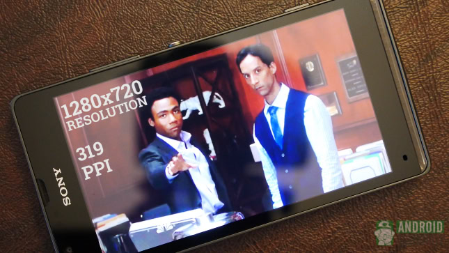
Because it’s slightly smaller than the Xperia Z, the Xperia SP has a pretty good pixel density at 319ppi. For the record, that’s only slightly lower than what Apple calls Retina, but way lower than the current cream of the crop of Android devices, which hover around 440 ppi, or more in the case of the HTCOne.
In terms of quality, the Xperia SP seems to suffer from the same issue that plagues the Xperia Z and the Xperia ZL – poor visibility angles. Look at it dead on (like you are likely to do 90% of the time) and the display of the Xperia SP is beautiful. Turn it slightly and the colors wash out and the text becomes hard to read. It may not be a major problem for most users, but it’s there. Otherwise, most regular users and even power users will find little to complain about the Xperia SP’s display.
Specs and performance
Living on the bleeding edge of smartphone specifications isn’t for everyone. Quad-core and even octo-core processors are fine and dandy, but it’s easy to forget that most people actually don’t need that level of processing power in their phones. This introduction is necessary because some may be inclined to dismiss the dual-core Snapdragon S4 processor of the Xperia SP as outdated.
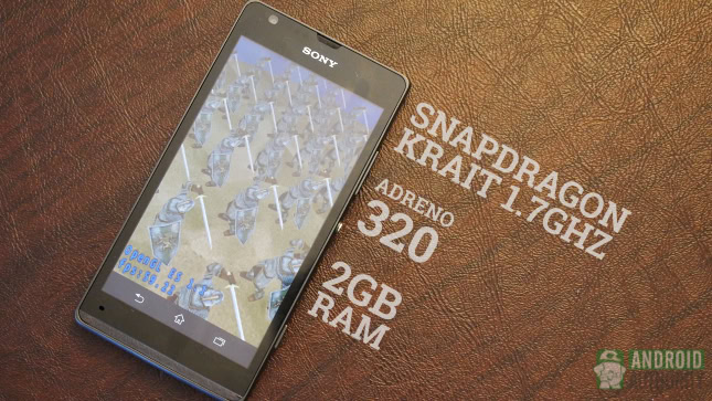
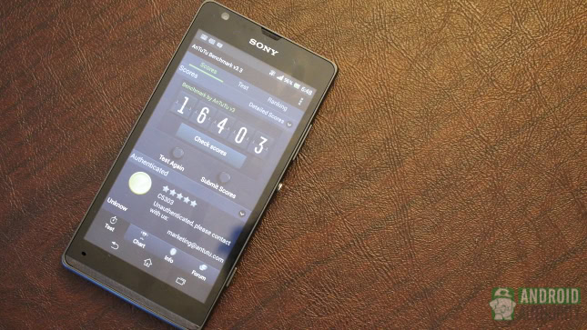
While it may be a year old, the S4 running at 1.7GHz does its job admirably, and powers the operating system without skipping a beat. The presence of an Adreno 320 GPU (the same as in the newer Snapdragon 600 series) and of 1GB of RAM helps provide the oomph required to take the device through the multitasking and graphics intensive applications.
One area where the SP outshines its sleeker sibling, the Xperia Z, is the quality of the sounds it outputs. The rear-mounted speakers are nice and loud, without distorting the sound on high volume. Sony endowed the Xperia SP with the assortment of connectivity options we’ve come to expect from every phone these days, such as WiFi, GPS, Bluetooth and NFC. The phone comes in two versions that offer HSDPA and LTE compatibility, while there’s only one storage option available – 8GB. That isn’t much, especially for users who regularly consume media on the go, but the good news is the removable back cover of the XP hides a microSD card slot that makes possible the addition of another 32GB of storage.
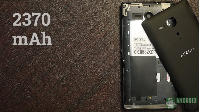
Unfortunately, a removable cover doesn’t necessarily mean that a removable battery is present, and that’s the case with the Xperia SP. The good news is that the 2370mAh battery can go the distance, probably thanks to the less power hungry processor and display. We’ve tested it using a locally stored video played in a loop for a little over three hours, which drained 50 percent of the battery. That means that, provided you are not going too hard on the SP, the device can power through about seven hours of straight media consumption, and get you through a day of moderate use.
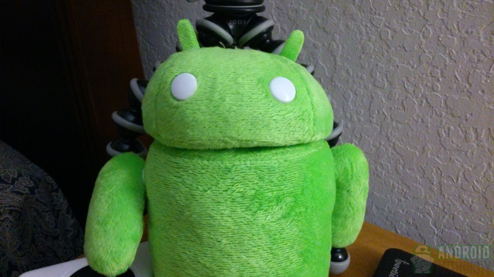
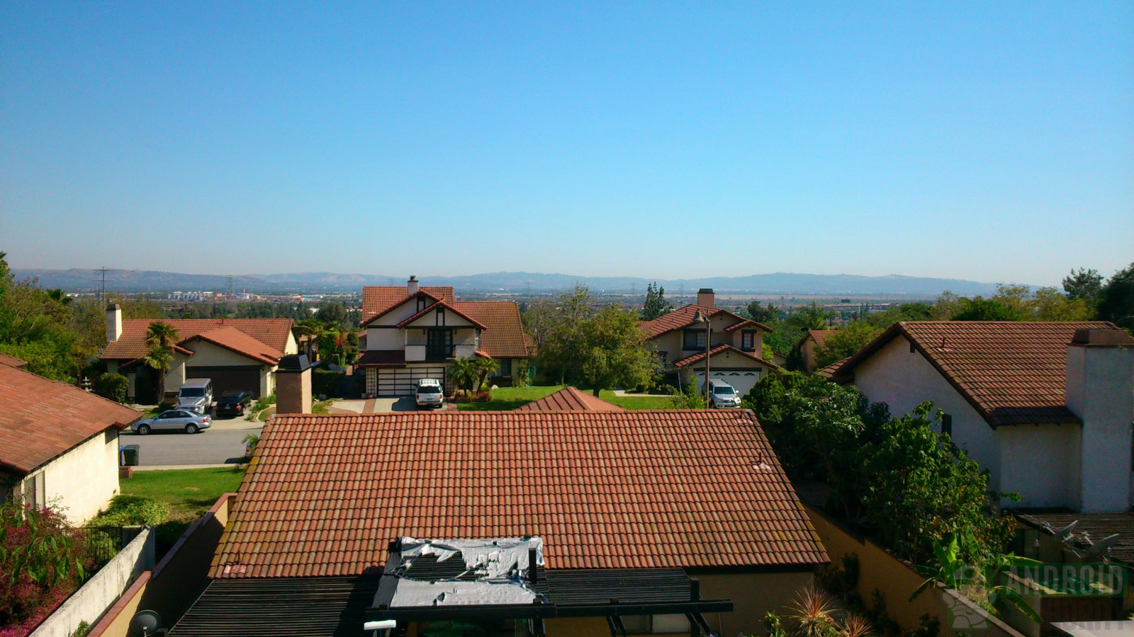
The camera of the Xperia SP is in many ways similar to that on the Xperia Z. Both have Sony Exmor sensors at their hearts, though the SP has an older 8MP model, as opposed to 13 on the Z. Most of the software features present on the high-end model make an appearance on the Xperia SP as well – Superior Auto, HDR, touch capture, and Panorama. Ultimately, we found the Xperia SP to be a decent shooter, but the truth is even some devices from last year, like the Galaxy S3, do better in this department.
Software: Xperia UI redux
If you’ve ever played with the Xperia Z, ZL, or even some of Sony’s devices from last year, you will feel right at home using the SP. Basically, the user interface of the device is a mélange of elements from Ice Cream Sandwich (the color schemes), Jelly Bean (Google Now and more), and Sony additions like the Walkman app and the Album photo gallery app.
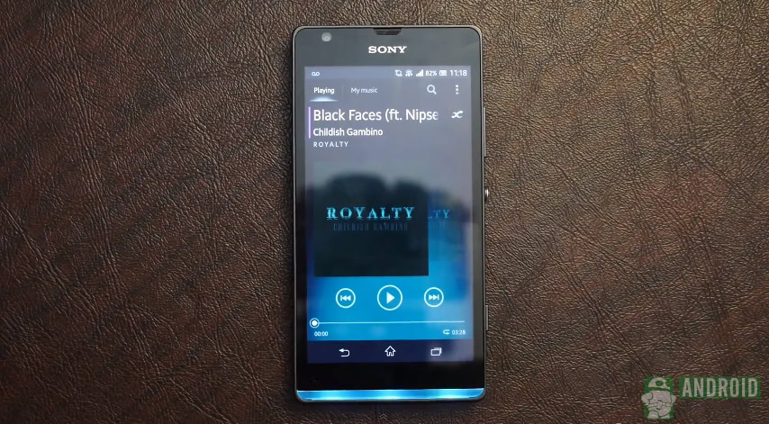
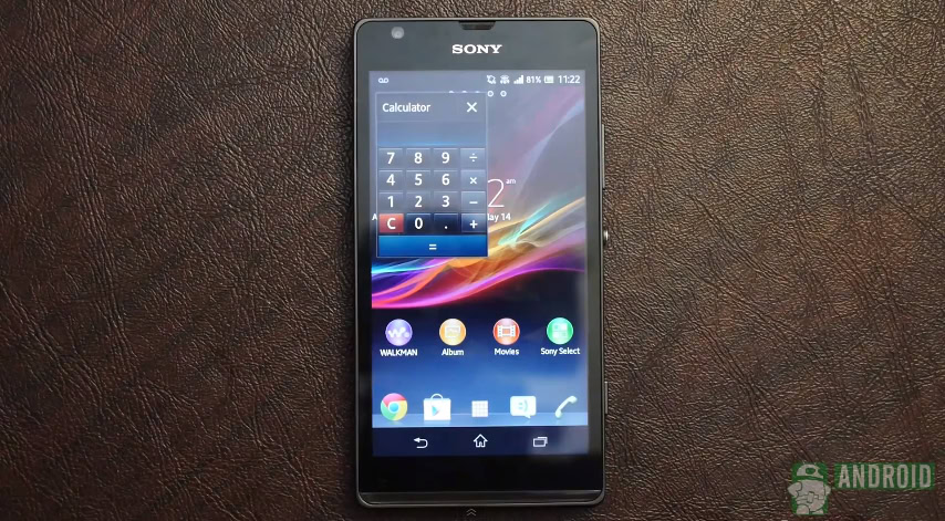
In addition to the preloaded apps we’ve mentioned, Sony also added its trademark Small Apps, a suite of applets that are accessible from the recent apps screen, which help users do some light multitasking. In terms of design, the UI of the Xperia SP tends to be minimalist, but in a pleasant, non-obtrusive way. Sony tried to keep it simple, and for the most part, the result is great.
Pricing and final thoughts
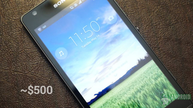
The Sony Xperia SP is available for roughly US $500 unlocked, which is a decent price for a device in this class. The SP isn’t currently ranged by any American carrier, but it should come for $100 to $150 on a two year contract. Now for the big question – is it worth it?
If you are a spec fiend, there isn’t anything on the Xperia SP to get you excited. You’ll be better off with an Xperia Z (if you prefer Sony), Galaxy S4, or HTCOne.
However, if you are a budget-conscious customer that wants to get the most bang for the buck, the Sony Xperia SP is an excellent choice. It costs far less than current high-end devices, and it’s able to hold its own respectably.
What do you think about the Sony Xperia SP? Vote in our poll or tell us in the comments.
Bogdan Petrovan contributed to this review.
[poll id=”300″]