Affiliate links on Android Authority may earn us a commission. Learn more.
Sony Xperia Z2 Tablet unboxing and first impressions
April 1, 2014
Unlike with its high-end smartphone launches, Sony decided to follow a yearly release cycle for its high-end tablet offering. We first got our hands on the very impressive Xperia Z2 Tablet during this year’s Mobile World Congress, and deservingly received Android Authority’s award for Best Tablet at MWC 2014. The follow up to the exceptional Sony Xperia Z Tablet is finally here, and we can’t wait to dive in, but before we do, as always, here’s a look at the unboxing and our first impressions about the Sony Xperia Z2 Tablet!
Unboxing
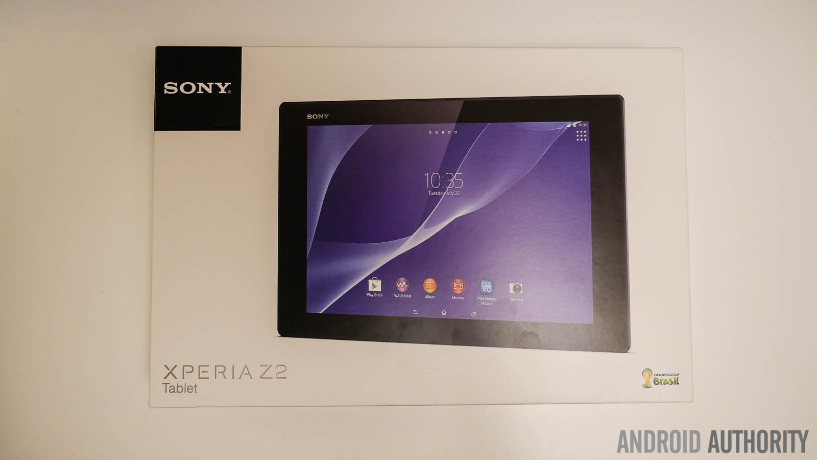
Opening up the box shows you the Xperia Z2 Tablet in all its glory. While the design elements remain the same across the board compared to its predecessor, the Z2 Tablet features corners that are slightly more rounded and less rigid, which means that it doesn’t poke into your hand like the first iteration did. While we get to check out the black version of the Xperia Z2 Tablet here, which is great, but it has to be mentioned that the white version that we got our hands on at MWC 2014 is even better to look at.
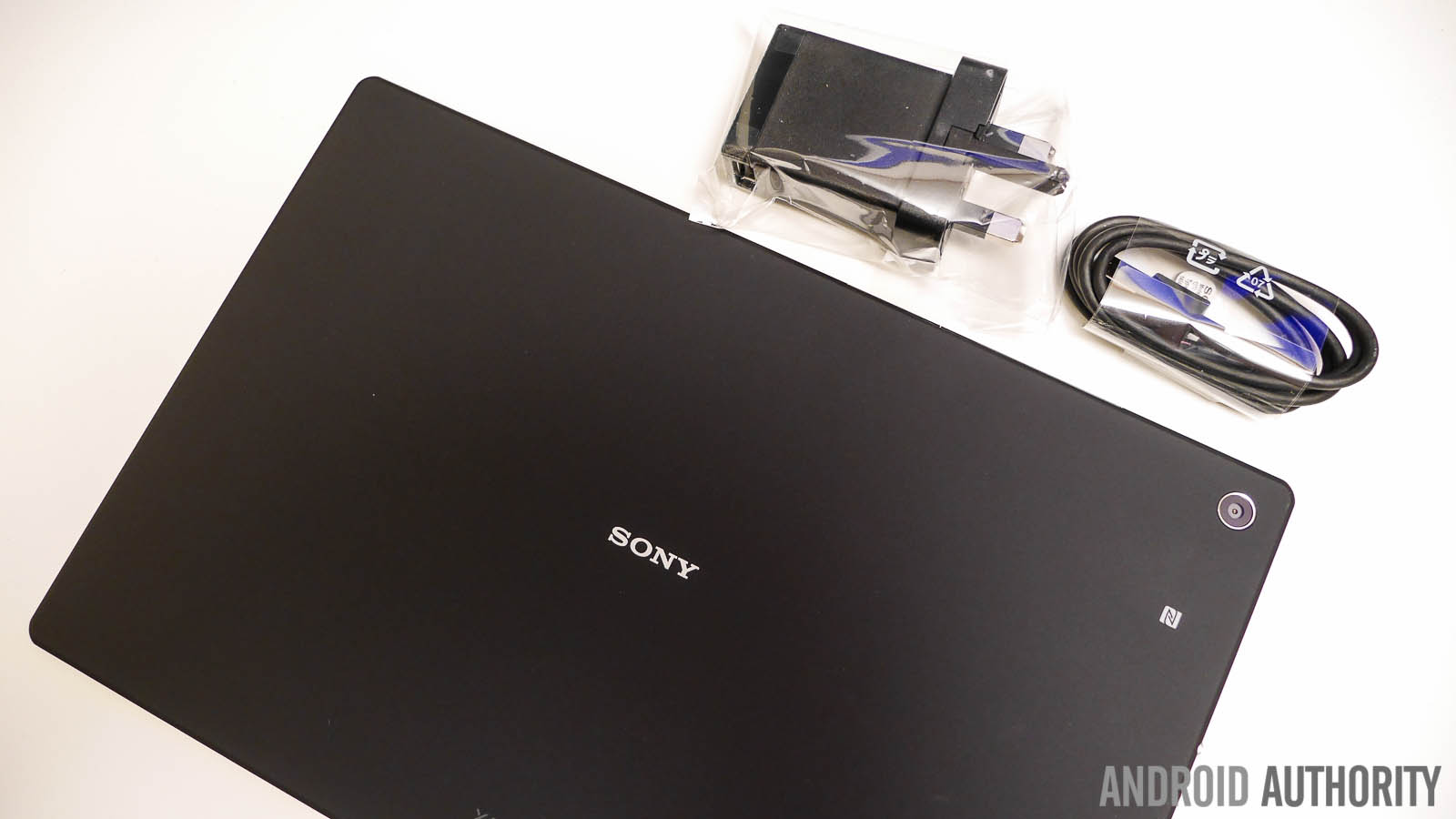
Other than the tablet, there’s nothing particularly of note in the box. In this case you get a Startup Guide, warranty and legal notices, and an advertisement page featuring some Sony peripherals like the SmartWatch 2 and the Sony fitness bands. Also included is a microUSB cable and AC wall adapter to charge the device.
First Impressions
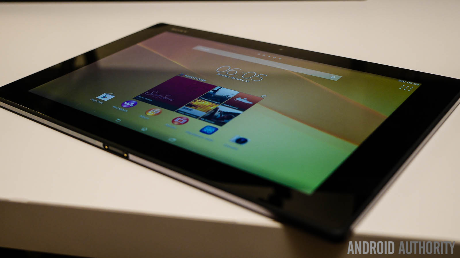
Most striking about the Xperia Z2 Tablet, as was the case with the Xperia Z Tablet as well, is how thin the device is. With a thickness of just 6.4 mm and weighing just 439 grams and an even lighter 426 grams for the Wi-Fi only version, Sony once again manages to pack in top of the line specifications in a sleek and light body. While it can get quite tedious to lug around a 10-inch tablet, the amazingly low weight of the Xperia Z2 Tablet makes it a pleasure to work on, even for long periods of time.
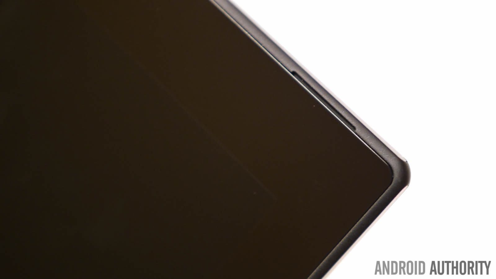
Not much has changed between iterations as far as the design language is concerned, but the sides are smoother and more rounded, which not only looks better, but makes the tablet easier to hold. The large bezels make a return as well, that makes the 10.1-inch display of the device actually seem small, but on the flip side, it allows you to hold on to the tab very easily, without running a risk of accidentally tapping on something on the screen.
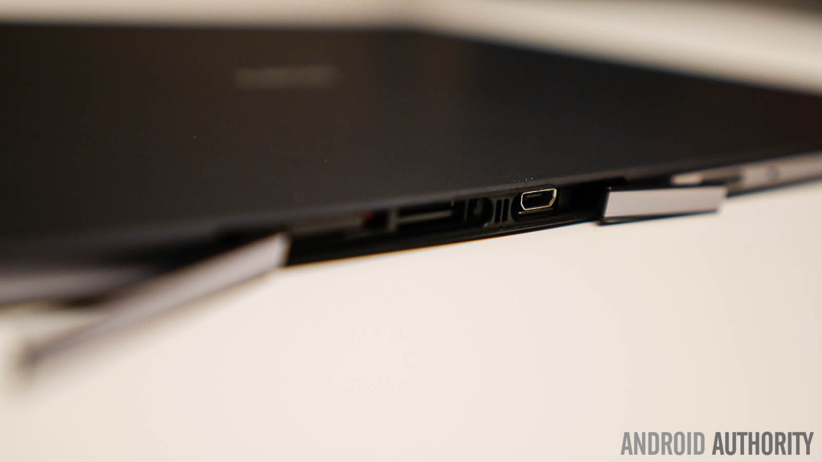
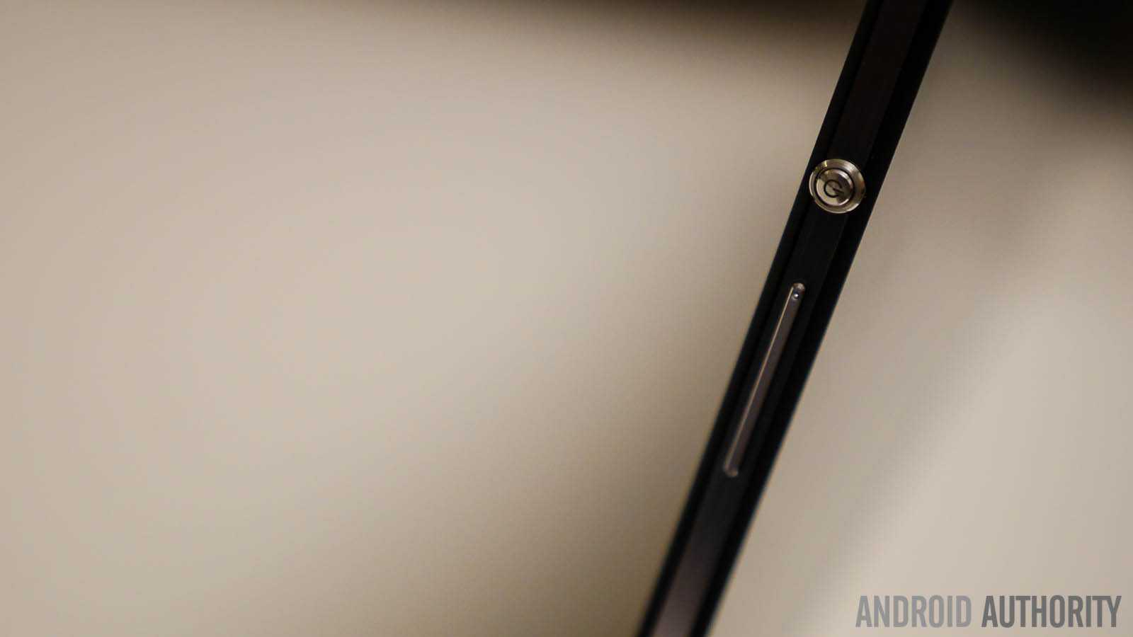
Taking a look around the tablet, you’ll find the headphone jack and the magnetic charging port at the bottom and the IR blaster, the microSD card slot, and the USB charging port at the top, both of which are covered to help with keeping the tablet waterproof. You’ll find the signature large silver power button and the volume rocker on the left side of the tablet. Speaking of being waterproof, the Xperia Z2 Tablet comes with the same IP58 rating that is found with the current lineup of high-end smartphones from the company, which means that you can dunk the tablet up to 1 meter in water without affecting performance.
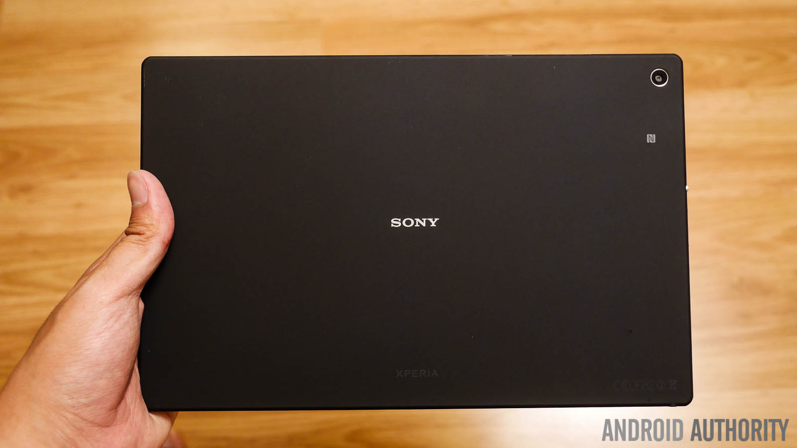
Unlike the high-end smartphones available from Sony, but like the Xperia Z Tablet before it, the back of the Z2 Tablet isn’t glass, and instead features a polycarbonate material that should make gripping such a large device much easier. It may not be particularly fingerprint prone, but can pick up smudges, especially with oily hands.
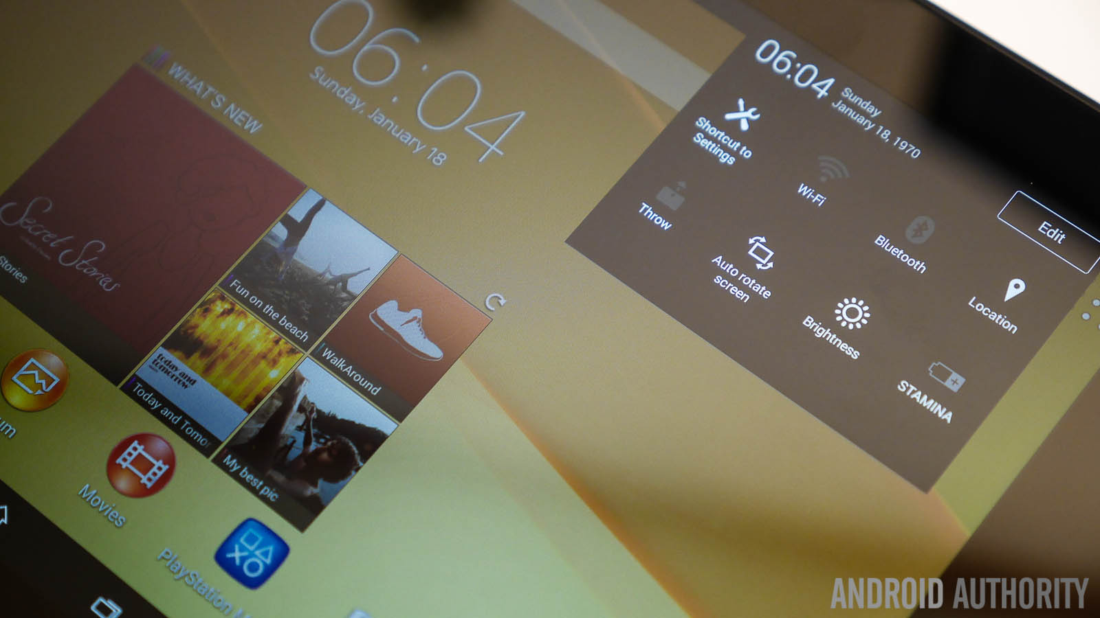
Jumping into the operating system, making a return is the Xperia UI, or Timescape as it is sometimes called, with a slightly updated look that is found on the recently launched Sony Xperia Z2 smartphone as well. Xperia UI features Small Apps are available, and the App Drawer comes with a pull out menu that lets you adjust the order of the apps, or easily access applications like the Google Play Store. A long press of the software home button gives the option to either open Google Now, or the Sony Experience area, which basically includes ads for various media that you can get from the subscription-based Sony media store.
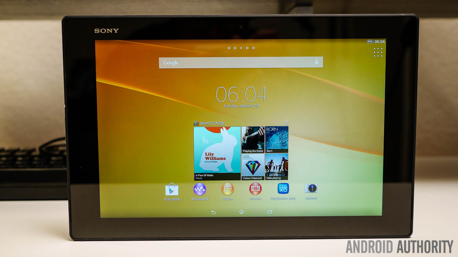
Once again, Sony employs a philosophy of “keep it simple, keep it fast,” and the device certainly flies through the minimalistic user interface. It’s pretty standard fare when it comes to the operating system, but that’s exactly what we’ve come to expect from the Xperia UI.
Specifications
| Display | 10.1-inch Full HD (1920 x 1200) TRILUMINOS display X-Reality and Live Color LED technology |
|---|---|
Processor | 2.3GHz quad-core Snapdragon 801 CPU, Adreno 330 GPU |
RAM | 3 GB |
Storage | 16 GB, expandable |
Cameras | 8.1MP Exmor RS rear camera, 2.2MP from camera |
Battery | 6,000 mAh |
Software | Android 4.4 Kitkat |
Dimensions | 266 x 172 x 6.4 mm, 426 grams (Wi-Fi only, 439 grams (3G/LTE) |
Connectivity | Wi-Fi only, 3G/4G LTE versions available |
Gallery
Other Videos
Conclusion at glance
Sony is well known for their fantastic build quality, and once again, you get a very attractive device all around, which features just enough subtle changes over its predecessor to make the experience even better. We can’t wait to put the tablet through its paces, so stay tuned with Android Authority as we bring you the full, in-depth review of the Sony Xperia Z2 Tablet very soon!
What are your thoughts? What are your first impressions about the Sony Xperia Z2 Tablet? Let us know in the comments section below!