Affiliate links on Android Authority may earn us a commission. Learn more.
I'm really excited for a square Galaxy Watch 7!
Published onMarch 17, 2024
A curious report from Sammobile this week claimed that the Galaxy Watch could go back to its square roots. It’s still a rumor for now, and we’re not sure if this will be the case for the Galaxy Watch 7 or if we have to wait more than a year to see it, but it got me hyped up! Samsung “copying” the Apple Watch design is a very good idea, and I put “copying” between quotes because we all know Apple didn’t invent that shape for smartwatches.
Square vs round across time

Let’s wind the clock back 10 years. The first Samsung Galaxy Gear, the Gear 2, and Gear Live were all square — well, rectangular if we’re being pedantic. Likewise, many of the first Android Wear smartwatches were square too. There was a time, around 2013-2015, when you could find a good mix of round and square designs from LG, ASUS, and Sony.
A shift started, though. In my mind, I can pin it down to two important factors: The Moto 360’s iconic round design was met with a lot of love and rave reviews, and the Apple Watch launched with a square design.
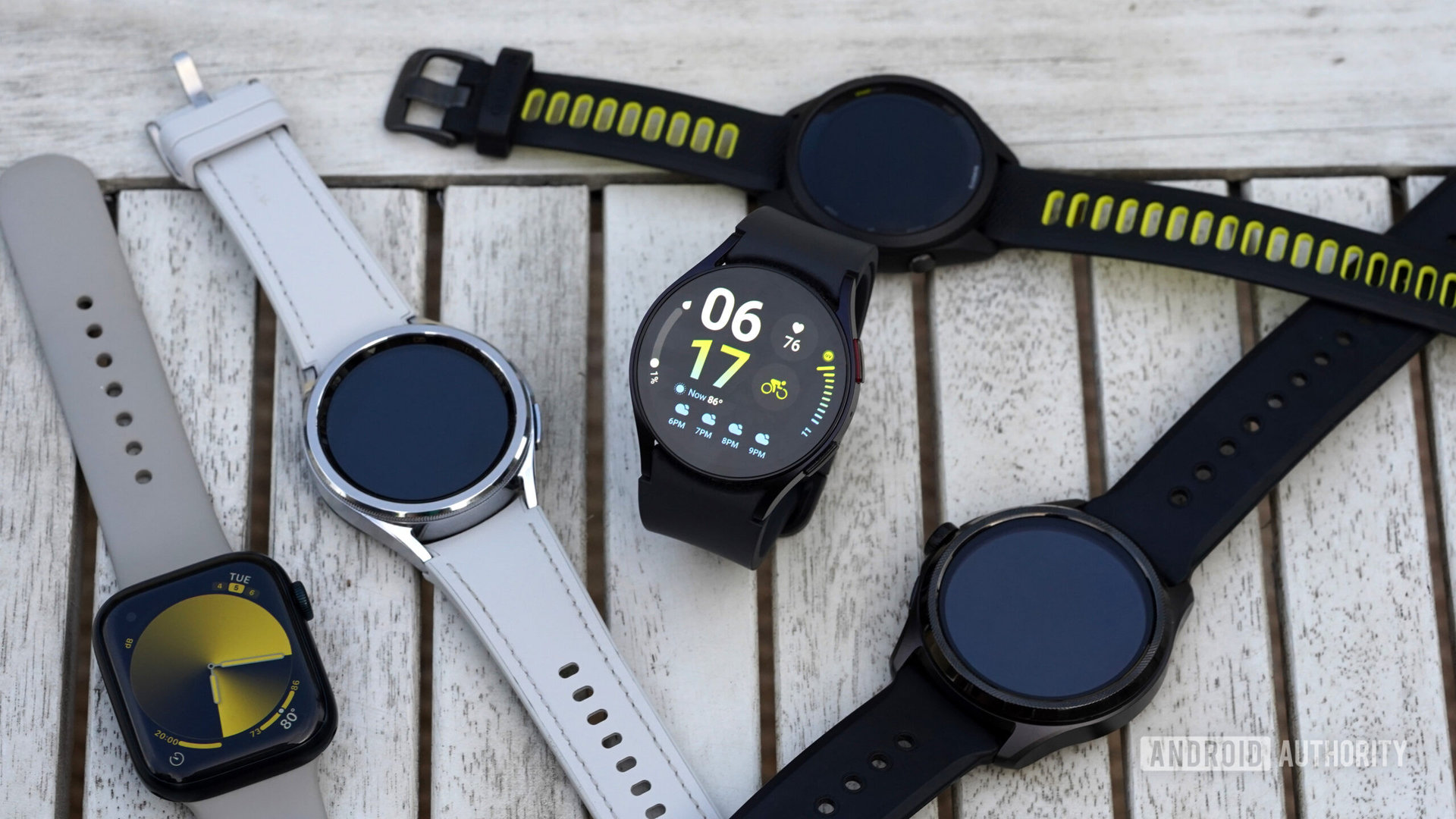
Android watches use the round shape to distinguish themselves from the Apple Watch, but they historically started square.
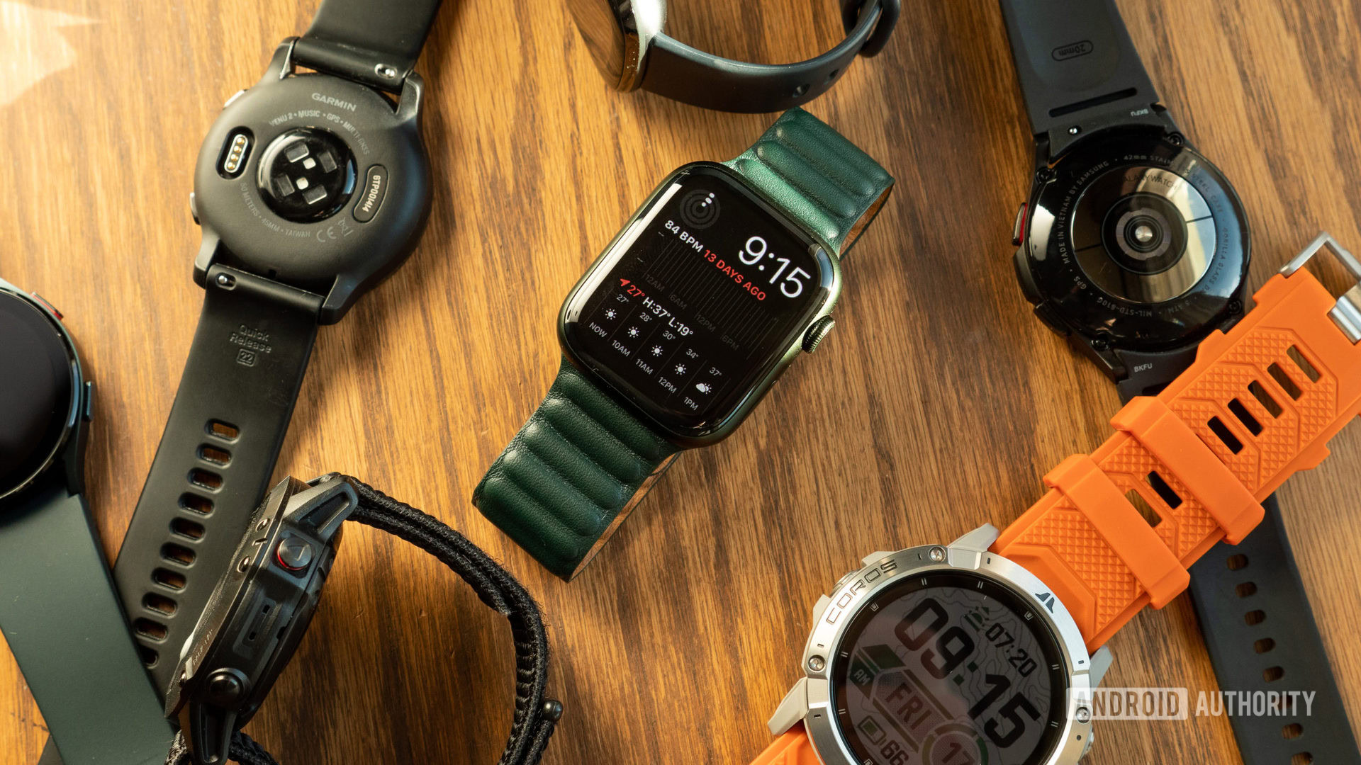
Over the years, the square design started disappearing from Android Wear and Wear OS watches. Fewer and fewer models launched with it until, well, now. There hasn’t been a square Wear OS watch (outside of China) for years. It’s as if Apple got an exclusivity deal on the shape while Android watches went round to distinguish themselves. And let’s face it, the circular design was the only real advantage Wear OS had over the Apple Watch for years.
It’s a matter of choice

What I love about the Android ecosystem is that it was built on choice. Phones, tablets, TVs, cars, I can find what I want, and so can you, even if our tastes and spec requirements are completely different. So why not watches too?
And I’m not alone in thinking this. We asked you guys, here on Android Authority, but also on Twitter and on YouTube, if you preferred round or square watches. We got over 5000 votes total and, of course, 60% or more picked round watches. However, 18-19% of you prefer the square design, and around 20% don’t really care about the shape as long as the watch does what they need.
One over five people preferring a square shape is not a small number. Giving these buyers an alternative square design just makes sense from a business perspective.
One in five people we polled prefers a square smartwatch shape. Samsung should offer them the option to buy one.
And look, I’ve heard the eternal argument about a round watch looking more like a watch a million times. I know it, I’m not disputing that the round shape is more in line with a traditional mechanical watch and is easier to dress up or down. But if a square design is good enough for Cartier, Richard Mille, and Hublot, then it’s good enough for Samsung. And me.
Let me be clear, though. I’m not saying that Samsung should switch to a square design for all of its watches. But should it offer it as an option? Yes, please!
The benefits of a square design

The benefits and issues of a square versus round design have been discussed for years, but I’d like to highlight what, for me, are the three clear advantages of a squared-off watch shape.
For one, it lets watchmakers fit more electronics inside. Smartwatch batteries, chipsets, and sensors are all rectangular, so putting them in a round watch is clearly an inefficient use of space.
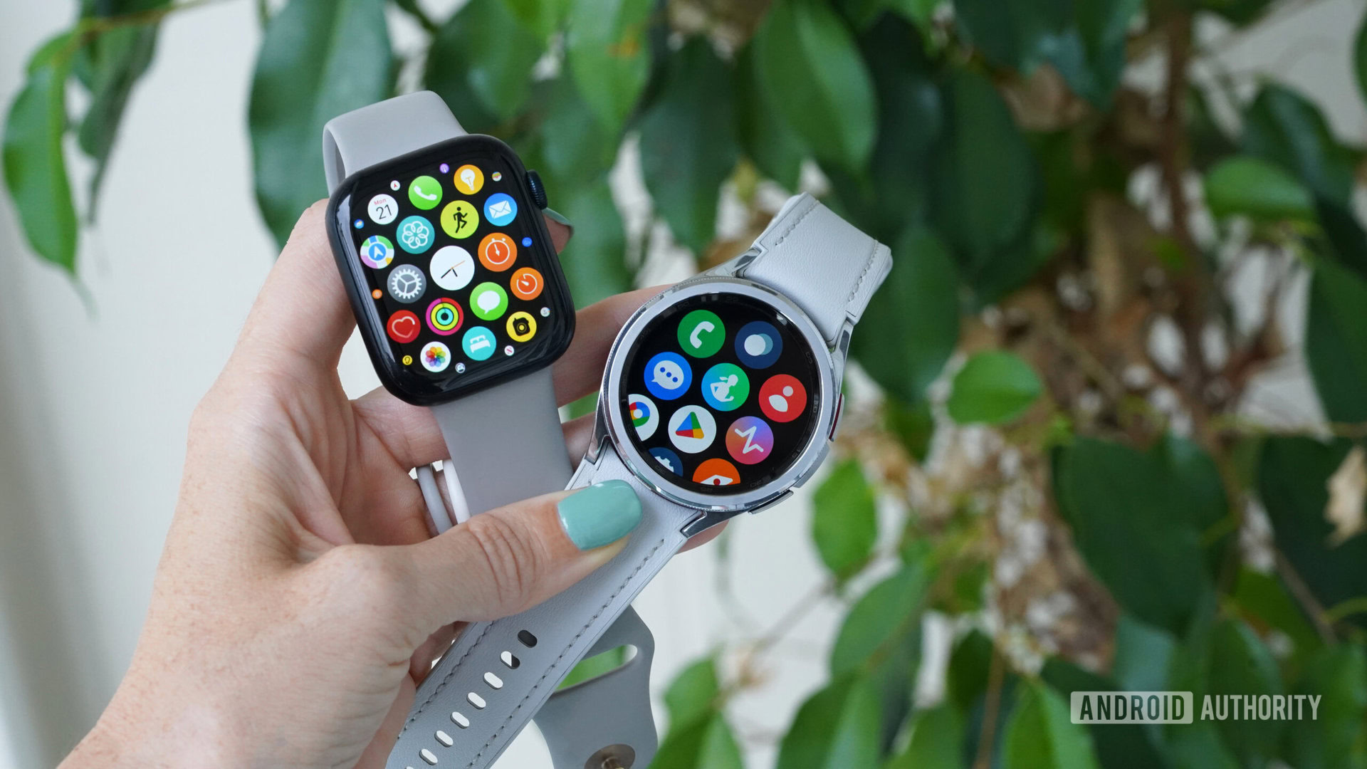
Two, the text doesn’t get cut off on all four corners of a square watch. This is my biggest pet peeve with my Google Pixel Watch 2 and the Galaxy Watch 4 I used before. I have to center text in the middle of the display to read it. Similarly, I have to center graphs, like my steps or heart rate, to the middle of the display to see them fully. It’s almost like the top and bottom of the circle are only useful for the watch face, because I instinctively aim for the middle of the display (both with my eyes and my finger) in any other app or menu. That’s not the case when I’m testing the Apple Watch; the whole display is usable and readable there.
When it comes to smartwatches, it's hip to be square — and very useful no matter how you look at it.
And finally, there’s this thing called geometry, so bear with me while I explain it. By definition, a round watch is as tall as it is wide. For Samsung to make a round watch bigger and cover the width of my wrist, it has to make the watch both wider and taller. A bigger round watch becomes gigantically wide too. We’ve seen this with the new OnePlus Watch 2, for example.
Over time, we’ve also noticed that a larger round display doesn’t always mean more text and info on the screen. When Samsung moved from a 1.4-inch display to 1.5 inches between the Galaxy Watch 5 and 6, it didn’t show more info in that extra 0.1 inches, it just showed the same thing, but slightly bigger.
By comparison, a rectangular watch — and I’m using the correct math term here — can go taller without getting wider. So I could have more screen estate without the watch looking ridiculous on my wrist. Going taller means more lines of text to read and more room for icons, menus, and options.
The closest analogy I can think of is this: Do you want to go back to phones with a 16:10 display ratio like the first Galaxy Note, or do you prefer seeing more content on your Galaxy S24 Ultra with its 19.5:9 display ratio? I know what I’m choosing every single time.
This is why I’d love to see Samsung make a squared-off version of the Galaxy Watch 7. And not just Samsung, I’d love to see more smartwatch brands do that too. The square shape is not an Apple exclusive, Android Wear watches did it first. So, please, let’s just have that as an option for people like me who don’t mind the sportier look.