Affiliate links on Android Authority may earn us a commission. Learn more.
HTC One (M8) review
We got our first look at the HTC One (M8) a week ago and while the latest HTCflagship was probably the worst-kept secret in the tech world, we were left impressed just from looking at it. By refining the amazing design and build quality standards set by the One (M7) and adding the obligatory hardware update and improved software experience, HTChas without a doubt put its best foot forward in its comeback attempt.
You might like: Best accessories for the HTCOne (M8)
The HTCOne (M8) tries to capture the same aluminum-accented buzz of the original One. With a slightly taller and more rounded form factor, an extra “eye,” and an updated user interface, does the HTCOne (M8) bring enough to the table to capture the imagination of consumers? We find out in this detailed HTCOne (M8) review!
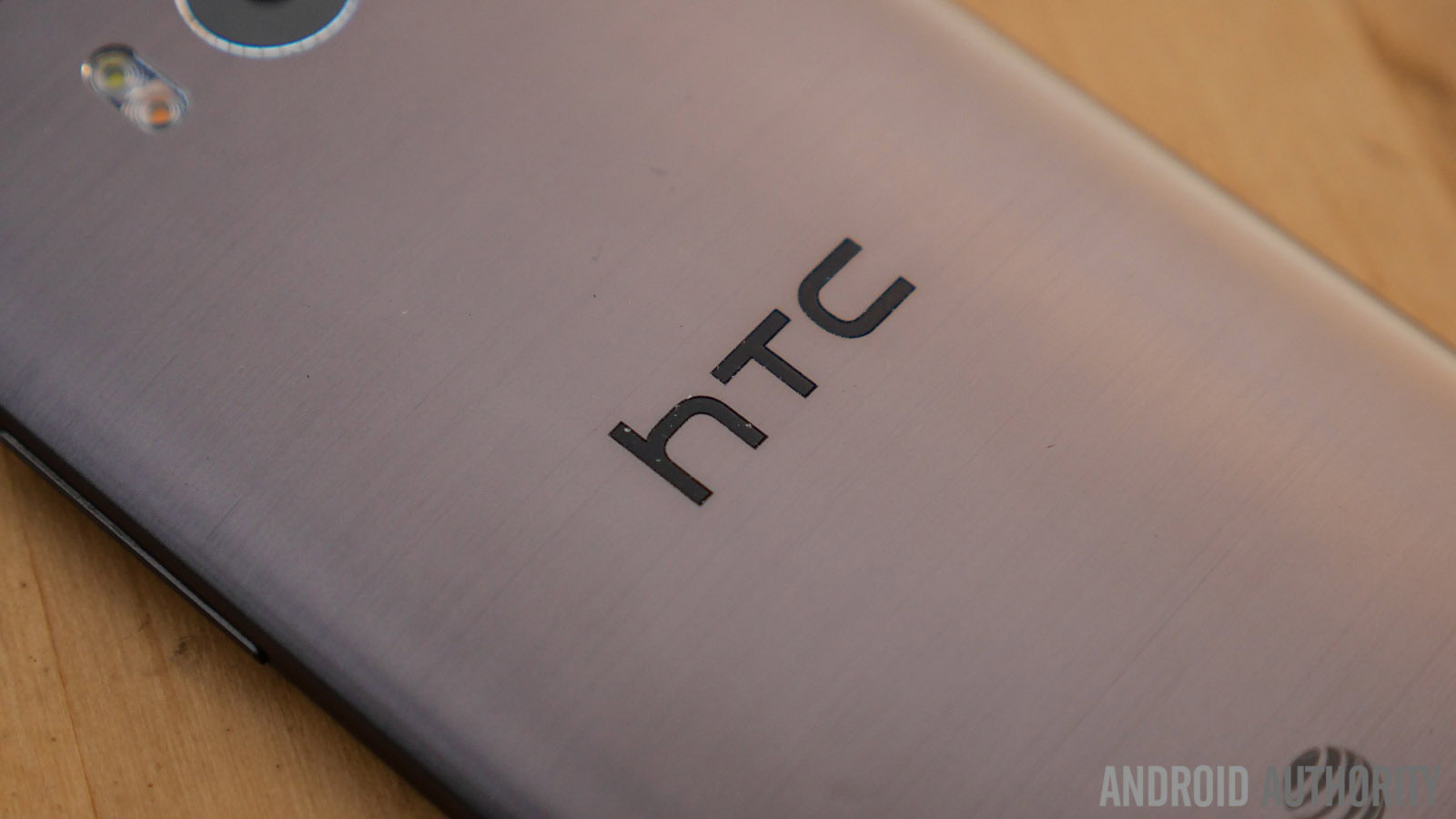
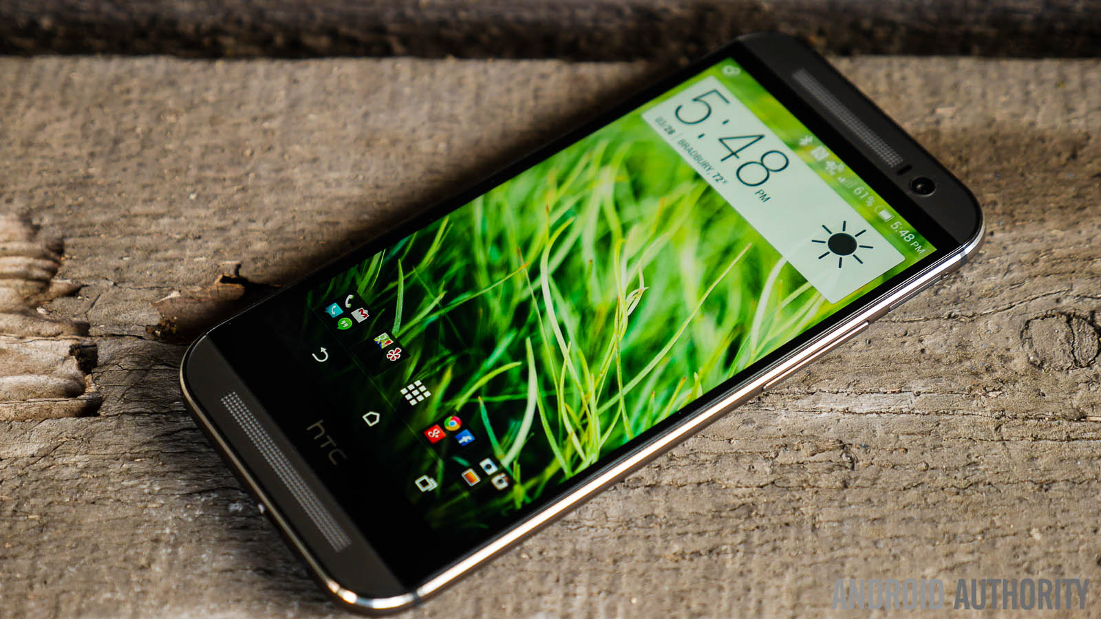
There’s one thing that simply cannot be denied about the latest HTCflagship — whether it’s the first time you hold the smartphone, or even the first time you glance at it, it’ll make you want more. This aluminum-built smartphone brings a premium choice of materials and workmanship to a phone that is a little larger overall compared to its predecessor, but still ends up being quite easy to handle.
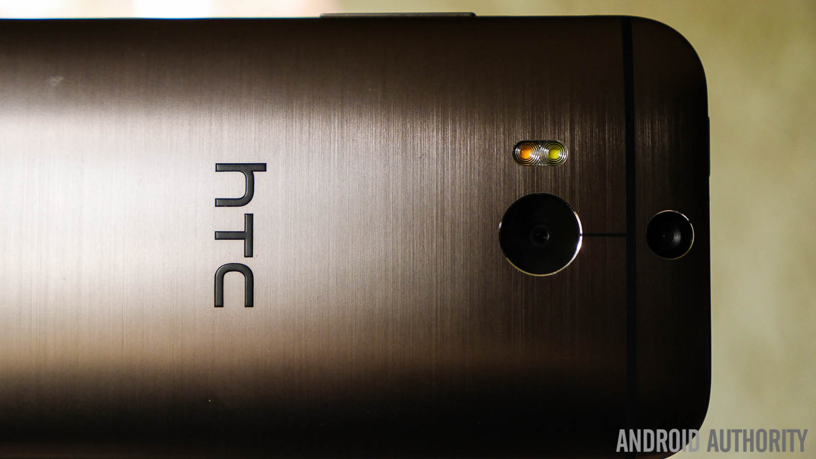
Fine tuning the design of the original, the metal wraps around the phone now, eliminating the plastic that wrapped around the sides of the phone on the M7. The brushed metal finish of the gun metal grey version of the HTCOne (M8) looks fantastic, but if it’s not your cup of tea, the matte finish of the silver and gold versions could be more to your liking.
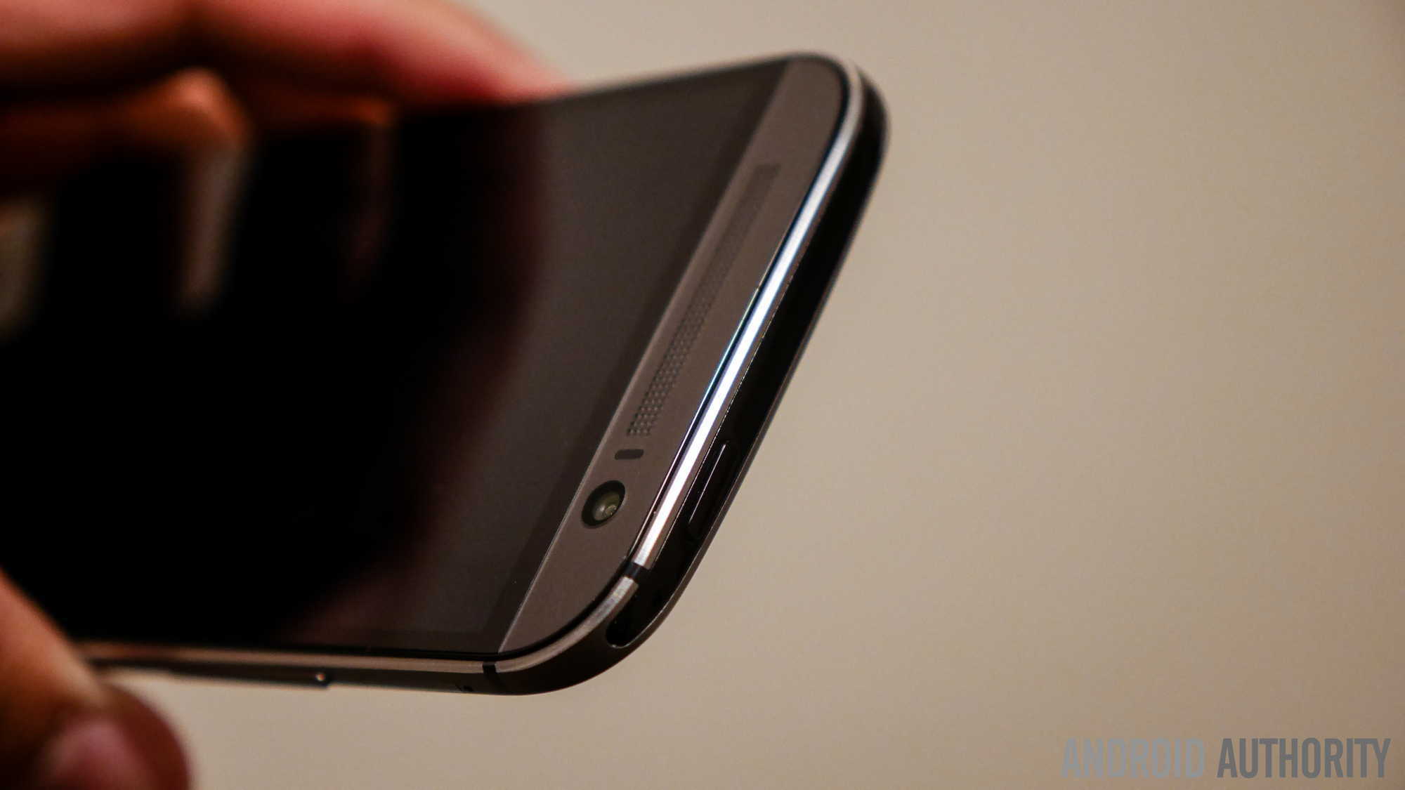
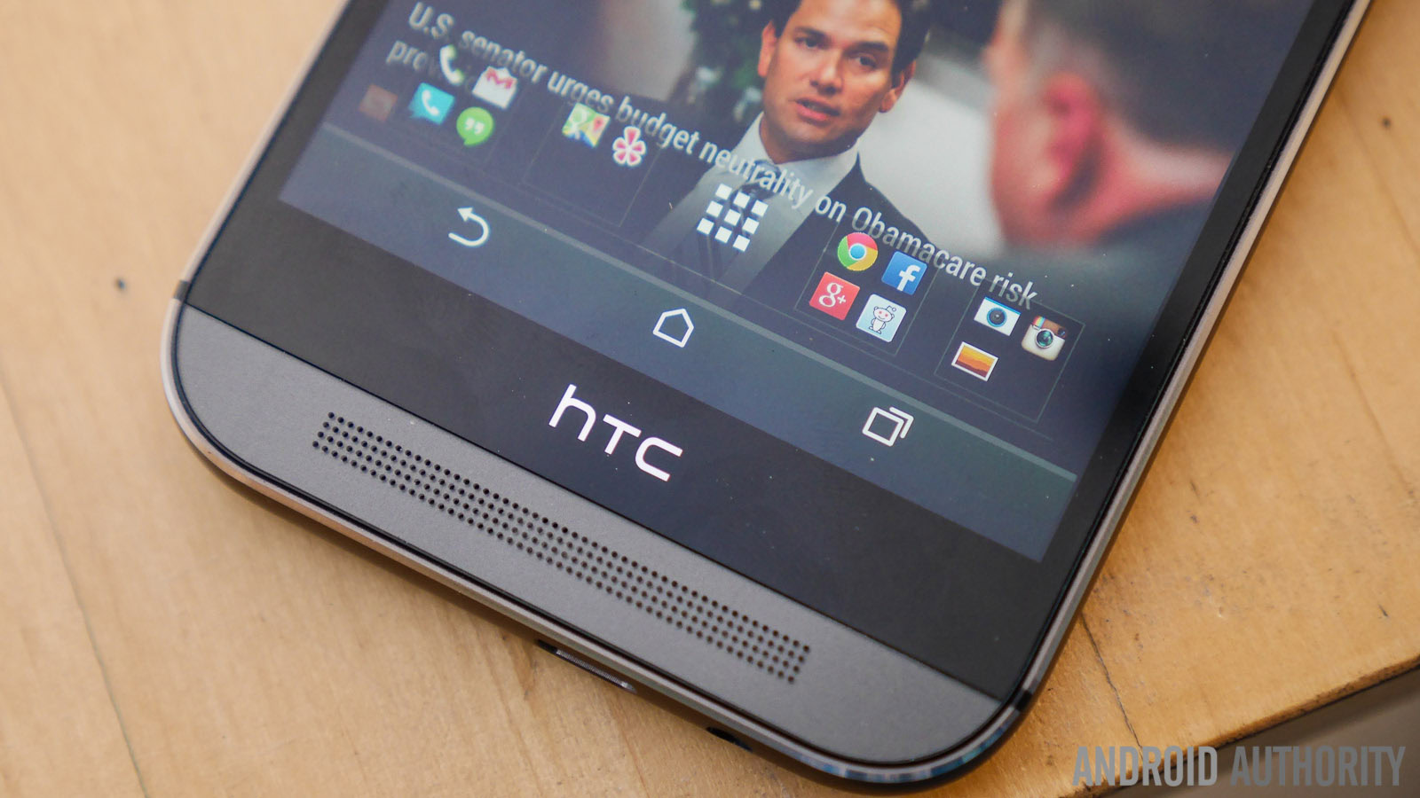
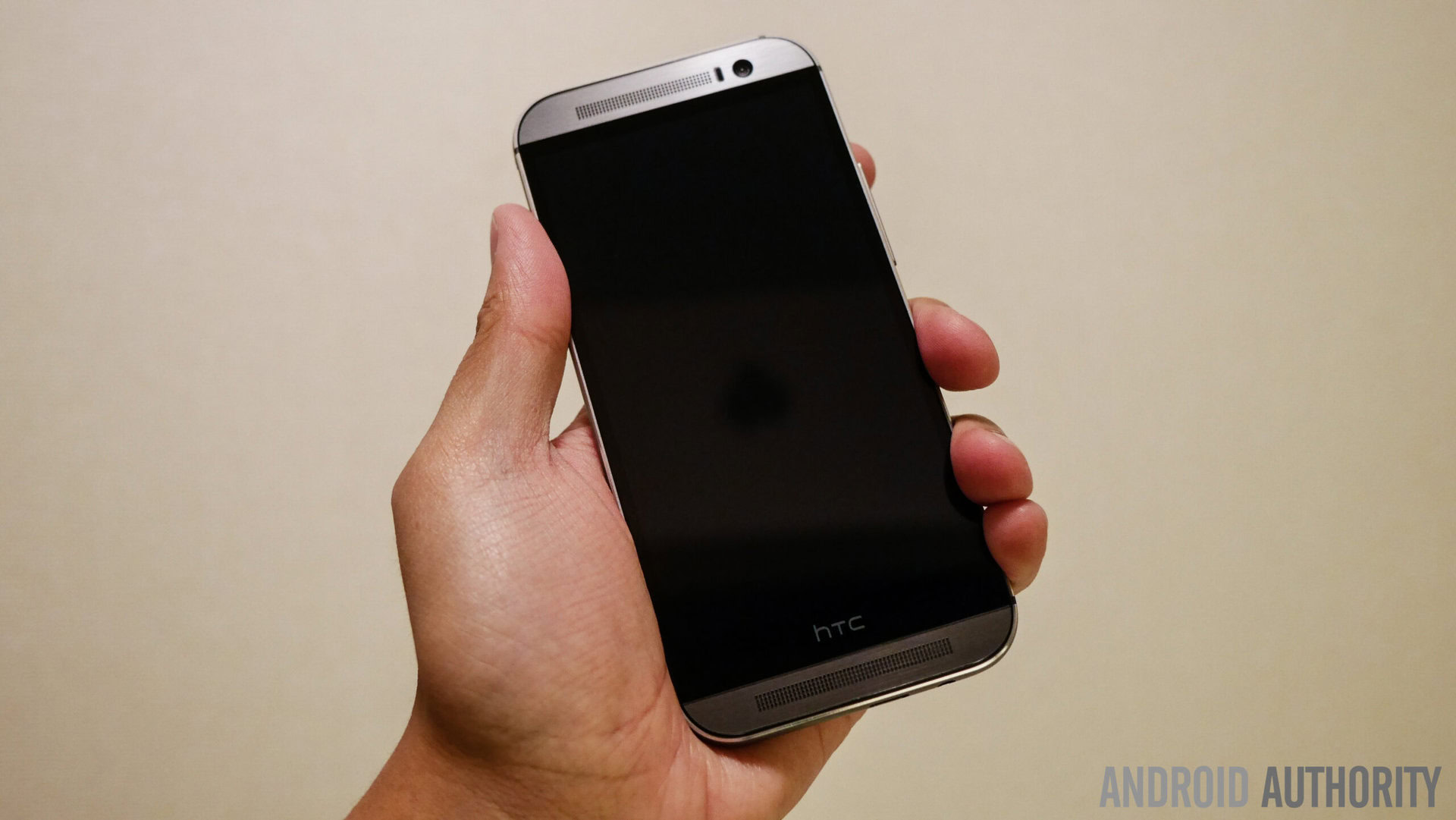
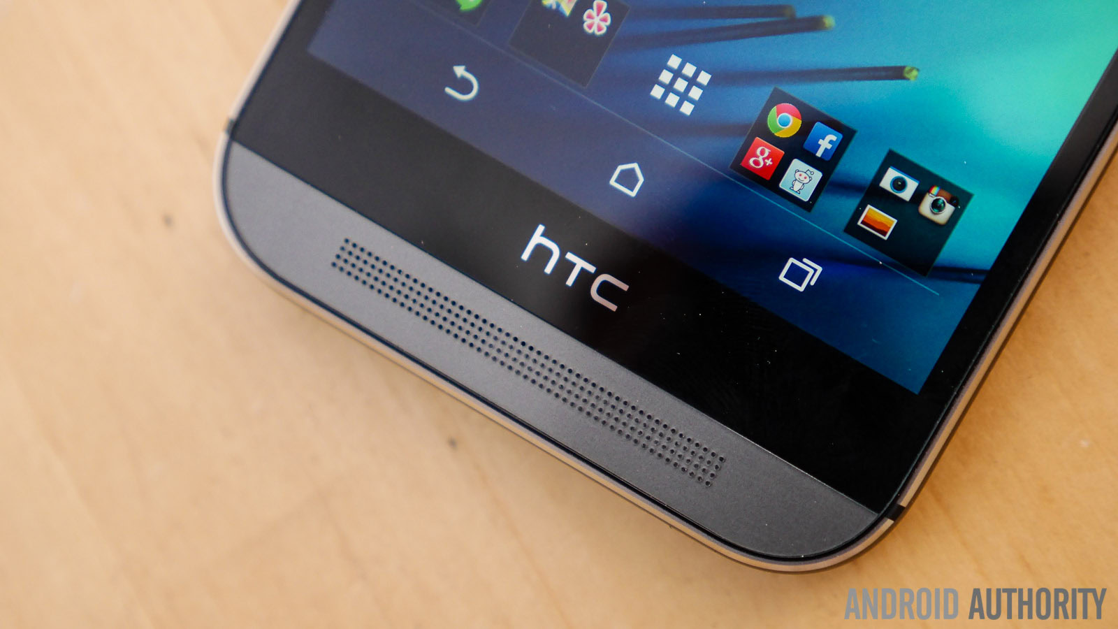
Coming around to the front of the device, the larger 5-inch display does result in the smartphone being bigger overall, and it’s actually quite tall, but there’s more than just the bigger screen contributing to the height of the HTCOne (M8). The front-facing BoomSound speakers make a return, taking up the top and bottom of the phone, with the 5 MP camera also found at the top. Yes, there is a rather large black bar at the bottom of the screen that used to house the capacitive buttons in the previous iteration, but now only features the HTClogo. The company opted for on-screen software keys this time around. Many questioned the necessity of this black bar, and when we asked HTCabout it, we were told there’s a lot going on under the hood and that the extra space is a requirement, rather than a subjective design choice.
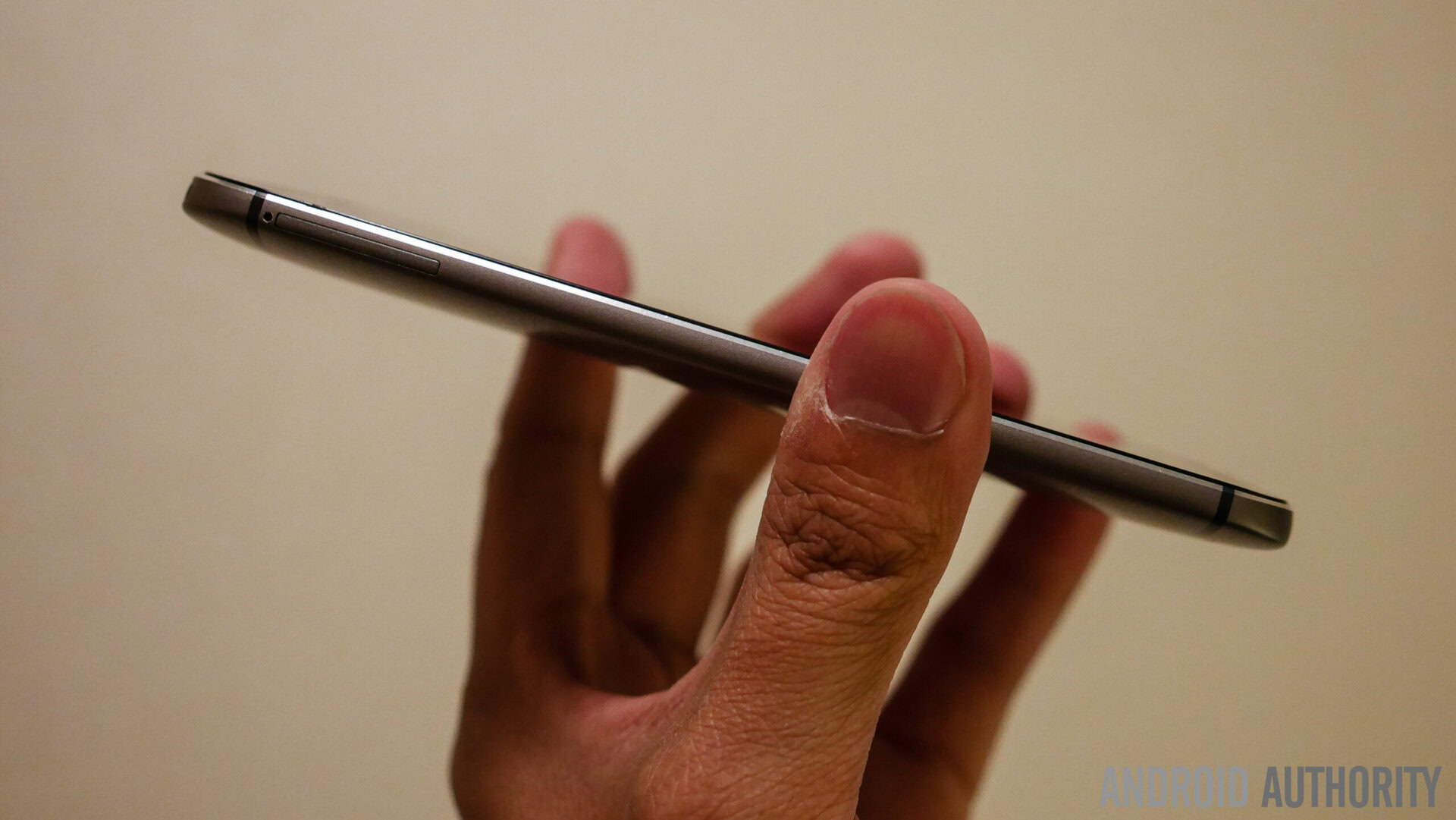
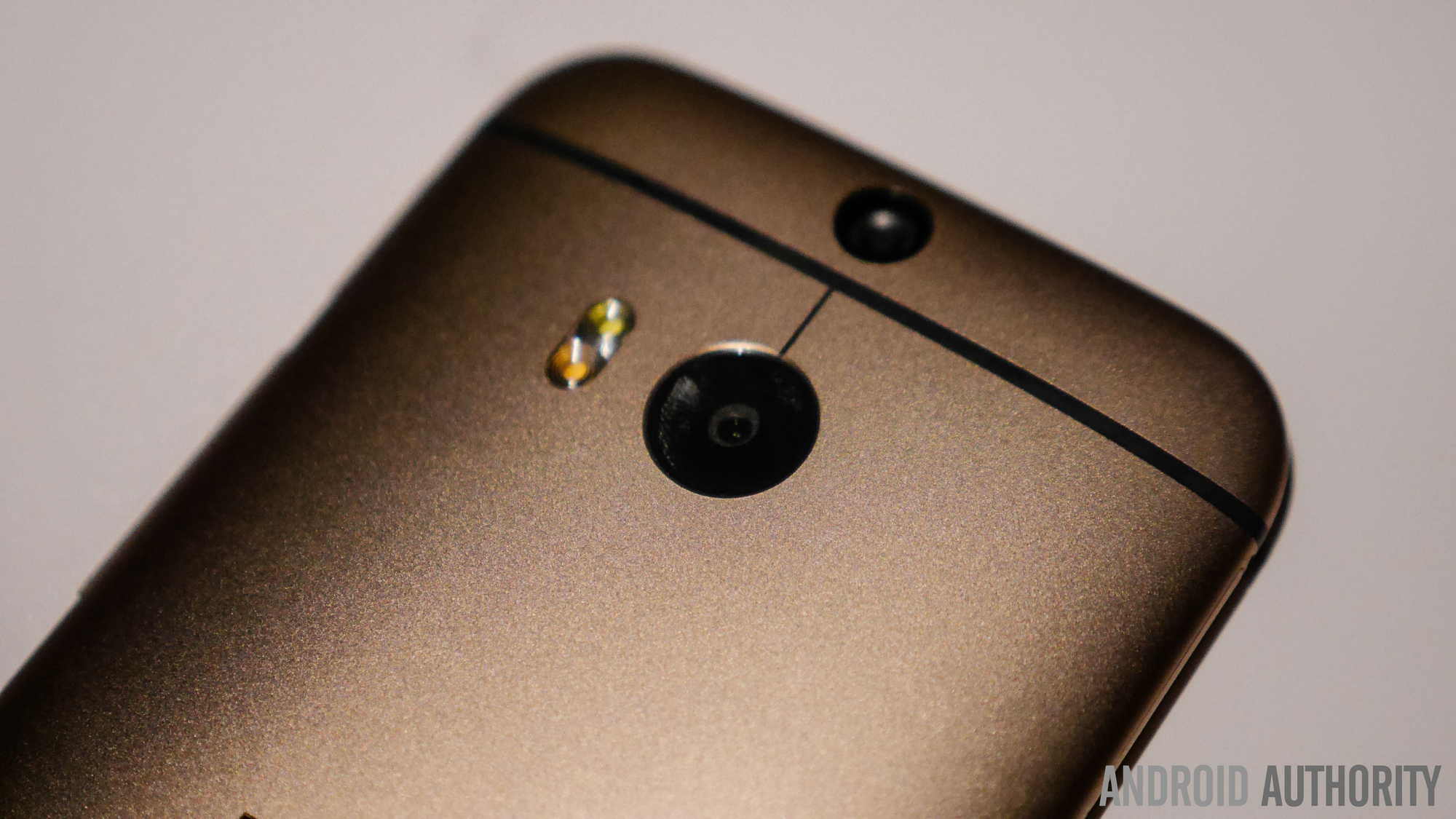
As mentioned before, because of the wraparound design, the sides of the device are also completely metallic. While the volume rocker is on the right side, the power button is placed at the top, which might take some getting used to for some users moving from devices from other manufacturers. In fact, the One (M8) is almost entirely metallic, and the only sizeable insertion of polycarbonate is at the top, where the infrared sensor is located.
The HTCOne (M8) is clearly a very attractive device, but with the overall increase in size, the issue of ease of handling does come into question. The good news is that despite the extra screen real estate and the added girth in the overall construction, handling the phone is quite easy, which is another highlight of the build quality and design. Metal phones do tend to slip around in the hand, but in this case, the rounded metal sides help with the grip. The device is indeed quite tall, but the narrow profile helps with typing and handling. Even when you use the phone with one hand, you can still reach the other side of the device without much trouble.
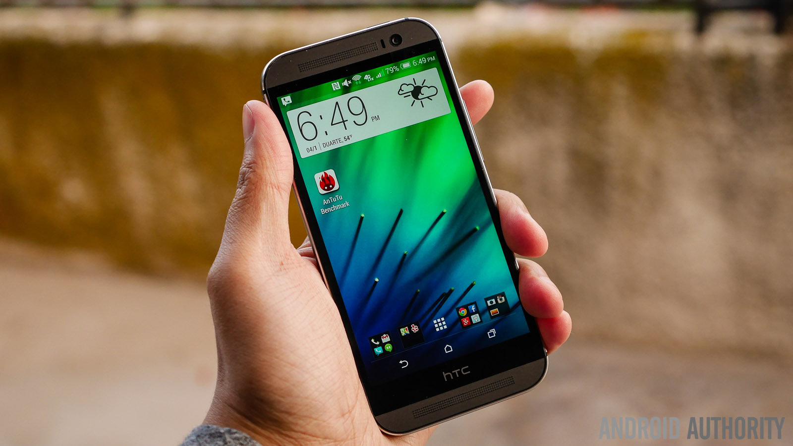
The Super LCD 3 display with 1080p resolution makes a return on the HTCOne (M8), but the screen size is bumped up to 5 inches, resulting in a pixel density of 441 ppi. With Sense 6.0 taking on a more colorful motif, it’s great to see that the display really does it justice.
Colors shine through quite well and is helped by the above average contrast, especially when contrasting them with the darker elements of the Sense user interface. Viewing angles are also really great and color fidelity is preserved even at very steep angles. Even in bright sunlight, everything on the screen comes through nice and clear, though you will obviously have to turn the brightness up to the maximum.
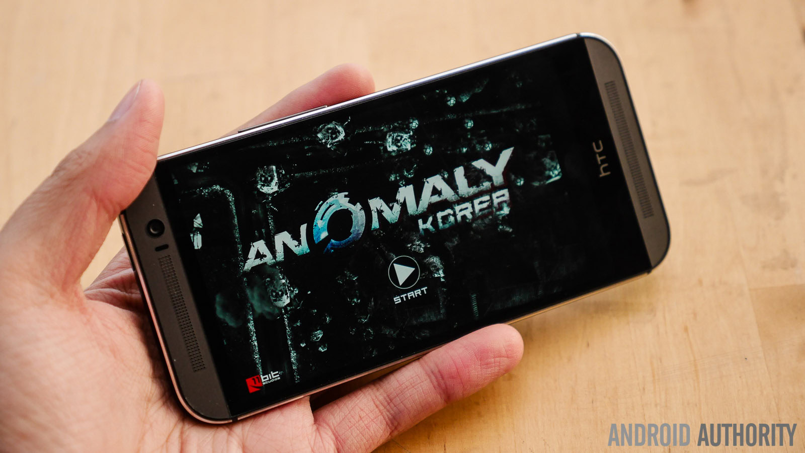
You can check out the benchmark test results above, but I don’t need numbers to tell you that you’ll be able to get things done very quickly and easily.
While I’ve talked a lot about the great build quality and design of the HTCOne (M8), and deservingly so, there’s also quite a lot underneath the surface that adds to the experience as well. First, it has to be said that the HTCOne (M8) will be available from all major carriers, so you’ll be able to use this device on 3G or LTE networks without a problem.
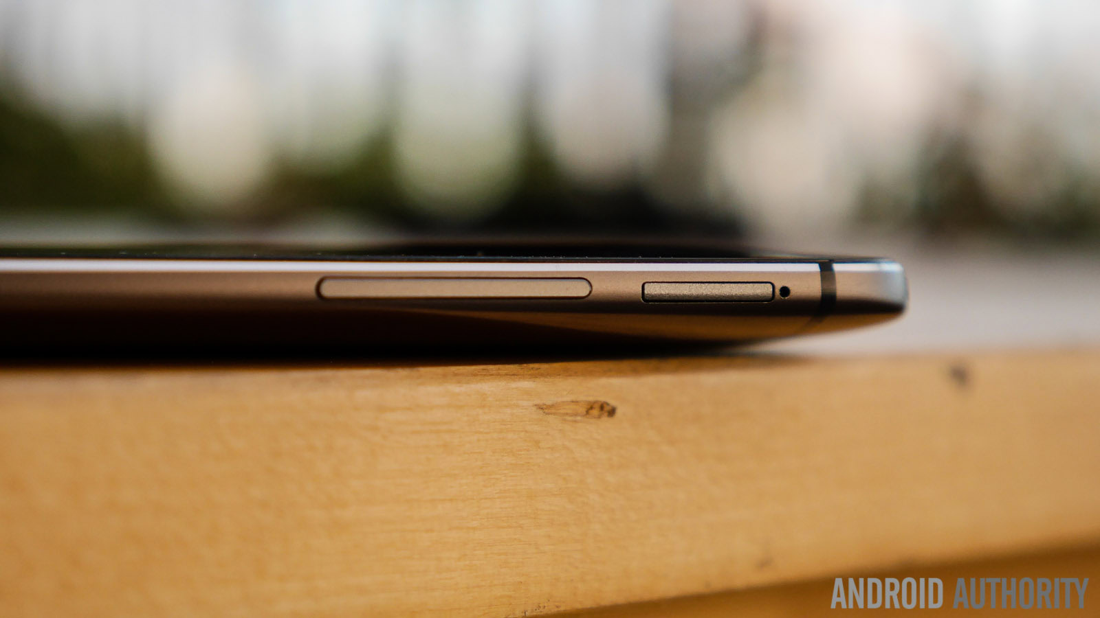
Many users pine for expandable storage in their devices, and finally, the latest HTCflagship delivers, coming with a microSD card slot that lets you add up to 128GB to the in-built 16 or 32GB of storage. Bringing up design again, the microSD slot is nicely incorporated on the right side of the phone, without compromising the design language. The infrared sensor at the top is for the Sense TV application, that lets you control your TV and offers various second screen features.
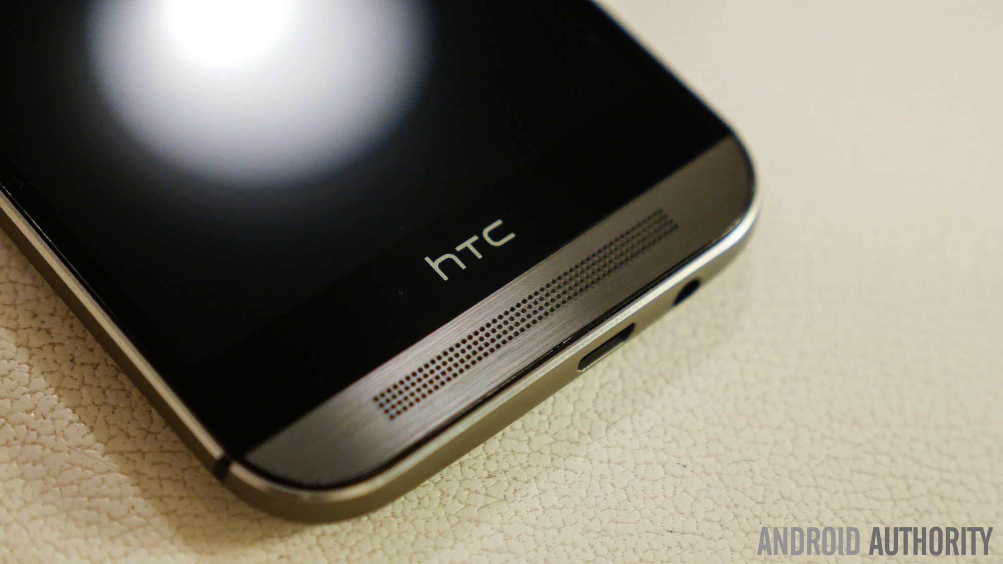
Of course, just like with the original One, the BoomSound speakers are a major aspect of the HTCOne (M8). The speakers have been improved to bring 25 percent more volume and even richer mids and lows. And they stand up to the task very well. It’s not hard to hear what you’re playing, even when you’re on a busy street. As a result, sharing media with friends is better on the M8 than on any other device currently out there. Phone calls came in nice and clear, with no drops and strong signals all around, but I have to admit that I found myself using the BoomSound speakers for phone calls as well, more often than not.
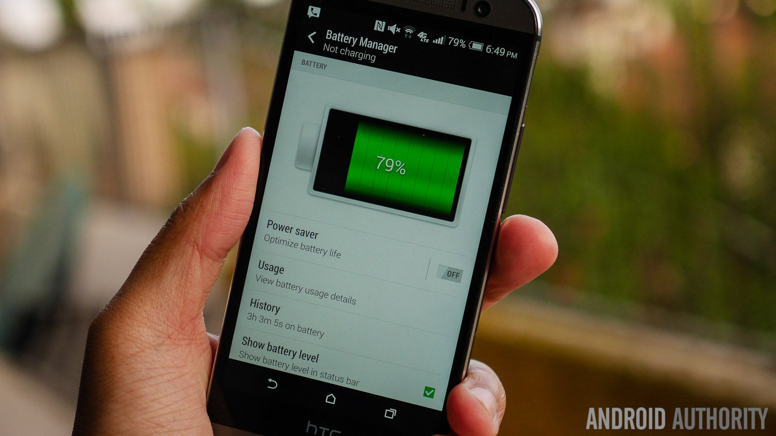
When it comes to the battery, its capacity alone might not impresses, but the non-removable 2,600 mAh unit found in the One (M8) manages to last for quite a long time. In a couple of instances, I used the phone for hours on end for tasks like navigation and playing music, and never did I feel the pressure to get to a charger, even by the end of the day. The good battery performance can be pushed even further with the power saving features that are available on this device, especially with the super power saving mode that strips down the user experience to the bare minimum, resulting in up to 15 hours of stand by time from a charge of just 5 percent.
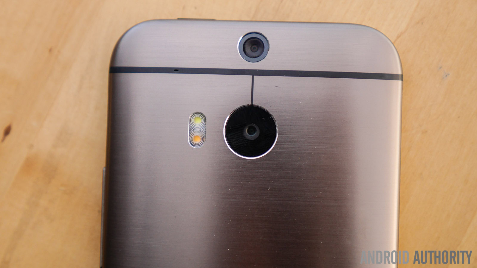
It’s in the camera department that you may find some conflicting information, especially considering that the rear shooter is the same 4 UltraPixel camera from the first iteration, with the front-facing camera getting a boost to a 5 MP sensor with a wide-angle lens.
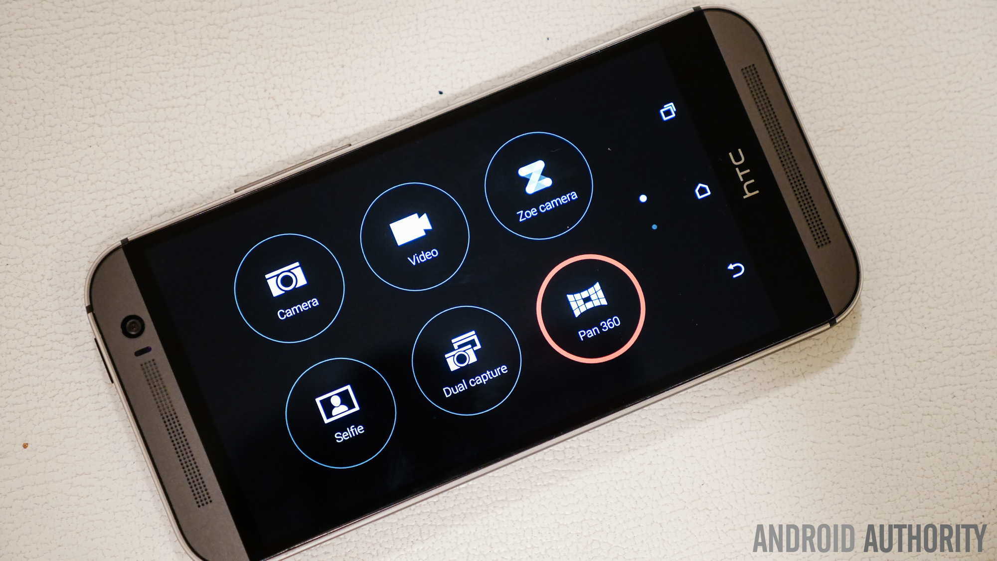
The streamlining of Sense UI continues in the camera application, which has a much simpler interface this time around, and is truly geared towards the average user. But what is really great about the app is the level of manual control you find if you dive just a little deeper into the interface. Controls for ISO and exposure compensation are available, alongside other modes like the sweeping panorama. You can also set the volume rocker to function as a camera shutter button, which is something I would recommend using.
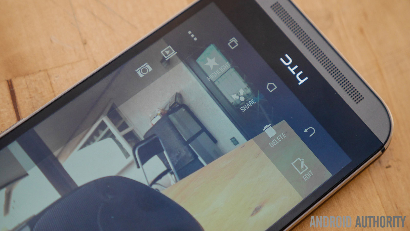
Photo quality is decent at best, as you can get some pretty great looking shots at times, while other times there’s a clear lack of dynamic range, resulting in washed out pics. In all cases, zooming in really brings to light the limitations of having a camera with a low megapixel count. Video capabilities are quite good, but without stabilization, you’d better have steady hands. Audio capture on the other hand is excellent, as you can hear in the intro and outro of the camera feature focus video below.
Zoes are still quite fun to use; the feature lets you add your own music to the highlight reel, so all you nostalgic types will be able to create great little mementos using this phone.
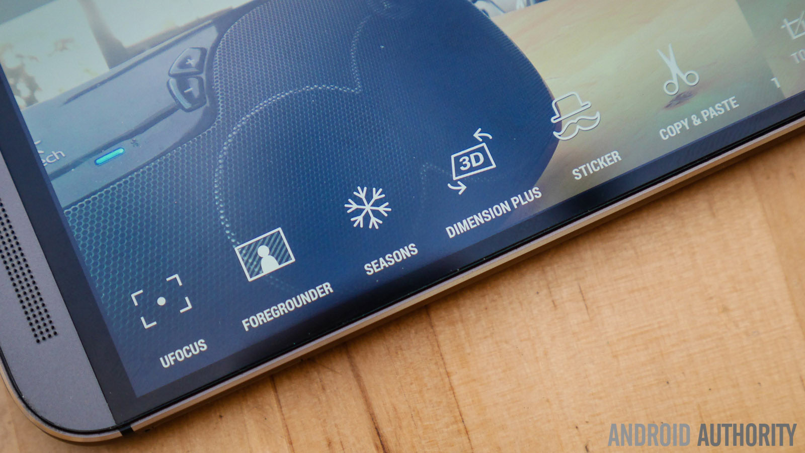
Of course, the main story here is the addition of a depth sensor located at the top of the device that feeds depth data to the main camera for every shot you take. The main benefit of this Duo Camera setup is the ability to select the focus area in a shot, without having to waste time with multiple photos. After you take the photo, go to the gallery to play around with your shot with effects like UFocus or selective colorization. But it quickly becomes evident that some optimization is still needed here. The software doesn’t perfectly capture the focal point every time, and when this happens you can pretty much see the line that was drawn to create the effect.
Ultimately, the HTCOne (M8) won’t please users looking for the best camera phone. Problems like washed out elements, low dynamic range, smudgy details, and the low megapixel count are major turnoffs. But any average user that likes to post on social media will probably have fun with the Duo Camera effects, and appreciate the creative options opened up by the M8.
In software, we have a new version of Sense based on Android 4.4 Kitkat, and in the case of the One (M8), this means optimization and speed. For any Sense veterans, much of what you remember from earlier versions of Sense is preserved, such as the vertical scrolling in both BlinkFeed and the application drawer. But HTCadded more color accents to the Sense interface on the M8, such as in the color coding of different categories of apps and in the background of BlinkFeed.
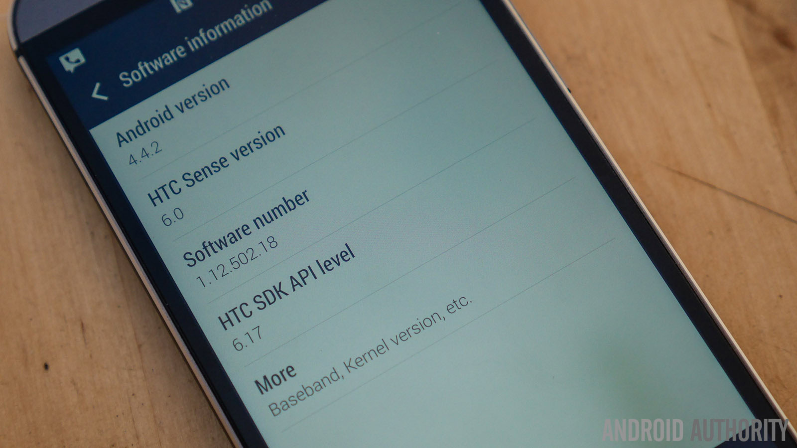
Users have more freedom to change the look of the UI with a collection of Themes that will continue to grow in the coming months. Other enhancements include the new notification dropdown power widget, which is tiled and brings easy access to a number of quick settings. The on-screen software keys are a nice addition as well, mostly because of the inclusion of the Recent Apps button for easy multi-tasking.
Another big feature is Motion Launch, which uses the sensors to determine when you pick up the phone and lets you perform a few swipes or taps to wake the device and jump to certain sections of the UI. The most useful gestures are probably swiping up to wake and unlock the device to the last screen, and the camera launch option, which lets you open the camera app by pressing the volume down button while holding the phone in landscape orientation.
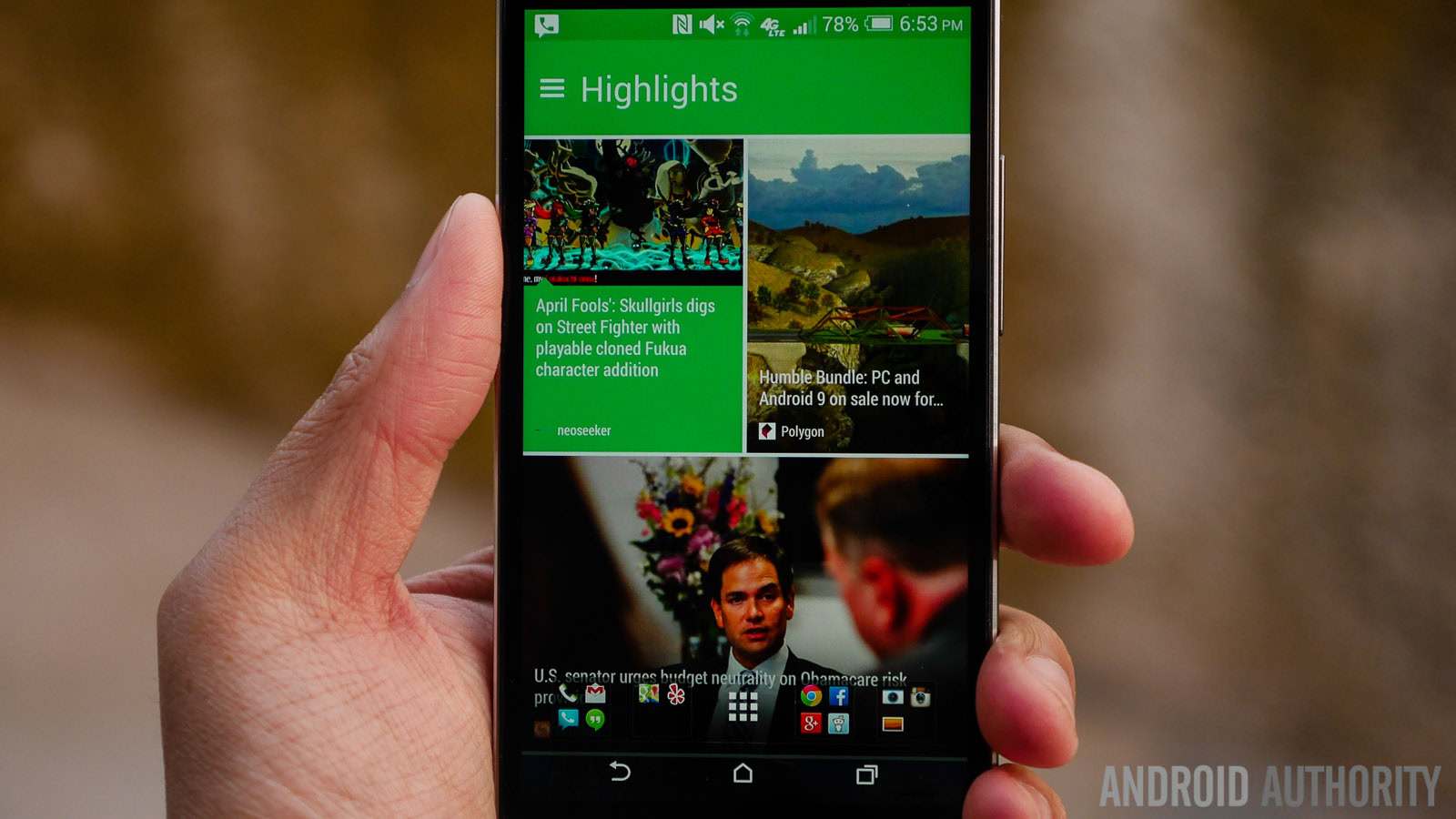
And finally, there is BlinkFeed, which has been enhanced and will continue to be enhanced with a new focus on developer additions. What was once a paginated layout is now a smooth scroll of square or rectangular tiles. Content is mostly curated by HTC, but there’s an increased number of sources to choose from now, including social media outlets. Ultimately, it’s a great way to check all your feeds at a glance, but it’s easy to focus on just one source if that’s what you prefer. By opening up its SDK to third-party developers, HTCopened the way for apps like Foursquare and Fitbit to show content in BlinkFeed, making it an even more compelling tool for staying on top of your digital life. You can check out the updated BlinkFeed in the feature focus video below.
At the end of the day, as far as software on the HTCOne (M8) is concerned, it all boils down to one big selling point, and that is the fact that Sense 6 is fast, easy to navigate, functional and stylish.
| Display | 5-inch Super LCD 3, Full HD (1920 x 1080), 442 ppi |
|---|---|
Processor | 2.3 Ghz quad-core Qualcomm Snapdragon 801 |
RAM | 2GB |
Camera | Ultrapixel Duo Camera, dual-LED flash 5 MP front camera with wide-angle lens |
Battery | 2,600 mAh |
Storage | 16/32 GB, expandable |
Networks | 3G, 4G LTE |
Connectivity | GPS, GLONASS, microUSB 2.0, WiFi ac, NFC, IR Blaster, Bluetooth 4.0 |
Software | Android 4.4 Kitkat, Sense 6.0 |
Dimensions | 146.36 x 70.6 x 9.35 mm, 160 grams |
Colors | Gunmetal Gray, Glacial Silver, Amber Gold |
The HTCOne (M8) is already available in select markets around the world with a full rollout planned in stages over the next month. The M8 is available from all major carriers in the US at the premium subsidized contract rates, or from major retailers at its full price of $649.
And so, there you have it, our review of the HTCOne (M8). While expectations were understandably running high, for the slew of flagship updates available this year the operative word has truly been “update.” And the HTCOne (M8) is an example of a proper evolutionary step. Sure, specifications aren’t groundbreaking, or all that different from other high-end smartphones launched recently. What HTChas done instead is focus on the user experience, crafting a stylish device that appeals to fans of the original One, while providing new users with an accessible and attractive package. Granted, the camera might be a wrinkle in an otherwise great smartphone, but it’s far from a deal breaker.
What you get with the HTCOne (M8) is a phone that I had a lot of fun with while using it as my daily driver, and I’m sure you will as well.