Affiliate links on Android Authority may earn us a commission. Learn more.
OPPO N3 Review
Published onDecember 23, 2014
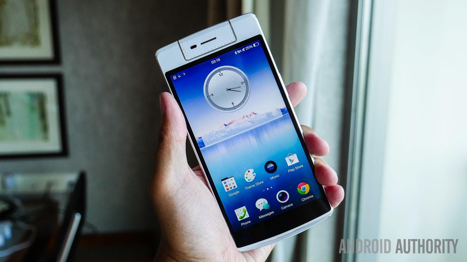
As the so-called selfie revolution continues in full swing, many OEMs are now offering different takes on what was the classically simple front-facing camera. From higher megapixel counts and ultra-wide angle lenses, to even identical rear and front-facing camera setups, there are a growing number of options available to all the selfie lovers out there. OPPO’s implementation in this regard is definitely unique, with the presence of a single rotating camera unit that can be used in both directions.
The concept was first introduced last year with the OPPO N1, and has been further refined with its successor. Does an update to the optics and an automated motor make OPPO’s latest flagship a must-have for selfie takers? We find out, and more, in this comprehensive review of the OPPO N3!
Anyone familiar with OPPO’s offerings will definitely be at home with the design language of the N3, made even better with a smaller form factor compared to its predecessor. With a 5.5-inch display, the OPPO N3 falls squarely in the camp of similarly-sized flagship devices, which is a very welcome change. OPPO’s penchant for solid build quality returns here, with a heft to the device that makes it feel even sturdier.
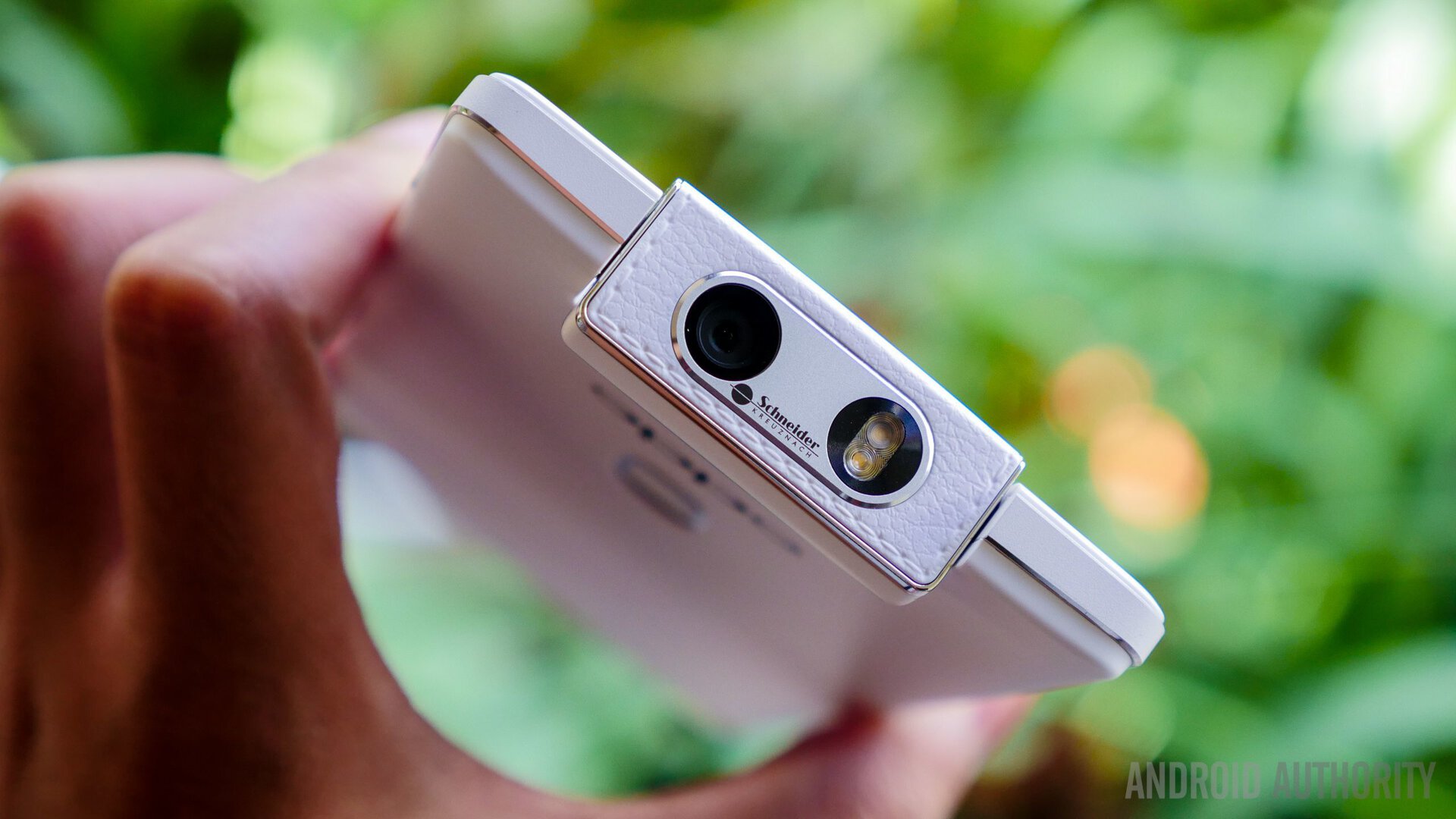
That said, the very aspects that this smartphone champions might stand out a little too much for your liking. The marquee rotating camera unit up top comes with a faux leather look and feel that seems out of a place when compared to the rest of the device that is made of a smooth plastic. The Skyline notification light at the bottom can now be seen from the front and back, but also looks like a hitch, or a tiny handle of sorts.
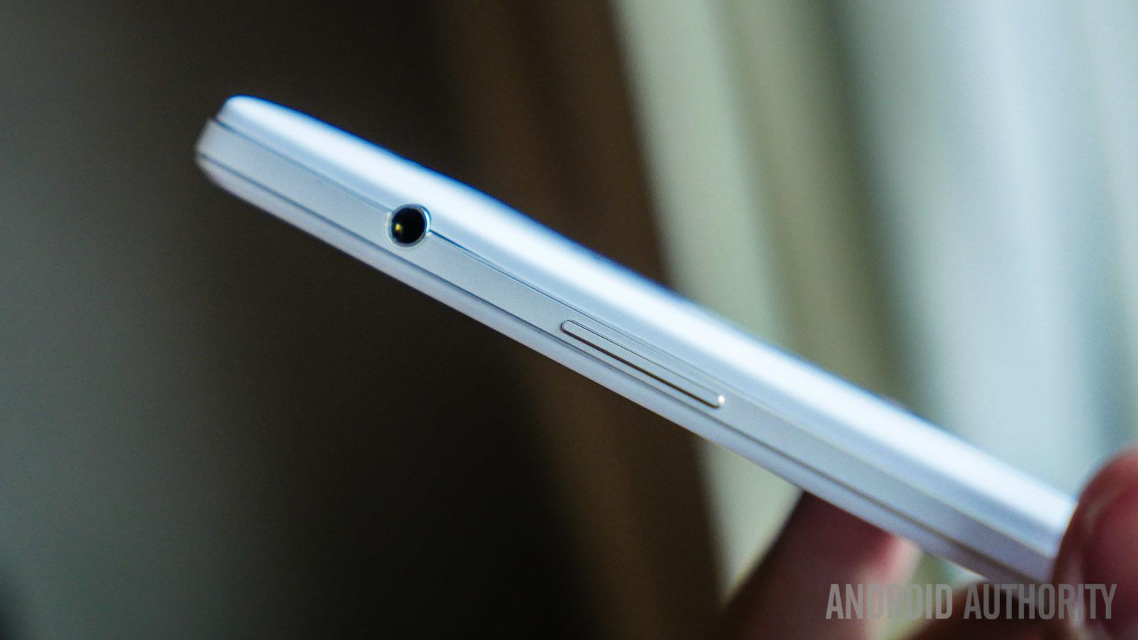
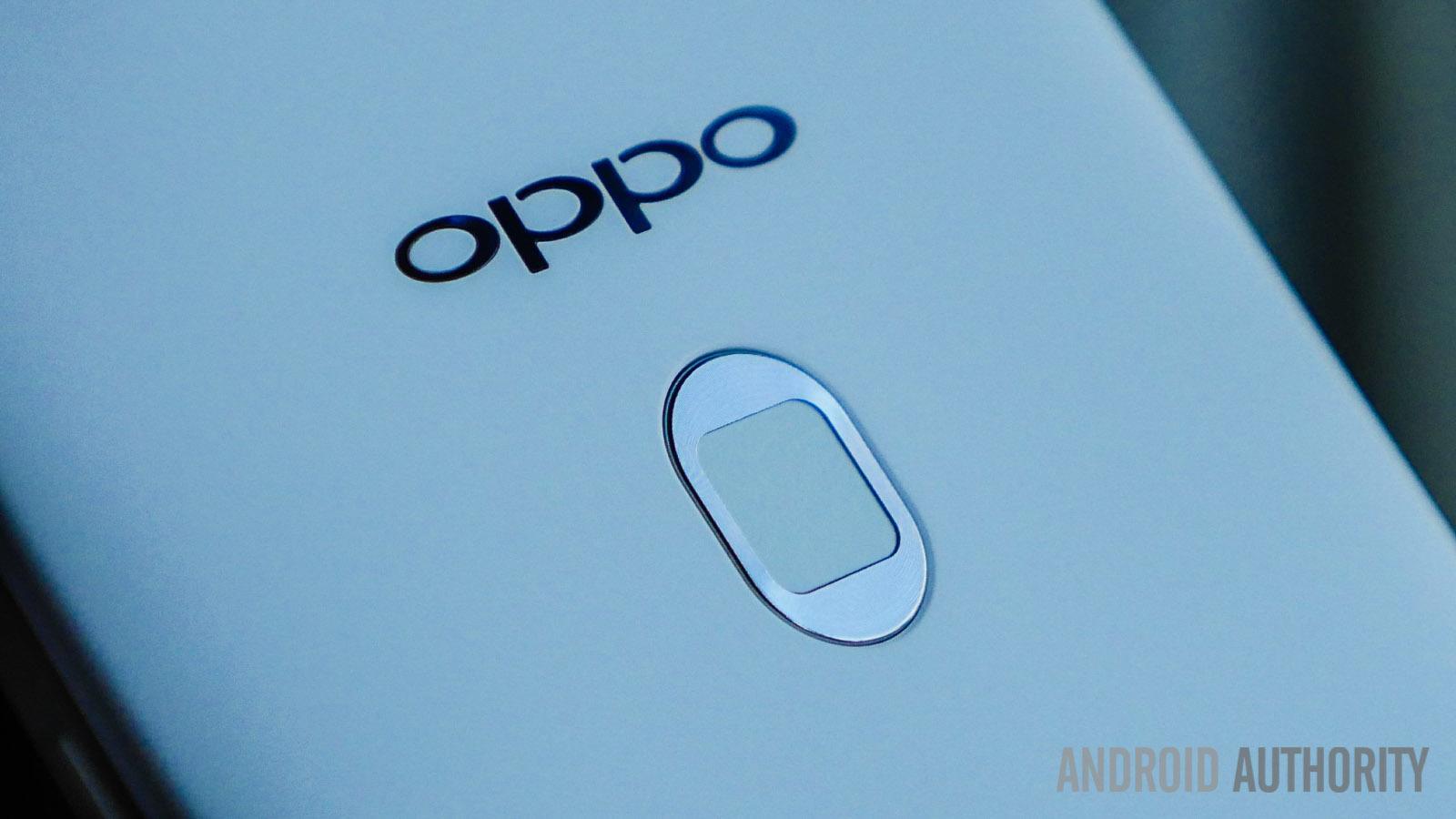
Finally, the O-Touch area on the back now comes with a great integrated fingerprint scanner, but is now outlined in a rather jarring silver frame. Making room for all these features also means that all the ports have been moved to the sides. While the headphone jack placed on the upper right side is fine, the microUSB port, found at the bottom left, makes for an awkward handling experience while charging the phone.
Ultimately, the OPPO N3 has a clean look that is punctuated by silver linings and some obvious additions, but the highlight of the device is its feel in the hand. A distinct line through the frame results in a very tactile element to the grip, and while the bezel around the display could have been smaller, the reach from side to side is much better with the smaller form factor. The OPPO N1 was a lot more unassuming in its looks, and while that somewhat remains the case with the N3, it does go out of its way to accentuate its capabilities.
The OPPO N3 features a 5.5-inch IPS LCD display with a 1080p resolution, resulting in a pixel density of 403 ppi. At this size, it does fall just outside the realm of comfortable one-handed use, which is line with most current high-end flagships though.
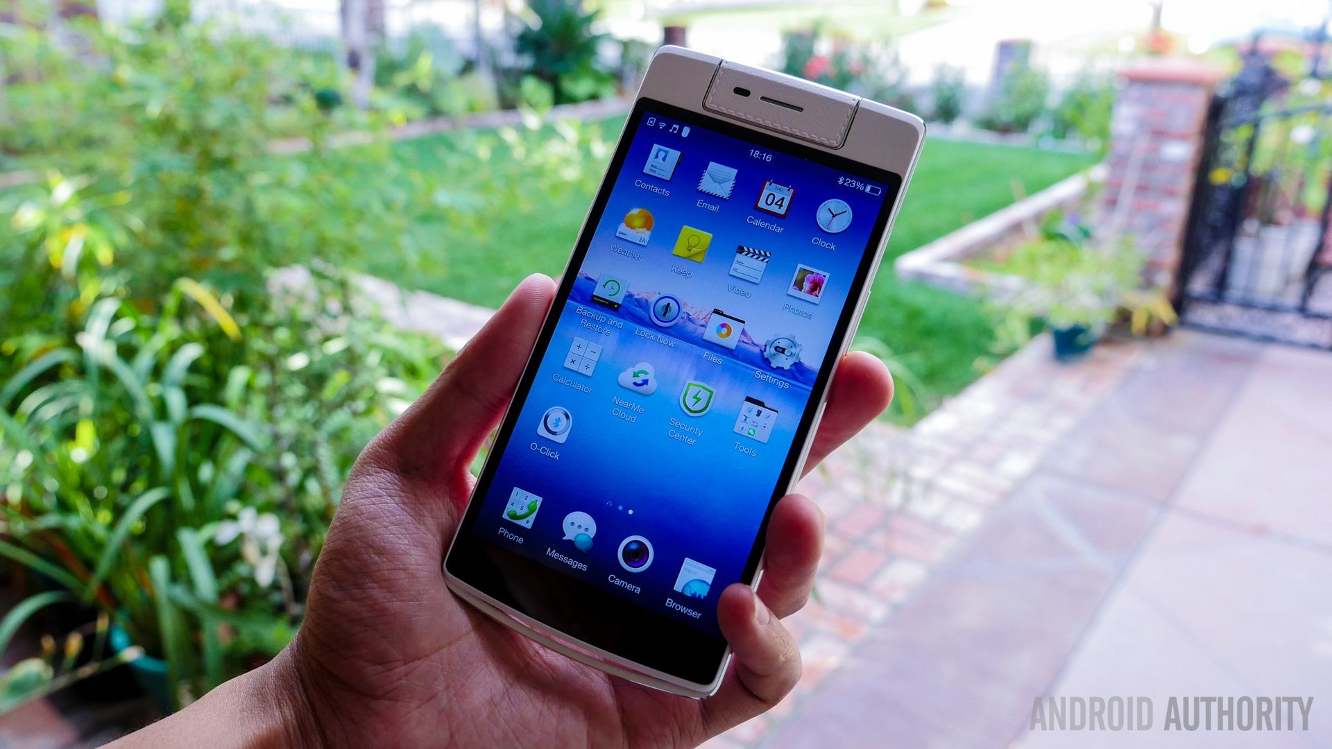
As far as the display is concerned, colors are adequately attractive in good conditions, sharpness is where it should be across the board, and viewing angles aren’t an issue either. The OPPO N3 also comes with capacitive keys, opening a little more real estate on the screen for whatever videos or games you may be enjoying. That said, the performance of this display in broad daylight is very disappointing. While an IPS display should make for good brightness, there were issues with seeing what was happening on the display even at the highest possible brightness settings.
Under the hood, the OPPO N3 packs a quad-core Qualcomm Snapdragon 801 processor, clocked at 2.5 GHz, along with the Adreno 330 GPU and 2 GB of RAM. This might not be the latest and greatest processing package anymore, but certainly doesn’t disappoint when it comes to the overall performance.
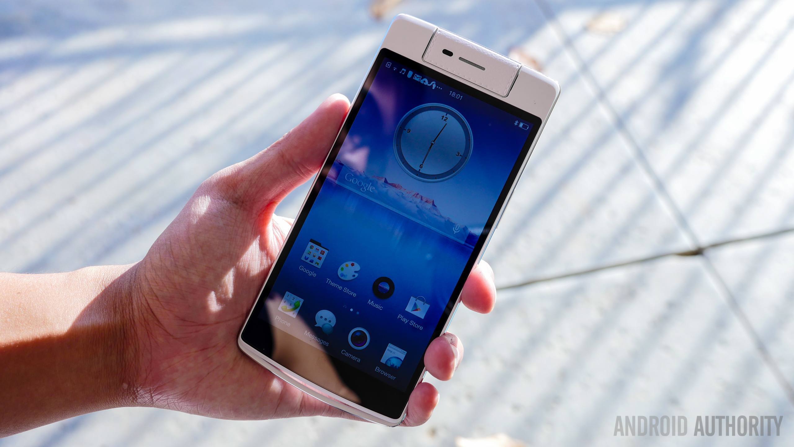
Color OS might not allow for the smoothest experience because of a lack of coherence in navigation, but getting in and out of applications doesn’t suffer. The navigation aspect was an issue was due to the somewhat small capacitive keys that weren’t always reliable to use, and some stutter when loading the Recent Apps screen. Gaming was handled very well by this still powerful processing package, though.
Even when not counting the rotating camera, the list of hardware features available with the OPPO N3 is quite significant.
As mentioned, the Skyline notification light can now be viewed even when the phone is face down, thanks to the addition of a second window. The only problem with it is what was an issue with its predecessor as well, which is the fact the light only glows one color, a bright white. So while it is useful to know when you do have a notification, you can’t change or set it to show what kind of notification it is.
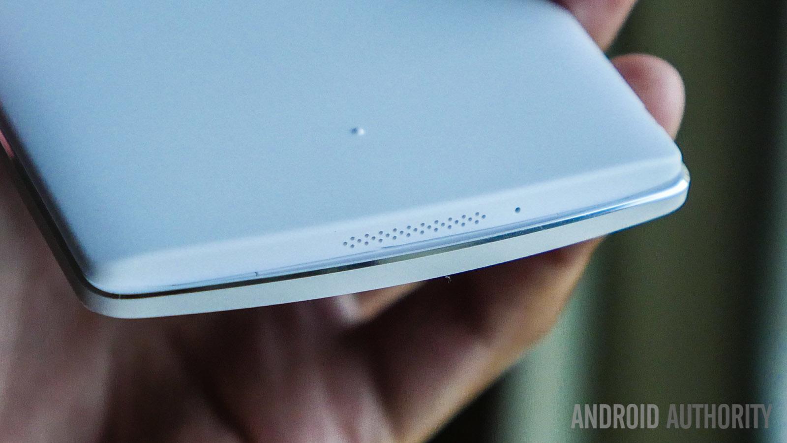
Sound quality from the bottom mounted speaker is pretty standard, with the MAXXAudio application allowing to further enhance its already adequate loudness. It’s a full equalization application that I ended up using to get a nice bass boost while using headphones. Call quality was a bright spot, with the speaker on the rotating camera unit producing very loud and clear sound without peaking. Calls weren’t dropped on the T-Mobile network, but LTE connectivity was a little spotty at times.
When it comes to network connectivity, the OPPO N3 comes with dual SIM capabilities, with a microSIM and nanoSIM combination. The N3 comes with 32 GB of on-board storage, with 22 GB available to the user. MicroSD expansion isn’t available, but the available storage should be more than enough for most.
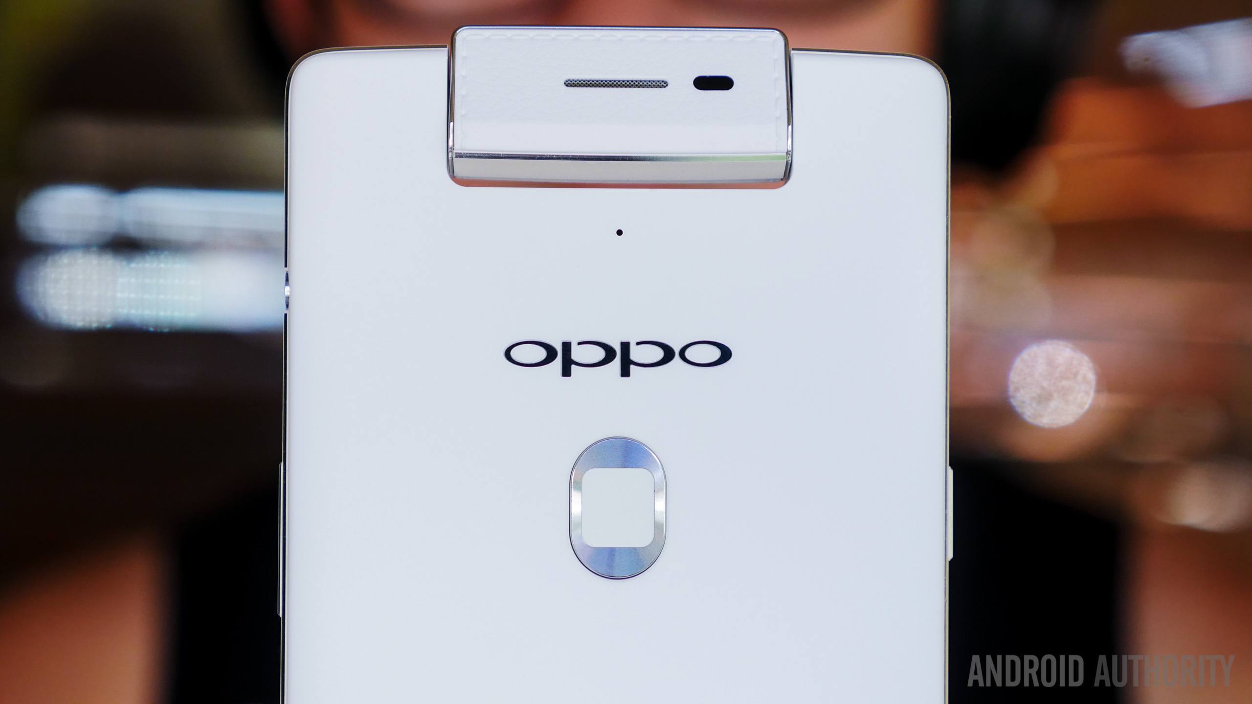
The O-Touch area that is centered on the back comes with an integrated fingerprint scanner this time around. The touch type scanner implementation is the one we really like, compared to the swipe type option available on some other devices. Its placement is also a big plus when it comes to usage. The O-Touch is also a button, and after setup, unlocking the device involves just pressing and holding the button. This can also be used to lock and access specific applications as well. You can swipe along the O-Touch area to control the camera rotation, and also press the button to take a shot. Everything said and done, the usefulness of the O-Touch button is undeniable, even if its appearance is somewhat questionable.
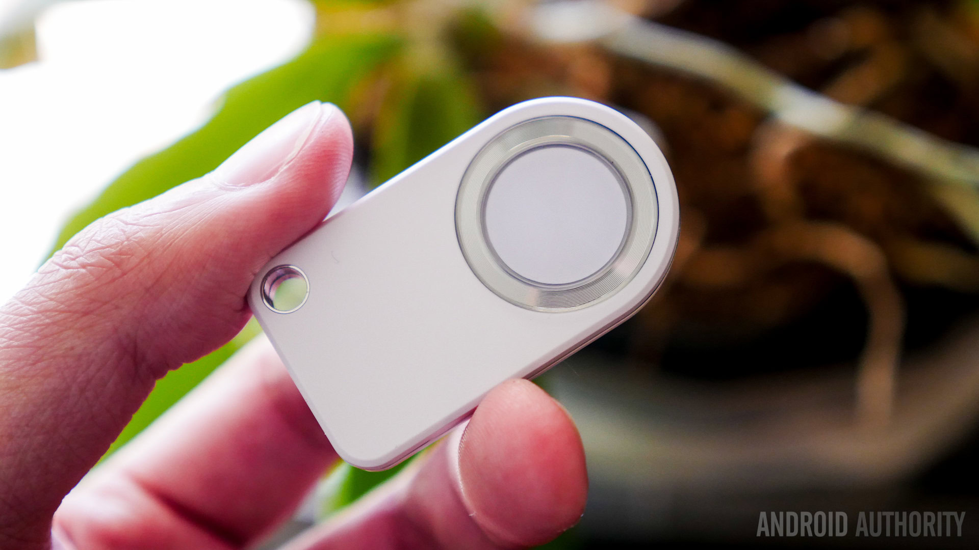
The O-Click accessory also comes standard with the box, and does have its advantages. Build quality is somewhat lacking with its cheap plastic construction, but it has been able to withstand punishment thus far. A four way directional circle allows for control of your music, as well as the rotating camera unit. The fact that it comes with free with the phone is great, but some connectivity and Bluetooth range issues stops it from being particularly useful, especially when it comes to being used as a phone locator.
When it comes to the battery, the OPPO N3 packs a relatively large 3,000 mAh unit, which unfortunately doesn’t cut it when it comes to longevity. Battery drain is uncomfortably quick, with the phone often conking out at the 12 hour mark– though it can be pushed to close to 16 hours and more by relying on the in-built power saving features. Of course, these features are a little aggressive on processing power and display brightness, and might not be the best solution.
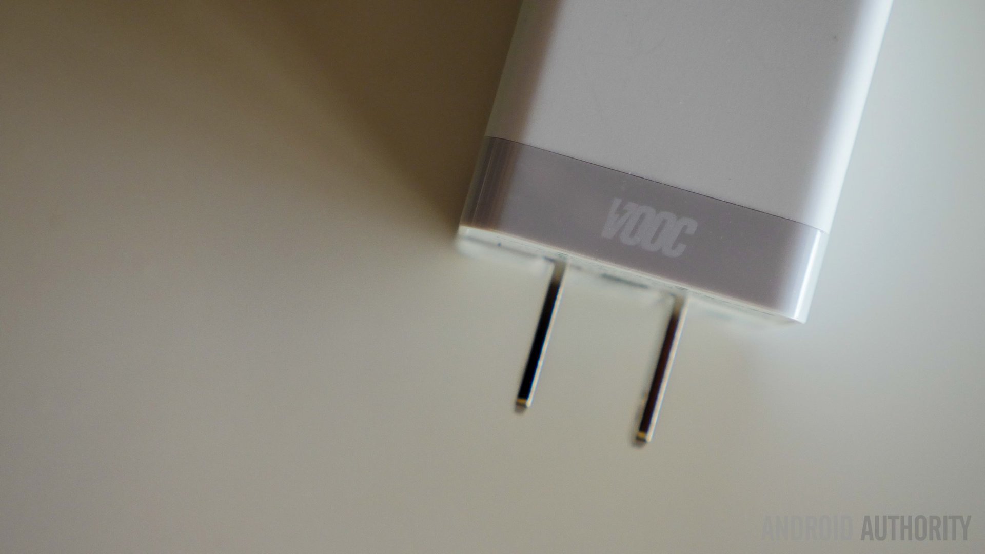
The good news is that the VOOC fast charging returns with the N3 as well, this time without needing the large tethered brick, instead taking on a more conventional adapter and cord combination. It is still a proprietary charger though, and is the only way to take advantage of its fast charging capabilities. In my experience, the battery charged to 65% in just half an hour.
Of course, the marquee feature of the OPPO N3 is its rotating camera setup, that now comes with a motor built in to allow for automated movements. While the original N1 camera was made to withstand a lifetime of rotations, how long this small motor powering the camera will last is somewhat questionable. Thankfully, manual rotation is still possible, in case something were to go wrong. The rotation can obviously be obstructed, like when the device is lying on a table, so placing the phone correctly is generally important. The motor does work well though, even if it is a tad slow.
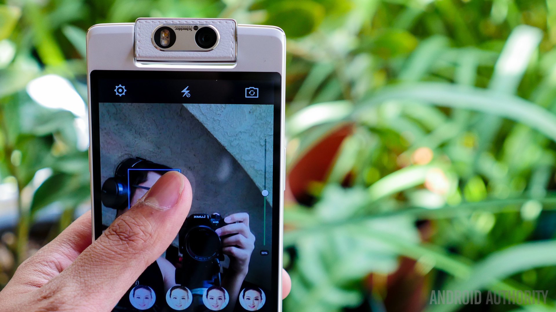
The camera application brings with it a simplistic interface, with a swipe up from the shutter button required to access the slew of features it offers. A bunch of different modes are available, including the returning Ultra HD mode, that take a huge photo, but only for a moderate increase in detail capture. A defocus mode is also available, but the manual mode also allows you to set the focus point, which I always find more ideal.
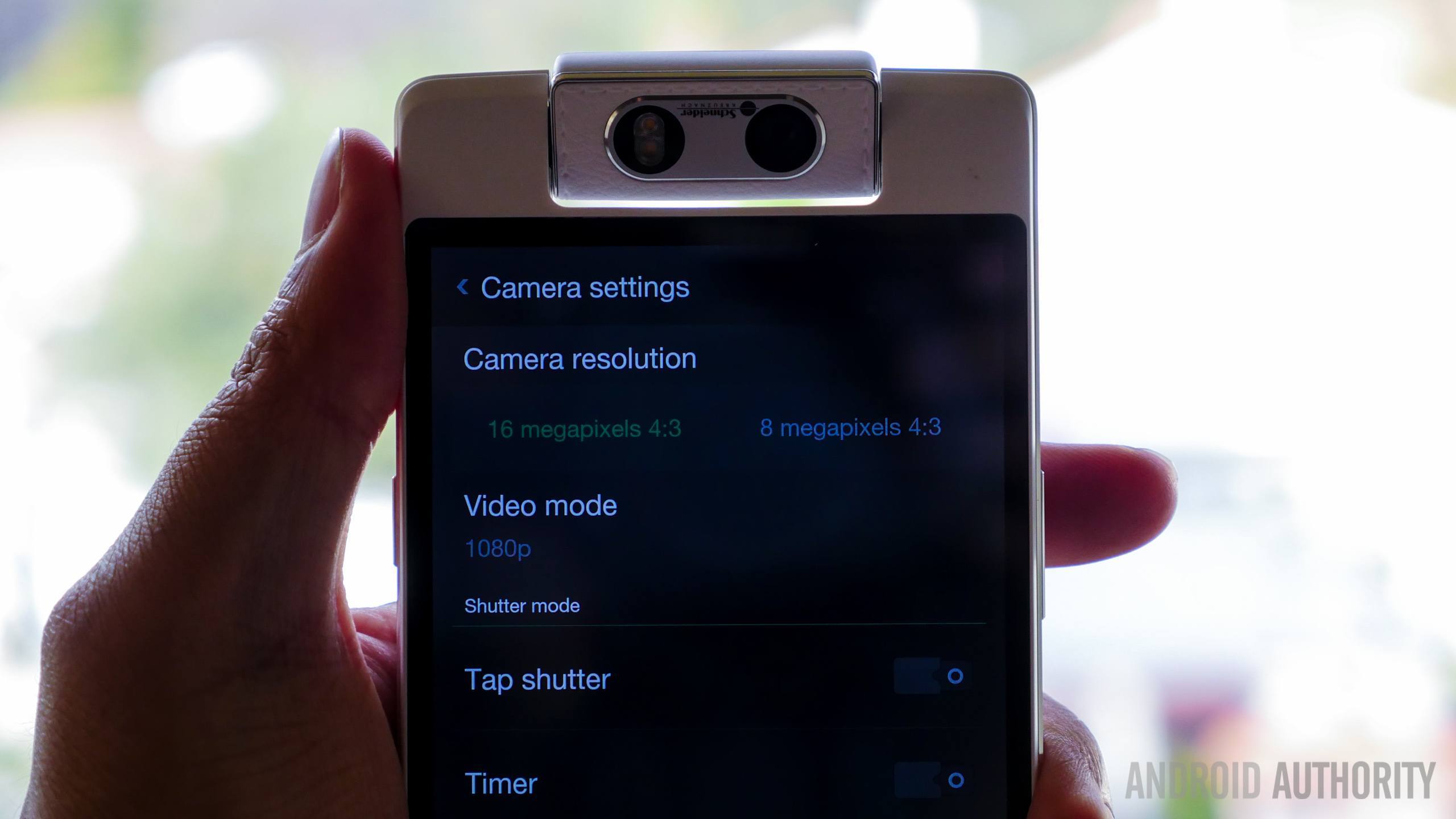
Taking advantage of the auto rotation of the camera is auto panorama mode, which takes the guesswork out of having to move the camera yourself. This works very well, especially when stitching doesn’t pose a big issue in the shot. Rotating the camera can be done using the O-Click accessory, the O-Touch button, swipes and holds on the viewfinder, or via the rotation button that allows for a quick switch.
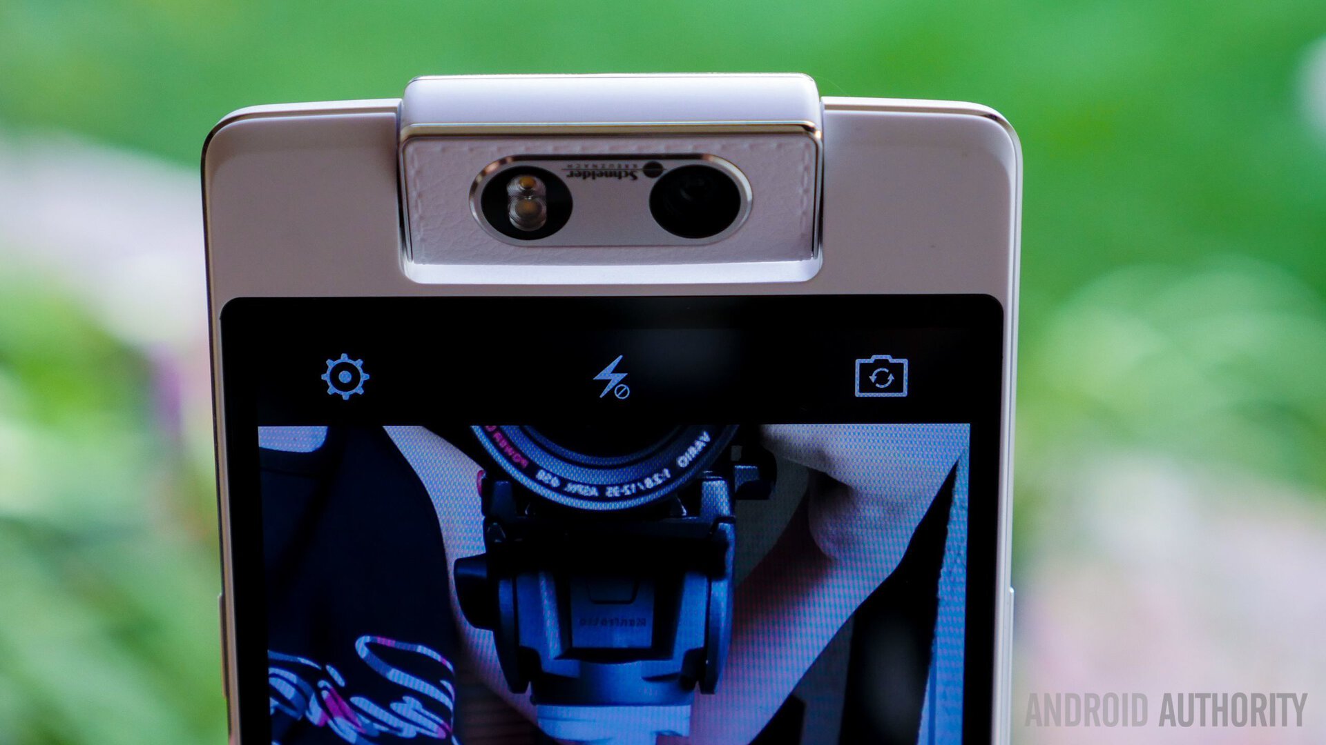
Picture quality turned out to be quite impressive, with me enjoying what came out of this camera about 70% of the time. What is noticeable was that the settings for the front-facing mode were different from when it is in a rear-facing orientation, mostly in color saturation, with selfies being bluer on the white balance scale.
Low light performance takes a hit, which isn’t unexpected, but a dual LED flash is available. Unfortunately, it wasn’t ideal while taking self portraits, as it tended to flood the subject, while exaggerating the beauty mode. In video mode, the bitrate could have used a bump for better quality movies, but the poor audio capture while shooting video is the real issue here.
For general photography, the OPPO N3 camera proved to be a more than capable performer, especially in the rear orientation where everything from portraits to landscape shots had good detail and nice colors. This camera does tackle selfie issue better than some other flagship cameras out there, and apart from a poor video implementation, it will be quite satisfactory as a daily companion.
Color OS makes a return with the OPPO N3, and as has been established in the past, may not be everyone’s cup of tea. The obvious differences from the general Android experience lies in the lack of an application drawer and the transitions while moving in and out of various elements.
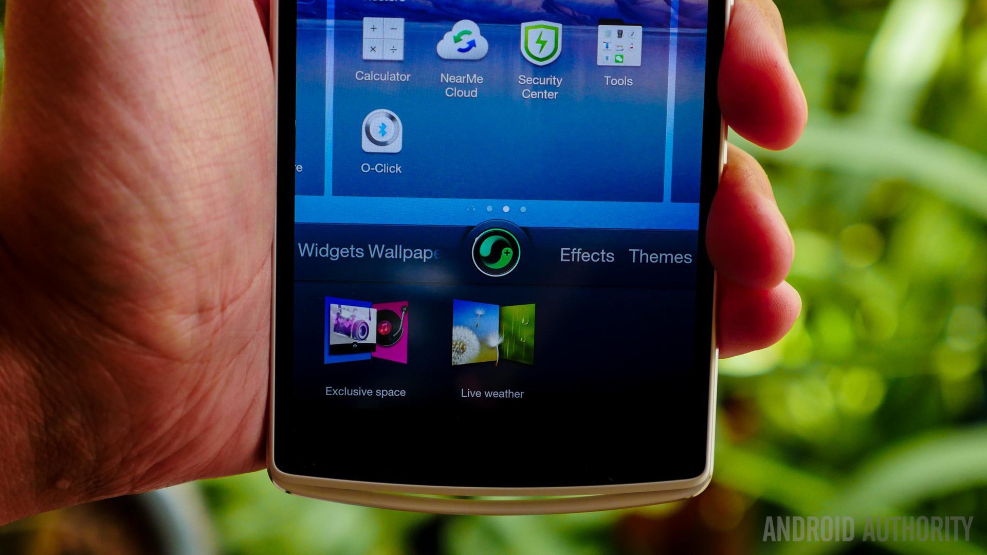
The user interface takes on a more ethereal appearance with more muted colors, but has some flashy features depending on your theme. Media pages, for example, bring attractive looking ways of controlling music and pictures. What is missing from previous Color OS iterations is the gesture panel that came down from the left side of the notification dropdown. You can still perform the same gestures on the standby off screen though, like double tap to wake, or drawing a circle to access the camera.
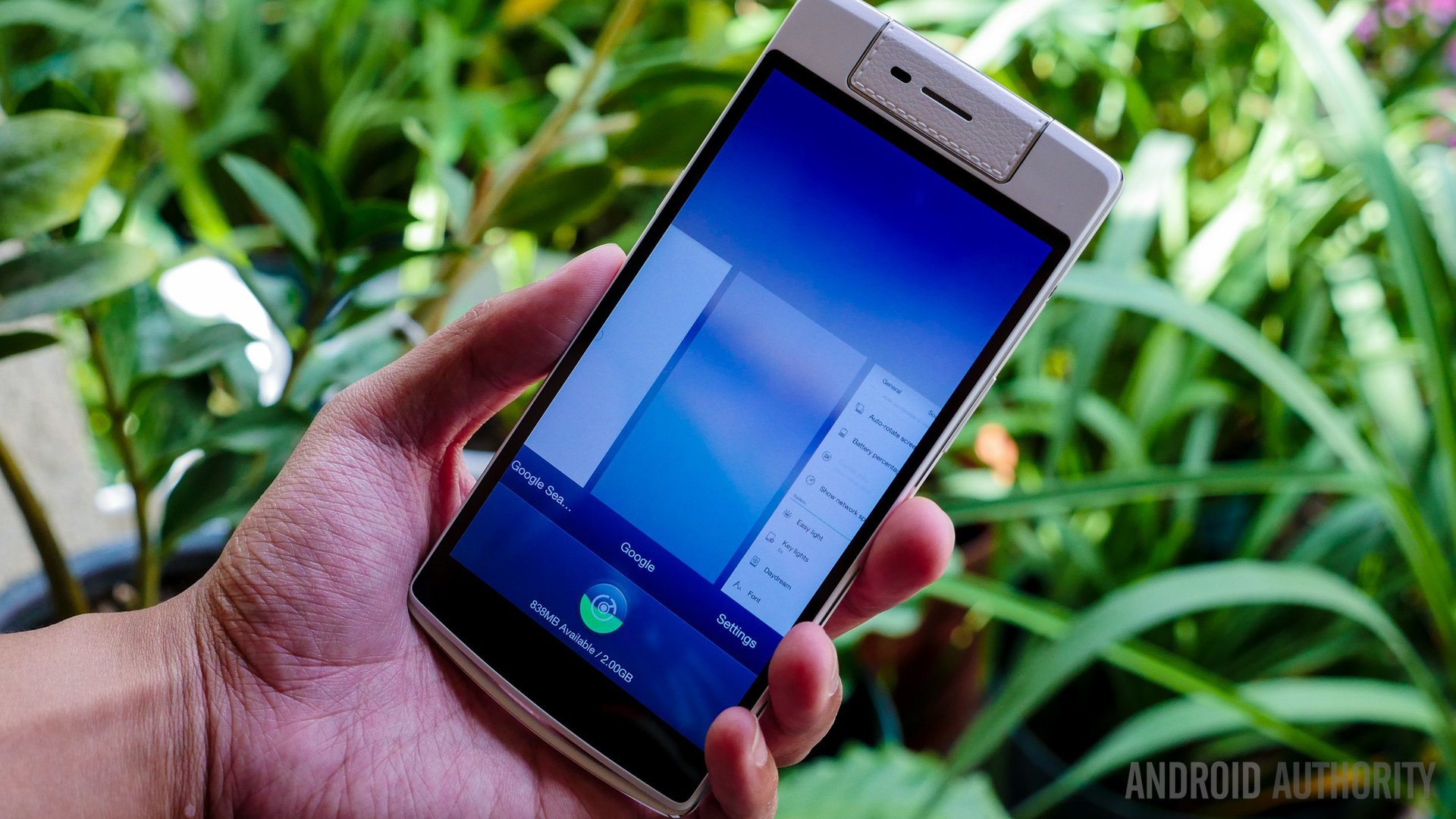
The way the Color OS handles the Recent Apps screen is not the best though, and the notification dropdown shows many of the features available via a swipe down, meaning you have to pinch out to expand notifications. In terms of customization, a robust Theme Store does allow you to get the interface to look exactly the way you may want it to.
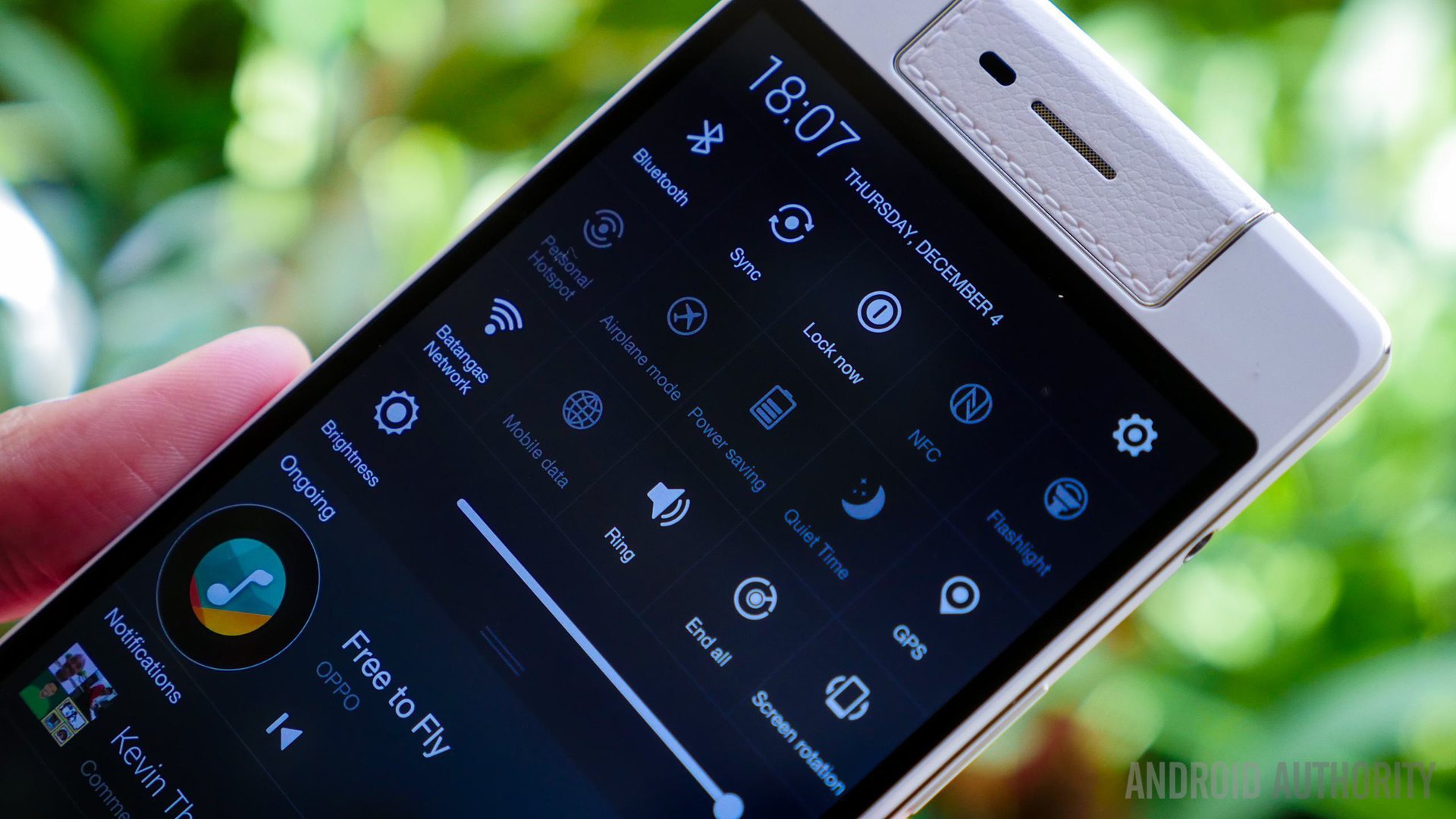
The Color OS isn’t the most polished operating system, especially considering its translations, but it has gotten considerably better. That said, updates to this operating system tend to be rather slow too, so any major issues may take a while to get fixed. Users more often than not may resort to using third party launchers instead, but if you do decide to stick with it, it is far from the worst iteration of Android I’ve ever used.
While the OPPO N3 isn’t available in western markets just yet, we have been told that it will be at a price point of $649. This is slightly lower than other high-profile flagships out there, and it is worth noting that the OPPO N3 is the only device to feature a rotating camera.
So, there you have it – an in-depth look at the OPPO N3! While we are still waiting for a perfect camera experience, the OPPO N3 manages to do quite well, and improves on an idea that was not as well executed in its first attempt. The experience of using the OPPO N3, which includes the O-Touch and the O-Click accessory, proved to be enjoyable and comparable to its competitors. As it stands right now, you can’t get any other phone that is quite like the this one, and that is a part of its appeal.
All of its unique features get the essentials right, and while the motorized camera is useful at times, it isn’t the deal maker here. What makes the OPPO N3 such a compelling package is that it improves on all that made the previous iteration different, which is why it is deserving of our Editor’s Choice award. If you want something unique without sacrificing quality, the OPPO N3 just might be what you’re looking for.