Affiliate links on Android Authority may earn us a commission. Learn more.
Samsung Galaxy Note Edge review
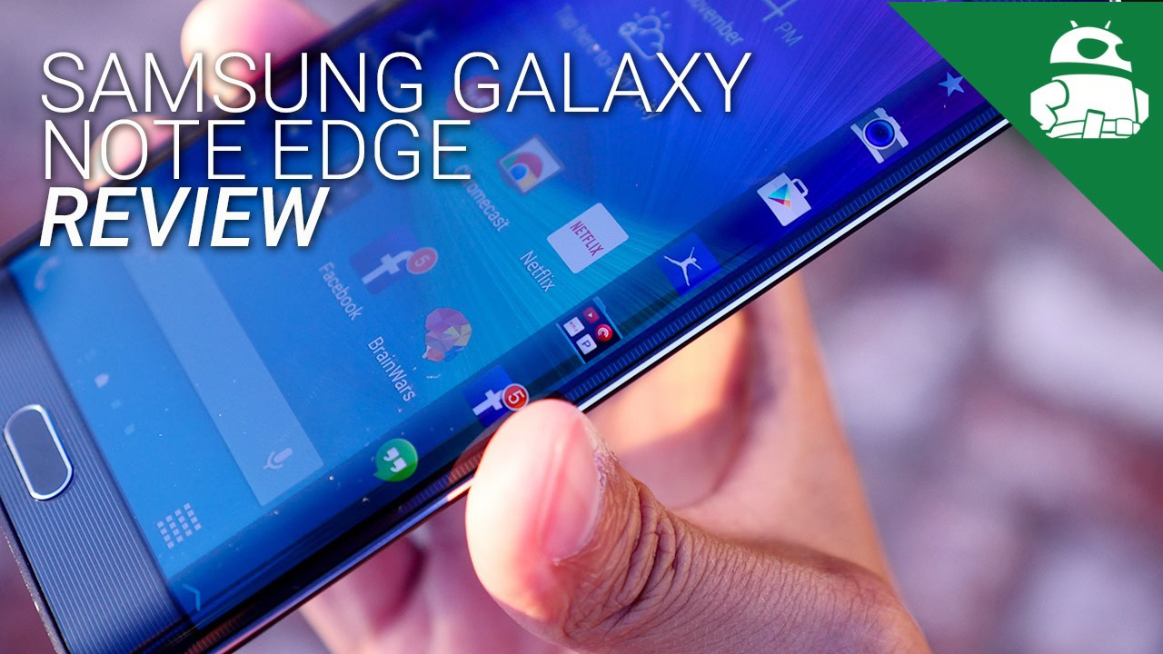
Up until recently, most smartphones have generally had the same form factor – a slab of glass, surrounded by a square body – and that gets boring. It’s not often that we see a new form factor readily available for the public to purchase. In fact, it almost never happens when it comes to the smartphone world. Believing that the industry needed a slight push on the hardware front, Samsung announced something very cool alongside the Galaxy Note 4, back at IFA 2014.
That device is the Galaxy Note Edge. It resembles the Note 4, but it’s still different. Instead of offering a plain slab of glass on the front, the side of the display gently curves around the right edge. Samsung is obviously trying to push the boundaries on how we use our devices, but is that enough to warrant purchasing this device over the Galaxy Note 4? Does it offer enough of a mainstream feature that people will get behind?
Find out this, and more, in our Samsung Galaxy Note Edge review!
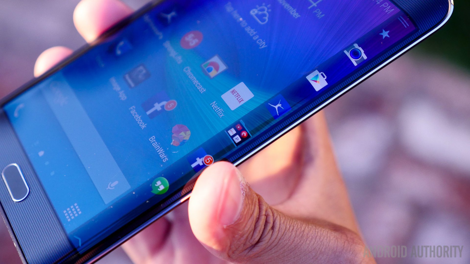
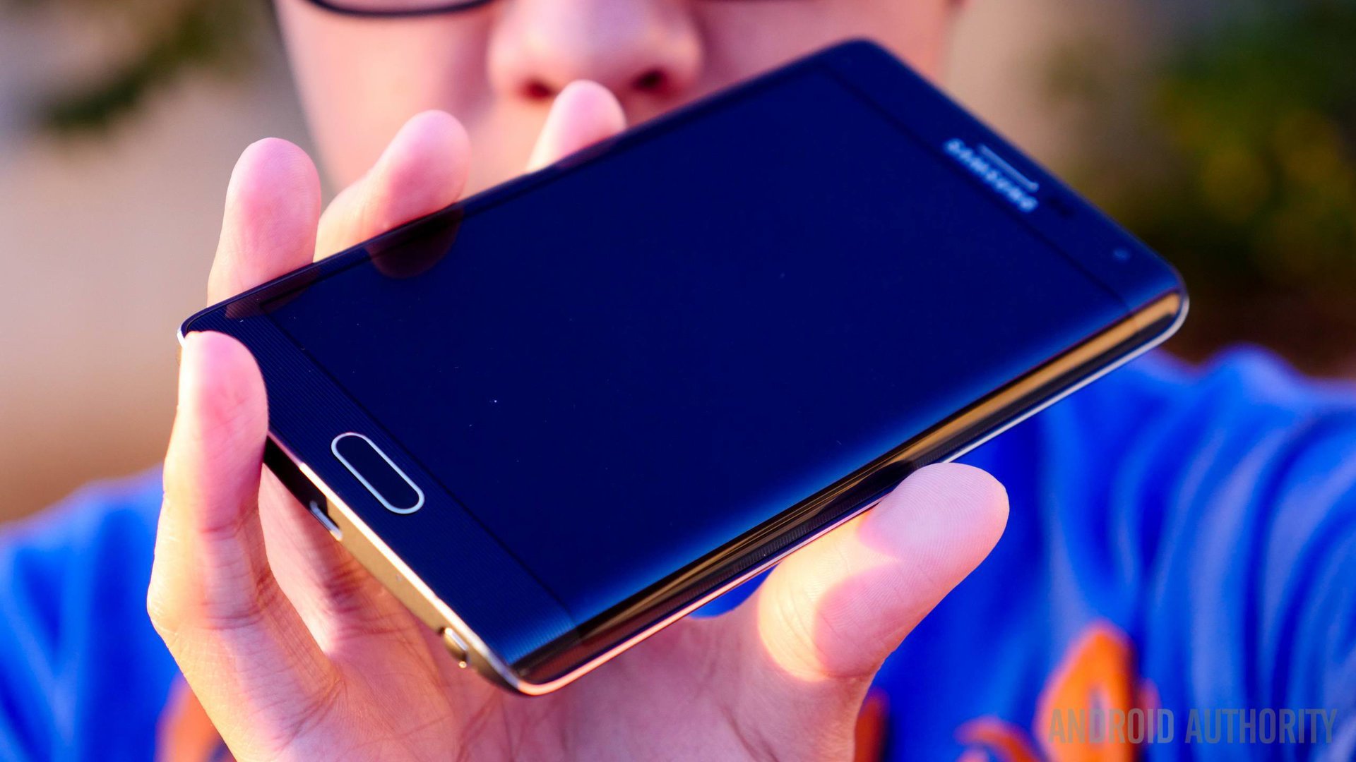
Here is where the Note Edge really stands out from the competition. It looks exactly like a Galaxy Note 4, but with one huge change. Obviously we’re talking about the right edge of the display. It changes the way we use the phone, sure, but in all other aspects, you can absolutely tell that it’s a Note device. The Edge uses the same faux-leather back, glossy-plastic front (complete with a big, tactile home button), and brushed-metallic sides as the Note 4.
The right side of the device almost looks as if someone melted the glass and let it cool. The curve is where we see the new handling experience that the Edge brings, in software and in hardware. Due to the added slippery-ness of the edge, there’s a slight lip on the screen, which Samsung hopes will help aid in holding it. Although we haven’t dropped the phone quite yet, we’re even more nervous to than on most other phones. Now that the display wraps around to two edges of the device, there much more of a chance of cracking it once it’s dropped. Since the right edge is the main feature of the phone, cracking it would be detrimental to the user experience.
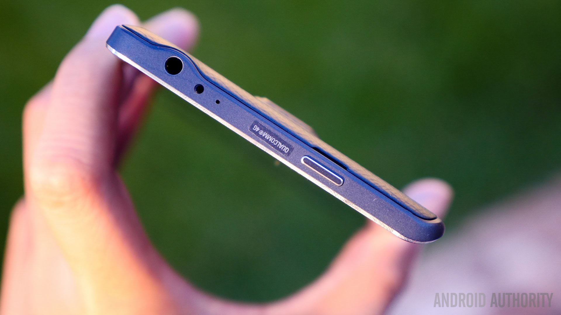
The button layout has been switched up quite a bit on the Edge, moving the power button to the top of the device. It’s definitely a change, especially since basically every other Samsung phone has had the power button on the right side. Waking the device is still very easy, thanks to the tactile home button, but it’s still odd getting used to reaching up top to put it in standby.
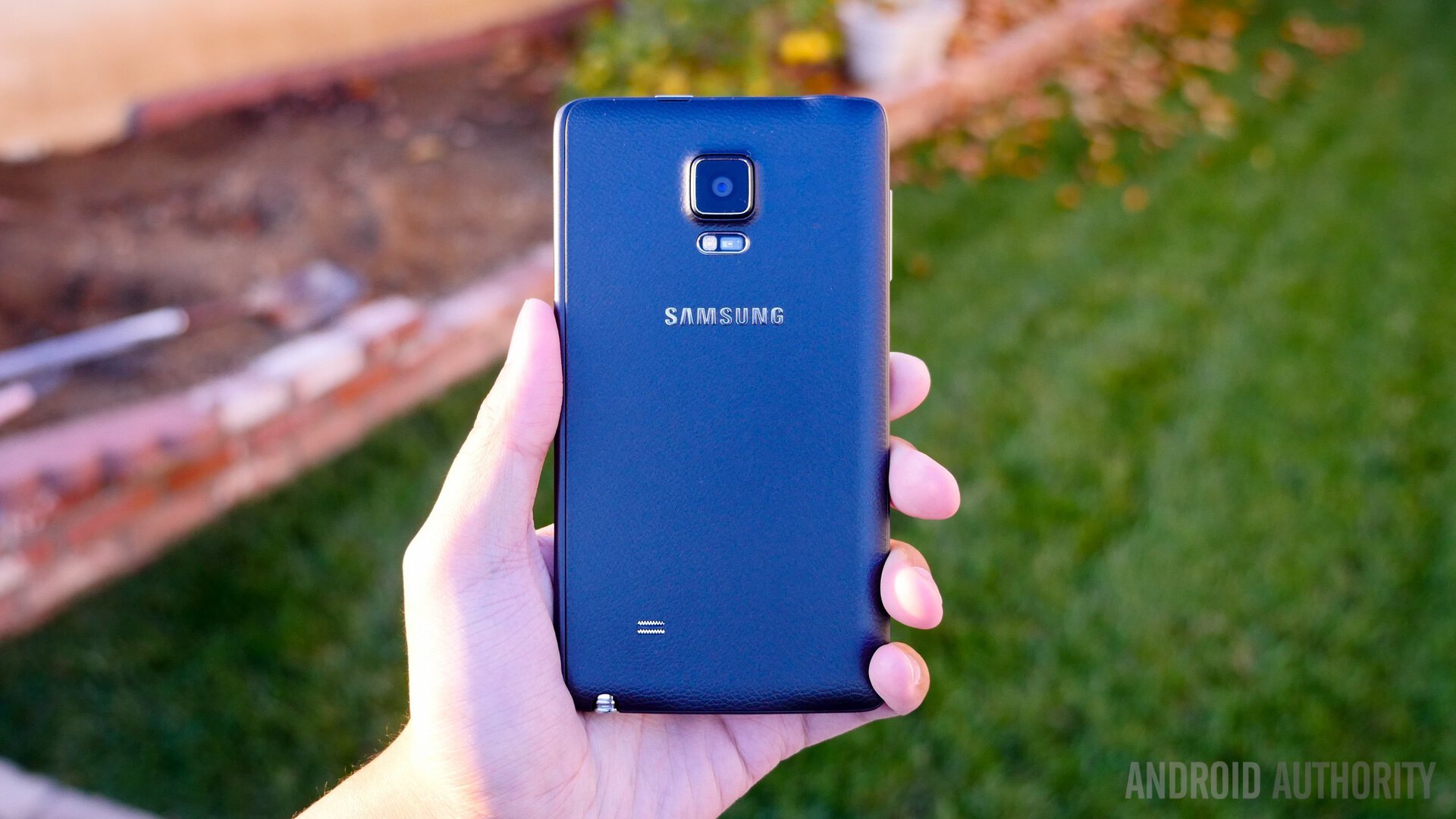
The other edges of the device still have the brushed-metallic look to them, and gives the Edge a nice, premium feel in-hand. The back is still removable, and covered in the familiar faux-leather plastic backing from the other Note devices. We’re happy Samsung decided to include a removable back and premium materials around the device, as it still makes for one heck of a great feeling phone.
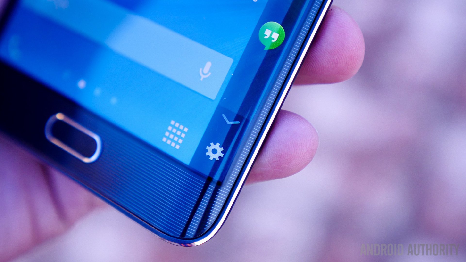
Let’s be honest, this device looks weird. A good kind of weird, though. It generates a lot of looks from people, and is usually followed up with, “What’s going on with your phone?” Albeit generally positive reactions, it still gets a lot of looks in public. Let’s just say that this device has piqued our interest in terms of design. We aren’t picking it up everyday because it’s the best all-around device, but mainly because it’s something new. It changes the software and the hardware experience completely, and we’re continually excited to see how it fairs from day to day.
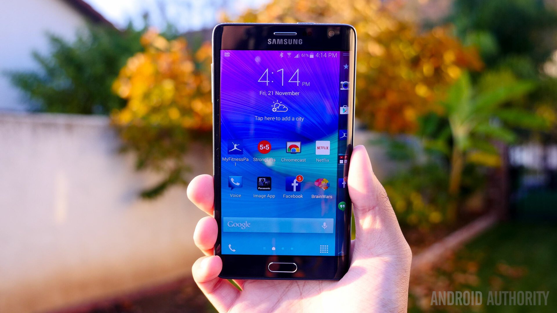
Obviously the display on the Note Edge is one of the biggest differences between this handset and the more traditional Galaxy Note 4. The 5.6-inch display not only looks unique, it actually has slightly more than a Quad HD resolution at 2560 x 1600. Of course, the 160 extra pixels on the right side of the display don’t really improve the viewing experience in any way, as they are reserved for a number of panels and controls.
The display might have a unique edge to it, but the rest of the characteristics are pretty typical of Samsung, meaning the same signature saturation and high fidelity. Text is sharp as ever, and I still enjoyed media and games just as much as I did on the Note 4. That said, I have to admit that the extra curve can be more than a little distracting at times, and I wasn’t too happy anytime I accidentally triggered it and thus covered a sliver of my Netflix or Youtube video up top.

Turning to the curve itself, it’s important to note that it can actually turn on independently from the rest of the display. This means you can use the curve as a clock on a night stand, or as a quick way to few basic notifications. Touch sensitivity here is as good as you’d expect, though interaction is limited to swipes and touches.
We’ll get into more details about how the curve changes the experience a bit later in the review. The big takeaway is that, yes, the display has a higher resolution but it really makes no difference in the grand scheme of things.
The influence of the Edge’s sibling returns here with the handset packing the same Snapdragon 805, Adreno 420 CPU and 3GB RAM as the Note 4. Of course, that’s not a bad thing. The Note Edge is absolutely a beast, providing a reliable, enjoyable experience.
Like the Note 4, the Note Edge packs one of the smoothest iterations of TouchWiz to date. While there are rare moment of stutter or lag, they are few and far between. In other words, no matter what you throw at it, the Note Edge should be able to take it all in stride.
The new addition of the panels in the curve don’t detract from the general experience found the device either, as everything still runs smoothly. I do notice that some new animations have been added in to draw attention to the side, as all of the apps slide in from the edge – but these are just aesthetic changes.
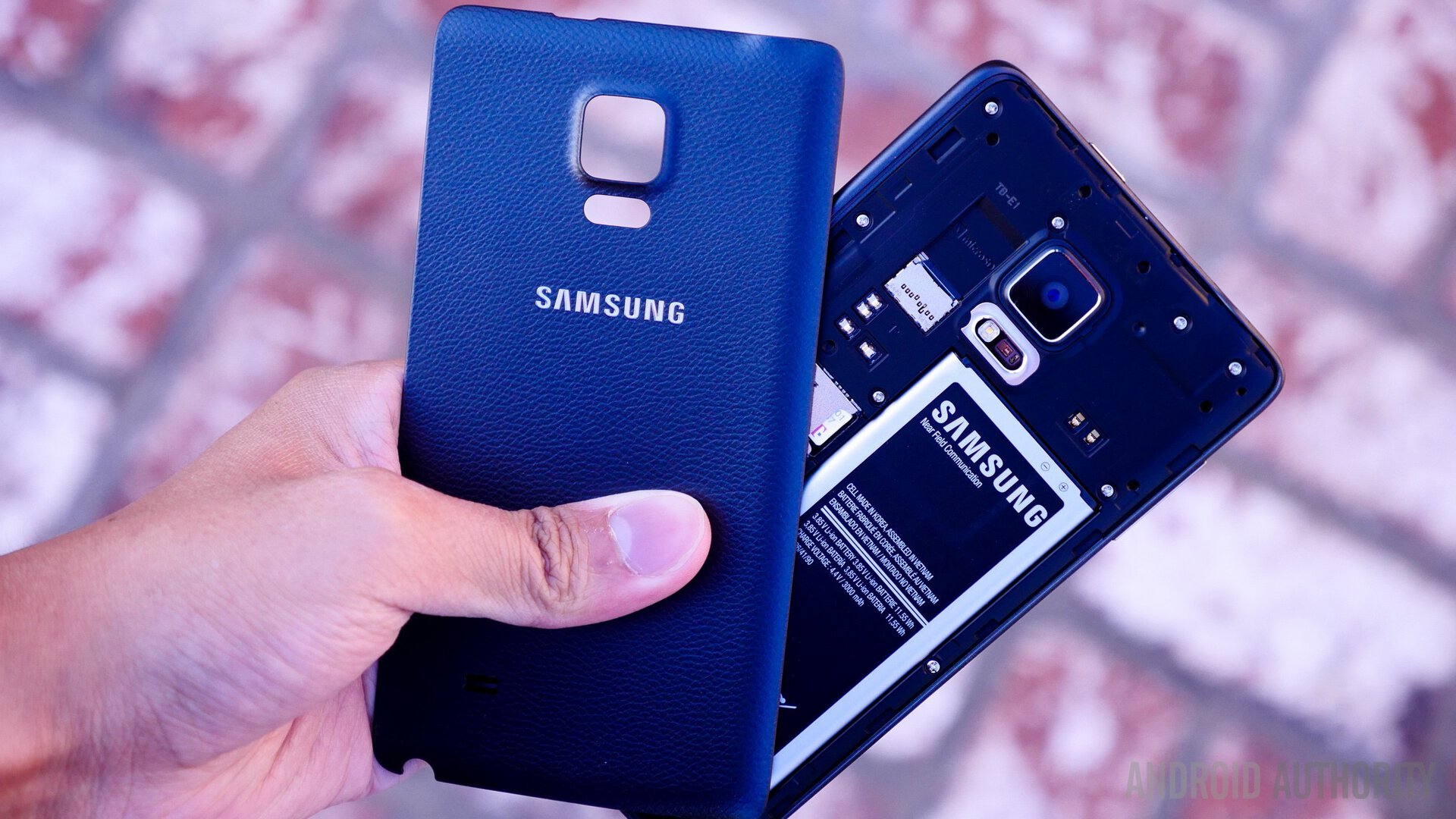
Apart from the curved display and its capabilities, the Galaxy Note Edge basically offers everything you’d get with its flagship sibling, making this one of the most feature-packed devices currently available as well. Usual Samsung features such as removable back cover, that gives you access to the replaceable battery, SIM slot, and microSD card slot, make a return here.
Call quality is decent, and while the external speaker does get quite loud, it is plagued with the issues that affect any speaker that is placed at the back of the phone. Recent Samsung additions like the heart rate monitor and the multiple microphone setup, that helps with recording specific parts of the sound spectrum, also make a return with the Note Edge.
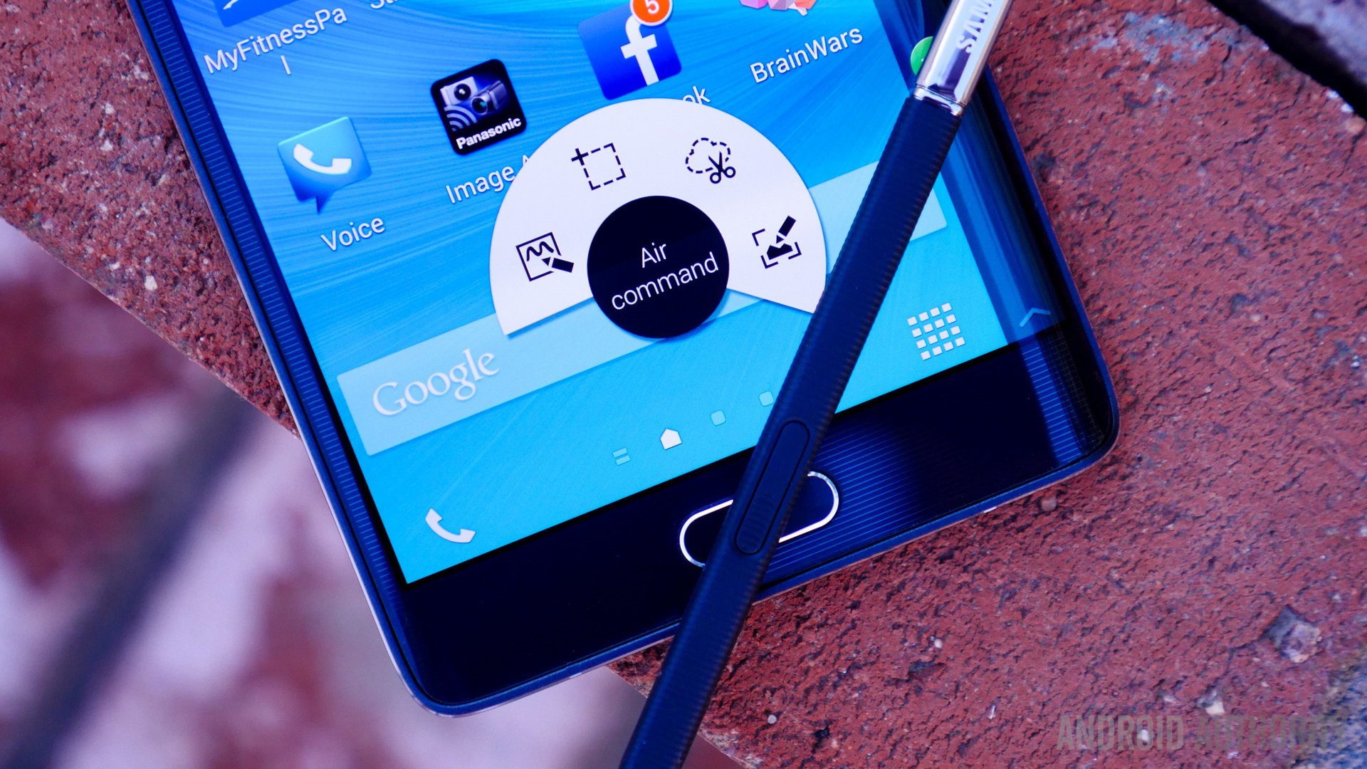
Of course, the main draw with any Note device is the S-Pen stylus, that provides precision usage and note taking abilities, like easily clipping parts of the screen for later usage, access to the S Note, and the Action Memo. The S-Pen itself has also been enhanced to allow for an even finer writing experience. The S-Note application now comes with Photo Note, that captures the lines and designs of any scene, and makes them editable, which is great for making signs, blackboards, or any presentation open to your creativity. Everything said and done, while the S-Pen can prove to be an integral feature of the Galaxy Note Edge, it does feel somewhat weird, especially when you, literally, fall off the edge.
As expected from a device with such a large form factor, the battery life is quite impressive. The 3,000 mAh unit lasted for around four hours of screen-on time, with the standby time and other power consumption features allowing me to reach at least a day and a half of usage on multiple occasions. While my usage might have been a little higher than most, what is appreciated is Samsung’s fast charging capabilities, that allows you to recharge the device very quickly.
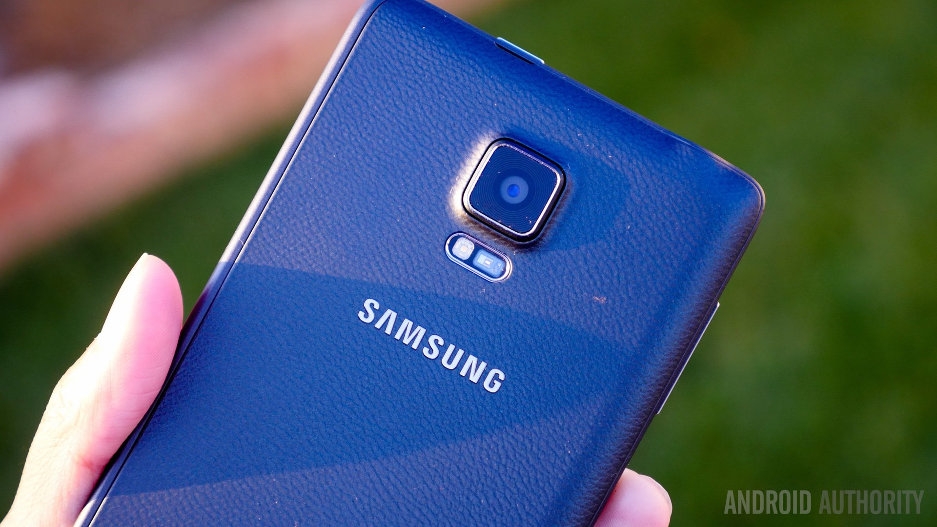
Keeping with the Galaxy Note 4 specifications, the Note Edge features a 16 MP rear shooter, bringing with the expected Samsung quality, and various modes to videos. That said, I still had quite a significant problem with the handling experience.
With the Note Edge, a lot of the controls that are used with various applications have been moved to the “curve,” which is actually quite useful, but proves to be a terrible idea in the case of using the camera. While you still get access to some on-screen buttons to adjust the settings, the controls and the quick settings are all on the curved edge, whose ergonomics are unfortunately just not made for smartphone camera shooting.
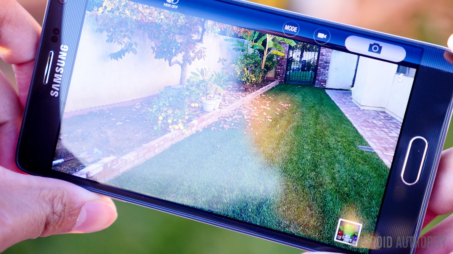
I was never able to snap photos with one hand, as reaching the shutter button was quite awkward, and constantly resulted in a feeling of the phone falling. The placement of the controls don’t destroy the experience entirely, but this is certainly an example of how an innovation like this does need a lot more thought put into it.
The quality of photos taken still remain the same however, including high levels of saturation that makes for overly vivid photos, which are nonetheless received well by the general user. Various modes are available, including HDR and Selective Focus, which does end up being a hit or miss feature. Low light performance is somewhat helped by the optical image stabilization, but photos do lose detail and get quite grainy the darker the situation becomes. That said, the pictures are still reliably good in well lit situations, which should be pleasing for most users.
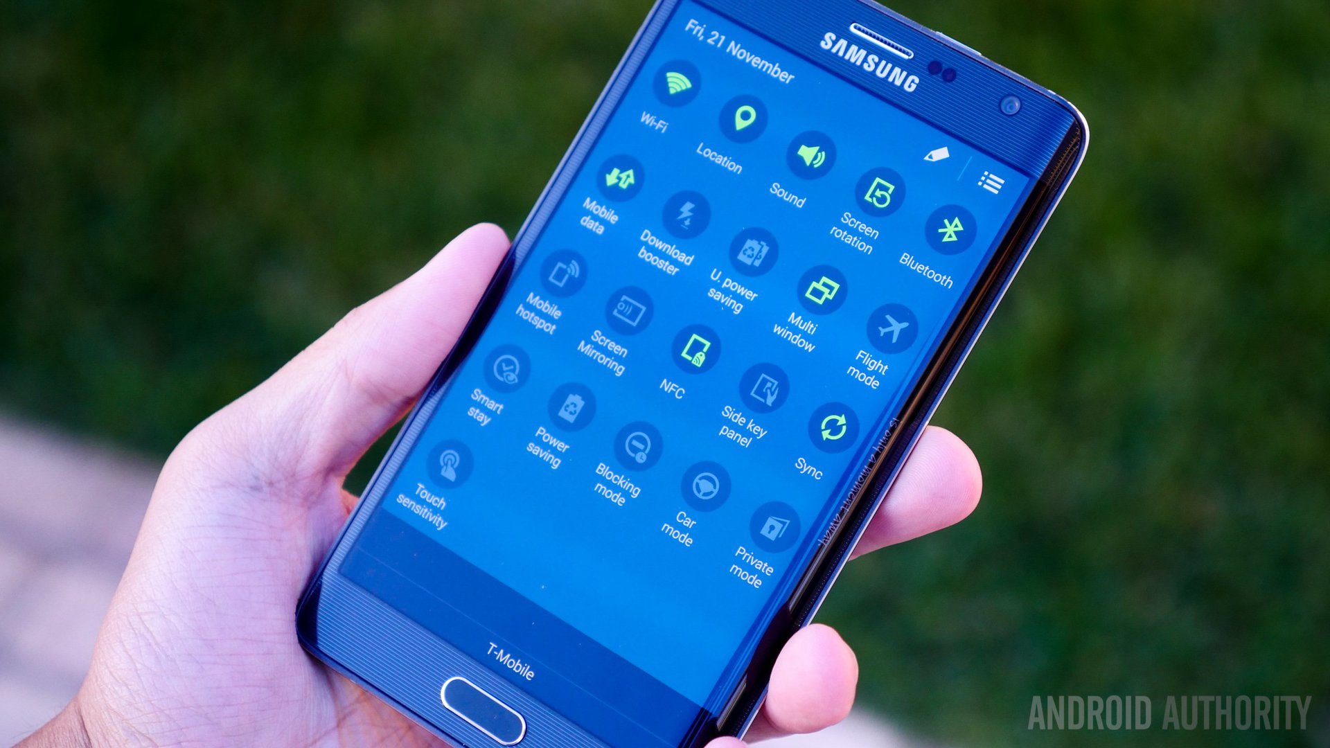
Finally, when it comes to software, TouchWiz makes a return in all its glory, but now with a new element to accommodate with the curved screen. Before we get to the curve, the software experience that we’ve covered in the Galaxy Note 4 review continues here, especially with regards to multi-tasking. While TouchWiz has seen an update with regards to its aesthetics, there is still an over saturation of available features, as you will see in an overly long Setting list. The ease of multi-tasking is a focus with the latest iteration of TouchWiz, and is clearly seen in the new Recent Apps screen, which also includes a new button to quickly trigger the Multi-Window feature. All the numerous multi-tasking features all make an appearance with the Note Edge as well.
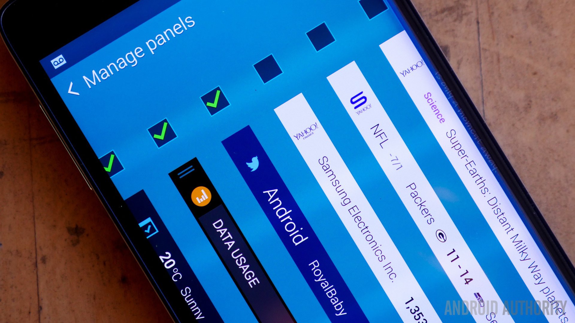
Multi-tasking is of course a very a big part of the Note experience, is actually at its most capable on the Note Edge, especially when you factor in the curved edge. A panel full of icons or folders that you can customize allow for shortcuts to your favorite apps at all times, which is one of my favorite aspects of this new curved display. A variety of other panel specifications like data tracking, a dedicated news ticker, one that will show notifications in real-time, and a ruler for quickly measuring anything are available here. You also have the ability to personalize the panel in which you have the ability to include a small phrase or drawing, to truly make the “edge” your own. The curve also ends up being the control panel for most applications, but this does end up being annoying in some cases. While not having the controls on screen while watching videos is appreciated, the horrible camera controls are a let down.

The software does use the curve to a good extent, even if not every situation yields a good experience. It definitely is a great place to put perpetual shortcuts, and a good way to easily check the time, but whether these features are enough to justify the need of an “edge” is still unknown.
Pricing does prove to be an issue in the case of the Galaxy Note Edge, with the device on occasion costing $150 more than the Galaxy Note 4, which is essentially the same device, save for the edge. Whether that edge is enough to justify the difference in price is entirely up to you, but all said done, the overall experience is mostly the same with the comparatively cheaper Galaxy Note 4.
So there you have it – the Samsung Galaxy Note Edge! Different, is the best way to describe the experience while using the Galaxy Note Edge. While the steep price point of this smartphone is certainly a drawback, the allure of something new is definitely undeniable. While the differences between the Galaxy Note Edge and the Galaxy Note 4 may not be enough to justify the signifcant difference in price, if you’re someone who is craving exclusivity, and basically just want something unique, the Galaxy Note Edge may just be the device you seek.