Affiliate links on Android Authority may earn us a commission. Learn more.
Android 6.0 Marshmallow features
Published onJune 14, 2017
It seems like not all that long ago Marshmallow was the latest and greatest thing. These days, more and more phones are switching to Nougat, and Android O is just around the corner. Still, if you have an older device or a lower-end phone — Android 6.0 might be as good as it gets. For those that either have recently upgraded to Android Marshmallow or bought a phone with it out of the box, you might be wondering what Android Marshmallow features stand out from previous versions of the OS.
In the Case of Marshmallow, the change was pretty significant when compared to Lollipop. Plenty of new Android 6.0 features and capabilities have been introduced, and our goal is to tell you all about the hottest new goodies in this post. Shall we get started?
Editor’s note: this piece was originally released in 2015, alongside the announcement of Android 6.0 Marshmallow. We have since updated the article to reflect it is no longer the newest version of Android — but for those unfamiliar with this version, the list below will tell you all the core features introduced in Android 6.
New app drawer
This will probably be one of the most obvious changes to the UI you will find. The new app drawer dumps horizontal scrolling, which has been around since Jelly Bean first came into the picture. The new app drawer scrolls vertically, which does seem to speed up navigation and gets you to your apps quicker.
In addition, users can now grab the scroll bar on the right side and jump through letters to more easily find the apps you need. It goes right in line with other Google apps, such as the Contacts applications. Not to mention, plenty of other applications have implemented this new mechanic, which works like a charm.
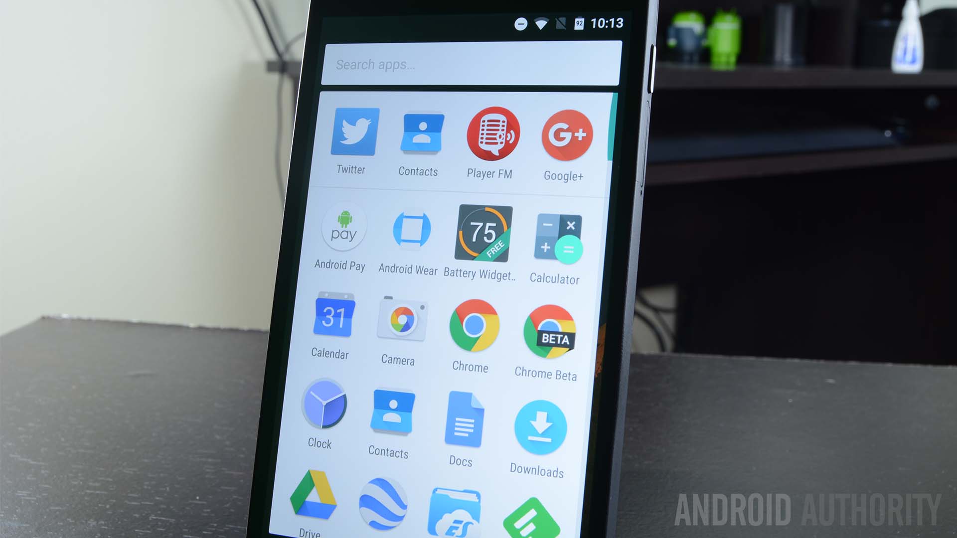
And if you really just don’t feel like scrolling around at all, there is also a new app drawer search bar that will help you really get to specific apps in a jiffy. But you probably won’t need to use it much, as the first row holds your most used apps.
Slight change to the lock screen
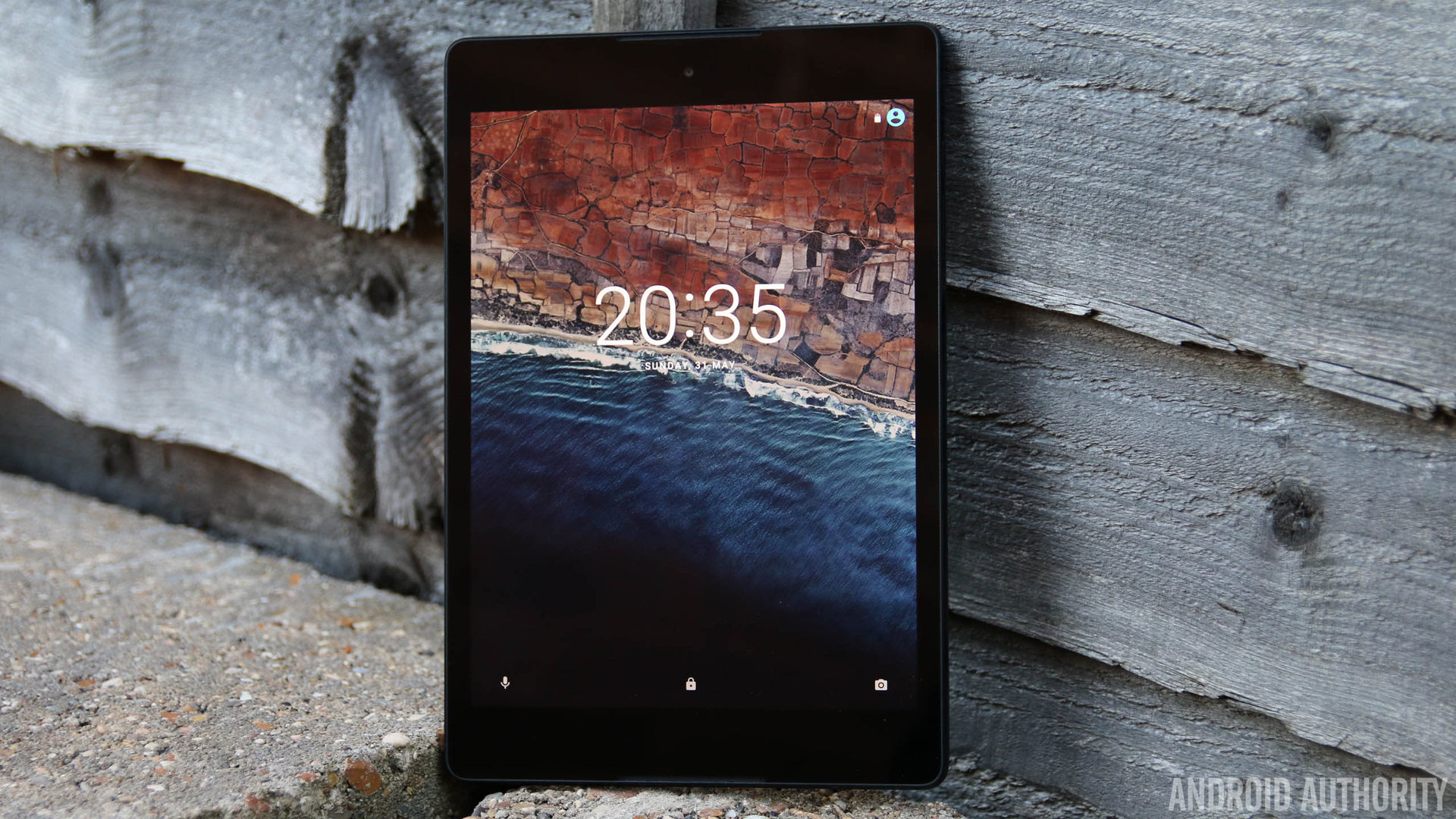
The lock screen really is almost identical to the one in Lollipop. There is only one real change here. Instead of having dialer and camera shortcuts in the bottom corners, Google has opted to replace the dialer app with access to voice commands. I suppose Google believes voice commands are more important than actually calling people, and at this point they may not be wrong.
Not much to see in the home screens
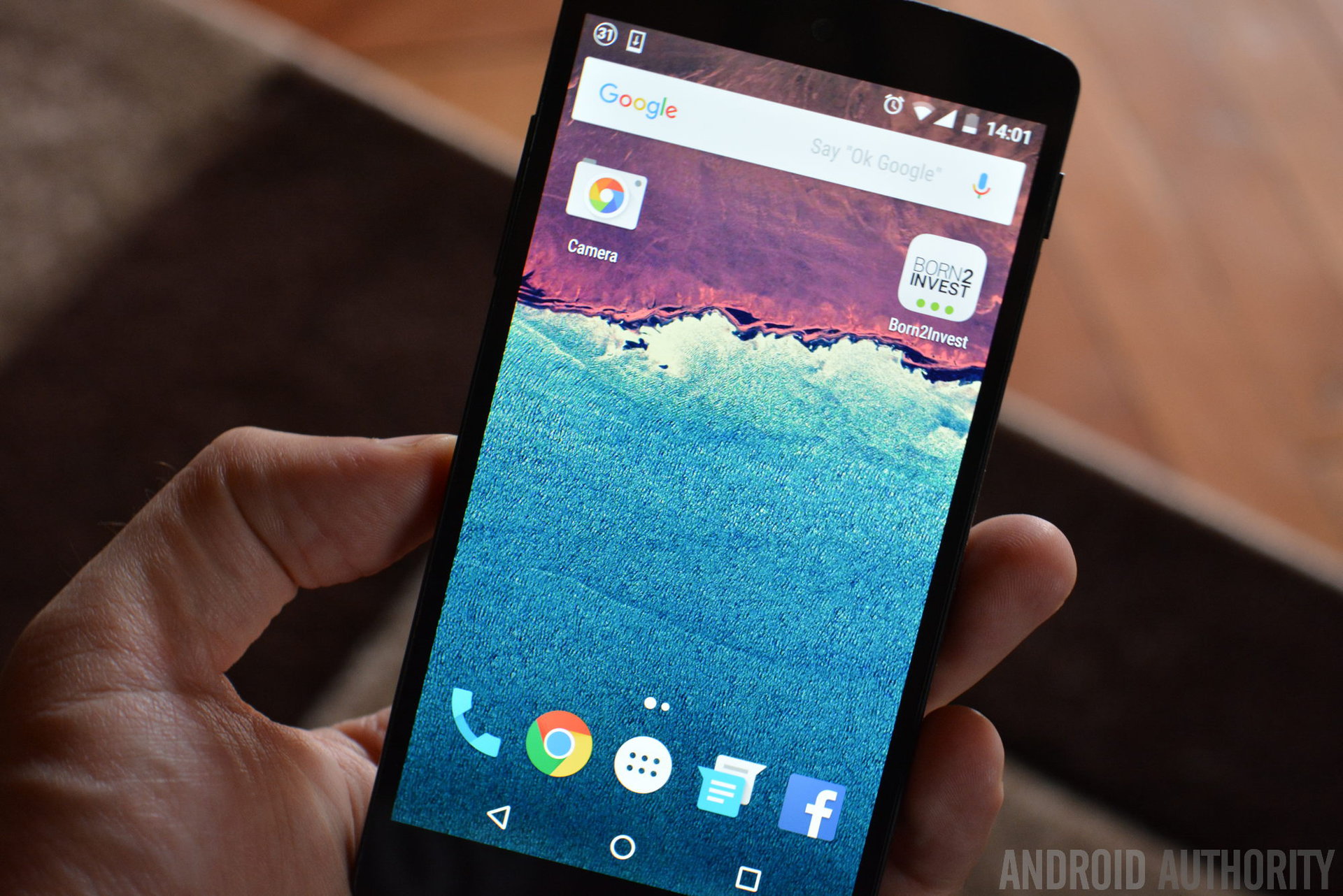
There really isn’t much to see around here. Well… yes, there are some changes, but these aren’t really exclusive to Android 6.0 Marshmallow. For starters, the Search bar on top and some icons will look more colorful, but the same applies to other devices, as these changes were implemented via Google Play Store updates.
Otherwise, this is just the stock Google Now Launcher experience you have experienced in the past. You can swipe all the way to the left to access Google Now, while other home screen pages will build up to the right.
The notification area
I spend much of my phone time using the notification area. After all, this is where my main settings and all alerts go. Google has found a good way to keep this section organized, but they are always trying to improve things, even if by a bit. this means that there are definitely some changes in here.
You still have your two-step notification area process process. Swipe down once (with one finger) and you will be presented with your current notifications, which can then be expanded or accessed. Swipe down again (or swipe down with two fingers) and the Quick Settings menu will show up.
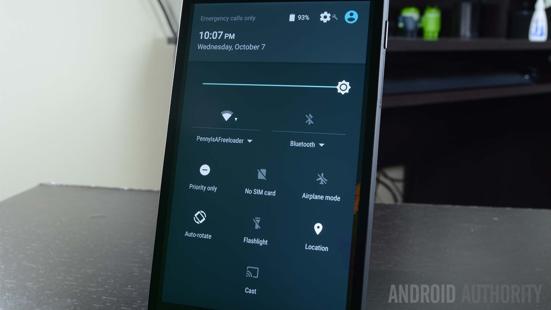
By the way, that ‘dismiss all’ button might look a bit different. Google simply changed the way it’s facing. You know – for no real reason, really. Oh, and the priority notification settings that caused quite a stir in Lollipop has now been relegated to the Quick Settings.
Google Now on Tap
This is one of the features Google focused most on when showcasing its new Android version. Have you ever been checking out a website reading about… I don’t know, a new Star Wars movie? Surely, you want to learn more about it, but it’s a hassle to access a new tab or launch another app just to perform a search.
Google Now on Tap makes Search a system-wide feature you can launch by simply long-pressing the home button. Doing this will present you with information relevant to whatever it is you are currently looking at.
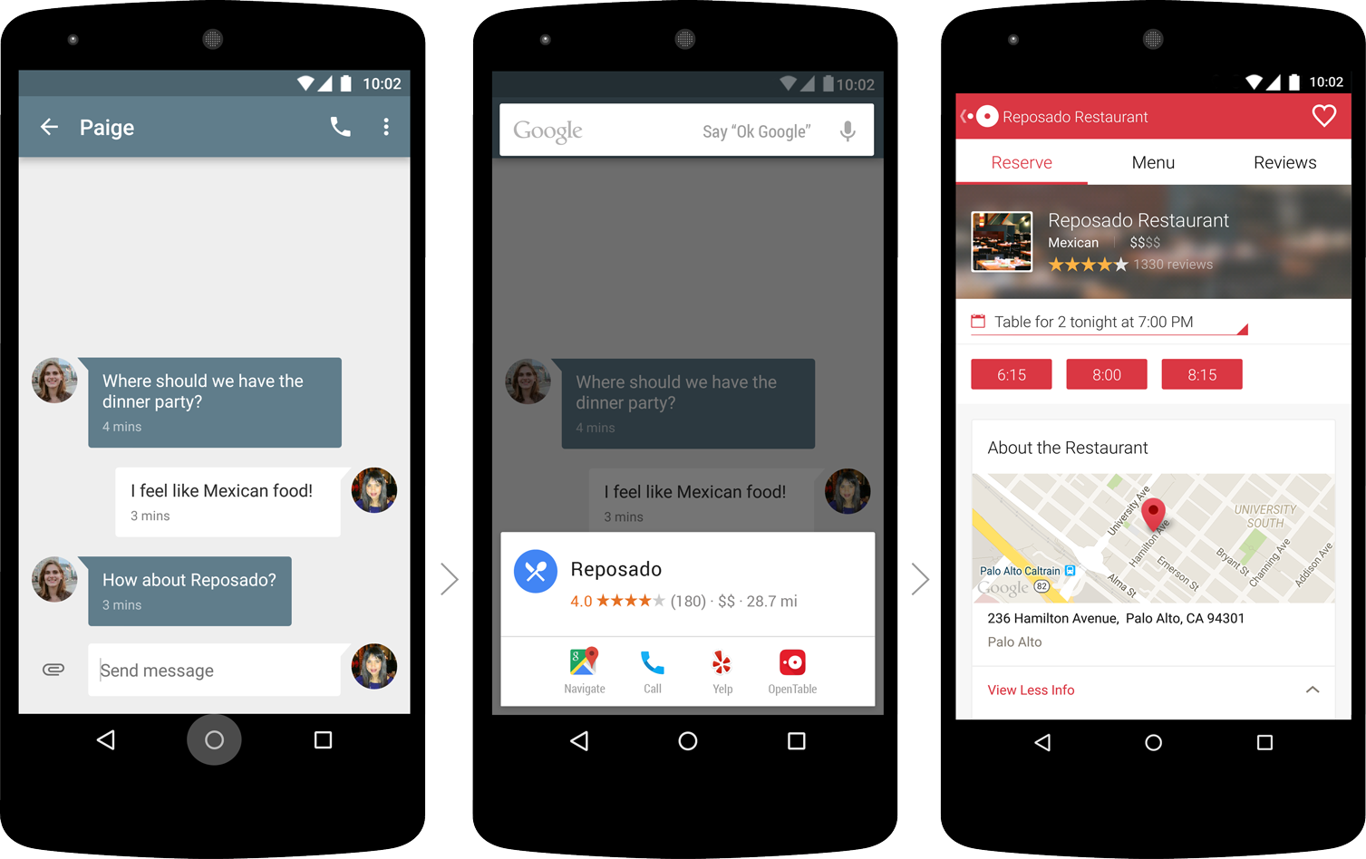
Unfortunately, Now on Tap turned out to not be as useful as Google originally promised, and in later versions was released by Google Assistant. In fact, you can actually get the assistant in your current device, no need for have Nougat or newer. Google will automatically update its apps to bring you the feature when you first set up.
Doze Mode – more battery life, happier users
Don’t you hate it when your phone dies and you don’t even use it? And I mean that in the most literal sense possible. Some phones will lose plenty of juice while in standby mode. Doze Mode was introduced to help desperate users stay off their phones for longer, without having to recharge all the time.
What Doze Mode does is extend standby battery life by putting the phone in a deeper slumber during longer periods of inactivity. Reports say a Nexus 5 can last days, and even weeks, on a single charge. Of course, with no usage.
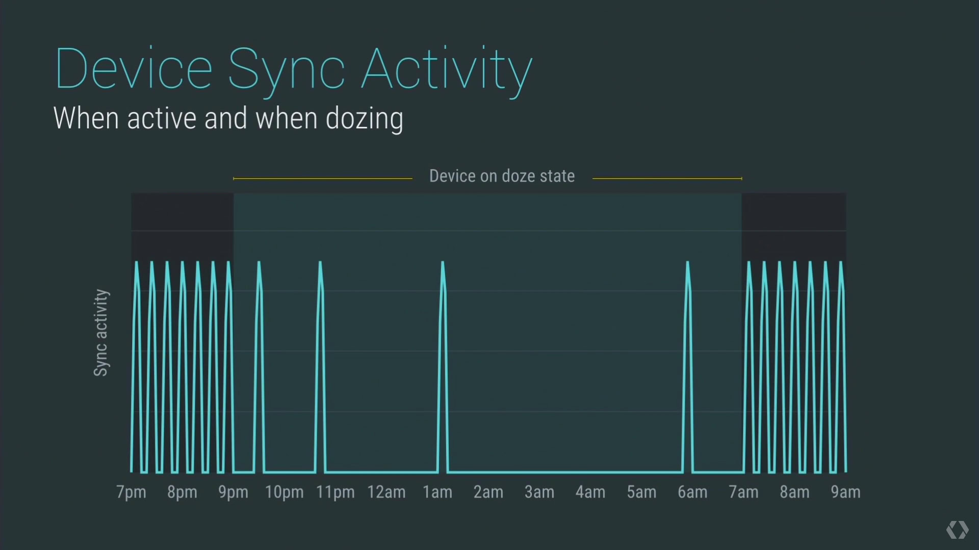
The only issue here is that Doze Mode requires long periods of inactivity in order to be engaged, something that will help very few of us. In addition, applications can bypass this feature if set to priority, and since developers are the ones who determine whether their app is important enough or not, chances are very few apps will be turned off in this mode.
Inactive apps will be put to sleep too
Google didn’t conform with putting the phone in a deeper sleep when the device is inactive. They went all the way down to the app level. One of the benefits of the Android OS is that it’s such a great multi-tasker, but it can also be a bad thing if you have a bunch of applications installed. To counteract this, Google has decided to take inactive apps and put them in a deeper sleep.
Native fingerprint support!
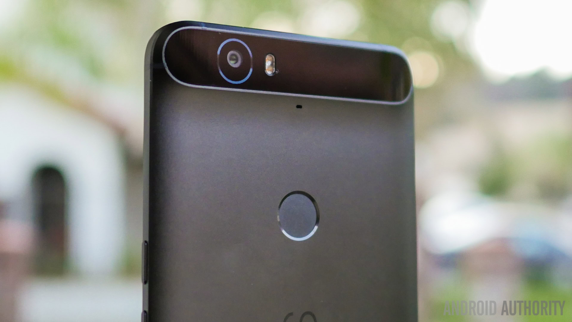
Google released fingerprint API that gives developers the power to tap into our phones’ biometric authentication.
What this means is that not only will these fingerprint readers be good for unlocking your device, any developer can use it to offer a secure connection with their users. Imagine once banks, social networks, email clients and other services integrate it. Say goodbye to passwords!
Android Pay
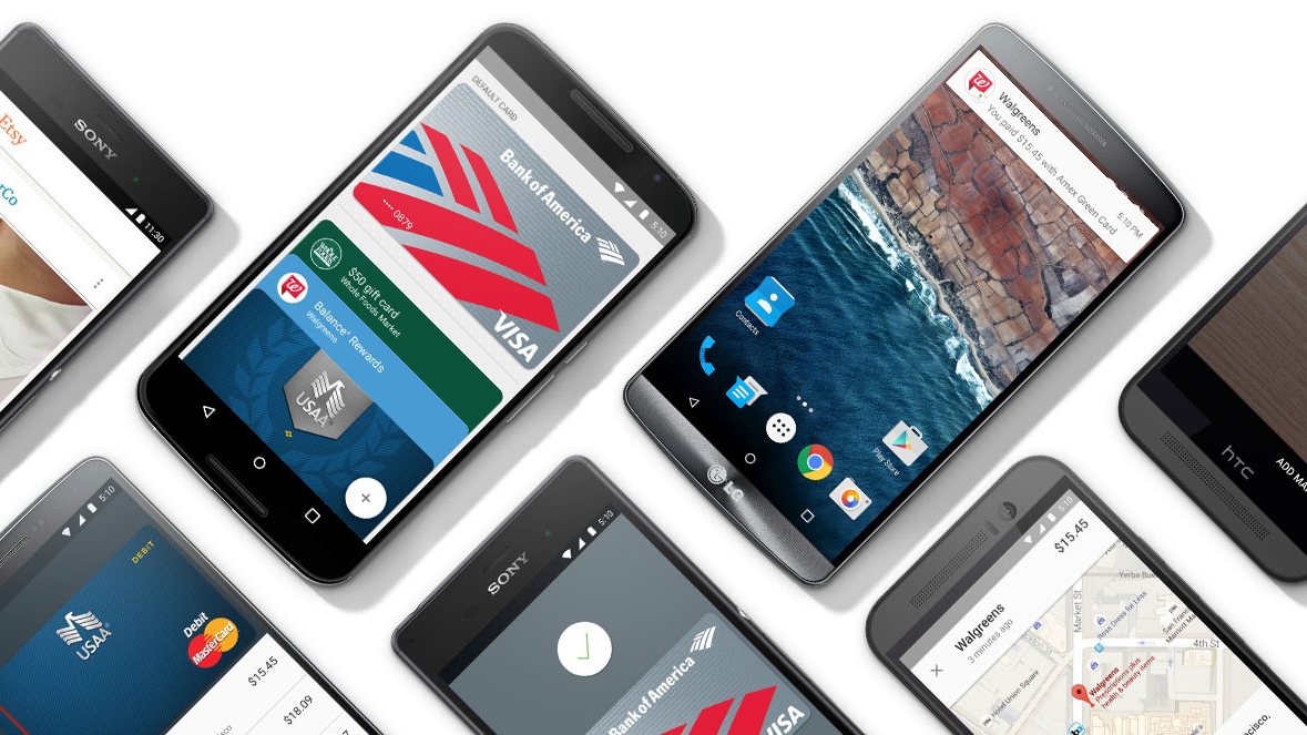
This app was introduced along with Marshmallow and allows you to pretty much do the same as Google Wallet and other contactless payment services. You can add your cards and make NFC payments at supported stores.
So, how is it better than Google Wallet? It is integrated to the very backbone of the system. It’s no longer just an app in the phone. The difference is that you don’t need to open an app to use it. Just unlock your phone and tap your way around!
Granular app permissions for the win!
Before, downloading an app meant having to succumb to accepting all the app permissions developers requested. Some of these seemed unreasonable and unnecessary. With Android 6.0 Marshmallow, you can now download any app and select with permissions you allow it to access.
Having control over these settings is something plenty of power users have been requesting for a long time, and now we see it at full force with Android 6.0. For starters, one can easily go to the Settings app and see which apps can access certain permissions. You can then disable them selectively.
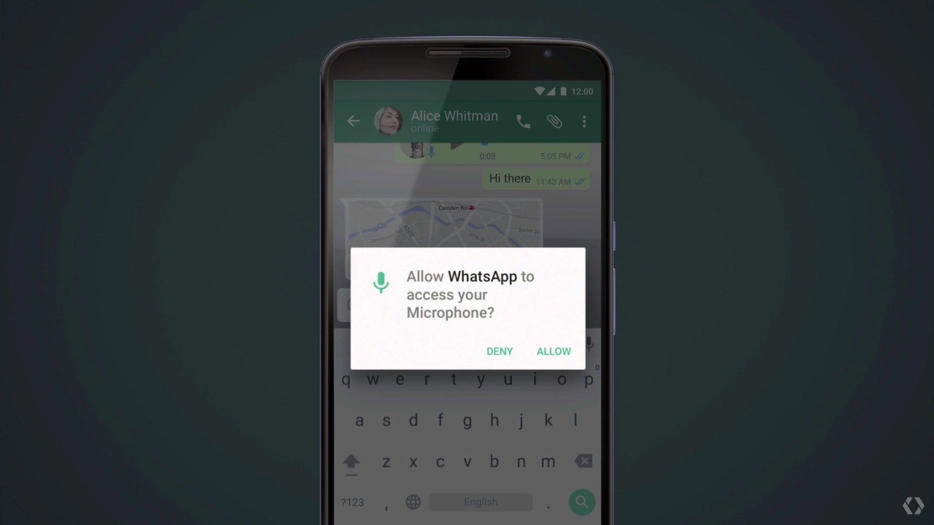
To avoid any potential conflicts, Google has a built-in system that feeds fake data to the app so it keeps on chugging along as expected. That means you won’t have to worry about older apps crashing when you disable permissions. Some functionality may stil break if you turn off the wrong permission, though. For example, you shouldn’t deny access to the camera on a camera app.
App Links
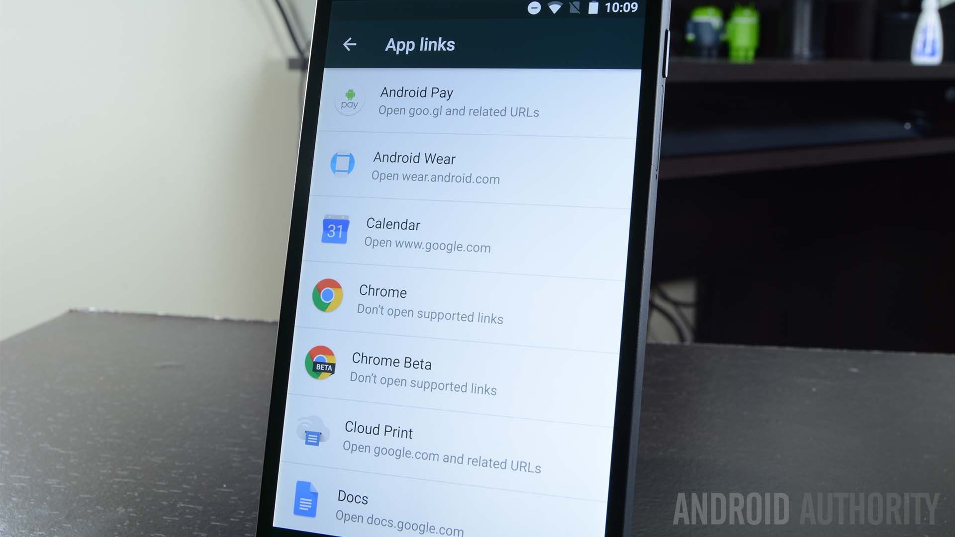
We all hate having to pick which app we want to open a link with, right? Surely, you know what I am talking about. Whenever you click on, say, a Facebook link, the system will pull up a box and ask whether you want to open it with a browser, the Facebook app or any other app that taps into the social network.
it gets annoying, so this is why Google is introducing App Links with Android 6.0. What this does is pretty much allow applications to take ownership of whatever links may belong to them. Of course, the box will still show up from time to time, but definitely not as often as before.
The simplified volume slider is back!
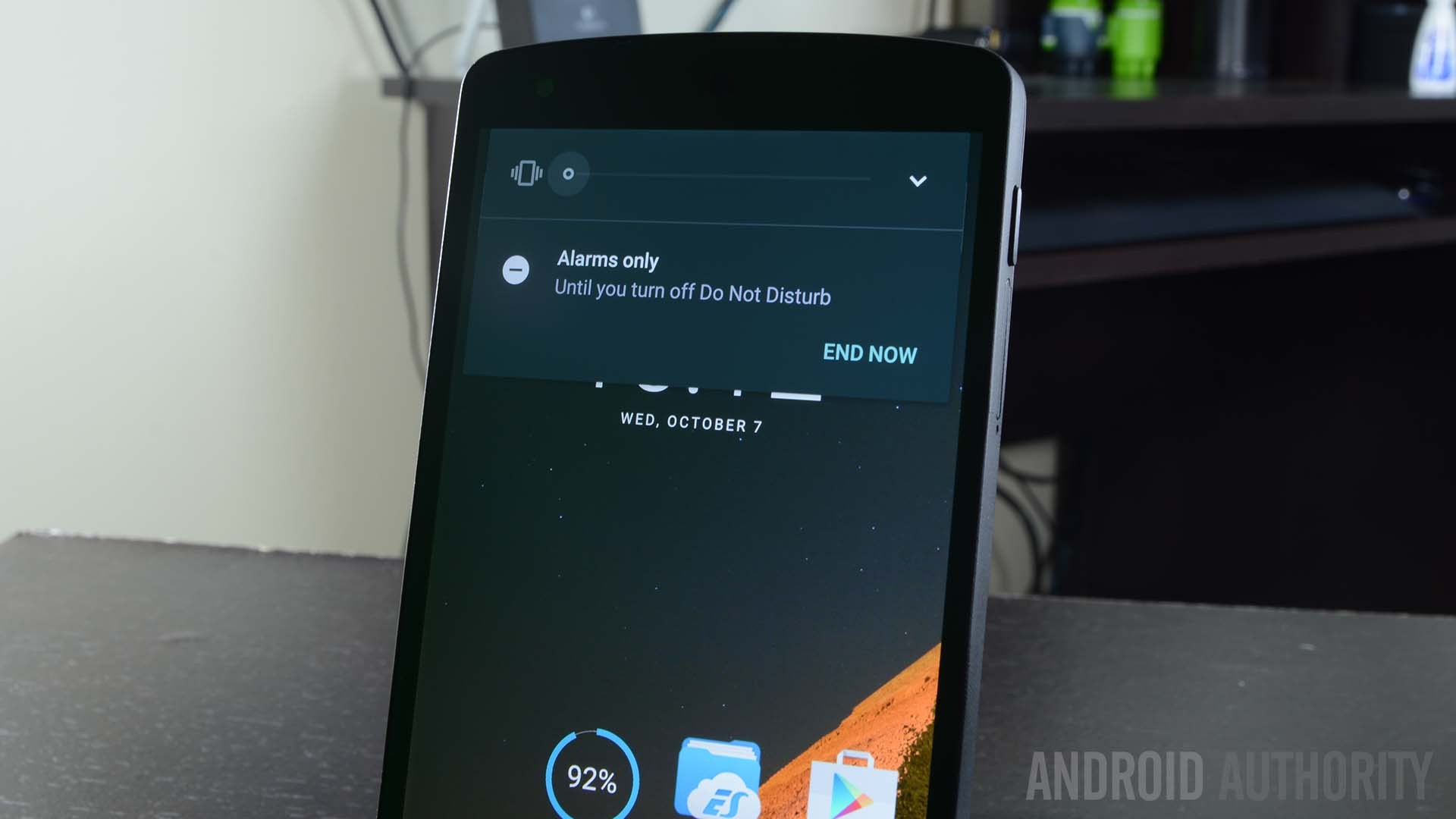
Was anyone else annoyed by the new volume slider controls in Lollipop? This “improved” system allowed you to tap into Priority Mode, in which only certain apps were allowed to send you alerts. Then there was a Do Not Disturb Mode, which silenced everything.This was cool, but it was too much to work with while on-the-go.
The volume controls in the notification area have been simplified again. Just lower the volume all the way and the phone will be put in Vibrate Mode, while one more move over will put you in Do Not Disturb Mode. Easy and clean. And you can still access that Priority Mode from the Quick Settings menu.
Text selection gets a floating window
Text selection hasn’t been the best on Android, something plenty of us have been complaining about for years. Google aims to change this in Android 6.0 Marshmallow, and I think they have gotten pretty far in their efforts of improving the experience.
When you highlight text, the system will now display a floating menu right next to the text, with 3 options included: Select All, Copy or Share. Simply edit your selection using the blue bubbles and tap on the action of choice.
Chrome Custom Tabs
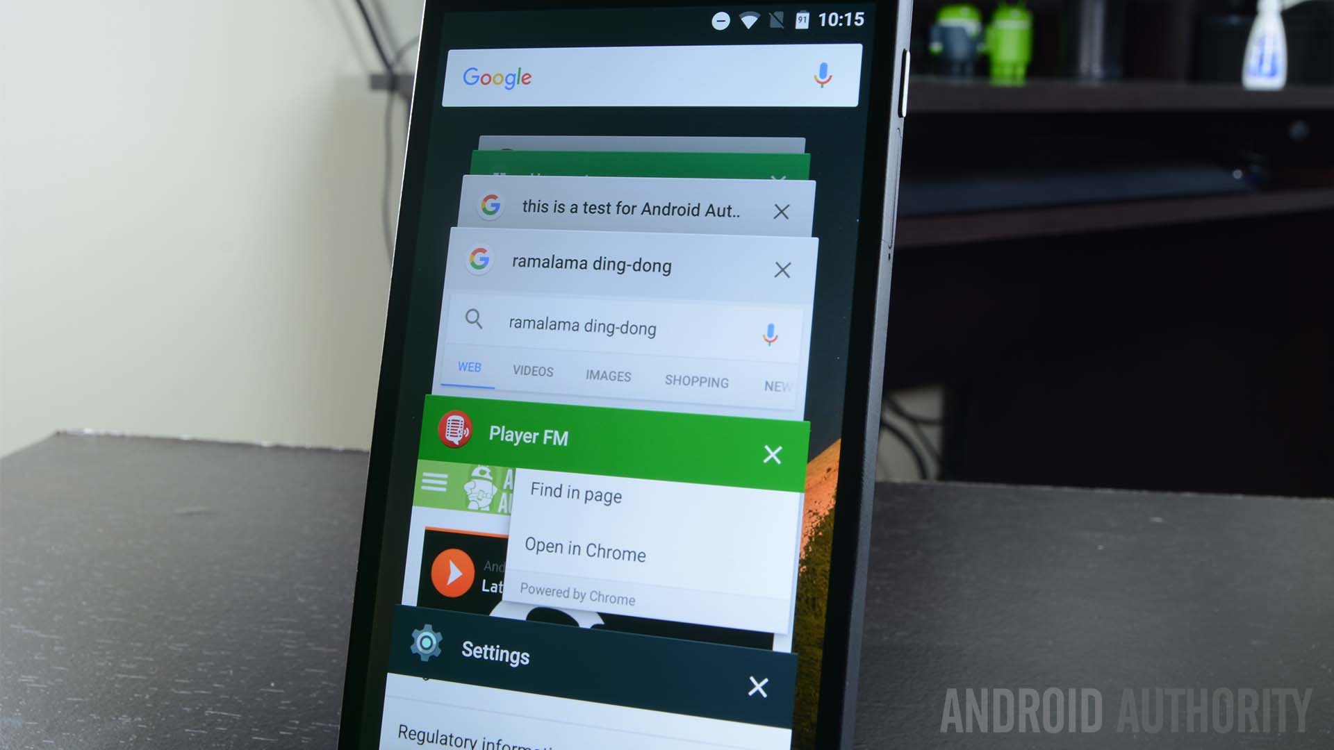
Don’t we all hate those silly in-app browsers we see in apps like Facebook, Twitter and Pinterest? I sure do, which is why I am glad Google introduces Chrome Custom Tabs, a feature not many are making much fanfare over, but will make a huge difference in in-app browsing.
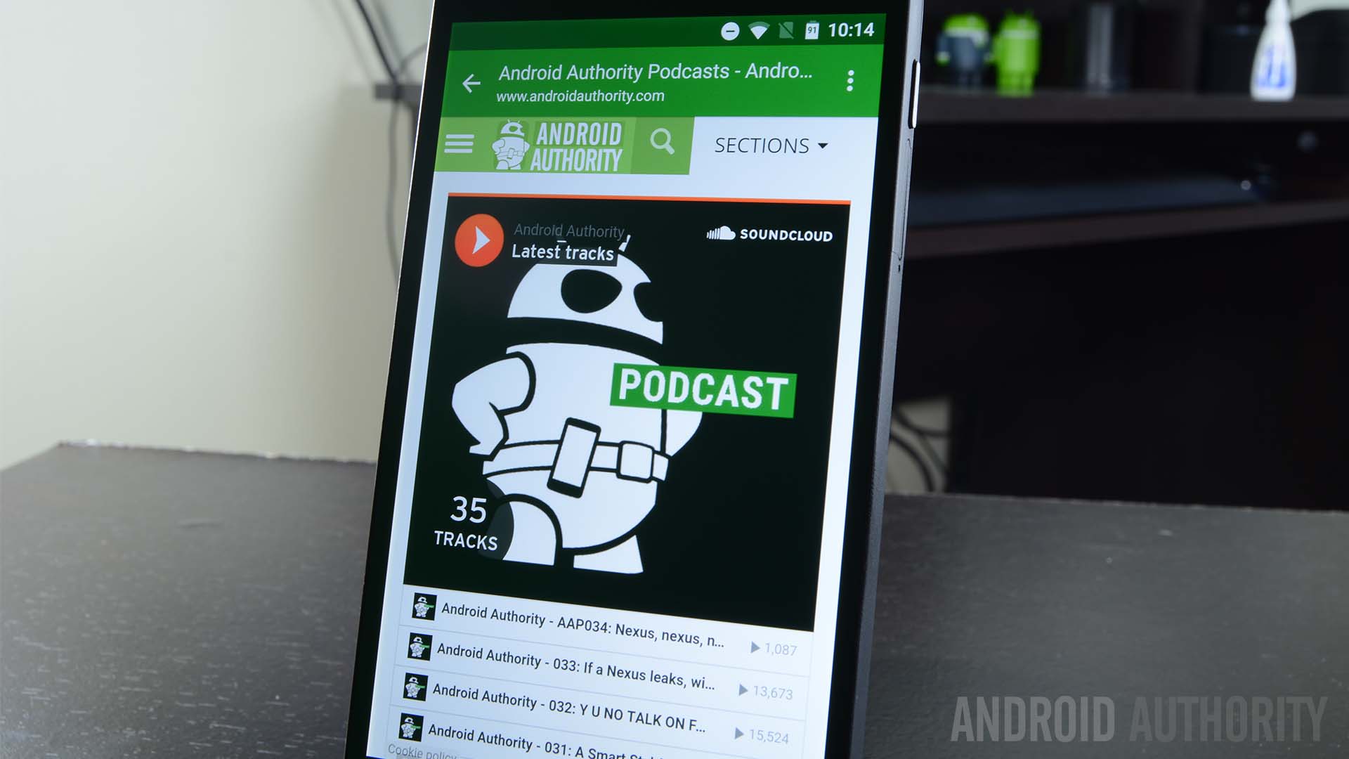
In essence, all Chrome Custom tabs is allow developers to use Chrome as the base for their in-app browsers. They can be customized to their needs, but will have Chrome at the base of all the code. This means you can benefit from things like cookies, log-in history, auto-complete and more.
System UI Tuner
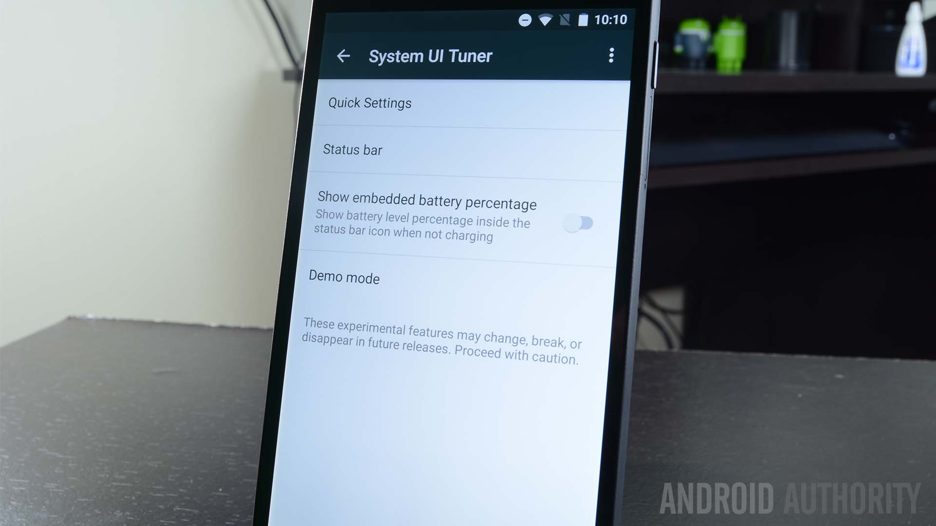
Tweaking the Android UI can be a bit complicated. We have plenty of options to choose from, but their are all buried in their little sections within the Settings app. This is why System UI Tuner proved to be a very helpful feature for those of us who like things a little different.
I like seeing the battery percentage in my status bar, for example. The System UI Tuner allows me to do this with a simple toggle. There’s plenty of other options to choose from, so go play around with it.
RAM memory manager
This one is a bit of a nifty feature for those of you who like keeping an eye on how much resources certain apps use. Google has added a whole new section in the ‘Memory” settings, in which the system shows you how much RAM memory apps have been using it. You can’t really do much else, but at least you will know if apps are going rogue and take the necessary actions.
USB Type-C and USB 3.1 support
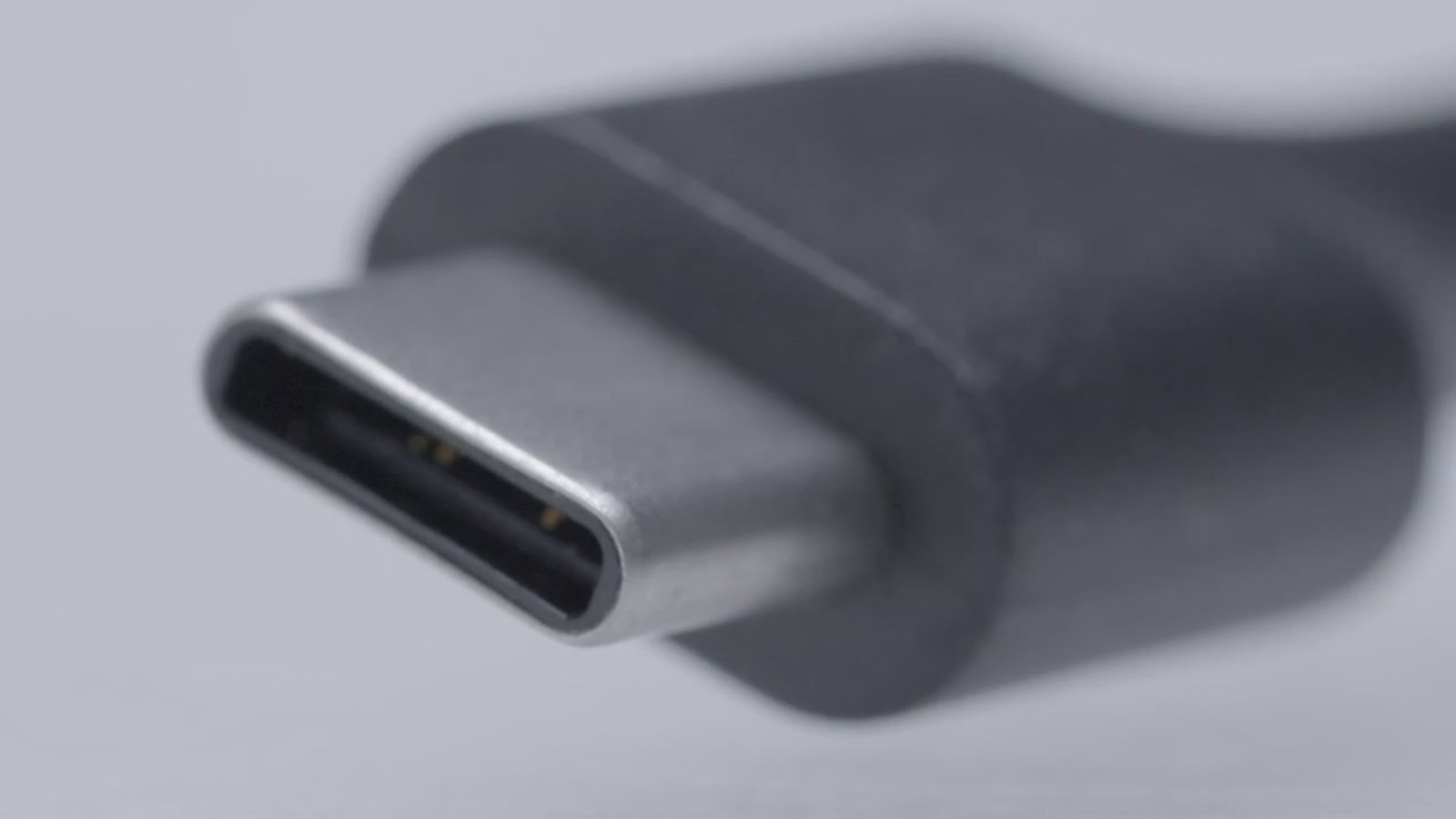
USB has its pros and cons right now, but it’s downsides are mostly due to how new the technology is. Truth is, USB Type C is the future. It allows for all kinds of interaction, such as charging, data transfer, accessory connections and more. All at faster speeds and stronger connections, thanks to USB 3.1.
Oh, and yes, it is reversible. No longer do you have to think about which side is up or down.
Other USB Type C articles:
Delete those screenshots right away
Manufacturers have done something similar, but the stock Android experience hasn’t natively supported the ability to delete screenshots from the notification area. I believe I am not alone when I say plenty of my screenshots are no good, and it’s a hassle to have to go into Google Photos to delete it.
Now you can just go to your notification area and press the ‘Delete’ option. You are done!
The ultimate microSD support
It has been a roller coaster ride with Google when it comes to microSD support. Their main phones don’t even support them, and plenty of manufacturers are following suit with this. Overall, support has been coming and going.
It’s currently hard to find a phone with a microSD slot, but if you do have one, you are in for a treat. Android 6.0 Marshmallow supports what they call “adoptable storage”.
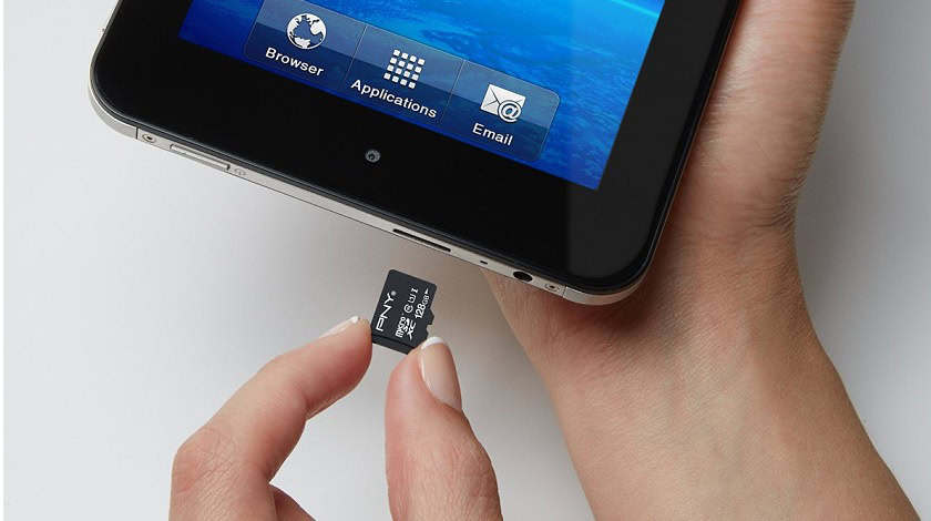
But what does that even mean? In a nutshell, you can insert a microSD card and format it to work with your device alone. This does mean it will no longer work with other devices, but the benefit here is that the storage will be treated as if it was internal. Apps and other content will be installed directly to the card. It will become an extension of your internal storage.
Grab a good deal on a microSD card!
Apps & settings backup
One of the biggest pains about getting a new phone, or factory resetting your current one, is that you have to spend hours setting up all your apps and settings again. Google kills that issue with Android 6.0 Marshmallow, after introducing the ability to backup most of the data in your phone to Google Drive.
This will include settings, WiFi passwords, apps, app data, game progress and more. Pretty freaking awesome, if you ask me!
Google Settings app is now in the actual Settings app
I always thought it was weird that the Google Settings app wasn’t in the… settings. But I am just a common citizen and Google knows better, right? Well, it turns out our concerns were not so wrong. The Google Settings app has been moved to the actual Settings app.
You can access the Google area in the settings to manage Android Pay, connected apps, Google Fit, Google Photos, Smart Lock for Passwords and more.
Direct Share
Direct Share is a new sharing feature enabled in Marshmallow. What it does is remembers who you share things with and in what apps you do your sharing. Over time, it will begin recommending people you can directly share to over the app you generally use to communicate with them. It’s a small thing, but it could save a lot of time if you always share to the same people.

What about Android 6.0.1 Marshmallow?
Yes, there is a new version of Android Marshmallow and it does come with some significant changes For starters, a bunch of new emojis have been added to the system. Tablet users are also enjoying a new button set-up, in which the back and home buttons are pushed to the left, while the recent apps button is on the right side.
In addition, one can now double press the power button to quickly access the camera. There’s also some Do Not Disturb Mode improvements in the form of an automatic way to unmute notifications after your alarm sounds off.
Other Android 6.0.1 Marshmallow content:
- Android 6.0.1 Marshmallow arriving to Nexus devices today, includes new emoji
- Android 6.0.1 Marshmallow adds power button shortcut and next alarm DND mode