Affiliate links on Android Authority may earn us a commission. Learn more.
Android Nougat review: what's new in Android 7.1.2?
With Android O just around the corner, Android Nougat is slowly drawing to a close as the latest and greatest version of Android. But as Nougat steadily creeps towards double digits in terms of Android version distribution, and with Android 7.1.2 now out for a number of devices, we thought it was time to revisit the Android N release.
Nougat may not have delivered the same dramatic visual overhaul we were first treated to in Android Lollipop two versions ago, but Nougat does provide a lot of major improvements and refinements over Marshmallow, along with quite a few arguably more important usability changes. With that in mind, join us as we run through all the major Android 7.x features – both user-facing and behind-the-scenes – in our full Android Nougat review.
What’s new in Android 7.1 Nougat?
For the sake of consistency, we've kept our original Android 7.0 Nougat review intact at the bottom of this post, with a new section above covering what's new in more recent updates. If you just want to know the very latest Android has in store, the top parts are for you, but if you want a complete overview of everything to expect in Nougat when it arrives for your device, skip to the original review below and then join us back up here for the more recent additions.
New Android 7.1.2 features
The latest update for the Pixel and supported Nexus family is Android 7.1.2, originally announced on January 31, which actually brings a bit more than you might expect for an incremental update. The Pixels miss out on the most exciting stuff, mostly because they have it already, gaining just the “powered by Android” logo on the boot splash screen and the March 5 security patch. Google also improved the finger swipe gesture for the Pixels and Bluetooth connectivity issues.
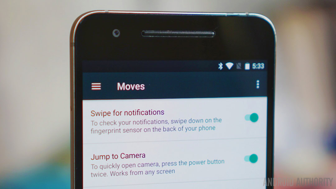
The Nexus 6P, which I’m using with Android 7.1.2 now, gained fingerprint scanner gestures at last, meaning you can now drag down the notifications shade with the rear-mounted finger scanner. It can be found in the Moves section of the Settings menu and is not enabled by default. Neither the Nexus 6 nor Nexus 9 will be updated to 7.1.2.
But the most significant Android 7.1.2 feature change came for the Pixel C, which inherited the Pixel Launcher from the smartphone line and got a whole new multitasking view added as well. The new recents apps overview shows small tiles arranged in a grid pattern as opposed to the more familiar card stack.
You’ll only be able to see eight apps at a time and for now you can’t even swipe them away, but it’s a solid start. The Pixel C also gets the new solid nav buttons found on the Pixel phones and you can simply swipe up on the home screen to open the app drawer.
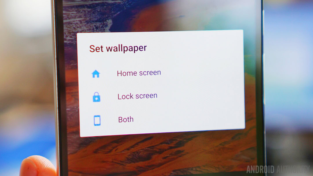
In a slightly weird twist, Android 7.1.2 also allowed some users – but not all – to choose where to install live wallpapers. Non-Pixel devices can install the Wallpapers app to replicate the functionality of the Pixel wallpaper picker, which brings with it a slew of nice new wallpapers and the ability to choose whether a wallpaper should be applied to the home screen, lock screen or both.
New Android 7.1.1 features
Check out the video below for a quick rundown of the new Android 7.1 Nougat features. As above, a distinction needs to be made between the Android 7.1 version found on the Google Pixel phones and the Android 7.1 update that went to Nexus devices. The Nexuses didn’t inherit the Pixel Launcher, although Google Assistant arrived separately at a later date (on February 26 to be precise).
The most significant stuff includes launcher shortcuts, which allow you to long press an icon and access a quick couple of actions, like to shoot a video or take a selfie on the camera app without having to launch the whole app first. Instead of five there’s now six quick toggles in the notifications shade, and if you hold the power button there’s finally a restart option in the power off menu.
There’s a new tabbed view in the Settings menu that replicates that found on the Pixels, with a new Support tab for getting assistance around the clock. Some changes were made to the Settings as well, including the addition of a smart storage manager with both automatic and manual cleanup options and the addition of a Moves section where various gestures and motion detection toggles live. GIF support also arrived in an early stage on the Google Keyboard.
A note on the Android 7.0 review
Anyone that saw the Android N developer previews will no doubt see a lot of familiar Android Nougat features here. The builds are so similar that if you were running Android N dev preview 5, the official OTA for the Android 7.0 update was a tiny 49.5 MB, compared to 1.1 GB if you updated from Marshmallow.
While some of us may have seen large parts of Nougat already, we’ll be approaching this Android 7.0 review from the perspective of a new user – someone who hasn’t “seen it all before”. We want to provide a sweeping overview of Android 7.0 features, but we’ll also draw comparisons to Marshmallow where relevant and provide context with discussion of features that appeared in the pre-release versions of Android N but that didn’t quite make it to the final version.
Nougat in a nutshell
If I had to sum Android Nougat up in a nutshell, I’d say that it’s Android putting its roots down. The general feel of Android has become increasingly stable since Lollipop, with less feature flip flopping, fewer performance issues and a greater focus on polish. Nougat is all about extending functionality, improving pre-existing features and further expanding what’s possible in stock Android.
As you know, Marshmallow largely maintained the overall look of Lollipop but baked in some big new features like Doze Mode, the fingerprint API and granular permissions. One year on and Nougat follows suit, maintaining the home screen and app drawer design of Marshmallow, but digging even deeper, laying the fundamental groundwork for what is yet to come.
There's way more exciting background stuff going on in Nougat than you see on the surface.
There are some new visual features to be sure, with a redesigned Settings menu and notifications area. But there’s also a lot more enhanced functionality and exciting background stuff going on in Nougat than you see on the surface.
HARDER
This section will be devoted almost entirely to Nougat’s multi-tasking and split screen functionality. These are arguably the biggest ticket items in Nougat and the ones that will rightfully garner the most attention – and likely cause the most confusion. That’s because as good as Google’s implementation of multi-window mode and other multi-tasking features in Nougat are, they are a little complicated and bound to leave more than a few people behind.
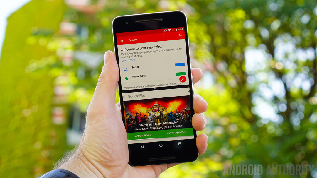
Nougat finally delivers split-screen mode to stock Android, a feature that has been around in manufacturer skins and custom ROMs since forever. Android Nougat’s built-in version is in some ways better than what we’ve seen before, but it can also be a little… over the top. Now, take a deep breath as I walk you through how it all works.
Split-screen works in both portrait and landscape mode, with the two ‘windows’ only being resizable in portrait mode. App developers can set their own minimum app height, but in landscape mode you’re stuck with a 50/50 width split, which actually makes sense.
Split-screen works in both portrait and landscape mode, with the two 'windows' only being resizable in portrait mode.
Split-screen mode can be activated by long-pressing the app overview/recent apps button while in an app proper. It can also be activated by long-pressing an app preview card in the app picker and dragging it to the top of the screen. You can even enable a gesture action so it launches when you swipe up on the overview button. So far, so many options.
That first app will then appear in the top window (or on the left if you’re in landscape mode) and you’ll be able to choose your second app from the app picker which displays automatically. Or, when the app picker is displayed in the secondary window, you can tap Home to launch an app from your home screen or open the app drawer.
Think of it like this: the app up top (or on the left in landscape mode) is the primary app, the other app is secondary and it is the one that can be changed easily. With this in mind, you’ll always want to start multi-window mode with the app you’re less likely to want to change.
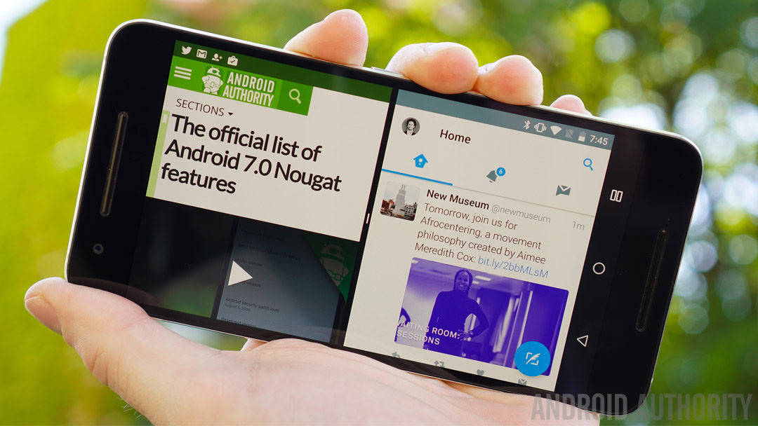
The quick app switching action is possibly my favorite Nougat feature of all.
Quick switching is basically just shuffling between the two most recently used apps. It works system-wide, so you can quick switch whenever you’re in a full-screen app and you can also use it in the secondary window of split-screen mode.
Simply double tap the app overview button and you’ll switch between your two most recent apps in your secondary window. (The same gesture flips between full-screen apps when not in split-screen mode.)
The presence of the quick switching action – possibly my favorite Nougat feature of all – thus means you can triple task in multi-window mode. For example, you can be watching a YouTube video in the top window and quick switch between two social feeds in the bottom. Or you can be composing an email in the top pane while simultaneously switching between a note app and a web page in the bottom window. It’s actually pretty awesome.
Working with split-screen mode
Speaking of writing, multi-window mode is pretty smart when it comes to the keyboard. If you have two evenly-spaced windows up and need to type into one (say, a URL or search term), the windows will automatically resize to accommodate the keyboard and then automatically switch back when the keyboard is off screen again. You can also cleanly drag and drop text between the two windows although this doesn’t work with every app.
Split-screen mode is a mix of intuitive and useful ideas mixed with inconsistency and confusion.
Exiting split-screen mode is quite intuitive also: just drag the black divider all the way up to go full screen with the app on the bottom or drag all the way down for the app on the top. Alternatively, you can long-press the app overview button again and your primary app will go full screen.
Hitting the Home button while in split screen mode pushes your apps off screen but you’ll always know you’ve got split-screen mode activated because your status bar will retain the color of the primary app and the overview button will change to a split-screen icon. Double tapping the overview button will return you to your current split-screen setup while tapping it once will bring back your primary app and replace the secondary app with the app picker.
When split-screen mode gets weird
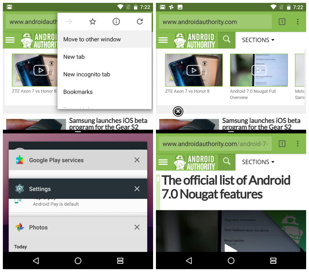
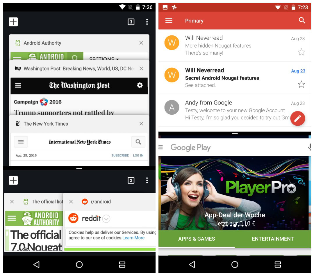
One final comment on multi-window mode might give you an idea of how good, but slightly odd, this Nougat feature is. When you have a Chrome tab open in split screen mode, tapping the overflow button provides a new option called ‘Move to other window’ which will then open a second Chrome tab in the other split screen pane – this is really great.
But, depending on the size of your two split-screen Chrome windows, opening up the tab view will either cascade your tabs vertically or horizontally – and this is just kinda weird. It makes sense, I guess, but it’s definitely strange. Not being able to consistently drag and drop text with all apps, not having all apps support split-screen mode and inconsistencies like this Chrome example (and other bugs I’ve found) show it is still not quite polished.
Google clearly also has a few remaining issues with split-screen content resizing too. Now, the font size and width changes depending on how tall each window is. This is fine. But, for example, opening Gmail first followed by Google Play leaves parts of the Play Store search bar cut off (which you can see in the screenshot below).
Resizing the windows fixes this visual glitch but it’s a bug that should have never made it to the final release, especially after months and months of developer previews. (The some-have-it-some-don’t Night Mode is another example of how Google seems to have slightly run out of time with Nougat.)
The million dollar question
If you’ve managed to follow me this far you’ve probably got a pretty good idea of just how useful split-screen mode can be if only you take the time to actually learn how to use it (there are no pop-up tutorials or anything for the feature). The question is though: will it actually catch on?
Unfortunately, the vast majority simply won't ever take the time to figure split-screen mode out properly.
Unfortunately for Google, the vast majority of Android users simply won’t ever take the time to figure it all out. Furthermore, the usefulness of split-screen mode on a 5.5-inch smartphone display is debatable and dwindling tablet usage means Nougat’s split-screen mode may never get as much use as it rightfully deserves. If you are rocking a tablet with Nougat though, you’re in for a treat.
BETTER
Not everything in Nougat is so convoluted though. Some features are plain, simple and intuitive. From new feature additions to tweaks on Marshmallow staples, Nougat does a lot of things better than its predecessor.
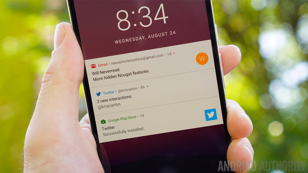
The notifications area in Nougat has received a slight makeover, doing away with the Google Now-esque cards from Marshmallow and going super flat and full-width. You get more information and less wasted space in them too, which is exactly what you want from a notification. Likewise, bundled notifications and Quick Reply are so obvious and so useful it’s surprising they haven’t appeared in stock Android until now.
Bundled notifications and Quick Reply are so obvious and so useful it's surprising they haven't appeared until now.
There are basically three views to Nougat notifications: the super-compact lock screen view, the slightly-more-information notifications shade view, and the expanded view with ‘quick actions’, which you access by swiping down on a notification or by tapping the top part of the notification itself. Quick actions are what I’m calling Nougat’s sexy new Quick Reply feature and other similar functions.
But quick actions go beyond just replying: you can also share, delete, archive and more directly from a notification. These actions make Nougat’s notifications area a much more active and responsive place. But again, not all apps support this functionality yet either.
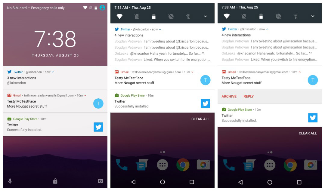
You can still swipe to dismiss notifications and tell Android how much notification information to display on the lock screen in the Notifications area of the Settings (Sounds also has its own dedicated section in Nougat). But you can also long-press a notification to access its priority settings or swipe it a little to the side and tap the gear icon to access your options.
You can choose to show notifications silently, block all notifications or don't silence or block.
The choices are simple: show notifications silently; block all notifications; don’t silence or block. You can also enter the full app settings page where you have even more control, including whitelisting the app to notify you even when Do Not Disturb mode is on (but more on that later).
Multiple notifications from the same app will now get bundled together too, saving more space and allowing you to dismiss them en masse or expand them for individual attention.
For those of you that preferred the ‘sliding scale’ for setting the importance of app notifications from the developer previews, you can easily enable it in System UI Tuner via Power notification controls.
To add System UI Tuner to your Settings menu, just tap and hold the gear icon in the Quick Settings until it spins and your device vibrates. You’ll now find it at the bottom of the Settings menu. System UI Tuner also contains the toggle for the split-screen swipe-up gesture and toggles for which icons are visible in the status bar. You also find some Do Not Disturb options there.
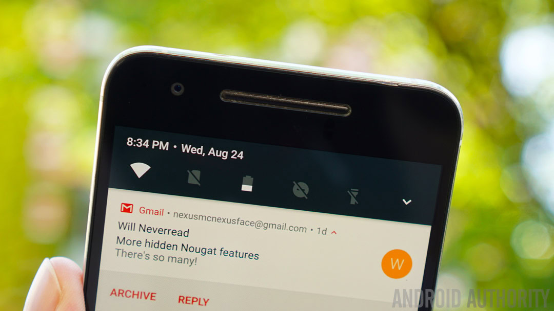
Quick Settings in Nougat have also been updated. For starters, you’ll now always have a handy list of five toggles at the top of your notifications shade. You can edit the order of this list to make sure only the most important shortcuts for you are present. The small arrow on the right hand side will take you to the full Quick Settings page, which you can also access with the familiar two-finger swipe-down gesture from the top of the screen.
Nougat introduces a handy list of five toggles that are always present at the top of your notifications shade.
You can now have multiple pages of tiles too. Some of them instantly toggle a setting on or off, like the flashlight, Do Not Disturb mode and Location. Other tiles, like Bluetooth and Wi-Fi, can be tapped to access a mini menu right in the Quick Settings.
The ability to turn Bluetooth and Wi-Fi off must now be done from the mini-menu, even after the uproar about removing the tap-to-toggle functionality in the developer previews. Fortunately though, you can toggle Wi-Fi and Bluetooth on or off via the ever-present Quick Settings toggles at the top of the notifications shade. Long-pressing a tile will take you to its full Settings menu screen.
In the full Quick Settings list you can also tap the Edit button at the bottom right to rearrange the tiles or replace them with others. The optional extras list is pretty minimal: just Cast, Data Saver, Invert colors and Hotspot. But developers are now able to create custom Quick Settings tiles for their apps, which will definitely make things a lot more interesting in the coming months.
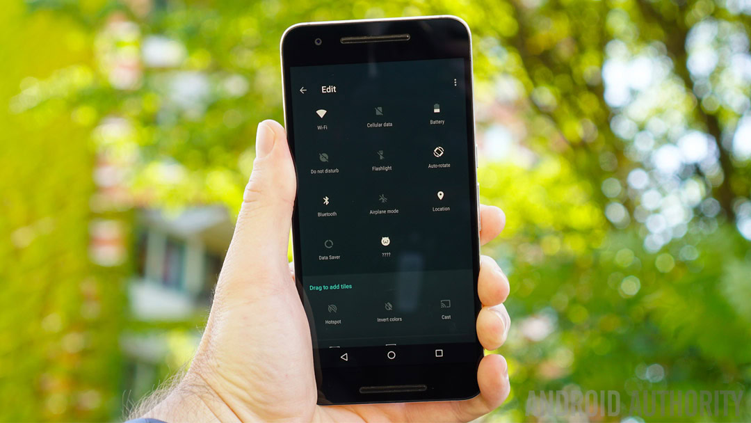
Some of you might remember how happy I was when the battery shortcut appeared in the developer previews, which meant a long-press on the battery icon would instantly take you to the full battery section in Settings. That’s here and I’m happy. But that’s not the most exciting battery feature in Nougat by a long shot.
Doze Mode now works not only when the device is stationary for a while but also when it is in motion.
Doze Mode has now been beefed up to work not only when the device is stationary for a while but also when it is in motion. Your screen needs to be off, obviously, but you’ll now get to enjoy varying degrees of Doze whenever your phone isn’t being used. It’s a little too early to say just how much better Doze is in Nougat, but the expanded functionality alone is appreciated.
The new two-layer system essentially means that a phone left in your pocket or bag while you’re on the move will shut down network access and only periodically sync data and run tasks. When a device is completely stationary for a while, it will slip into an even deeper hibernation, with no syncing, deferred jobs, no wakelocks and no GPS or Wi-Fi scanning. In this mode, the maintenance windows are even further spread out.
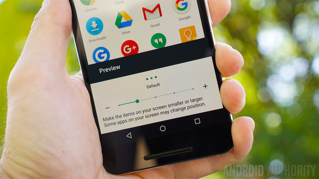
Nougat now lets you set multiple locales as well as a primary and secondary language – and switch easily between them – which is obviously a huge deal for bi-lingual Android users and frequent travelers. You also have full control over how much information is displayed on-screen with the addition of a simple DPI changer in the Display settings.
Slide to the left to fit more stuff on screen and to the right to make everything bigger. This is another simple but excellent feature to have in stock Android, previously requiring an edit to the device’s build.prop file. It’ll come in extra-handy on big-screen phones and tablets.
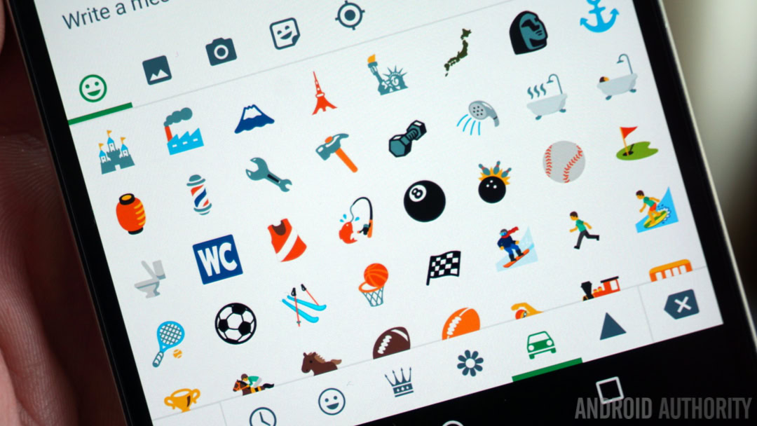
There's 72 new emoji in Nougat including various skin tones and over 1500 emoji total.
You can still pin apps to your screen (great for when temporarily sharing your phone with someone), define which apps open particular types of links (now known as Opening links in the Apps section of the Settings menu), and manage individual app permissions as you could with Marshmallow.
FASTER
Android Nougat isn’t just about making things better or more complex though. A lot of work has been put into speeding Android up, a far greater project you can see Google-wide, from Chrome optimization and Accelerated Mobile Pages to Google Fiber and the Wing drone delivery project.
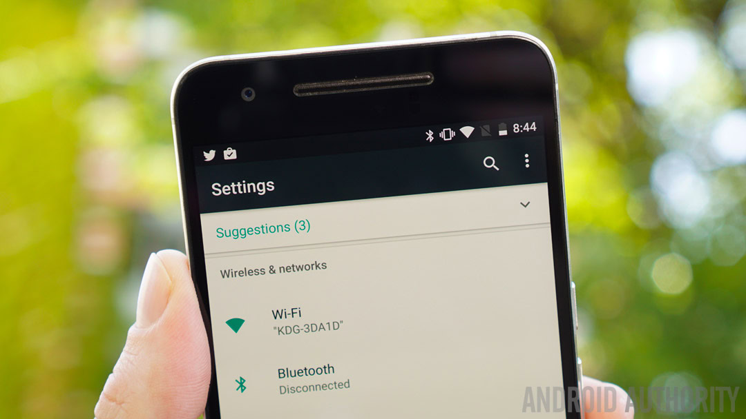
The Settings menu has been reconfigured in Android 7.0, with the two primary changes being the addition of a hamburger menu on the left and the presence of high-order information under each Settings section title. The first of these is going to be very familiar: it’s the same mechanism you’re used to for accessing Google Now and the navigation drawer in many Google apps.
Although you can access it anytime, once you’re in a sub-menu in Settings you’ll see the hamburger menu icon at the top left, which replaces the need for the back button. Tap it (or swipe from the left edge) and you can jump to any other part of the Settings menu instantly without having to repeatedly tap the back arrow.
Even when you can’t see the icon, like in the Advanced Wi-Fi Settings or on the main Settings page, you can still swipe it out. It’s a handy ‘quick escape’ feature even if it’s not likely to be used by many people. Like a lot of new features in Android 7.0 you can use it if you want to, but if not, you won’t even notice it’s there.
The essential information contained in each Settings section is now displayed on the main page.
The best part of the new Settings menu though is that the essential information contained in each Settings section is now displayed right there on the main page. You’ll instantly know which Wi-Fi network or Bluetooth device you’re connected to, how many apps you have installed, how much storage you’ve used and how much longer your battery is expected to last. It’s a small addition perhaps, but another massive time saver.
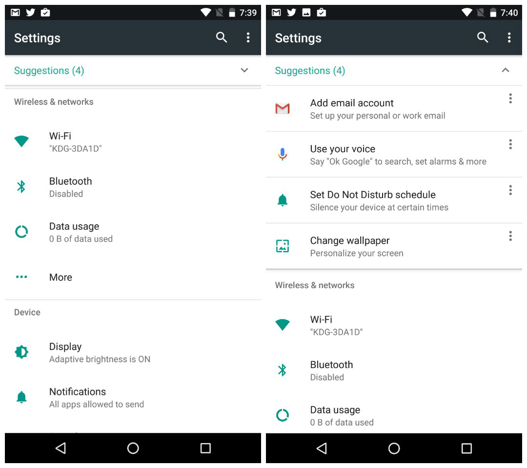
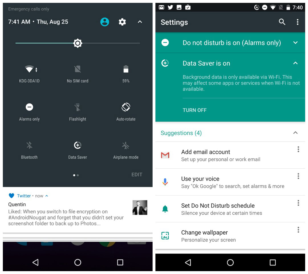
When you’ve got Do Not Disturb mode (or several other settings like Flight Mode) enabled, you’ll also see a persistent reminder at the top of your Settings menu where you can also turn it off. The built-in file manager – found in Storage > Explore – has been slightly rejigged too, using a tiled layout now instead of the list view you got in Marshmallow.
In Nougat, when you go to the App Info page for apps you’ve installed yourself you’ll now be able to see whether they came from Google Play or were side-loaded. This probably won’t matter to most folks, but it will help if you’re wondering why an app hasn’t been updated recently or if you’re troubleshooting something.
Sounds and Notifications now have their own dedicated Settings areas and you can set your phone to Total Silence via the Do Not Disturb toggle in Quick Settings (but not via the volume button).
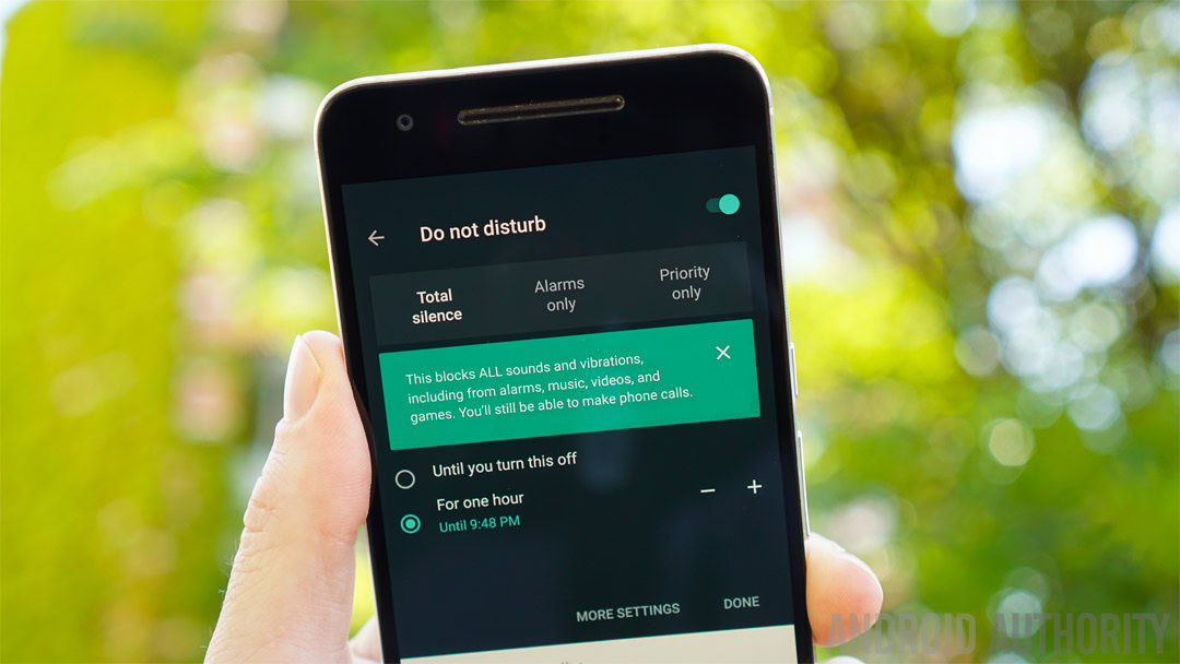
Do Not Disturb has been one of the most complicated implementations of any Android feature in recent memory. If nothing else, continued exposure to it means the basic idea has probably slowly started to sink in by now though. If you can wrap your head around it, it can actually save you a lot of time and effort when you don’t want to be interrupted.
Do Not Disturb settings allow you to choose from Total Silence, Alarms Only and Priority Only for a short period of time or indefinitely, as well as set exceptions.
The Do Not Disturb settings allow you to choose from Total Silence, Alarms Only and Priority Only. You can set exceptions for Priority Only mode to allow certain notifications in, enable Do Not Disturb mode for a set period of time or indefinitely, create automatic rules for the weekend, evenings or work hours and also block visual disturbances like LED notifications or on-screen pop-ups.
Data Saver is not exactly rocket-science, but it does put the tools in your hands rather than in those of app developers. Data Saver basically lets you deny internet access to background apps when you’re connected to cellular data. You’ll also get a large reminder at the top of the Settings menu when Data Saver is enabled to remind you it’s active.
Data Saver denies internet access to background apps when you're connected to cellular data.
Enabling Data Saver – which is accessible both as a Quick Settings toggle or via the Data area in Settings – will limit background syncing to when you’re connected to Wi-Fi. Of course, you can whitelist any apps you want to have unrestricted network access (like email or WhatsApp) even when Data Saver is switched on.
Speaking of updates, Android Nougat is also introducing the concept of seamless updates, which essentially means new Android updates will be downloaded in the background and stored on a different system partition. It’s the same approach to upgrading that Chromebooks take.
The 2016 Nexuses will be the first devices to receive Nougat's seamless updates.
Once an update has been downloaded in the background, the next time you restart your phone, the system will switch partitions and you’ll instantly have the new Android updates without having to go through the usual download, reboot and install process.
Unfortunately, the 2016 Nexuses will be the first devices to receive these seamless updates though. That means you won’t get them on any current device, including the Nexus 6P and Nexus 5X.
[related_videos title=”LATEST NEXUS VIDEOS” align=”center” type=”custom” videos=”707847,688299,651385,651264″]
For those of you on the Android N beta program, you might want to stay on it even now that Nougat is officially out. Google has announced that regular Maintenance Release (MR) updates will be rolling out in pre-release form to those on the beta program. The pre-release MRs will bring “continued refinements and polish,” but also deliver bug fixes and feature tweaks before everyone else gets them.
As with all beta releases though, these might also be less stable than the regular updates everyone else will get. If you’re the type that simply must have the latest and greatest as soon as possible and are willing to suffer the occasional bug to get them, then the beta program is for you. Everyone else can just sit tight and wait for the regular public releases to roll out.
Camera shortcuts
The update to the Google Camera that comes with Nougat on Nexus devices also adds a new twist gesture to switch between front and back cameras. Unlike on Moto devices, it can’t be used to launch the camera so it only works when the camera app is already open.
Fortunately, the outstandingly handy power button shortcut returns, so all you need to do to instantly launch the camera is double press the power button. You may need to enable this feature in the Display settings first though.
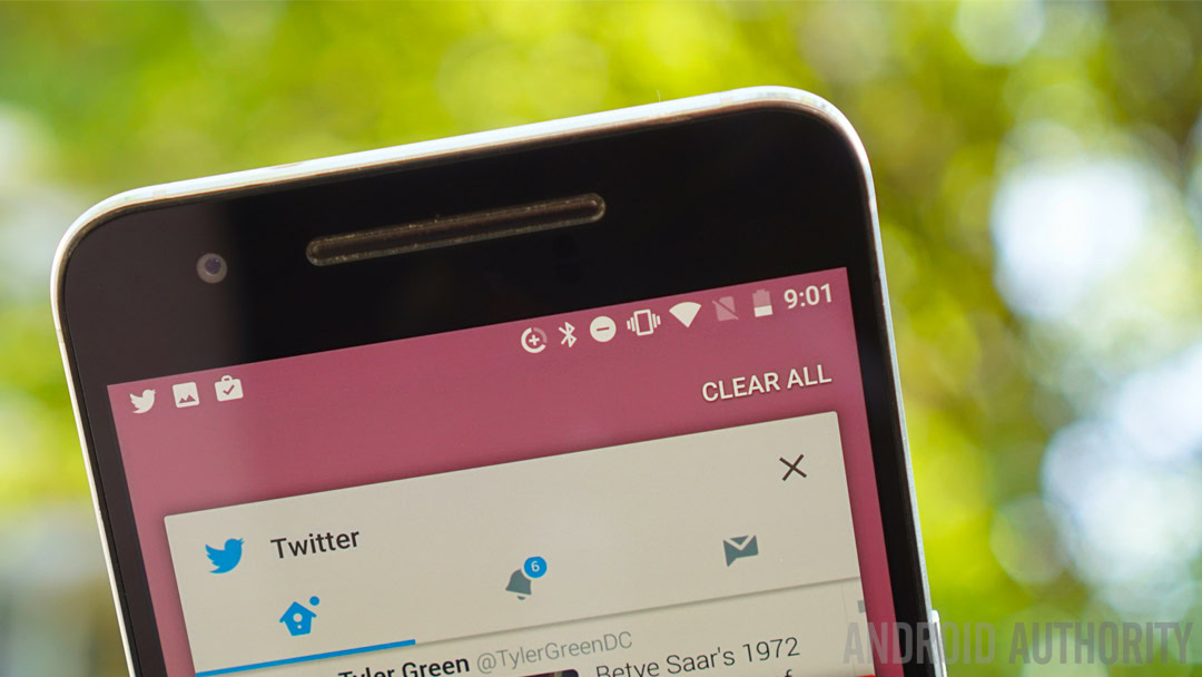
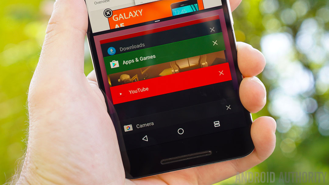
The recent apps menu, or app overview, or multitasking menu or whatever you want to call it, has also been slightly modified in Android 7.0. Cards are now larger and there’s fewer of them, meaning the potentially endless list we had in Marshmallow has been trimmed down to something a little more realistic. The Android system itself can now remove long-unused apps from the list.
A handy Clear all button has been added to the very top of your card stack so you can clear up the clutter and tell Nougat that it can close any associated app processes. If you use it on the regular, it will also make switching between your most recent apps a much easier-to-navigate affair.
These changes, along with other time savers like the Quick Settings mini-toggles, camera shortcuts and the quick app switching feature really start to add up.
Time savers like the Quick Settings mini-toggles, camera shortcuts and the quick app switching feature really start to add up.
Nougat officially adds support for the Vulkan API, which promises faster, smoother and better rendered gaming graphics. I won’t go into details because we’ve covered Vulkan elsewhere in greater detail, just know that it comes from the same folks responsible for OpenGL and that OpenGL remains in Nougat.
Game developers can simply choose from the higher performance and complexity of Vulkan or stick with the easier-to-implement but less intense OpenGL standard. It’s a win-win for gamers and developers alike, even if Vulkan will take a while to spread.
Nougat also supports Java 8. Java 8 really only applies to developers, so I won’t do a hatchet job here trying to explain why it’s a good thing. Sleep well knowing it allows developers to do better things with code though. Finally, Nougat makes the move from Java APIs to an OpenJDK-based approach, which maybe doesn’t matter so much considering Google just beat Oracle in court.
You know how on Lollipop and Marshmallow when you rebooted you’d have to wait ages while the system ‘optimized apps?’ That’s because back in Lollipop, Android made the switch from the Dalvik virtual machine to the Android Runtime (ART) which compiles apps ahead-of-time. While this meant apps launched faster once you were booted, rebooting itself took forever because all your apps had to be compiled first.
JIT means a faster booting phone and apps that use less RAM, require less storage and get updated faster.
Android 7.0 switches things up a little, re-introducing just-in-time (JIT) compilation to ART’s repertoire. In simple terms, this means the Android system will pre-compile some apps but only compile parts of other apps when they are actually required. The result is a faster booting phone, apps that use less RAM, require less storage and get updated faster. Not bad, huh?
STRONGER
No Android update would be complete without security improvements either. Android 7.0 has a lot of stuff going on, from hardening the media stack so as to deny future Stagefright-style media library privilege escalations, to simply letting you know from where an app was installed. But Nougat also has a few safety-minded features as well as serious security advancements.
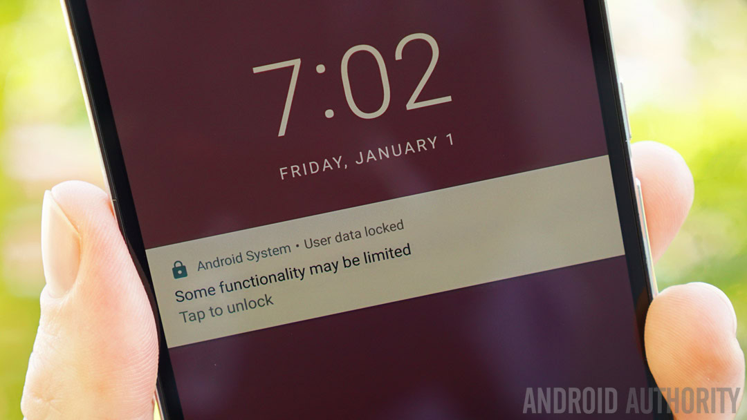
Direct Boot in Android Nougat aims to take that limbo stage between booting up and decrypting your device and make it a little more useful. Imagine your phone randomly reboots without you knowing and you then miss an alarm and several important notifications? Well, Nougat will now boot all the way to the lock screen before requiring a PIN or pattern unlock to decrypt, allowing select information to still be delivered to an encrypted device.
Direct Boot means you’ll still be able to receive incoming calls, get notifications, hear alarms and see new emails while your private information remains secure. You just have to wait for developers to add Direct Boot support to their apps and hopefully not abuse the privilege. Direct Boot will never get a pat on the head in the same way as split-screen mode will, but it’s arguably more useful for the average person.
Direct Boot means you'll still be able to receive incoming calls, get notifications and hear alarms while your private information remains secure.
I know, these topics are getting less and less sexy as we go on, but it’s important stuff, so stick with me, OK? Encryption is a really big deal. If the San Bernardino iPhone case didn’t already make you aware of that, Google wants to make sure Android Nougat does.
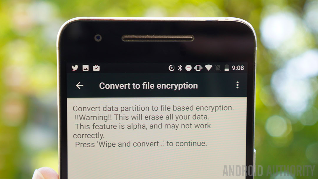
Suffice it to say that Android 7.0 moves to a file encryption basis as opposed to Marshmallow’s full disk encryption system. This means there is now a clear distinction between device-encrypted content (like generic system data) and file-encrypted content (like app and user data). What this means for you is that your personal stuff is better protected while boring system stuff can be made more useful.
Android 7.0 moves to a file encryption basis from full disk encryption in Marshmallow.
As an example, Direct Boot accesses device-encrypted data that allows it to boot all the way to the lock screen. But device-encrypted data can also include explicitly registered app data like incoming notifications and calls. Everything else is safely encrypted at the file level, further securing your data.
The new Nexuses will support file encryption and Direct Boot automatically, but everyone else will have to enable Developer options and select Convert to file encryption, which will wipe your data in the process. You will now see a lock screen system notification on Direct Boot that reads ‘Some functionality may be limited’.
Android 7.0 features an advanced number blocking and call screening platform that provides users with complete control over unwanted callers and unknown numbers. Carrier integration also means numbers you’ve blocked through the dialer can be blocked via all mediums, including VOIP and call forwarding. Number blocking can also block texts and allow multiple apps to use the blocked numbers list for more system-wide blocking support.
Additionally, Nougat adds fine-grained control over what folders installed apps can access. Before, you kind of granted apps access to everything, but now you can limit their access to files in much the same way as you can manage their permissions. ‘Scoped directory access’ allows app developers to specifically request access to individual folders rather than all of your folders – another win-win.
Similarly, in the Special access part of the Apps section settings, you can tap through a multitude of restricted areas like Modify system settings, Draw over other apps, Premium SMS access and Unrestricted data access to see which apps have requested access and toggle that access on or off. This is just one of the many user-facing controls in Android 7.0.

Android Nougat can add emergency information to your lock screen. Simply go to Settings > Users > Emergency information to add the kinds of data you’d want any first responders knowing, like your blood type, name and address and any allergies. Keep in mind though that this information will also be visible to anyone that happens to pick up or steal your phone.
With Nougat, even simple things like app backups are improved because they now cover app permissions, network access settings, restrictions and accessibility settings. Accessibility on Android 7.0 has been stepped up too, with Accessibility settings being available during device setup, an obvious plus for anyone needing those features front and center. Variable text-to-speech speed and mono output for those with single-ear hearing loss are great additions, as is the DPI slider for resizing on-screen content.
To round out the I-can’t-believe-you-made-it-this-far section, Android 7.0 adds quite a few new features for Android for Work. From an always-on VPN to a Work Mode setting that lets you block work-related notifications once you’ve clocked off for the day.
You’ll obviously need a device with an Android for Work profile set up on it, but if you do, you’ll be able to enjoy fun stuff like ready access to the company directory and additional security features for work-related apps that won’t affect the rest of the device. Woohoo.
OTHER FEATURES
In the leftover pile we have an assortment of stuff, from Allo and Daydream to Night Mode and VR. To run through them quickly, Google Assistant won’t appear until the new Nexuses arrive with Allo on board (we’re not even sure we’ll see Allo released as a standalone app before then).
While Nougat officially supports both Daydream VR and Project Tango, that won’t really matter until we start seeing Nougat appear on Daydream-ready devices and the Tango phone. Various mentions of VR mode already exist, but they don’t do much yet. We also don’t have any Daydream headsets for the Nexus 6P either, assuming it will indeed support full blown Daydream VR.
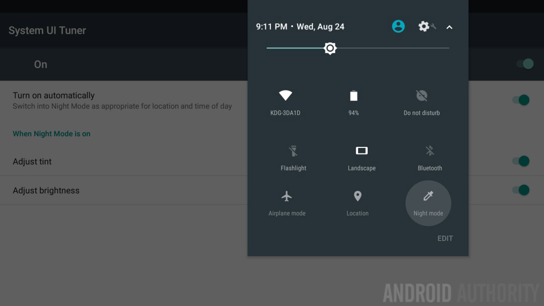
Android’s blue-light filtering Night Mode is another weird one. A piece of leftover code from the first developer preview meant Night Mode stuck around in the previews as long as you kept accepting the OTA updates and didn’t flash a new factory image.
Strangely, Night Mode, which was removed in the developer previews, still appears for some people in the final build of Nougat.
Oddly, Night Mode still appears for some people in the final build of Nougat, although its functionality seems to be a little wonky depending on who’s using it. A new app has appeared to bring it back fully (as all the relevant code remains in Nougat), but again, even that’s not working for everyone. Hopefully Google will fix those performance issues and bring it back officially in the next MR update.
Finally, there are a couple of new features in Developer options that are actually pretty useful to regular folks if you’re willing to risk breaking things in order to make use of them. You can now tell Android to allow an app to be moved to the SD card even if the app’s manifest values say it can’t be.
Furthermore, you can tell the system to force any app to appear in split-screen mode, even if it hasn’t been designed to do so. Of course, the Google Camera – the most obvious non-split-screen-friendly app of them all – is somehow exempted from this kind of coercion.
- Don’t miss: Android 7.1 is already in the works
WRAP UP
If you’ve made it this far then you’ll be painfully aware of just how few sexy and exciting “general audience” features Android Nougat has and just how many boring but ultimately more-useful-for-everyone nerd-features it packs in instead. There is a lot of customization potential in stock Android now, more than there has ever been before, but it is perhaps wisely kept out of mainstream view.
Nougat adds some great features, the kind of stuff we used to have to turn to custom ROMs, manufacturer skins or third-party apps to get. But most of these will only really ever be used by advanced users – either because they are too complicated for the ‘average user’ or because most people will never even realize they even exist.
This is perhaps, the best way to sum up Android 7.0 Nougat. It’s an Android version for Android fans. It does the basics well and without much fuss for everyone, but for those of us willing to dig around or with an eye on the future, there’s plenty to keep us busy. It’s remarkably stable with only a few inconsistencies and bugs: certainly the fewest I’ve ever seen on a new Android version.
But while it may be harder, better, faster, stronger for the Nexus master race, for the vast majority of Android users, the most important Nougat feature will be how well it works if or when they ever actually get it on their device.
When do you expect to see Nougat? What is the one feature it misses out on?