Affiliate links on Android Authority may earn us a commission. Learn more.
The many flavors of Android: A look at the major Android skins
Published onMarch 15, 2024

If you were to look at a Samsung smartphone and a OnePlus smartphone, you’d think they would have the same software, right? After all, they’re both Android phones. However, a glance at both will show that they look very different. That’s because they both have custom variants of Android, which are known as Android skins.
Android skins are software tweaks that live on top of stock Android. They often look very different and offer features that other skins don’t.
In other words, underneath all the additional design and functionality tweaks, the core version of Android is on all Android devices. To add some brand identity, though, some manufacturers craft an experience that’s truly unique to their lines of phones. Others leave well enough alone and barely touch how Android functions.
Below, we’ve rounded up the major Android skins available on the market. If you’re shopping for an Android phone for the first time, this will be a great resource to help in your decision.
Editor’s note: This article is updated as of March 2024. We will update it as new manufacturers come along as well as when current OEMs update their products.
Stock Android
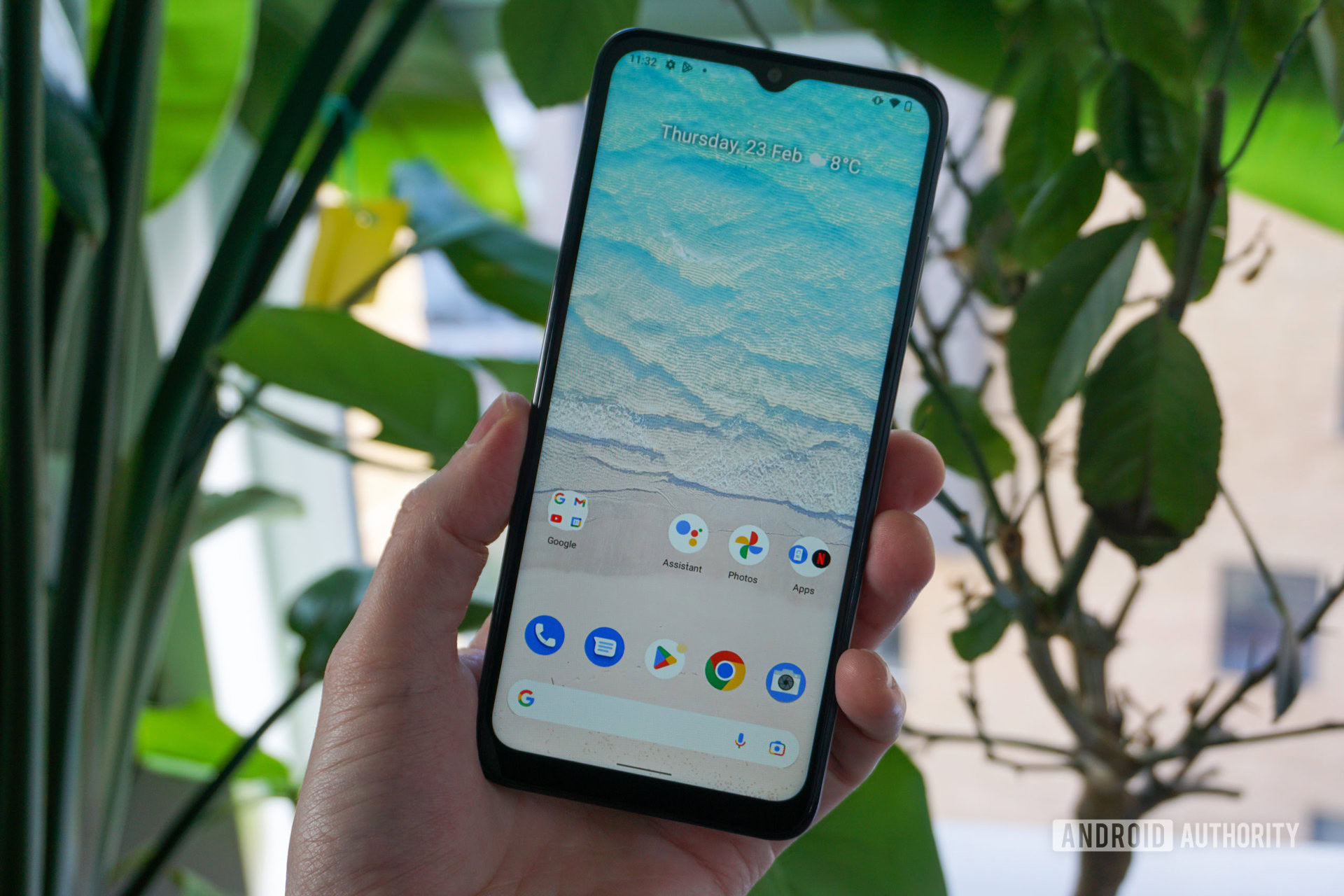
When people refer to “stock” Android, they’re usually referring to the core version launched in the Android Open-Source Project (AOSP). This is the baseline level of Android that Google creates and supports. Android skins are then built on top of this. However, some phones come with stock Android with no or very little skinning.
As of now, Nokia-branded phones from HMD Global are the most prominent devices that feature a very close-to-stock experience. In the past, Google’s Nexus line came with stock Android, and Google Play Editions of popular third-party phones also came with stock. This practice doesn’t happen much anymore. These days, if you want a phone with a true version of stock Android, you usually need to remove the pre-installed software and then put in stock Android yourself.
How it compares: Stock Android is what lies beneath any Android skin. The closer the device is to running stock, the more “raw” the experience will be. Unfortunately, that does come at the expense of unique features and gimmicks.
Stock Android breakdown
- Updates: Usually gets the latest versions of Android very quickly.
- Best for: Minimal bloat, security.
- Worst for: Originality and exciting new features.
- Most interesting features: All the features you consider standard in an Android phone are stock features. Examples include the app drawer, basic Android settings, notifications, etc.
Google Pixel UI
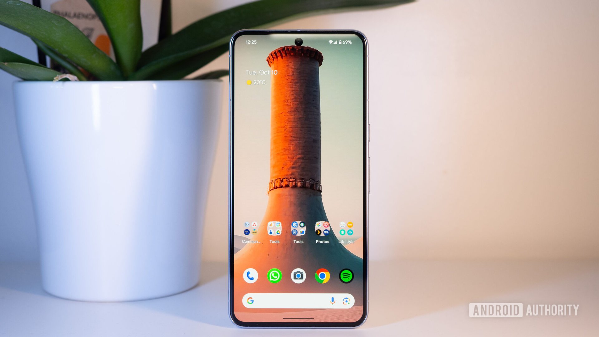
A lot of people might think Google’s Pixel phones come with stock Android. However, that’s not totally true. Google’s line of Nexus phones came with stock Android, which is why most people tend to assume Pixel phones do as well.
Today, Pixel phones come with an Android skin colloquially known as Pixel UI. This is a version of Android that looks a lot like stock but incorporates a multitude of non-stock features and design tweaks.
Pixel phones come with exclusive software features, known as Pixel Feature Drops, that you can’t find anywhere else. Some of these eventually become available on other Android devices, but some will only ever work on Pixel phones. Likewise, there are design elements of Pixel phones that don’t make it to other Android devices.
How it compares: Pixel UI looks and feels much like stock Android. If you’re looking for a bloat-free version of Android that doesn’t drastically change the way Android naturally feels, Pixel UI should be one of your top choices of Android skins. However, it will still be missing a lot of interesting features other “heavier” skins provide, such as Samsung’s One UI or OPPO’s Color OS.
Pixel UI breakdown
- Updates: Google pushes updates faster than nearly all other smartphone manufacturers.
- Best for: Minimal bloat, security, AI-based features.
- Worst for: Originality, risk-taking features, power users.
- Most interesting features: Google Assistant-based features are the best part of Pixel UI. Call Screen, Hold For Me, Magic Eraser, and other AI-based smarts are useful and usually exclusive to Pixel devices.
Samsung One UI
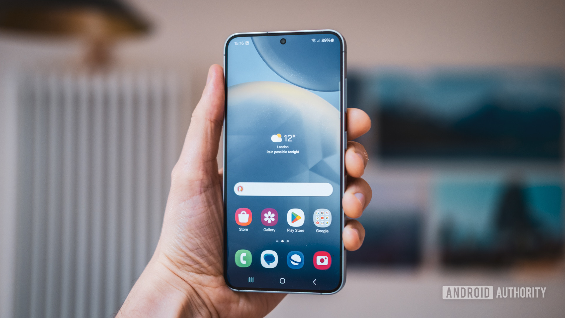
Samsung is the world’s most popular smartphone manufacturer. Therefore, it’s reasonable to assume that most people reading this own a Samsung phone. If you do and the phone is relatively recent, you’re already familiar with One UI.
One UI is one of the heaviest Android skins. By that, we mean it adds many more features and makes more tweaks to Android’s design than some other skins. This can be a real draw for power users who appreciate how much control they have over their smartphone experience. However, people who aren’t power users may find the experience to be a bit chaotic. They also might never use (or even know about) half the features available, including the new Galaxy AI features that debuted with the Galaxy S24 series.
Regardless, One UI has helped Samsung remain the number one smartphone manufacturer. It’s probably the most well-known version of Android around the world.
How it compares: One UI looks drastically different from other Android skins as well as stock Android. Samsung brings playfulness to the design. It also pre-installs a lot of its own applications, which some people don’t appreciate. However, many of the features offered with One UI blow competitors out of the water. In fact, Google sometimes cribs ideas from One UI for future stock Android releases.
One UI breakdown
- Updates: Samsung is the best for Android updates, even trumping Google in some cases.
- Best for: Fast updates, lengthy support, power users, customization.
- Worst for: A bloat-free experience, a stock feel, minimalists.
- Most interesting features: Samsung has a robust theming system that allows you to completely customize the way your phone looks. Samsung is also bringing its fledgling AI features to its flagship devices.
Xiaomi MIUI
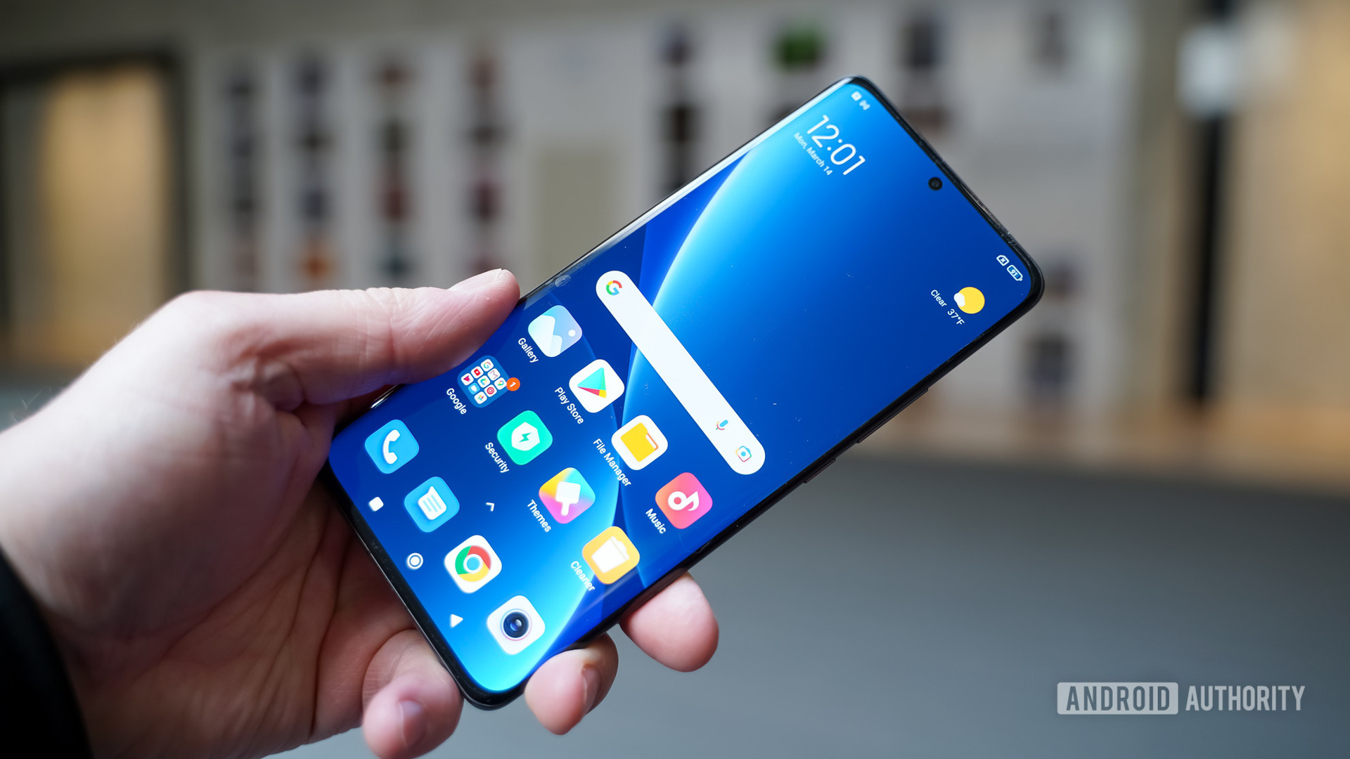
When Xiaomi’s MIUI first launched, it was clear the company was trying to emulate Apple’s iOS. For example, the company removed the app drawer, and various design elements cribbed heavily from iOS. This made the original iterations of MIUI almost like an Apple-fied version of Android.
Recently, though, Xiaomi has moved away from this and tried to find more of its own identity. The app drawer is back (although sometimes not by default), and things don’t scream “iOS” as much as they used to.
Additionally, MIUI now offers many incredible features you can’t get with stock Android. Like Samsung’s One UI and other heavy Android skins, there are some things you can do with a Xiaomi phone you just can’t do with others.
Do note that MIUI also appears on some sub-brands from Xiaomi, including Redmi and POCO. The company is also phasing out MIUI in 2024 in favor of Hyper OS — its new take on Android debuting on the Xiaomi 14.
How it compares: MIUI is similar to One UI in that it offers a lot of unique features and designs. It also comes pre-installed with many apps you may or may not want. It’s important to note as well that Xiaomi considers itself a data company, not a hardware company. As such, you can always expect more data collection, ads, and software partnerships with Xiaomi phones.
MIUI breakdown
- Updates: Xiaomi doesn’t have a great history of updating its phones quickly.
- Best for: Unique features, an experience different from stock, customization.
- Worst for: Stability, privacy, an ad-free experience, a stock feel.
- Most interesting features: MIUI has a feature called Control Center that’s essentially a carbon copy of Apple’s feature of the same name. It augments the notification shade to offer a one-stop shop for all the toggles and information you need. It also has an Ultra Battery Saver feature that can significantly extend your phone’s battery life.
Nothing’s Nothing OS
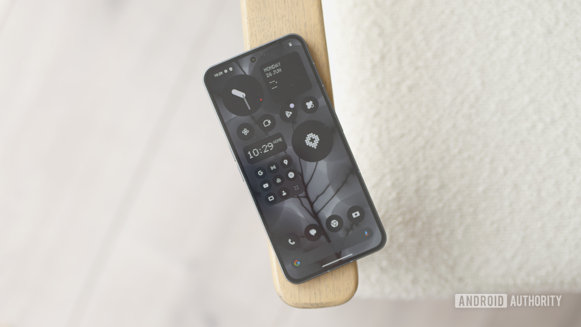
The newest skin on this list, Nothing’s Nothing OS is a wild reinvention of the Android operating system, at least from a design standpoint. Nothing OS has all the core features of Android and introduces a few new tricks, but it doesn’t look anything like stock Android. This is mostly due to Nothing’s retrofuturism aesthetic.
These design changes match the physical design of the phone itself. While this parity makes for a truly unique package, it also makes a Nothing Phone a love-it-or-hate-it situation.
Outside of the design, Nothing OS is basically stock Android with a few new tools thrown in. Once you get over how different it looks, you realize that Nothing OS is pretty run-of-the-mill as far as Android skins go.
How it compares: There’s probably no other skin on this list that changes how Android looks more than Nothing OS. However, outside of these design changes, you’ll find the skin to be pretty feature-light. As such, this should appeal to folks who appreciate design more than they appreciate unique tricks.
Nothing OS breakdown
- Updates: Nothing is a young company, but so far its been terrific with updates.
- Best for: Minimal bloat, a unique design experience, updates.
- Worst for: A stock look and feel, customization, features.
- Most interesting features: A Nothing Phone has lights on the back that you can control through the phone’s software. The Nothing Phone 2, in particular, offers a ton of neat features in this realm.
OnePlus Oxygen OS
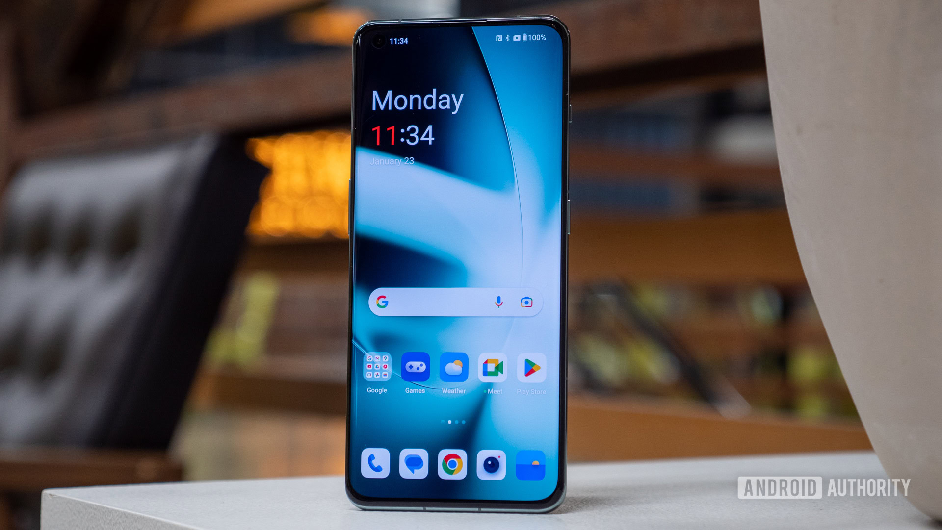
Originally, Oxygen OS was incredibly close to stock Android. Over the years, OnePlus has significantly changed how Oxygen OS looks and feels. Nowadays, it’s so far from stock that it’s getting closer to One UI territory.
New OnePlus phones will come with (or eventually receive) the latest version of Oxygen OS, which is built on the core code of sister brand OPPO’s Android skin. That means Oxygen OS and OPPO’s Color OS are very close now. They aren’t the same, but they aren’t much different. In fact, OnePlus phones in China actually come with Color OS out-of-the-box.
Oxygen OS still features a wealth of cool features that stock Android lacks. It’s still one of our readers’ favorite Android skins, even if it has lost some of its favor as it moves away from its stock roots.
How it compares: Oxygen OS is a very elegant Android skin. It’s smooth and simple, with OnePlus giving a lot of attention to the small details of the user experience. It isn’t quite as robust with features as One UI or Color OS, but it augments Android to a high enough degree that power users should feel right at home.
Oxygen OS breakdown
- Updates: OnePlus has been slacking with updates over the past few years, tarnishing its former reputation as a speedy updater.
- Best for: Minimal bloat, a refined experience, interesting features.
- Worst for: A stock feel, customization.
- Most interesting features: Zen Space is a cool feature that locks you out of your phone for a set amount of time, forcing you to focus on other things. OnePlus also offers some very interesting always-on display designs you can’t get anywhere else.
OPPO Color OS
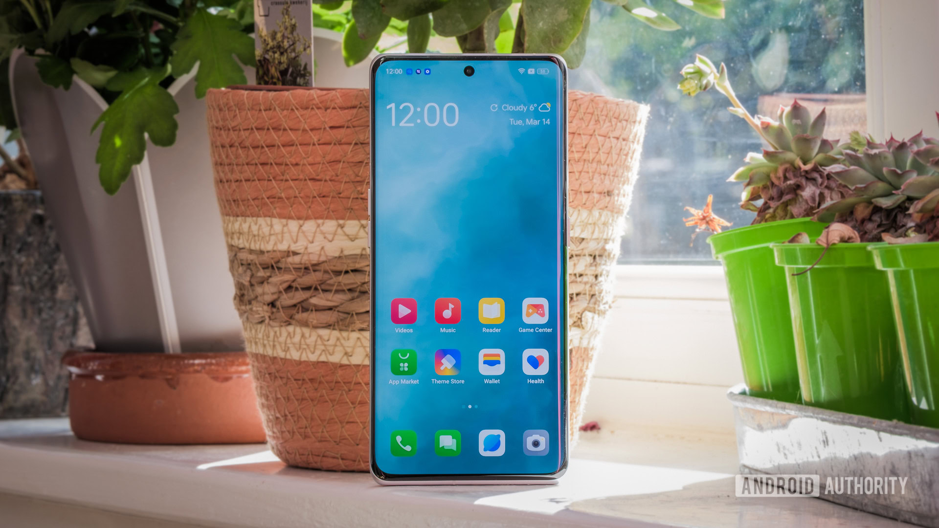
OPPO’s Color OS is most like Samsung’s One UI. However, don’t make the assumption that they look or feel the same because they don’t. It’s just that OPPO takes the same approach to its skin as Samsung, meaning it tries to offer you anything and everything.
Color OS is almost nothing like stock Android. It revamps nearly every software detail to give it a unique style. It also offers a multitude of features that will almost certainly never appear in the stock system.
This wealth of changes and options makes Color OS quite polarizing. Some love its unique feel and the exciting features it offers, while others think it doesn’t feel enough like traditional Android. You’ll need to try out all the Android skins you can to see which side of the line you fall on.
As mentioned in the previous section, OnePlus’ Oxygen OS gets its core code from Color OS, so the systems are quite similar.
How it compares: Color OS allows you to totally control nearly every facet of the operating system. There are lots of customization options and plenty of included apps and features that allow you to make your phone your own. This comes at the cost of stability, a bloat-free experience, and speedy and consistent updates.
Color OS breakdown
- Updates: OPPO’s update policy is getting better each year, but it still lags behind companies like Google and Samsung.
- Best for: Customization, interesting features, uniqueness.
- Worst for: Stability, a stock feel, a bloat-free experience.
- Most interesting features: Color OS allows you to make aspects of the Android operating system your own, including always-on display animations, ringtones, icons, etc. You create these through easy-to-use applications that come pre-installed with Color OS. There are also a lot of interesting design changes that really give the OS a unique look and feel.
ASUS Zen UI / ROG UI
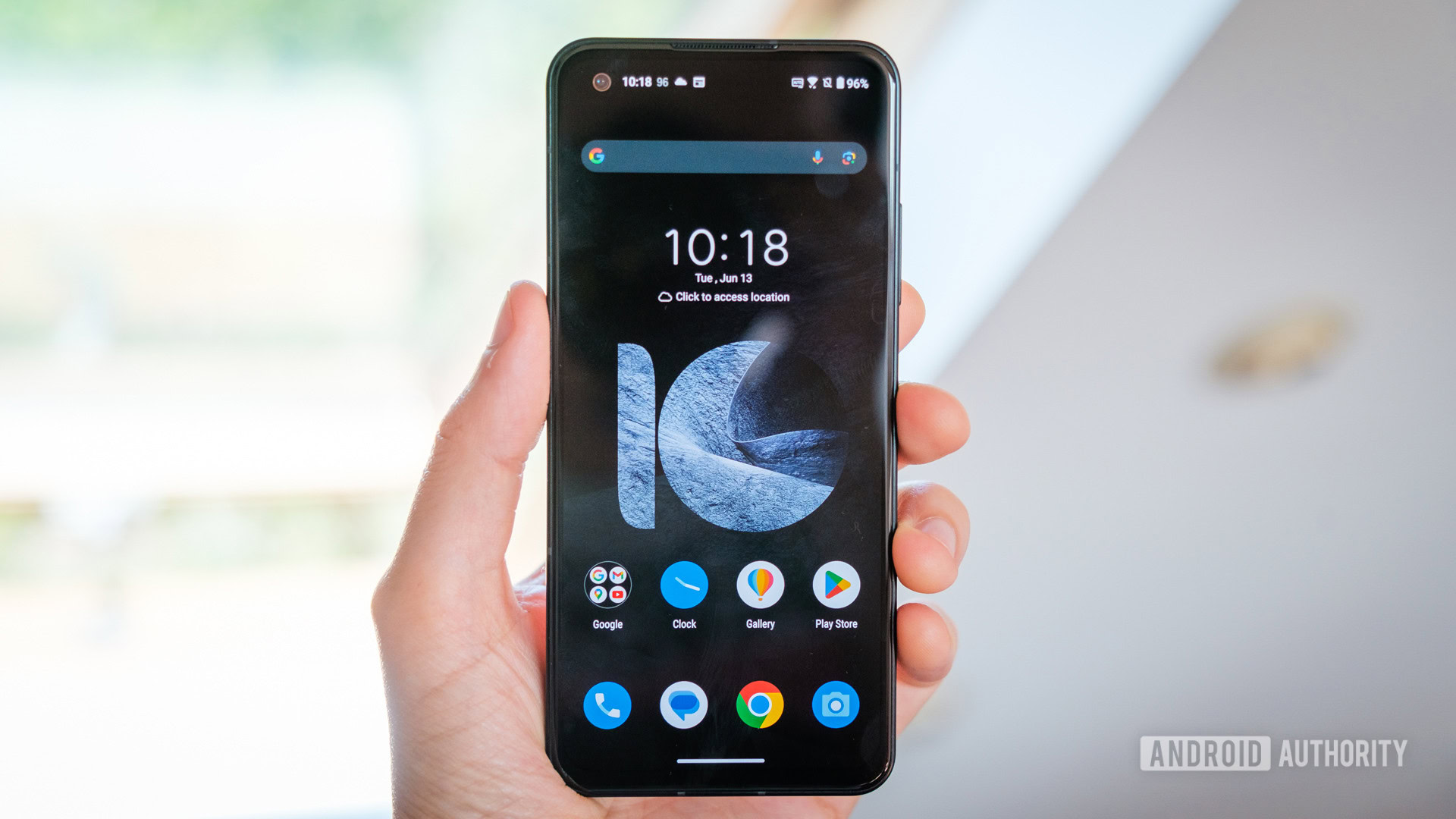
ASUS actually has two different Android skins. Its normal smartphones come with Zen UI, a very close-to-stock experience, not too far removed from Pixel UI. Meanwhile, the gaming phones in the ROG Phone series can use ROG UI, which has a much more “gamer” aesthetic.
Zen UI looks and feels like stock Android, keeping it light, simple, and bloat-free. It does add in some extra features and alters the design, though, so it’s not quite stock.
Meanwhile, ROG UI focuses on gaming with bright colors and interesting features to improve your smartphone gaming experience.
Either way, ASUS’ Android skins are well-regarded for nailing the basics while still offering some neat perks. They aren’t as fully featured as something like One UI or Color OS, but many smartphone users out there appreciate that simplicity.
How it compares: The closest approximation for Zen UI is Google’s own Pixel UI. Its simplicity is its major strength, as the skin ends up being very stable and smooth. ROG UI is also stable and smooth, but non-gamers might be turned off by how chaotic the gamer-centric designs are.
Zen UI /ROG UI breakdown
- Updates: ASUS has a very poor reputation when it comes to updates.
- Best for: Minimal bloat, stability, privacy.
- Worst for: Security, unique features, support.
- Most interesting features: Both Zen UI and ROG UI feature a Battery Care feature that focuses not on your overall battery life but on your battery’s longevity. It helps keep your battery going longer by preventing over-charging. Another neat feature is Game Genie, which brings your gaming experience to the next level. This used to only be in ROG UI but is now included with Zen UI as well.
Sony Xperia UI
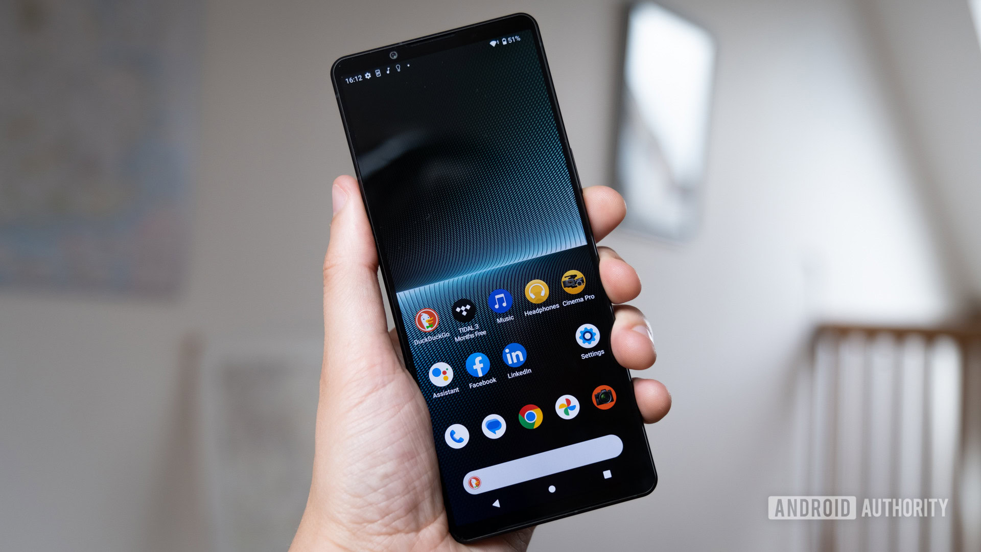
Sony’s Xperia UI comes on its Xperia smartphones. Like ASUS’ Zen UI, the Sony Android skin makes minimal changes to stock Android. This makes the system light, simple, and stable.
Of course, Sony does still add its own features on top of stock Android. It just doesn’t go nearly as far as other Android skins, such as One UI or Color OS.
In general, Xperia UI is a great choice for people who appreciate Pixel UI or just stock Android in general, but don’t want a Pixel phone.
How it compares: If you’ve ever used a Pixel phone before, you’ll feel right at home with Sony’s Xperia UI. It looks and feels just like stock Android, so it’s immediately familiar.
Xperia UI breakdown
- Updates: Sony is one of the worst companies when it comes to updates, so don’t expect fast and consistent software support.
- Best for: Minimal bloat, stability, a stock feel.
- Worst for: Exciting features, security.
- Most interesting features: Xperia UI offers a feature called Side Sense, which is a widget that makes one-handed use much easier. It also offers exclusive camera apps that take the best advantage of Sony hardware. Creator Mode is also an interesting and unique feature that makes the displayed colors as accurate as possible, which is perfect for cinephiles.
Motorola My UX
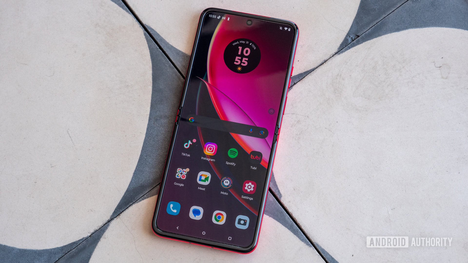
My UX is what you’ll find on the newest Motorola phones. Like Sony’s Xperia UI, My UX is very similar to Google’s Pixel UI. It is simple and retains many of the design elements of stock Android.
In the past, Motorola had a dismal reputation for its Android skin. Not only was it buggy, slow, and ugly, but some features were locked behind an account you’d need to make with Motorola. It was a mess.
Nowadays, My UX has a good reputation as a great Android skin. Motorola took a “less is more” approach and didn’t alter Android much. It did throw in some new features and tweaks, but overall, it has a stock feel.
How it compares: Motorola’s My UX will feel like stock, so it will be quite similar to Xperia UI, Zen UI, and Pixel UI. It does tend to feature more bloatware than those other skins, though, especially if you buy your Motorola phone from a carrier.
My UX breakdown
- Updates: Motorola doesn’t have a great reputation for Android updates and does not appear to be getting any better.
- Best for: Stability, a stock feel, simplicity.
- Worst for: Exciting features, security, a bloat-free experience.
- Most interesting features: My UX has a cool Moto app that helps you find and master all the cool tricks your smartphone can do. This is great for people new to the Motorola ecosystem — or new to Android in general.
What is your favorite Android UI/skin?
Those are the major Android skins and how they work. Which one is your favorite? Take our poll above and share your thoughts!
FAQs
An Android skin is a customized UI/UX layer that runs on top of Android. This layer is usually developed by Android manufacturers who wish to add a host of additional features to their devices.
There’s no answer that will satisfy every user. For power users, we recommend One UI. Stock Android or Pixel UI is the best for those who want minimal fuss.