Affiliate links on Android Authority may earn us a commission. Learn more.
HTC 10 Sense UI - Feature focus
May 20, 2016
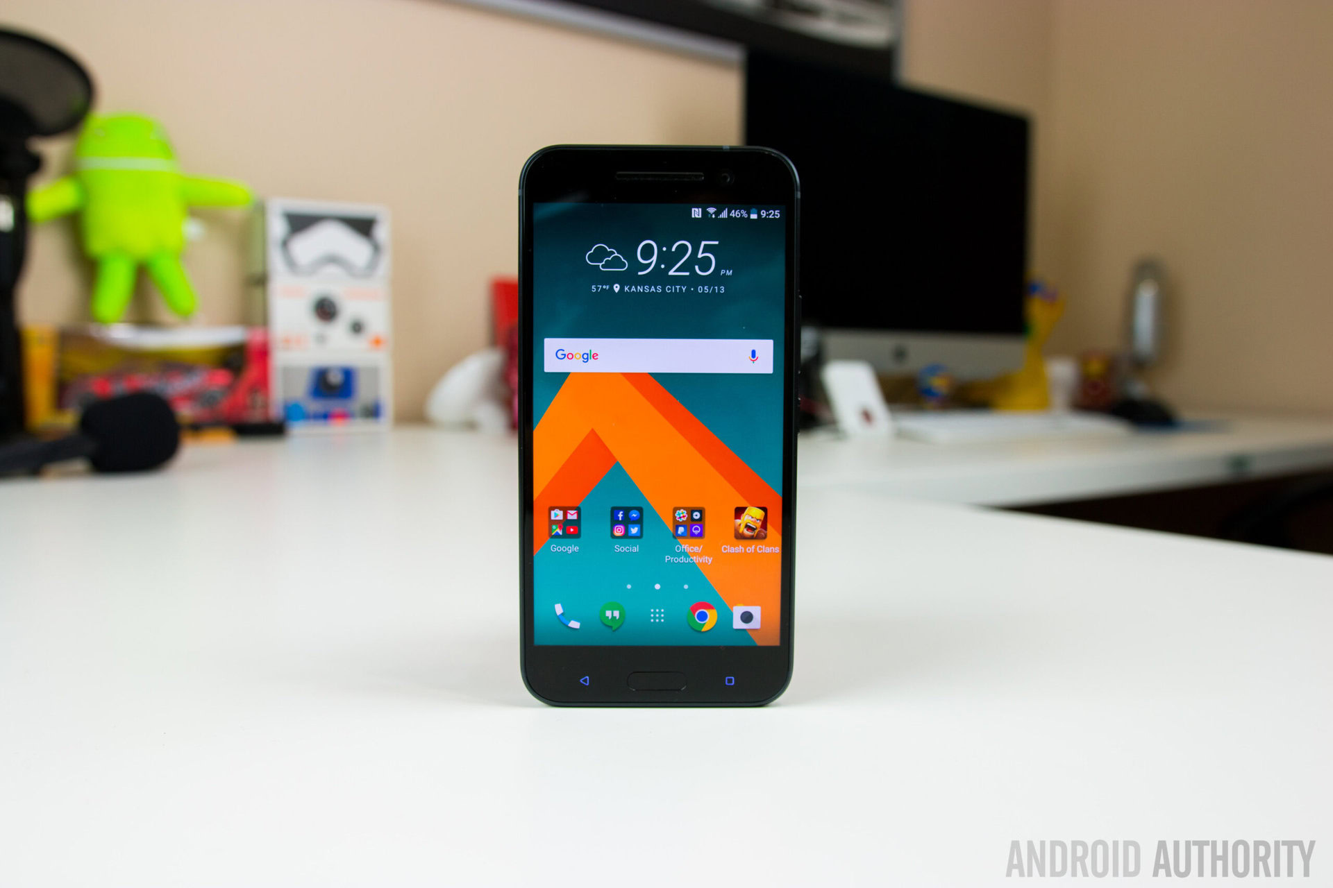
One of the biggest and longest running problems with OEM skins is how heavy and bloated they feel, and while Samsung and LG have made pretty good strides with regards to streamlining their respective software experiences, no one has done a better job with that than HTC.
- HTC 10 review
- HTC 10 vs Galaxy S7 / Edge vs LG G5
- Camera shootout: HTC10 vs iPhone 6S Plus, Galaxy S7, LG G5, Nexus 6P
HTC’s Sense UI has always been one of the favorites when it comes to custom OEM interfaces, and while early versions of the Sense UI did have its problems, HTChas made some noticeable improvements over the years, leading to the best version of the Sense UI yet, as seen with the HTC 10. What does the Sense UI have to offer?
We find out, as we take a closer look at the HTC10 Sense UI!
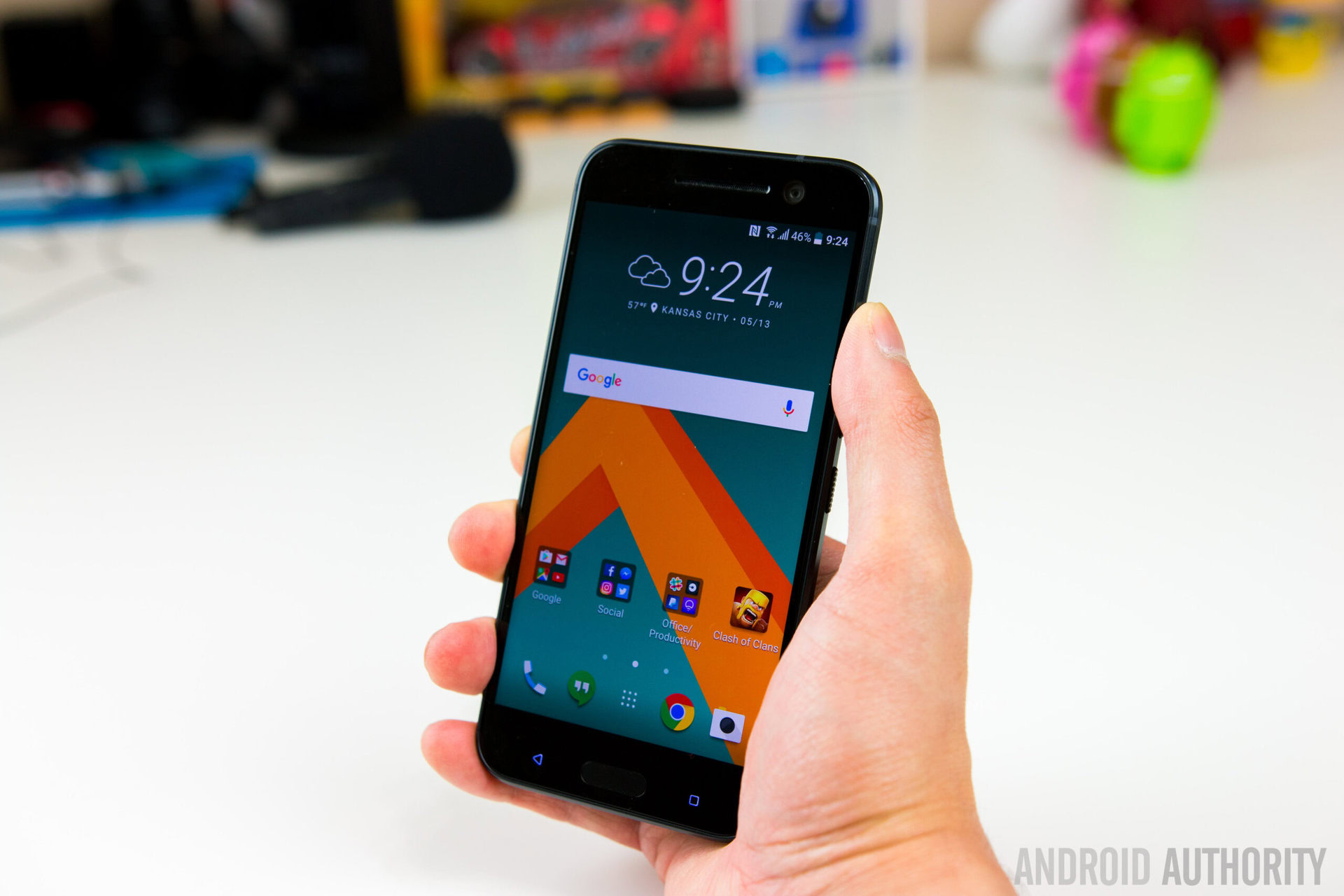
HTC Sense has always been one of the more attractive looking user interfaces out there, with a very mature, toned down look. With the HTC10, the general look and feel of the Sense UI has been retained, but it also feels a lot like stock Android.
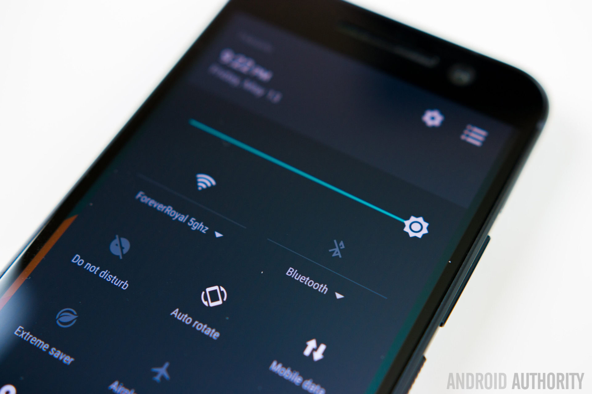
As far as custom interfaces go, this is probably the closest you’ll get to stock Android, but with a different overall aesthetic. This is a much cleaner and slimmed down version of the interface, and areas that HTCused to tamper with, such as the notification shade, settings menu, and Recent Apps screen, have been left alone and kept identical to what is seen with stock Android.
HTC has made it a point to reduce bloat as much as possible, and as such, as you aren’t going to be bombarded with a slew of HTCwidgets anymore. The iconic HTCclock is still available, but that’s about it as far as widgets go. HTCalso worked closely with Google to eliminate redundant apps, so instead of having two apps that do the same thing, you now only get one of the apps. For example, Google Photos instead of HTCGallery, Google Play Music instead of the HTCMusic app, and more.
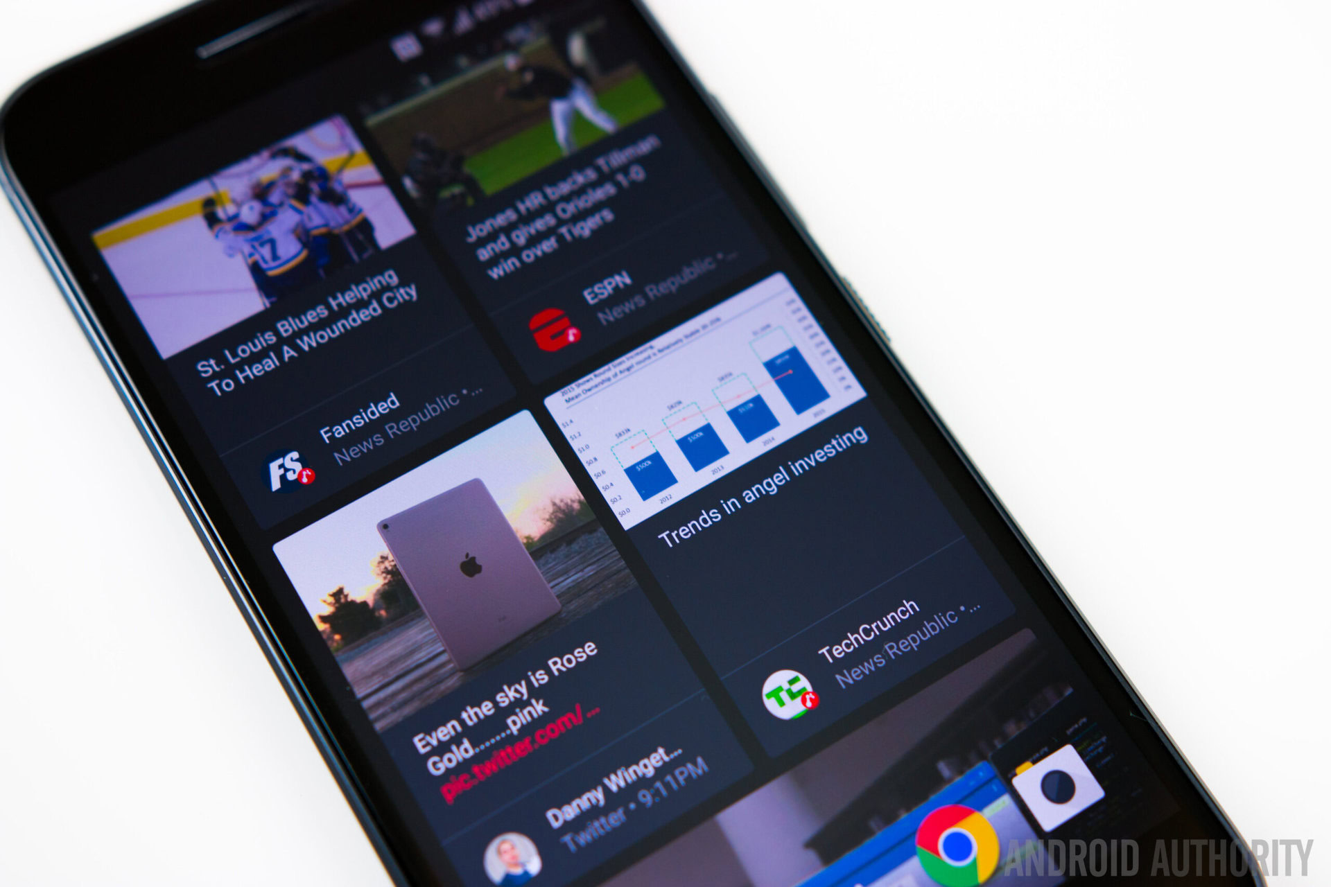
One of the best features of the HTCSense UI has been BlinkFeed, which was first introduced with the One M7. Just like everything else in this latest version of Sense, BlinkFeed is a lot cleaner and more streamlined. It has a darker color scheme compared to previous iterations, it is much nicer to look at (with HTC’s new font), and there’s more padding between the blocks. HTCwas one of the first companies to start the left home screen trend, and out of all the companies that have done something similar, BlinkFeed is definitely one of the better implementations out there.
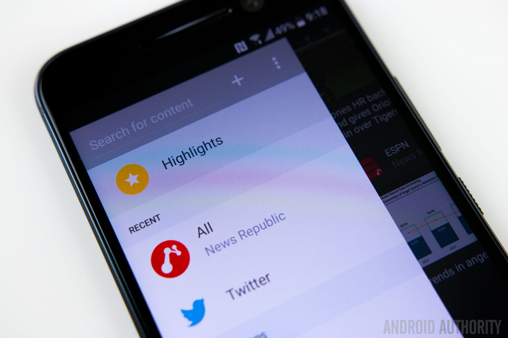
It is fast, fluid, and highly customizable, allowing you to pick and choose exactly what you want to see. There are also numerous publications to pick from, giving you a one stop solution for all your sports, politics, technology news, and a lot more. Of course, if BlinkFeed is something you don’t want to use, it is very easy to disable as well.
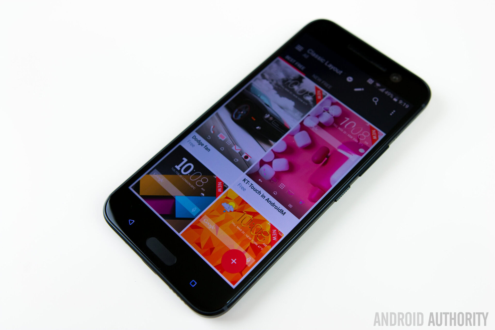
One of my favorite things about HTCSense is the built in Themes engine, which lets you easily customize the look and feel of the interface. There are a lot of themes to choose between, in a variety of categories, and you also have the option to mix and match wallpapers, icon packs, sound profiles, and fonts from any of the available themes, or even create your own.
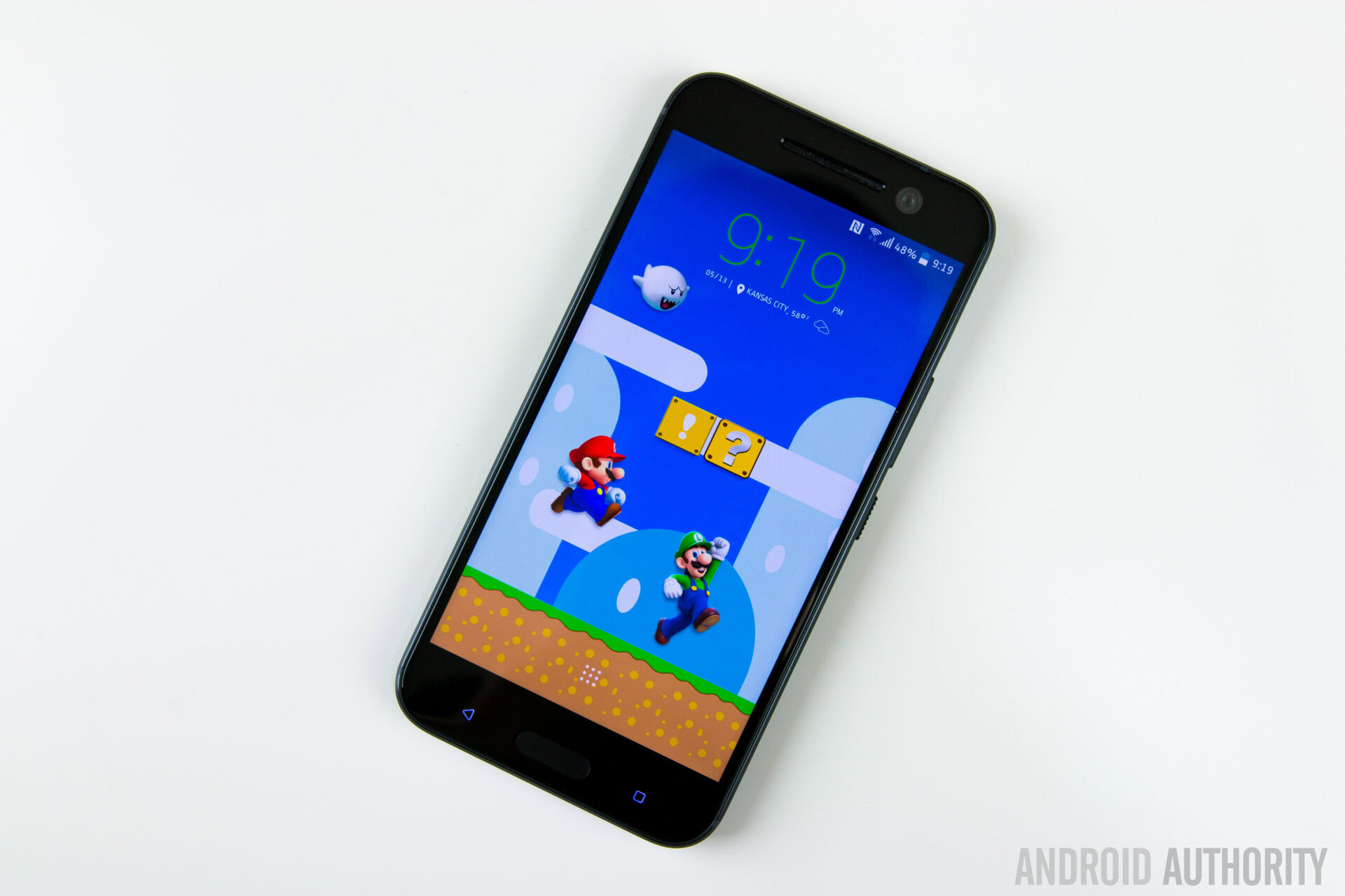
New to the Themes engine is what HTClikes to call Freestyle themes, which basically ignore the grid layout. This allows for some very unique looking themes, since you can easily move around and place the icons wherever you want. There are some third party applications that work the same way, and is certainly a very nice addition to the HTCThemes engine.
Also new with this version of Sense is the theme-able keyboard, with the new keyboard being powered by TouchPal, which is a very popular third-party keyboard that offers a variety of themes, and lets you make the keyboard look like anything you want. Despite how light this version of Sense is, it’s really great that HTCgives you a lot of flexibility with customization.
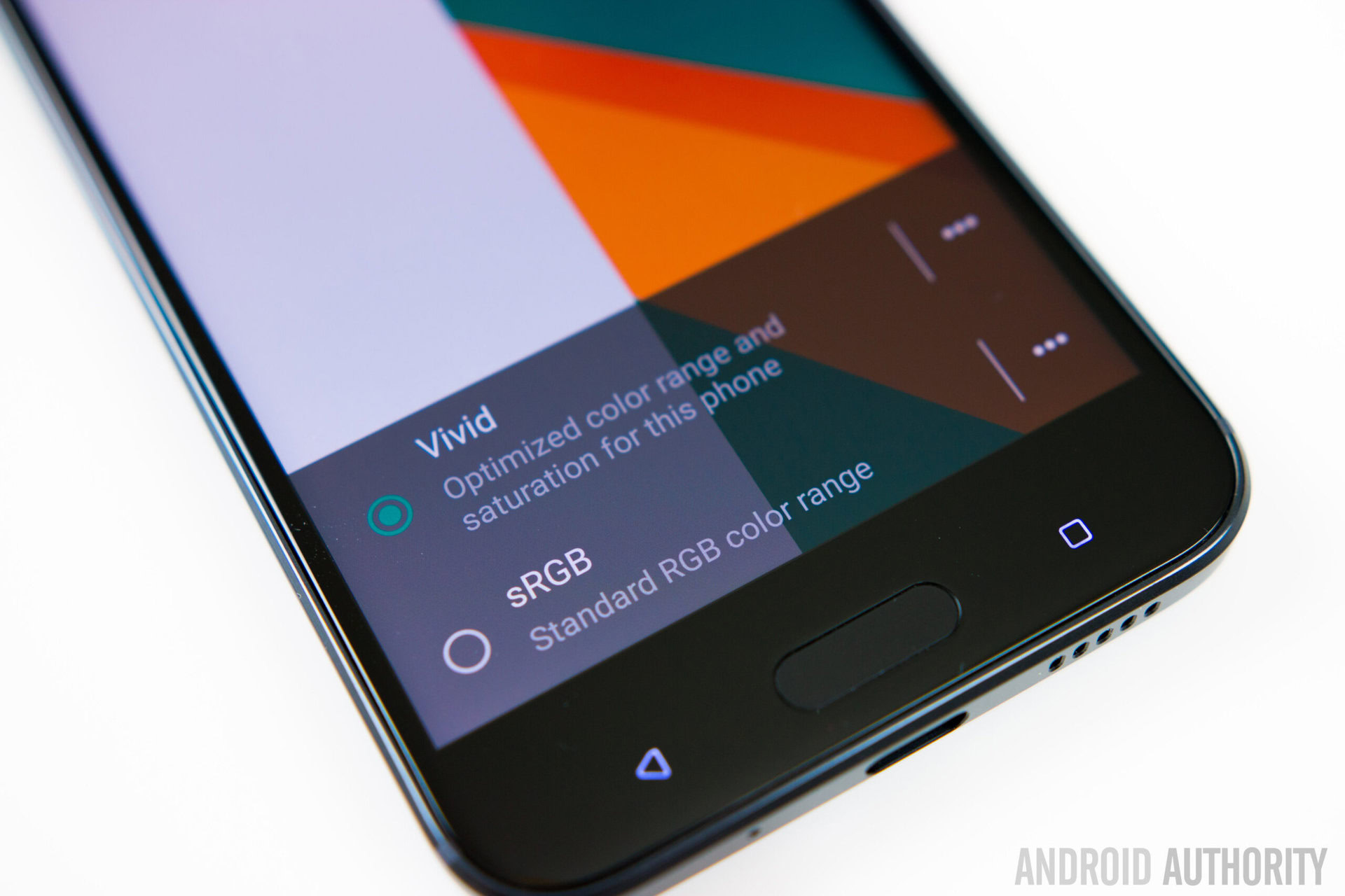
HTC has also given users the ability to calibrate the display with the HTC10. You don’t have a lot of control over this aspect, but you do have the option to pick between a vivid mode, which is selected by default, and a standard RGB mode, that results in a flatter color profile. You can also adjust how cool or warm you want the display to appear, based on your personal preference.
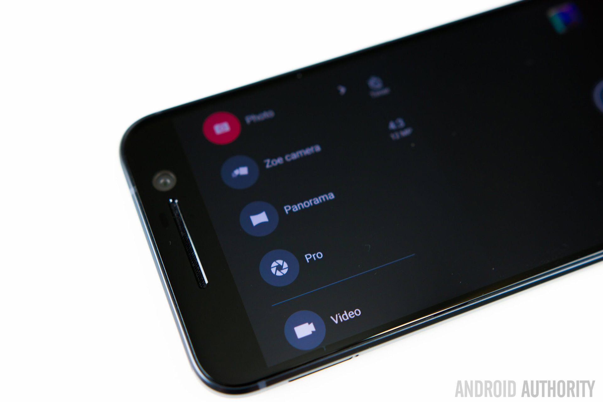
The camera app has also been toned down significantly, and is now a lot cleaner, more intuitive, and easier to use. Also the camera settings and modes are found in a single panel that slides out from the left side of the screen, making everything easy and quick to get to. There is also a new Pro mode that gives you DSLR-like manual control. While it is easy to make manual adjustments to the various settings, the layout can clutter the viewfinder when you are trying to make multiple changes at once.
So there you have it from this quick look at the Sense UI on the HTC10! HTChas done a great job with reducing the amount of bloat over the years, and the latest version of Sense is as close to stock Android as you can get, while retaining its unique aesthetic, and also continuing to offer some really nice and useful features.
What do you think of Sense UI? Is it your favourite Android OEM skin? Let us know your views down in the comments and don’t forget to check out the links below for more on the HTC10.
Thank you for being part of our community. Read our Comment Policy before posting.