Affiliate links on Android Authority may earn us a commission. Learn more.
Moto X (2014) Review: Motorola outdoes itself again
Published onNovember 3, 2014
Last year, we were witness to a comeback of sorts by Motorola, and what a return it was. With the original Moto X, Motorola released a phone that championed user experience over specifications, personalization over cookie-cutting, and forced consumers to re-evaluate what they thought defined a smartphone as flagship. This year, despite some managerial and logistical changes, Motorola may have managed to outdo itself once again. So what does its latest flagship smartphone have to offer? We find out, in this comprehensive review of the Moto X (2014)!

While customization has always been an integral part of the Moto X experience, the latest iteration has seen some updates across the board in terms of design elements. A new metallic frame holds together the 2.5D glass front with whatever back cover you may have decided on. The new addition of front speaker grills allows for another area of color customization. The Motorola logo on the back has been enlarged and given prime positioning under the rear camera, that comes with a dual ring flash.
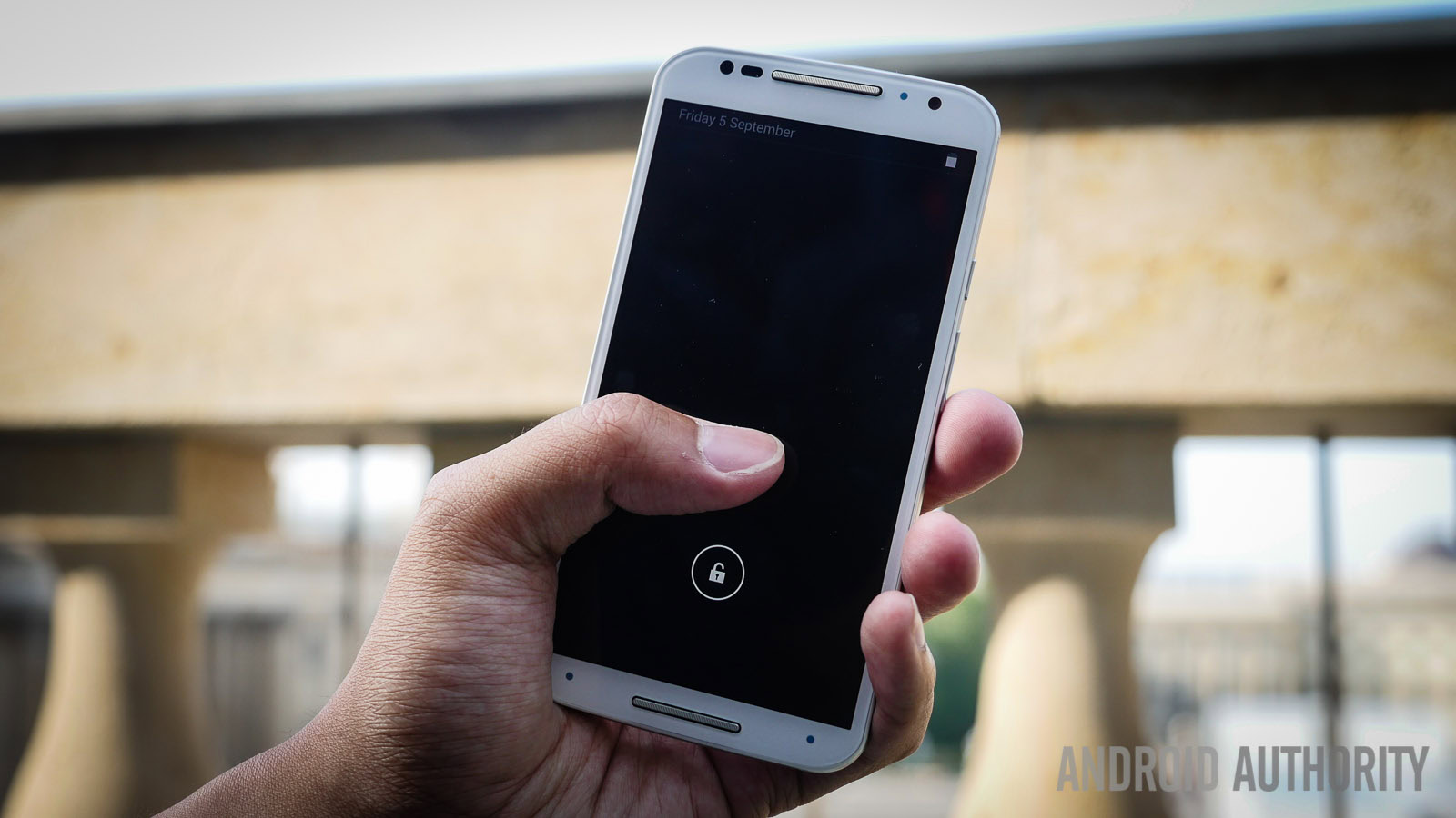
A bump in the screen size results in a better viewing experience, but the handling experience may not be to the liking of those who preferred its more compact predecessor. That said, the noticeable curve on the back hearkens back to the original design, making ergonomics a continued focus.
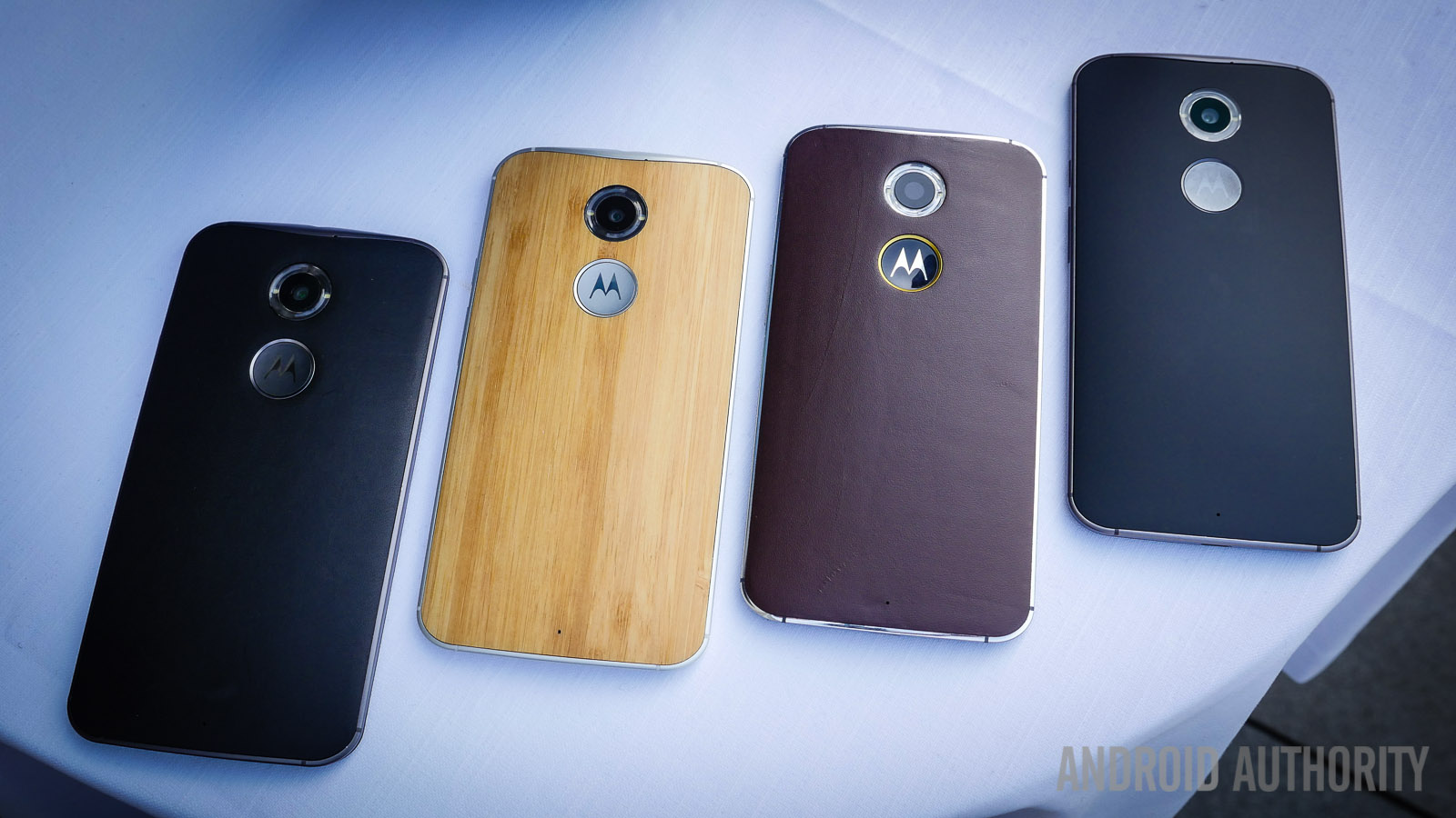
The choice of different materials for the back cover will dictate the grip, but in my experience with the various material choices, there shouldn’t be too much of an issue with holding on to the phone. Grip on wood options are more than adequate, the leather sticks quite well to the palm, and the plastic backings feel very familiar. One issue I had with the handling, however, is the fact that the sides have been made very thin in order to accommodate the curve. Due to the smoother feel of the metal, the thinness can make side gripping a bit difficult, something that you will eventually get used to, but is something to watch out for.

All in all, the general shape of the phone is a continuation of Motorola’s already well received design language, further improved by a better frame and the numerous customization options. Thankfully, all material choices have been made available from the start this time around, so creating a phone that is really yours is easy via the Motomaker. Plastic, leather, and a bunch of different color combinations, including accents, help put together a fully personalized phone.
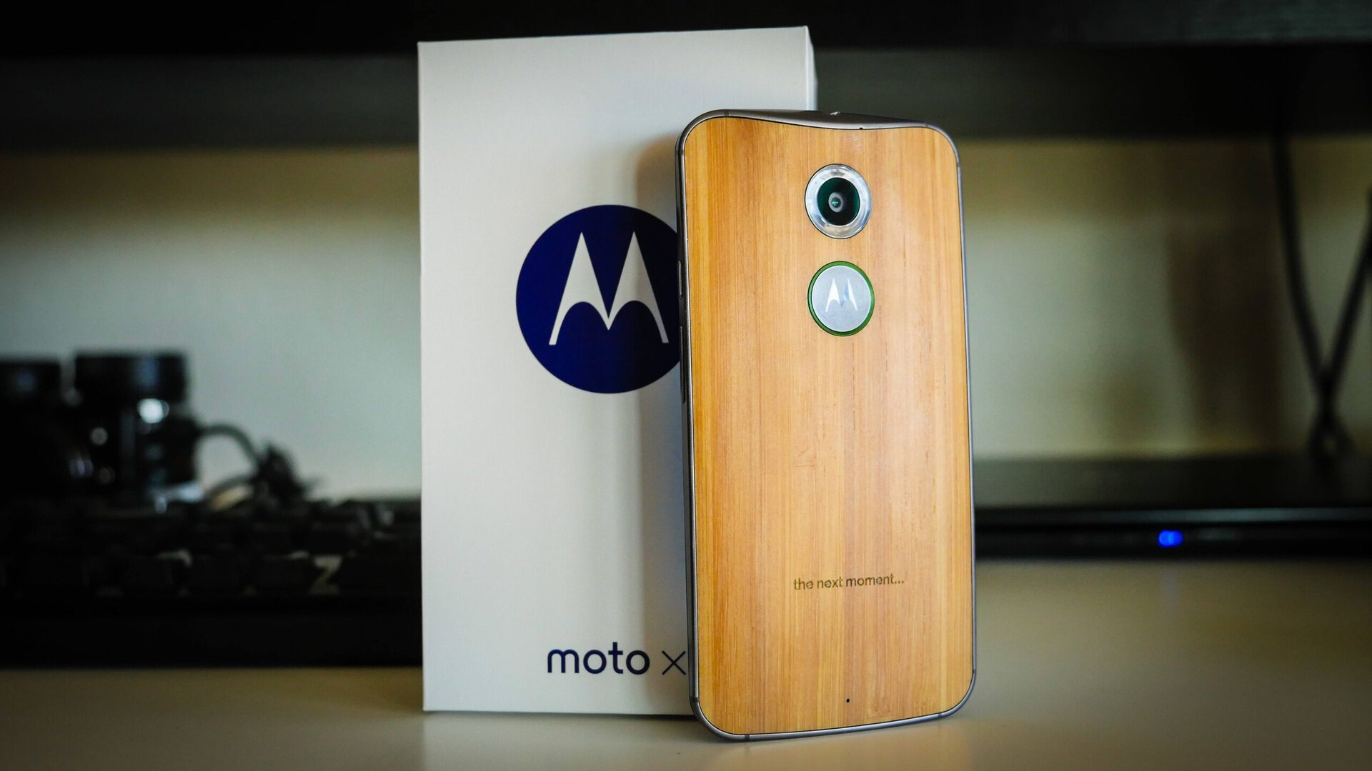
It’s no secret that I have had my eyes on the bamboo version ever since it was an option available with last year’s iteration, and I’m really happy that I was finally able to get it with the current release. It looks and feels great, and understandably turns quite a few heads when out and about. While the only gripe I might have involves the large Motorola logo, because it flashes the branding a little too much, it’s definitely far from a deal breaker.
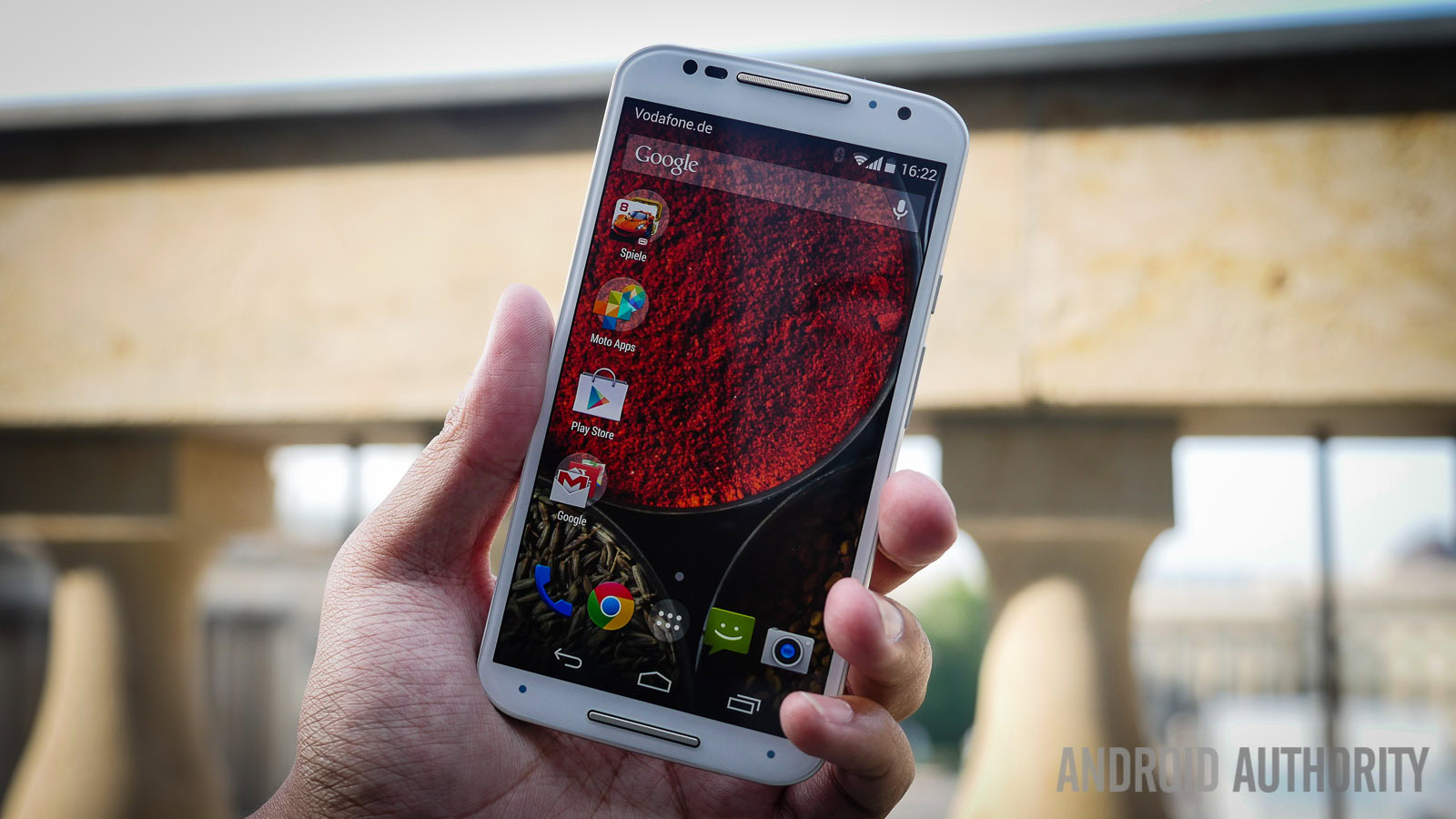
Though a lot of people appreciated the fact that the original Moto X was not a very large phone, this iteration has been bumped up to the industry standard. 5.2-inches is the size now for the screen, with the resolution also jumping to 1080p, resulting in a pixel density of 424ppi. AMOLED technology is also used here, bringing the kind of color saturation and contrast that you’d expect from it, but its usage is also advantageous for the Active Display, which only activates the needed pixels to show the time and notifications. Sharpness is where it should be, making text easy to read, and things like media and games are all enjoyable on this larger screen.
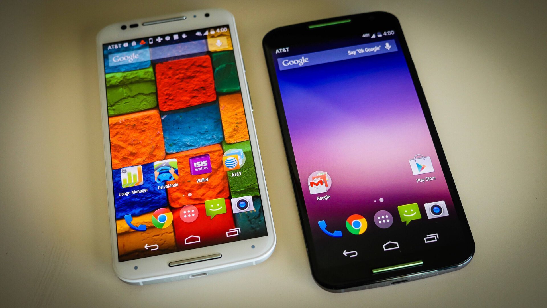
There are going to be a few people who would have preferred that the sub 5-inch display was kept, mainly for handling purposes, but Motorola has managed to keep the ergonomics as good as they could be for a screen this size, and the experience remains very enjoyable.
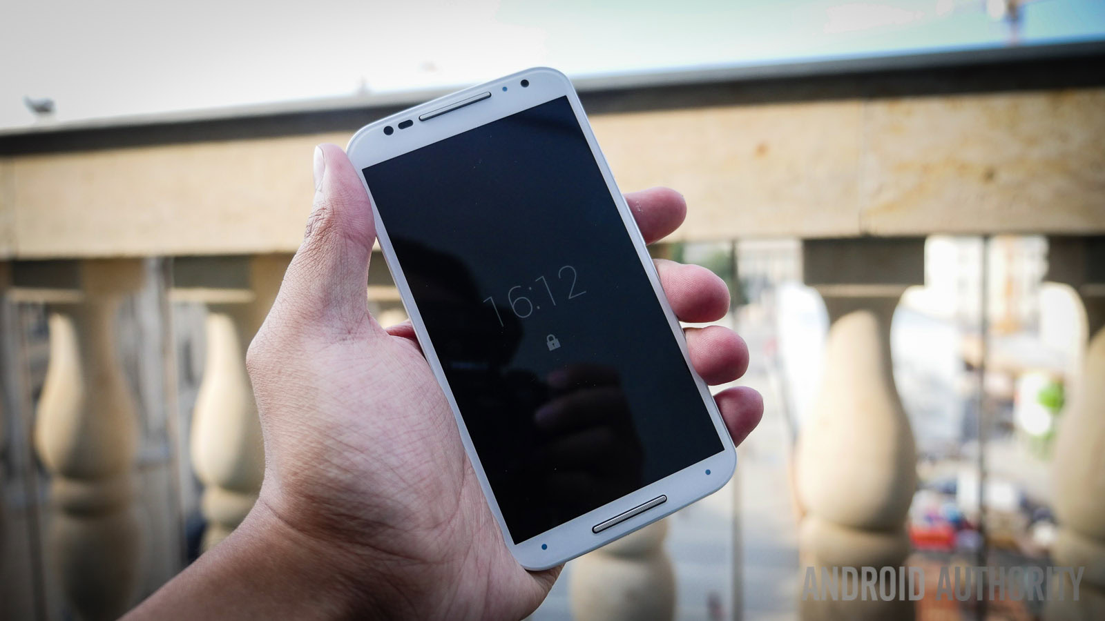
With the original Moto X, Motorola stayed far away from the specs race that is rampant in the Android world, but this time around, that is only somewhat the case. While what it packs under the hood isn’t the bleeding edge, the quad-core Qualcomm Snapdragon 801, clocked at 2.5 GHz, along with the Adreno 330 GPU and 2 GB of RAM, is still the standard that is found with most 2014 flagships, save for for the Galaxy Note 4 and the Nexus 6.

Helping the device feel incredibly snappy is the almost stock version of Android, allowing for a smooth, lag-free experience, and you certainly won’t regret not having the latest and greatest processing package available. Even with Motorola’s additions put in, there is little you can do to really slow down this phone. Apart from the newest and most processor-intensive of games, the Moto X (2014) easily handles every task you throw at it.
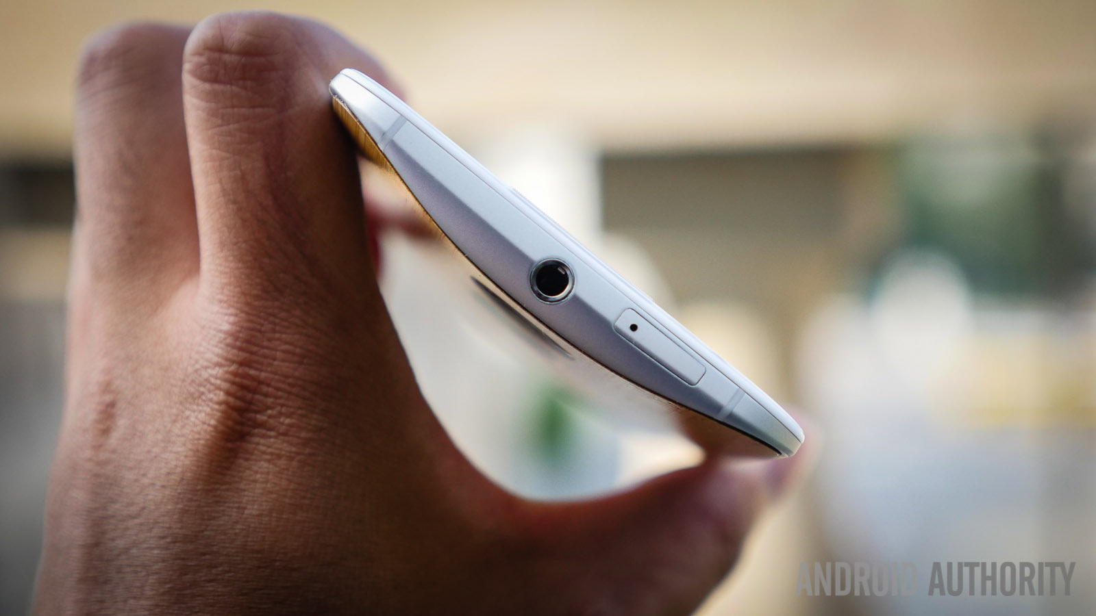
When it comes to hardware, there are a few places that Motorola seems to have held back on, but has clearly made up for it in other details. For starters, microSD expansion isn’t available, so 16 GB or 32 GB internal storage options are what you will have to deal with.

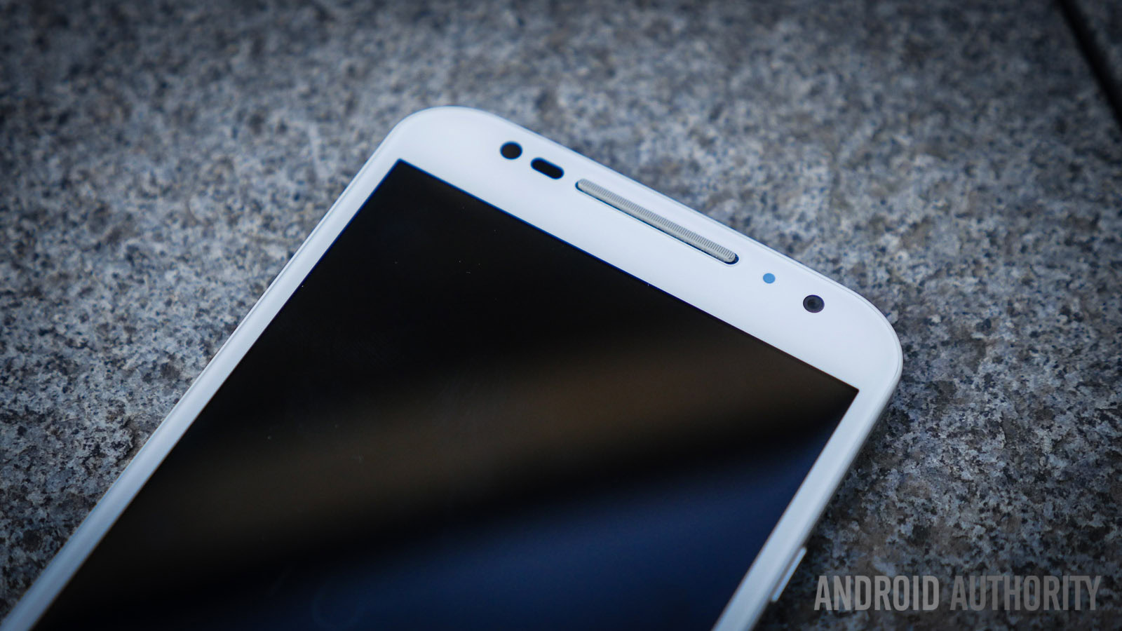
Call quality is still as good as you’d expect Motorola to make it with a robust microphone setup that ensures that audio capture sounds great. Speaking of audio capture, the same voice recognition hardware and software returns, and is even better this time around. Perhaps the best new feature of the Voice service is the ability to pick your own phrase. Even in noisy environments, the device is able to pick up the custom phrase and activate voice commands. On the corners of the phone is an infrared sensor array that can recognize when your hand is over the phone, allowing for various gesture controls, such as a wave to silence a call, or holding your hand above the phone to turn on Active display.
Battery life looks to be be another area of compromise on Motorola’s part, with the Moto X packing a rather small 2,300 mAh unit. Getting through a full day shouldn’t be too difficult, but you will find yourself on the verge of running out of juice more often than not. The battery life can be pushed to almost a day and a half with less than average usage.
One hardware aspect that doesn’t get enough attention with regards to the Moto X (2014) is the fact that it is water resistant. While not the full IP certification that some other devices may boast, a splash of water won’t easily destroy this device.
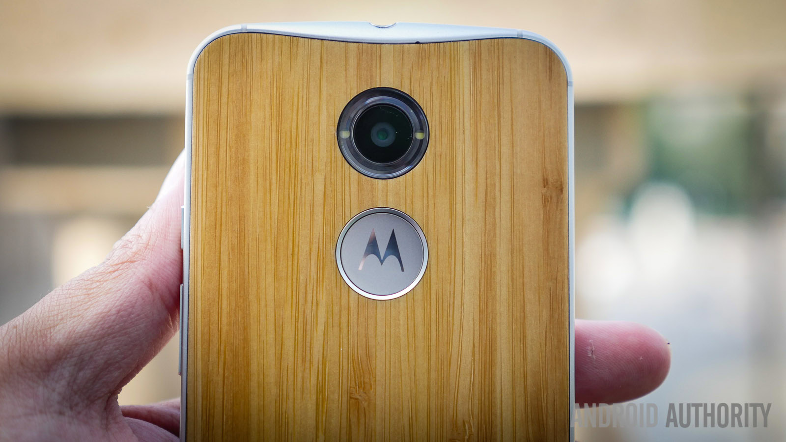
If there was one real point of contention with the original Moto X, it was with the camera. While it was easy to access using some twisting motions, its performance was unfortunately below par. This time around, we have a 13 MP shooter and a dual LED flash that is found in a ring around the optics.
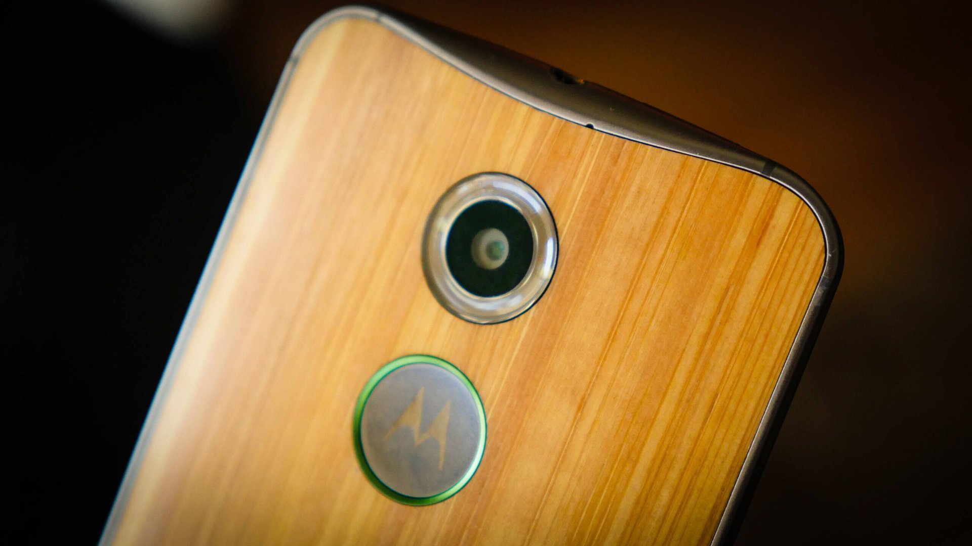
As far as the camera software goes, it is still quite minimalistic, with only a few different options available. The modes include HDR, panorama, and a burst mode that activates when you hold down, instead of tapping, to take a shot. 4K video recording is also available, and in the right conditions does get quite a bit of detail, with the only problem being that it is not a default setting. Focusing in the app requires dragging the focal point to where you want it to be, which can be bothersome, especially when trying to take shots with one hand, and I would have preferred the tap to shoot to handle the focus and exposure just seconds before taking the picture.
Nonetheless, the photo taking experience is pretty easy on this device, but once again, the quality does leave a bit to be desired. The performance in bright environments is nicely detailed, but the color reproduction can be hit and miss. For the most part, you’ll get a usable image, but it might take a few tries. It’s in lower light that I actually found there to be some higher than average performance. Higher ISO limits allow for a pretty good looking image without the incredible amounts of noise and blur, and that’s even without the flash. The flash, though ingeniously wrapped around the optics, are still quite harsh and can actually bleed some light into the image due to how close they are. Though far from the best smartphone camera found in the Android world right now, the new Moto X does offer an improved camera performance compared to its predecessor. That said, a far better experience would have certainly set the device apart.
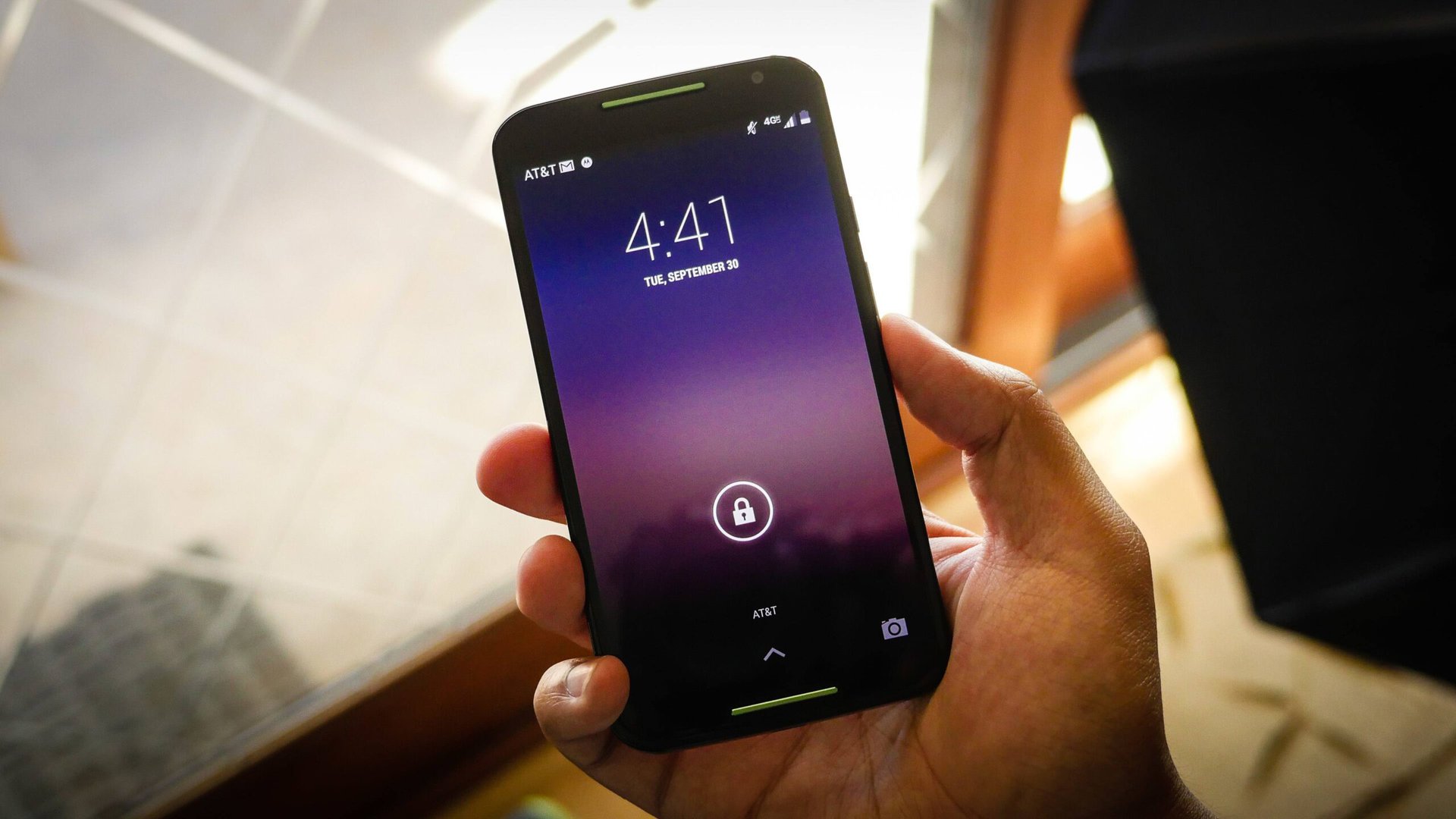
When it comes to the software, it is still the very stock-like Android experience that includes Motorola’s very useful additions. Anyone that has used a Nexus device or any stock Android build will feel right at home here. Homescreens, the app drawer, the notification dropdown with quick settings shade, and the Google Now Launcher bring back a familiar experience.

It’s in Motorola’s own additions though, that we find some actually useful extras. We have the Moto Voice service and the Active Display, but some Assist abilities make the phone aware of where you are and react accordingly. Connect your phone to an audio source in your car and it will automatically play music when it detects you’re on the road. Set it to know when your meetings are and the phone will be silent during those important times, and will do so at night as well so as not to disturb you.

After using the original Moto X, what is great about the software experience this time around are the small improvements. Being able to pick your own voice activation phrase is the right step forward from the already reliable “’OK Google Now.” In the Active Display, you can now select different notifications, and swipe to either side to dismiss them, and even the date is displayed up top when using the Active Display.
The Moto X (2014) is available from all network carriers in the US for below the usual premium price at $99. For a phone that easily falls in the realm of flagship, it’s great that it doesn’t have the flagship price. A fully unlocked Pure Edition Moto X is also available, with a price that starts at $499. Adding the bamboo back cover and 32 GB of storage for my version brought the phone up to just over $600, so be aware that customization does come at a price.
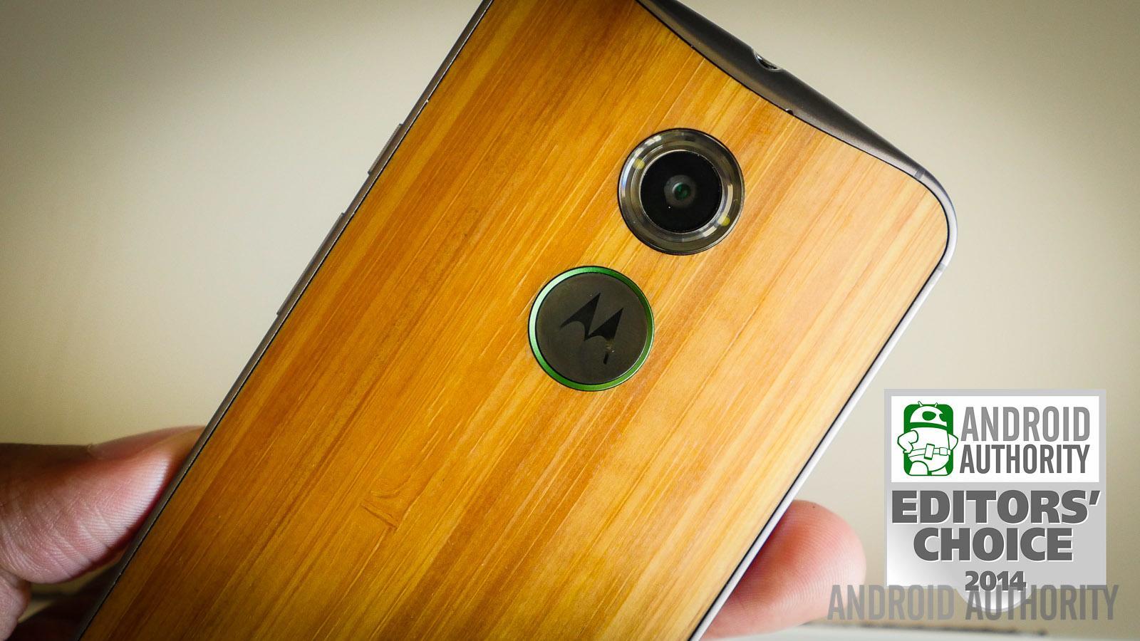
So there you have it – an in-depth look at the Moto X (2014)! It’s hard not to like a phone when you’ve been given the ability to make it the way you want it. With its predecessor, that might have been the saving grace of what could have been considered a sub-flagship device, but now, the Moto X has matured and gotten its foot in the top-tier door.
