Affiliate links on Android Authority may earn us a commission. Learn more.
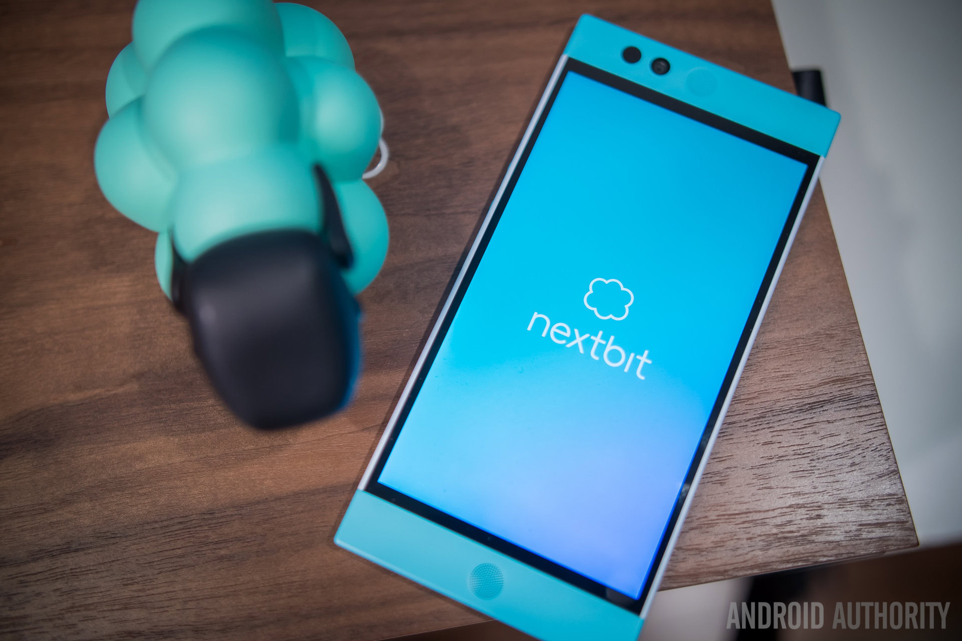
Nextbit Robin Review
Published onFebruary 18, 2016
Nextbit Robin
What we like
What we don't like
Our scores
Nextbit Robin
Crowdfunding isn’t a new concept and while many projects do fail to see the light of day, just occasionally, we’re treated to a project that has the potential to alter the way we use technology. The problem of limited storage is one that affects the growing number of devices that launch without microSD card expansion, but American company Nextbit has a unique solution to this growing problem with its Nextbit Robin smartphone.
Harnessing the power of the cloud, Nextbit’s first smartphone aims to supercharge the smartphone experience using smart cloud-based storage, which intelligently, and automatically, backs up your photos and apps to the cloud. When the company first launched on Kickstarter, many may have thought this was a dreamy concept that wouldn’t see the light of day, but several months later, the Robin is almost ready to jet into your pocket.
With over $1.3 million in backing on Kickstarter and a leadership team that has considerable mobile pedigree – including Scott Croyle, the former SVP of design at HTC and Tom Moss of Google – the Nextbit Robin has many ingredients for success. However, does it deliver and is cloud storage really the solution to a lack of storage? Let’s find out in this, our Nextbit Robin review.
Design

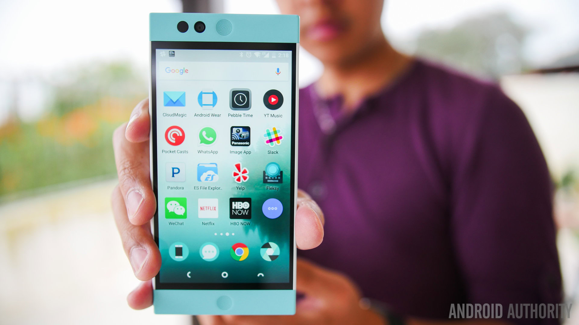
In an industry of seemingly-homogeneous devices, the Nextbit Robin stands out from the crowd, despite being a throw back to older smartphones that were nothing more than rectangular slabs. Yet, with the industry widely adopting curved front and/or reader displays, the rectangular design of the Robin actually feels refreshing and there’s no denying that it’s unlike any other smartphone.
Since we first went hands on with an early unit of the Robin back in September last year, Josh and I have been waiting to experience the phone in all its glory, and for good reason: from the design to the cloud storage, the Robin is the most unique devices on the market, and both of us really like the design. As Josh puts it:
It’s very rare that you find a device that’s incredibly unapologetic about its design.
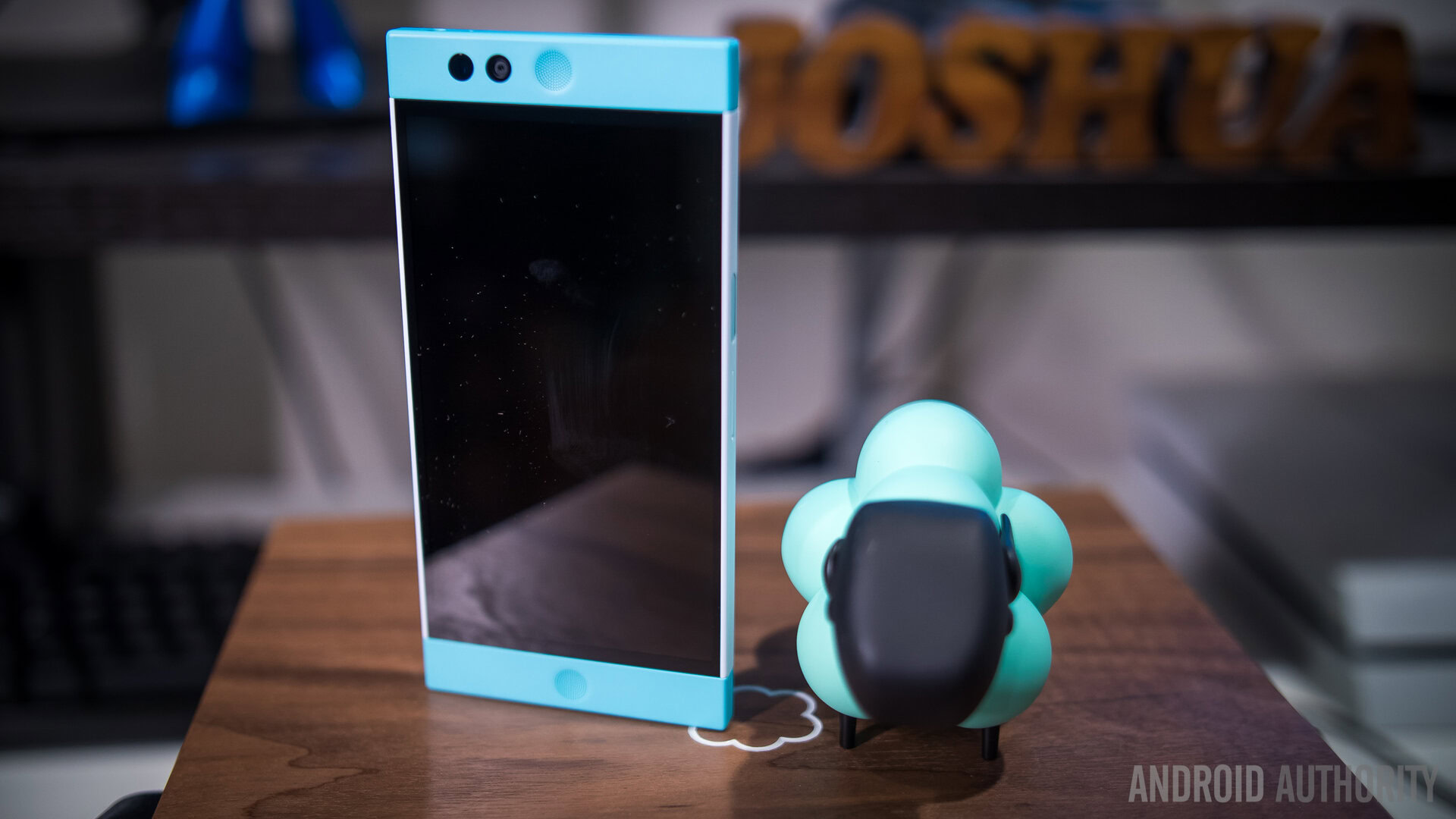
Opting for the flat rectangular shape has also allowed Nextbit to be quite clever in the design of individual elements; from the size of the bezels above and below the display (more on this later) to the front and back cameras and the speakers, all the individual elements are perfectly symmetrical to one another; the bezels are the same size and colour; the speakers are exactly placed; the cameras are exactly the same size and distance from the edge of the phone and the USB Type C port is perfectly in line with the headphone jack.
For a rectangular device, the symmetry makes the phone surprisingly pleasing to look at and the circular elements contrast the rectangular design perfectly. Aside from the power button, the SIM tray and the USB Type C port, all the other elements on the Robin are circular, which continues through to the OS as well.
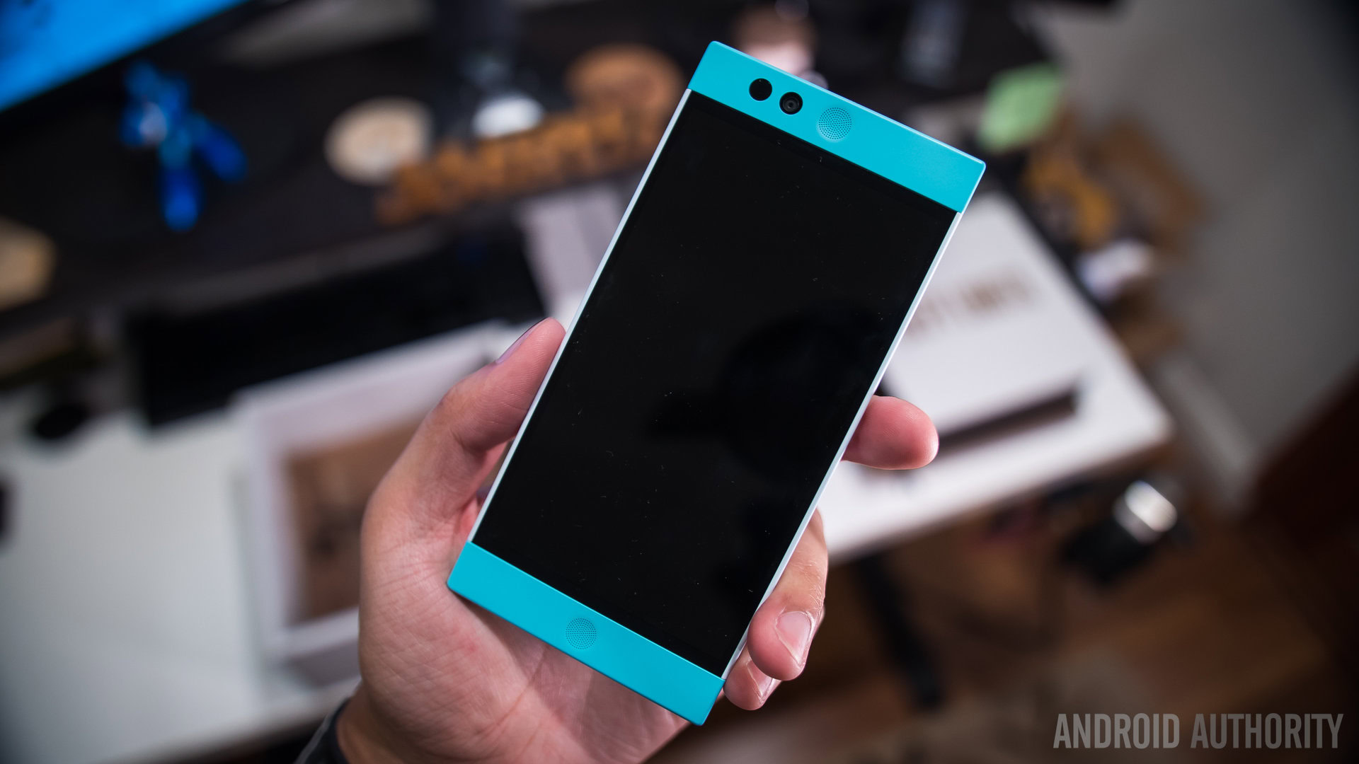
Bezels are a necessity on almost all smartphones as they serve to hide the complex mesh of wiring, connectors and transistors that are packed tightly underneath them, but Nextbit have – quite cleverly – use circular elements to make the considerable size of the bezels more forgiving. For example, the company could have opted for more traditional shaped speakers, but by opting for circular speaker grilles, the bezel somehow feels a lot smaller.
One benefit to the rectangular and flat design is the graspability of the phone; whereas current smartphone designs that adopt curved sides can be quite difficult to grasp, the flat sides of the Robin makes the smartphone easy to pinch and hold. Furthermore, while some may make claims that a curved back is more ergonomically friendly in the hand, the flat design of the Robin refutes this.
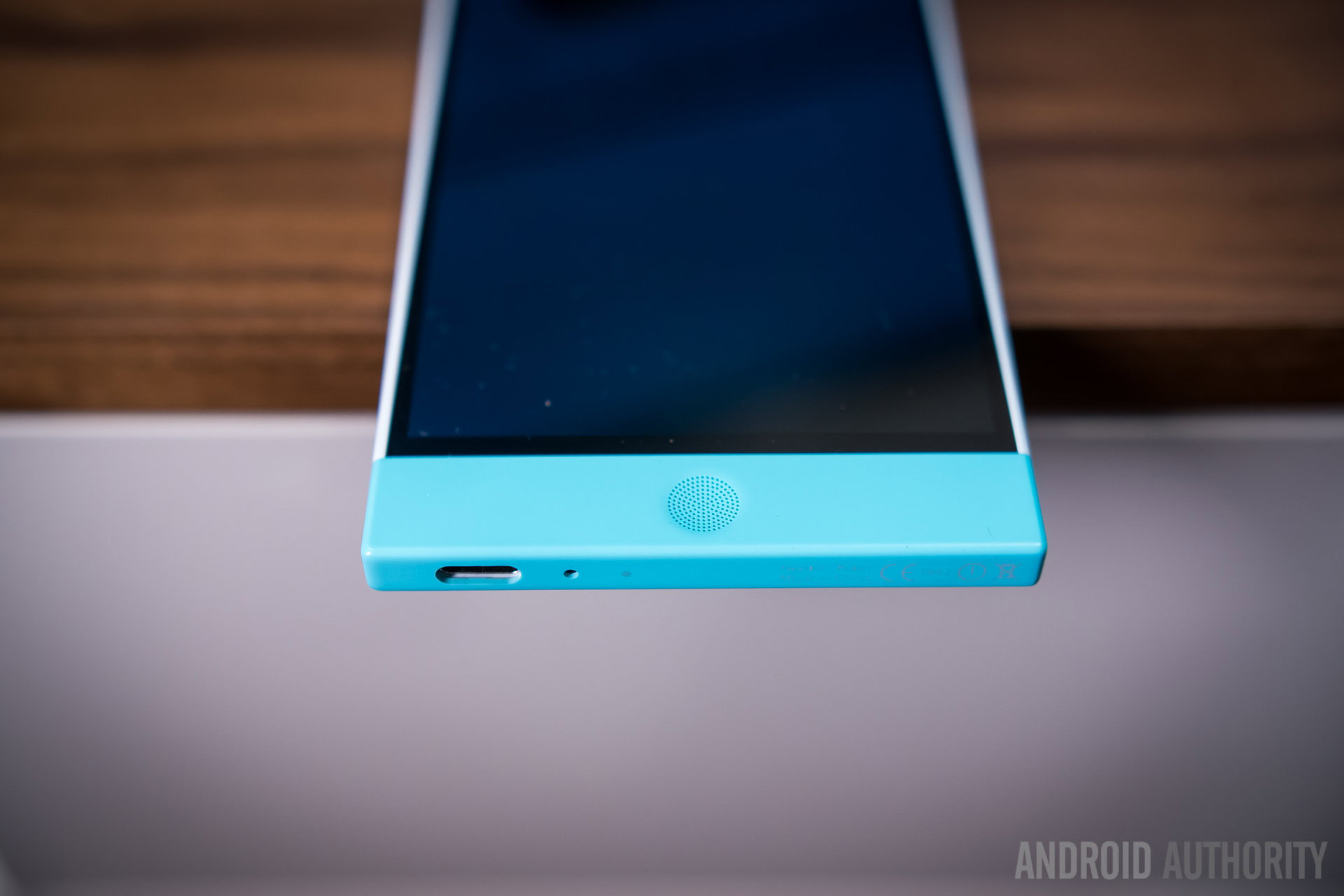
There’s a lot to like about the design of the Robin but there are a few areas that takes adjusting to. One of these is the location of the USB Type C port, which is offset to the left of the bottom of the phone and means gripping the phone is extremely difficult when it’s on charge. While the software goes some way to solving this by allowing you to use it upside down – unless you’re on the home screen that is – it’s near on impossible to comfortably grip if you have the charger and headphones plugged in at the same time.
On the left of the Robin is the two circular volume keys that are recessed enough to provide solid tactile feedback, while on the right is the dipped power button, which also houses the fingerprint sensor. The design of this is similar to that found on Sony’s latest Xperia Z5 range, but the button is more dipped, meaning you have to press it down further than you might have first thought.
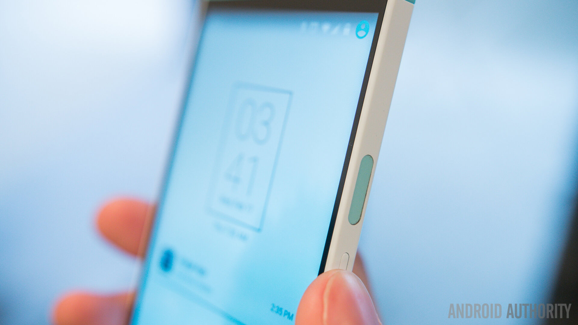
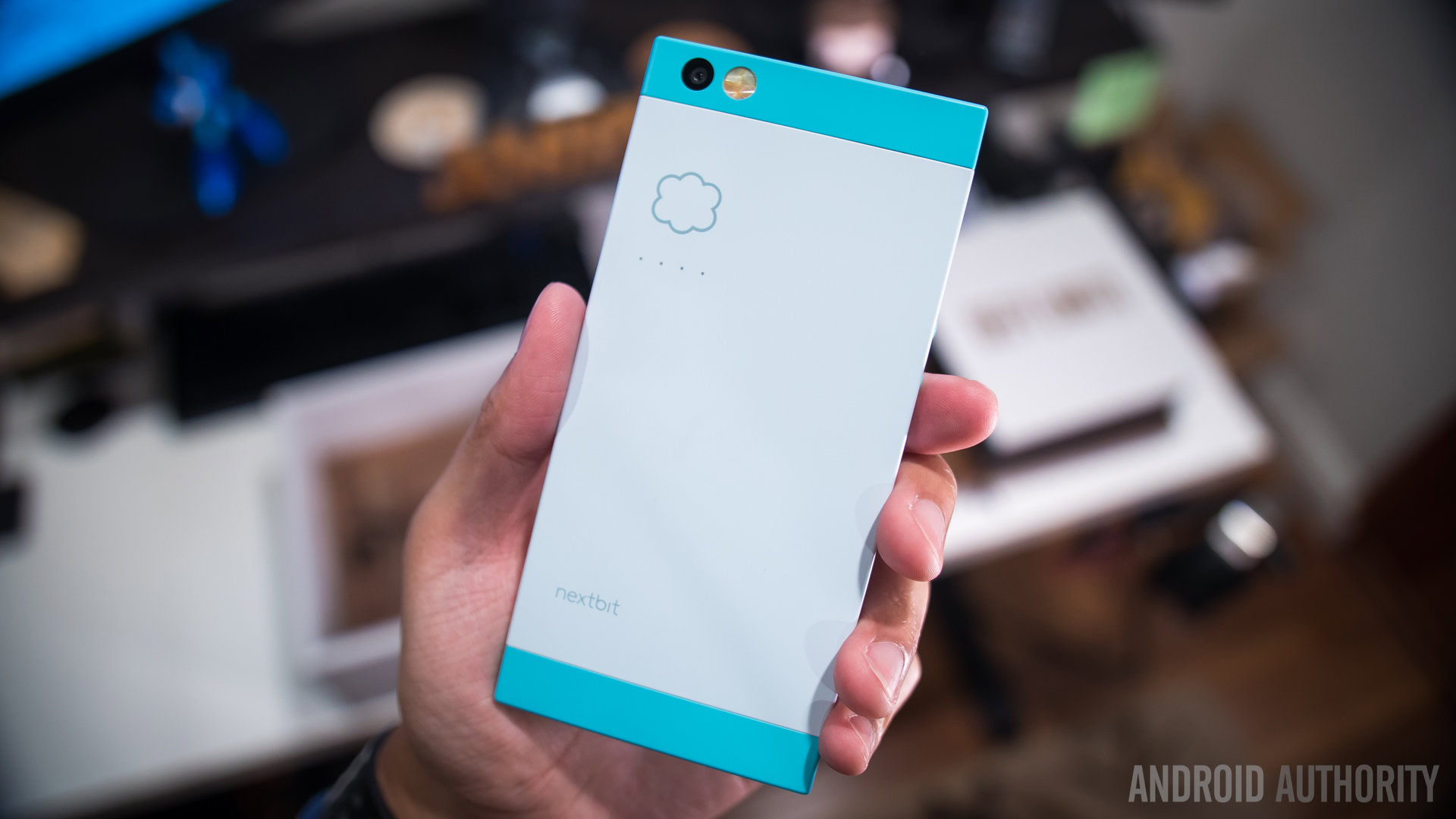
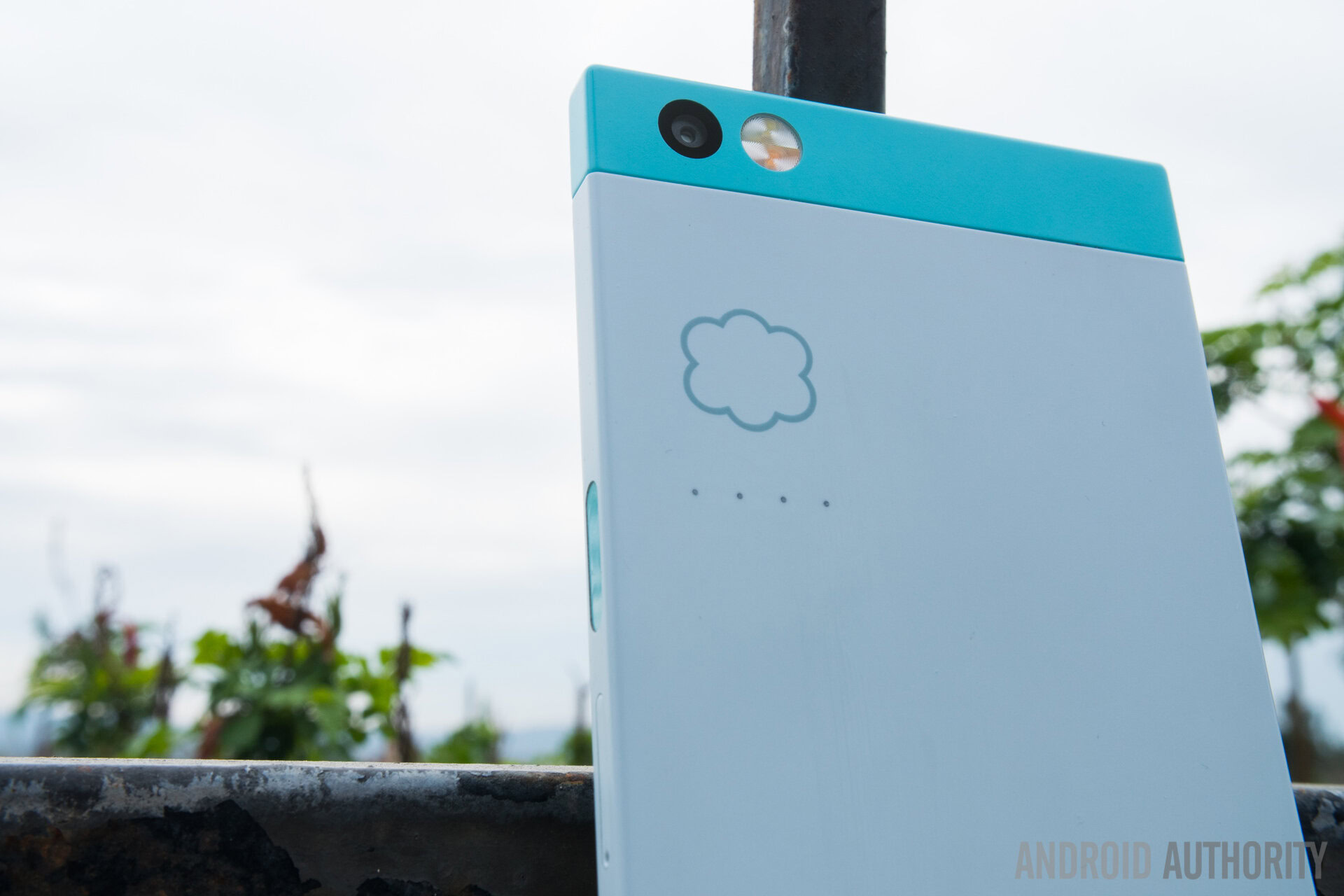
On the back of the Robin is the circular camera elements alongside a rather nifty cloud logo, which has LED lights underneath that light up when the Robin is connected to the cloud; it’s a cool design feature that makes the Robin feel ever more unique. The back is made of plastic but, as we’ll touch on later, it can get as hot as a metal smartphone does; that being said, the phone feels sturdy and quite comfortable in the hand.
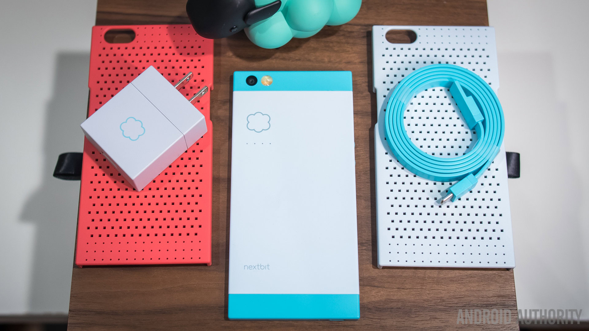
As you can see by the plethora of images used in this review, the unique identity of the Robin is also largely down to the colour scheme; rather than the more-traditional black and white colours we see on other smartphones, the Robin is available in this rather quirky mint colour. This is also where Josh and I agree and disagree; while Josh prefers the midnight colour, I rather quite like the Electric Blue version, which is exclusive to those who backed the Robin on Kickstarter. Both of us agree that, while the mint colour is certainly unique and quite nice, the other colour options are more likely to appeal to you and, when questioned, Josh’s brother had no hesitation is saying the midnight colour was the one to buy.
Despite a few elements that do take adjusting to, there’s no denying that the Nextbit Robin is a striking smartphone in every sense of the word and, in a world full of devices that blend together – much like the clouds in the sky – the Robin certainly stands out. HTChave a considerable pedigree in making stylish smartphones and now – no doubt thanks to the influence of Scott Croyle – Nextbit does as well. If there’s one area that Josh and I definitely agree, it’s that the Nextbit Robin is one of the nicest smartphone designs we’ve used in many years.
Display
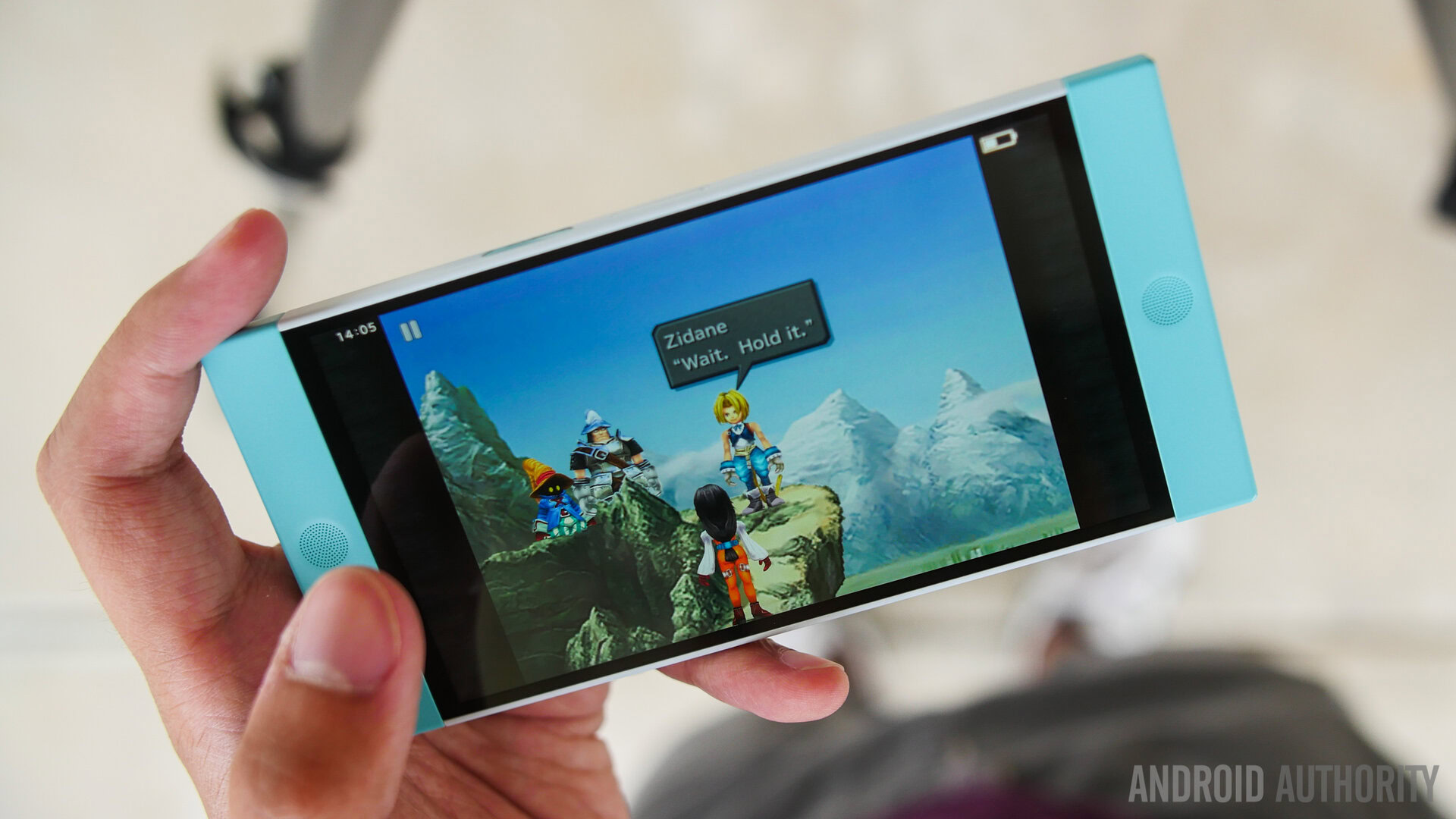
In between the bezels on the front, the Nextbit Robin has a 5.2-inch Full HD IPS display, which is acceptable given the price tag. Full HD has become the standard for affordable flagship devices and the Robin’s display is on par with the current crop of Full HD devices at the same size.
In actual usage, the display proves to be satisfactory, but not amazing. When testing the display in the Arizona sun, Josh found that the display remained legible when the phone was set to full brightness, which is somewhat surprising as other devices do struggle in direct light. Many of you may be contemplating whether QHD would have been a better choice to make the Robin stand out more from other affordable flagships, and while it would have helped, it’s unlikely the phone would have remained as affordable.
As Josh eloquently puts it, the display is absolutely fine and – when you have the right expectations of it (remembering that it’s a device that costs $399) – the display is actually great. If you’re coming from a more expensive device that has QHD resolution, you might find yourself a tad disappointed, but for the most part, the display on the Robin is certainly more than acceptable for an affordable flagship at this price.
Software
Aside from its unique design, the Nextbit Robin truly stands out from the rest of the smartphone market thanks to its unique selling point; the innovative cloud-based smart storage provided by the Nextbit cloud. However, before you rush to buy the Robin, it’s worth keeping in mind that this isn’t cloud storage in the traditional sense, and the experience vastly differs from cloud backup solutions such as Google Drive or Dropbox.
Why it differs so vastly is solely down to the implementation of cloud storage into the OS; while the Robin does run stock Android in its entirety, Nextbit’s Smart Storage features have been baked directly into the OS so it’s able to intelligently manage your storage. To do this, the Robin automatically offloads the apps and photos you’re not using to the cloud when your smartphone is running out of space, but this comes with its own set of issues.
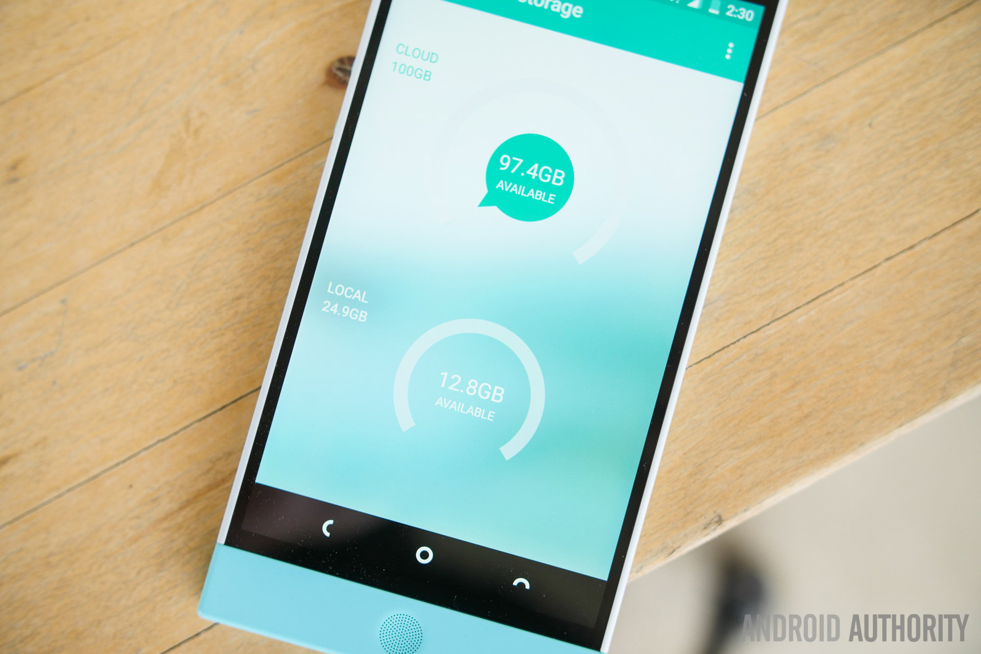
For example, when we received our Robin smartphones, they had been set up as if they had been used for many months as it showed the smart storage in action. However, when you use the phone from new (or after a reset), and subsequently run out of space (if, for example you take thousands of images when travelling for a week), the smart storage features won’t offload any apps or photos as you’ve only just taken / installed them.
Furthermore, there’s no way to force a backup to the cloud as you, the user, have no control over the cloud storage feature. This is where many users are likely to be left disappointed and both of us are no different; the key selling point behind the Robin is the cloud storage feature, but as the user has no control over the storage – whether it’s being able to force a backup or use the storage as you see fit – the cloud features do leave you wanting.
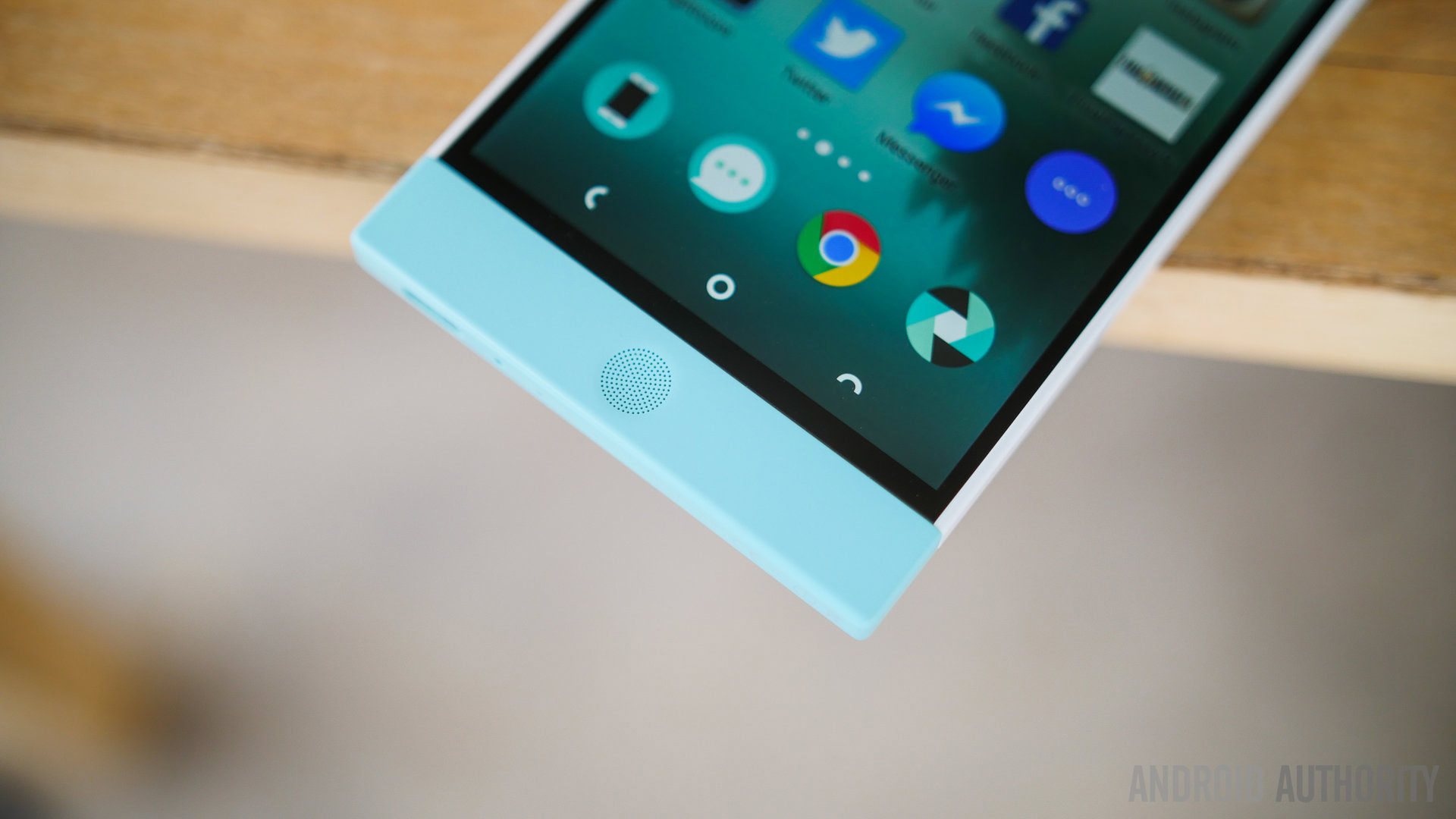
With that being said, the smart storage features do have the potential to be incredibly useful. For the average consumer, who keeps a smartphone for two to three years, the cloud backup will come in handy after around 12 to 18 months, when you’ve filled up the phone and the lack of storage is becoming an issue. In its current state, it’s unlikely you’ll use the smart storage features too often in the first 12 to 18 months but with a simple tweak to the experience, Nextbit could make the Robin truly stand out.
What should Nextbit do? It’s simple; give users access and greater control over the cloud storage, whether it’s allowing them to force a backup or even use it as traditional cloud storage (like Google Drive). How could Nextbit do this without having to put considerable resources into building it into the next update? Josh has the perfect solution; build an app, ask users to login with their Nextbit account (which you have to sign up for to use the smart storage features) and you can manage all the cloud features from there. Will this happen? At the moment, it’s unknown but we honestly believe they’ll adopt this approach by the end of this year.
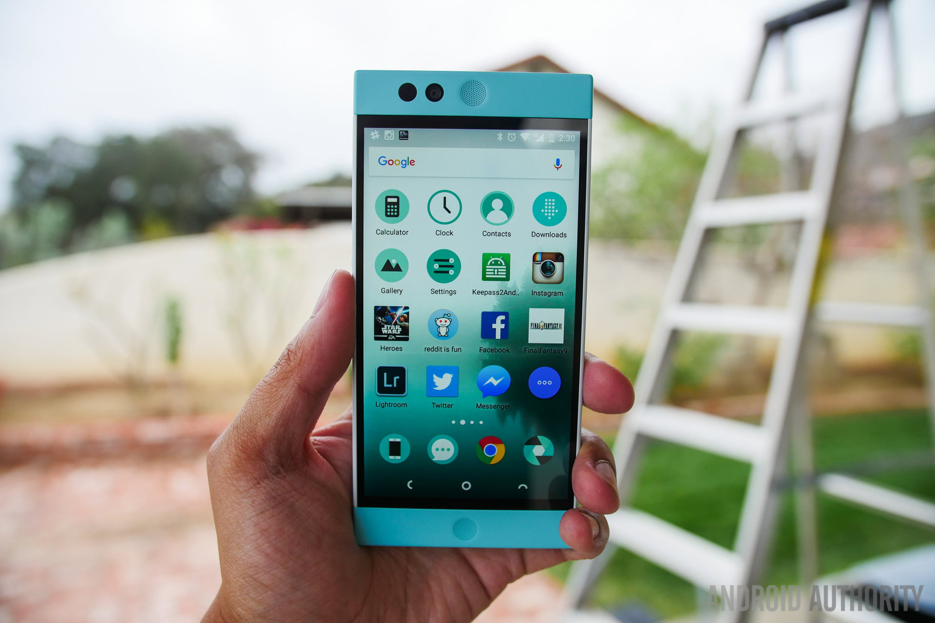
The cloud storage features may be a key selling point but what about the rest of the Nextbit software experience? For the most part, the company has stuck to stock Android, which is unsurprising as Mike Chan, the co-founder and CTO at Nextbit, was a software engineer at Google and worked on Android from its inception until Android 3.0 Honeycomb.
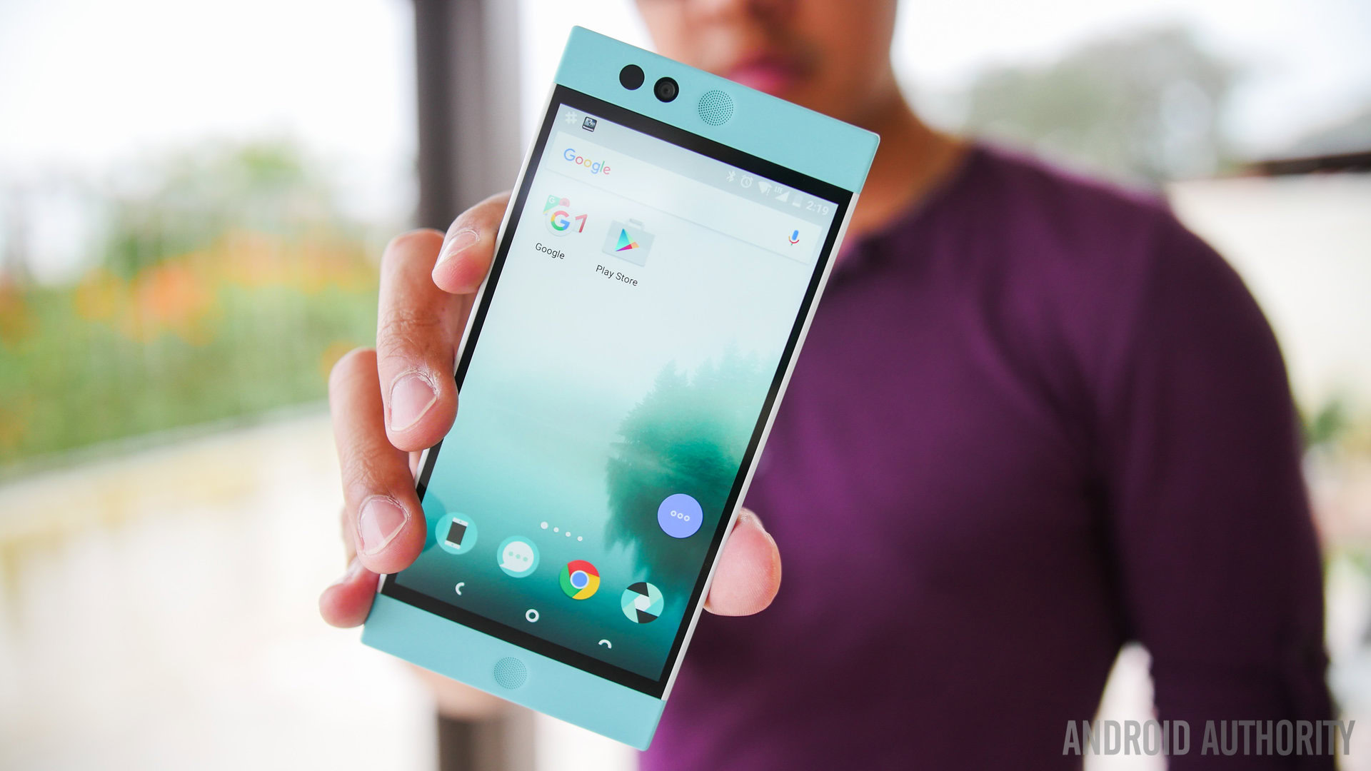
The changes to stock Android are minimal and mostly visual, with the key changes being the colour set and the launcher adopted by Nextbit. The company’s launcher is key to the cloud storage experience as apps that have been offloaded to the cloud are represented by a grayed out icon and restoring an app is as simple as tapping on it (although, there’s no way to offload a particular app or an app you’ve restored by accident). The launcher also supports pinned apps, which will never be offloaded to the cloud and there’s also an omnipresent menu button, which gives you quick access to various lists: your pinned apps, apps that you have archived to the cloud and all your apps.
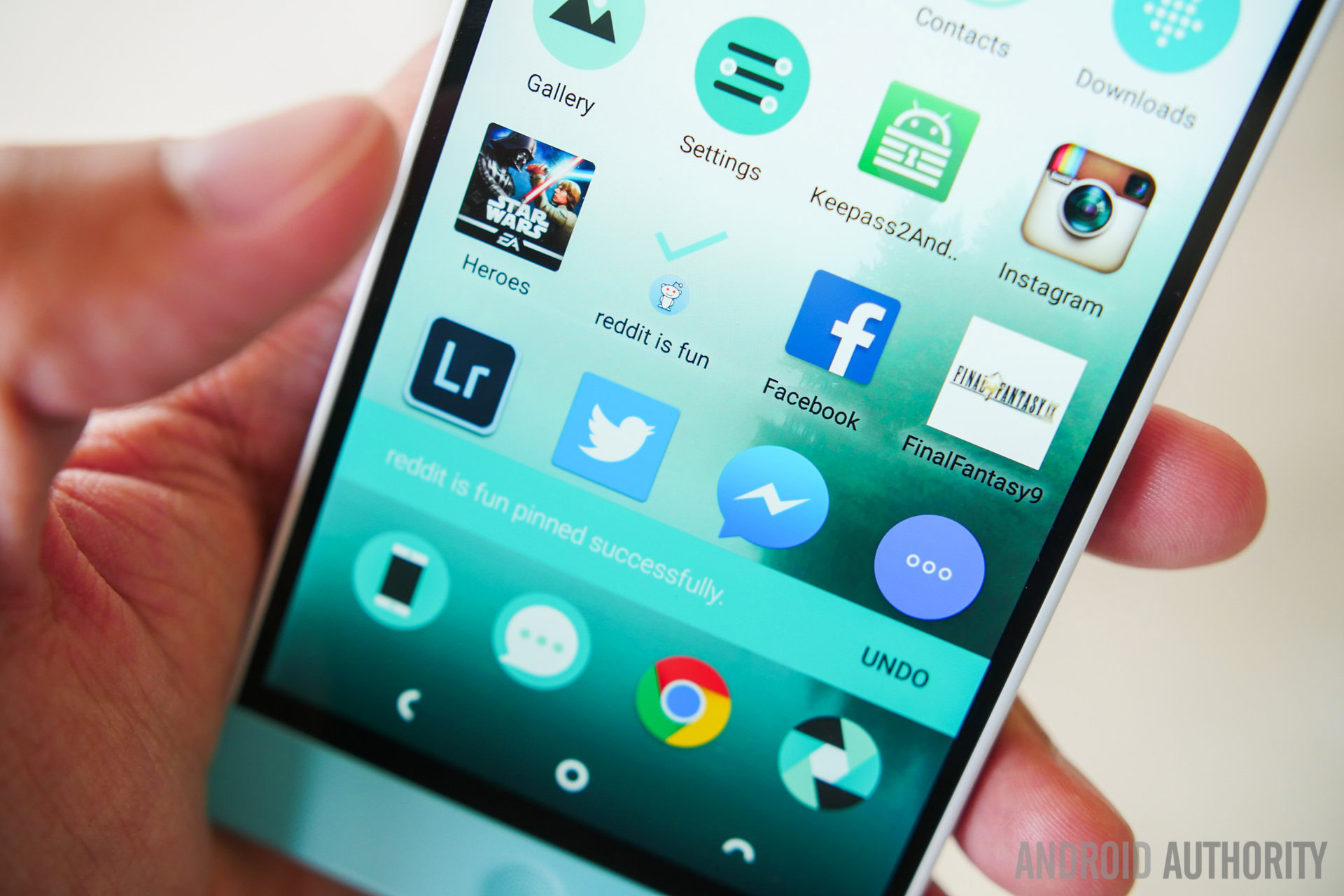
You might be asking why you’d need a list for all your apps and the answer is somewhat simple; the Nextbit launcher comes without the app drawer found in the traditional Android experience. What is good however, is that if you choose to change the launcher to one of the excellent third-party launchers available, icons for archived apps are still grayed out and you’re still able to restore apps with a single click. This is crucial as – at least while running Nova launcher – you get the benefit of the smart storage features without being bound to Nextbit’s launcher. For those who do use the Nextbit launcher, you can easily pin an app by swiping down on it and we’d like to see Nextbit add the option to swipe up on an app to offload it to the cloud, as the ability to force a back up would really improve the smart storage experience.
There’s a particularly good reason you might choose to use an alternative launcher and that is the colour scheme used by Nextbit. The company has clearly attempted to make an ethereal experience using light colours and for the most part, the experience is mostly positive.
That being said however, there are a few areas that Josh and I agree could be improved; in particular, the notification menu is a light grey and semi-translucent colour that looks sloppy, especially when used in a light app. The translucency of the notification menu is quite nice when used in an app with dark colours, but the experience is strange when you pull the notification menu down while using an app that has predominantly light colours.
Despite a few changes to colour scheme, the Robin is stock in almost all its entirety and if you’re used to stock Android, you’ll find the Robin easy to use. I’m personally not a fan of stock Android, but the Robin feels like a smarter version of stock Android and is surprisingly enjoyable to use.
Camera
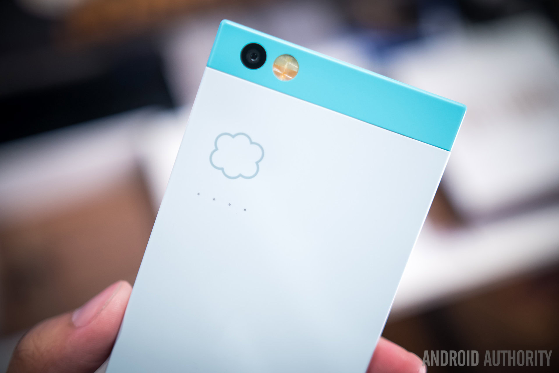
On paper, the 13MP camera on the back of the Robin should be average at best but the company has really surprised us with the quality of this camera. The sensor itself is the same one used by Samsung in the Galaxy Note 4 and, although it doesn’t have all the features included in the Note 4, the camera is certainly impressive.
The Robin’s camera comes equipped with Phase Detection Auto Focus and f/2.2 aperture and most images captured are usually quite vibrant and, despite the lack of optical image stabilisation, low light performance is much better than expected. It’s not without its flaws however, as as there is a fair amount of noise reduction happening in post-processing meaning images aren’t the sharpest on the market and in particular, noise is apparent when zooming into a particular image.
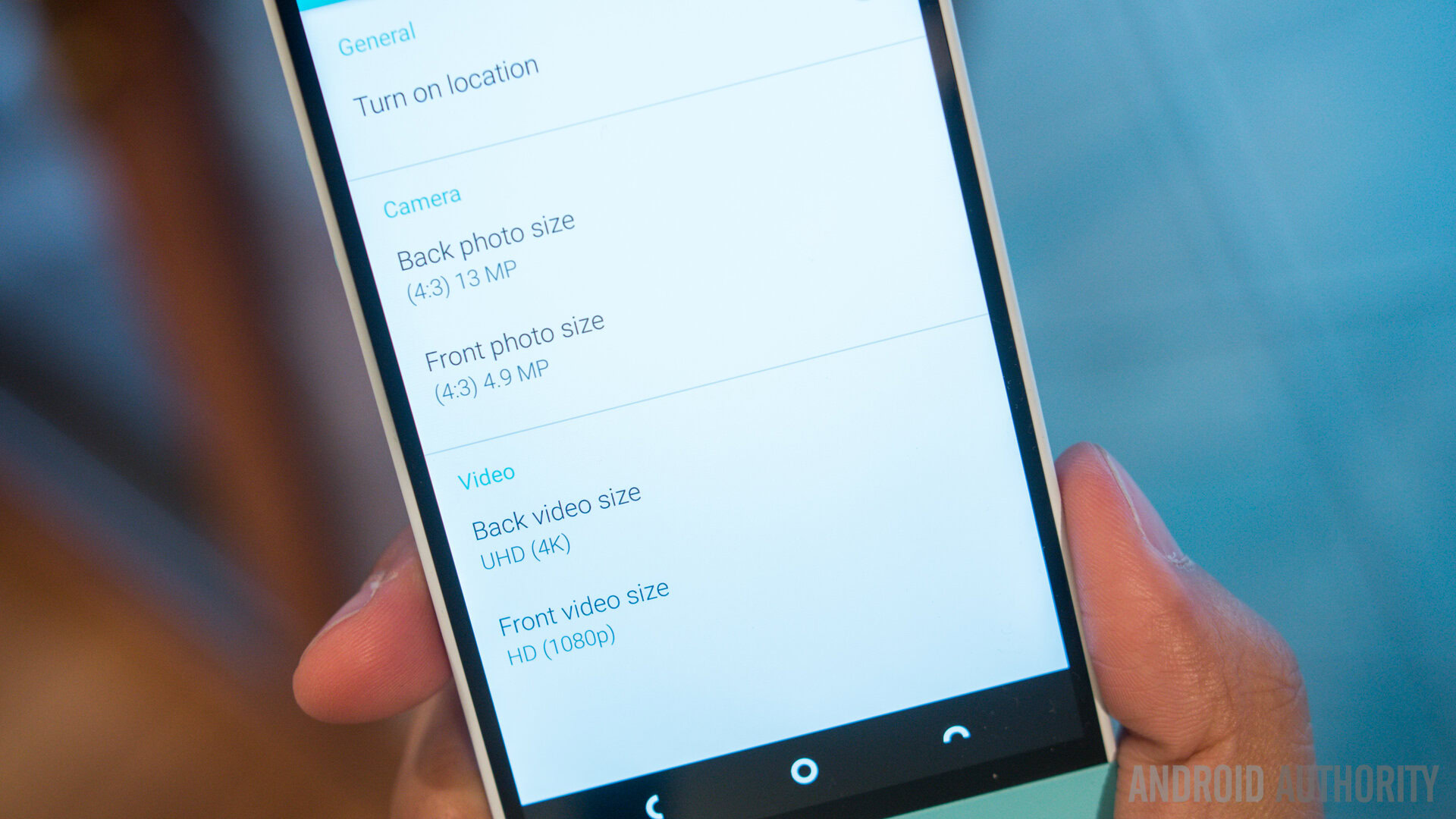
By far the biggest disappointment with the camera is the camera app itself, which is bare and leaves us wanting more. Firstly, this build of the Robin is lacking in camera modes, including panorama mode, which Nextbit say will be available in the next software update. Both, Josh and I, have also found that the camera app is rather slow with a noticeable lag when taking an image; when taking a normal image, the Robin takes between half a second and a second to take the image, while there is 2-4 seconds lag when capturing a HDR image. Nextbit have told us that they are working on a software update to remove this lag, but it’s unclear when this update will be released.
That being said, the camera app does come with a few modes and by far, the most interesting of these are the HDR and manual modes. When capturing a HDR image, the Robin does well to brighten the image with less shadows, but it does fail to have an effect on blown out areas of the image.
Below you’ll see the effect of HDR on the Robin, with images on the left captured without HDR and the ones on the right, captured with HDR.
The other mode that you may use quite often is manual mode, which is nice but is not a true manual mode. For example, the first setting Josh changes in manual mode is shutter speed but this option isn’t available on the Robin. Furthermore, the white balance options are presets – such as cloudy, daylight, incandescent etc – and there’s no option to configure the white balance to a particular Kelvin figure. With that being said, the manual mode is really well designed as – if you’re holding the phone with two hands – the various settings load next to your left hand and, once selected, the control sliders load next to your right hand.
Overall, the camera is certainly impressive on the Robin and despite a few flaws, it’s actually rather impressive. From an affordable flagship that costs $399, you could be forgiven for expecting a less-than-stellar experience, but the camera on the Nextbit Robin is a pleasant surprise and is a lot better than it actually should be.
Performance & Hardware
Under the hood, the Nextbit Robin is certainly on par with most smartphones at the same price (and several that are more expensive as well). It’s powered by a Snapdragon 808 processor with Adreno 418 GPU, 3GB RAM and 32GB storage, and the performance of the Robin mostly lives up to the powerful internals it possesses.
On the software side, Josh and I haven’t found the handset to slow down and mostly, the performance is above average and definitely more than acceptable for an affordable flagship. The Robin does have the half-step of lag that is found on other Snapdragon 808 devices but, unlike the Nexus 5X, 3GB RAM does serve to make the experience almost-always snappy and responsive.

However, there are a few areas of performance that the Robin leaves us wanting; in particular, the heat management. I’ve personally found the handset can warm up considerably, and on one occasion, it even overheated to the point I wasn’t able to hold the phone without it burning my hand. Granted, this was while the phone was plugged in to a charger, the phone was running low and was trying to offload apps to the cloud while also downloading new apps from Google Play, but it was a major concern.
As covered earlier, the smart storage features don’t work as you expect them to and the actual performance of the automatic backup does seem to be a little hit and miss. It’s worth noting that Josh and I agree that it will take a while for you to fill the internal storage before you need to rely on the smart storage features, and it’s quite likely the cloud backup will be vastly improved by then.
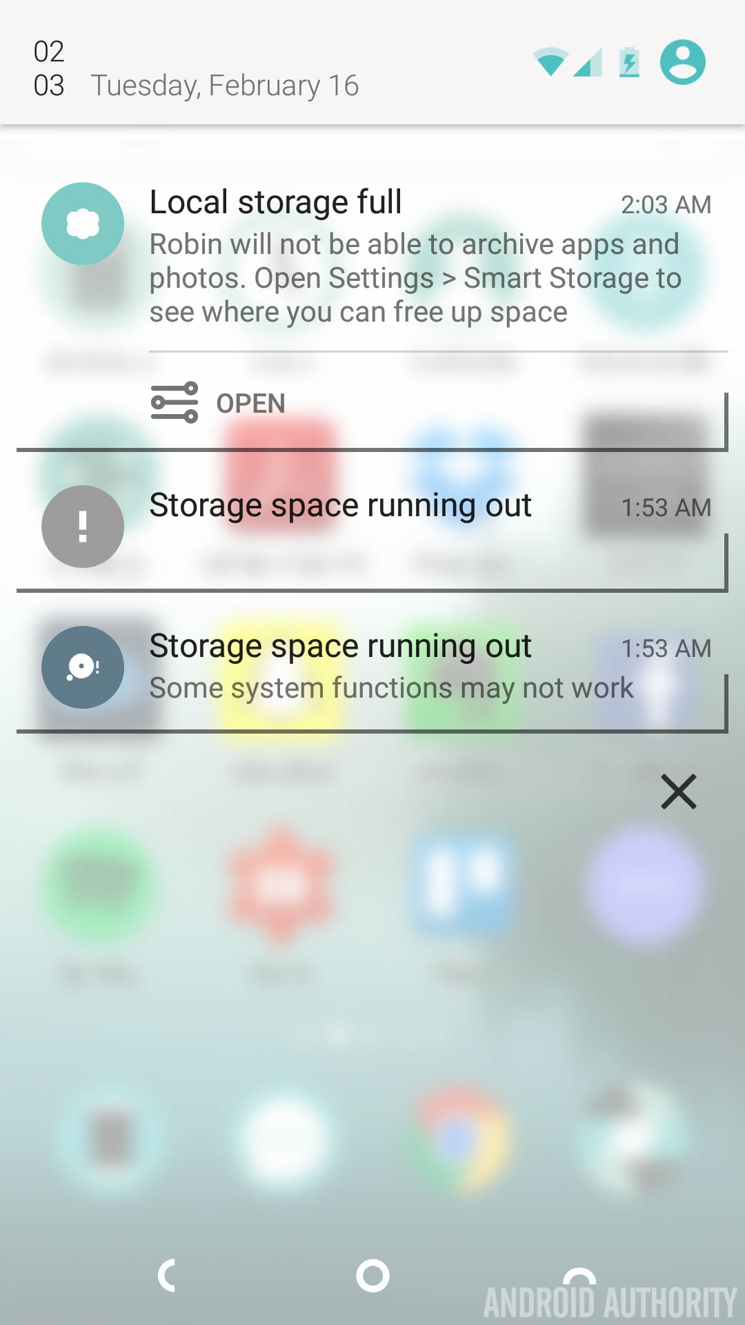
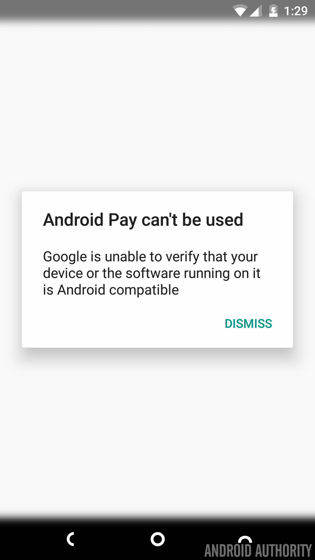
Alongside the impressive hardware, the Robin also comes with NFC, which is missing from other smartphones at a similar price, and can be used with Android Pay that comes preloaded on the phone. It’s worth noting however, that when I tried to set up Android Pay, the Robin failed Google’s authentication checks; we’ve reached out to Nextbit and they’ve said the Robin is still waiting for certification from Google for Android Pay, and while these review units don’t work with Android Pay, the final units shipped to backers will support Android Pay.
By far the most surprising part of the Nextbit Robin is the dual front facing stereo speakers, which are absolutely fantastic and some of the loudest speakers on the market. HTC’s BoomSound feature is known for leading the way in terms of audio quality and the Robin does seem to imbibe the quality of these speakers. As an example, Josh was able to watch a YouTube video in a crowded restaurant and hear the audio clearly, with no issues at all.
Overall, the Robin features some impressive hardware that, while being older compared to the new chipsets of 2016, does offer a flagship experience. The company certainly needs to improve its smart storage features and implementation, but for the most part, the Nextbit Robin delivers an experience that is worthy of most flagship devices.
Battery Life
The area that the Robin most disappoints us is the battery life; under the hood, the Nextbit Robin is powered by a 2680mAh battery, which, coupled with Doze Mode in Marshmallow, should offer ample power for a full day’s usage. In actual practice however, the Robin does fail to deliver in the battery department.
Although the battery isn’t a 3000mAh unit like many other smartphones, there is the expectation that it will last a full day but it does struggle to do so. While testing the Robin in the Arizona sun – which included taking lots of photos and the phone was constantly searching for coverage – Josh found the phone struggled to make it to the end of the day, with around 3 hours’ screen-on-time.
One of the best features in Marshmallow is doze mode, which is meant to offer vastly improved standby time and, as we found in the Nexus 6P during Best of Android last year, it can be very effective when implemented correctly. On the Nextbit Robin however, doze mode is very ineffective and in some of my testing, the standby battery time is worse than on Lollipop. During day to day usage, I’ve found the Robin battery can drain to almost empty in less than two days with very minimal usage and, on one occasion, I’ve even had it drop 35 percent in less than three hours with no use.
Throughout our testing, Josh and I agree that there is something preventing Doze mode from being effective and this is most likely due to something running in the background. Given the Robin runs almost-stock Android, it’s likely that the company’s smart storage features are preventing doze mode from being effective and it’s a shame, as the battery life on the Robin definitely leaves us wanting more.
In effect, the Robin is a smartphone that runs Marshmallow, but with the battery life of Android Lollipop.
Although the Nextbit Robin only has a 2680mAh battery, the presence of doze mode gave us hope that the battery would make it through a day but it certainly struggles to do so. If you’re someone who uses your phone even moderately, it’s likely you’ll need to keep a portable charger with you, as you’re likely to be searching for a power outlet by the end of the day. In effect, the Robin is actually a smartphone that runs Marshmallow, but with the battery life of a smartphone running Lollipop.
Gallery
Final Thoughts
The Nextbit Robin is definitely one of the most interesting smartphones ever made and if you’re looking for a smartphone that different in many ways, the Nextbit Robin definitely sets the standard. Every bit the smartphone that the LG Nexus 5X and the OnePlus 2 should have been, the Robin has its head in the clouds, for better or worse.
Rather than being the complete product, the Robin is definitely a dreamer’s phone in the sense that it shows the potential of cloud storage, but with some improvements needed in the implementation. Giving Nextbit the benefit of the doubt, the company did say the cloud storage features worked in a particular way and they’ve definitely achieved this, but it’s not enough o make the Robin a truly cloud-first smartphone. Luckily for them, when you look at the Robin phone-first, it’s pretty fantastic.
At the moment, it’s a nimbus cloud, but given time for the smart storage to evolve, it has the potential to become a cumulus cloud.
At the end of the day, the Nextbit Robin is a very unique phone, but with this, comes its own set of flaws: mainly, it’s a new concept that, while performs exactly as Nextbit said it will, definitely needs improving. At the moment, it’s a nimbus cloud, but given time for the smart storage to evolve, it has the potential to become a cumulus cloud.
At a cost of $399, the price makes sense for a phone that is – cloud storage aside – rather fantastic, but if users had control over the 100GB storage (which is provided for free by Nextbit), the phone and its price would be an excellent choice. As an affordable flagship, the phone is great and with the right tweaks and improvements, it has the potential to be a truly remarkable smartphone.