Affiliate links on Android Authority may earn us a commission. Learn more.
Nexus 6 review: Google goes all-in
November 12, 2014
Amid the multitude of flagship smartphones available today, one line that Android purists fervently track is the Nexus. Speculation that the entire series was going to be abandoned in favor of the rumor Silver program turned out to be unfounded. Instead, we got a new, larger, more powerful Nexus smartphone, that’s understandably one of the most eagerly anticipated devices of the year.
You might like: Best Nexus 6 cases
While previous Nexus devices were a study in modesty, Google’s latest smartphone is anything but humble. Google has gone all in, but does the Nexus 6 live up to our high expectations, especially considering that high price tag? We find out this, and more, in our in-depth Nexus 6 review!
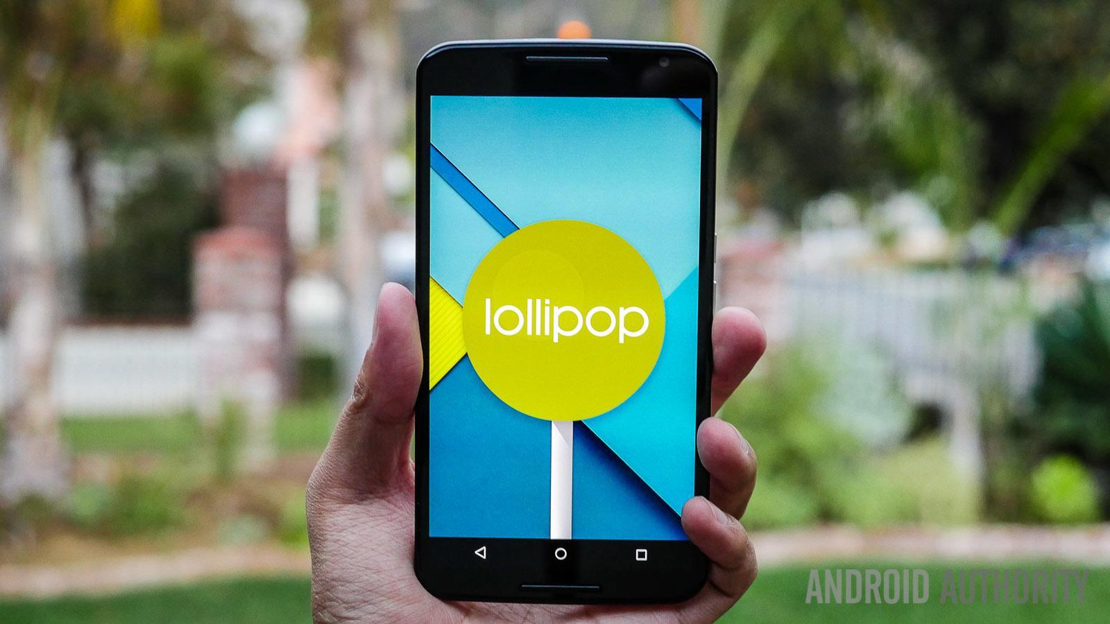
The Nexus 6 is literally and figuratively a grown-up device, featuring a large form factor that goes beyond most competing devices released this year. The Nexus 6 is manufactured by Motorola, so it’s understandable that in terms of design, it basically looks like a blown up Moto X (2014). The metal frame, the distinct curve on the back, and the button layout on the right side make a return here, just on a much larger scale.
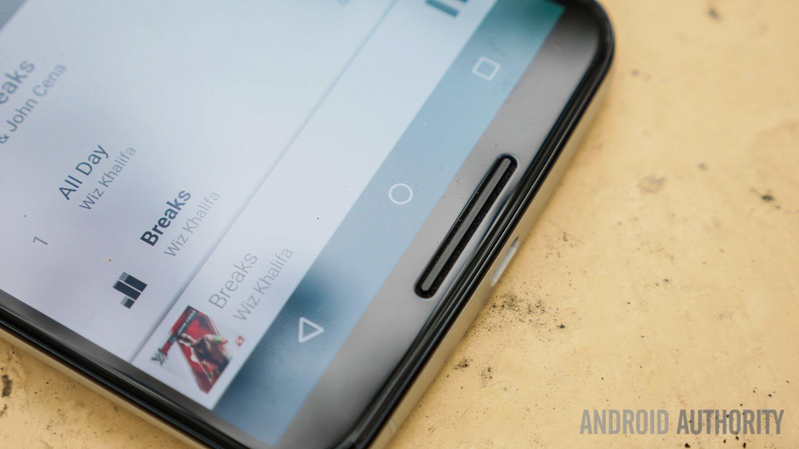
Two grilles up front house the earpiece and the dual speaker setup. You may find it surprising that there is no LED notification light anymore, but there is a specific reason for this choice that we will discuss in the “Software” section below.
Relatively thin bezels are found on the sides of the large 5.96-inch display, which is covered by 2.5D glass, which features a subtle rise and curve all around its edges. At the top and bottom, the headphone jack and the microUSB port are centered, and the lines of the metallic frame make for a really slim profile.
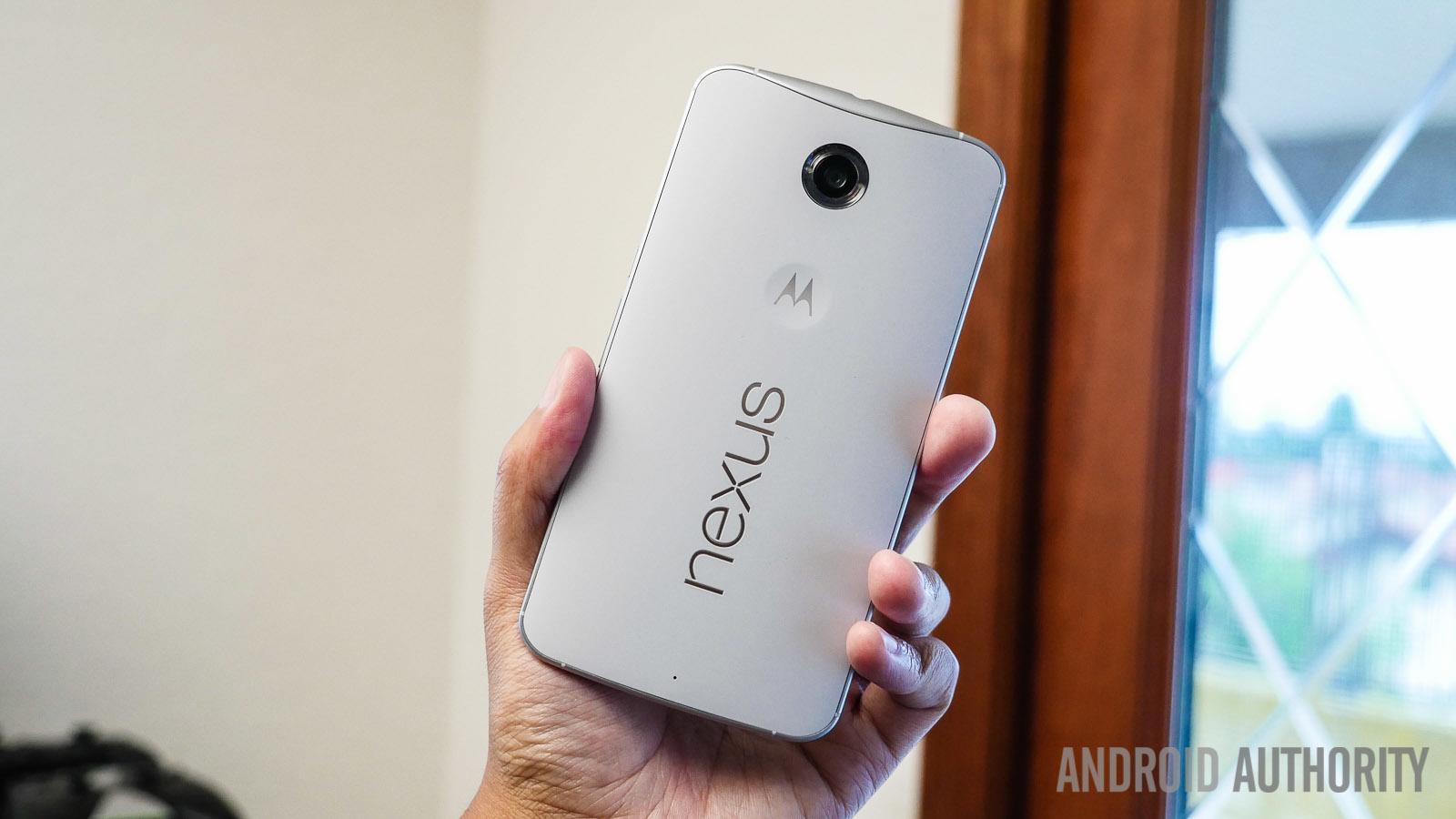
Continuing to take inspiration from the design elements of the Moto X (2014), the camera is surrounded by a dual LED ring-shaped flash. One difference is the Motorola logo, reminiscent of the original Moto X, that isn’t as prominent as the logo on the Moto X (2014). Below the more subtle Motorola logo is the large landscape-oriented Nexus logo.
The hard plastic material on the back of the Nexus 6 doesn’t show smudges too easily, especially in this white edition of the device, and the signature Moto curve does help with the ergonomics.
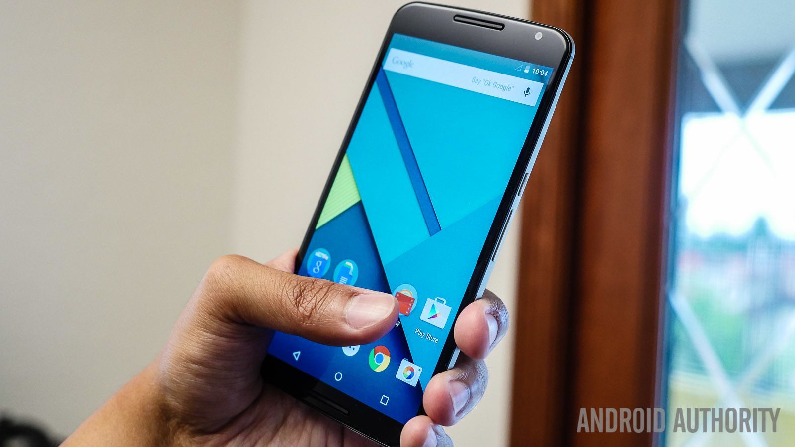
When it comes to the handling experience, there’s no denying that the Nexus 6 is a very large phone. However, so are phones like the Galaxy Note 4, which people accepted happily, although their dimensions are quite similar.
One possible reason for this difference in perception (other than the massive jump in size from the Nexus 5, which isn’t the case with the Note series), is the choice of material. The slipperiness of the hard plastic, coupled with the very thin metallic sides, makes it difficult to grip the Nexus 6 securely. The overall large size only serves to exacerbate this. Very rarely have I felt safe enough to use the device with one hand, and I was worried about dropping it more often than not. If you have large hands, you may not face too many issues with handling the Nexus 6, but for everyone else, simply using this device in day to day situations may prove tricky.

Everything said and done, the Nexus 6 is still quite simply exquisite, with its iconic Motorola design and solid construction. However, because of the handling issue, it’s not by any mean a phone that everyone will appreciate.
Of course, the reason this phone is so large is its massive 5.96-inch display, but it’s not just the size that has been given a bump. Resolution also makes a jump to Quad HD, resulting in an impressive pixel density of 493 ppi.
Simply put, this screen is an absolute beast that offers a viewing experience bar none, and due credit should be given to its AMOLED construction. Colors remain vivid and bright throughout, without going too overboard. All the real estate makes it very fun to play games or watch videos, and this benefit alone could justify the unwieldy size.
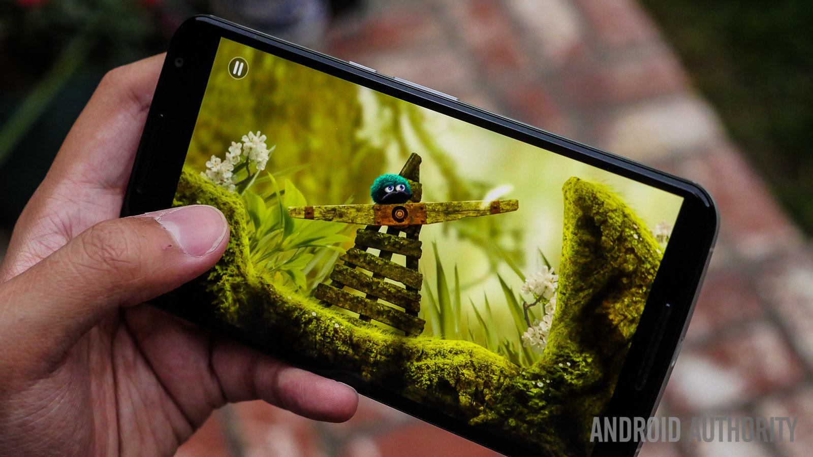
Viewing angles are also great, and the display manages to remain perfectly serviceable even in broad daylight.
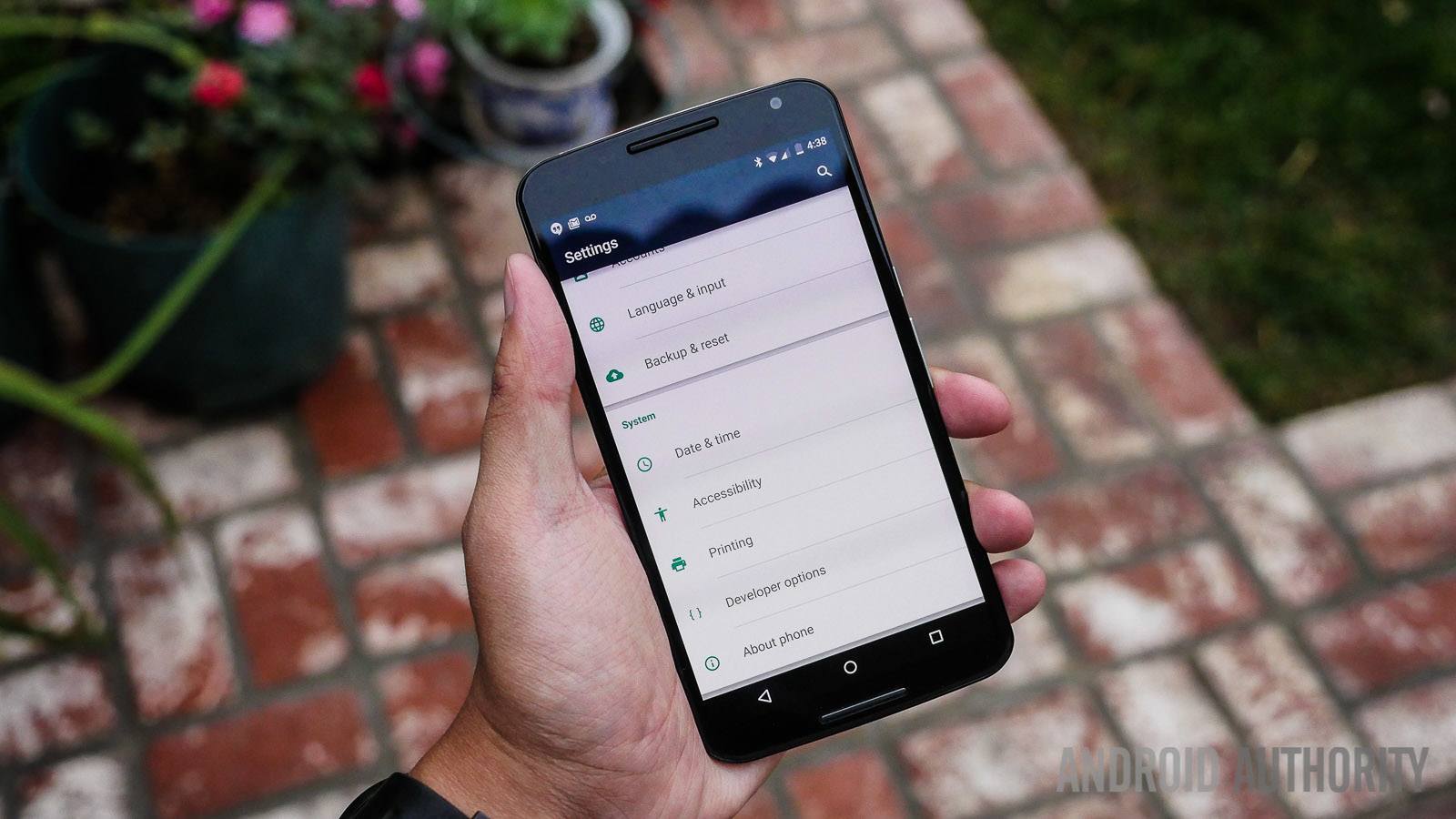
Quad HD doesn’t quite blow 1080p out of the water, and the latter would have probably provided a great experience as well. But while the upgrade to the higher resolution may not be easily noticeable, it’s still highly appreciated.
All the work and play that can be done on the Nexus 6’s huge screen is all courtesy of the best processing package available now in smartphones. With its quad-core Qualcomm Snapdragon 805 processor, clocked at 2.7 GHz, backed by the Adreno 420 GPU and 3 GB of RAM, it’s obvious that Google and Motorola have pulled all bars for this phone.
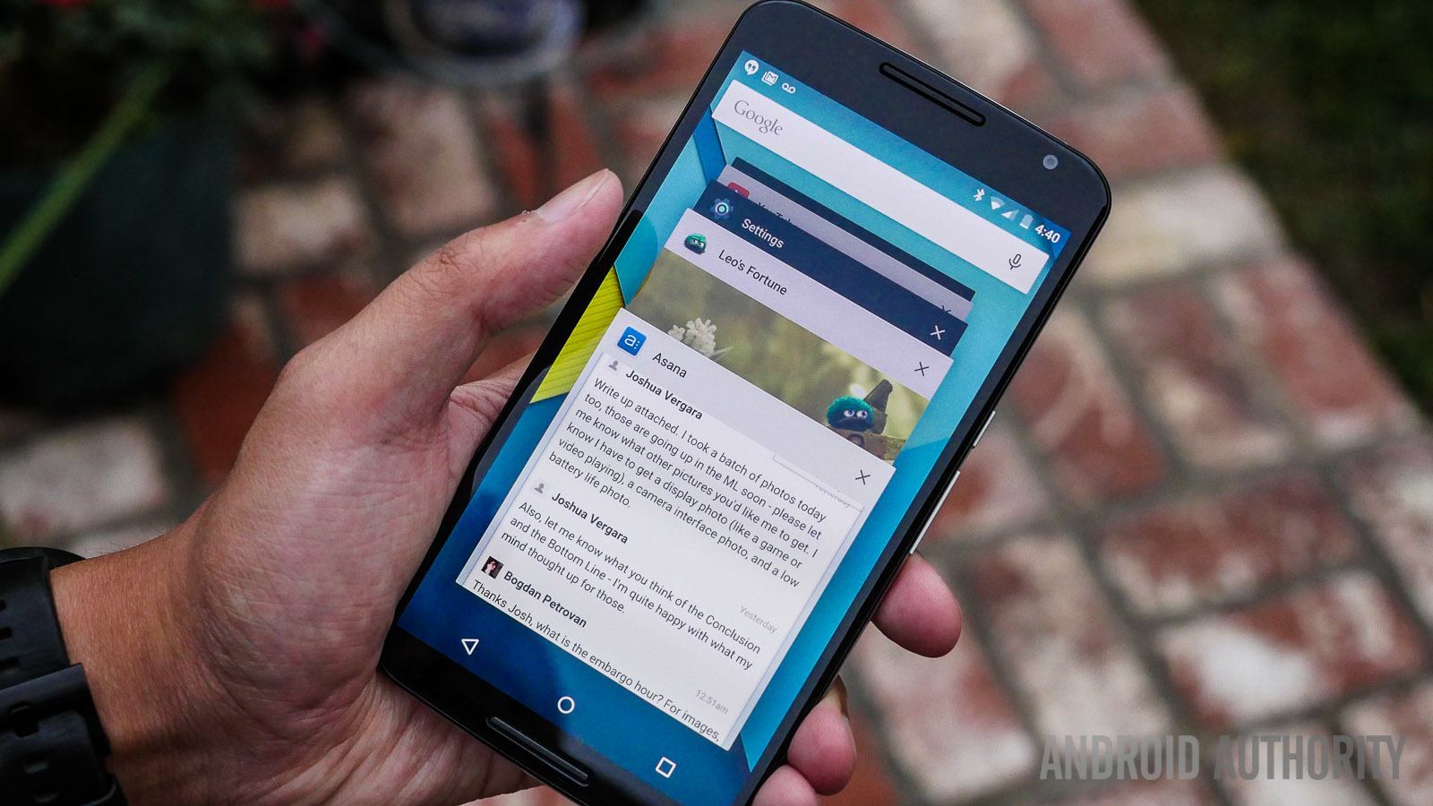
Coupled with the optimized and beautifully designed Android 5.0 Lollipop, describing the performance of the Nexus 6 as incredibly smooth feels like an understatement. Switching between applications using the new Recent Apps screen was a breeze, and with smooth transitions between each and every step, the multi-tasking experience was pretty stellar. Speaking of multi-tasking, it’s quite surprising to see how many items can be stacked in the Recent Apps screen, which now also lists any Google Chrome tabs you may have open, as well as multiple cards for different activities of the same app.
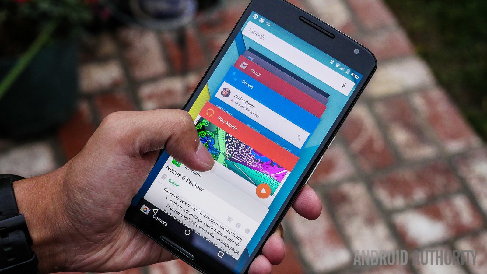
Only when I really pushed the Nexus 6 at a really rapid pace and loaded certain functions like the camera did I encounter a little extra load times, but for everything, the Nexus 6 certainly excels.
When it comes to hardware, the Nexus 6 does stay true to the spirit of the series, providing all of the necessary tools for connectivity, while forgoing the inclusion of a microSD card slot. However, compared to the Nexus 5, internal storage options have been given a bump to 32GB and 64GB respectively.
| CPU/GPU | Snapdragon 805, Quad-core 2.5 GHz Krait 450 / Adreno 420 |
|---|---|
Display | 5.96-inch, 2560 x 1440 |
RAM | 3GB |
Memory | 32/64GB |
Battery | 3220 mAh, Wireless charging, Turbo Charge: 15 minutes for 6 hours of power |
Camera | rear 13MP OIS, Dual LED flash, f 2.0, front 2MP |
Connectivity | WiFi 802.11 a/b/g/n/ac, GPS / GLONASS, NFC, Bluetooth® v 4.0 (LE) |
Network North America | GSM: 850/900/1800/1900 MHznCDMA Band Class: 0/1/10nWCDMA Bands: 1/2/4/5/8nLTE Bands: 2/3/4/5/7/12/13/17/25/26/29/41nCA DL Bands: B2-B13, B2-B17, B2-29, B4-B5, B4-B13, B4-B17, B4-B29n |
Network International | GSM: 850/900/1800/1900 MHznWCDMA Bands: 1/2/4/5/6/8/9/19nLTE Bands: 1/3/5/7/8/9/19/20/28/41nCA DL: B3-B5, B3-B8n |
Sensors | Accelerometer, gyro, proximity, compass, barometer |
OS | Android 5.0 Lollipop |
Dimensions and Weight | 82.98 mm x 159.26 mm x 10.06 mm, 184 grams |
Nexus 6 versions will be available from all major network carriers in the US. This unlocked version, available directly from the Google Play Store, worked perfectly with SIM cards from both AT&T and T-Mobile. Call quality was as good as expected in my main testing on the T-Mobile network, with calls coming in nice and clear on both ends.
The dual front-facing speakers are hidden but not obstructed by Motorola’s specific grilles, making for a good stereo experience that is a very welcome addition on the Nexus 6. It’s not exactly as good as the sound from the BoomSound speakers of the latest HTCflagships or the Nexus 9, but the sound on the Nexus 6 is almost as high on the quality scale, and clearly better than any rear or side-mounted speakers from competitors. You’ll have a great time playing games, watching videos, and doing any media consumption on this device.
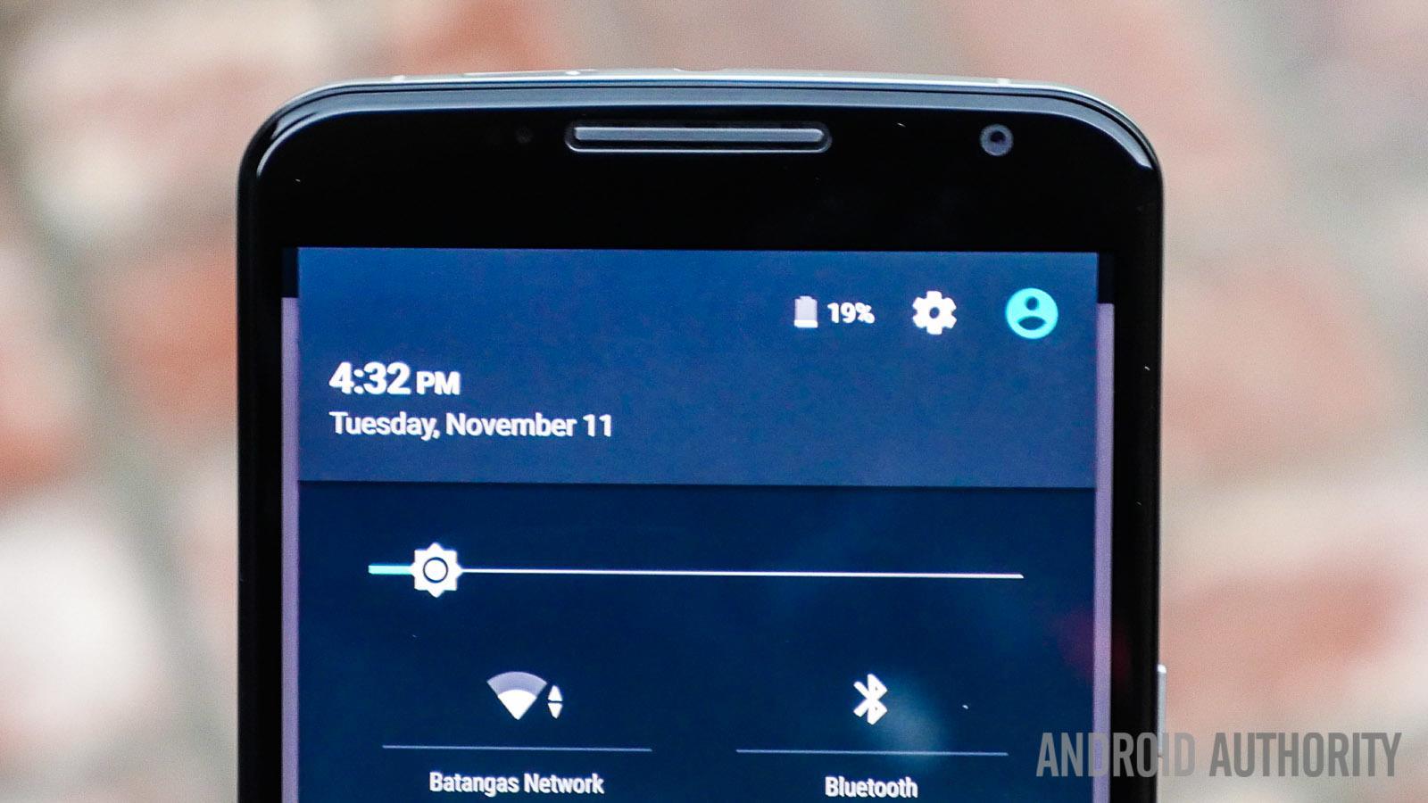
A typical advantage of large phones is longevity. Unfortunately, the 3,220 mAh battery of the Nexus 6 is only able to provide an average performance. Screen-on time never got past the 5-hour mark in my experience, which allowed for a full day of use, but never any more than that. Heavy usage will drain the battery quite quickly, and while the phone does offer good standby times, it’s hard to get two days of battery life, even with less than average use. You can activate the built-in battery saving mode to turn off all major power draining features, but a larger battery would have been ideal on such a large devices.
Thankfully, Qualcomm’s fast charging technology has made it to the Nexus 6 and the even better news is you can use the Motorola Turbo Charger that comes in the box, instead of having to pick it up separately for $35.
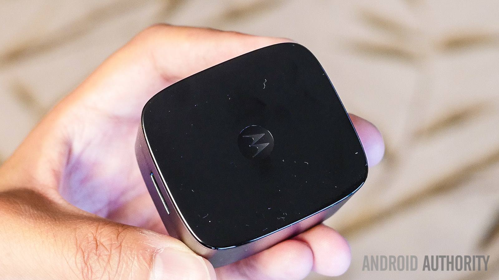
Motorola claims that a charge time of 15 minutes allows for up to 6 hours of battery life, which does happen, if you charge the device while it’s off. With the phone one, getting to the same level of battery takes around 25 minutes.
Fast charging is definitely a handy feature — in this case, unfortunately, I would say it’s also very necessary, which means you may find yourself carrying around the large plug adapter in order to use it.
One point of contention with Nexus smartphones has always been their cameras. The Nexus 4 camera wasn’t a very good performer, and the Nexus 5 is only somewhat better. There are some fantastic smartphone cameras out there right now, and the Nexus 6, with its 13 MP rear shooter with f/2.0 aperture and optical image stabilization, it certainly poised to compete.
The camera app is the Google Camera that launched earlier this year, with its simple interface, and just a few modes: panorama, Photo Sphere, Lens Blur, along with an enhanced version of HDR. The app is not hard to use by any means, but a few better design choices would have helped, in my opinion. The ability to start recording video by tapping an extra button rather than by swiping the menu over and selecting the mode would have been nice, while the settings are relatively difficult to access. On the bright side, despite these hoops that the user has to jump through, the minimalism of the app makes for a very clean experience.
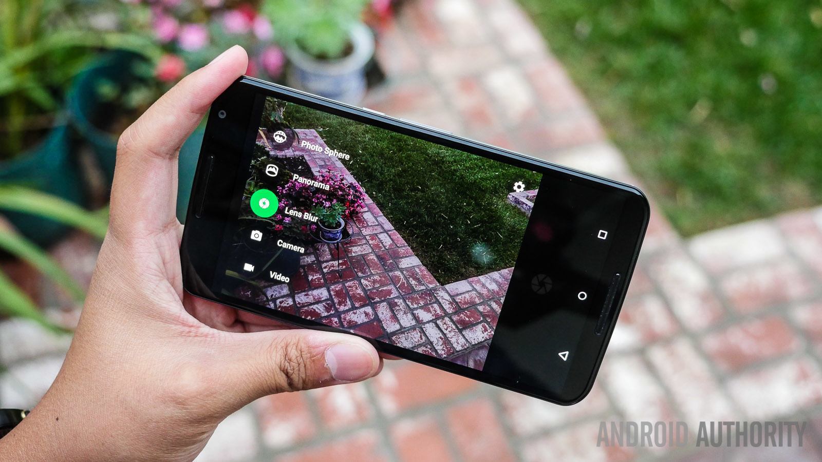
4k video recording is available and results in some nice looking video, though I did notice that video loses some of the saturation found in the pictures. Nevertheless, videos are definitely not dull by any mean. Taking panoramas is mostly a good experience, but on occasion photos weren’t stitched together that well; Photo Sphere is a novel, but ultimately rarely used mode.
Image quality is definitely a huge improvement over the Nexus 6’s predecessors. From the very first picture I took, I was pleasantly surprised by how detailed and sharp the photo was, without doing a whole lot of processing. The area around your focal point will have a very good amount of detail to it, and as far as colors go, there is still a bit of extra saturation, but the picture doesn’t stray too far from being accurate.


HDR+ actually does what it’s supposed to do, by capturing all of the dynamic ranges and putting them together for a compelling shot. Tapping on a dark point in the photo to increase the exposure can blow out the lighter parts of the scene, and HDR+ solves that problem. This is not a mode you would just have on all the time, as plenty of scenes don’t call for its usage. You’ll have the best results using it outside, where daylight creates deep shadows and intense highlights.
In the gallery below, images taken with HDR+ have visibly better contrast and exposure:
Low light shots are actually quite decent, with the low aperture of the lens and the OIS making it possible to capture some nice shots. Unfortunately, the flash isn’t much help, as it harshly illuminates the subject, and HDR+ actually helps more in these situations.

All in all, the camera is a refreshingly pleasant surprise in the Nexus 6, and I continue to be impressed after pretty much any photo that I take.
Finally, we come to the software, the crux of the Nexus experience. On top of being among to receive updates in the Android cycle, the Nexus line has always been the stage where Google showcases the latest features of its mobile operating system. Android 5.0 Lollipop is the flavor you get with the Nexus 6, bringing with it a slew of optimizations underneath a new look called Material Design.
The lockscreen has been revamped into a version of the new notification dropdown, allowing you to interact with your notifications by swiping them away or double-tapping to activate them. You can still use gestures like swipe up to unlock, and left or right to access the phone’s dialer or camera respectively.
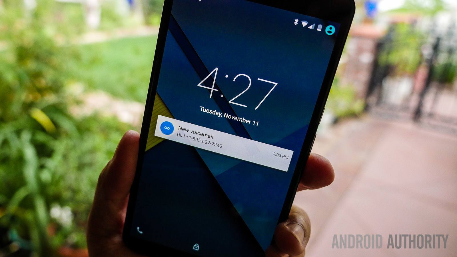
Google Now returns as a permanent second screen accessible with a swipe from the left. The card-based interface takes on an even flatter look, in line with Material Design guidelines. Opening the app drawer or folders comes with a ripple effect that reveals and conceals everything in a fluid motion, which works without any hiccups thanks to the power of the Nexus 6.
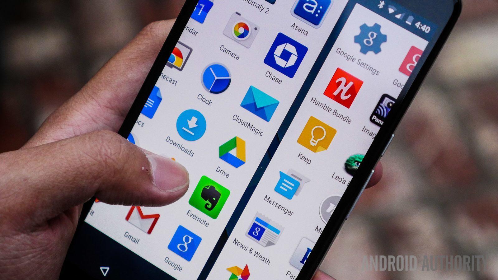
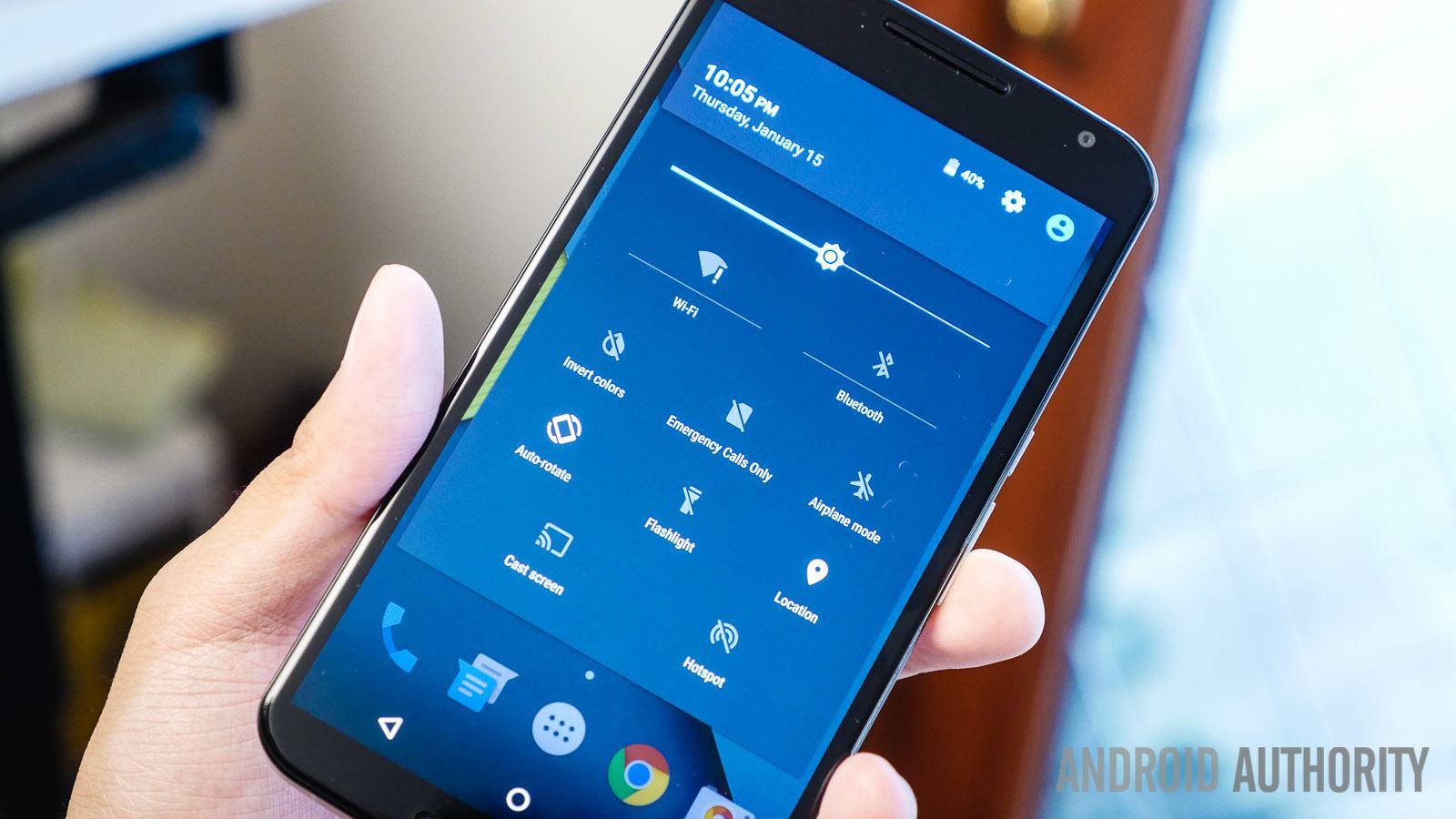
Smooth animations permeate the entire user interface now, allowing for what feels like a seamless transition in and out of applications. Notifications in the dropdown are arranged as a stacked set of cards, and you need to tap or swipe down from the top again to access the Quick Settings menu.
The Recent Apps screen has also been reworked to a cascading series of cards, and now includes any tabs that you may have open in Google Chrome. This is certainly a convenient way to jump between apps and pages, but it can get overwhelming to look for the right activity, if there are too many open.
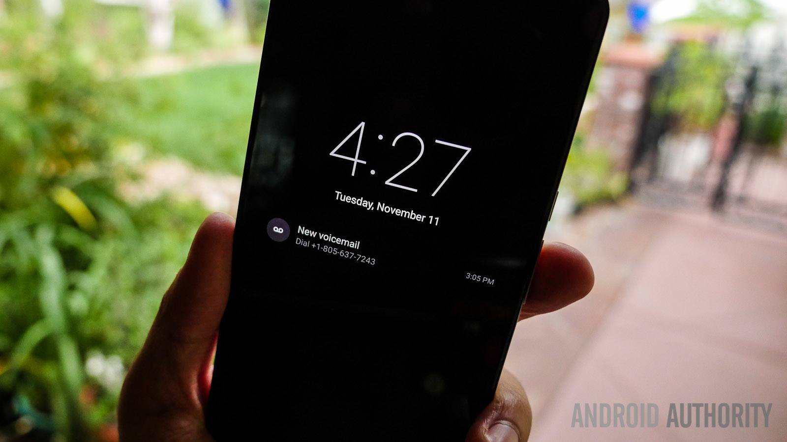
Ambient Display is a new way to check your notifications via a minimized version of the lockscreen, that comes on when you pick the phone up. Unfortunately, the feature just isn’t as reliable as Moto Display, and I was hitting the power button more often than I feel I should have had to. This is also Google’s way of eliminating the need for a LED notification light. Even though I haven’t paid attention to notification lights in a long time, Ambient Display is still in need of some improvements to make this change more compelling. The only thing that makes me miss the notification light is the way Lollipop handles low battery states: when the power saving mode switches on because the battery is at a critically low level, the notification and navigation bars turn red, which is very jarring and can get quite annoying.
As Google continues to strip away unnecessary extras and get back to a really minimalist interface, the small details are what really made me happy. In the Quick Settings menu, tapping the words Wi-Fi or Bluetooth take you to their respective settings pages, the battery icon was moved up top to save space, and hitting the mobile network icon shows you your data usage. Even if the quick heads-up notifications will cover a part of the video or game, they aren’t big hindrances, and don’t stay on for too long.
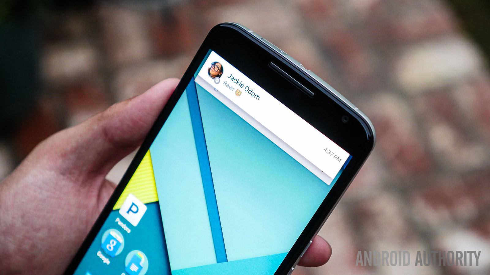
As this design permeates throughout the different Google apps, it looks like Material Design will help make overall user experience better. With that said, while I like Material Design, I can understand if some users out there view it as an oversimplification of Android. Functionality remains intact, but its presentation is continuing to get more spartan. But, as I like to say, when the operating system keeps it simple, the device keeps fast.
While we are used to rave about the fantastic price points of Nexus devices, that’s unfortunately not the case this time around. The Nexus 6’s price is, in fact, proving to be a point of contention for some. The base 32GB model is available for $649, while doubling the internal storage requires a $50 premium. While steep, especially compared to previous iterations, we have to keep in mind that the Nexus 6 is still cheaper than some of its direct competitors, like the Samsung Galaxy Note 4 and iPhone 6 Plus.
And so, there you have it – a closer look at the Nexus 6! It’s clear that the Nexus 6 is a major step forward in the Nexus line in many ways. From the larger screen and its Quad HD resolution, to its smooth performance, to its greatly improved camera performance, and finally, to the wonderful evolution of Android in Lollipop, the upgrades are numerous.

The Nexus 5 was like a high-end road car, affordable, but not quite there in being absolutely super. The Nexus 6 is much closer to that and is Google’s way of going all-in with Motorola and establishing its place in the Android kingdom. Like many people who look past the impractical aspects of owning a super car, if you look past the few flaws of the Nexus 6, you’ll have a phone that is sleek, requires few compromises, and can go from 0 to 100 really quick.